1. Acrylic welcome sign in a clear desktop frame
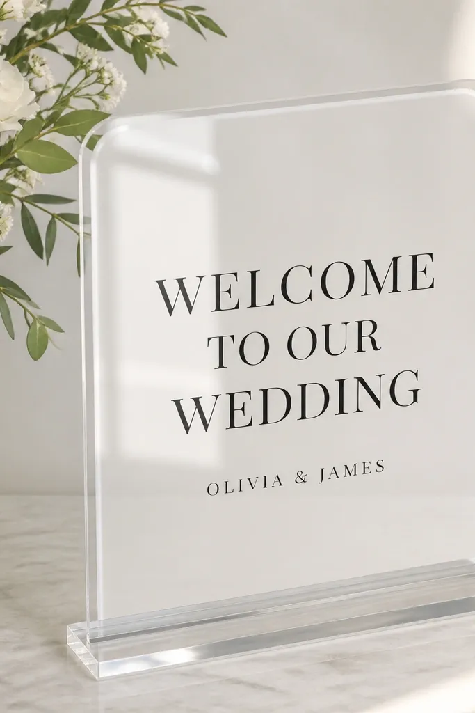
This idea works because acrylic is tough enough for busy welcome tables and it stays glossy even when people touch it while taking photos. I like a white background under the acrylic so the text looks sharp and doesn't get washed out by venue lighting. Black lettering reads clean in both indoor and outdoor shade, and it makes skin tones look warmer in photos. If you're wearing bold colors like emerald or rust, black-on-white keeps the sign from fighting your florals. The frame also hides messy edges, which is where DIY versions usually look cheap.
Start by buying a clear tabletop acrylic frame that takes an insert size close to 8x10 or 9x12. Print your welcome text on heavy paper, then laminate it or use a UV-print insert if you have access. Slide the insert into the frame, then clean the acrylic with microfiber and a spray made for glass. Place it on a tray or charger plate so it has a stable base and doesn't slide when guests bump the table. Pair it with a small eucalyptus bundle or olive branch to echo the clean lines.
Try thisUse vinyl lettering directly on acrylic only if you can keep the vinyl edge perfectly straight - otherwise a laminated print looks just as crisp with less stress.
Common mistakeAvoid bare paper inside an acrylic frame - it shows fingerprints and curls at the corners.
2. Laminated welcome card in a slim metal easel
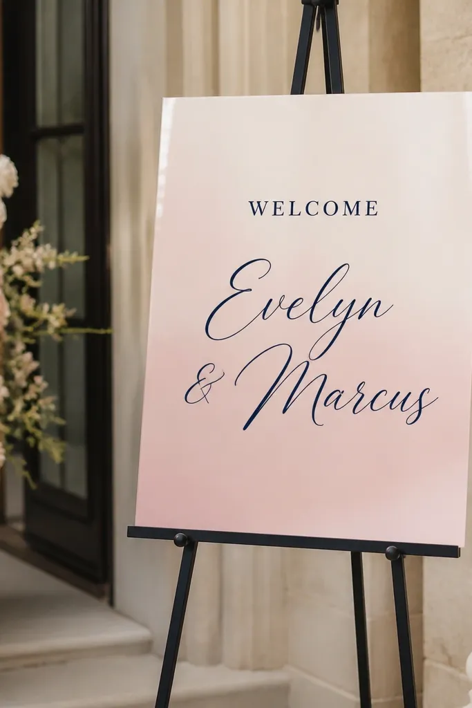
A laminated card in a metal easel is my go-to when I want something that looks styled but doesn't punish me later. Lamination takes away the fear of smudges from hands, perfume, and condensation from cold drinks nearby. The easel's metal finish looks intentional in photos, especially against wood tables or a neutral entry console. Blush and navy is a classic combo that flatters most skin tones in guest photos, and the script names add personality without clutter. You get a "real sign" look without needing to build anything complicated.
Start by designing a card that's readable at a distance - I aim for the word WELCOME at least 3 inches tall on an 8.5x11 layout. Print on cardstock, then laminate with a matte finish to reduce glare. Put the laminated sheet into the easel's clips or secure it with small binder clips hidden behind the frame. Position the easel slightly angled toward the walkway so the camera catches the text. Finish with one matching accessory nearby, like navy napkin rings or a small blush ribbon on the tray.
Try thisChoose matte lamination if your venue has bright overhead lights - glossy laminate turns letters into glare.
Common mistakeAvoid tiny font sizes just because the layout looks good up close - guests need to read it while walking.
3. Sealed wood plaque with vinyl lettering
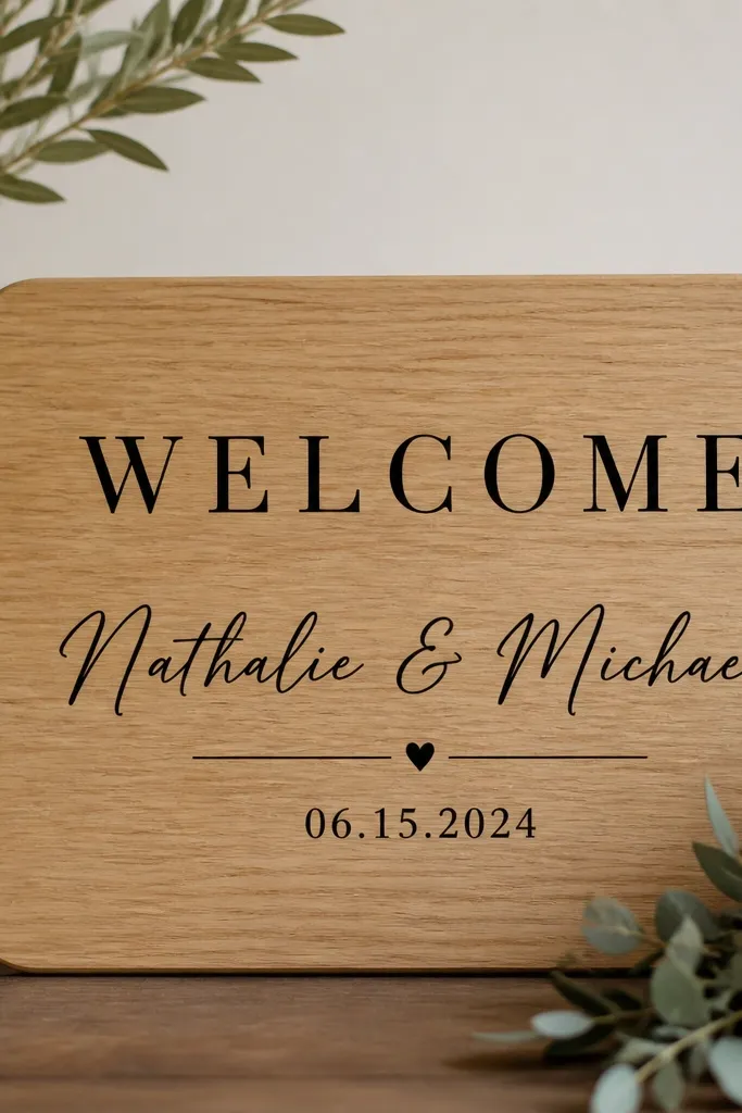
Wood plaques look grounded and expensive even when the build is simple, and sealing makes them genuinely easy care. Vinyl lettering stays clean because it's not ink that can smear; you wipe the surface and you're done. Light oak with black text reads well against almost any wedding color palette, from dusty rose to deep green. The grain adds texture without distracting from the message, so your photos look warm rather than flat. This is a strong pick if you want a sign that matches rustic venue details like barn wood, stone walls, or wood beams.
Start with a pre-cut wood plaque that's sanded smooth and sealed or plan to seal it with a satin clear coat. Apply vinyl letters using transfer tape so you can place the line spacing evenly. Press each letter firmly with a soft squeegee, then trim stray edges with a craft blade. After lettering, add a thin second coat of satin sealer if the plaque is fully dry - keep it light so you don't gum up vinyl edges. Set it on a small stand or prop it against a tall vase so the bottom edge doesn't catch table clutter.
Try thisDo a dry layout with painter's tape first so your "WELCOME" sits centered and your date line doesn't drift upward.
Common mistakeAvoid glossy sealer on wood - it reflects faces and turns the plaque into a shiny mirror in photos.
4. Chalk marker sign on sealed slate board
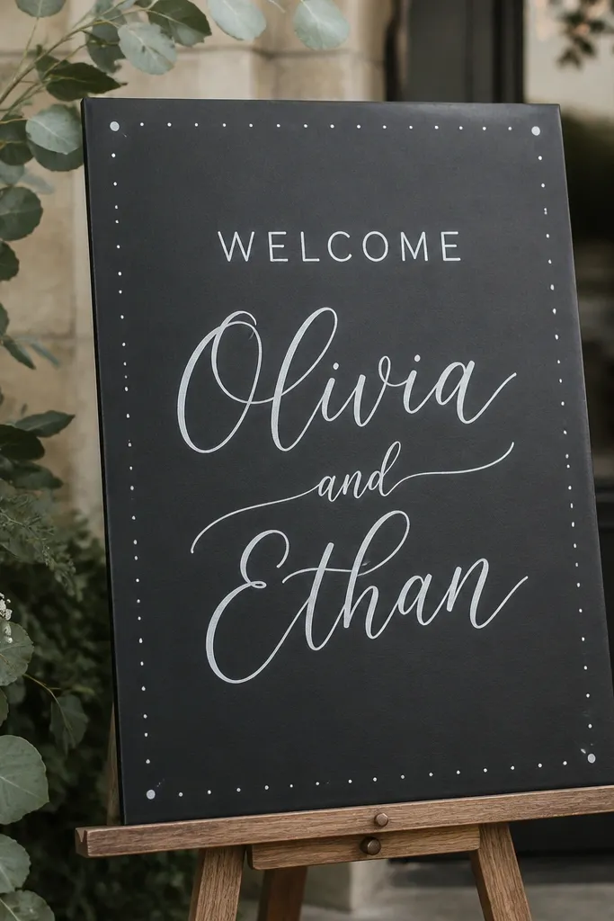
Slate is the smooth, sturdy option when you want the "handwritten" vibe without the mess of real chalk. Chalk markers look bold on dark stone, and sealed slate stays easy to clean with a damp cloth. I love this idea for modern weddings because the handwriting style feels personal while the slate looks refined. It also photographs well under mixed lighting because the matte surface avoids harsh glare. If your venue has a black backdrop or dark entry wall, the contrast is gorgeous and reads instantly.
Start by buying a slate board and checking that it has a sealed surface you can wipe. Write your text with a fine chalk marker, then add a border with a slightly thicker nib for emphasis. Let it set for about 10-15 minutes before moving it. When you're done with the design, spray a chalkboard sealer made for chalk markers if the product indicates it's safe for that marker type. Place the slate on a small wooden easel or at the center of a tray with a few matching candles.
Try thisUse painter's tape as a guide for straight lines - peel it off immediately after you finish the line.
Common mistakeAvoid using regular chalk on slate unless you're okay with smudging - chalk marker is the cleaner look.
5. Waterproof vinyl on foam-free corrugated plastic sheet
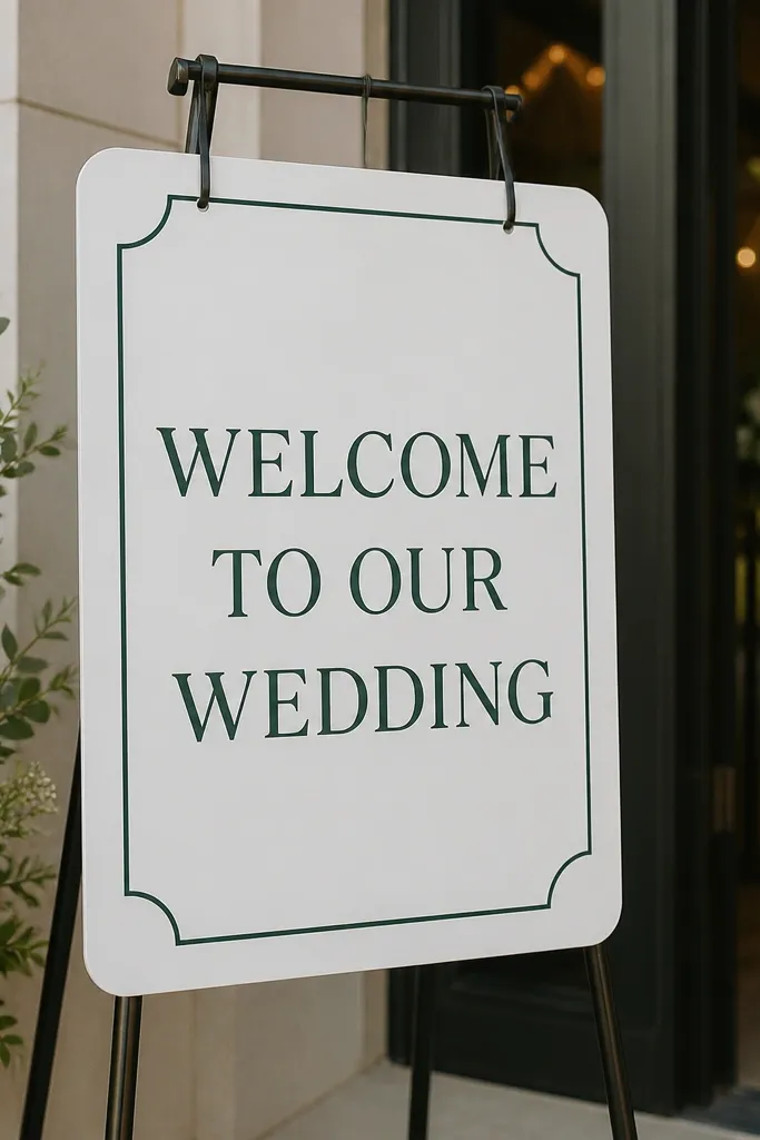
This is the no-nonsense option for outdoor weddings because corrugated plastic is light, stiff, and doesn't absorb moisture like paper. Waterproof vinyl stays legible even after someone brushes the edge while juggling a program. I've used this at windy venues and it holds up, especially when the sign is weighted at the base. Green vinyl on white is a calming, earthy look that pairs well with both wildflower themes and minimalist setups. It also keeps your message crisp when the background behind the sign is busy.
Start with a foam-free corrugated plastic sheet cut to your preferred size - 12x18 is a good starting point for entryways. Clean the surface thoroughly with isopropyl alcohol so vinyl sticks without lifting edges. Apply vinyl lettering with transfer tape, pressing each section carefully to avoid bubbles. Add a simple border line so the sign looks intentional, not like a stickered sheet. Mount it on a sturdy A-frame stand or attach it to a weighted base so it doesn't swing in wind.
Try thisPlan your font sizes for distance: keep the word WELCOME at least 4 inches tall on a 12x18 sign.
Common mistakeAvoid cheap vinyl that isn't labeled waterproof - edges peel fast near humidity.
6. Matte poster print in a black picture frame
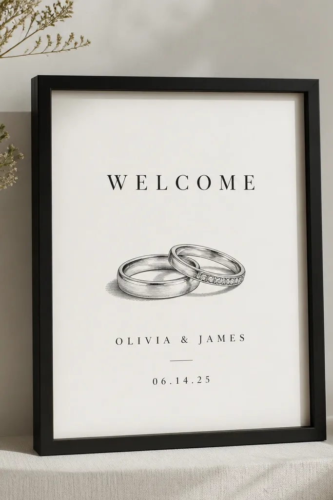
A picture frame is the easiest way to get a polished wedding sign without worrying about the surface. Matte poster prints reduce glare, and the frame hides corners so it looks finished even if you printed at home. I like monochrome designs here because the frame does the styling - you don't need heavy florals or extra elements. This works especially well when your venue has lots of colors and you want the welcome message to stay readable. It also scales nicely: you can go small on a welcome table or bigger for entry photos.
Start by choosing a frame with a black or dark walnut finish so it looks intentional next to candles and table linens. Print your poster on thick paper, then use a matte clear sheet if your printer can't handle heavy cardstock. Insert the print, then secure the backing so the paper stays flat. Place the framed sign on a table with a slight angle toward the entrance so guests see it as they arrive. Add one accent color through flowers behind the frame, not on the print itself.
Try thisIf you can, use anti-glare glass - it keeps text readable when someone's phone flashlight hits it.
Common mistakeAvoid glossy prints in bright venues - the glare makes the text look washed out in photos.
7. Table tent welcome sign made from laminated cardstock
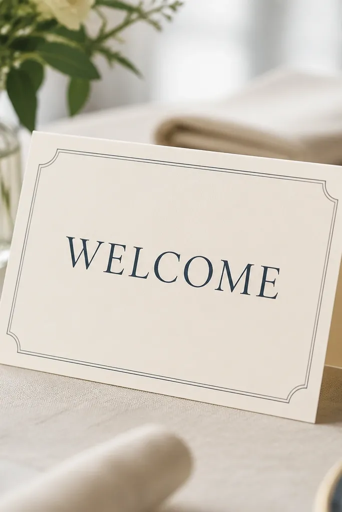
Table tents are underrated because they solve the "guests miss the sign" problem when they're rushing to find seats. Laminated cardstock is the cheat code: it survives spilled water and it wipes clean if someone leans on the table. I like using a two-panel design so the front reads instantly and the inside gives extra directions without cluttering the main message. Cream and navy looks clean with almost any wedding palette and photographs well next to place cards. This is a great pick for welcome tables that already have lots of items, like favors and menus.
Start with a tent size that fits your table - I use a 5x7 folded tent when possible. Print the front panel with large WELCOME text and keep names and date in the next line smaller but still bold. Laminate the whole tent so edges don't soften from moisture. Fold along the center crease using a bone folder so it stays sharp and flat. Place it at the front edge of the welcome table, closest to where guests pick up their program.
Try thisAdd a simple arrow icon for directions like "Reception at 5:30" so it reads in one glance.
Common mistakeAvoid unlaminated cardstock - it curls after a single spill.
8. Acrylic stand sign with magnetic backing for easy swaps
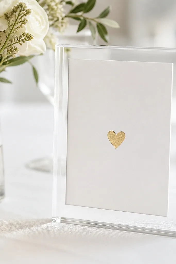
If you want low maintenance wedding welcome sign ideas easy care that you can reuse or update, magnetic inserts are the move. The acrylic stand is sleek and modern, and the magnetic backing keeps the insert perfectly flat without corners lifting. I've used this format for welcome signs that change from rehearsal dinner to wedding day by swapping the insert only. The white insert keeps text crisp, and a tiny gold accent looks classy without turning into glitter mess. This setup also makes it easy to keep the sign looking clean because you're not touching vinyl on the day-of.
Start with an acrylic stand that supports magnetic inserts or comes with a compatible backing. Design two versions of your welcome layout - one for ceremony day and one for rehearsal day - and print them on thick white paper. Insert the printed sheet into the magnetic frame, then wipe the acrylic stand with microfiber before placing it. For styling, keep the sign centered on a charger or tray and add a small cluster of greenery behind it so the stand doesn't look lonely. Store spare inserts flat in a folder so you can swap quickly.
Try thisUse a matte white insert paper so the ink doesn't reflect and the text stays readable from the walkway.
Common mistakeAvoid thin printer paper - it warps and makes the insert look like it's floating.
9. Wipe-clean cornhole-style signboard for indoor welcome table
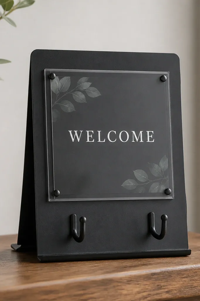
This one looks fun but it's practical: the printed panel sits behind a protective cover, so you can wipe the front without worrying about ink. The freestanding shape makes it hard for guests to block it with flowers or a basket because it stands higher than table items. I like it for indoor venues with high foot traffic because the sign stays visible even when people crowd the welcome table. The dark finish hides scuffs better than light wood, which matters when someone bumps it with a chair leg. Keep the text simple and bright so it reads fast.
Start by choosing a signboard with a clear protective cover over the insert area. Use a high-contrast printed insert with white text on a dark background or dark text on light. Secure the insert according to the board's design so it doesn't slide. Place the signboard in the center of the welcome table or slightly toward the entry side so it catches the first line of sight. Add one matching element like a small menu stand next to it to keep the visual rhythm.
Try thisIf your board has a clear cover, clean it with glass cleaner and microfiber right before guests arrive.
Common mistakeAvoid busy designs with too many tiny icons - they blur behind the cover.
10. Ceremony entrance banner on grommets with washable fabric
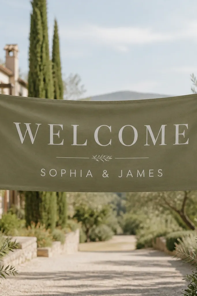
A fabric banner is easy care when you pick the right material and mounting method. Matte cotton-poly or polyester blends handle outdoor light and don't look like crinkled paper in photos. Grommets keep it stable on a line or frame, so you're not fighting tape residue on doors or walls. White lettering on a neutral fabric base makes the sign readable from across the entrance. This is great for weddings where the welcome moment happens at the threshold and guests walk past it on the way to the ceremony.
Start by ordering or making a banner from a washable fabric, cut to fit the entrance span you have. Use heat-transfer vinyl or dye-sublimation if you have access, then keep the design centered. Hem the edges so it doesn't fray, then add grommets spaced evenly along the top. Hang it using a taut line or a frame so the banner doesn't droop and block sightlines. Add small greenery garland along the bottom edge if you want a softer look without adding bulky decorations.
Try thisTest your hanging height with a quick phone photo from guest eye level - you want the text to sit above heads.
Common mistakeAvoid lightweight organza or thin chiffon - it flaps and blurs the lettering.
11. Vintage-style framed print with preserved botanical paper
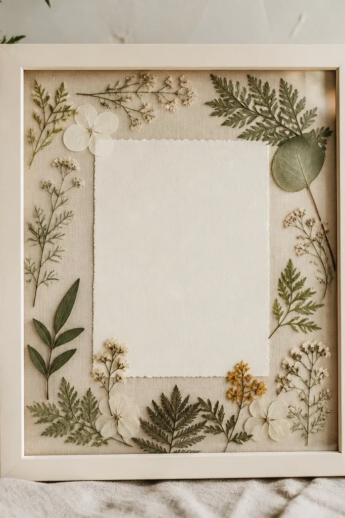
Glass-fronted botanical prints look romantic, but the easy care part is the protection. When the design is under glass, you avoid the dust and handling issues that come with loose dried elements. The textured background gives warmth and makes the welcome message feel like part of a real set, not a last-minute sign. Cream frames and warm neutrals flatter most wedding color palettes, especially if you have beige linens or ivory dresses in the mix. This is a strong choice for indoor photo areas and welcome tables where guests will linger.
Start with a frame that closes tightly with a backing so nothing shifts. Print your welcome message on textured paper or a premium cream cardstock, then place it behind glass with the botanical background. Use a thin mat board if you want a vintage spacing effect - it keeps the text from touching the frame. Position the framed sign on a table with a table runner that matches the paper tone, like ivory or warm taupe. Store the frame back in its box after the wedding if you plan to reuse it.
Try thisChoose glass with anti-reflective coating if your welcome table sits near windows.
Common mistakeAvoid loose dried botanicals without glass - they crumble and make the sign look tired fast.
12. Reusable chalkboard easel with removable vinyl letters
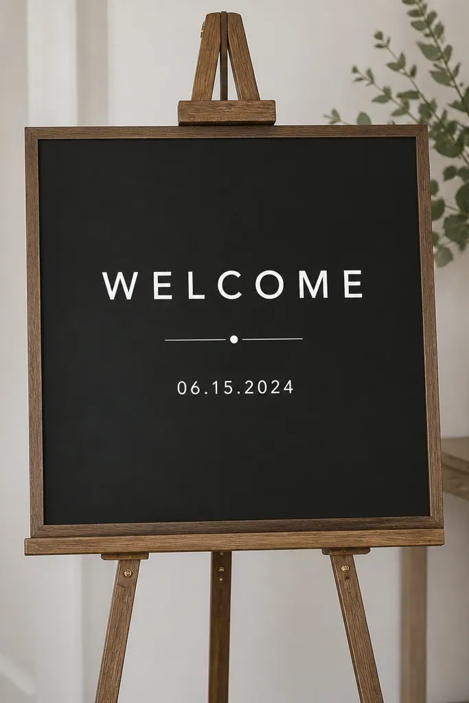
This format gives you the chalkboard look without the smudging mess. Removable vinyl letters sit crisp and flat, and you can wipe the chalkboard surface with a damp cloth as needed. I like it when couples want a classic handwritten feel but still want something that survives day-of handling. The black board makes white text pop and reads clearly even in dim reception lighting. It's also a reuse-friendly option because you can peel the vinyl off and store it in a labeled sleeve.
Start by buying a chalkboard easel with a smooth slate surface. Clean the board, then mark your layout lightly with chalk or painter's tape for straight lines. Apply removable vinyl for WELCOME and names, pressing down firmly along each letter. Add a second vinyl line for the date so it stays consistent across events. Place the easel near the welcome table but not where people set bags - chalkboards pick up scuffs.
Try thisUse painter's tape strips as temporary guides and remove them right after you place the vinyl.
Common mistakeAvoid permanent vinyl on the board if you want reuse - it can leave residue.
13. Neon-look LED sign with printed message insert
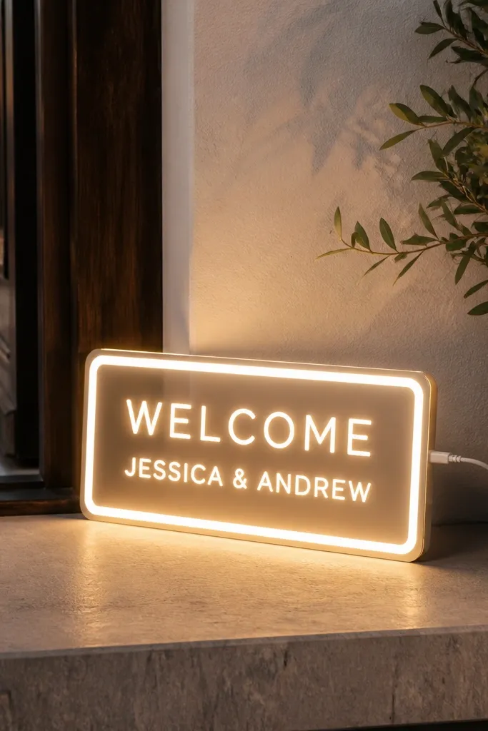
LED "neon" style signs are a lifesaver when you want a dramatic photo spot without a complicated build. The low maintenance part is that you're not dealing with paper texture, wind, or ink smears. Warm white LEDs look flattering on skin and wedding makeup because they add soft light near the entrance. If you choose a sign with a removable insert or simple design, you keep it clean and easy to change. This works best for evening weddings where the glow becomes part of the vibe rather than a gimmick.
Start by choosing an LED sign model that reads clearly at your entrance distance. If it allows inserts, print a clean insert with high contrast and insert it into the housing. Plug it in at least 30 minutes before guests arrive so it warms up and brightness looks even. Place it on a stable stand or in a corner near a wall so the glow frames the welcome area. Pair with simple decor like a single arch flower cluster or a minimal balloon strip to avoid visual overload.
Try thisRun the power cord along the floor edge and tape it down with low-tack tape so nobody trips.
Common mistakeAvoid battery-powered LEDs for outdoor wind - they dim and die at the worst time.
14. Foil-stamped welcome card in a protective clear sleeve
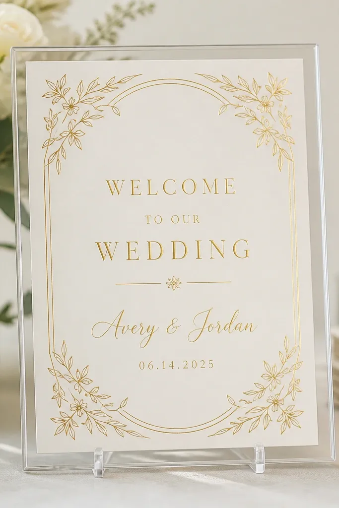
Foil-stamped cards look fancy, and the care part is the protective sleeve or acrylic holder. When foil is under plastic or acrylic, it doesn't get rubbed by hands and it stays smooth in humid venues. I like cream and gold because it feels celebratory without being loud, and it photographs well next to white table linens. The holder also raises the sign above table clutter, which helps guests actually read it. This is a smart pick for couples who love the "invitation" vibe and want the welcome sign to match.
Start by getting a foil-stamped card design that matches your invitation suite. Place it inside a clear acrylic holder or slide it into a protective clear sleeve that seals at the edges. Insert the card so it sits flat with no wrinkles. Position it on a small stand or easel so the text faces the entrance, not the table. Add one gold-toned accent like a candle jar or a satin ribbon around the stand base.
Try thisWipe the clear holder with microfiber right before the first guest arrives to remove finger smudges.
Common mistakeAvoid handling the foil card by the printed area - fingerprints show fast on metallic surfaces.
15. Minimalist framed map-style welcome sign with wipeable surface
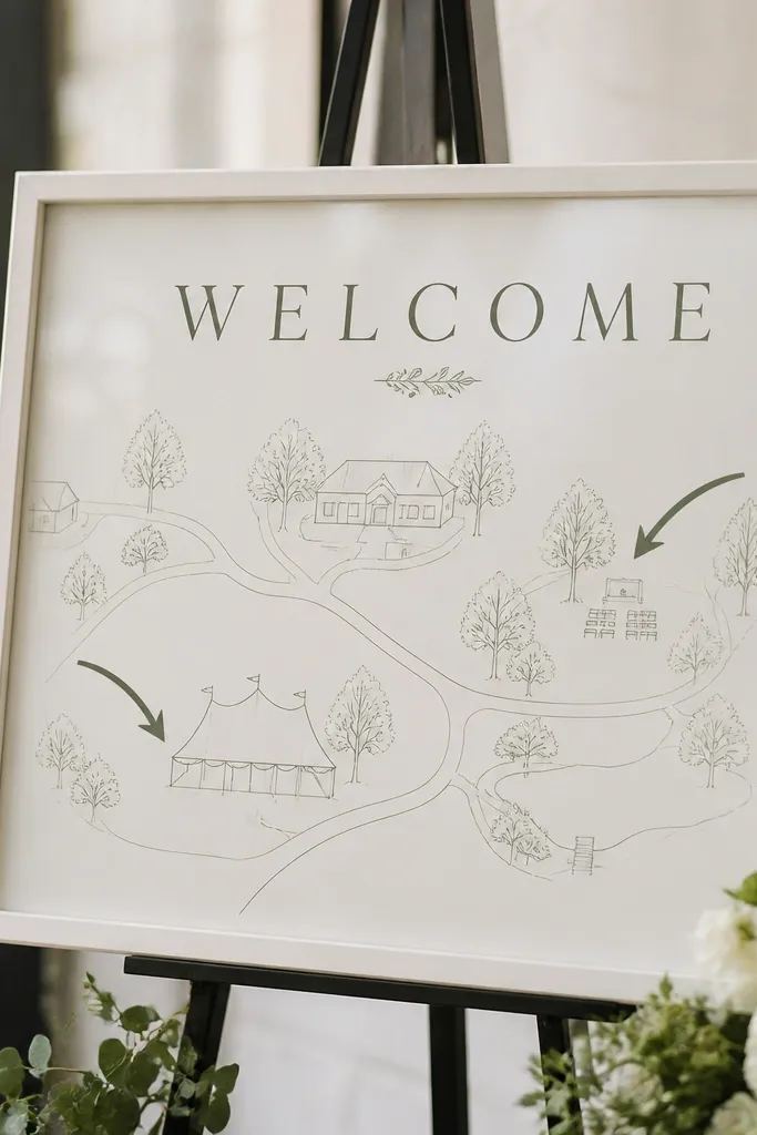
This sign works when you want more than a greeting, especially if guests are arriving from out of town. A framed map-style design helps people locate the ceremony and reception points without needing extra paper handouts. The wipeable laminate under glass keeps the surface clean even if it gets touched while guests ask questions. I like line-art maps because they look classy and don't turn into clutter when your venue has a complex layout. It also photographs well because the lines are simple and high contrast.
Start with a framed print size that's readable - 11x14 is a good sweet spot. Print a simplified map with bold labels for "Ceremony" and "Reception," and keep the welcome text at the top. Use laminate or anti-smudge print finish if available. Insert behind glass and tighten the backing so nothing shifts. Place the frame on a welcome table near the seating chart so guests can plan in one stop.
Try thisAdd a small legend with icons (chair for ceremony, fork for reception) so it reads fast for guests who don't read small text.
Common mistakeAvoid tiny street labels - guests only need directions to your wedding spaces.
16. Polyester banner with printed welcome and snag-resistant grommets
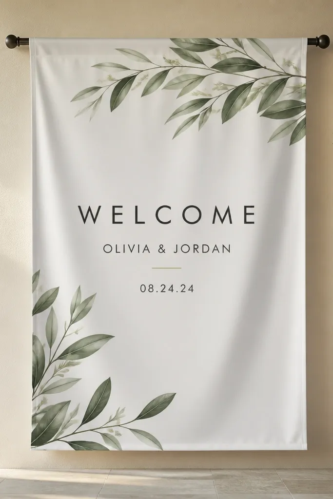
Polyester banners are easy care because they handle folds, humidity, and repeated setup better than paper-like materials. Snag-resistant grommets mean you're not worrying about tearing when you hook it to a stand or tension rod. I like clean sans-serif text here because it stays readable and modern in both daylight and indoor lighting. Neutral backgrounds also make it easy to match your wedding color scheme without redoing the whole design. This is a practical choice for couples who want a professional look but hate fragile signage.
Start by ordering a banner from a print shop that will hem the edges and add grommets - don't try to DIY grommet placement unless you have the tool. Choose a size that fits your entrance sightline, like 24 inches wide by the length you need. Hang it with a tension rod or two posts so the fabric stays taut and the text doesn't warp. Position it at eye level with the center of the WELCOME text around chest height. Pair with simple decor like a matching ribbon tied to the posts.
Try thisTake a quick test photo before the day: if the letters look too low in the photo, guests will miss it in person.
Common mistakeAvoid banners without hemmed edges - frayed sides look messy and reflect poorly in photos.
17. A framed mirror welcome sign with removable lettering
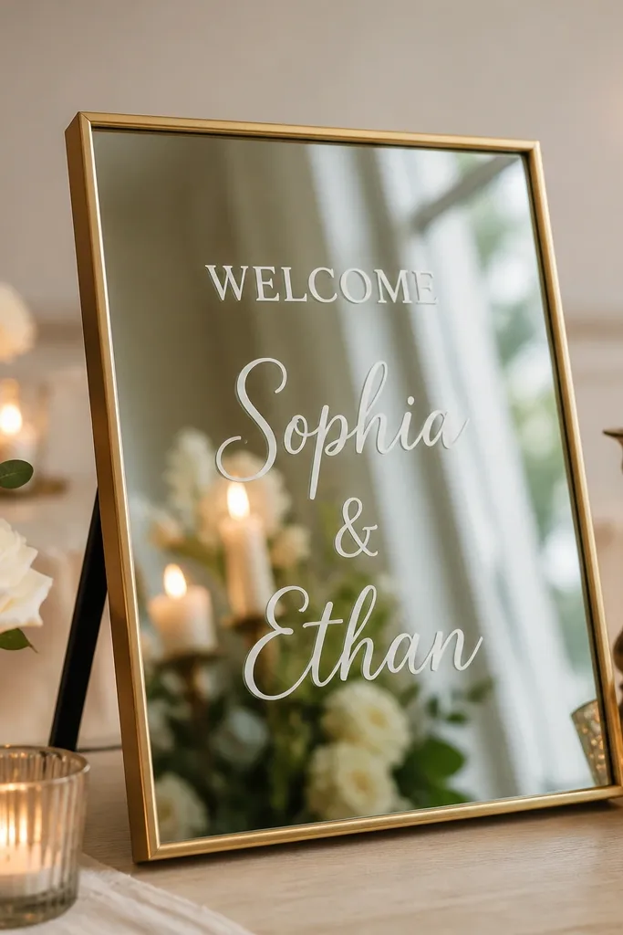
A framed mirror sign is one of the fastest ways to make a welcome area feel styled, and it's easy care when you use removable vinyl. Mirrors don't soak up humidity, and you can wipe the glass clean like you would any home mirror. The vinyl lettering stays crisp and doesn't smear, and the reflection adds depth to your decor. I've used this when the welcome table is in a corner with poor lighting - the mirror bounces light and makes the space feel brighter. It also flatters photos because guests end up in the reflection while still reading the message.
Start with a small tabletop or leaning mirror with a sturdy frame. Clean the mirror glass thoroughly, then apply removable vinyl lettering in a centered layout. Keep the main word WELCOME larger and place names and date in a smaller line beneath. Use a microfiber cloth to remove any dust before you set it down. Place the mirror near a candle cluster or soft lamp so the reflection adds glow rather than glare. Keep the mirror angle slightly tilted toward the entrance so the text is readable from the walkway.
Try thisUse matte-finish vinyl so the letters don't catch glare and disappear in bright light.
Common mistakeAvoid permanent adhesive vinyl - removing it later can leave residue on the mirror.
18. Seating-direction welcome sign on a wipeable acrylic panel
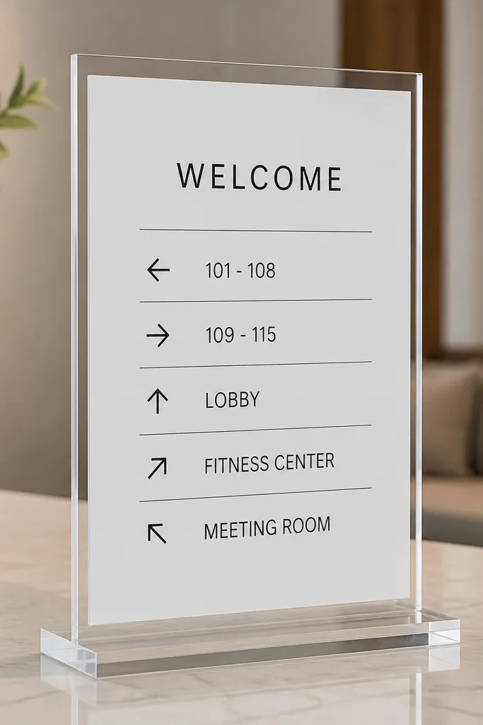
If your guests get confused about where to go, a directions-style welcome sign is worth it. Acrylic panels are easy to clean and they look sleek at the venue entrance, which helps guests trust the information. I like putting the welcome greeting on top and then the directions in a smaller, structured layout so it doesn't feel chaotic. Black arrows on white keep the message crisp, and the transparent frame makes it look modern next to wood or stone. This format also works well for venues where you need to point people to parking, ceremony, and reception all at once.
Start with an acrylic panel stand that can hold a white insert. Print your welcome text and directions on the insert and keep the arrow labels large enough to read while walking. Place the insert into the acrylic holder so it sits flat and doesn't shift. Wipe the acrylic with microfiber and glass cleaner, then set it at the first decision point guests face. Add a small sign stand nearby if you need parking instructions so you don't cram everything into one panel.
Try thisUse a consistent arrow style and spacing so the sign reads like a map, not a list.
Common mistakeAvoid overcrowding the directions - if you need more than two lines per area, make a second sign.
19. Corner welcome sign on a foam-free board with corner clips
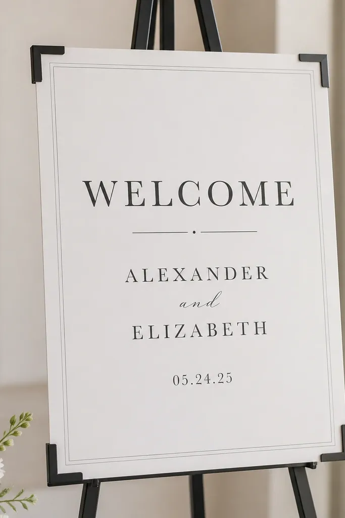
Corner clips are a small detail that makes a big difference in how "clean" a sign looks. Foam-free board keeps the sign light but stiff, and corner mounting prevents edge curling and tape residue. I like this option when your venue has strict rules about adhesives or when your sign needs to be moved between rehearsal and wedding. The neutral white base with dark gray text is easy on the eyes and works with both bright and muted wedding palettes. It's also easy care because you can wipe the board surface and remove dust from the corners without tearing anything.
Start with a foam-free board cut to the size you need, like 12x16 for an entry table. Add a printed design or apply vinyl lettering, then finish with a matte laminate sheet if you want extra wipeability. Mount the sign onto a stand using corner clips or a frame so the edges stay straight. Place it at a slight angle toward the entrance line so guests see the text as they walk in. Style the stand base with a small neutral runner or a couple of candles to keep it from looking like a plain poster.
Try thisIf you use vinyl, apply it in one centered pass and press with a squeegee - uneven edges show under venue lighting.
Common mistakeAvoid tape mounting on the face of the sign - it looks messy and lifts in humidity.
20. Welcome sign on a roll-up stand with laminated print
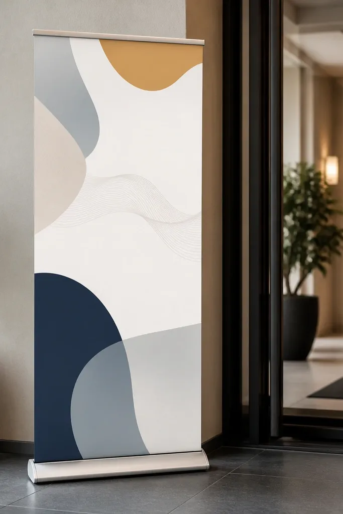
Roll-up stands are the easiest "set it and forget it" option for venues where you need something that travels well. You roll the stand out, lock it, and the laminated print stays smooth and wipeable. This is the best choice when you want a large sign but you hate carrying heavy frames. The printed design looks sharp because it's flat and protected, and the stand keeps it vertical and stable. I like using a simple geometric background because it doesn't look busy behind guest movement.
Start by choosing a roll-up stand size that matches your space, like a 33x80 inch stand for entrances with room. Print your welcome design on a material that works with laminated finishing so the surface wipes clean. Slide or attach the laminated print into the stand's track, then roll it down carefully to avoid creases. Lock the stand legs and check stability by gently pushing the base. Place it near the entry point where guests naturally slow down, then add matching decor like a small potted plant at the side.
Try thisBring a small lint roller on setup day. Roll-up graphics pick up dust fast and a quick roll makes it look fresh.
Common mistakeAvoid folding or rolling the laminated print with dirt on it - it scratches the surface.