1. Thrifted frame with printed welcome card (no-craft lettering)
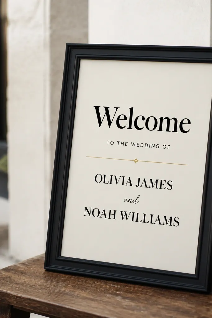
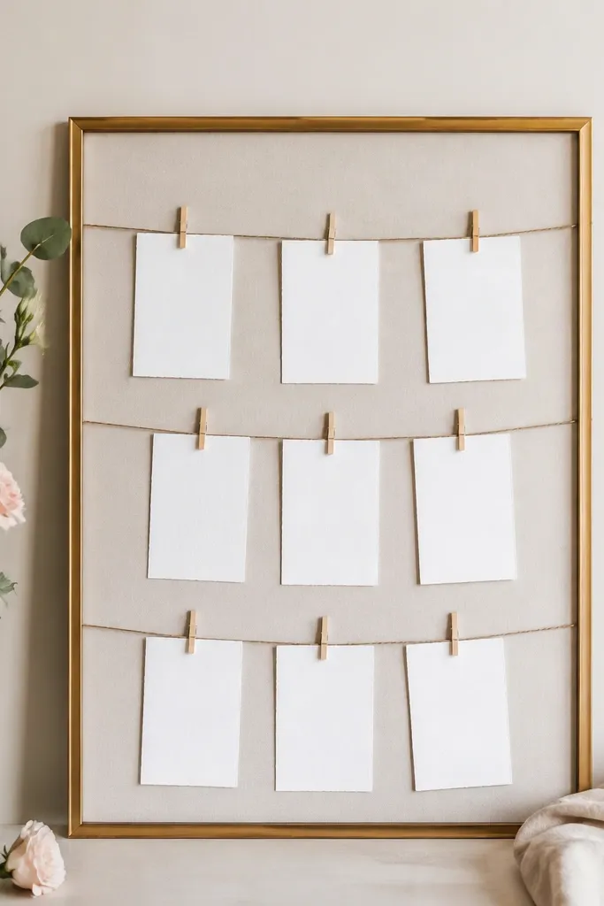
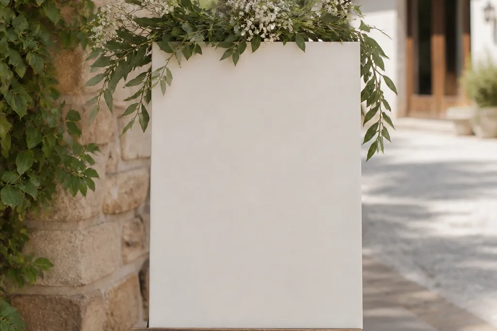
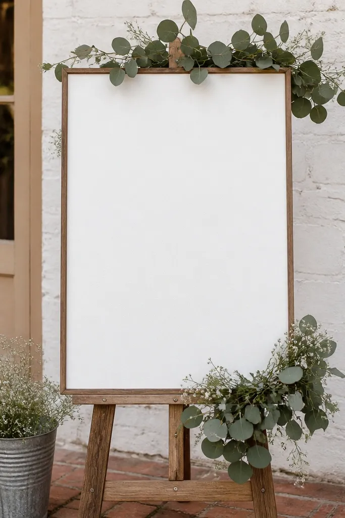
I love this idea because the frame makes the DIY look finished even if your printing is basic. Use a 5x7 or 8x10 print inside a larger mat opening, then scale up to 18 x 24 inches if you can - it reads better at the entrance. Choose cream paper with black lettering for the cleanest contrast; if you're matching a theme, swap black for deep navy. This works for almost every skin tone and venue vibe because it's all about the typography and spacing, not color-heavy decorations.
Start by finding a frame that's at least 18 x 24 inches or one that can hold a 16 x 20 insert. Print your design on cardstock (not regular paper) and keep the main word "Welcome" at least 3 inches tall. Remove the backing, lay the paper flat, and use thin mounting tape on the corners so it doesn't ripple. Add a simple border line with a gold gel pen or a printed line so the whole thing looks like a designed card, then hang it or prop it on an easel.
Try thisIf the frame has no glass, cover the paper with clear packing tape in smooth layers before mounting.
Common mistakeAvoid using glossy photo paper - it reflects light and makes the text harder to read.
2. Foam board sign with vinyl letters and a single accent stripe
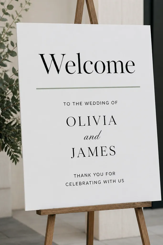
Vinyl on foam board gives you sharp edges that look store-bought. Foam board is also rigid, so your sign stands straight without sagging, which is what usually makes budget signs look messy. Keep the design minimal: one title line, one couple-name line, and one date line. This style looks great in photos because the matte board absorbs glare while the vinyl stays crisp.
Cut foam board to 18 x 24 inches. Clean it with a dry microfiber cloth so dust doesn't block vinyl adhesion. Apply large vinyl for "Welcome," then add one horizontal accent stripe in a muted color like sage, dusty blue, or terracotta. Finish by layering the smaller vinyl lines centered under the stripe, then press firmly with a squeegee or a credit card to avoid bubbles.
Try thisUse a matte clear spray over the vinyl edges if the sign will be handled a lot or transported in a car.
Common mistakeDon't add three different fonts - the variety makes it look like random stickers.
3. Cardboard "architectural" arch sign with stenciled lettering
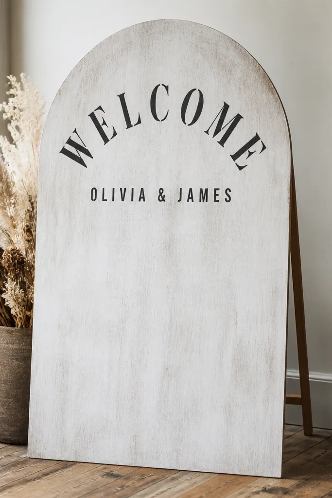
This is the sign that makes people stop walking. The arch shape frames guests' faces and photos, and cardboard is cheap, especially if you use a sturdy box from appliances or furniture. The stenciled lettering keeps it readable and avoids the shaky look of freehand paint. It also looks good in both rustic and modern settings because the shape does the work.
Start by cutting an arch from double-layer cardboard; reinforce the back with tape and extra cardboard strips so it doesn't bow. Paint with white acrylic thinned slightly with water, then dab with a sponge to keep it textured. Use a stencil for "Welcome" at the top curve and keep the stencil aligned with painter's tape guides. Add the names and date centered below, then attach the arch to a simple stand made from a folded cardboard base.
Try thisSeal the cardboard with matte clear spray so it doesn't scuff when guests brush past it.
Common mistakeAvoid thin, single-layer cardboard - it warps fast and makes the arch look crooked.
4. Window cling welcome sign on a clear plastic board
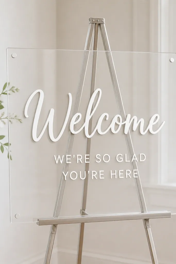
If you have a venue with bright windows, window clings look surprisingly high-end. The letters float on the surface, and the clear board makes it feel clean and modern. This is a budget-friendly option because clings are reusable and you don't need to buy paint or vinyl tools. It flatters any wedding color palette since white clings match everything, especially on daylight.
Buy a clear plastic board (or use an acrylic sheet cut to size) and set it on an easel or stand. Apply clings for "Welcome" first, centered high enough that guests can see it over table height. Add the date and names with smaller cling pieces, keeping consistent spacing. If your cling edges lift, press them down with a dry cloth and smooth slowly to avoid wrinkles.
Try thisPrint your wording in a simple layout first so you don't have to eyeball the spacing.
Common mistakeAvoid placing it too close to busy backgrounds - the cling edge can disappear.
5. Chalkboard paint on a wood scrap panel with faux gold tape border
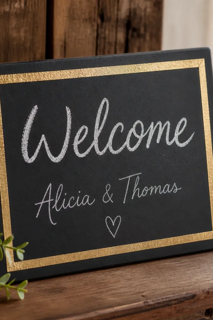
Chalkboard paint on a wood scrap gives you that classic, photo-friendly look without paying for a chalkboard sign. The matte black absorbs glare, so your writing stays readable in daylight and evening. Faux gold tape makes the border look intentional even if your chalk lettering isn't perfect. This works especially well for weddings with neutral florals, warm woods, or black-and-white stationery.
Sand a wood panel lightly and wipe dust off. Paint with chalkboard paint in two thin coats and let it cure fully. Add painter's tape around the edges for a clean border, then place gold foil tape along the tape lines. Write "Welcome" with white chalk, then add names and date in smaller lines underneath, keeping the spacing consistent.
Try thisRub a little chalk dust over the border lightly so the tape doesn't look too sharp next to the matte paint.
Common mistakeAvoid thick chalk smears - use short strokes and go over letters only once or twice.
6. Sheet music print welcome sign with black vinyl names
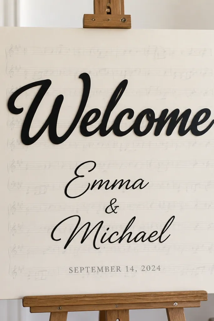
This one looks expensive because sheet music has built-in texture. The trick is keeping the background light so the text stays readable. Use black vinyl for names because it's crisp and stands out against the gray lines. This style fits music-loving couples and also works for vintage or classic weddings without adding extra décor.
Print sheet music pages and trim them to fit an 18 x 24 poster board. Glue them down with a thin layer of matte glue and smooth so there are no bubbles. Apply black vinyl for "Welcome" first, then add names in a slightly larger vinyl size and the date in printed gray or smaller vinyl. Finish by adding a thin black line under the title so the layout looks like a designed poster.
Try thisChoose sheet music with lighter ink so the background doesn't fight your lettering.
Common mistakeAvoid dark, dense sheet music pages - your names will get lost.
7. Dresser drawer handle sign with ribbon hanging panel
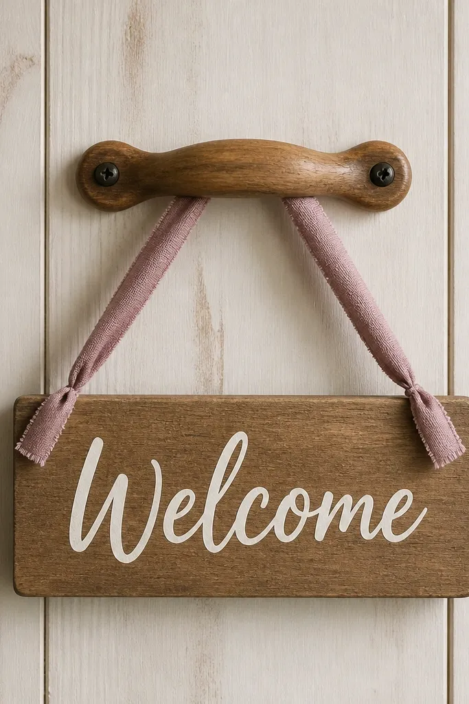
This is the sign you use when you want something charming but not huge. Hanging a panel from a handle gives you a built-in "frame" look, and it's perfect for small entry tables or welcome bags displays. The warm wood background and simple white lettering keep it readable without needing fancy supplies. It also photographs well because the ribbon adds soft movement.
Grab a thrifted drawer handle and mount it to a flat backing board using screws or strong mounting tape. Cut a sign panel from thin wood or sturdy cardboard, then paint it with a warm stain or light tan paint. Letter "Welcome" in white using a stencil so it stays clean. Tie ribbon to the panel corners, loop it over the handle, and adjust the height so the text sits at eye level.
Try thisUse satin ribbon and knot it tightly; loose knots look messy in photos.
Common mistakeAvoid flimsy ribbon that curls - it makes the sign look unplanned.
8. Pressed flower border sign on kraft paper with black acrylic letters
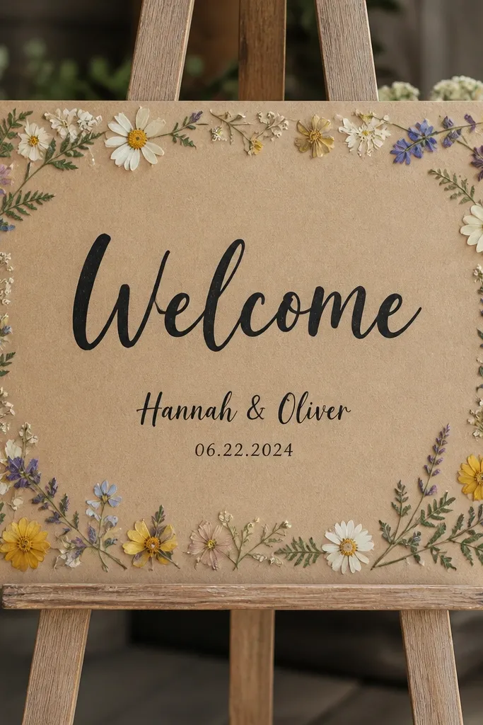
Pressed flowers make a budget sign feel personal without buying expensive florals. Kraft paper gives you a warm base that hides minor imperfections, and black acrylic lettering stays bold. The border is the key - it frames the text while keeping the center clean for readability. This works for outdoor weddings, rustic barns, and anything with neutral linens.
Cut kraft paper to 18 x 24 inches and mount it onto a foam board so it stays flat. Press small flowers (dried daisies, baby's breath, or thin leaves) and place them along the perimeter, then fix with a tiny brush of matte decoupage. Paint "Welcome" with a stencil in black acrylic, then add names and date centered below. Finish with a matte seal spray so the flowers don't lift.
Try thisUse a sponge to apply paint through the stencil so the edges stay sharp.
Common mistakeAvoid placing big flowers too close to the text - they look crowded and reduce contrast.
9. Dollar-store placemat sign with vinyl lettering and backing
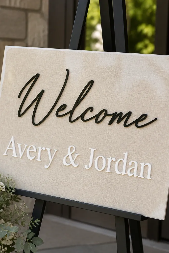
This is one of my favorite hacks because placemats are already stiff and wipe-clean. When you use vinyl on a laminated surface, you get crisp letters that survive accidental spills and rain. The look is modern because the base is smooth and flat, and the typography keeps it from feeling like a kitchen item. It's great for casual backyard weddings where the sign might get moved around.
Buy a large placemat (aim for 18 inches wide if possible). Clean it with rubbing alcohol so vinyl sticks. Apply black vinyl for "Welcome," then add names and date in white or cream vinyl to keep contrast. Mount the placemat on a thin foam board backing using double-sided tape so it stands up straight on an easel.
Try thisIf the placemat is glossy, lightly scuff with a fine sanding block so vinyl adheres better.
Common mistakeAvoid placing vinyl directly on a dusty placemat - it peels at the corners.
10. Painted wood ruler sign with long horizontal layout
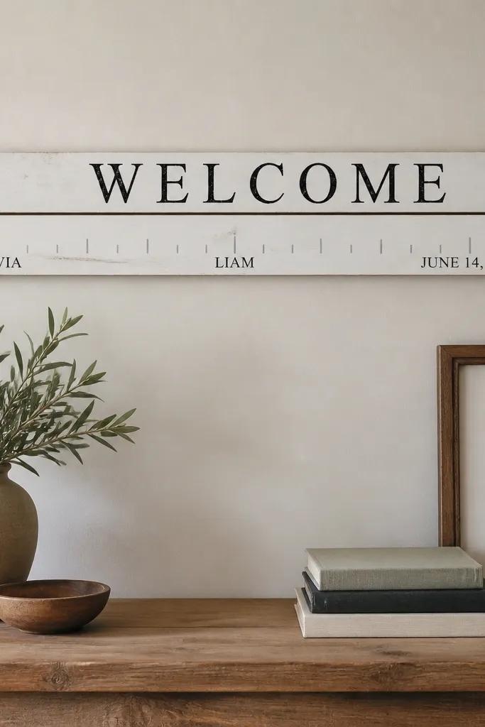
This layout is clean and graphic, and it makes a welcome sign feel like part of the décor instead of a last-minute craft. Wood boards are cheap at thrift stores, and ruler-style spacing makes the design look intentional. The pale tick marks keep it subtle while the bold "Welcome" remains readable. It works for modern, minimalist weddings and also pairs well with barn wood settings.
Find two similar-size wood boards and sand them down. Paint the background in white or warm cream, then use painter's tape to create straight lines. Paint "Welcome" across the top board in black and add tick marks with a ruler and gray paint. Arrange the second board underneath with names and date spaced out like numbers, then attach both to a simple backer so the sign stands.
Try thisUse a thin craft brush for tick marks, not a wide brush, or the lines look wobbly.
Common mistakeAvoid freehand straight lines - tape guides make the whole thing look professional.
11. Mirrored acrylic sign with black permanent marker lettering
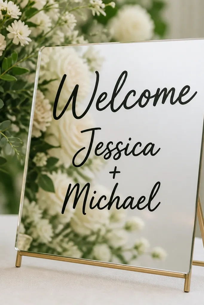
Mirrored surfaces are a cheat code for budget signage because they bounce light and make the sign look high-end. Black marker lettering looks crisp from a distance, and it also photographs well because the reflection adds depth. This works best for indoor receptions or covered patios where you control glare. If your wedding has lots of candles or fairy lights, this sign will look especially good.
Buy a small mirrored acrylic sheet (or a mirror panel cut to size). Clean it thoroughly with glass cleaner and dry with a lint-free cloth. Use a vinyl stencil or painter's tape to guide "Welcome," then fill with black permanent marker. Add names and date in smaller marker lines, then wipe away any smudges carefully with a microfiber cloth.
Try thisDo a quick test on a scrap acrylic piece first - marker behaves differently on each surface.
Common mistakeAvoid writing too close to the bottom edge - reflections can make it hard to read.
12. Kraft paper roll sign with calligraphy-style vinyl
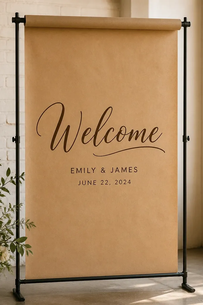
A banner made from kraft paper looks thoughtful and relaxed, and it hides minor wrinkles better than smooth white paper. Vinyl lettering gives you the "calligraphy" vibe without the shaky hand. This style is perfect for outdoor ceremonies or rustic venues where you want the sign to feel like décor, not a poster. It flatters warm-toned color palettes and looks good next to wood, rattan, and linen textures.
Unroll kraft paper and cut it into a banner size around 12 x 36 inches or larger if your stand is tall. Mount it to a backing board or use a double-tape strip on the back to keep it flat. Apply dark brown vinyl for "Welcome," then add names in a slightly smaller size directly under it. Finish by attaching the banner to your stand with clips or twine tied into small loops at the ends.
Try thisIf the paper keeps curling, press it under a heavy book for 30 minutes before you apply vinyl.
Common mistakeAvoid tiny text - vinyl banners need bigger lettering than you think.
13. Chalk marker on white ceramic tile mosaic board
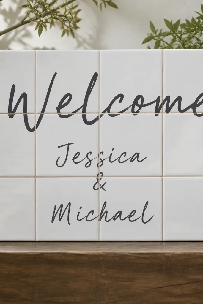
This is a surprisingly photogenic sign because tile gives you a clean grid and a little shine without being glossy like acrylic. Chalk marker stays readable and feels wedding-appropriate. You can make it look cohesive by keeping your lettering consistent and using one color. It works for modern weddings and also for black-and-white themes since the tile background is bright.
Glue or mount ceramic tiles onto a plywood or foam board backing using tile adhesive or strong craft glue. Let it set flat, then clean the tiles so the marker adheres well. Use chalk marker to write "Welcome" across the top, then add names and date centered across multiple tiles. Seal the board with a light matte finish only if you want extra scuff resistance, then display it on a stand or against a chair.
Try thisUse a ruler under your hand when writing across tile grout lines - it keeps the baseline straight.
Common mistakeAvoid heavy smudging - chalk marker wipes off tiles more easily than paint.
14. Fabric banner sign with iron-on vinyl letters
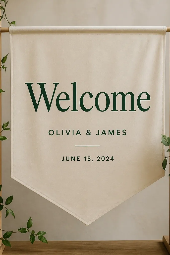
Fabric signs look soft and intentional, and they don't crack like paper when you move them. Iron-on vinyl is the key because it gives you sharp lettering with no paint bleed. This design flatters outdoor backdrops and works with neutral florals, eucalyptus, and linen table runners. It also photographs well because fabric texture adds depth without needing extra décor.
Cut a rectangle of cotton or canvas fabric, around 18 x 36 inches, and hem the edges with a simple fold. Press iron-on vinyl for "Welcome" using a heat press or iron - keep heat times short and use a pressing cloth. Add names and date in smaller vinyl lines centered below. Stretch the banner on a dowel frame or tie it to a stand with ribbon so it hangs taut.
Try thisTest the vinyl on a scrap of your fabric so you don't scorch it or under-adhere.
Common mistakeAvoid stretchy knit fabric - the letters warp when the banner hangs.
15. Wood pallet-style sign using stencil, not freehand
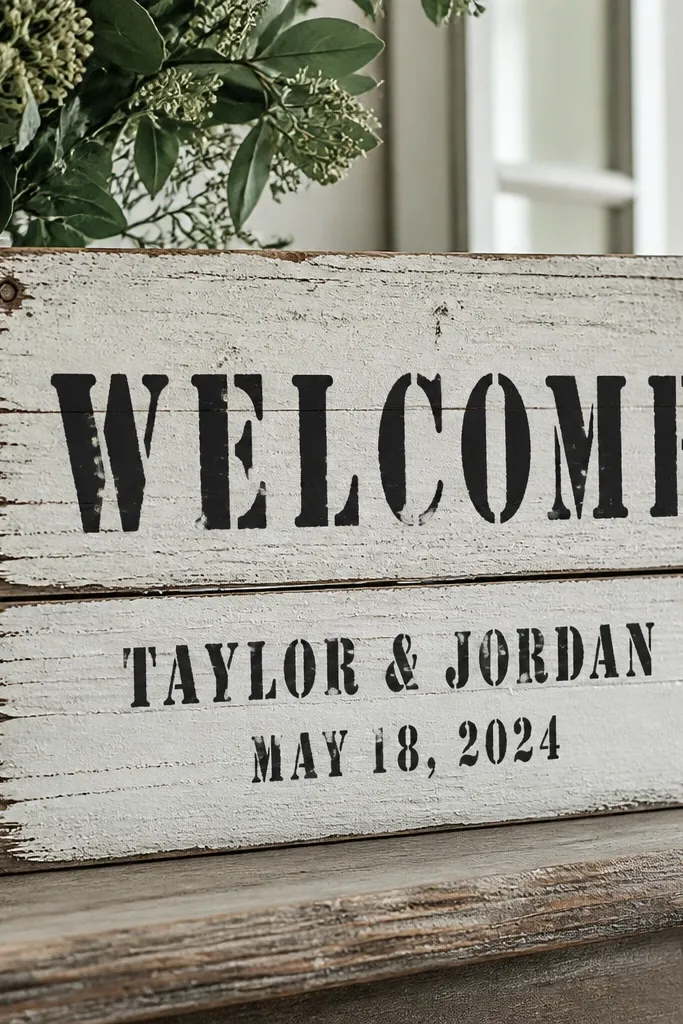
You get the pallet look without having to buy a pallet. Stenciling on wood gives you that bold wedding signage vibe, and the grain texture keeps it from feeling flat. This works for rustic venues, outdoor weddings, and anyone who wants a sign that looks durable. The finish matters - a light stain wash makes the wood feel aged instead of brand new.
Use thin wood planks or a single board that looks reclaimed. Sand lightly and wipe clean, then apply white paint thinned with water so the grain shows through. Tape a stencil for "Welcome" and paint over it with black craft paint using a foam brush. Remove the stencil carefully, then stencil names and date under it. Seal with a matte clear coat so it holds up outdoors.
Try thisKeep your stencil flat with painter's tape so paint doesn't seep under the edges.
Common mistakeAvoid wet paint on stencils - it bleeds into the wood texture.
16. Clear acrylic "welcome" label on foam board backing
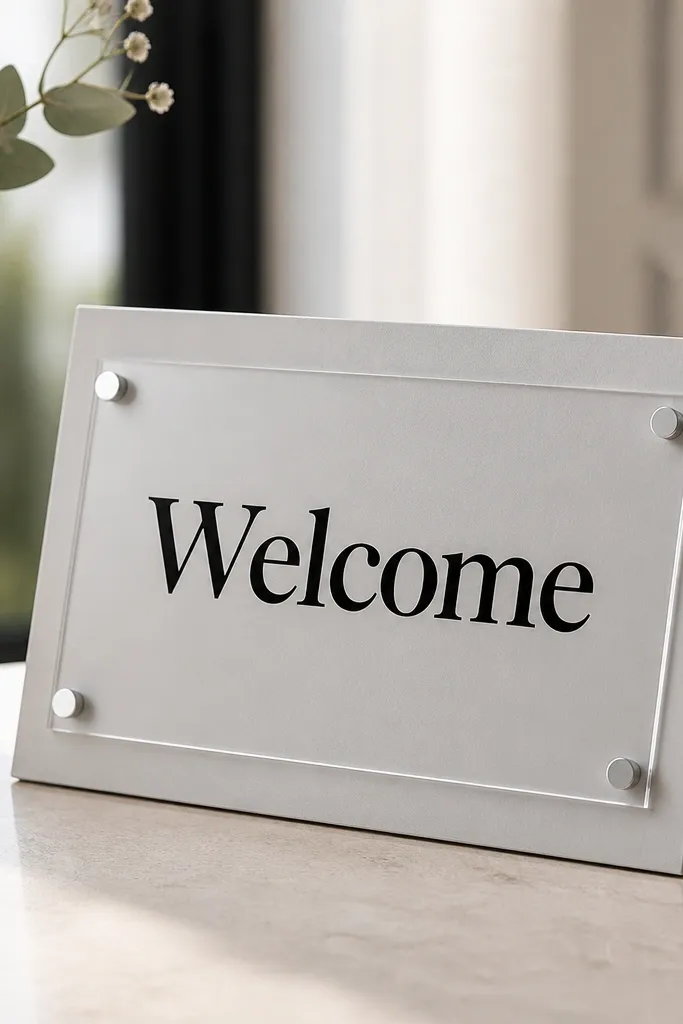
Layering clear acrylic on a solid backing makes your sign look like a real prop. It reads modern, and the floating label effect is what sells it. You can keep the cost down by using a small acrylic sheet and focusing on one strong word. This style works well for both minimalist weddings and more colorful palettes because the label is neutral and the background can match your theme.
Cut foam board to 18 x 24 inches and paint it a light neutral like light gray or warm white. Cut a clear acrylic rectangle around 10 x 16 inches and attach it with small standoffs or clear mounting tape. Apply black vinyl or printed lettering to the acrylic label - place it centered and leave a margin of at least 1 inch around the text. Add the names and date on the foam board beneath the acrylic label so the overall layout stays balanced.
Try thisUse standoffs if you want a stronger shadow effect - it makes the label look more "3D."
Common mistakeAvoid placing all text on the acrylic - thin letters disappear when light hits the surface.
17. Paper fan welcome sign with layered cardstock letters
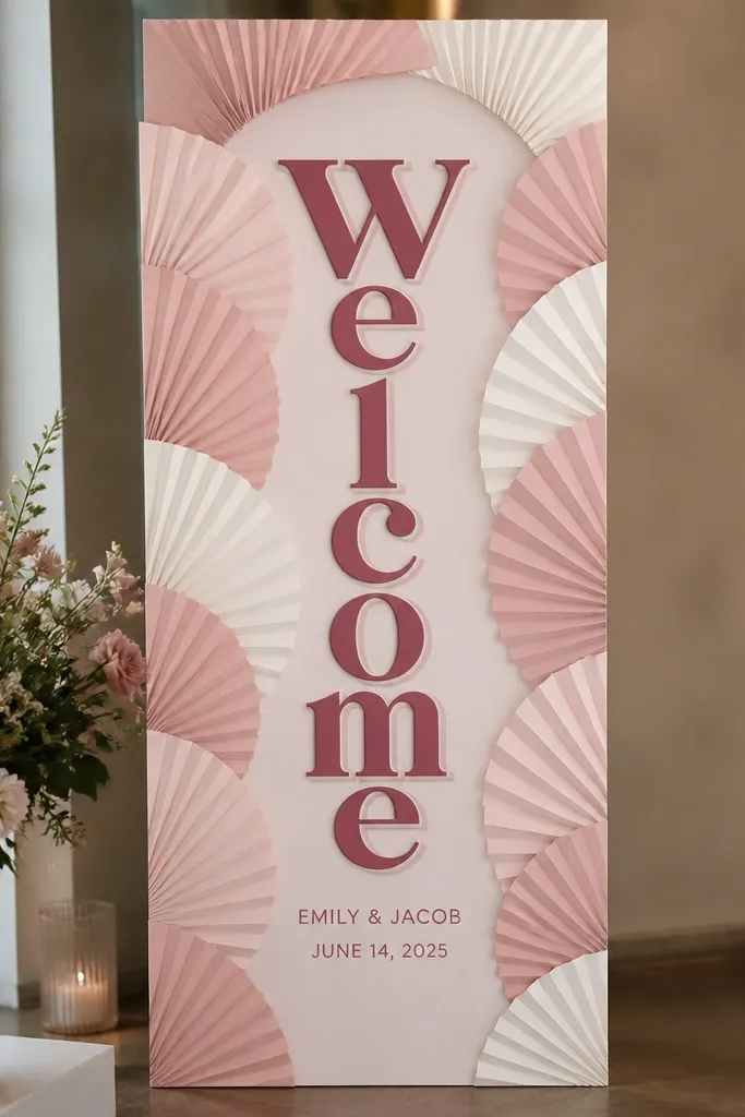
Layered cardstock letters look like a party backdrop, and the fan background gives you movement in photos. This is a great budget option because paper is cheap and the visual impact comes from layering, not expensive materials. Keep the colors to blush plus cream plus a dark rose for contrast. It's especially flattering for weddings with warm florals, rose gold accents, and candlelight.
Make a fan background using folded cardstock strips glued into a semicircle or full rectangle behind your text. Cut layered letters for "Welcome" from two shades of cardstock and glue them with slight offset to create a shadow effect. Attach the letter stack centered on the fan background. Add names and date in smaller printed text directly under the letters, then mount the whole thing on a foam board backing so it stays rigid.
Try thisUse a bone folder to crease the fan strips sharply so the layers look clean, not wavy.
Common mistakeAvoid thin paper for the letters - it bends and makes the stacked effect look weak.
18. Monogram welcome sign on dowel with painted wood circles
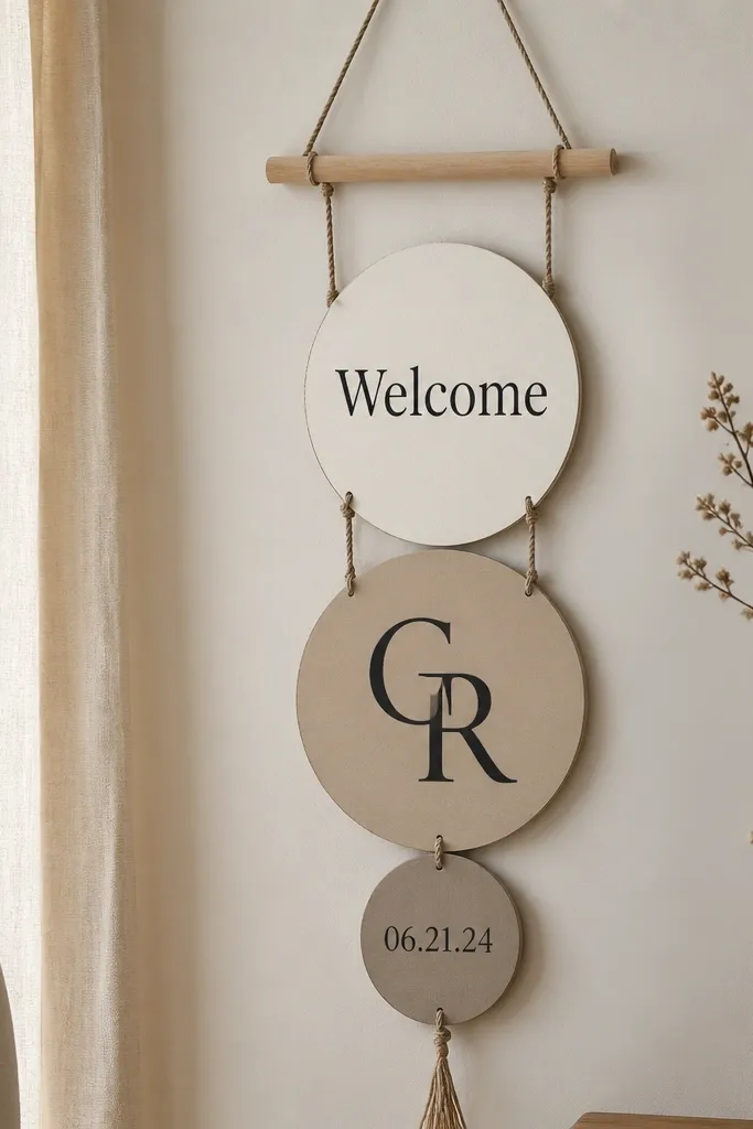
This sign is playful and still readable because each element is large and spaced. Wood circles add a handmade feel, and a dowel keeps everything tidy without building a big frame. The best part is you can match your wedding palette by painting circles in your exact colors. It looks great at spring and summer weddings, and it also works indoors where you want something guests can notice without blocking traffic.
Paint several wooden circles in a palette of three neutrals. Use stencils for "Welcome" and the initials so the letters don't wobble. Attach each circle to a dowel using small screws with washers or strong string tied into loops, spacing them evenly. Add the date on the bottom circle in smaller text, then hang the dowel at eye level near the entrance.
Try thisPre-drill the holes in wood circles so you don't crack them when you hang them.
Common mistakeAvoid overcrowding the circles - leave at least 1.5 inches between pieces.
19. Black-and-white photo strip welcome sign with printed names
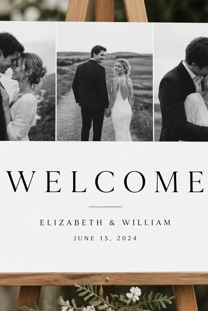
This is a personal option that still feels clean and modern. Black-and-white photos hide imperfections in printing and keep the sign from looking too colorful or busy. The photo strip adds a designed element, while the center stays white for readable text. It works for any wedding theme because the photos bring the personality and the typography brings the order.
Print a strip of 3-5 black-and-white photos and trim them to fit the top width of an 18 x 24 board. Glue them down with matte glue and smooth the edges. Leave a large clean white area in the middle for the text. Print "Welcome" big in black and names and date in smaller lines, then mount the whole sign on foam board so it doesn't curl.
Try thisUse matte glue so the photos don't look shiny under venue lighting.
Common mistakeAvoid full-bleed photos behind text - the contrast makes letters harder to read.
20. Mini chalkboard on a wooden ladder rung with ribbon bow
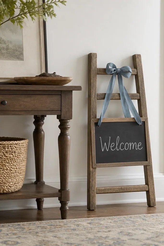
If you want a sign that looks like décor, a ladder rung does the work. A mini chalkboard is cheaper than a full-size board and still reads because it's framed by wood. The ribbon bow makes it feel wedding-specific without adding clutter. This style looks great near rustic tables, wooden chairs, and neutral centerpieces.
Find a small wooden ladder or separate rung pieces at thrift stores. Sand and wipe the rung, then mount a small chalkboard panel on top using screws or strong mounting tape. Write "Welcome" in white chalk, then add names and date below in smaller lines. Tie a ribbon bow and attach it at the top of the rung so it doesn't cover the text.
Try thisUse a chalk marker for steadier lettering if you're not confident with chalk sticks.
Common mistakeAvoid writing too close to the edges - chalk dust smears when hands brush the board.