
1. Chalk-White Frame with Soft Linen Mat
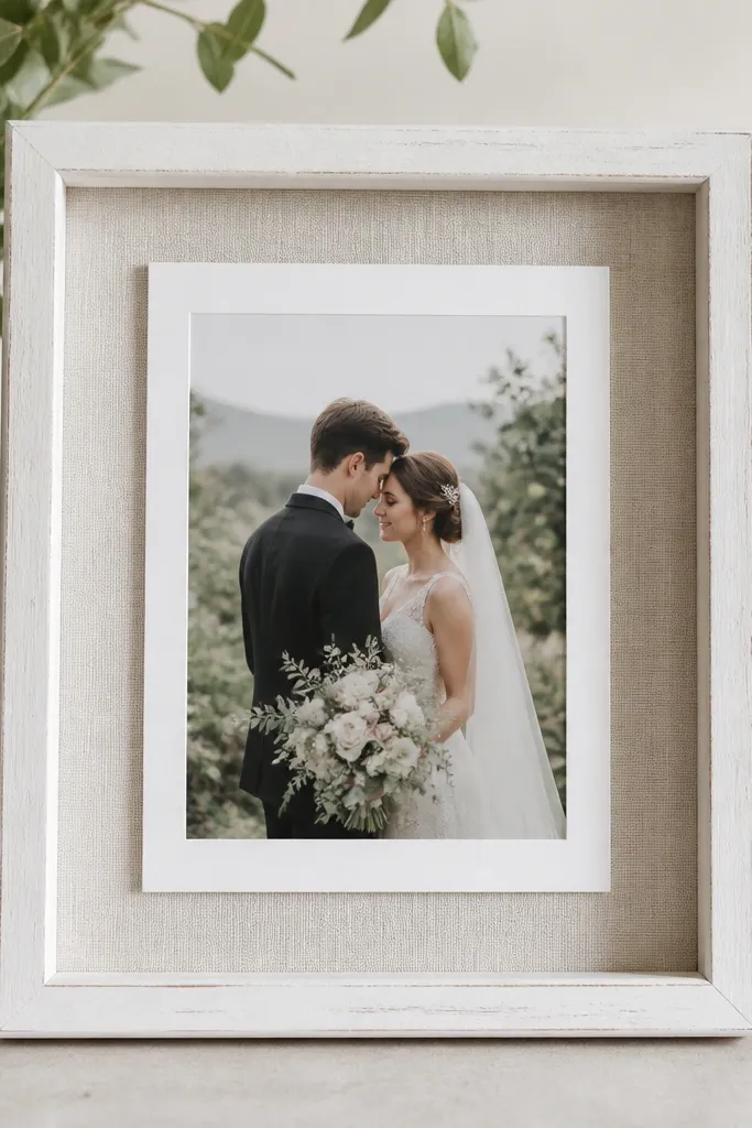
This is the cleanest beginner look I've made because it hides uneven edges. The chalk-white finish makes skin tones and blush ink look warmer, and the linen mat adds texture without color chaos. I've used it for couples who want classic, neutral decor - think ivory tablecloths and beige napkins. It flatters most card designs, especially when your card has lots of white space or light lettering. The texture is subtle, so the card stays the hero.
Start by painting a thrifted wood frame chalk white, then let it dry fully (I give it a full day if the paint is thick). Cut a mat backing from mat board to match the card size plus 1/4 inch border all around. Glue linen fabric to the mat backing, pull it tight, and trim cleanly on the back. Insert the card with a small strip of double-sided tape at the corners so it doesn't shift when you move the frame.
Try thisUse black or dark brown ink on the card if possible - it pops hard against linen without looking harsh.
Common mistakeSkip glossy fabric backings; they reflect light and make the card feel washed out in photos.
2. Black Frame with Satin Ribbon Crosshatch
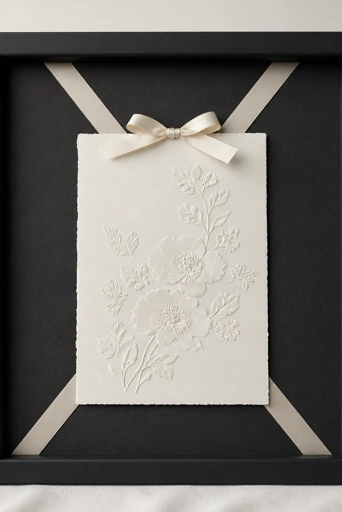
This one makes even simple cards look styled. Matte black frames are forgiving because they hide minor scuffs, and the satin ribbon adds a controlled shine. I've done it for modern weddings where the invitation suite has black accents or deep green - it ties the palette together fast. The crosshatch line pattern pulls the eye toward the center, which is great if your card has a busy design. It also flatters darker paper stocks because the ribbon creates a bright focal point.
Pick a black frame with a flat back or a removable insert. Cut a backing from cream cardstock and place it behind the card so you get a crisp border. Lay two 1/4-inch satin ribbons diagonally to form an X, then tack them down with hot glue at the corners on the backing, not on the card. Finish by adding a small ribbon bow at the top, centered, using a 3-inch length of ribbon folded into two loops.
Try thisIron the ribbon before you cut it so the ends don't look wavy.
Common mistakeDon't glue ribbon directly to the card; it can wrinkle the paper and looks messy when guests touch it.
3. Soft Gold Frame with Faux Pearl Trim Border
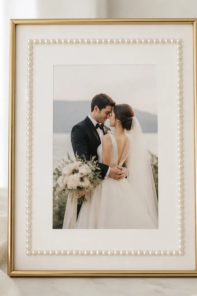
If you want "romantic but not fussy," pearls are the easiest texture to control. A soft gold frame warms up cool-toned invitations, and the pearl border gives a polished edge without adding bulk. This works especially well for weddings with champagne, blush, or sage accents. It flatters cards that have gold foil details because the pearl highlights echo that shimmer. You'll also get great contrast if your card background is white, ivory, or pale gray.
Choose a gold frame with a mat or build one from foam board. Cut a backing mat so it sits about 1/8 inch behind the frame opening. Glue faux pearl trim along the mat border using a hot glue dot every few pearls to keep the spacing consistent. Center the card, then secure it with four tiny tape dots near the corners so it stays flat.
Try thisUse pearl trim with a consistent bead size (around 4-6mm) so it looks uniform instead of random.
Common mistakeAvoid mixing pearl sizes; it reads like leftover craft supplies in close-up photos.
4. Clear Acrylic Frame with Dried Eucalyptus Strip
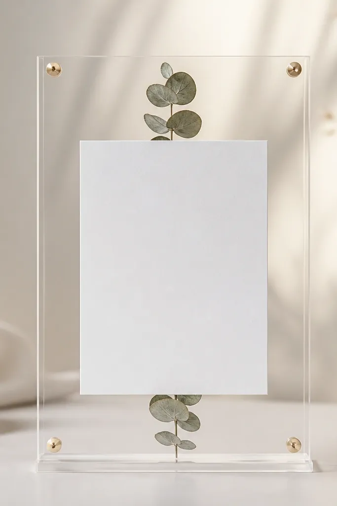
This is a modern way to get greenery without the mess of fresh stems. Clear acrylic keeps your card sharp and readable, and the dried eucalyptus adds a soft green line that doesn't overpower the text. I used this for a late-summer wedding where the color palette was mostly cream and olive. It flatters minimal cards because the decoration is a single botanical element. Also, it looks great in daylight because the eucalyptus texture catches light.
Buy a small acrylic frame with a clear backing and a slot for the card. Cut a piece of kraft paper or cream cardstock to the frame size and place it behind the card. Press dried eucalyptus leaves gently into a thin strip shape, then glue the strip to the backing with a few small dots of hot glue along the center. Slide the card in so it sits in front of the eucalyptus strip, centered top-to-bottom.
Try thisSeal the dried eucalyptus with a light spray of matte clear acrylic spray if it sheds.
Common mistakeSkip wet glue or thick glue piles; they fog acrylic and look cloudy.
5. Rattan Frame with Woven Jute Bow
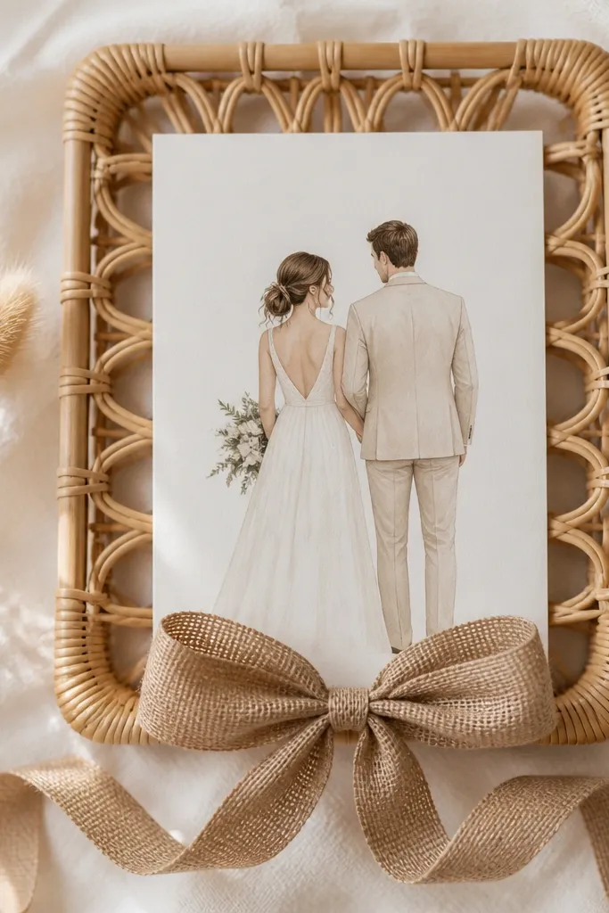
Rattan plus jute reads warm and coastal without going full rustic. The woven texture makes your card feel grounded, and the neutral fibers match almost any wedding palette. I've used this for barn weddings where the rest of the decor is wood, candles, and linen. It flatters cards with darker lettering because the natural fibers create contrast. If your card has a lot of light color, add a cream backing to keep it readable.
Pick a rattan frame that already has a sturdy backing. Cut a cream cardstock backing to fit inside and glue it down so the card doesn't slide. Tie a jute bow from 12-inch lengths, then trim the ends at an angle for a clean look. Hot glue the bow at the bottom center of the backing, leaving the top area clear so the card sits cleanly.
Try thisUse jute that's not too thick; thin jute looks neater and photographs better.
Common mistakeDon't overfill the frame with extra twine; one bow is enough.
6. Vintage Brass Frame with Lace Window Mat
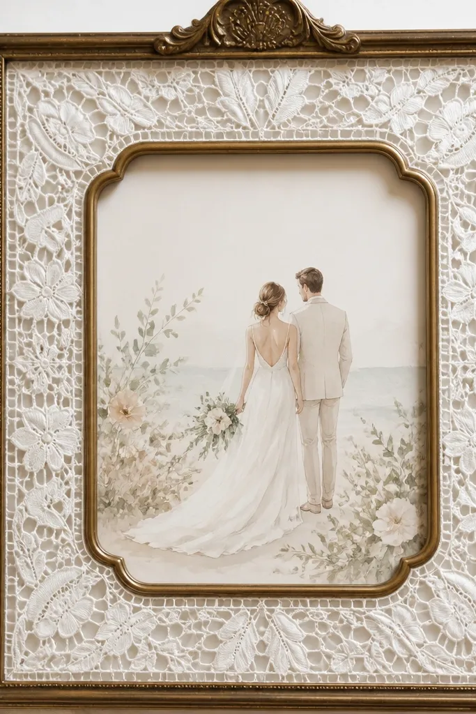
This look gives you "heirloom lace" vibes while still keeping the card readable. Brass frames add warmth, and lace creates soft visual edges that match classic invitations. I did this for a couple whose stationery had antique florals and cream paper. It flatters cards with pastel colors because the lace background doesn't compete. The lace also softens harsh lighting, so photos look gentle instead of stark.
Start with a brass frame and remove any glass if it's too reflective. Cut lace fabric into a rectangle slightly larger than your card area, then create a window opening where the card sits. Glue the lace to a thin white mat board so it lays flat and doesn't bunch. Place the card centered in the lace window and secure it with two small tape dots at top corners.
Try thisPress the lace flat first by placing it under a book for 10 minutes.
Common mistakeAvoid stretchy lace; it distorts and creates wrinkles around the card.
7. Walnut Stain Frame with Faux Leather Strip
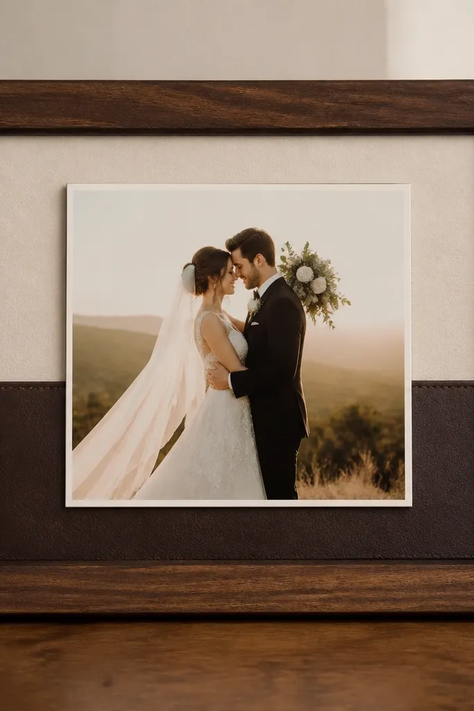
This is for couples who want a moody, modern feel without adding glitter or heavy florals. Walnut stain makes the frame look expensive, and faux leather adds a smooth, dark texture that makes the card look crisp. I used it for a wedding with black, espresso, and cream tones, and the result looked tailored. It flatters cards with serif fonts and darker ink because the leather gives a strong backdrop. The leather strip also creates a visual "shelf" that centers the card.
Stain a raw wood frame walnut, then seal it with a matte clear coat so it doesn't look shiny. Cut a cream backing and place it behind the card. Cut faux leather into a strip about 1.25 inches tall, spanning the width of the inner opening. Glue the leather strip to the backing with even dots of hot glue, then tape the card to the backing at the corners so it sits just above the strip.
Try thisUse matte faux leather, not patent; patent reflects and can blow out photos.
Common mistakeDon't use thick leather chunks that warp the card area.
8. Blush Pink Frame with Velvet Ribbon Side Panel
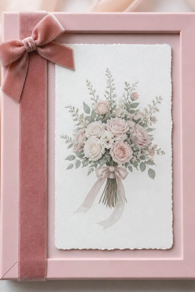
Velvet gives you that soft, romantic look without needing lots of decor pieces. Blush pink frames make the card feel coordinated even if your invitation colors are simple. I used this for a wedding where the bridesmaids wore dusty rose and the stationery was ivory with blush accents. It flatters lighter skin tones and pale inks because velvet darkens the contrast gently. The side panel design also keeps the center clear, so the card stays easy to read.
Paint or buy a blush pink frame and let it cure fully. Cut a white or ivory cardstock backing that fits the inner opening. Glue a 1-inch velvet ribbon vertically along the left side of the backing, leaving a small gap from the edge so it looks intentional. Add a tiny bow made from 4-inch ribbon pieces at the top left, then mount the card centered and secure it with tape dots.
Try thisTrim velvet ribbon ends with sharp scissors and lightly dab the edge with fabric glue to prevent fraying.
Common mistakeSkip bulky bows; if the bow sits higher than the card, it looks crowded.
9. Spring Green Frame with Mini Paper Flower Corner
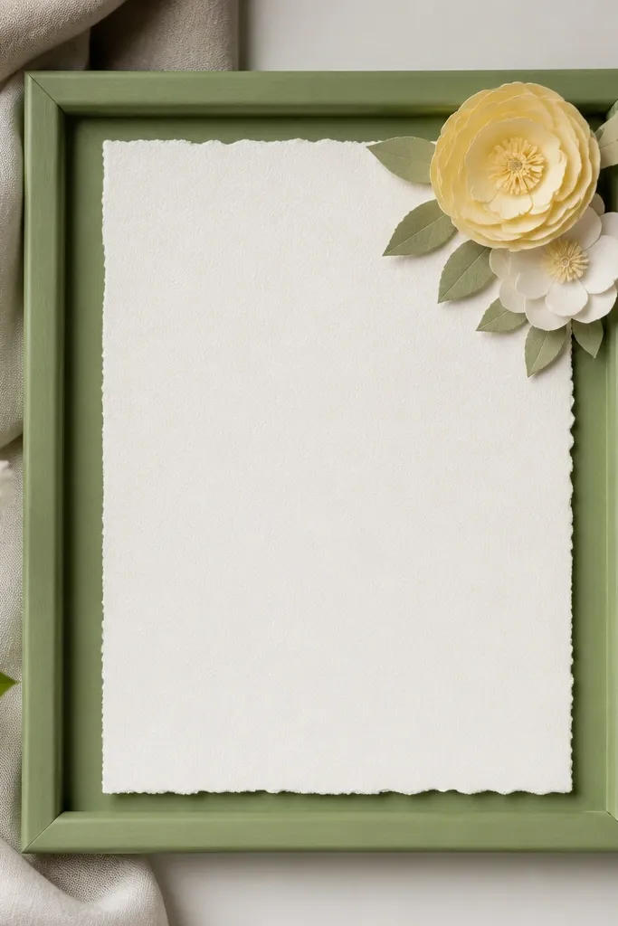
One tiny paper flower corner makes the whole frame feel custom, and it's cheap. A spring green frame adds freshness, while the flower gives a delicate focal point that doesn't block the text. I've used this for outdoor ceremonies where the palette was mint and cream. It flatters cards with clean typography because the corner detail adds just enough decoration. If your card design has a lot of whitespace, this is the easiest way to fill it without clutter.
Use a spring green frame with a mat or backing. Cut a cream cardstock backing and mount it behind the card. Make a mini paper flower from 2-3 layered circles of cardstock, then shape petals with your fingers so they curve slightly. Glue the flower into the top right corner of the card area, then center the card and secure it with two tape dots on the back edges.
Try thisMake three petals slightly larger than the rest; it keeps the flower from looking flat.
Common mistakeDon't place the flower too close to the card text; leave at least 1 inch of breathing room.
10. Navy Frame with White Rope Border
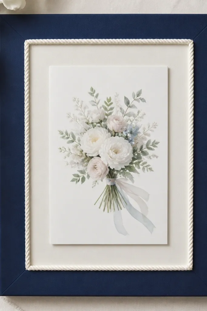
Navy plus white rope looks nautical and clean, especially for seaside weddings or modern coastal themes. The rope border adds depth, and the navy frame makes the card stand out. I've used this for couples who wanted a bold color but still wanted the card to feel elegant. It flatters cards with light backgrounds because the rope border creates a frame-within-a-frame effect. The shadows from the rope also read well in photos.
Start with a navy frame and remove glass if it causes glare. Cut a white cardstock mat to fit inside. Glue white rope around the mat border in a tight square, using small hot glue dots at corners and every few inches along the sides. Let it dry, then place the card centered and secure with tape at the corners so it stays flat against the mat.
Try thisUse thin rope (around 2-3mm) so the inner opening still looks neat.
Common mistakeDon't use thick rope that steals space from the card border.
11. Terracotta Frame with Fabric Tape Grid
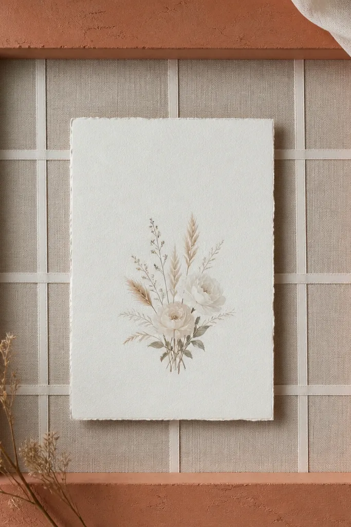
Fabric tape grid gives you a modern textile look without bulky crafts. Terracotta frames warm up the card and pair well with cream, off-white, and warm gold stationery. I made this for a wedding where the invitation suite had terracotta seals and the reception had terracotta planters. The grid lines guide the eye to the center, so the card looks designed even if it's plain. It works best for cards that have a strong title or names at the center.
Choose a terracotta frame and add a cream backing cardstock. Cut four strips of thin fabric tape in complementary tones - think terracotta, cream, and a muted warm gray. Mark the backing lightly with pencil for spacing, then glue the strips in a grid: two vertical lines and two horizontal lines. Center the card over the grid and secure with corner tape so the card sits flat and readable.
Try thisStick to 2-3 tape colors so it looks cohesive, not like you grabbed random rolls.
Common mistakeAvoid thick tape; it creates a lumpy surface under the card.
12. Silver Frame with Foil Washi Tape Frame-Inside
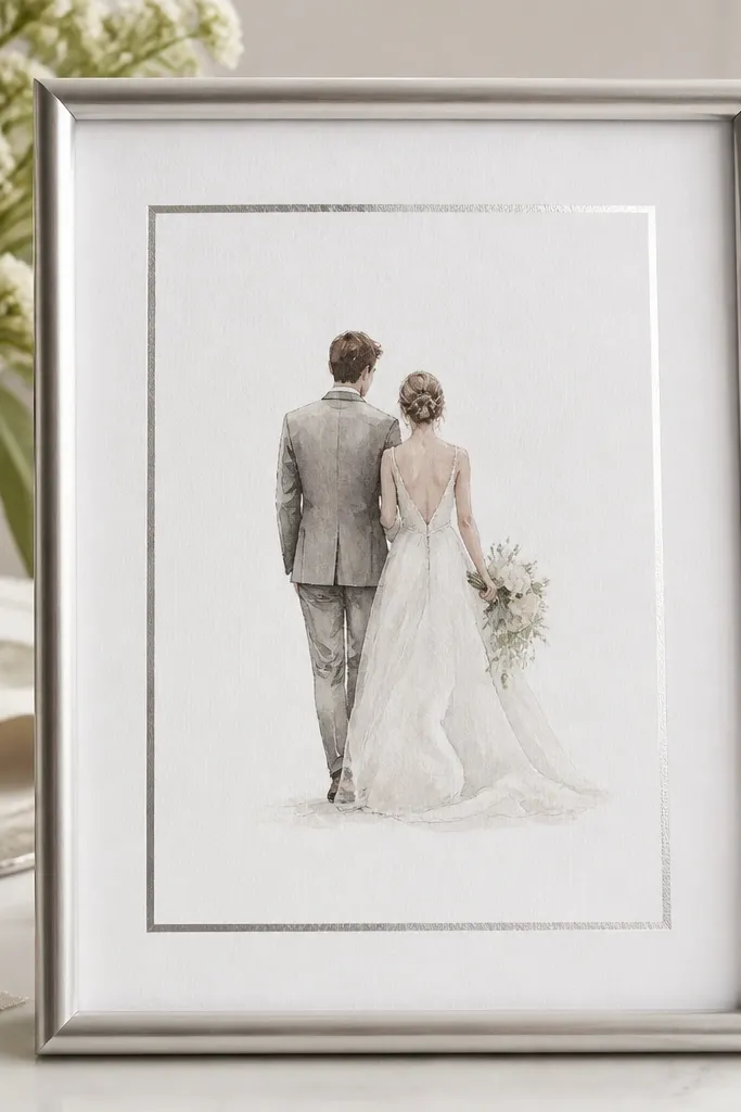
This look is fast and makes your card look expensive because foil catches light. A silver frame already leans clean, and foil washi creates a crisp border line that looks like custom matting. I used it for winter weddings with silver candle holders and it matched the sparkle without being glittery. It flatters minimalist cards because the border does the decorating for you. If your card has small details, foil tape helps them show in photos.
Start with a silver frame and a plain white backing. Cut two strips of foil washi tape to make an inner rectangle around the card area, leaving a 1/4 inch gap from the card edges. Apply tape gently so it doesn't crease - press it down with your fingernail. Place the card centered, then attach it with small tape dots at the back corners so it doesn't lift.
Try thisUse a ruler and pencil marks for perfect corners; foil tape hides mistakes less than paper tape.
Common mistakeDon't overlap tape at the corners; overlapping makes a thick ridge.
13. Clear Glass Frame with Stitched Fabric Background
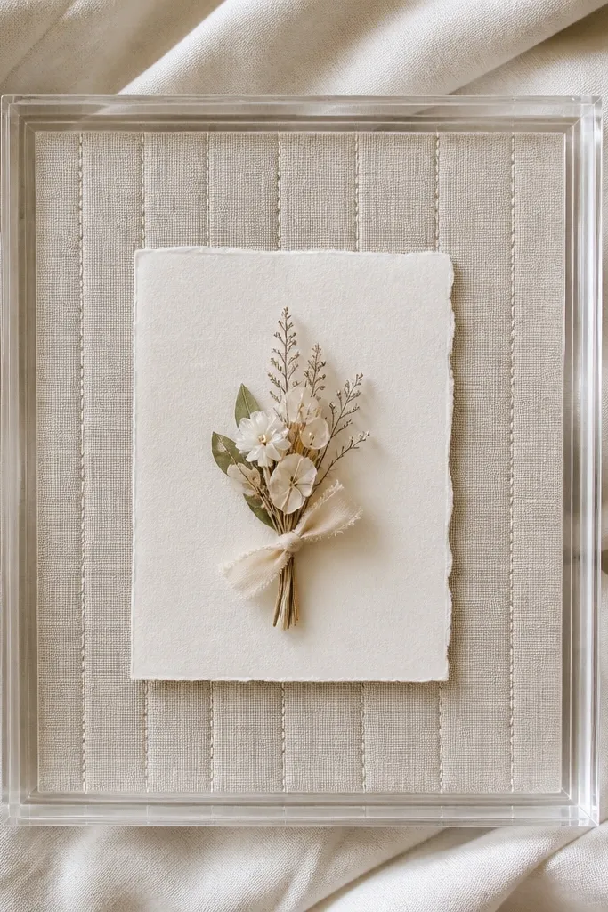
Fabric stitching adds a handcrafted feel that still looks neat. A clear glass frame shows the fabric texture through the frame, and your card stays readable because the fabric is flat. I've done this for couples who wanted "homemade" but didn't want ragged edges or messy glue. It flatters cards with bold typography because the stitched background adds interest without competing. Choose a fabric color that matches your wedding linens for the best cohesion.
Pick a clear glass frame with a removable backing. Cut fabric to the inner frame size and stretch it over a thin board or stiff cardstock so it lies smooth. Stitch a simple grid or straight lines onto the fabric using a contrasting thread color, like white thread on blush fabric. Place the fabric backing inside, then center the card and secure it with four small tape dots.
Try thisUse cotton fabric for clean stitching; polyester drapes and can pucker behind the card.
Common mistakeSkip frayed fabric edges; they look sloppy behind glass.
14. Cream Frame with Burlap and Button Center
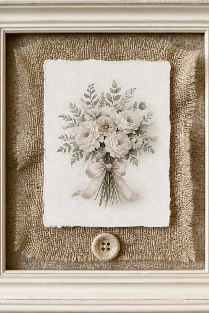
This is rustic without looking like a craft fair. Burlap adds texture, but the single button keeps the design controlled. I used this for a backyard wedding where the decor leaned farmhouse: mason jars, wood signs, and linen runners. It flatters cards with kraft or cream paper because burlap matches the warmth. The button gives a focal point that looks good from a distance on tables and stands.
Paint a frame cream if it's raw wood, then let it dry. Cut burlap to the backing size and glue it flat to a stiff cardstock backing so it doesn't sag. Center the card and secure it with tape dots at corners. Glue one vintage button (about 1 inch wide) in the middle below the card, leaving at least 1 inch between button and card bottom so it doesn't look like a hinge.
Try thisChoose burlap in a tight weave; loose-weave burlap looks messy in close-ups.
Common mistakeAvoid multiple buttons or extra twine loops; they make it look overdone.
15. Emerald Frame with Gold Leaf Accent Line
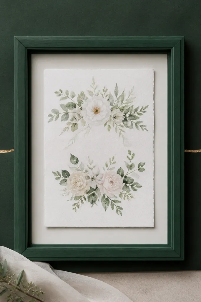
Emerald frames look rich on camera, and gold leaf adds that "luxury stationery" effect. The trick is keeping the gold leaf as one thin line so it doesn't overwhelm the card text. I've used it for weddings with deep green bridesmaid dresses and gold flatware. It flatters cards with white or ivory backgrounds because the contrast is sharp. If your card has a simple layout, this accent makes it feel intentional.
Use an emerald-painted frame and a matte white or cream backing. Cut a mat board to fit inside and place it behind the card. Tear a small strip of gold leaf and press it gently onto a thin strip of adhesive tape on the backing, creating a straight line. Let it set, then mount the card centered and secure with corner tape so the gold line stays visible behind the card space.
Try thisPractice on scrap first; gold leaf sticks fast and you get cleaner edges when you already know the timing.
Common mistakeDon't cover the entire mat with leaf; it turns into a glitter patch and kills readability.
16. Corkboard Frame with Pin-and-Label Card Hold
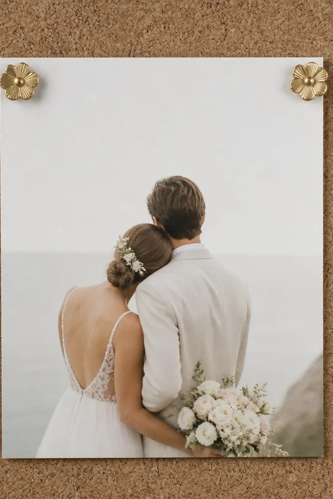
Corkboard frames are the easiest way to make your card feel interactive and display-ready. The cork texture is neutral, so it works with almost any wedding palette. I used this for a couple who wanted their card frames to double as place card holders later, and pinning made swaps easy. It flatters cards that are thicker cardstock because pins grip better. Also, cork looks good in natural light and doesn't create harsh glare like glass sometimes does.
Buy a corkboard frame or use cork sheet cut to size inside a wooden frame. Add a thin white cardstock backing if your cork has deep stains. Center the card and mark where you want the pins, usually 1 inch from the top corners. Push decorative pins through the card and into the cork, then adjust until the card sits perfectly straight. If the card is lightweight, add two small binder clips behind the card corners instead of pins.
Try thisUse pins with flat heads in gold or pearl tone so they match your wedding hardware.
Common mistakeSkip cheap plastic pins; they look flimsy and can snag sleeves.
17. Sunflower Yellow Frame with Fabric Petal Garland
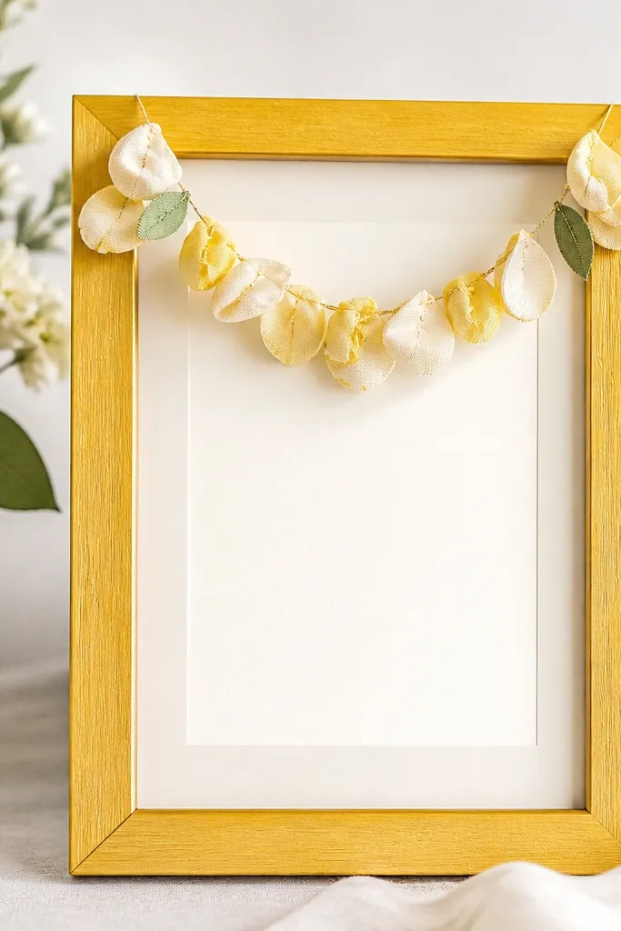
This is the cheerful option that still looks classy when you keep it small. Sunflower yellow frames brighten the card and make warm invitation colors look richer. I've used it for fall weddings with mustard, cream, and sage accents. The fabric petal garland adds movement and softness, but because it sits above the card it doesn't block text. It flatters cards with a centered name or date since the garland points attention upward.
Choose a sunflower yellow frame and a cream backing mat. Cut small fabric petals from cotton or felt, then glue them to a thin string or ribbon in a gentle curve. Place the garland above the card area, then glue the ends to the backing so the card stays centered below. Mount the card with tape dots at the corners so the garland can remain the only "top decoration."
Try thisPick felt petals in two shades of yellow so the texture shows even in low light.
Common mistakeDon't make the garland too long; if it reaches the card sides, it looks crowded.
18. Monochrome Frame with Hand-Painted Dots Background
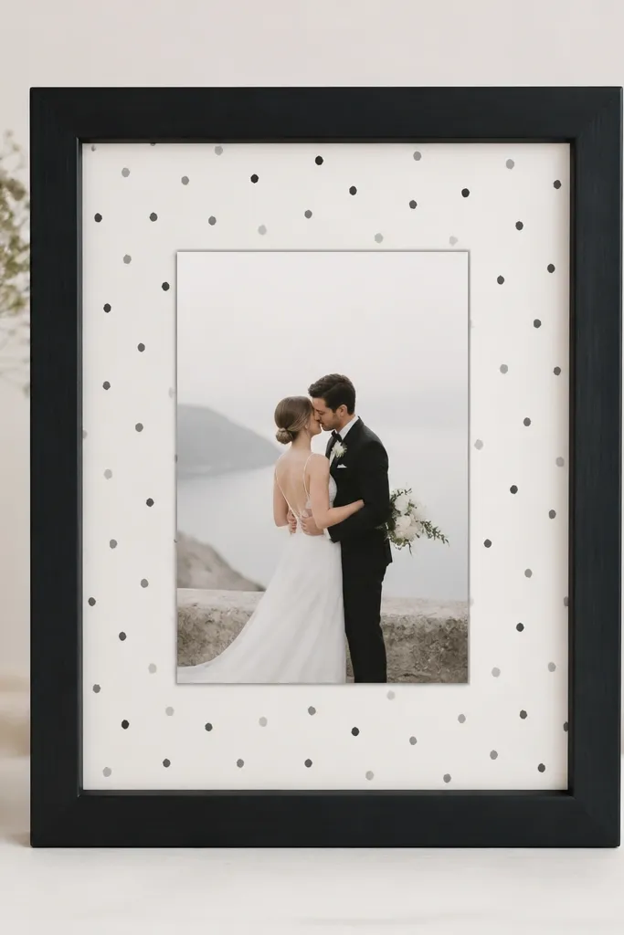
Hand-painted dots are the easiest way to add personality when you don't want floral clutter. A monochrome frame keeps everything crisp, and the dots add depth without blocking readability. I used this for a couple with black ink invitations and a black-and-white reception vibe. It flatters cards with minimal typography because the dots fill the space behind the card. Also, it looks good from a distance because the dot pattern reads as texture, not decoration.
Paint or choose a monochrome frame, then start with a white mat backing. Use acrylic paint watered slightly and a small dotting tool or the end of a pencil eraser to create dots in two sizes: one set at 1/8 inch and another at 1/4 inch. Let it dry flat for at least 30 minutes between layers if you add more dots. Center the card and secure with tape dots at each corner.
Try thisKeep the dot spacing uneven on purpose; perfectly uniform dots look machine-made.
Common mistakeDon't use wet paint directly behind the card; smears happen when you slide the card into place.
19. Rosewood Frame with Macrame Knot Border
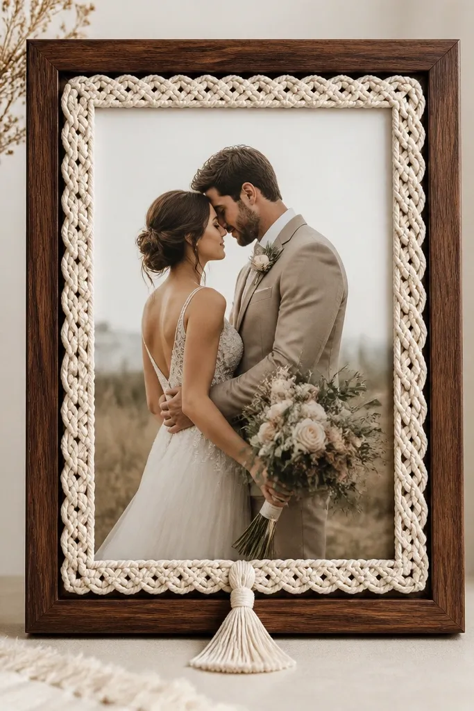
Macrame cord looks expensive because it has structure and shadow. A rosewood frame warms the palette and pairs well with blush, dusty rose, and cream. I used this for a boho wedding where the invitation suite had warm neutrals and a simple script. The knot border creates a soft frame-within-a-frame effect, pulling attention toward the card center. It's also flattering for darker cards because the cord adds texture contrast.
Use a rosewood frame with a sturdy inner lip. Cut a backing board to fit and glue a neutral cardstock to it, like cream or warm gray. Build a macrame border using 4mm cotton cord, making small square knots along the inner edge, about 1 inch apart. Glue the border to the backing, then add a small tassel at the bottom center made from 8-10 strands trimmed to equal length. Center the card and secure it with tape at corners so it doesn't shift.
Try thisPre-measure the border length with string before cutting cord, so you don't run short mid-knots.
Common mistakeSkip floppy cords that sag; the border needs tension so it sits straight.
20. Whitewashed Wood Frame with Map-Print Window and Twine Hinge
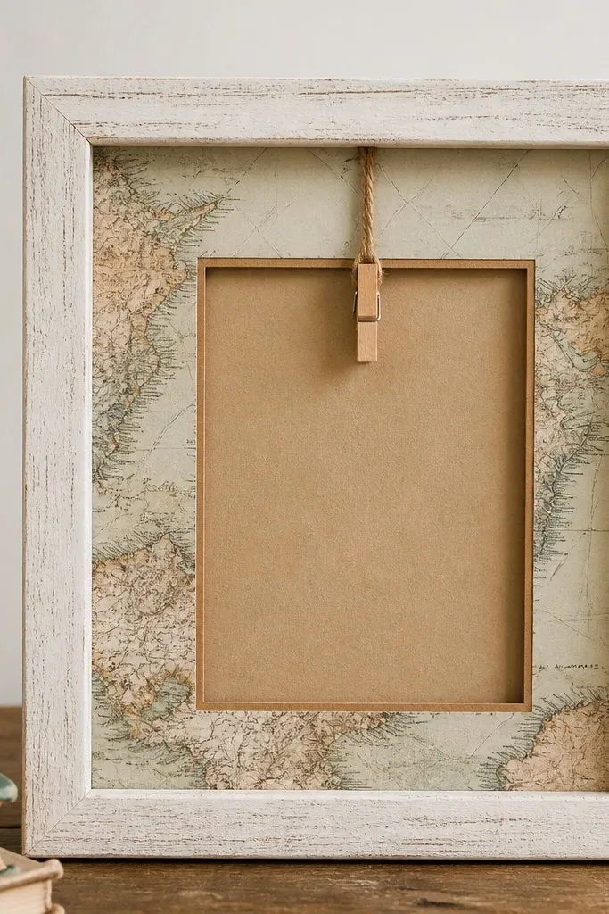
This one looks like you stole it from a travel trunk - in a good way. The whitewashed wood keeps it bright for wedding photos, and the map print gives the card frame a story without needing any fancy wording. I've used this style for couples who love cities, train rides, or road trips, and the frame never looks generic because the map details vary by sheet. The twine hinge detail adds texture you can feel, and it also makes the card feel a little interactive, like it can be swapped later.
Start with a plain wood frame you can open from the back. Sand it lightly, then wipe on a whitewash mix (white paint thinned with water, about 1:2) and wipe off before it dries so the grain stays visible. Cut a map-print rectangle to the exact size of the inner opening, leaving a 1/4 inch border so the wood rim shows. Back the map panel with kraft paper and glue it down with a thin layer of Mod Podge so the print doesn't bubble. Tie 12 inches of jute twine into a loop and glue the loop ends to the top inside corners; clip a tiny wooden clothespin onto the twine loop so it sits above the map window.
Try thisUse a map sheet with readable street names - even partial text looks better than blank-looking cartography. Seal the map with a single light coat of Mod Podge so the ink doesn't smear when you handle it.
Common mistakeAvoid covering the whole frame in paint - if the grain disappears, the frame loses the lived-in charm that makes this one work.