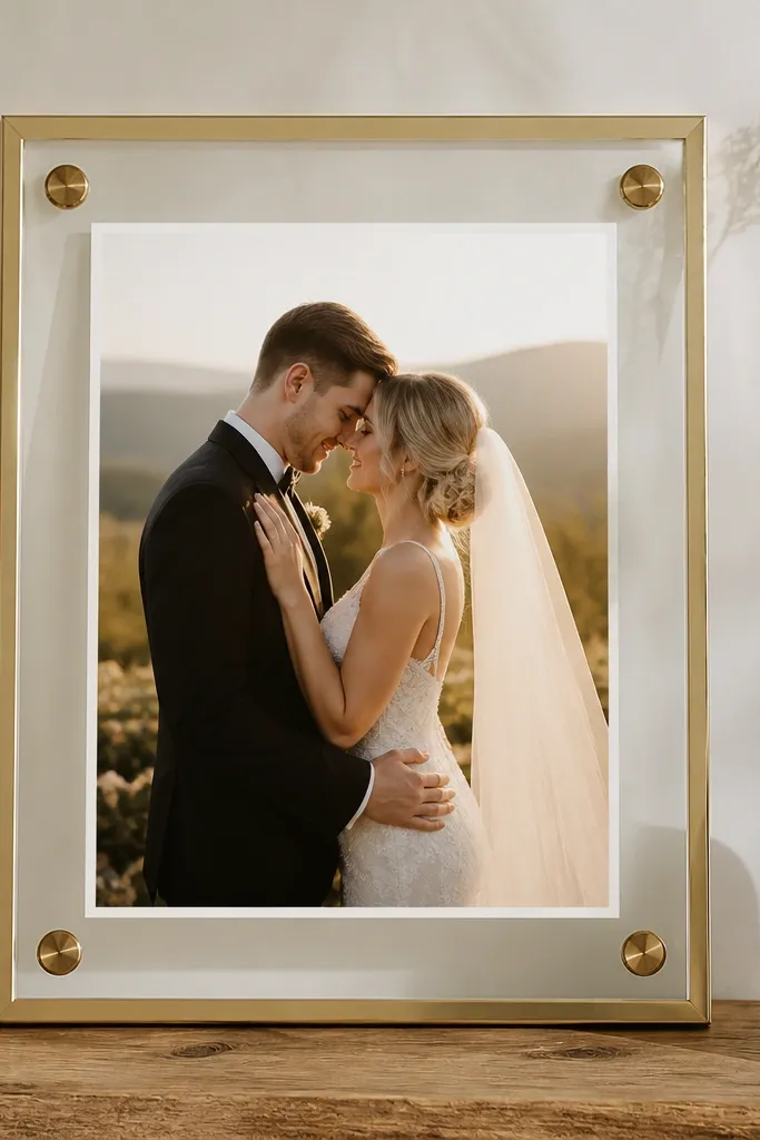
1. Antique gold micro-carving frame with a 5x7 window
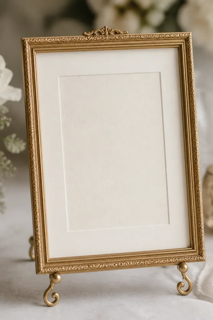
This one works when your invitation has a lot of text or a busy border. The antique gold micro-carving gives you shine without adding bulk, and the wide ivory mat makes the card feel "set" like a gallery piece. I like it for ivory, champagne, and warm beige cards because the gold doesn't fight the ink colors. It photographs well on both marigold days and evening mandap lighting, since gold reflects warm tones. If your skin tone is warm (wheatish/golden undertones), the gold reads flattering in family photos too because it adds a soft glow around hands and cards.
Start with an outer frame size around 10x12 inches and a visible window for a 5x7 card. Add an ivory mat or spacer so you get a 1-1.5 inch border around the invitation - that border is what keeps the card from looking cramped. Place the frame on a slim easel so the card sits at about eye level for guests (roughly 30-36 inches from the floor). Finally, wipe the glass with a microfiber cloth and check alignment by looking at the card edges straight-on from the front.
Try thisIf your wedding palette is off-white, choose antique gold over bright chrome - it looks softer in photos.
Common mistakeDon't use a thick, heavily ornamented frame with a busy invitation border - the combined detail makes it look cluttered.
2. Walnut stained wood frame with a cream foam-mat insert
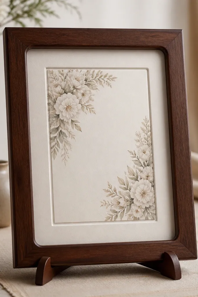
Dark walnut is my go-to when the card design is minimalist and you want the frame to add warmth. The stained wood tone looks natural next to mehendi greens, plain gold, and neutral florals. Because the wood is smooth, it doesn't compete with the text, and the cream mat keeps the invitation bright. This frame looks especially good for couples with cooler-toned stationery (silver accents, navy ink, or grey typography) because the walnut adds a warm counterbalance. For photos, it gives a grounded, homey feel without looking rustic in a sloppy way.
Pick an outer frame around 10x12 inches, then choose a walnut stain that matches your other decor elements like photo frames or the table base. Insert a cream foam mat board with a clean bevel edge; keep the mat border 1-1.25 inches around the 5x7 card. Place it on a stand with a stable base so it doesn't tilt - I've had thin bases tip when families bump the table. Set it near a neutral runner (beige, ivory, or soft grey) and avoid placing it against shiny metallic tablecloths that reflect light into the camera.
Try thisLightly dust the wood grain with a dry cloth; walnut looks better when it's not glossy.
Common mistakeSkip frames with rough unfinished edges - they look cheap when the card is the star.
3. Transparent acrylic frame with pearl edge tape
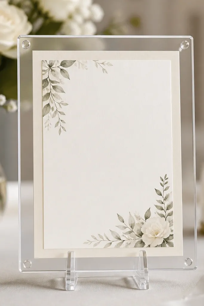
Acrylic is a lifesaver for small spaces because it doesn't visually block other decor. The pearl edge tape gives you a soft wedding look without the bulk of wood or metal. This style is great if your invitation has metallic foil or detailed artwork - the clear frame lets the card do the talking. I use this when the venue lighting is bright or when the card table is near reflective decor; acrylic stays clean and doesn't steal attention. It also works well for mixed-color weddings because the frame color is basically invisible.
Choose an acrylic frame sized for your card with an outer dimension around 10x12 inches for a 5x7 invitation. Apply pearl-white edge tape only to the inner border area so it frames the card, not the whole outer edge. Place it on a transparent stand or wall-mount it using acrylic standoffs - aim for the card center at about 32 inches from the floor. Finally, wipe acrylic with a lens cloth to remove micro streaks; acrylic shows smudges faster than glass.
Try thisIf you want extra stability, add felt pads to the bottom of the stand legs.
Common mistakeDon't skip edge tape if your wedding palette is warm - bare acrylic can look too modern for Indian weddings.
4. White MDF frame with hand-painted gold corner accents
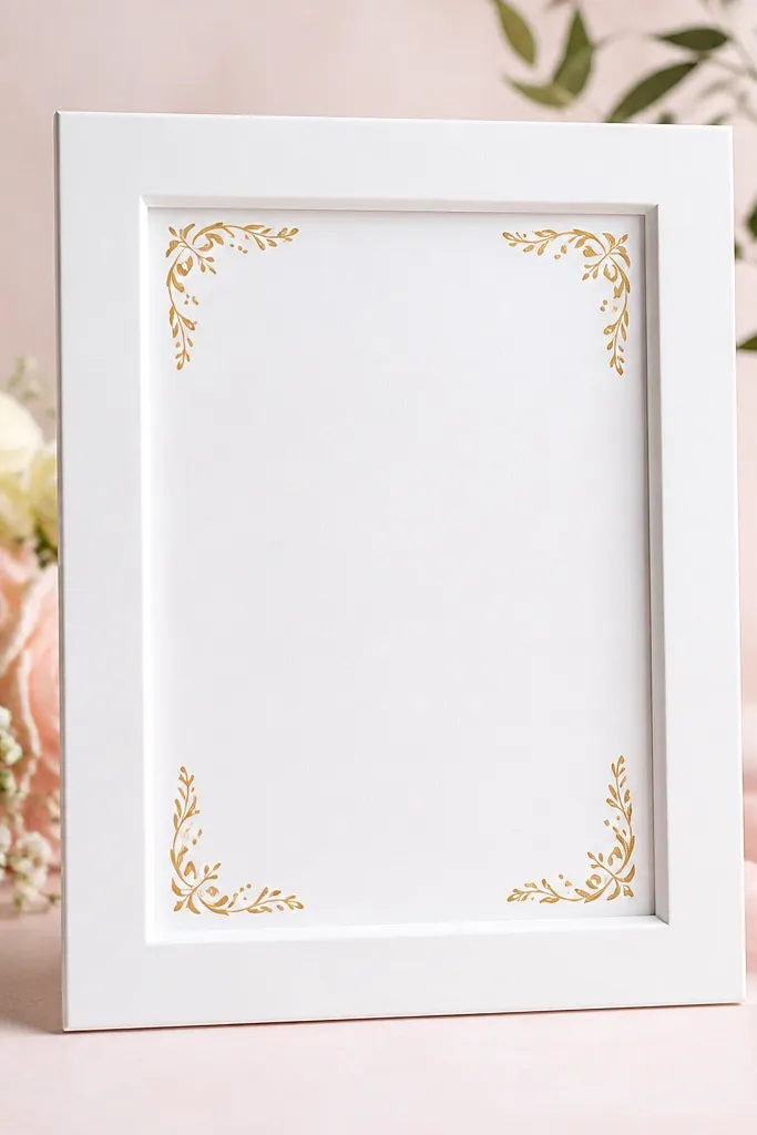
This is the "small but expensive-looking" option when you want a crisp, modern wedding look. The white MDF gives a clean base, and the hand-painted gold corners add just enough ornament to feel festive. It's perfect for invitations with white space and thin typography, because the frame doesn't add heavy weight behind the text. I've used this style for indoor ceremonies where the decor is mostly white and gold, and it photographs like a designer piece. If your card background is cream or ivory, the white frame makes it pop without turning the invitation into a dull beige blob.
Start with a white MDF frame sized for a 5x7 card - aim for about 10x12 inches outer. Add a white mat insert with a 1-inch border around the card, keeping the inner opening clean and centered. Use gold paint only at the corners in small motifs (leaf or paisley dots) and let it dry fully before assembly. Place the frame on a white or light beige table runner and keep the surrounding items minimal so the corners remain visible.
Try thisChoose matte white, not glossy - glossy catches overhead lights and creates glare on the glass.
Common mistakeDon't paint large gold bars along the sides; they overpower the card and look uneven in close-up photos.
5. Beaded jali border frame in champagne and crystal
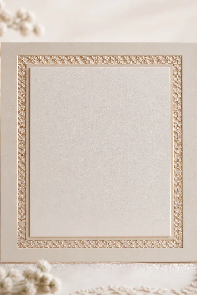
Beaded jali borders give a traditional Indian feel without taking over the whole space. Champagne and crystal tones are the sweet spot because they match both warm gold and silver jewelry palettes. This works best when your invitation has a classic theme like temple motifs, floral stamps, or gold foil text. The beadwork adds sparkle only at the edges, which keeps the center readable. I like it for evening receptions because beads catch the warm lights and add gentle movement when people walk past.
Choose a frame with a narrow profile around 10x12 inches outer and a 5x7 window. Add a beaded jali strip only around the inner border - keep it 1-1.25 inches thick so it doesn't eat the card area. Seat the invitation on a light champagne mat so the beads don't look harsh against pure white. Place the frame on a stand near a small lamp or warm light source, and keep the background simple (plain cloth or neutral decor) so the bead shimmer is visible.
Try thisIf beads are loose, secure them with a thin transparent thread at the back before final mounting.
Common mistakeAvoid heavy beadwork across the entire frame face; it makes the card look like it's trapped under decoration.
6. Mirror-finish frame with antique gold side trim
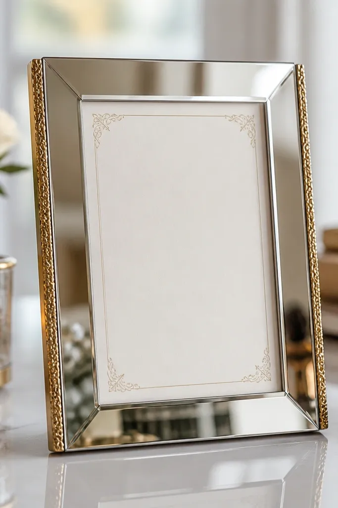
Mirror-finish frames are great for small spaces because they visually widen the setup. The reflection makes the table look more "full" without adding more objects. I pair mirror with antique gold side trim so it still feels wedding-appropriate instead of too modern. This style is best for cards with darker text or strong colors because the mirror background reflection creates contrast. It's also useful when your decor has gold accents but not enough height - the reflection gives you a bit of dimension.
Use a mirror-finish frame around 10x12 inches outer with a 5x7 window. Keep the mat border minimal, about 0.75-1 inch, so the invitation doesn't look swallowed by the reflective area. Align the card perfectly straight - mirror surfaces show crookedness instantly. Place the frame on a table with matte decor (avoid shiny satin under it) so reflections don't create glare spots in photos.
Try thisWipe the mirror with a streak-free glass cleaner and finish with a dry microfiber cloth.
Common mistakeDon't place mirror frames in front of busy patterned cloth - the reflection can create a visual mess behind the card.
7. Ivory linen frame wrap with a simple gold nameplate strip
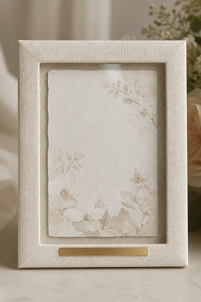
Fabric wraps look soft and expensive, especially when your wedding decor leans toward neutrals. Ivory linen gives texture without sparkle, and the thin gold strip adds a clean, readable touch that looks good in close-ups. This frame works for invitations with pastel florals, script fonts, or light-colored backgrounds because the linen doesn't fight the ink. It also flatters the look of mehendi-themed setups where greens and earthy browns are present. If you're setting frames on a fabric-covered table runner, linen wraps blend in and look intentional.
Start with a base frame (wood or MDF) around 10x12 inches outer, then wrap it in ivory linen using fabric glue at the back corners. Add a 5x7 window with a 1-1.25 inch linen or cream mat border. Attach a thin gold strip label at the bottom only, keeping text minimal (names or initials) so it doesn't compete with the invitation. Place it on a table with textured fabrics like jute or matte cotton so the linen surface doesn't look out of place.
Try thisUse a soft lint roller on linen before you mount the glass - tiny fibers show under flash.
Common mistakeSkip glossy satin fabric wraps; they look slippery and cheap next to linen and wood.
8. Terracotta-and-cream terracotta tile frame with a white mat
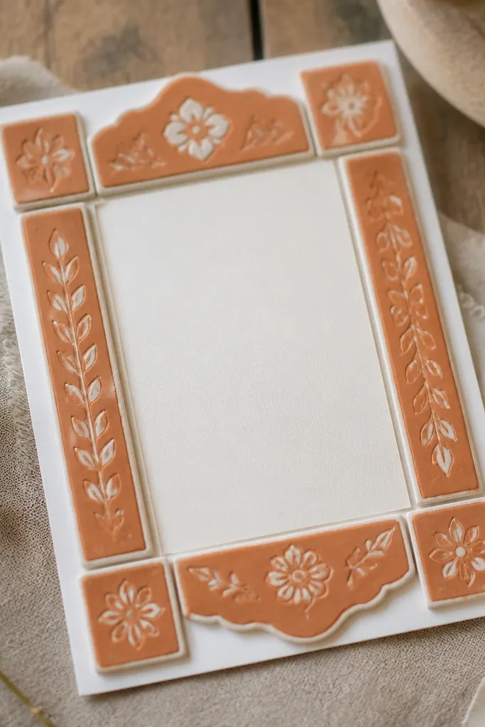
If your wedding has a rustic or earthy palette, terracotta tile frames look like they belong - not like an afterthought. The warm orange-brown tones bring life to plain invitation designs, especially cards with cream backgrounds and brown or black typography. I've seen this style work beautifully for outdoor sangeet or haldi events because the color matches natural light. It also looks great when your decor has clay pots, cane baskets, or rattan chairs. The key is keeping the mat white so the card stays readable.
Choose an outer frame size about 10x12 inches, then use terracotta tile panels only on the outer frame face. Insert a white mat border around your 5x7 card with 1 inch spacing. Seal the tile surface if it's porous so it won't stain when you handle it. Place the frame on a table with jute runner or matte wood and keep the stand sturdy so the tile edges don't feel fragile.
Try thisAdd a thin felt layer under the card mat to prevent any tile dust from transferring.
Common mistakeDon't use terracotta frames with very bright neon invitation colors - the clash looks harsh in photos.
9. Black metal frame with gold leaf corners
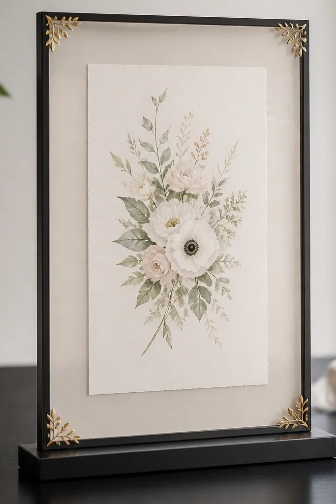
Black metal frames make wedding cards look modern and sharp, especially when your invitation has black ink, gold foil, or deep maroon accents. The gold leaf corners add a delicate wedding touch without making the frame bulky. This style is a strong pick for urban venues where the decor is minimal and you want the stationery to stand out. I've used it for destination-style weddings with clean table lines, and it looks crisp in both indoor and outdoor lighting. For people with warm undertones, black/gold combo frames don't wash them out - it creates a clean contrast.
Use a slim-profile black metal frame around 10x12 inches outer with a 5x7 window. Add a light beige or cream mat border around the card, about 1 inch, so the invitation doesn't sit too close to the glass. Apply gold leaf only at corners or very small arcs - keep it subtle. Place it on a stand with a dark base near a gold centerpiece so the colors echo each other in the photo.
Try thisIf the gold leaf sheds, seal the corners with a matte clear sealant before placing the glass back.
Common mistakeAvoid thick black frames for small spaces; they look heavy and swallow the card.
10. Rangoli-inspired paper quill border frame in pastel
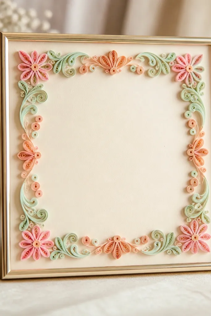
Paper quill borders look handmade and cheerful without being messy. Pastels keep it wedding-friendly, and the quilled border stays light enough for small space tables. This frame suits invitations with soft floral illustrations, pastel monograms, or minimal text blocks. It's also great for daytime functions because the paper texture looks good in natural light. The center stays clean, so the invitation remains readable while still feeling festive.
Pick an outer frame around 10x12 inches and a 5x7 window. Make or buy a quilled border that sits only along the inner edge, about 1-1.25 inches wide. Use a cream mat board so the pastel paper doesn't look dull; keep the card centered with equal margins on all sides. Place it on a table with solid color cloth (plain peach, off-white, or light mint) so the quill colors get attention.
Try thisUse a clear acrylic sheet instead of regular glass if you're moving frames between functions - it's lighter and safer.
Common mistakeDon't add more quill elements on the glass - extra 3D items make the frame look busy.
11. Single-stem side garland frame on a tall stand
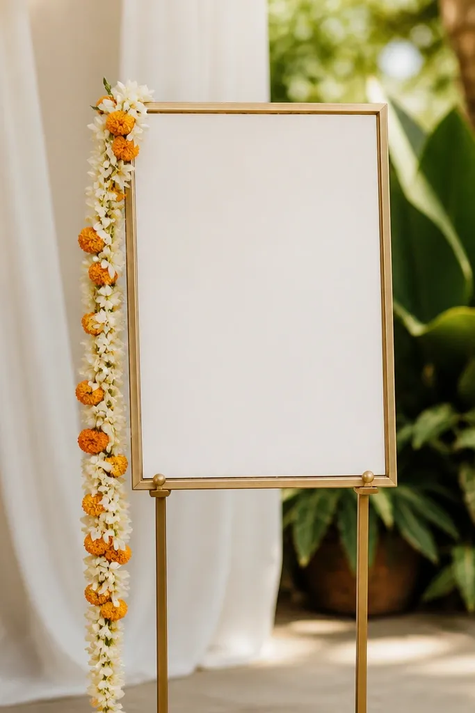
This is my favorite trick when you want wedding energy but you're working with tight table width. Instead of decorating the frame face, you decorate the stand side with one controlled garland. It gives height, adds fragrance if you use fresh jasmine, and keeps the invitation looking clean. This works for both traditional and modern invitations because the garland is the theme, not the frame. In photos, the garland creates a soft diagonal line that makes the card feel placed with intention.
Use a simple slim frame around 10x12 inches outer with a 5x7 window and a clean inner mat border. Choose a tall stand so the card center sits around 34-38 inches from the floor. Attach a single garland along the right or left side of the stand, not across the frame - use floral wire and hide it behind the stand's back. Keep the garland length about 1.5 times the frame height so it doesn't droop onto the table.
Try thisIf you use fresh flowers, mist them lightly and replace garlands after 3-4 hours in warm halls.
Common mistakeDon't hang multiple garlands around the frame face; it looks like leftover decor stuck to stationery.
12. Pearl-bead ribbon bow frame with minimal border
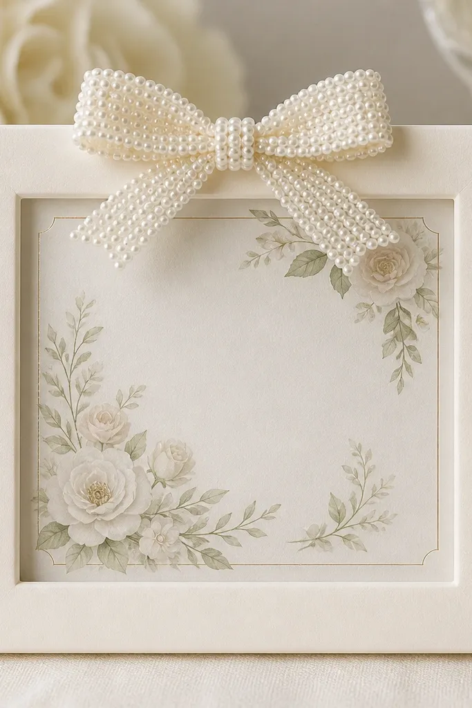
Pearl-bead bows look sweet and formal, and they work well when your invitation has a classic layout. Keep the frame itself plain - the bow becomes the only decoration, so the card stays readable. This style flatters people who like soft, feminine color palettes: blush pink, champagne, and ivory. It also photographs beautifully because the bow catches flash without covering the text. If your wedding is more reception-focused than ceremony-heavy, the bow gives a polished look for gift tables and reception counters.
Pick an outer frame around 10x12 inches with a 5x7 window and a clean ivory mat border of about 1 inch. Attach a pearl-bead ribbon bow at the top center only, with loops sized to about 3-3.5 inches wide. Secure the bow on the back or under the frame lip so it doesn't press against the glass and cause uneven pressure. Place the frame on a white or blush tablecloth and keep nearby items minimal so the bow remains the focal point.
Try thisUse a hot glue gun on the back only; glue marks show through thin ribbon if you get sloppy.
Common mistakeAvoid oversized bows - if the bow is wider than the top margin, the invitation looks secondary.
13. Marble-look resin frame with thin black border line
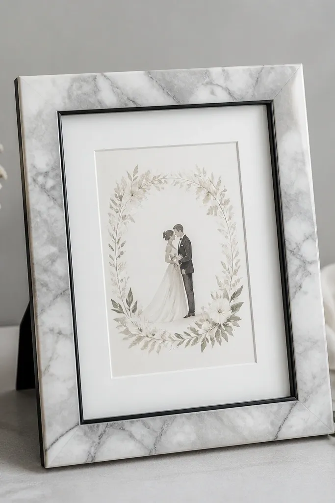
Marble-look resin frames bring a clean luxury feel for minimal, modern wedding stationery. The grey-white marble pattern works with silver accents, grey typography, and even navy cards. I've used this for weddings where the decor is mostly white, black, and silver balloons, and the card instantly matches the mood. The thin black inner line keeps the frame crisp, so it doesn't look like a random printed effect. This style is great for small spaces because resin frames are light and you can place two frames side-by-side without them looking bulky.
Choose a resin frame around 10x12 inches outer with a 5x7 window. Add a white mat border of about 1 inch so the card stands out from the marble pattern. Keep the invitation centered and check that the top margin matches the bottom margin - marble patterns make misalignment obvious. Place the frame on a light grey or white tray table and pair it with black accents like candle holders or a slim pen cup.
Try thisIf the marble pattern is too busy, reduce the mat border to 0.75-1 inch so the card stays the focus.
Common mistakeDon't use marble-look frames with bright multicolor invitation art - the patterns fight each other.
14. Gold leaf paper mache frame with a soft scallop edge
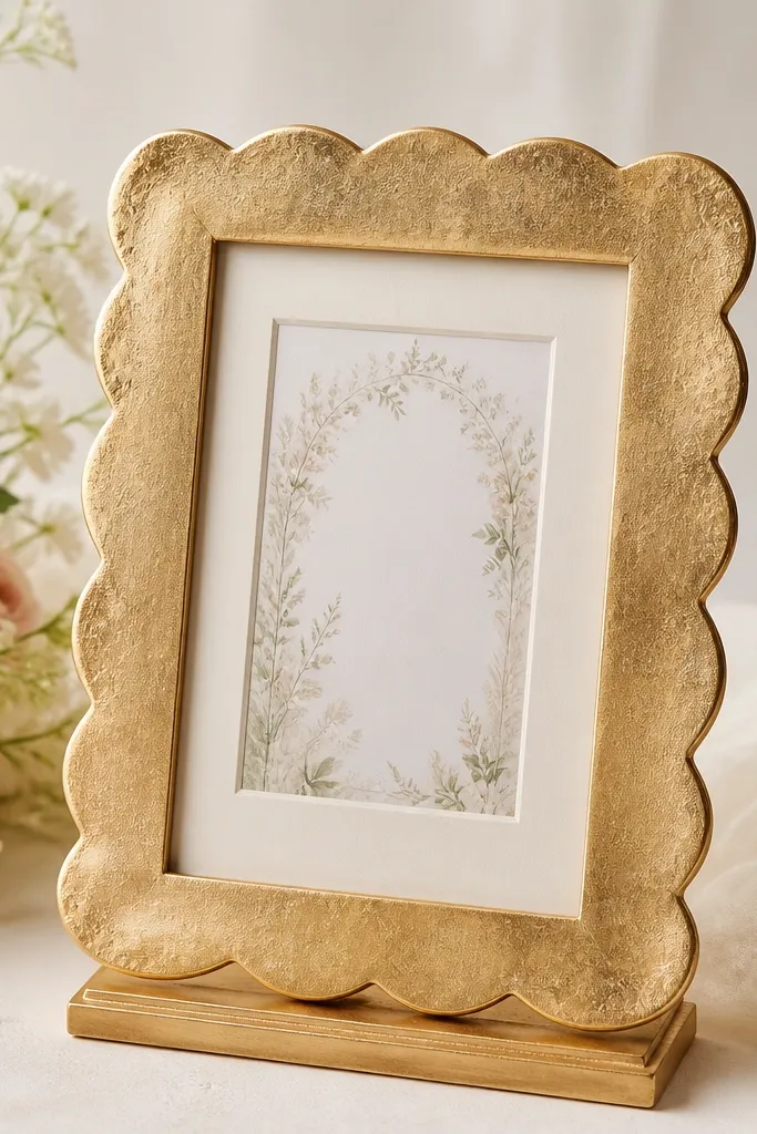
Scalloped edges make frames feel celebratory without heavy carving. Gold leaf paper mache gives texture that looks expensive in close-up, especially when the invitation has warm tones like saffron, copper, or champagne. This works best when your card design has a warm palette and you want the frame to match the ceremony vibe. In photos, the scallops create gentle shadows, which makes the card look dimensional even in flat lighting. I like this for haldi and sangeet setups because it feels festive but still neat.
Use a frame sized around 10x12 inches outer with a 5x7 window. Keep the mat border warm cream and around 1 inch so the gold leaf doesn't overwhelm the card. Position the frame on a gold or brass stand so the scallop edge is visible from the front. Avoid placing it right next to tall flowers; the shadows can get messy. Check the glass for smudges - gold leaf frames show dust quickly.
Try thisSeal gold leaf with a matte clear coat if the frame will be handled by many relatives.
Common mistakeDon't choose scallop frames with a super thick edge - they take over small tables.
15. Rosewood frame with engraved name panel at the bottom
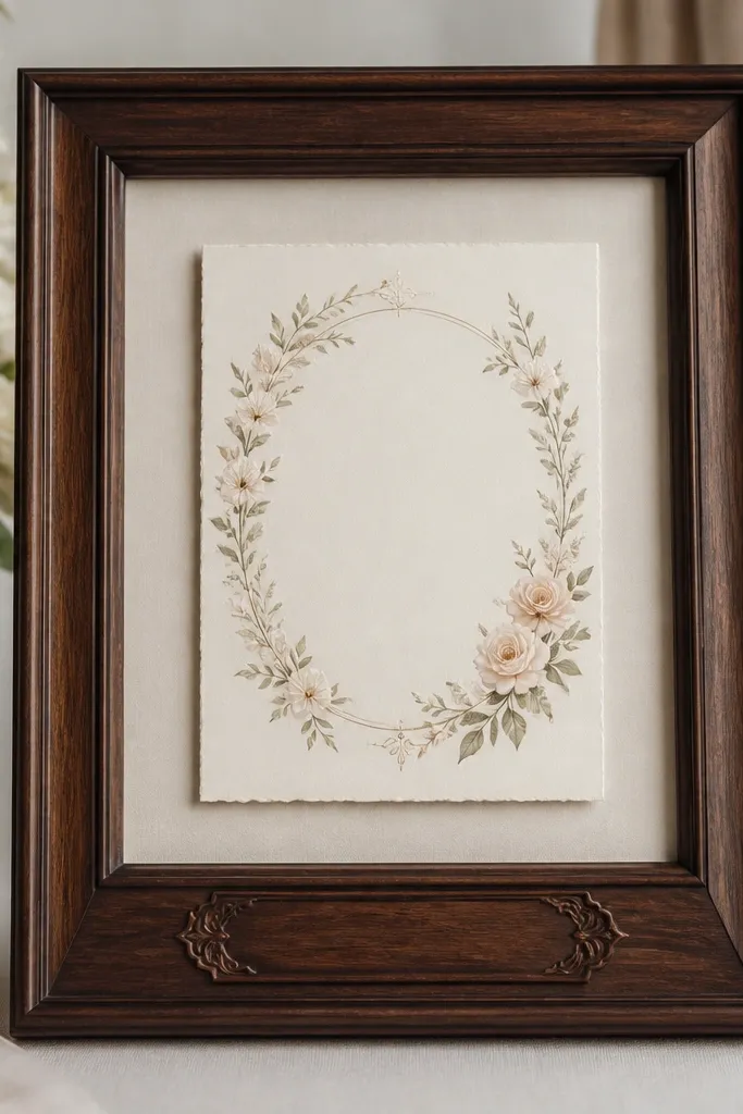
This is a clean option when you want personalization but you don't want extra decoration competing with the invitation. Rosewood looks classy under warm lighting and pairs well with both traditional and contemporary invitation designs. The engraved name panel at the bottom adds a deliberate finish, like a plaque, and it helps the frame look complete even if the invitation has minimal design. I use it when the couple wants the card to be the main visual, but they still want their names visible in the setup. It also looks great for indoor receptions where the table decor is simple.
Pick a rosewood frame around 10x12 inches outer for a 5x7 invitation. Add a cream mat border of about 1 inch, and leave space at the bottom for the engraved panel so it doesn't overlap the card design. Keep the engraved panel small (about 2.5-3 inches tall) and use engraved text or a neat metal plate that matches the invitation ink color. Place the frame on a table runner in ivory or taupe and keep surrounding items under half the frame height so the name panel stays readable.
Try thisIf you're adding a metal plate, roughen the surface lightly so adhesive holds better.
Common mistakeSkip sticker-style name labels - they peel and look flat next to real engraved details.