
1. Linen-cardstock welcome board on a simple tabletop easel
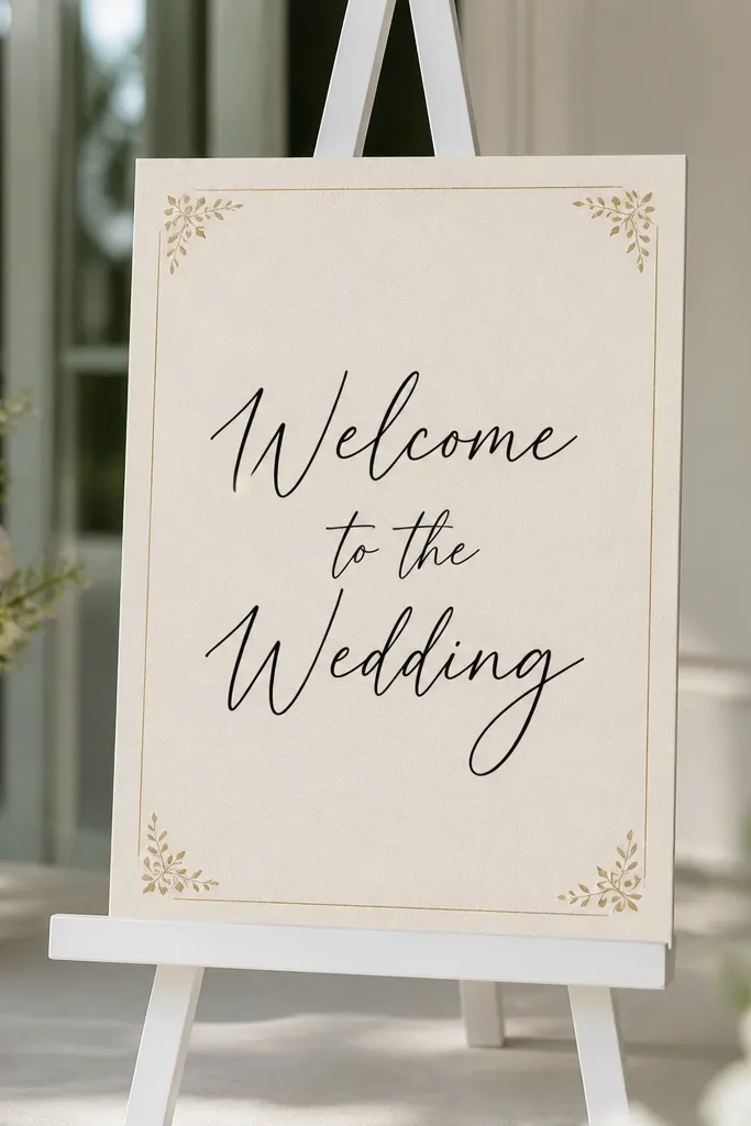
This one looks expensive because linen cardstock has tiny fibers that catch light softly instead of shining. Use a cream base (not bright white) and black lettering so it stays readable from across the room. I've used this format at indoor weddings where spotlights can make glossy prints look washed out - the matte surface stays crisp. It flatters almost everyone's color choices because it works with black-tie looks, garden weddings, and casual beach setups. The principle is contrast plus texture: one textured background, one clear text color.
Start with a 11 x 14 inch linen cardstock sheet. Print your text on plain white paper first, then trace the layout lightly with a pencil guide so your spacing looks intentional. Mount the finished paper to the cardstock using double-sided tape, then add a thin gold corner accent (foil stickers or small metallic corner decals). Place it on a tabletop easel sized for 11 x 14, and keep the easel legs centered so the sign doesn't tip toward guests.
Try thisSpray the final mounted sign with a matte photo sealant if your venue is humid. It cuts fingerprints when people lean in to take photos.
Common mistakeAvoid glossy ink pens - they smear when you handle the sign to set it on the easel.
2. Black acrylic sign holder with a printed welcome card
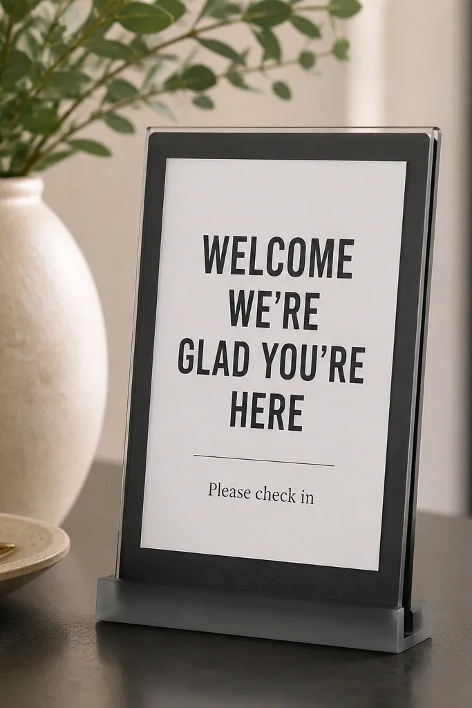
A clear holder makes your sign look like a boutique menu without you doing any fancy design work. Black acrylic looks clean with both warm and cool palettes, and the holder keeps the card perfectly flat. I used a similar setup at a modern wedding where all the decor was black and white, and the welcome sign matched without fighting the rest of the styling. It flatters high-contrast color schemes because the white card pops against dark acrylic. The styling principle is framing: the holder gives you structure so your typography looks deliberate.
Buy a black acrylic sign holder that fits an 8.5 x 11 or 11 x 14 insert. Print your welcome text on a thick matte card stock (around 200-300 gsm) so it doesn't look flimsy behind acrylic. Put the card in the holder and align it so the border sits evenly - check from the side, not just straight on. Add one small accent line like "Reception at 4:30 PM" in a lighter gray for hierarchy.
Try thisUse a matte insert, not glossy, to avoid glare from overhead lights. I've watched glossy cards turn into reflections during ceremony photos.
Common mistakeDon't use thin printer paper - it wrinkles and shows through the acrylic edges.
3. Kraft paper banner with triangle pennants and vinyl lettering
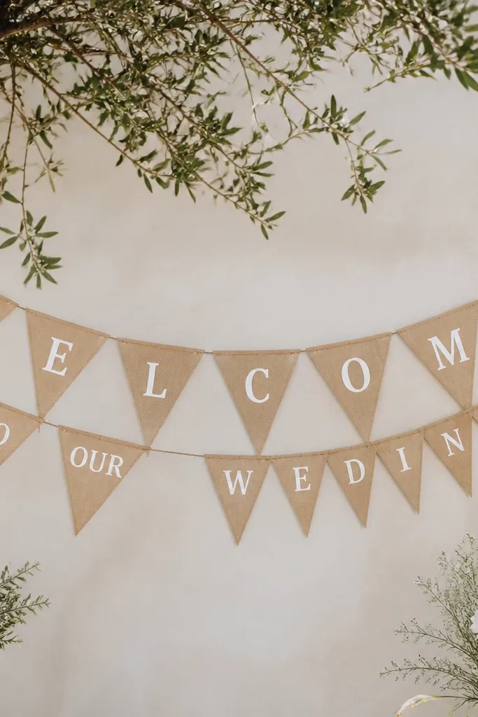
Kraft paper gives you instant rustic texture, and vinyl lettering stays sharp even if you're not a lettering person. This is one of my favorite beginner-friendly options because you can lay the vinyl on straight using a ruler and a slow hand. It looks great outdoors on a fence or indoors above a welcome table. It flatters earthy color palettes like sage, terracotta, and warm neutrals, and it also works with black-and-white weddings when you keep the text colors to white and black. The principle is repetition: repeating pennants makes the message feel designed, not improvised.
Cut or buy triangle pennants sized around 5 x 7 inches. Use a straight edge to place vinyl letters, spacing them so each pennant has one or two words. Punch a hole at the top corner of each triangle and thread baker's twine through, tying knots that keep flags about 3-4 inches apart. Hang it at about chest height so guests see it while approaching the check-in table.
Try thisIf your venue has wind, add a small dab of hot glue at the knot points to stop shifting. I've had pennants swing and smear under breezy outdoor tents.
Common mistakeAvoid cutting tiny letters - they peel off kraft paper edges and look messy fast.
4. Framed watercolor-style print with a white mat
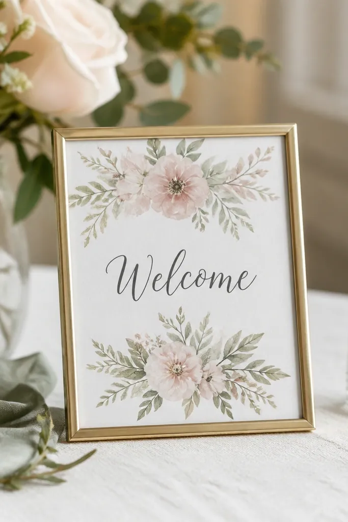
A framed print makes the welcome sign look like art, which means it photographs well even if guests don't read every detail. The white mat adds breathing room and makes the colors look more intentional. I've used this at indoor weddings where the entry wall is busy - the frame keeps the sign from blending into the background. It flatters guests because the message stays readable and the floral palette is soft, not loud. The principle is separation: the mat creates a boundary between text and the background artwork.
Pick a print size of 8 x 10 or 11 x 14 and choose a frame with a mat that's at least 1 inch wide. Print your welcome text as a separate overlay so it stays crisp - don't rely on low-res watercolor fonts. Place the mat so the text sits centered, then secure the print with the frame's backing clips. Set it on a table using a frame stand or lean it against a chair at a slight angle so glare doesn't hit the glass.
Try thisUse museum-style glass or a low-glare front if you can - it keeps the words readable in photos.
Common mistakeDon't skip the mat - text directly on the art looks cramped and cheap.
5. Chalkboard-style sign on a wooden board with gold marker accents
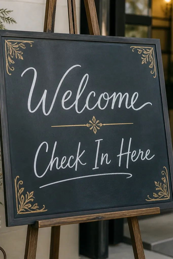
This is the quickest way to get a classic look without buying a chalkboard you have to erase. Use a wooden board with a chalkboard finish and write with a chalk marker that has a soft tip. I've done this for fall weddings and the warm wood edge makes the dark surface feel cozy. It flatters warm skin tones in photos because the gold accents catch light without looking neon. The principle is readability: thick strokes and short lines beat fancy scripts for quick guest scanning.
Start with a pre-made chalkboard sign board or a wood plaque painted with chalkboard paint. Wipe it clean with a microfiber cloth. Draw a simple border and write "Welcome" large in the center, then add a smaller line like "Please check in" underneath. Finish with gold marker dots or corner swirls, then let it dry fully before placing it on the welcome table.
Try thisUse painter's tape to mask straight lines for the border. I've saved so many signs from crooked edges.
Common mistakeAvoid thin lettering - it looks patchy once the marker dries.
6. White foam board sign with black vinyl lettering and a single blush underline

Foam board is cheap and sturdy, and vinyl lettering makes it look clean even if your spacing skills aren't great. The single blush underline is what keeps it from looking like a plain poster. I used this style at a large reception where guests were moving fast - the bold black text read from the entryway. It flatters minimal palettes and also adds contrast when your wedding has lots of color. The principle is hierarchy: big headline, one supporting line, one accent color.
Cut foam board to 16 x 20 inches and add a backing strip so it sits flat on the easel. Apply black vinyl letters for "Welcome" and "to the wedding" using transfer tape. Add the blush underline as a solid vinyl strip, about 1 inch tall, aligned with the baseline of the main text. Place the sign on an easel on the welcome table, adjusting height so the top of the word sits around adult eye level.
Try thisPress vinyl firmly with a credit card edge - it prevents bubbles that catch light.
Common mistakeAvoid multiple accent colors - too many shades makes foam board look like a school project.
7. Window cling welcome sign for venues with glass doors
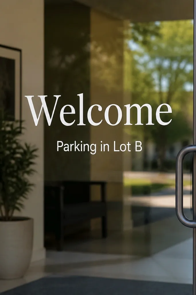
Window clings are brilliant because the venue already has a perfect background - glass. The white letters look bright without needing a lot of ink color, and they stay readable even in daylight. I used this at a venue with bright morning sun, and the text still showed clearly because it sits on the glass surface, not behind it. It flatters almost any wedding palette since white is neutral, and it helps guests when you add practical info like parking or check-in location. The principle is location: put the sign where guests are already looking.
Measure your door glass and decide how high to place the main word. Clean the glass with rubbing alcohol and let it dry completely. Place the cling using a level or by measuring from the top edge so it's centered. Add a second line of text in smaller size, like "Check in inside," and avoid more than two lines so it doesn't look crowded.
Try thisIf the cling edges lift, press them with a fingertip and a flat edge tool to seal the contact.
Common mistakeAvoid placing clings too low - people miss them while walking through.
8. Mirror acrylic welcome sign with "Welcome" in removable vinyl
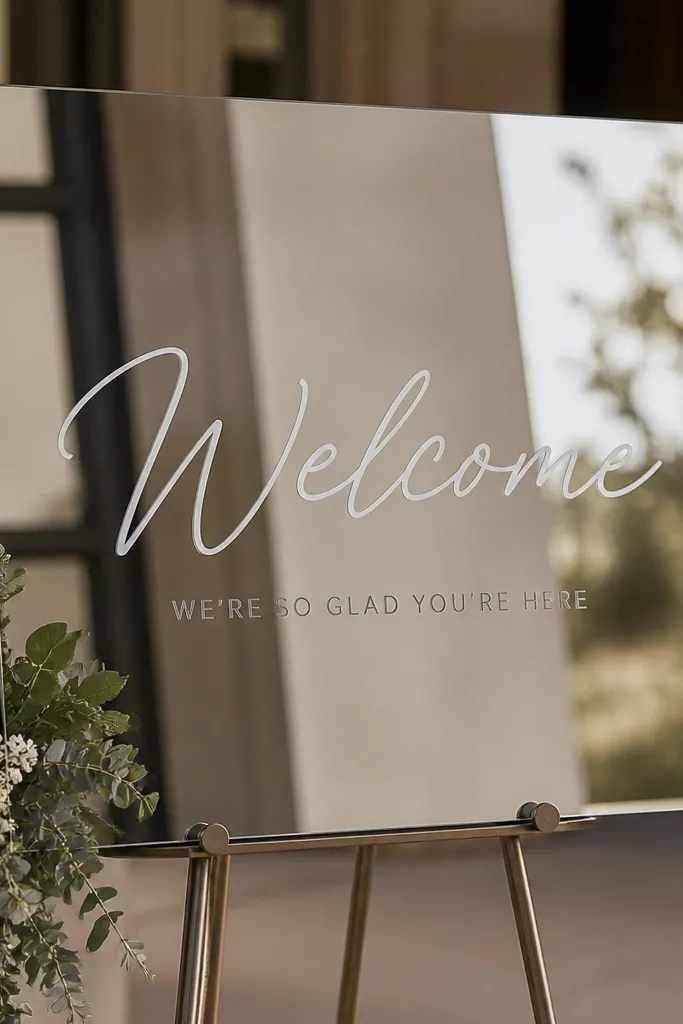
Mirror acrylic turns a simple message into something that looks styled, because reflections make the sign feel brighter and more dimensional. Removable vinyl is key because you can reuse the sign for future events or swap text by night. I've seen this work especially well for evening receptions where the mirror catches candlelight and string lights. It flatters glam weddings and also adds sparkle to neutral decor. The principle is controlled reflection: keep the design minimal so the reflections don't make the text hard to read.
Use a mirror acrylic panel around 11 x 14 or 12 x 18 inches mounted on a small stand. Clean the surface with glass cleaner and dry with a lint-free cloth. Apply removable vinyl letters for "Welcome" first, then add one smaller line like "We're so glad you're here." Step back and check readability from 6-10 feet away, then adjust spacing before pressing down fully.
Try thisLay down vinyl on a cutting mat with a ruler - it prevents letters drifting when you transfer.
Common mistakeAvoid overcrowding the mirror with many words; reflections make it look busy.
9. Photo strip welcome sign with printed couple portraits and a check-in note
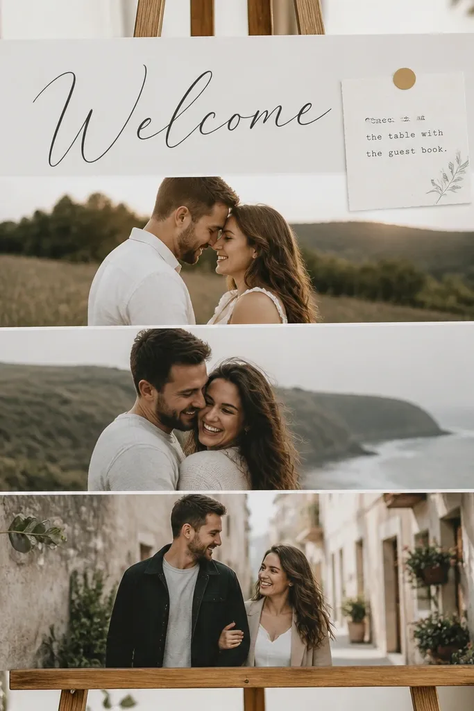
This one feels personal without requiring fancy typography. A photo strip layout gives you a natural focal point, and the printed check-in note keeps it functional. I've used it at weddings where guests want to see the couple right away when they arrive. It flatters most aesthetics because you can choose photo tones - warm sepia for rustic, cool black-and-white for modern. The principle is clarity: keep the message short so the photos do the storytelling.
Print 3-5 photos of the couple in a consistent size strip (like 2.5 x 3.5 inches each). Mount them to a 11 x 14 cardstock with even spacing and a thin white border between photos. Add a header rectangle at the top with "Welcome" in bold black type. Place a smaller printed line at the bottom for check-in instructions, then mount the whole piece on foam board for stability.
Try thisUse a white gel pen to outline photo edges lightly if your prints don't have crisp borders.
Common mistakeAvoid random photo sizes - mismatched prints make the sign look thrown together.
10. Botanical sprig sign on vellum overlay over a white base
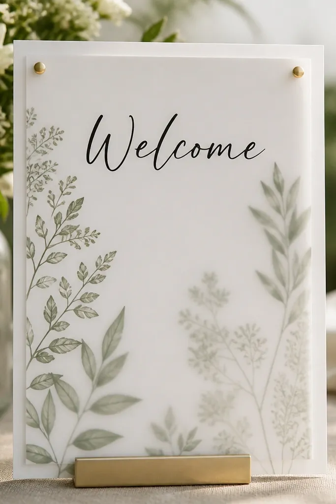
Vellum adds that soft, layered look you usually see in store-bought wedding stationery. The semi-transparent overlay makes the botanical print feel like it's floating, and it photographs beautifully with window light. I've used this at ceremonies with greenery-heavy decor, and it matched without needing actual flowers. It flatters neutral and sage palettes, and it keeps the sign airy instead of heavy. The principle is layering: one solid base, one translucent top, and one clear text line.
Start with a 11 x 14 white cardstock base. Print your botanical sprigs on vellum and cut around the outer edges so the design sits cleanly. Place the vellum on top and secure it with tiny double-sided tape dots at the corners only. Add "Welcome" in dark ink on the base or on a small vellum label, then set the sign on a stand with the vellum angled slightly to catch light.
Try thisUse a matte adhesive tape - glossy tape shows through vellum in photos.
Common mistakeAvoid chunky tape strips - they show as shiny blobs through the vellum.
11. Minimalist one-line sign on black cardstock with white vinyl
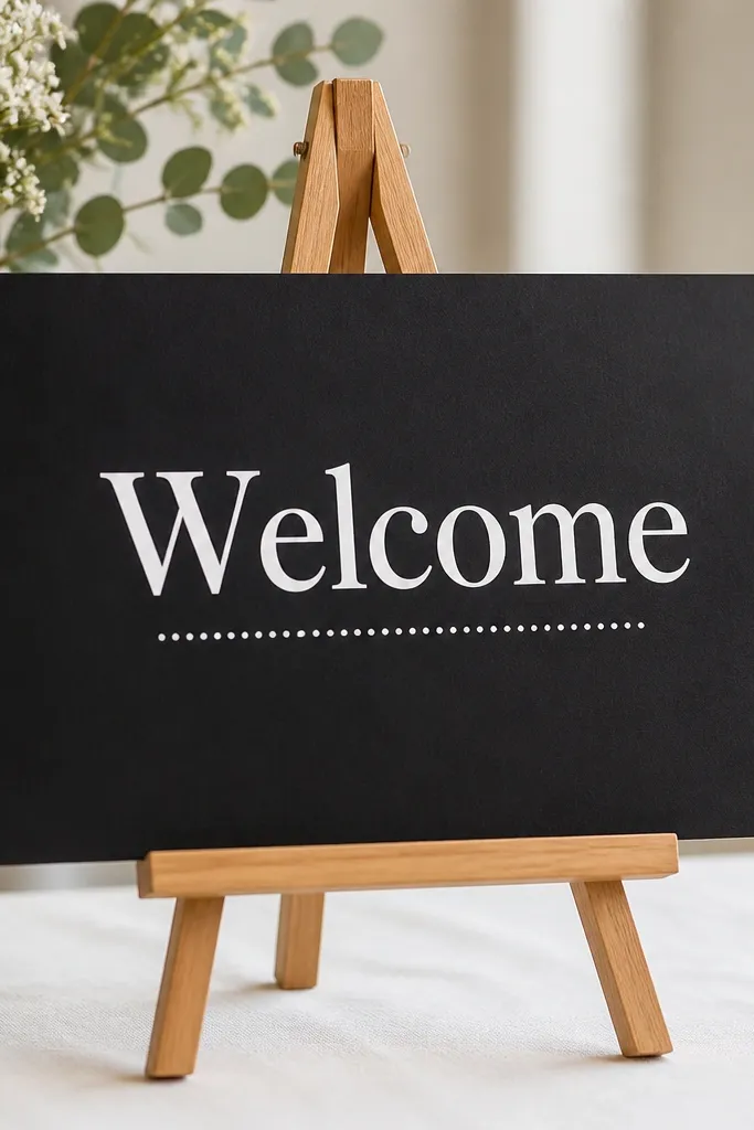
If you want a sign that looks modern and stays readable, go with one line and big type. Black cardstock makes the white vinyl pop instantly, and it also hides minor paper imperfections. I've used this for weddings with bold florals where the rest of the table already has texture, and the sign didn't compete. It flatters photographers because it stays clean and high-contrast. The principle is negative space: leave plenty of blank area so the design breathes.
Cut black cardstock to 11 x 14 and round the corners if you want a softer look. Apply white vinyl for "Welcome" using transfer tape so the letters stay aligned. Add a simple dot line or short divider under the word, keeping it under 3 inches long. Place it on a tabletop easel and set it so the sign faces guests straight-on, not at a steep angle.
Try thisUse vinyl that's at least 2 inches tall for the main word. Smaller lettering disappears in busy entry photos.
Common mistakeAvoid adding multiple paragraphs of text - it turns minimalist into clutter fast.
12. Sequin letter welcome sign using foam letters and clear glue
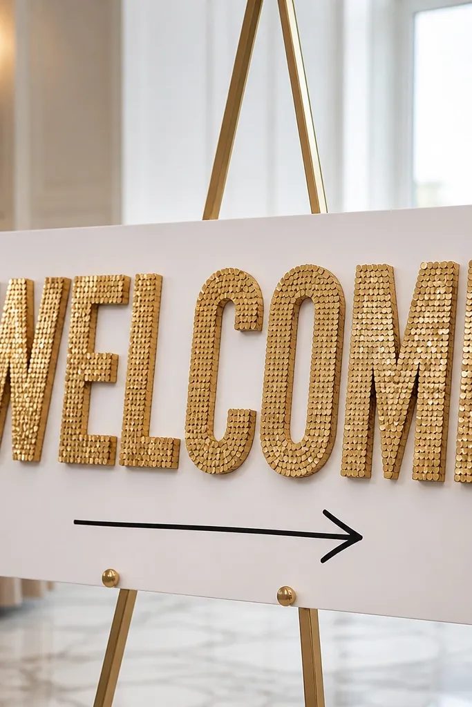
Sequins sound flashy, but in a controlled layout they look party-ready and very wedding-appropriate. Foam letters are lightweight, and gold sequins catch light without needing extra decor. I did this for a couple who had champagne-gold accents, and the welcome table looked like it belonged in a photo shoot. It flatters glam and evening events, and it adds sparkle even if your venue lighting is flat. The principle is focus: one big word dominates so you don't need lots of smaller elements.
Buy foam letters for "WELCOME" in a size around 3.5-4 inches tall. Cover the letters with gold sequins by brushing a thin layer of clear craft glue and pressing sequins in rows. Let each letter dry fully before placing them on the white foam board backing. Add a black vinyl arrow and a short check-in line like "Guest book on the right" so guests know what to do.
Try thisWork on a tray so loose sequins don't scatter. I learned that the hard way after vacuuming my whole living room.
Common mistakeAvoid using glitter glue - it looks uneven and sheds under handling.
13. Fabric ribbon banner sign with printed cardstock strips
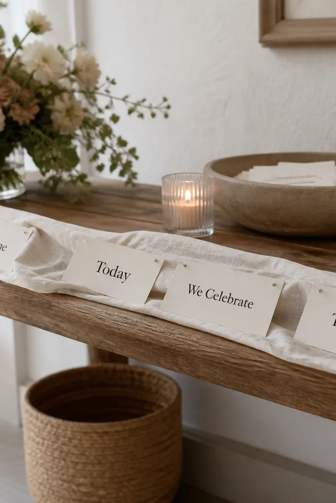
This looks soft and handmade without requiring calligraphy. Fabric drape is forgiving - it hides slight paper misalignment and adds movement, which reads well in photos. I've used it at outdoor ceremonies where the wind lightly moves the ribbon and makes the sign feel alive. It flatters rustic, boho, and garden weddings, especially when you match ribbon color to your bridesmaids' dresses or bouquet wrap. The principle is texture and flow: fabric gives you softness, while printed text stays crisp.
Cut a length of satin or cotton ribbon about 6-8 feet long. Attach printed cardstock strips (2.5 x 4 inches) to the ribbon using mini clothespins or small binder clips. Space the strips evenly so the words form a readable line from left to right. Tie the ribbon across two chair backs or a freestanding stand, keeping the bottom edge about 2 feet off the table so people can still see the guest book.
Try thisUse a fabric ribbon in a solid color like dusty blue or blush, not a busy pattern. Patterns compete with the text.
Common mistakeAvoid thin paper strips without backing - they curl when guests touch them.
14. Wood-slat sign with a single printed welcome card clipped on
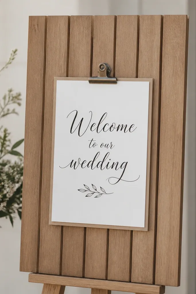
Wood slats make any sign look intentional because the texture already looks crafted. Clipping a printed card also makes it easy to swap text if you change details like time or location. I've used this at venues that already have lots of wood decor, and the welcome sign blended in naturally. It flatters warm-toned weddings and works with both neutral and colorful florals. The principle is modular design: the base stays the same, the card changes.
Buy or make a wooden slat board around 12 x 24 inches. Use a small clip frame, or screw two small binder-style clips to hold a 8.5 x 11 card. Print your welcome message on thick matte cardstock and center it in the clip frame. Set the board on the welcome table using a small easel or lean it against a stand so it stays stable in foot traffic.
Try thisIf your wood has a glossy finish, lightly sand and wipe dust before attaching clips so they grip securely.
Common mistakeAvoid heavy cardstock cards that don't fit the clip depth - they bow and look sloppy.
15. Pegboard check-in sign with two color label stickers
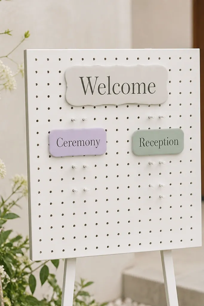
This is the most beginner-friendly "organizational" style I've made because it's functional and looks tidy from every angle. Pegboard also hides small mistakes - if a label isn't perfectly placed, it still looks like part of the design. I used this at a venue where guests kept asking where to go, and the sign reduced questions fast. It flatters modern and minimalist aesthetics, especially if you keep sticker colors to two. The principle is wayfinding: add clear categories so guests don't stand there guessing.
Use a small pegboard panel around 12 x 18 inches and mount it on a tabletop stand. Place a large label at the top with "Welcome" in bold black text. Add two smaller label stickers or vinyl pieces for "Ceremony" and "Reception," each with a color-coded dot. Write the times and location notes on separate labels so you can swap them later if details change.
Try thisUse removable vinyl for the labels so you can peel and restick without damaging the board.
Common mistakeAvoid handwriting tiny times - print them so they read quickly.
16. Gold foil frame sign with printed script inside a mat
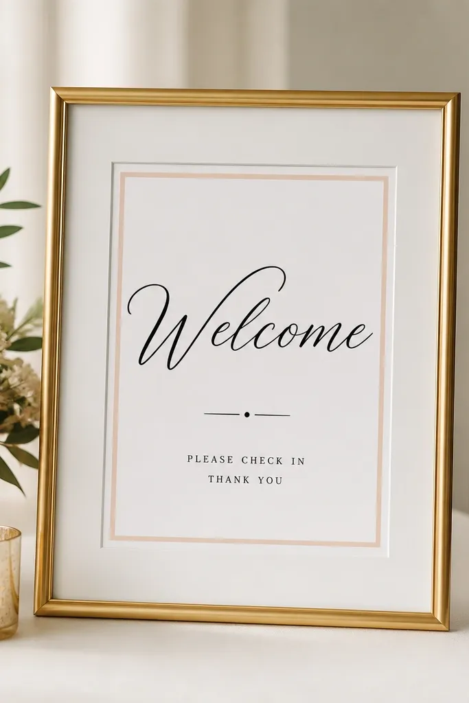
Gold frames photograph like jewelry. When you add a white mat and keep the design simple, the sign reads classy instead of costume-y. I've used gold frame welcome signs for weddings where the table already has candles and glassware, and the frame tied everything together. It flatters warm palettes and also looks sharp with cool colors like dusty blue. The principle is restraint: one gold element, one text block, no extra patterns.
Pick a frame that fits an 8 x 10 or 11 x 14 print and choose a mat color that matches your palette (cream or bright white). Print your "Welcome" in a script font sized large enough to fill the top half. Add a thin blush line under the main word using a simple editing template. Insert into the frame, then place it on the welcome table at a slight angle so the glass doesn't glare.
Try thisWipe the inside of the glass with microfiber - fingerprints look like smudges in photos.
Common mistakeAvoid frames with thick ornate details if you also have busy floral decor nearby.
17. Acrylic easel with watercolor name-and-date card
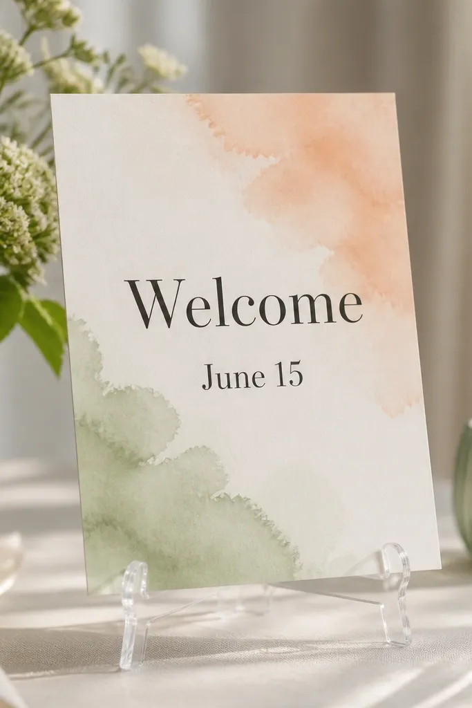
This combines the readability of a printed card with the clean look of an acrylic easel. Watercolor washes add softness, and acrylic makes it look crisp and modern. I've used this for couples who wanted something romantic but not floral-heavy, and it fit perfectly. It flatters pastel palettes and also works with neutral decor because the watercolor stays light. The principle is keeping the card design uncluttered so the watercolor doesn't compete with the text.
Use an acrylic easel sized for an 8.5 x 11 card. Print your watercolor background on thick matte paper, then print your date and welcome text on a separate layer or a clean overlay area. Mount the card to a slightly thicker backing sheet so it looks flat inside the easel. Place the easel so the top of the card sits around eye level for guests approaching the table.
Try thisChoose watercolor colors that match your florals, then keep the text color dark charcoal for readability.
Common mistakeAvoid light gray text on a pale wash - it disappears at a distance.
18. Succulent-pattern sign on matte cardstock with a terracotta title
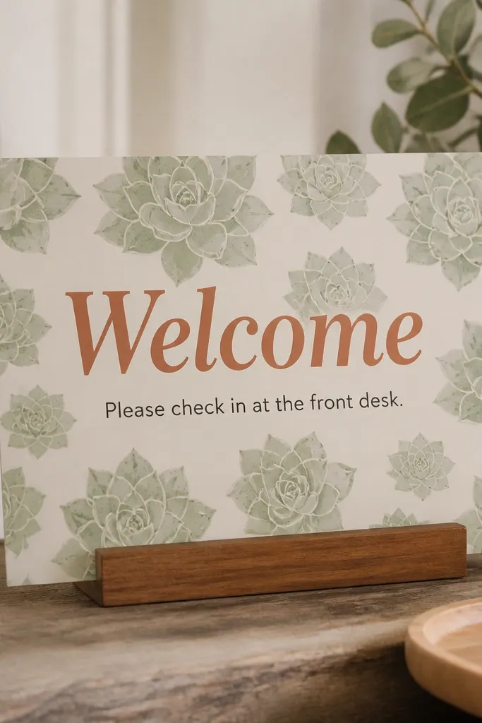
Patterned backgrounds can look cute without looking childish if you keep the pattern subtle and the headline strong. Matte cardstock prevents glare, and terracotta vinyl gives you a warm focal point. I used this for a desert-inspired wedding, and it tied into the centerpieces without needing real plants on the welcome table. It flatters warm skin tones and works well with gold jewelry and neutral outfits. The principle is one strong color for the main headline against a quieter background.
Print or buy a succulent-pattern paper, then choose a matte finish so it doesn't shine under lights. Cut a sign size like 12 x 18 inches on sturdy cardstock. Apply terracotta vinyl for "Welcome" centered at the top, then add a small black check-in line underneath. Mount it on a foam board backing and place it on a wide tabletop easel so it doesn't feel too narrow.
Try thisIf your pattern is busy, reduce the text to two lines. That's the easiest way to keep it elegant.
Common mistakeAvoid bright red vinyl - it fights the muted pattern and makes the sign look harsh.
19. Chic "Welcome" sign on mirrored tray with small printed cards
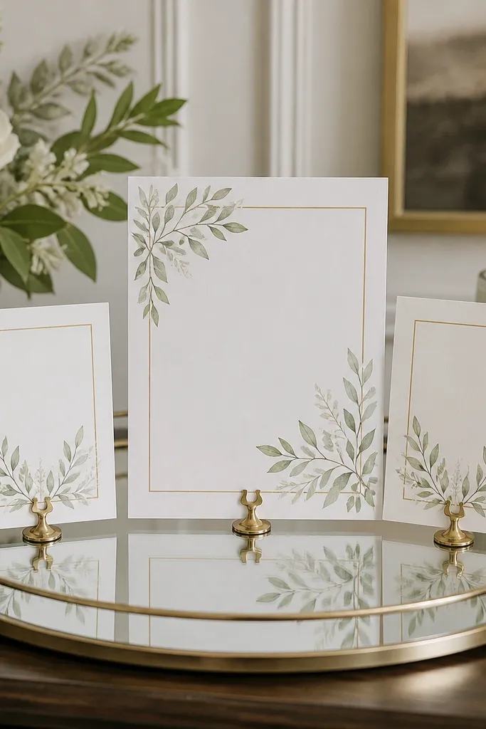
Mirrored trays make small signage look styled because the tray adds shine and elevates everything to the same "photo-ready" plane. This is great when your table setup includes candles, frames, or a guest book and you need the welcome sign to look like part of that composition. I've used mirrored trays at cocktail-style receptions, and the welcome card stayed readable while looking glamorous. It flatters modern decor and works with both gold and silver accents. The principle is grouping: one base tray, three cards, consistent fonts.
Buy a mirrored tray around 12-14 inches across. Print a main welcome card (8 x 10 or 5 x 7, depending on tray size) and two smaller cards sized about 3.5 x 5 inches. Stand the main card using a small easel clip or fold-back stand, then place the smaller cards in front like a mini information station. Keep everything aligned so the headings line up and the tray doesn't look scattered.
Try thisUse matte cards on a mirrored surface to reduce glare. Glossy cards reflect so much that text gets blurry.
Common mistakeAvoid too many cards - three is enough for a welcome table.
20. Seaside rope sign with a printed anchor icon and navy vinyl
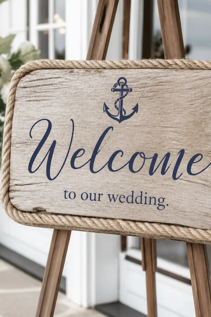
Rope trim gives you beach texture instantly, and navy vinyl keeps it from looking like a craft store holiday decoration. I've done this for coastal weddings where the color palette is white, navy, and sand, and it fit right in. It flatters guests because the sign stays readable and doesn't blend into light-colored table linens. The principle is texture framing: rope creates a border so your text stays the main focus.
Start with a wood board about 10 x 20 inches. Wrap rope along the edges and secure with hot glue, keeping the rope tight and evenly spaced. Apply navy vinyl for "Welcome" in a bold font, then add a printed anchor icon in the center using a small adhesive card. Finish with a short line like "Check in at the table" in smaller navy type. Lean it on a tabletop easel or hang it from a stand using sturdy twine.
Try thisPress vinyl down firmly and avoid glue near the vinyl edges so it doesn't lift during setup.
Common mistakeAvoid jute rope that's too fuzzy - it makes the sign look messy next to crisp vinyl.
21. A simple hanging sign using a dowel and two-sided cardstock
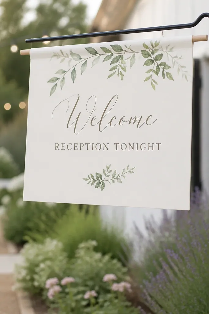
A hanging sign is a lifesaver when your welcome table is crowded. The dowel keeps the sign straight, and two-sided cardstock means it still looks good from behind when guests walk around. I used this in a garden where people were moving past the entry, and the sign stayed visible without taking up table space. It flatters outdoor weddings because it catches breezes gently instead of looking stuck to one spot. The principle is visibility through movement: hang it where guests naturally pass.
Cut two identical cardstock pieces (8.5 x 11 or 11 x 14) and print your welcome message. Punch holes along the top edge and tie them to a dowel with ribbon, keeping the spacing even. If you want it extra clean, add a thin border line on both sides so it looks polished when it flips. Hang at about head-to-shoulder height, centered over the walkway so it's readable without craning.
Try thisUse double-sided tape only on the cardstock edges - keep the center free so the sign doesn't warp.
Common mistakeAvoid paper that's too thin - wind will ripple it and blur the text.
22. Wooden pallet style welcome sign using laser-cut letters

The pallet look is popular, but beginners can make it look clean by using finished letters instead of trying to paint each character. White painted letters on warm wood look sharp and readable, even from a distance. I've done this at rustic weddings where everyone expects barn vibes, and the laser-cut letters kept the sign from looking uneven. It flatters rustic and farmhouse palettes, and it also works for casual ceremonies because it feels grounded. The principle is using pre-made components to control quality.
Choose a wood board with a flat top surface and sand it lightly. Paint the laser-cut letters white (two thin coats) and let them dry fully. Attach letters with wood-safe adhesive or screws based on your board thickness. Add a simple arrow sticker or vinyl arrow pointing to check-in, then lean the finished board on a sturdy easel so it doesn't wobble.
Try thisSeal the wood with a matte clear spray so the sign doesn't scuff during setup and transport.
Common mistakeAvoid dark staining under white letters - it can make the letters look muddy instead of crisp.
23. Polaroid-style welcome sign with numbered check-in cards
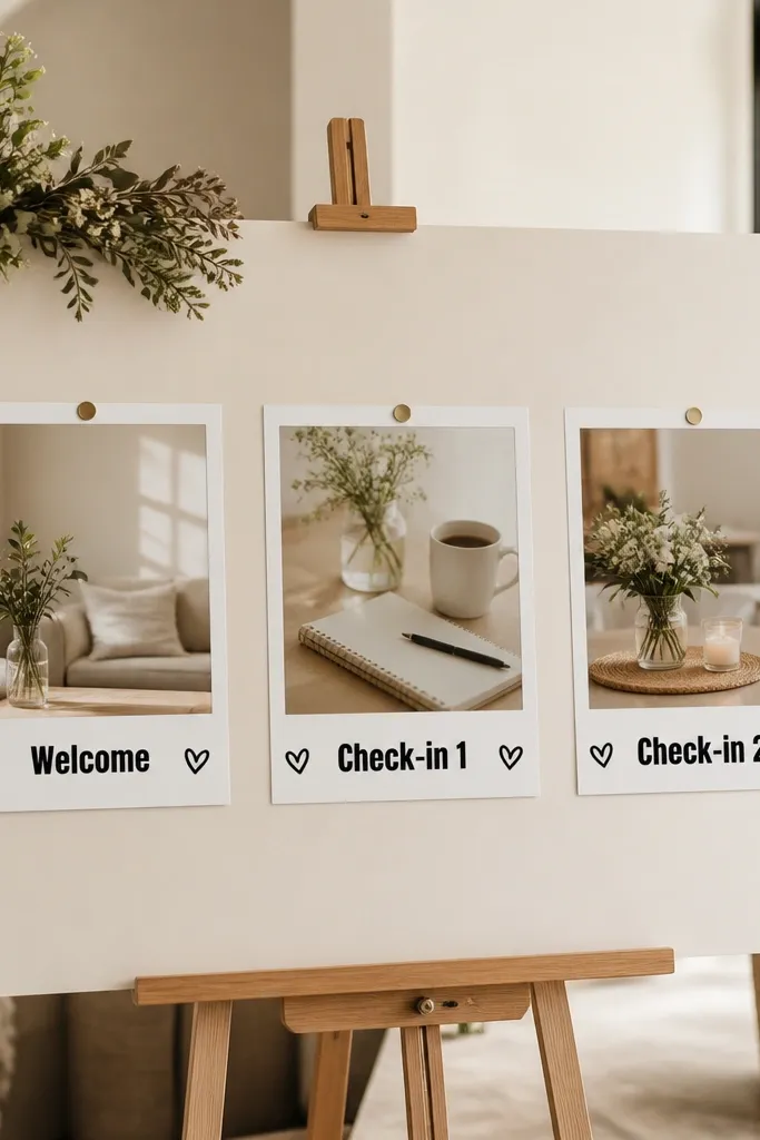
Polaroid-style frames make the welcome sign feel playful and organized at the same time. Numbered check-in cards reduce confusion because guests know where to go, and the numbered frames look intentional instead of random. I used this for a wedding with two family groups and two check-in lines, and it cut down on side conversations. It flatters casual venues and works with both neutral and colorful palettes because you can choose the Polaroid border color. The principle is combining fun visuals with functional instructions.
Print Polaroid-style frames on thick cardstock, then cut out the inner photo areas. Use one frame for "Welcome" and two frames for check-in instructions with numbers. Mount the frames onto a 16 x 20 foam board, leaving equal spacing between them. Add a small printed heart or icon in the corners to tie the frames together, then place the board on a wide easel.
Try thisUse a consistent font for all frames, and keep the numbers larger than the rest of the text.
Common mistakeAvoid tiny numbers - guests rush and miss them.
24. Gold-embossed look sign using foil transfer and thick cardstock
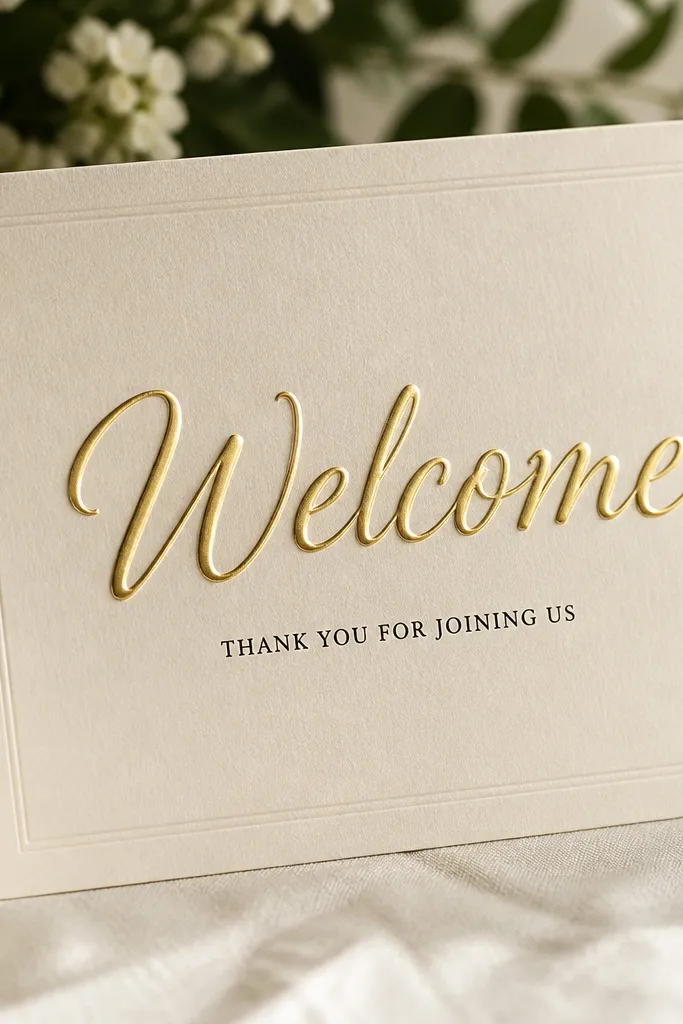
You can get the gold-embossed look without buying an expensive heat press if you use foil transfer sheets and a basic transfer method. Thick cardstock helps the foil adhere and makes the final sign feel sturdy and premium. I used this for a winter wedding and the gold popped beautifully against the cool venue lighting. It flatters formal palettes because the gold reads upscale, and it stays readable because you keep the design simple. The principle is surface quality: thick paper plus clean foil placement makes the effect look real.
Use a thick cream cardstock around 300 gsm and keep it flat while you work. Place foil transfer on top of your printed stencil for "Welcome," then follow the transfer method on the foil sheet instructions. Press evenly and lift carefully so you don't smudge the edges. Add a short black line under the gold word, then mount on a foam board backing and place on a tabletop easel.
Try thisPractice on a scrap piece first - the first attempt always teaches you pressure and timing.
Common mistakeAvoid thin cardstock - foil transfer looks patchy and tears easily.
25. Soft blush florals with black frame border and a "Check In Here" arrow
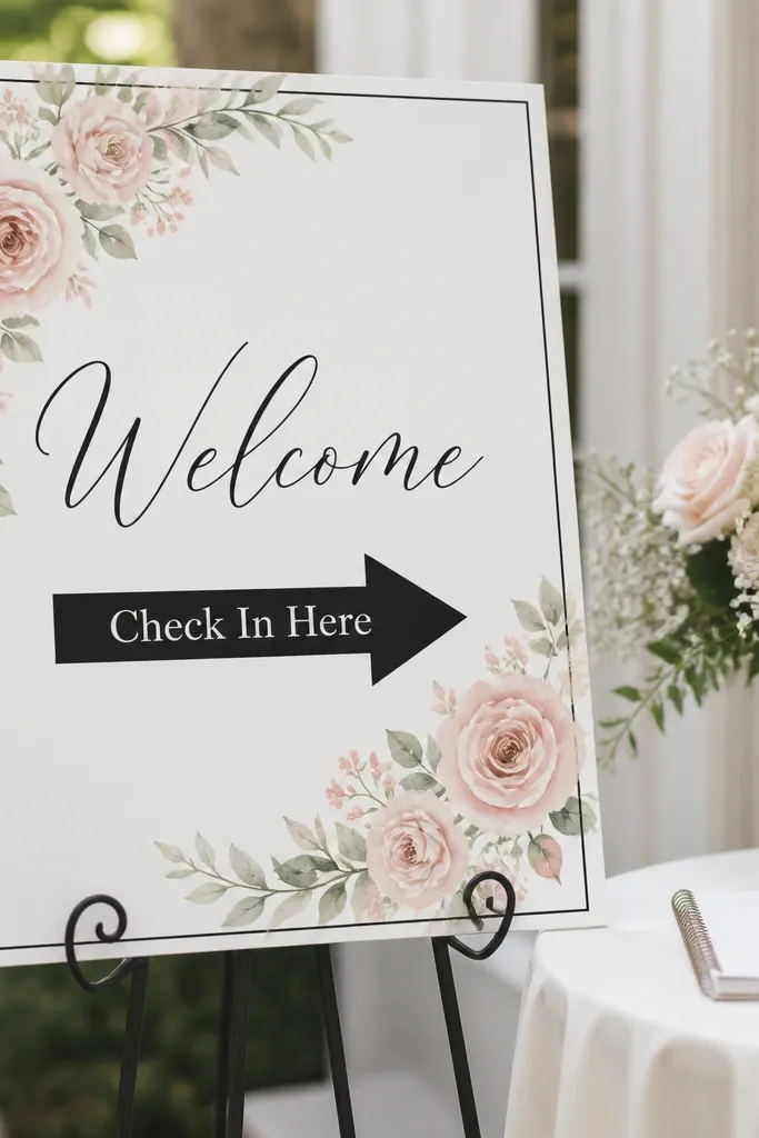
This design works because it gives you a decorative element without turning into a full floral poster. The thin black border keeps everything structured, and the arrow makes the sign useful. I used this for a wedding where the welcome table had lots of small items, and the arrow stopped guests from wandering. It flatters classic and romantic aesthetics, and it also works for people who don't want bold colors. The principle is framing plus direction: decoration in the corners, instructions in the center.
Print or create a blush floral corner graphic on white cardstock, leaving space in the center for text. Add a thin black border rectangle around the edges using a printed template or vinyl border strips. Place "Welcome" in black centered at the top, then "Check In Here" in a smaller bold font with an arrow beneath or beside it. Mount on foam board and set on an easel so the border stays visible from across the entry.
Try thisUse a thicker arrow line than you think you need. From 10 feet away, thin arrows vanish.
Common mistakeAvoid placing arrow text too close to the border - it gets cramped and looks off-balance.