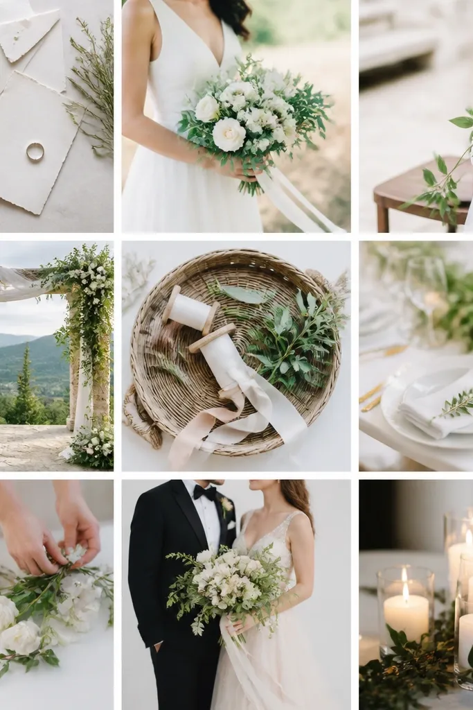
1. Place cards with a ruler-made grid (not "freehand" spacing)
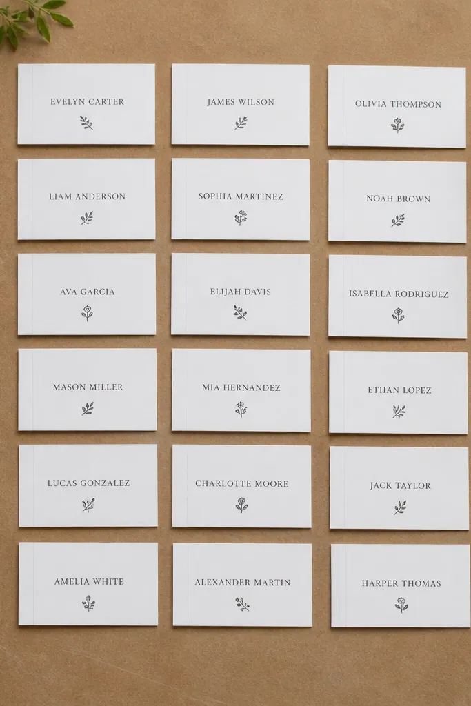
The place cards that look expensive are the ones where spacing is consistent. I print or handwrite names in black ink, but I build the layout first using a simple grid: a fixed margin and a consistent baseline. Use a white card stock around 250 gsm so the ink doesn't ghost and the edges don't curl when you stack them. This flat layout looks best on light skin tones because the contrast is crisp, and it reads clearly from a table setting where people are wearing rings and holding drinks. If you're doing men and women mixed seating, this also keeps the set cohesive even when handwriting varies.
Start by deciding on your card size - I use 4 x 2.5 inches finished, cut from a letter sheet so it's easy. Then draw a faint pencil line for the baseline and a faint vertical guide for the left margin on the back of one "master" card. Place your ruler on the guide and stamp or write the names across all cards without moving the template. Finally, add a small icon or monogram at the bottom in a matching color (matte gold or deep green) using a fine-tip paint pen for a clean dot edge.
Try thisMake a master card and trace it once with a lightbox if you're writing by hand. Consistency beats "pretty letters" every time.
Common mistakeAvoid centering by eye - it makes the whole table look uneven even if each individual card is nice.
2. Table numbers on foam board with a shadow gap frame
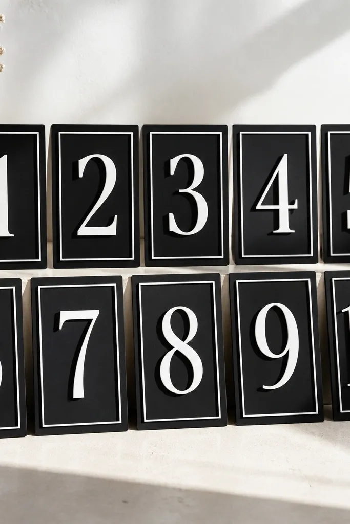
Foam board table numbers look sharper when you add a frame gap instead of flat-gluing everything. I use matte black or deep charcoal foam board as the base, then apply matte white vinyl numbers for high contrast under warm venue lights. The shadow gap is the trick: it makes the number look layered, not stuck-on, and it reads from across the room. This works for both men and women because the typography is bold and doesn't rely on delicate details. If your venue has wood tables or beige walls, the black base keeps the numbers from blending in.
Start with foam board cut to the finished size you want, like 8 x 10 inches for tables 1-6 and 6 x 9 inches for smaller displays. Cut your frame strips from 1/2-inch wide cardstock or thin poster board and glue them to the base, leaving a 2-3 mm inner gap. Apply matte white vinyl numbers to a separate layer, then mount that layer inside the frame using double-sided mounting tape so the gap stays even. Finish by sealing the edges with a thin strip of coordinating washi tape so the board doesn't scuff in transport.
Try thisUse transfer tape on vinyl and burnish with a plastic card so the edges stay crisp. Press longer at corners.
Common mistakeAvoid glossy vinyl - it reflects overhead lights and makes the number look washed out from certain angles.
3. A "no-warp" menu card set with plastic sleeve backing
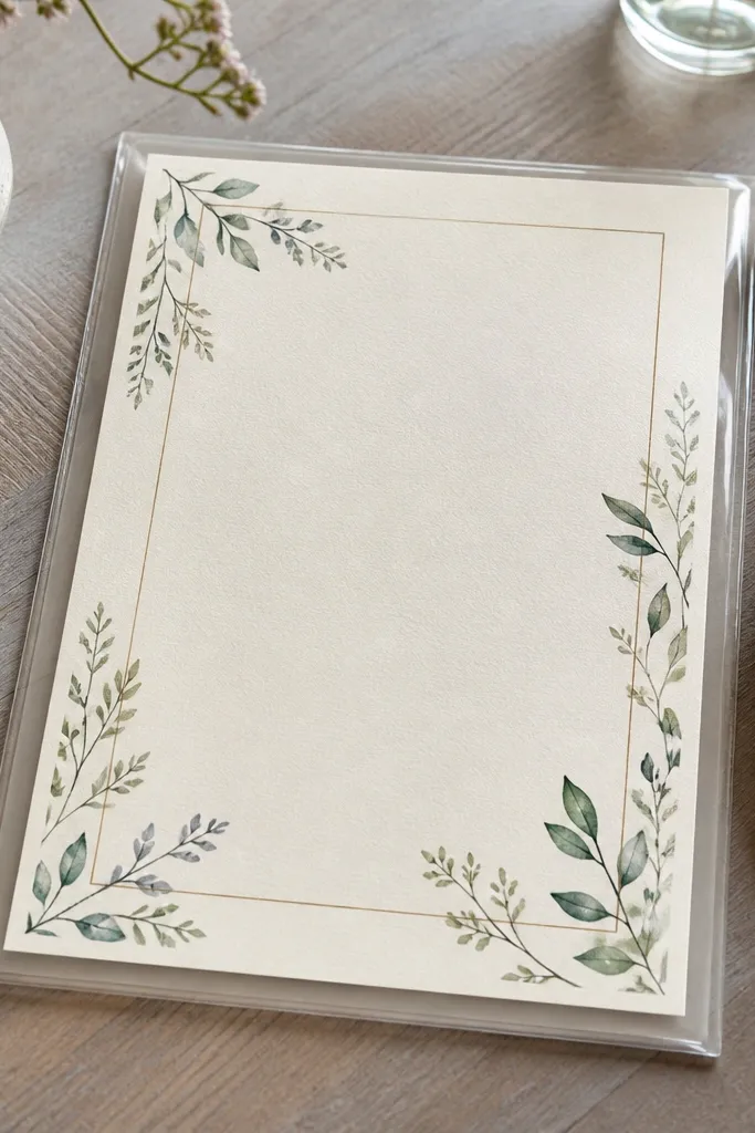
Menus warp when you print on thin paper and then set them near heat, steam, or direct sun. I stopped fighting that by building menus inside clear sleeves with a firm backing - the paper stays flat all night. Use 110 lb cover stock or 220 gsm paper for the menu page, then slide it into a sleeve sized for the card. The sleeve also protects ink from condensation if your venue runs humid. This is especially helpful for older guests because they handle menus more, and warped paper looks messy fast.
Start by printing your menu on thicker cardstock and trimming with a paper trimmer for straight edges. Then place each menu inside a clear plastic sleeve and tape the sleeve edges to a backing board cut to the same size. I like a 2 mm thick backing board so it doesn't feel flimsy, but you can use foam core. Finally, add a small strip of matching ribbon across the bottom edge of the backing board so it looks intentional instead of "hardware store plastic."
Try thisUse a matte seal or matte laminate sheet on the menu page before sleeving if your ink smears easily.
Common mistakeAvoid thin printer paper - it curls and makes the typography look crooked even when the design is centered.
4. Hanging photo garlands with bead-stopped fishing line
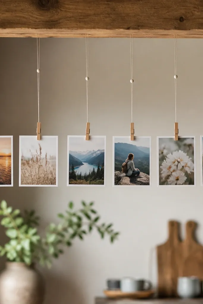
The reason DIY photo garlands look uneven is the line slides. I switched to fishing line with a bead stop so every photo drops to the same length, even after the garland gets bumped. The photos are printed on thicker paper (at least 200 gsm) and clipped with mini clothespins for a clean edge. This looks great for couples who want a personal touch without turning the decor into clutter. It also flatters the room because the garland has a consistent rhythm, which looks intentional against busy walls.
Start by measuring the total width between anchor points and divide by your photo count so spacing stays even. Cut fishing line lengths slightly longer than needed, then slide on a small bead stop and tie a knot below it so it can't move. Clip photos using mini clothespins, then adjust the bead stop height until the photo faces are level. Finally, add a single ribbon loop at each anchor point so installation takes seconds and you don't fight tangles.
Try thisDo a dry run on the floor first and mark the bead height with painter's tape.
Common mistakeAvoid tying fishing line directly to a hook without a stop - the photos drift as soon as people walk past.
5. Ribbon-wrapped glass jars for seating cards with removable inserts
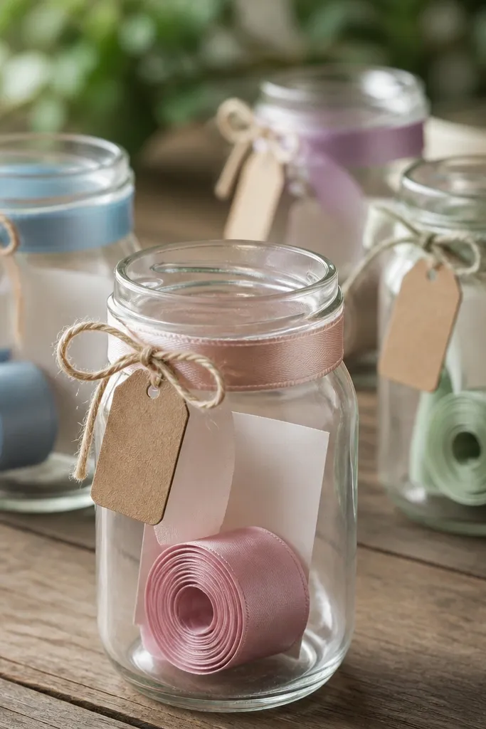
When seating cards are glued into place, you lose flexibility and you create mess if there's a last-minute change. Jars solve that - you can swap inserts quickly while keeping everything looking styled. I wrap jars with 3/4-inch satin ribbon in dusty rose or sage, then tie a small twine bow to hide the ribbon seam. Use a thick insert card stock so the names don't bend when you roll or fold them. This looks best on tables with wood or linen because the glass catches light and the ribbon adds softness.
Start with clean, dry jars and cut ribbon long enough to wrap with a 1-inch overlap where the seam will be hidden. Wrap the ribbon and secure the seam with a dab of hot glue at the overlap point only, not across the whole jar. Make name inserts on 4 x 3 inch cardstock, then roll them with a tight tuck so they slide in and out easily. Place the inserts into the jar, then tie a small tag on the outside so the jar reads as decor even when you're not looking closely.
Try thisUse a small rubber band around the insert stack if you're using multiple jars so the names don't spill during transport.
Common mistakeAvoid hot-gluing ribbon around the entire jar - it looks lumpy and can peel if the venue runs warm.
6. Aisle markers with Velcro straps so they don't tear fabric
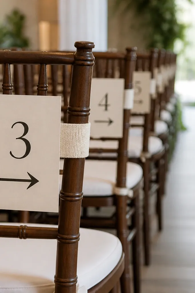
Tape and pins wreck venue fabric fast, and guests notice. I switched to Velcro straps for aisle markers so the signs go up cleanly and come down without ripping. The signs are printed on thick cardstock, then mounted to a thin backing board so they stay flat. Use cream paper with black text or deep green text for a strong contrast against chair upholstery. This method works whether you're styling a church aisle, a backyard ceremony with folding chairs, or a gallery with delicate seating.
Start by cutting your sign size to about 4 x 6 inches, then mount the cardstock to thin foam board so the edges don't curl. Punch two holes near the top corners and attach the back to a short strip of Velcro loop tape on the chair. Wrap the matching hook tape strap around the chair back and press until it holds. Finally, add a small arrow symbol printed at the bottom so the sign points the direction without needing extra hardware.
Try thisBring a small strip of matching fabric to test on one chair before you hang all of them.
Common mistakeAvoid duct tape on chair backs - it leaves residue and makes you the person everyone blames.
7. Seating chart that reads like a map, not a poster
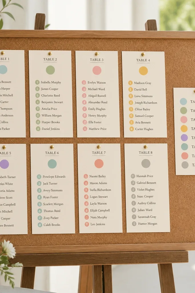
Seating charts get ignored when they're dense blocks of text. Mine works because it has a map-like layout: numbered tables, grouped names, and color dots that guide the eyes in seconds. I use a corkboard or foam board base, then attach small printed name labels with removable adhesive squares. Names are grouped by table number, and each table number has a colored circle sticker so people can find their group even if they're nervous. This style helps both men and women because guests scan quickly and don't have to read tiny paragraphs.
Start by choosing a board size that matches your guest count - for 80 guests, I use around 24 x 36 inches. Print table headers in a larger font and color-code each table with a single dot color. Then create individual name labels that are big enough to read at arm's length, and mount them with removable adhesive squares. Add a small legend with your color key and a clear "Tables 1-10 are on this side" note so people don't circle the board.
Try thisDo one test print and measure a label in your real lighting. If you can't read it from 6 feet, the font is too small.
Common mistakeAvoid one huge list with no grouping - it forces guests to hunt and creates lines at the board.
8. Ceremony program fans built from scored cardstock
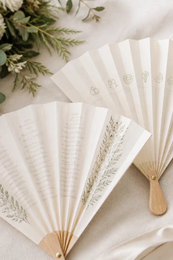
Programs look cleaner when they fold the same way every time. I build fan-style programs using scored cardstock and accordion folds, so the layout stays readable and the paper doesn't tear at the crease. Use 110 lb cover stock or 200 gsm matte paper so the score lines hold. This style is great for weddings where the ceremony is held in warm weather or with a breeze, because guests actually use the fan. It also looks flattering in photos because the shapes create repeating lines across the aisle.
Start by choosing your final folded size, like 5 x 7 inches folded flat, then calculate the accordion panels (I use 6-8 panels). Print the text panel-by-panel so the schedule reads when the fan opens. Score each fold line with a scoring tool before assembling, then fold along the scores for sharp edges. Finally, add a small belly band around the closed fan using a strip of ribbon so it stays neat in hands.
Try thisTest-fold 1 sample and adjust panel widths before you print the full batch.
Common mistakeAvoid skipping the scoring step - unscored folds crack and look sloppy after the first few uses.
9. Napkin rings made from leather scraps and snap closures
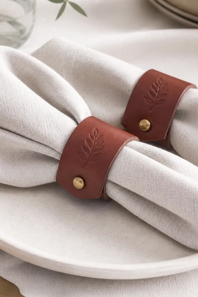
Fabric napkin rings look romantic, but they stretch, and paper rings fall apart fast. Leather scrap rings are sturdy and they photograph well because the material has texture. I cut strips to about 1 inch wide, wrap into a tight circle, and use small snaps so the ring opens and closes without fighting knots. This looks good on both linen and cotton napkins, especially in neutral palettes like ivory, oatmeal, and soft gray. For men's seating tables, the darker leather reads masculine and doesn't feel too "girly."
Start with vegetable-tanned leather scraps and cut strips long enough for a snug fit around your napkin thickness. Wrap the strip around the napkin as a guide and mark where the snap will land. Punch holes, attach small snaps, then stamp or paint a simple monogram on the front panel. Finish by burnishing the edges with a damp cloth and letting them dry flat before you set them on the table.
Try thisIf you don't have snap tools, use rivet-style closures from a craft kit and keep the ring opening at the back so it hides hardware.
Common mistakeAvoid using thin faux leather - it creases and cracks by the end of the night.
10. Table favors that don't melt - candy in heat-safe cellophane
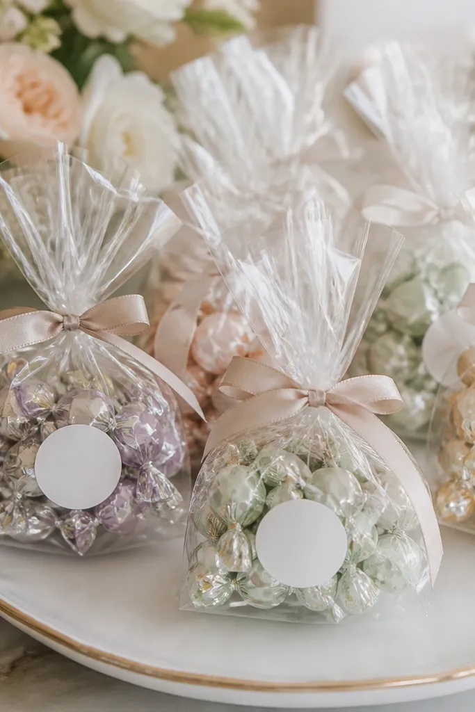
Food favors look great until the venue warms up and cellophane turns cloudy or sticky. I switched to heat-safe cellophane and sealed bags with a twist tie plus a tiny label. Use individually wrapped candies so there's less risk if one bag gets handled a lot. Pick candy colors that match your palette but keep one neutral accent - like white wrappers or clear bags - so it doesn't look childish. This works for guests of any age because the favor is practical and doesn't require assembly at the table.
Start by buying heat-safe cellophane bags in the right size so the candy sits flat without lots of empty air. Fill each bag with the same number of candies, then twist the top and secure with a thin twist tie. Add a label sticker on the front with the flavor name or a short note, and keep the font large enough to read without squinting. Tie ribbon over the twist tie so it looks decorative, then store the favors in a cool bin until the table set-up.
Try thisDo one test bag and leave it in your car for 30 minutes. If it fogs, you need a different bag type.
Common mistakeAvoid cheap thin cellophane - it wrinkles and looks greasy under indoor lights.
11. Unity candle set with label sleeves for easy transport
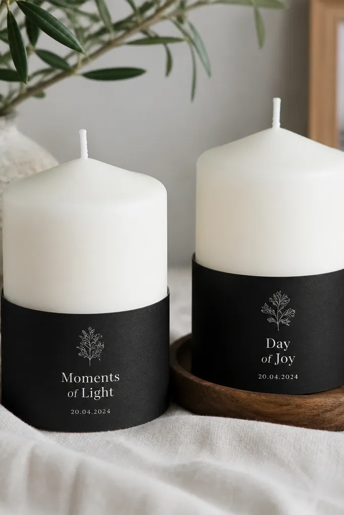
Custom candles are a crowd-pleaser, but the DIY part often ruins the look in transport. I use label sleeves so the printed design stays crisp and you can remove it for packing. The candles are white pillar candles with a matte finish so the label doesn't slide. The sleeve has a snug fit around the base and uses a low-tack adhesive so it doesn't leave residue. This works for both men and women because the design is clean and the candle shape doesn't fight the typography.
Start with pillar candles that are the same diameter so the sleeve sizes match. Print your label sleeve design at the correct circumference and height, then cut it to wrap cleanly with a small overlap. Wrap the sleeve around the base and press along the seam so it sits flat. Pack candles upright in a box with tissue between them, then put the sleeves on the day before the wedding so you don't risk scuffs from moving.
Try thisUse matte black ink or toner for labels. Glossy text reflects candlelight and can look washed out.
Common mistakeAvoid applying ink directly to the candle with markers - it bleeds and smears when the candle warms.
12. Wedding backdrop corners with removable grommet clips
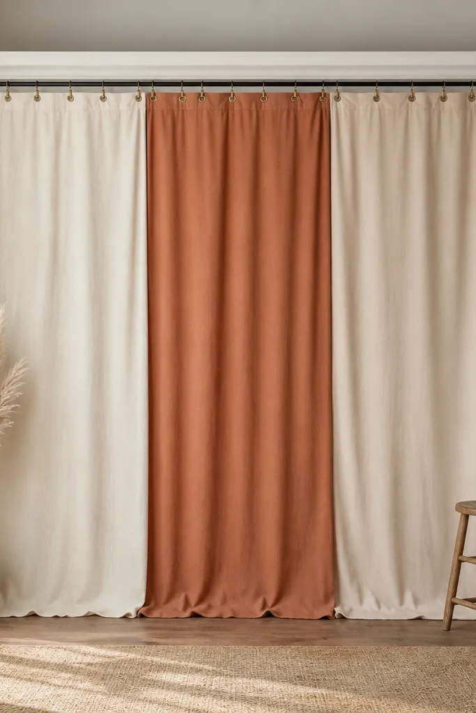
Backdrops look messy when you attach fabric with random knots. The clean version uses removable clips at the corners and evenly spaced attachment points. I use grommet clips on a tension rod or a simple overhead line so the fabric hangs with consistent tension and doesn't sag in the center. Choose a fabric with drape - like cotton voile or a medium-weight linen blend - so it falls in soft folds, not stiff pleats. This looks good for photos because the edges frame the couple without hiding them in wrinkled texture.
Start by cutting fabric panels so each panel has a little overlap at the center seam, like 1-2 inches. Hem the top edge if you can, then install grommets or use clip-friendly reinforced tape strips. Attach the first and last clip at the corners, pull the fabric taut, then add the middle clips so the height stays level. Finally, hide the rod with a narrow fabric valance or ribbon strip so the top line looks intentional in photos.
Try thisMark clip positions on the rod with painter's tape before you hang fabric. It keeps the spacing even.
Common mistakeAvoid tying fabric to a string at random heights - it creates a wavy top edge that shows up in every photo.
13. Bar sign lettering using vinyl over printed paper templates
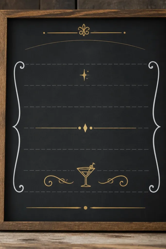
Hand-lettering on big signs is where DIY often falls apart under real lighting. I stopped trying to freehand the words and started using vinyl on top of printed paper templates as my guide. The background can be chalkboard paint or printed faux chalk texture, but the lettering itself is vinyl so it stays sharp. I use matte white vinyl for the main words and a smaller gold vinyl for the menu categories. This combo reads cleanly and looks classy for both men's and women's tables, especially when your bar setup is busy with bottles.
Start by choosing sign size - I do 18 x 24 inches for bars so people can read from 10 feet. Create a template in your design software or on paper with the exact text line breaks you want, then print and tape it to the sign surface. Apply vinyl lettering using transfer tape, burnish each letter with a plastic applicator, and peel carefully. After removing transfer tape, add a thin border line in a contrasting color using a vinyl strip so the edges look framed.
Try thisUse a small piece of painter's tape as a hinge when positioning the vinyl. It prevents one-sided placement mistakes.
Common mistakeAvoid using vinyl directly on dusty backgrounds - it lifts at the corners and looks cheap.
14. Welcome sign with layered acrylic and removable standoff mounts
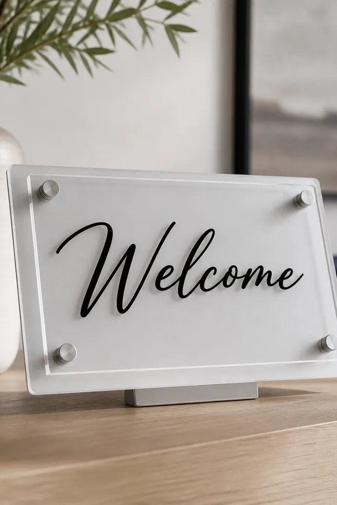
Flat paper welcome signs get wrinkled and fade faster than you expect, especially outdoors. Layered acrylic looks cleaner and lasts longer because it doesn't absorb moisture. The standoff mounts create a small gap that makes the text look dimensional, and it reads as intentional instead of "sticker on plastic." I use frosted acrylic for the base and clear acrylic for accents, with matte vinyl lettering on top. It looks great for couples who want modern decor without going full neon.
Start by cutting or ordering acrylic panels in consistent sizes - like 12 x 18 inches base with a 1-inch smaller top layer. Clean the acrylic with isopropyl alcohol so vinyl sticks without bubbles. Apply matte vinyl lettering to the top layer, then drill or mount standoffs at four corners so the gap stays even. Mount the base on a stand, then attach the top layer using the standoffs. Add an edge strip of matching vinyl to cover any rough acrylic cut lines.
Try thisDo a test piece with vinyl on one scrap acrylic panel. If it won't adhere, clean again and reapply.
Common mistakeAvoid mounting vinyl on unclean acrylic - fingerprints show up as cloudy spots immediately.
15. Painted place cards on wood slices with a wax resist edge
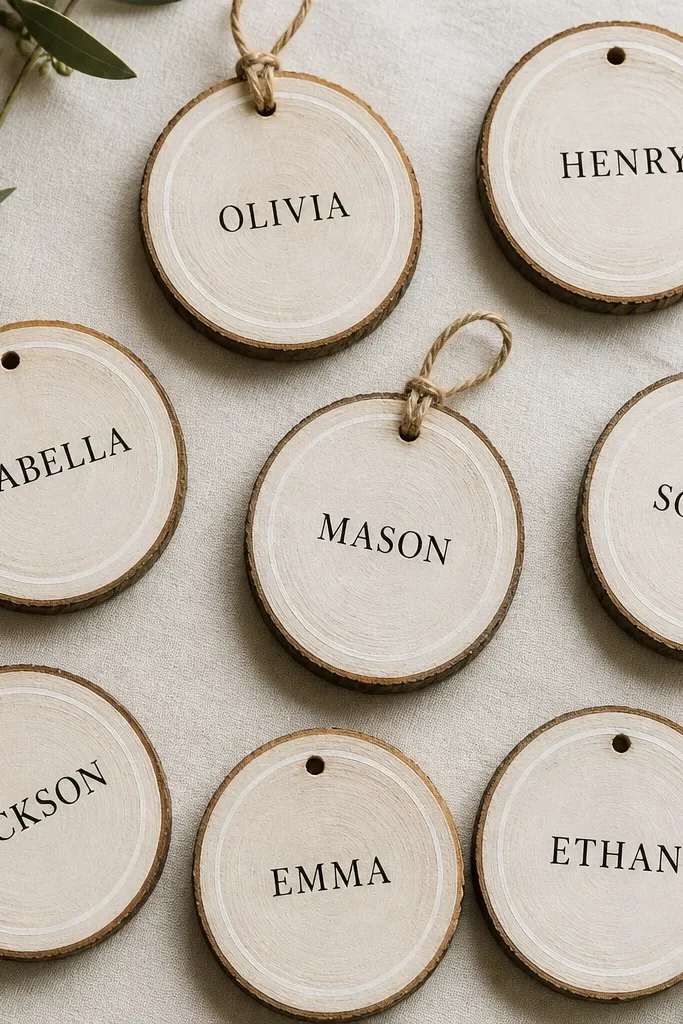
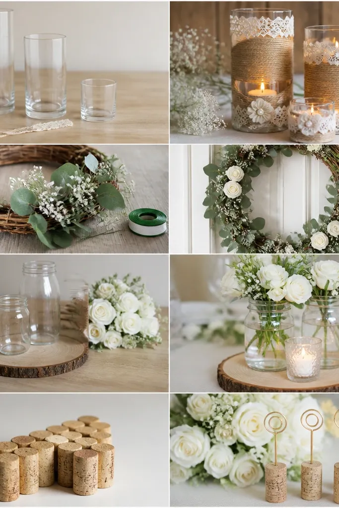
I stopped using paper place cards for my own DIY weddings after I realized they look better in photos when they have texture you can actually see. Wood slices do that instantly - the grain catches light, and the names feel intentional even if the font is simple. The wax-resist edge is the part that makes them look finished instead of handmade-in-a-rush. When you paint inside a wax ring, you get a clean boundary that hides tiny slips and makes each card look like it belongs at the same table.
First, seal the wood slices so the paint does not soak in and blur. I use matte Mod Podge or a clear acrylic spray, then let it dry until it feels dry to the touch but still slightly tacky around the edges. Second, draw a thin ring around the rim with a white wax crayon or candle wax, then paint the center with acrylic craft paint. After the paint dries, wipe off the wax with a dry paper towel - the edge stays crisp. Third, punch a small hole near the top with a 2mm hand punch, then tie a short loop of twine so the card can be handled without cracking. Write names with a fine-tip paint marker or a small brush and black acrylic, keeping the letters about 10-12 mm tall so they read from across a table.
Try thisUse one font size and one spacing rule across every card - I measure the center with a ruler and keep names aligned to the same baseline. If the wood slice is uneven, sand just the high spots before sealing so the paint stays smooth.
Common mistakeSkip painting directly on raw wood - it soaks unevenly and your names end up fuzzy at the edges.