1. Warm-white fairy lights behind the head table
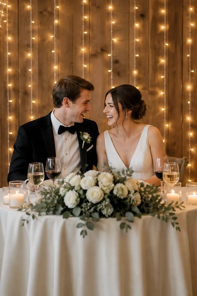
I used this on my own head table when our venue had ugly wall texture. The warm-white strands sit behind the setup and give a gentle halo around faces, which makes photos look smoother and less shadowy under the table. It flatters people with cooler skin tones too because the light warms everything up instead of making blush look washed. If you're wearing a satin dress or a crisp shirt, the light catches that sheen in small highlights instead of big glare. Keep the strand density moderate - too many bulbs makes it look like a carnival photo booth.
Start by measuring the space behind your head table so the lights cover the height of your bouquet and signage, not the entire wall. Mount the lights to a lightweight backing (a foam board panel, a narrow wood slat frame, or even a curtain rod) so you can hang it 6-10 inches behind the chairs. Drape the strand in a loose "S" pattern rather than a straight line - it spreads the glow. Finally, hide the battery pack or extension cord behind the table skirt and tape the cord flat to the wall so it does not lift when people walk by.
Try thisTurn off the overhead lights for a quick test photo at the same time of day you'll shoot. If skin looks too orange, swap to slightly cooler warm-white; if it looks gray, you need warmer.
Common mistakeDon't string lights directly onto a textured wall without control - the bulbs reflect weirdly and create hot spots.
2. Hanging lanterns with warm LED bulbs over the ceremony aisle
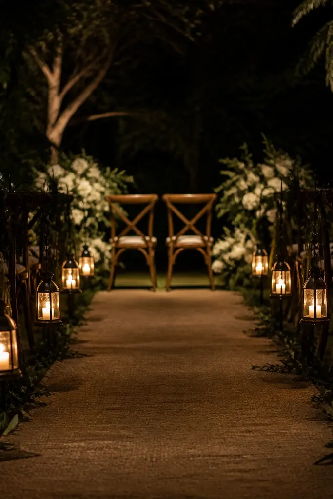
Lanterns are the easiest way I've found to make a small ceremony feel intentional, because they give light from above and slightly forward. They flatter everyone because they reduce side shadows - you don't get that one cheek lit and the other swallowed by darkness. I've used this look with both dark wood benches and simple folding chairs; the lantern glow makes the whole setup feel cohesive. If you have a boho vibe, choose lanterns with frosted glass or paper shades so the light diffuses instead of looking like bare bulbs. For more classic weddings, use clean metal lanterns in matte black or brushed gold.
Start by placing your anchors: ceiling hooks, a pergola beam, or two sturdy stands at the aisle ends. Hang lanterns at a height where the bottom sits around 6-7 feet from the ground, then adjust after you stand in the front row. Space them about 4-6 feet apart so the aisle has a continuous glow without looking cluttered. Then swap in warm LED bulbs and dim the room lights if you can - lanterns look best when they are the brightest thing in the frame.
Try thisUse frosted or fabric shades if you want flattering skin; clear glass makes faces look harsher in photos.
Common mistakeAvoid hanging lanterns too low - people will bump them and their reflections will show in glasses.
3. Tabletop LED candle clusters in hurricane vases
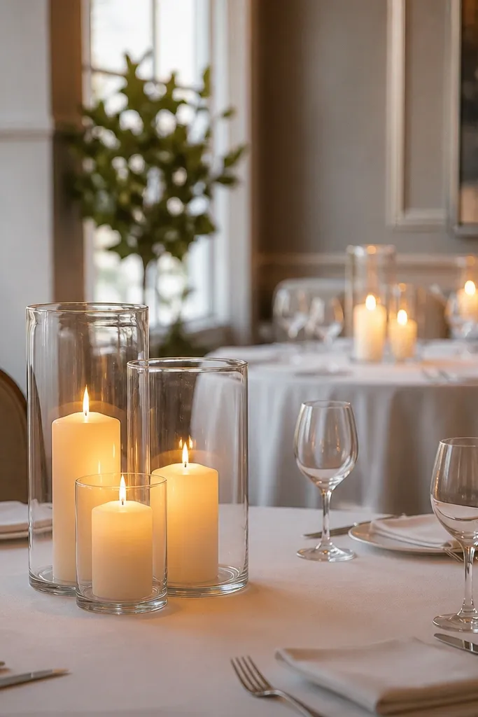
I switched from regular candles to LED flameless candles in hurricane vases because I wanted the candle look without the constant wick management. The glass vases create a soft, contained glow that looks expensive in close-up photos. This setup flatters hands and jewelry because the light reflects in small, warm highlights instead of burning out the frame. It also works across skin tones - warm light makes olive, fair, and medium tones all look healthy. If you have a lot of metal decor (cutlery, gold frames, hairpins), the glass helps tie it together.
Start by choosing candles that are the right height for your centerpieces, usually 3-5 inches for small tables and 5-7 inches if you have tall glassware. Then group three to five candles per vase cluster - mix heights but keep the total spread under 10-12 inches so guests don't feel blocked. Place the cluster in the center of the table, not at the edge, and keep it at least 2 feet away from any place cards so the light doesn't shine into eyes. Finally, test one table from the back of the room at night - if it looks dim, add one more cluster rather than turning up brightness.
Try thisPick candles with a warm flame color (around 1800K) and a slow flicker. Fast flicker reads as "cheap" on camera.
Common mistakeDon't put LED candles directly on bare tablecloth - the light looks flat. Glass or a tray adds depth.
4. Uplights at the corners of the photo wall
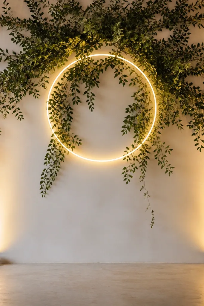
Uplights are how you turn a plain wall into a photo backdrop without building a full set. I used corner uplights because they create depth - the center stays softer while edges glow, so your couple looks separated from the background. This is flattering for everyone because it reduces the "flat phone flash" look and gives you a warmer color temperature. If your backdrop has greenery, uplighting makes the leaves look dimensional instead of flat. It also helps if your venue has off-white walls that otherwise turn gray in photos.
Start by placing two uplights on the floor 2-3 feet away from the backdrop, aimed slightly inward so the light overlaps in the center. Set the beam so it washes the wall, not the floor - tilt until the glow hits about 6-8 feet high. Use warm white and dim to a level where faces look natural when you stand in front of the wall. Finally, hide the uplights with a small basket, a low planter, or a strip of fabric so they don't appear in the frame from behind the photographer's angles.
Try thisTake a test shot on your phone from the exact spot where you'll stand. If the wall is brighter than your face, lower the tilt and dim the lights.
Common mistakeAvoid aiming uplights straight up - it creates bright stripes and makes the wall look uneven.
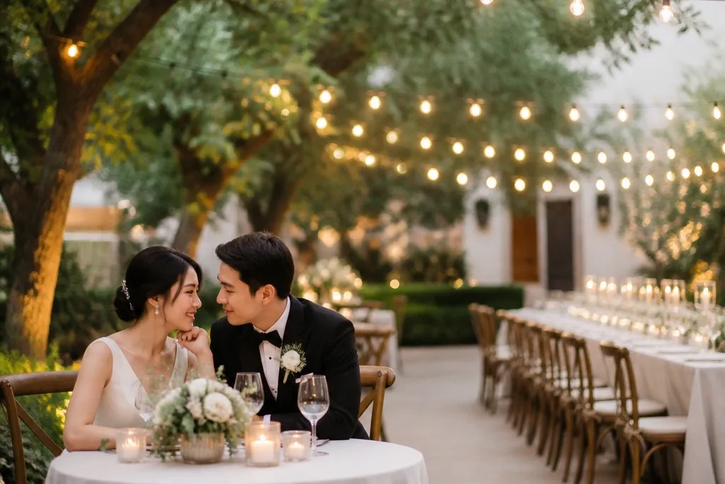
5. Café lights across a backyard patio at two heights
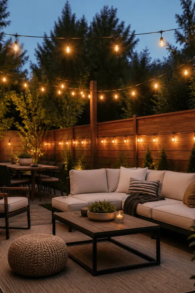
This is the layout I now copy every time I see a backyard wedding that looks "almost right." Running lights at two heights gives you a layered ceiling glow and a secondary edge glow that makes the space feel bigger and calmer. It flatters body photos because it fills shadows under chins and along shoulders. For people wearing black, the warm lights keep skin from looking washed out and stop the outfit from swallowing the face. If your tables are low and close to the ground, the lower strand gives enough light to read menus and signage without turning it into a spotlight.
Start by anchoring the higher strand first - keep it around 9-11 feet high so it doesn't interfere with head height and photo angles. Then run a lower strand at about 6-7 feet along a fence line, railing, or the edge of a pergola. Space bulbs so the gaps are small enough that the light looks continuous, usually 12-18 inches between bulbs on most café-style strings. Finally, route the power cord along the far side of the patio, tape it down with outdoor tape, and keep it away from foot traffic.
Try thisIf you're using dimmable bulbs, set the dimmer so the darkest areas still show table textures. You want "soft room," not "campfire only."
Common mistakeDon't hang only one strand - one-height lighting creates harsh shadows and dark table corners.
6. Light-up menu boards and table numbers with warm illumination
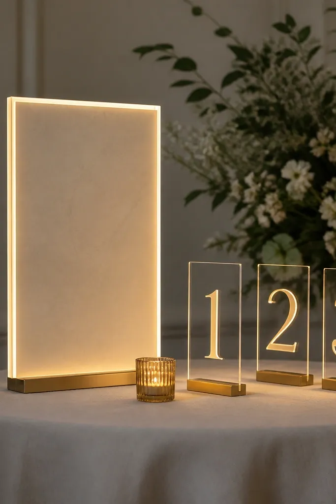
Table numbers and menus look way better when they're lit like signage, not like random lanterns. I did this with warm backlit panels because the text stays readable without blasting guests in the eyes. It's perfect for small weddings because you don't have to cover a whole venue - you just need the places people look. It flatters photos too; the numbers become part of the composition instead of a blurry detail. If your wedding palette is neutral, warm backlighting makes cream and taupe look intentional.
Start by placing your welcome board where people will naturally pause for photos, usually near the entrance or gift table. Mount table numbers so they sit at eye level for guests seated - around 24-30 inches from the ground. Use warm backlighting (again, 2700K-3000K) and keep the brightness moderate so it supports the scene instead of overpowering faces. Then secure the panels with clear command strips or a small base stand, and test readability from 10-15 feet away under the same lighting conditions.
Try thisMatch the sign brightness to your ambient lights - if your ceremony area is dim, keep table numbers slightly brighter so they guide people.
Common mistakeAvoid using bright cool-white LEDs for signage - the text looks harsh and guests squint.
7. Glowing aisle markers with LED rope lights
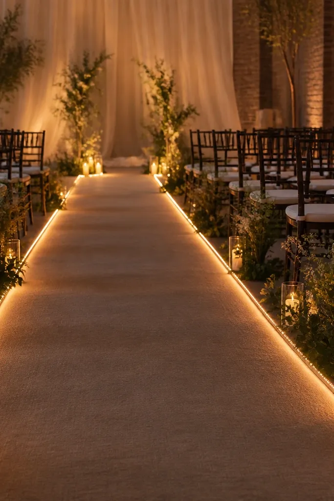
Rope lights are my go-to when the aisle is narrow and you want guidance without adding a ton of decor. The warm line glow helps photos look clean because it frames the path instead of cluttering it. It's also practical in small venues where you don't have room for large floor lamps. Rope lights flatter feet and lower legs in wedding party photos because the glow fills gaps that would otherwise be dark. If you're wearing a long dress with a train, the warm outline helps the fabric show texture in motion.
Start by measuring the aisle edges and choosing rope lights with a warm white setting. Tuck the rope lights into a narrow channel - the edge of a runner rug, a shallow cable track, or even a fold of decorative fabric - so the bulbs don't face straight toward eyes. Lay the rope lights in a smooth line and secure with small clips or tape that sticks to your surface. Finally, check the brightness from the front row and adjust with dimmers or spacing so it looks like a guide, not like an illuminated strip.
Try thisIf your aisle has steps, add one extra segment higher up so people don't miss the change in level.
Common mistakeAvoid letting rope lights face outward - direct bulb view makes the aisle look cheap fast.
8. String lights woven into a sheer curtain backdrop
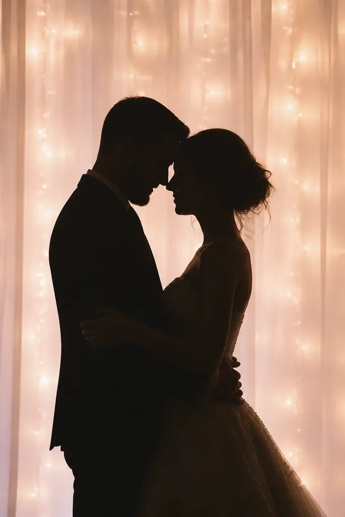
This is a trick I used when my venue had plain walls and no budget for a full backdrop. A sheer curtain spreads light so your photos look soft and flattering instead of "point light" harsh. It works especially well for couples with darker outfits because the curtain glow separates them from the background. For skin tone, the diffusion keeps highlights from blowing out on foreheads and cheeks. If you're doing vows or a first look photo corner, this setup makes it look like you hired a lighting designer.
Start by hanging the sheer curtain on a rod or light stand at least 2-3 feet behind where the couple will stand. Weave warm string lights behind the curtain - pin the bulbs so they sit in the top half and around the center. Leave the curtain slightly loose so the glow spreads, then clip the bottom so it doesn't drag onto the floor. Plug everything in safely with a power strip placed behind the setup, then do a test shot from the camera position to confirm the couple's face is the brightest area.
Try thisUse warm white and avoid super-bright strands. You want glow you can tolerate for 10 minutes of photos without squinting.
Common mistakeDon't place the curtain too close to the wall - you lose the separation glow and it looks flat.
9. Warm LED window candles for indoor receptions
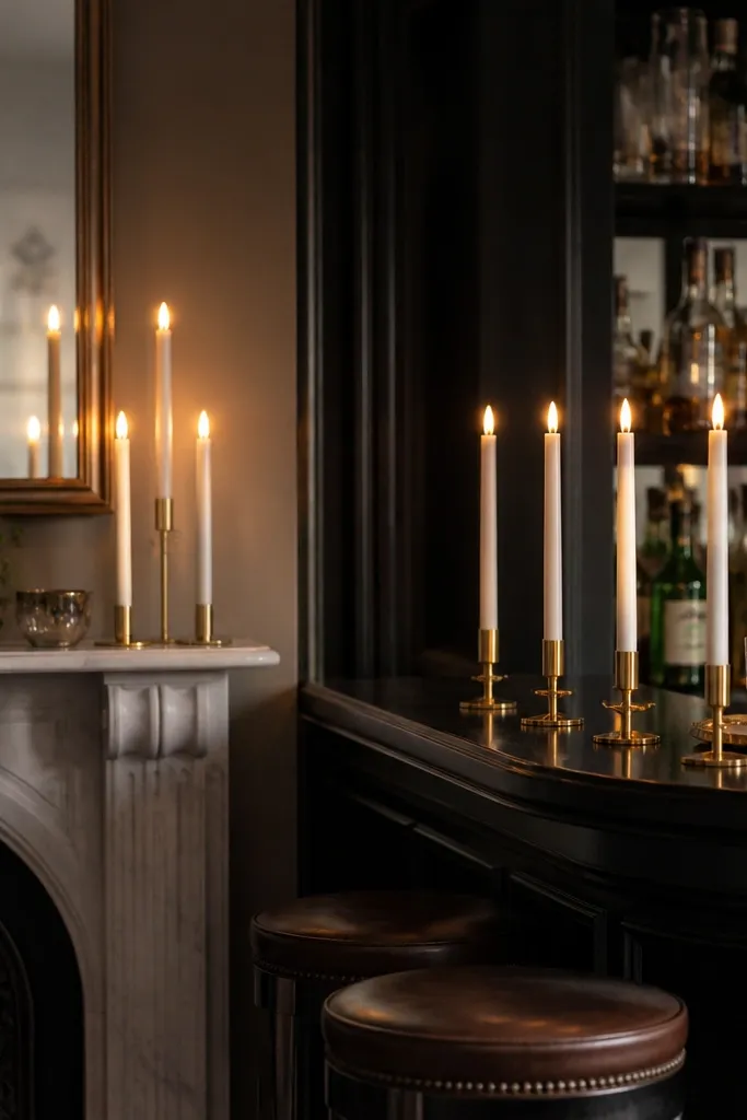
Indoor venues with big windows can look cold fast after sunset. LED window candles solve that by giving a vertical glow that fills the corners without taking up table space. I used them along a bar and mantel and my photos stopped having those dark, empty corner patches. It flatters people because it adds soft light from the side, which reduces under-eye shadows. If your decor is neutral, the warm candle color makes everything feel cohesive. It also works with both modern and traditional styling because the shape is simple.
Start by placing candles where they can catch ambient reflections - near mirrors, glass cloches, or the side of a bar. Keep the candle height consistent so the glow looks intentional, usually 12-18 inches for mantels. Choose warm white or warm "flame" settings and avoid blue-tinted LEDs. Then power them with a nearby outlet or use battery models if cords would cross walkways. Do one test photo at the angle where guests will sit for dinner.
Try thisIf you have framed photos or signage, place candles slightly off-center so the glow creates a gentle gradient instead of a bright block.
Common mistakeAvoid mixing random LED temperatures (one cool strand, one warm candle) - your photos will show color mismatch.
10. Lighted bar cart with under-shelf warm strips
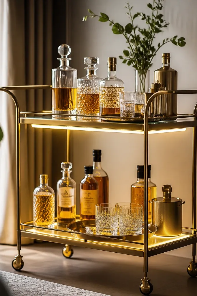
A bar cart is basically a photo magnet, and under-shelf lighting makes it look styled even when you're serving basic drinks. I added warm LED strips under the top shelf so the light skims across bottles instead of shining straight at faces. It flatters hands pouring drinks because it lights knuckles and makes the scene feel warm and cozy. This works best with gold, amber, and clear glass because those surfaces catch warm light. If your cart is black metal, the warm glow makes it look less industrial.
Start by cleaning the underside of the shelf where the strip will stick - dust kills adhesion. Then place the LED strip along the outer edge, leaving a small gap from the center so the glow spreads. Use a warm white setting and set it to a medium brightness so it doesn't blow out label text. Arrange bottles by color group first, then add glassware so it catches the light. Finally, route the wire along the inside of the cart legs and secure it with small clips so it doesn't swing when the cart moves.
Try thisIf you're using clear acrylic signs on the cart, turn the strip brightness down so the sign doesn't glare in photos.
Common mistakeDon't put the strip on the shelf edge facing outward - it creates a hard line of light and looks DIY.
11. Ceiling uplight to soften overhead harshness
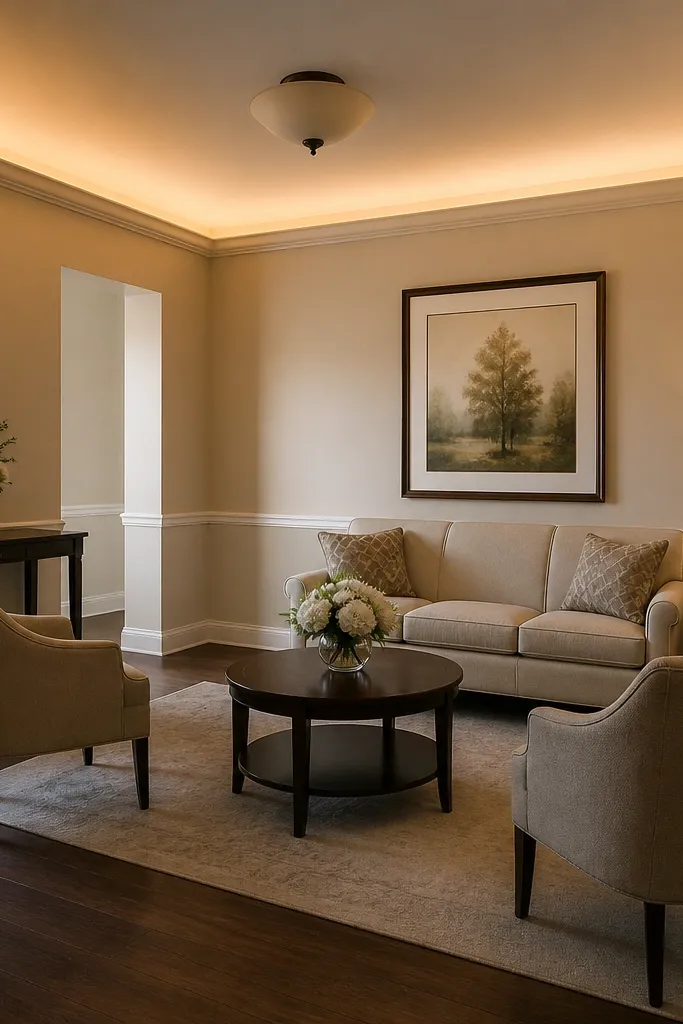
If your venue has ugly overhead lighting, you don't have to fight it with more decor. I used small warm uplights aimed at the ceiling to bounce light back down. That bounce makes skin look more even because it spreads light across faces instead of creating a strong top shadow. It also helps if you're photographing in a restaurant where you can't control the ceiling fixtures. For small weddings, you only need a few uplights - usually one per corner area of your dining zone. The ceiling bounce makes the room feel larger because it removes dark patches.
Start by turning off or dimming the overhead lights during your photo test. Place two to four uplights around the dining area corners at a distance of about 3-6 feet from the wall. Aim them at the ceiling, not the people, and adjust until the ceiling is softly lit but faces still look natural. Use warm white and keep brightness moderate so guests aren't blinded. Then hide the uplights behind chair backs, low florals, or a bar skirt so they don't show in the photographer's wide shots.
Try thisIf the ceiling is very low, use fewer uplights and lower brightness - too much bounce makes the room look flat and yellow.
Common mistakeAvoid pointing uplights directly at table centers - you get glare on glassware and harsh shadows.
12. Garden path glow with mason-jar LED lanterns
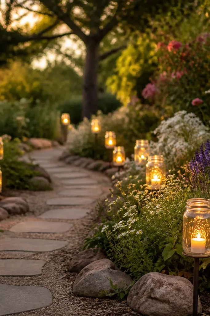
This is the most charming lighting mistake I made - I overcomplicated it with too many items. The fix was simpler: mason-jar LED lanterns placed at consistent spacing along the path. Warm light on small jars looks cozy and reads well in photos without looking like a Halloween set. It flatters because it lights legs and hems from the side, not from above. If you're doing a garden or backyard entrance, this helps guests find the ceremony area without torches or harsh flashlights. It also pairs well with rustic, farmhouse, and even minimal modern decor.
Start by choosing jars with frosted or lightly opaque glass so the LEDs diffuse. Place jars on low stakes, stepping stones, or a narrow runner edge, keeping them 12-18 inches apart so the light reads as a line. Use warm LED tea lights and set them to a slow flicker if available. Then run a single power cord to the nearest outlet and plug in battery packs only where you need total freedom. Do a walk-through at night and adjust spacing if the path looks dim in the middle.
Try thisPut one jar closer to the entrance than you think. Guests arrive looking down at their phones and need the first cue immediately.
Common mistakeDon't mix jar sizes randomly - the path looks uneven and photos show bright-dark-bright gaps.
13. Backlit welcome sign with warm LED strip
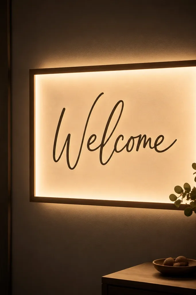
Your welcome area gets photographed more than you think, especially in small weddings where guests linger. I added a warm LED strip behind a framed welcome sign so it glows evenly instead of relying on overhead room lights. The advantage is readability and photo consistency - the text stays crisp and doesn't cast hard shadows. Warm lighting keeps the sign color from shifting, which matters if your typography is black, brown, or deep green. If you have a neutral tablecloth and simple florals, the backlit sign ties everything together without adding clutter.
Start by choosing a sign material that doesn't warp - acrylic or a stiff foam backing works best. Mount the LED strip behind the sign, keeping it centered and away from the edges so the glow spreads. Use warm white and test brightness by placing the sign where guests will stand, usually 3-6 feet away. Then secure the frame so it cannot tilt, and hide the battery pack or plug behind the sign stand. Finish by placing a small tray or riser under the frame so it stays stable and doesn't wobble during the rush of arrivals.
Try thisIf your sign has fine lines or thin fonts, keep the LED brightness lower and increase distance from the strip for a cleaner look.
Common mistakeAvoid cheap LED strips with visible hotspots - they create bright bars behind the letters.
14. Warm string light canopy above the dance floor
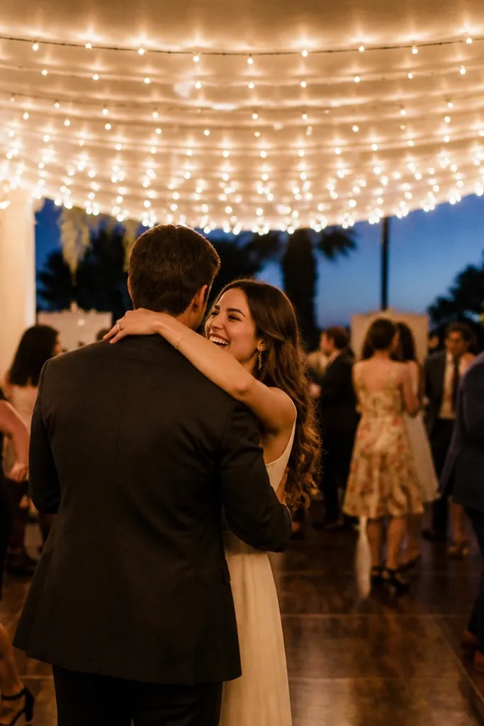
A canopy makes a small dance floor feel like a destination, and it fixes the "we're dancing in a dark room" problem. I used warm string lights above the dance area because it gives even overhead glow without the harsh look of spotlights. It flatters faces because it fills shadows from above and reduces the under-chin darkness. This also helps with video - warm lights make skin look consistent across frames, and it reduces the flicker you get from some cheaper LEDs. If you have a compact reception, this is how you make it feel designed.
Start by finding two solid anchor points above the dance floor, like balcony rails, pergola beams, or ceiling hooks. Stretch the string lights so they form a gentle curve, not a straight taut line - the curve spreads light and looks more natural. Hang the lights about 7-8 feet high so guests don't feel it overhead but their faces still catch the glow. Choose warm white and a strand with steady output, not chattery color-changing modes. Hide the power source behind a speaker stand or under a side table, and tape down any cable that crosses the floor.
Try thisTurn off any colored party lights for one hour and let the warm canopy do the work. Your photos will look calmer and more flattering.
Common mistakeDon't use color-changing lights as your main dance-floor light - skin tones shift and faces look inconsistent.
15. Lanterns on the bar and dessert table for a matching glow
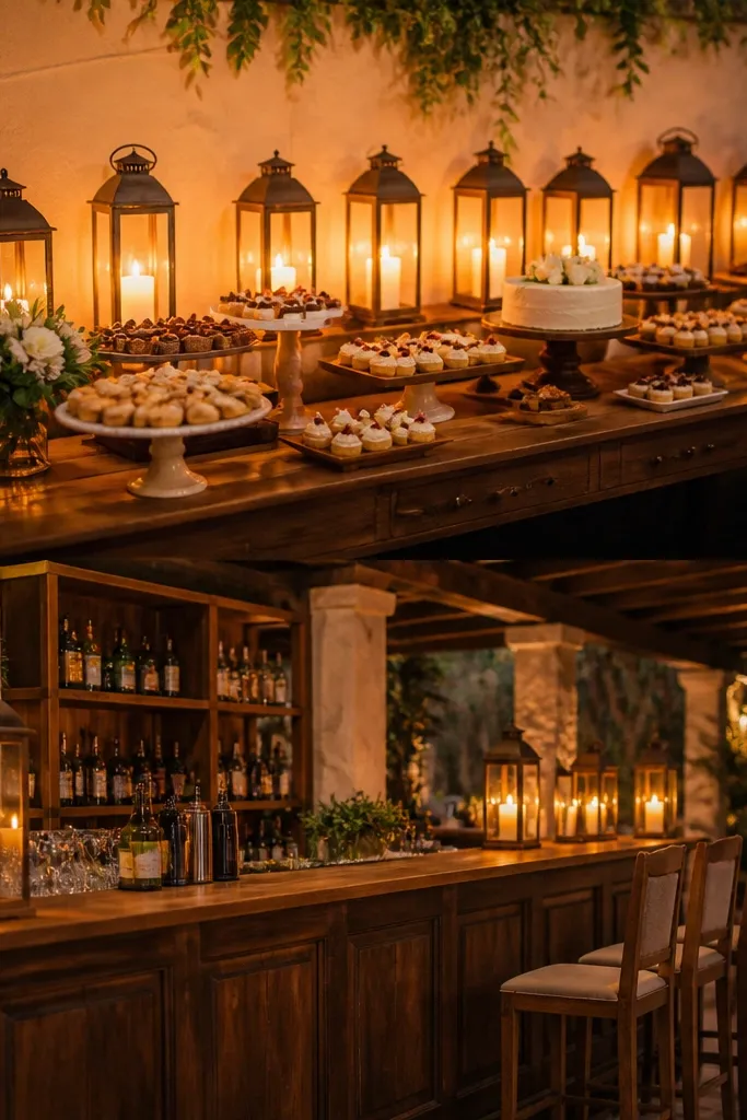
When your bar and dessert tables don't match lighting, they look like two different events. I solved it by using the same warm lantern style on both tables so the glow feels like one continuous design. Lanterns are also forgiving with different table heights because the light sits in a similar visual "frame." This flatters food photography too - cake frosting and chocolate highlights look warm instead of gray. If your dessert table has cake stands, the lantern glow makes the glass and metal feel intentional rather than random. It's small wedding magic without the complexity.
Start by choosing one lantern size and one warm LED bulb type for consistency. Place lanterns along the back edge of each table so the light faces toward the center and doesn't blast guests sitting nearby. Use a spacing of about 10-16 inches between lanterns depending on your table length, then add one taller lantern at the center for height variation. Keep the lanterns slightly behind the dessert plates so guests can still move comfortably. Finally, route the power cord behind the tables and tape it along the underside or back rail so it doesn't cross the front.
Try thisMatch lantern color to your metal decor - matte black lanterns with black trays, brushed gold lanterns with gold frames.
Common mistakeAvoid mixing lanterns with different warm levels - it makes the tables look mismatched even if the decor is the same.