1. Vintage-Look Table Numbers with Foam Board + Gold Rub-On
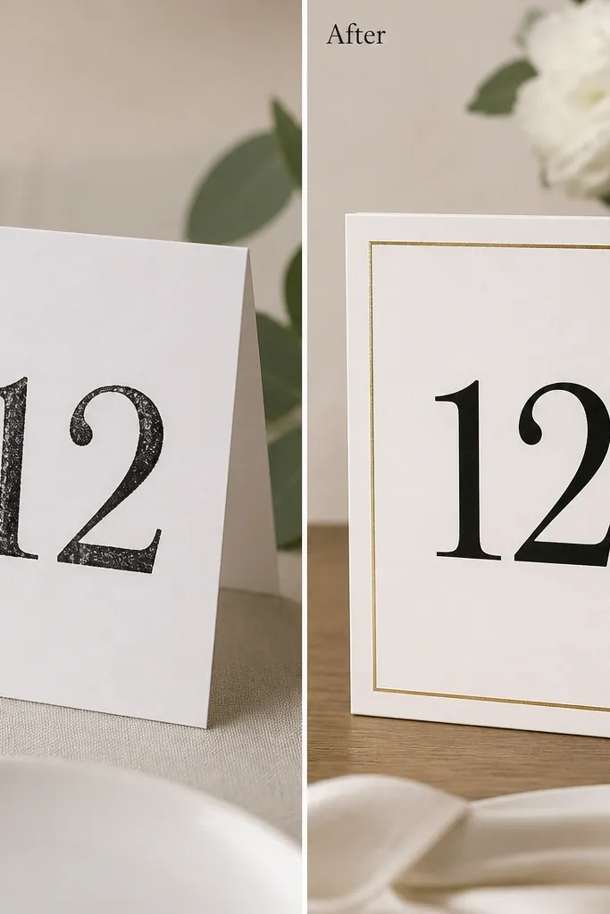
This one fixes the classic problem where table numbers look flimsy on a reception table. I start with thick foam board so the sign has weight and doesn't curl when the room is humid. The after version uses matte black numbers for readability and a gold rub-on border that catches light without looking like messy paint. It looks best against soft neutrals - cream tablecloths, light wood, and ivory linens - and it photographs cleanly in both warm and cool lighting.
Start by cutting foam board to your final size (I use 5x7 inches for most tables) and rounding the corners with a coin or corner punch. Print or hand-letter your numbers in matte black, then seal the ink with a clear matte spray so it doesn't smear when people touch it. Apply gold rub-on transfer to the border last, then press with steady pressure using a clean brayer or the back of a spoon. Mount the finished sign on a second layer of foam board if you want extra thickness, and place it in a small stand or clamp holder that grips the edges.
Try thisDo a quick "camera test" by holding the sign at chest height near a window. If the numbers read from 10 feet away, you're set.
Common mistakeAvoid thin cardstock - it warps and makes the whole table look like a last-minute classroom project.
2. Painted Glass Votives with Masked Ombre Rim
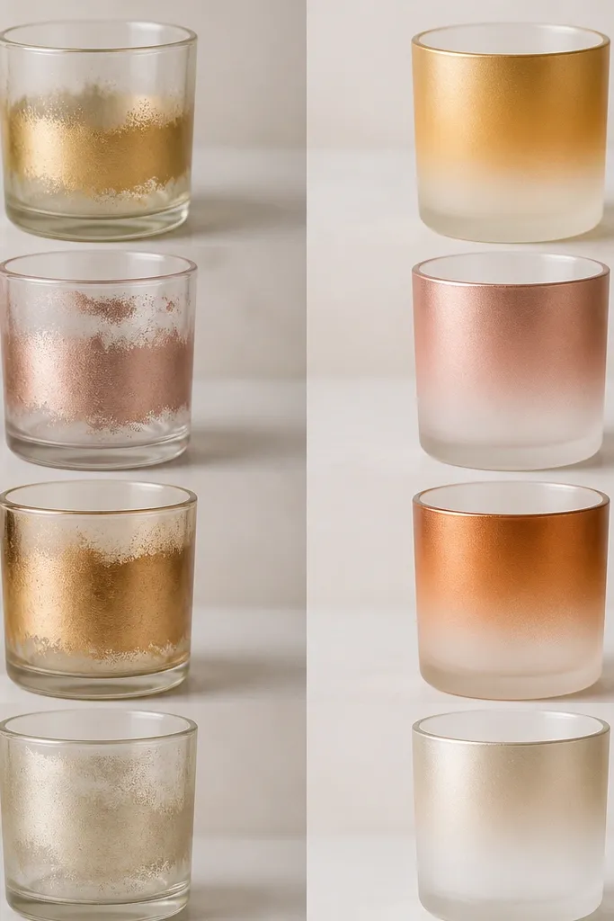
Glass votives look expensive when the paint is even and the rim line is crisp. For the after version, I use frosted spray paint only on the lower half, then mask a straight band so the transition looks intentional. The ombre rim reads beautifully under candlelight because the gradient reflects tiny highlights instead of one flat tone. This works with almost any wedding palette - I've done it in champagne-gold, dusty rose, and deep sage - but it especially flatters warm venues with wood beams.
Clean each glass with rubbing alcohol, then dry it completely so the spray grabs. Mask the top rim with painter's tape, making sure the tape edge is smooth - press it down firmly and run a fingernail along the seam. Spray in light passes from the side, starting lower and moving up so you build the ombre gradually. Let it dry for at least 30-60 minutes, then remove tape to reveal the crisp line. Finish by adding a small strip of ribbon around the outside if you want a color tie-in with your bouquets.
Try thisUse short bursts and rotate the glass every few passes. It prevents drips and gives that smooth, even coverage.
Common mistakeAvoid heavy, one-coat spraying - it creates runs that look ugly once candles start flickering.
3. Ribbon-Wrapped Ceremony Hangers for Aisle Florals
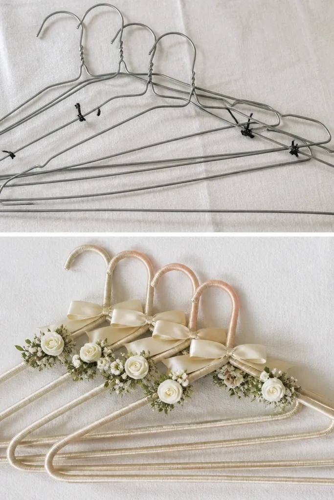
Bare hangers scream "DIY supplies," especially in aisle photos where people can see the hardware. The after version wraps a simple metal hook with satin ribbon so it looks like part of the design, not an attachment. I like 1-inch satin ribbon because it covers well without looking bulky. It's flattering on both men and women's attire in photos because the ribbon adds a soft highlight that matches the dress fabric - and it doesn't fight strong flower colors.
Start by cutting ribbon long enough to wrap the vertical length plus 6 inches for tying. Use a light tack adhesive or a small strip of double-sided tape to lock the ribbon at the top, then wrap tightly downward with no gaps. When you reach the bottom, fold the ribbon edge under and secure with a dab of hot glue. Attach your floral stems with floral tape, then tie a small bow at the top of the hanger so it looks centered. Finally, mist the finished ribbon lightly with fabric-safe spray so it holds shape and doesn't curl.
Try thisChoose ribbon in a shade that matches your bridesmaids' dress undertone, not just the wedding color name. Warm ivory ribbon looks wrong next to cool white bouquets.
Common mistakeAvoid zip ties showing on the front side - cover them or hide them behind the ribbon wrap.
4. Hand-Finished Place Cards with Folded Corner Tabs

Place cards are small, but they sit right where guests focus when they're searching for their name. Flat cards with straight edges look basic; folded corner tabs add structure and a "tailored" feel. I use 110 lb white cardstock with a colored underlayer (dusty blue or muted mauve) so the accent only appears when the corner is lifted. This style looks clean on camera and works for both formal dinners and backyard weddings with rustic tables.
Cut your base cards to 4x6 inches and score a fold at the corner using a ruler and bone folder. Create the accent by cutting a small triangle underlayer in a contrasting color and gluing it behind the corner fold. Print names and table numbers on the base card first, then assemble the corner after so ink stays crisp. Add a tiny dot of glue only at the triangle edge, not across the whole tab. Place cards in a stand or tuck them into a small holder so the corner tab stays visible.
Try thisUse a bone folder - your fold line should feel sharp, not creased and messy.
Common mistakeAvoid thick glue blobs on the tab edge, because they show as bumps in close-up photos.
5. Custom Seating Chart Poster with Black Grommet Edges
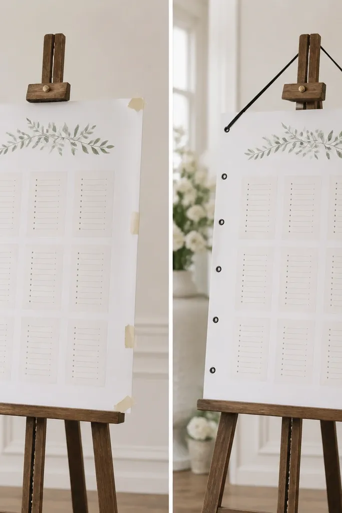
A seating chart often looks like a printout taped to a wall. The after version makes it look like an event sign by adding hardware that looks intentional. Grommets give you a straight hang line and keep the paper from sagging. I like black grommets with a satin ribbon because they read crisp against wood walls and white linens. This also helps if your venue has textured surfaces where tape leaves residue.
Start with a foam board backing cut to your size (I use 24x36 inches for easy reading). Mount your printed seating chart on top with spray adhesive or double-sided mounting tape, smoothing from the center outward. Mark grommet points 2 inches from the top and bottom edges, then punch clean holes with a grommet tool. Install black grommets and thread satin ribbon through to hang the board. Keep your chart text in a high-contrast palette: black ink on off-white, or white ink on charcoal if you're using a dark board.
Try thisHang it at eye level for guests - around 60 inches from the floor to the center of the board.
Common mistakeAvoid scotch tape corners - it looks messy and can peel the print when guests brush past.
6. Realistic Faux-Flower Boutonnieres with Felt Stem Wraps
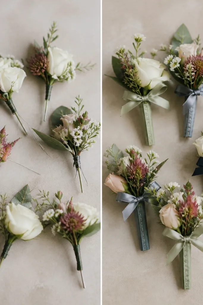
Faux flowers can look cheap if you leave the stems exposed. The after version hides all the wiring with felt wraps, so the boutonniere reads like it came from a florist. I use 3-4 mm felt in a close match to the suit color palette - charcoal, deep green, or dusty blue - because felt gives a soft, non-shiny finish. It photographs well next to suit fabric and skin, especially in daylight where metal clips can reflect.
Cut stems from your faux bundle, leaving about 2-3 inches of stem base. Arrange petals first, then secure with floral wire and wrap the wire tightly using thin floral tape. Cut felt strips long enough to wrap the stem and glue the first edge at the bottom, then roll the felt upward in a smooth spiral. Stitch the seam with matching thread if you want extra polish, or use hot glue sparingly if you're moving fast. Finish by tying a small satin ribbon knot at the base of the flower so it looks centered on the lapel.
Try thisPin a finished boutonniere to a jacket you already own and check how it sits when you move your arm.
Common mistakeAvoid shiny tape on the stem - it reflects and looks like craft supplies.
7. Monogram Napkin Rings with Wood Slice + Heat Transfer
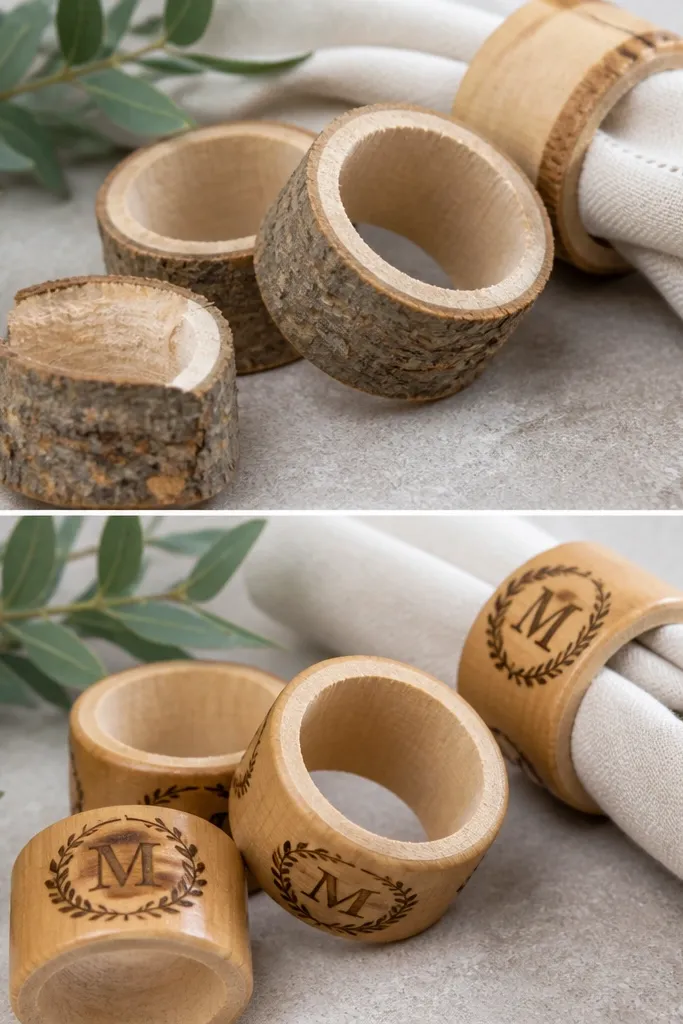
Wood napkin rings look rustic and expensive when the edges are smooth and the monogram looks crisp. The before version fails because rough slices catch light unevenly and the ink fades. For the after, I sand the edges to remove splinters, then use heat transfer vinyl for a sharp monogram. A clear matte coat protects the design from water and keeps the wood from looking dull. This pairs beautifully with linen napkins and any warm-toned table setting.
Sand each wood slice ring lightly with 220 grit paper, then wipe dust off with a dry cloth. Add a light round-over on the outer edge so it feels smooth to the touch. Apply heat transfer vinyl monograms using a heat press or a household iron with parchment paper - press firmly for the full time on the vinyl instructions. Seal with a thin matte clear spray so the ink doesn't rub off. Fit the ring onto napkins and check spacing - aim for rings that sit about 1 inch from the top fold.
Try thisTest the heat transfer on one spare slice first. Wood takes heat differently than fabric.
Common mistakeAvoid leaving raw wood - guests will snag fingers on splinters and photos look harsh.
8. Hanging Photo Display with Clipboard Clips and Color-Matched Tape
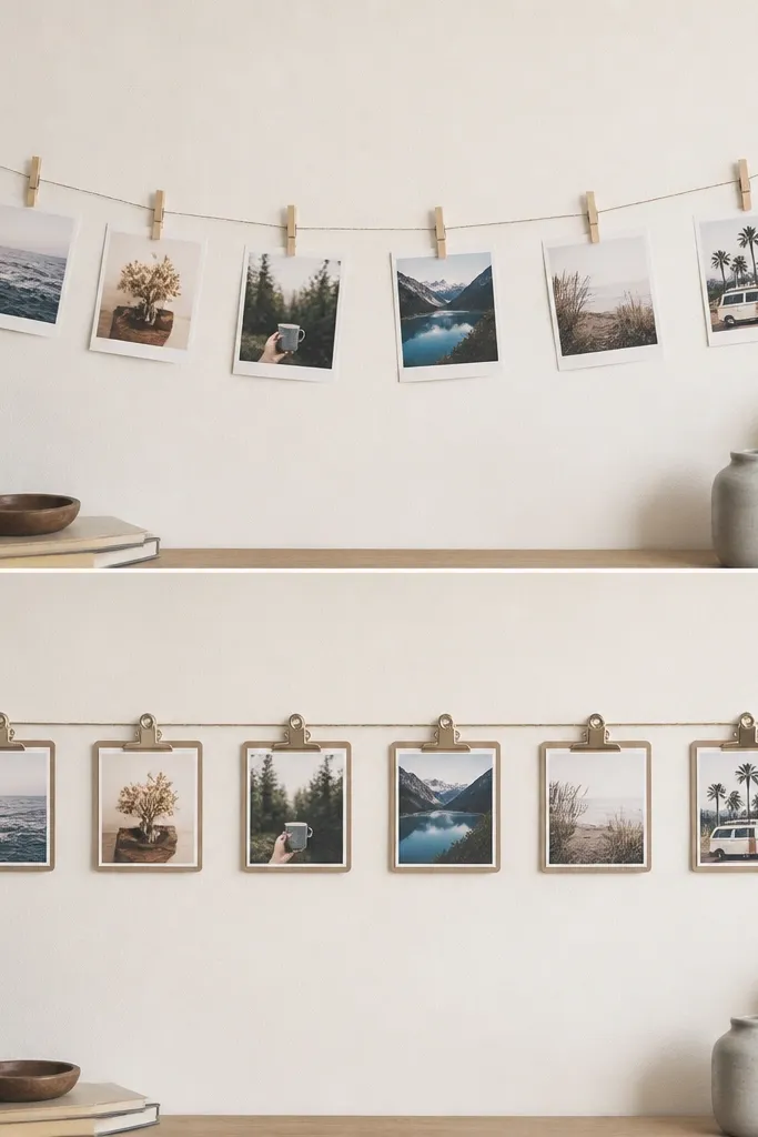
This is the photo display I use when I want it to look designed, not improvised. Clipboards give you a rigid top edge so photos don't curl, and color-matched tape hides the messy edge where paper meets string. In the after version, each photo has the same spacing and the same clip angle, so the whole thing reads as a set. It also works great for wedding weekends because you can swap photos for rehearsal dinner and ceremony.
Choose mini clipboards or small wooden clothespins with a flat top. Paint or stain them lightly if needed, then let them dry fully. Thread a strong twine line and tie it between two points, then mark spacing with a pencil so every clip sits evenly. Use thin strips of washi tape in your wedding colors to frame each photo edge and keep it flat. Clip the photos onto the clipboards and adjust angles so all pictures face the same direction under hanging light.
Try thisMeasure spacing with string - wrap the twine around the display height and mark every 6 inches.
Common mistakeAvoid uneven spacing and mixed clip directions - it makes the whole display look chaotic.
9. Twine + Wax Sealed Favors with Numbered Tag Labels
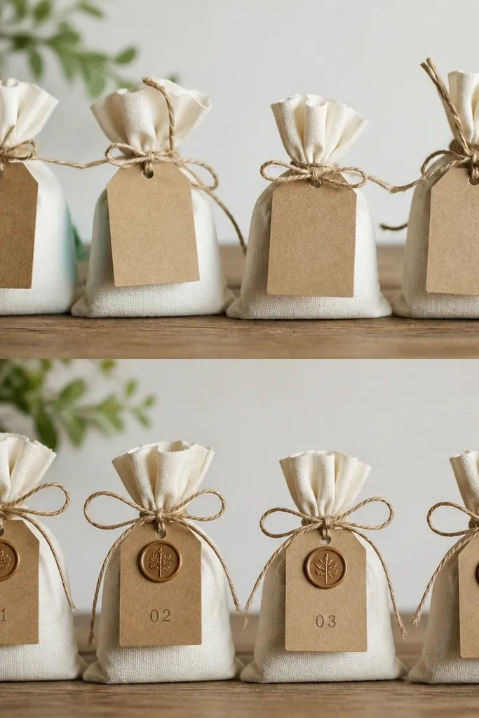
Favor bags look messy when the tie is random and the label is just printed paper. The after version uses wax-sealed Kraft tags so the closure looks like a package, not a craft bag. I like numbered tags (like "F-07") because they match escort card systems and keep things organized for guests. Wax seals also catch warm light and add texture that shows up in close-up photos. This works best with Kraft paper, white organza, or simple cellophane bags.
Start by cutting Kraft tags to about 2x3 inches and punching a small hole near the top. Tie your twine in a consistent bow around the favor bag, then loop the twine through the tag hole. Use a wax seal stamp on a small piece of wax and press it onto the tag near the top edge. If you want the seal to look centered, mark a dot with a pencil first. Write the numbers with a fine black paint pen so the text stays bold after handling.
Try thisLet the wax cool 60 seconds before you touch it. Fast handling smears the stamp shape.
Common mistakeAvoid glitter wax or metallic glue - it looks messy and can transfer onto fingers.
10. Aisle Aerial Confetti Cones with Heat-Sealed Bottoms
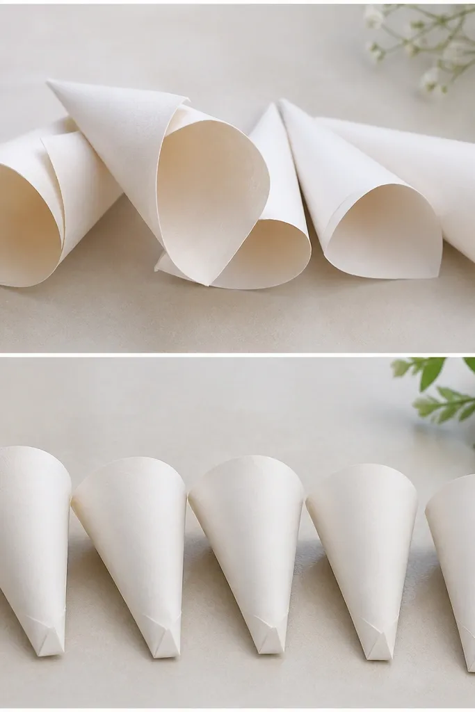
Confetti cones look great when they hold their shape and don't leak paper. The after version uses a heat-sealed bottom so the cone stays crisp in the hand and doesn't unravel when someone squeezes it. I use thick wrapping paper or craft paper in a solid color, then add a small band of ribbon at the top for a finish that matches the party's palette. This looks best with champagne, blush, or pastel paper because the confetti color stays readable.
Cut paper into cone templates - I use a 6-inch wide strip that rolls into about a 3-inch cone. Roll tightly and tape the seam with double-sided tape or a glue dot. Fold the bottom seam inward and heat seal with a low-temp iron through parchment paper, then let it set. Tie a narrow ribbon band around the top so the cone opens upward. Fill with small confetti pieces right before the ceremony so nothing gets crushed.
Try thisPractice one cone in your exact paper - some papers seal better than others.
Common mistakeAvoid thin printer paper cones - they collapse and look flimsy when guests hold them up.
11. Candle Table Numbers with Painted Labels on Acrylic Clips
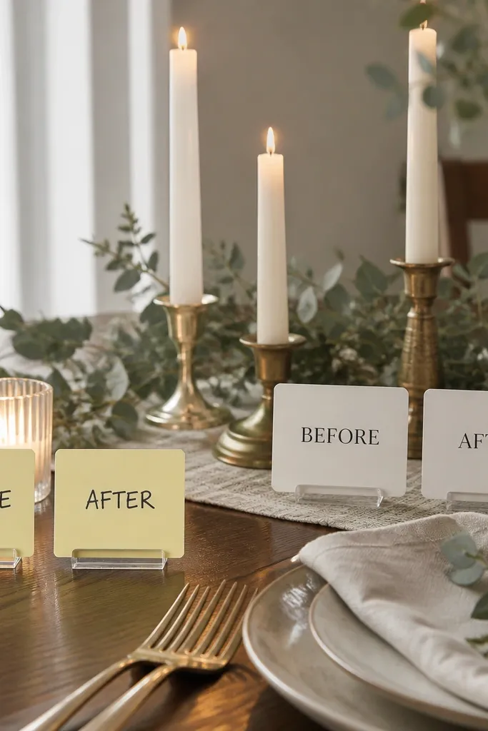
If you're using pillar candles, table numbers can look messy when you stick paper directly to glass. The after version uses small acrylic clip cards with painted labels so the number sits at a consistent height and doesn't smudge. Acrylic also reflects light, so the label stays visible even when the candle flickers. I use white acrylic clips with matte label paint in black or deep navy for readability. It's a strong option for evening weddings where warm candlelight is doing the heavy lifting.
Clean the acrylic clip surface with rubbing alcohol so paint sticks. Paint your numbers on a small card insert (about 2x3 inches) using acrylic paint and a fine brush, then let it dry fully. Seal the painted area with clear matte spray so it won't smear. Clip the label onto the candle holder at the same height for every table. Style the rest of the centerpiece with one matching ribbon or one consistent metallic - like brass - so the labels don't look random.
Try thisKeep the number font simple and bold. Fancy script disappears when the candle light is low.
Common mistakeAvoid sticky notes - they yellow and look like a "temporary fix" in every photo.
12. Custom Wedding Window Signs with Vinyl Letters and Painter's Tape Layout
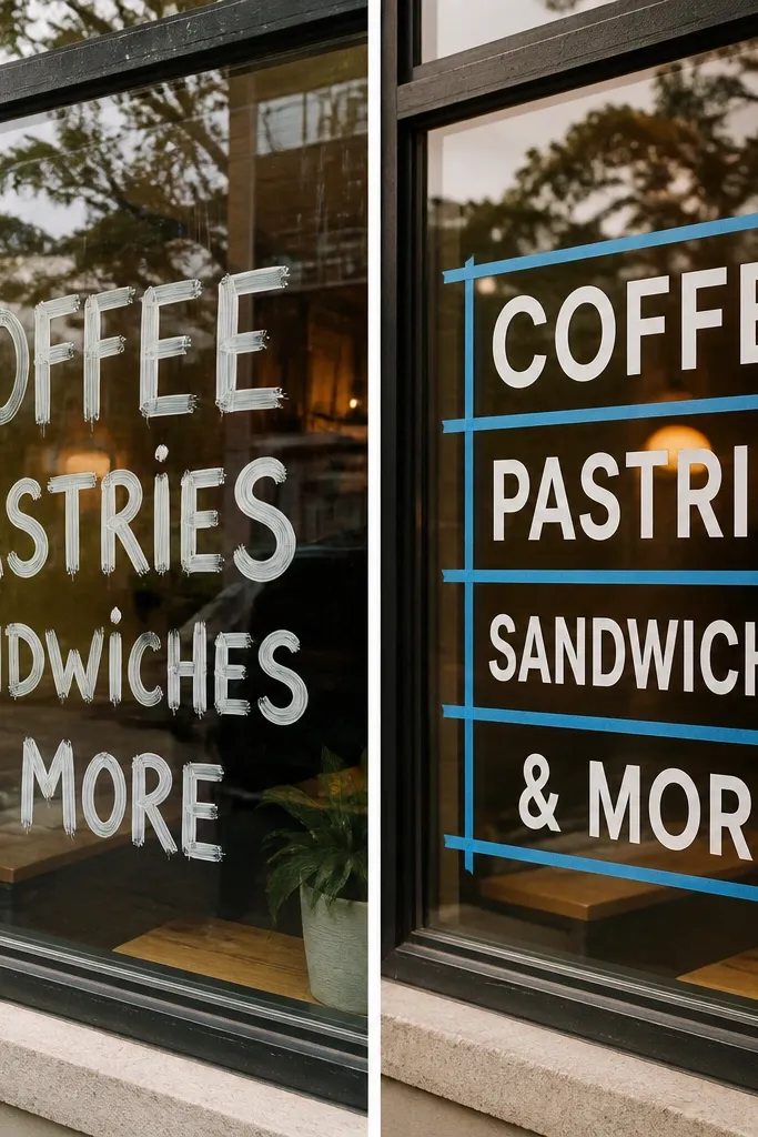
Window signs are one of the fastest ways to make a venue feel intentional, and they look best when the lettering edges are sharp. The after version uses vinyl lettering and painter's tape layout guides so everything stays straight even if your hands shake. I add a subtle border line in a contrasting vinyl color so the sign looks framed, not floating. This works in both indoor venues and outdoor photo corners where guests stand close to the glass.
Clean the window with glass cleaner and dry it completely. Plan your layout by taping a rectangle outline on the glass with painter's tape, keeping the corners aligned with the window frame. Apply vinyl letters inside the rectangle using transfer tape, smoothing each letter with a credit card edge. Press firmly, then remove transfer tape slowly. Add a border line in a second vinyl color if you want a more finished look, then peel away the painter's tape once the vinyl is secure.
Try thisDo a dry run with the vinyl letters still on the backing to check spacing before you transfer.
Common mistakeAvoid marker lettering - it smears and looks uneven once the venue lighting hits.
13. Fabric Flower Hair Pins with Hot Glue-Free Thread Wrap
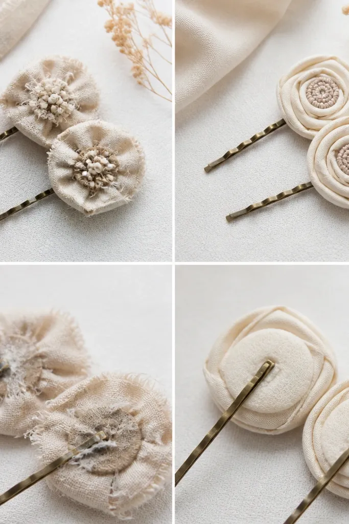
Hair pins are small, but guests notice them in candid photos. Hot glue can leave shiny blobs that look obvious up close, and it can peel if you sweat in summer heat. The after version uses a thread wrap center so the flower stays tight and flat against hair. I use rolled fabric petals in satin or cotton-silk blend, with a small pearl bead in the middle for a soft highlight. This flatters a range of skin tones because the flower color sits close to the face instead of competing with the dress.
Cut fabric into petal shapes, then roll each petal tightly and secure with a stitch along the base. Build the flower by layering petals around a center circle, then stitch through all layers so it holds without glue. Wrap thread around the center several times and knot it on the underside, trimming the thread ends. Attach the flower to a U-shaped hair pin with a needle and thread through the pin holes. Finish by placing the pearl bead with thread so it looks centered and doesn't snag.
Try thisIf you plan to wear these yourself, pin one up on a sweaty day. Thread holds better than glue in humidity.
Common mistakeAvoid glue-heavy centers - they look lumpy and catch flash in close-ups.
14. Chalkboard Welcome Sign with Chalk Marker + Clear Matte Finish
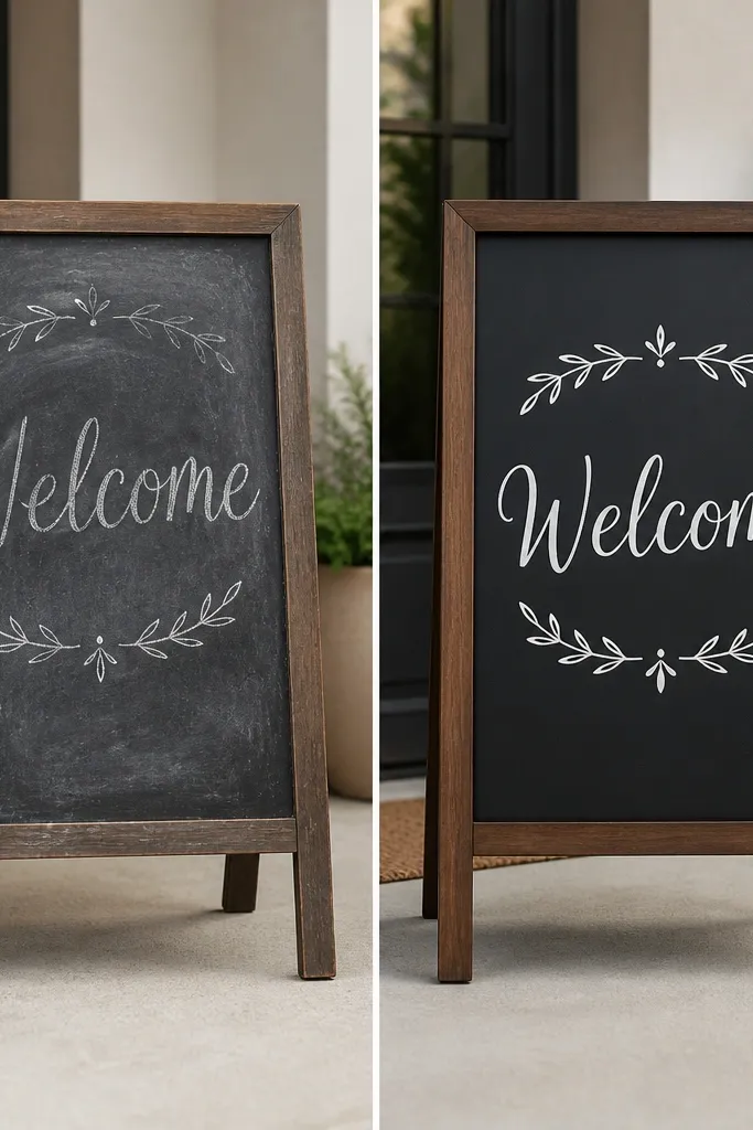
Chalkboard signs often look messy because chalk smears from humidity, and handwriting gets inconsistent across the board. The after version uses chalk marker for consistent thickness, then locks it in with a clear matte spray made for chalk - so your lettering doesn't rub off when people touch the sign. I use a dark green or charcoal base, then write in white and light gray for depth. This looks great at entryways where guests take photos and it keeps your welcome message readable from across the room.
Sand the chalkboard surface lightly if it's glossy, then wipe it clean. Write your welcome text with a chalk marker, starting with the biggest line first so spacing stays balanced. Add small icons or a border using a thinner marker to frame the message. Let the marker dry for at least 20 minutes, then spray a thin coat of clear matte sealant from 12 inches away. Add a second coat only if you see any dull areas after the first dries.
Try thisUse a ruler for your baseline. Even slightly crooked chalk lines make the whole sign look rushed.
Common mistakeAvoid regular clear gloss spray - it creates glare that washes out the letters in photos.
15. Table Runner Fringe with Hemmed Organza Strips
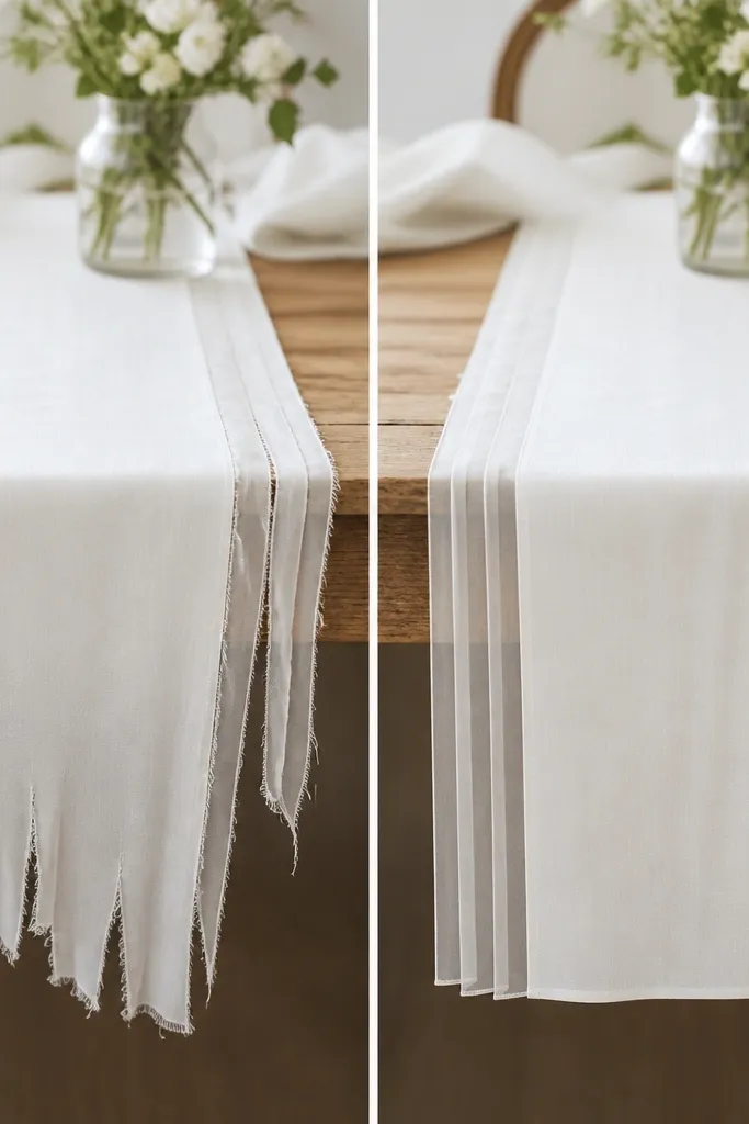
If your table runner has raw edges, it looks unfinished fast. The after version uses organza fringe that falls evenly because every strip is hemmed and weighted with a clean stitch line. I like 10-12 inch wide organza strips in ivory, blush, or dusty blue, layered over a simple linen runner so the fringe shows texture without looking messy. This looks flattering on both long banquet tables and small sweetheart tables because the fringe adds movement without stealing attention from the centerpieces.
Cut organza strips to your runner length, adding 1 inch extra for the hem. Hem the long edge with a straight stitch or a narrow folded hem so the fringe doesn't unravel. Gather the top edge lightly with a running stitch if you want a soft wave, then attach the strip to the runner with small hidden stitches or fabric glue dots. Space strips evenly - I do every 3 inches for a full look. Press lightly with a low iron through a pressing cloth so the fringe falls cleanly.
Try thisWeight the bottom hem with a tiny stitch - it keeps the fringe from curling upward when guests move chairs.
Common mistakeAvoid skipping the hem. Raw organza frays into uneven strings that look sloppy in close photos.
16. Guest Book Alternatives with Photo Strip + Magnetic Backing
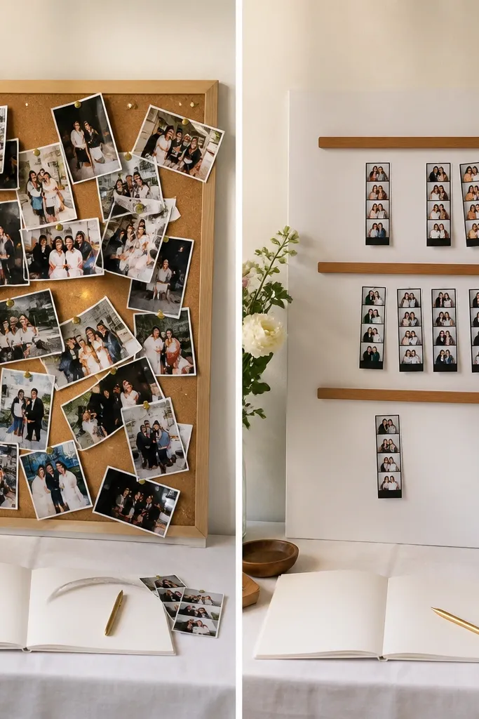
Guest books get handled constantly, and loose papers end up bent or torn. The after version uses a magnetic backing system so guests can add a photo strip without damaging anything. I use a large foam board or framed board with magnetic tape strips, then provide pre-cut photo strips that slide into place. It looks neat, stays flat, and it's easy for guests who don't want to fuss with glue. This works especially well for couples who want a guest book that grows throughout the weekend.
Start with a backing board sized to your space, like 18x24 inches. Cover it with a smooth matte paper or fabric so magnets stick consistently. Add thin magnetic tape strips horizontally and mark where each strip should go. Prepare photo strips in a consistent size (I use 4x6 inches cut down to 4x3 for easy placement) and label them lightly on the back. Put a sign next to the board with a simple prompt and a pen - guests slide photos into the magnetic slots.
Try thisUse magnets strong enough to hold at an angle if your board leans. Weak magnets fall off when someone bumps the table.
Common mistakeAvoid thumbtacks - the holes and bent corners show in every photo and make the book look worn on day one.