1. Warm Ivory Wood Frame with Linen Mat
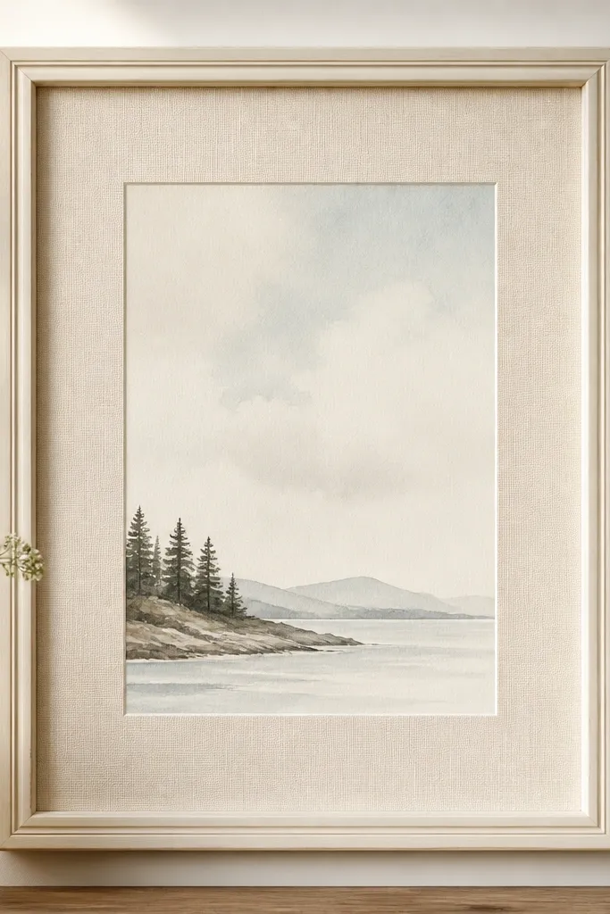
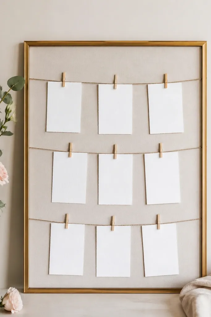
This look is expensive because the linen texture reads soft and tailored, not crafty. I use a warm ivory frame so it flatters most skin tones and wedding palettes, especially blush, champagne, and sage. The linen mat creates contrast against the card paper, so the text looks sharper in photos. It also hides minor card imperfections because the weave texture breaks up flat glare. If your venue lighting is bright or overhead, linen reduces shine compared to glossy paper.
Start with a simple wood frame that has a flat backing and a removable inner lip. Paint it warm ivory with two thin coats, sanding lightly between coats with 220-grit so the finish feels smooth. Cut a linen mat from foam board: measure the card opening, then leave a 1.25-inch border on all sides. Wrap the foam board with linen using spray adhesive, pull it tight at the corners, and trim flush. Finally, center the card, tape the corners to the backing, and seal the linen edges with a thin brush of clear matte Mod Podge.
Try thisIf your card paper is thick, leave a slightly wider inner window so it doesn't bow the card. A 0.5-inch gap around the card looks airy.
Common mistakeAvoid glossy varnish on the linen mat, because it turns the weave shiny and makes it look like craft-store fabric.
2. Brushed Gold Thrift Frame with Black Velvet Backing
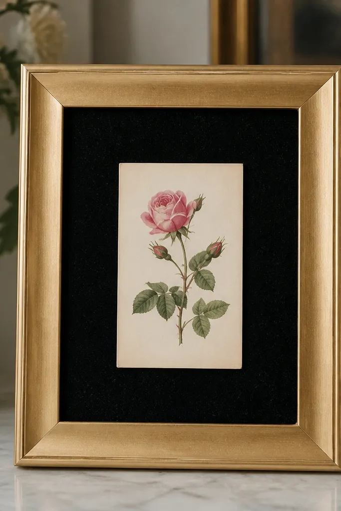
Velvet backing makes the whole thing feel formal fast. The brushed gold frame brings warmth without looking neon, and the black velvet gives strong contrast so the card text pops. This combo looks especially good for weddings with black accents, deep green bridesmaid dresses, or formal evening lighting. It also photographs well because velvet has no glare and absorbs light. I've used this at a candlelit table and it still looked crisp in photos.
Buy a thrift frame with a similar outer size to your card and confirm it has a flat back you can cover. Spray it with brushed gold metallic paint in light passes, then let it cure overnight. Cut black velvet to fit the backing area, leaving a 1-2 inch border around the card opening so it's visible. Attach velvet with a hot glue gun along the edges, not the center, so it stays smooth. Place the card centered, then secure it with small clear tape corners to keep the velvet from wrinkling.
Try thisUse a lint roller on the velvet before assembling - tiny fuzz shows up in close-up shots.
Common mistakeSkip cheap "fake velvet" that looks shiny; it reads plastic under flash.
3. Frosted Acrylic Frame with Pearl Edge Trim
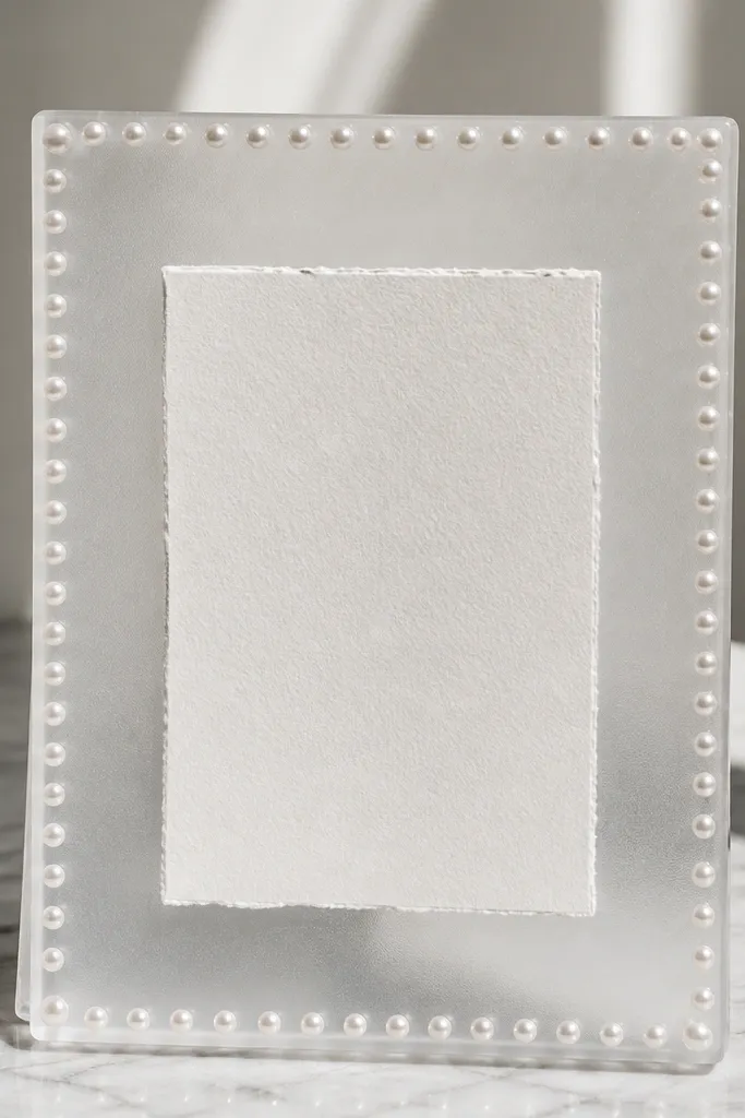
Frosted acrylic looks clean and modern, and the pearl edge makes it feel romantic without heavy floral clutter. The frosted surface softens reflections, so your card looks sharp even under strong venue lights. This one flatters both minimalist weddings and classic ones because pearls bridge styles. I like it for couples who want "quiet luxury" without gold leaf mess. It also keeps the card protected from fingerprints compared to fully open frames.
Start by cutting frosted acrylic to the outer frame size and using clear acrylic for the inner window if your sheet is thick enough. If you're not set up to cut acrylic, use pre-cut acrylic frame pieces from craft stores and add the frosted panel inside. Glue a thin strip of foam tape around the inner opening so the acrylic window sits snug and doesn't rattle. Then attach faux pearls along the outer edge using clear craft glue, spacing them about 1 pearl per 1 cm. Mount the card behind the inner window and secure with corner tabs made from double-sided tape.
Try thisChoose pearls that are matte or satin finish, not glossy - glossy pearls can look like toy jewelry on acrylic.
Common mistakeDon't use hot glue directly on acrylic; it fogs and leaves ugly strings.
4. Champagne Spray Frame with Dried Eucalyptus Corner
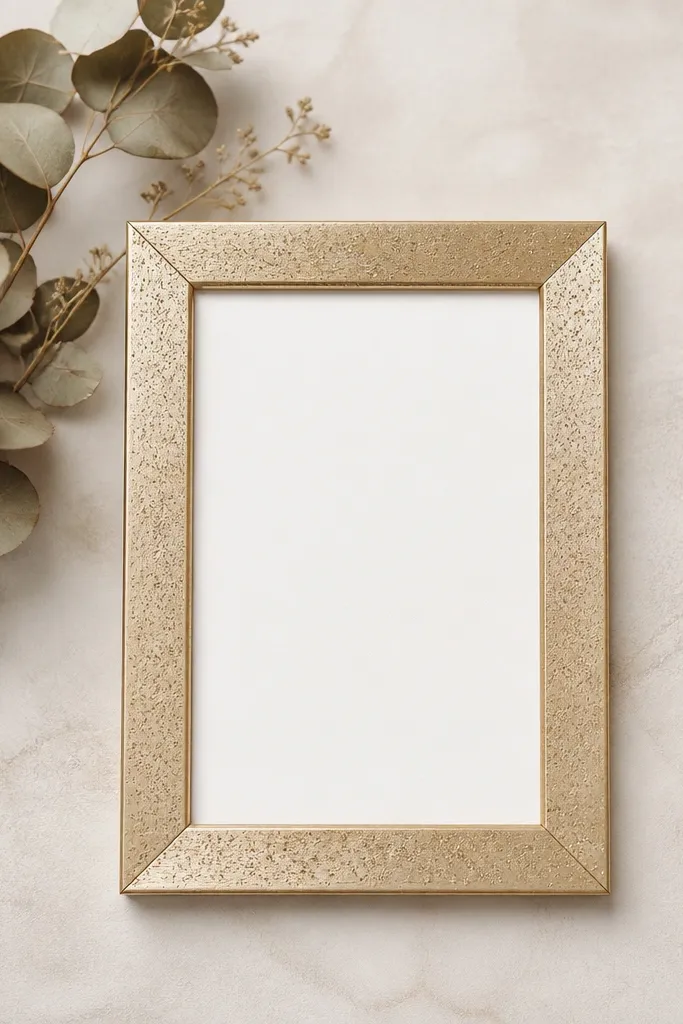
This is the "soft botanical" look that still reads polished. Champagne spray keeps it warm and bridal, while dried eucalyptus adds texture without turning into a bulky floral mess. I like it for spring and fall weddings, especially if your invitation suite has green tones. The corner placement feels intentional and doesn't block the card text. In photos, eucalyptus edges look crisp rather than messy when you keep the cluster small.
Use a simple wood or plastic frame with a removable back. Spray it champagne in 2-3 light coats, then let it cure fully. Cut a neutral backing card from thick kraft or light beige cardstock, then attach it to the backing. Arrange 6-10 eucalyptus stems in a small corner cluster and trim ends so they sit flat. Secure the stems with hot glue at the base only, then place the card centered and tape it down with narrow clear tape strips.
Try thisMist the eucalyptus with a little matte hairspray before attaching so it holds its shape and sheds less.
Common mistakeAvoid covering the whole frame with greenery; it starts to look like a craft wreath and hides the frame.
5. Black Lacquer Frame with White Satin Ribbon Bow
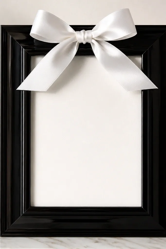
Glossy black plus white satin reads formal instantly. The satin bow adds a celebratory element without needing a full floral arrangement. This setup works great for black-and-white weddings, and it also looks sharp for couples who want a modern vibe. It flatters the card because the ribbon frames it from above and directs the eye to the text. If your venue has dark walls, glossy black makes the frame pop.
Pick a simple frame and scuff it lightly with 220-grit so paint sticks. Spray with black lacquer spray paint in thin coats, then let it cure 24 hours for that smooth glassy finish. Cut a satin ribbon about 1 inch wide and 18-20 inches long for a top bow. Tie a bow with two loops and two tails, then trim tails at an angle. Glue the bow at the top center of the backing, then place the card centered and secure with four corner dots of removable tape.
Try thisUse a ribbon width that's 1/8 to 1/6 of the frame's height so it looks proportional, not like a headband.
Common mistakeSkip frayed ribbon edges - trim and seal the ends with a quick dab of clear glue.
6. Navy Matboard Frame with Gold Foil Lettering Strip
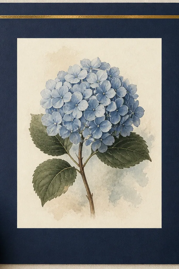
This is the kind of frame that looks expensive because it has graphic design discipline. Navy matboard feels tailored, and the gold foil strip adds a luxe highlight without heavy decoration. It works for both men's and women's wedding stationery styles, especially if your save-the-dates or menus have gold accents. The lettering strip also helps the card look like part of a coordinated set. I've used this on smaller tables where you need something bold but not bulky.
Use a shadow box frame or build a flat frame from foam board with a navy mat. Cut an outer piece for the border and an inner window opening slightly larger than your card. Cover the outer border with navy matboard or wrap foam board in navy paper for a smooth surface. Add a gold foil strip at the top: cut a strip about 2 inches tall and 1/3 the frame width, then apply gold foil transfer or adhesive foil. Place the card centered, then tape it behind the inner window so it doesn't shift.
Try thisKeep the gold strip plain - no multiple fonts, no sparkles, just clean foil and one line of text.
Common mistakeDon't use glitter glue on the strip; it looks uneven and catches light in a cheap way.
7. Clear Glass Tile Frame with White Pebble Backing
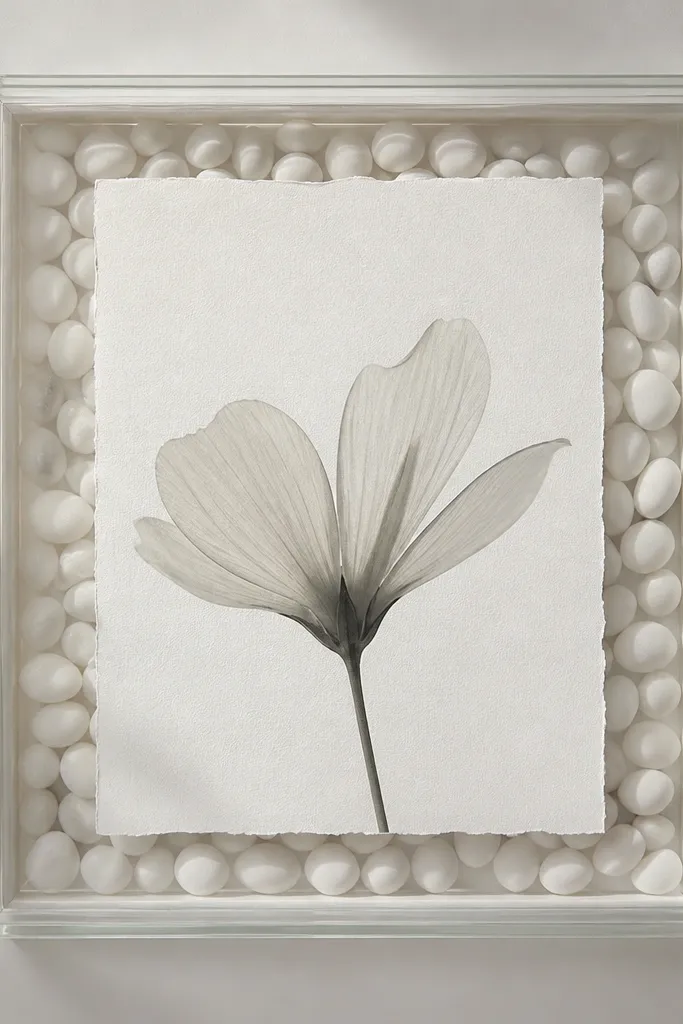
Glass and pebbles create a seaside-polished look that still feels wedding-appropriate. The card stays readable because the pebbles sit behind it rather than covering the text area. This works well for beach weddings, but I've also used it for winter weddings when couples wanted "cool" tones. The texture gives depth in photos, and the clear frame adds an airy, modern feel. It also looks great in natural light - pebbles catch tiny highlights.
Start with a small shadow box frame or a clear display frame with a flat back. Glue a thin layer of white pebbles to the backing area only where they won't touch the card edges - leave a clean border around the card opening. Use strong craft glue and let it set fully before you insert the card. If the frame is fully transparent, add a thin white cardstock layer behind the pebbles to keep the pebbles from making the card look gray. Center the card, then secure with corner tape.
Try thisPick pebbles that are uniform in color and size; mixed gravel makes it look messy fast.
Common mistakeAvoid heavy glue blobs - they show through clear panels.
8. Blush Ribbon Frame with Two Vertical Stripes
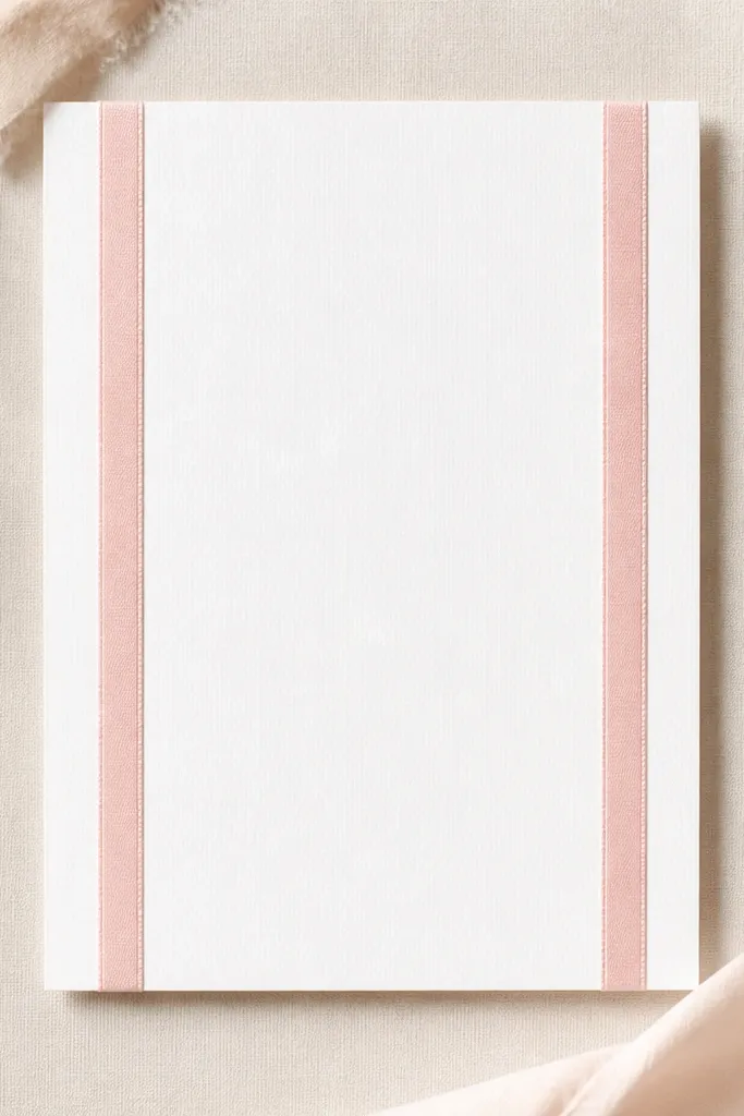
This looks expensive because it's minimal and symmetrical. Two vertical blush ribbon stripes create a "tailored border" effect without covering the card. It flatters soft color palettes like blush, rose gold, and light gray. Symmetry matters here - it reads intentional, like a boutique invitation set. I've also used it for same-sex couples because it doesn't lean too floral or too masculine.
Use a white or cream frame with a removable back and a wide enough inner opening for ribbon. Cut two pieces of blush satin ribbon about 0.5 inch wide, and match their height to the card opening plus a 0.5-inch overlap at top and bottom. Attach the ribbons with double-sided tape on the backing first, then press them so they're perfectly parallel. Add a thin strip of matching ribbon across the bottom only if it feels balanced, then place the card centered. Secure the card with corner tabs so it stays flat against the backing.
Try thisMeasure ribbon spacing from the centerline of the frame, not from the edges, so it looks exactly balanced.
Common mistakeDon't bunch the ribbon - wrinkled satin makes it look like a last-minute craft.
9. Rose Gold Foil Edge Frame with Matte White Backing
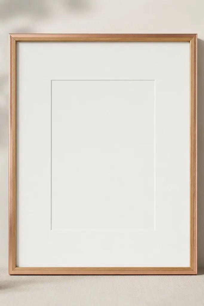
Edge foiling looks luxe because it's subtle and precise. Rose gold has a warmer blush tone that looks great with ivory, dusty pink, and warm neutrals. The matte white backing keeps text readable and stops rose gold from reflecting too much. I like this for couples who want "pretty" but don't want fake flowers or heavy ornamentation. The negative space is what makes it feel like a designer piece.
Start with a light wood frame and paint it matte white or leave it natural and seal it. Apply edge foil: brush a thin layer of foil adhesive to just the outer edge, wait until tacky, then press rose gold foil carefully along the perimeter. Trim stray foil with a craft knife once it's dry. Cover the backing with matte white cardstock and center the card. Use small clear tape tabs to hold the card so there are no visible tape lines.
Try thisUse a foam brush for adhesive so you don't leave thick ridges on the edge.
Common mistakeAvoid foiling the entire face of the frame; full-foil frames look flashy and less wedding-polished.
10. Gold Leaf Effect Frame Using Acrylic Medium and Sponge
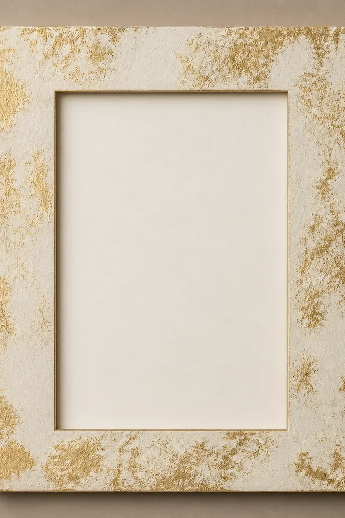
You get the luxury look of gold leaf without the flakes everywhere. The sponge method creates a worn, light-catching surface that feels intentional rather than shiny and cheap. Taupe or warm beige backing keeps the gold from looking harsh. This style fits vintage weddings, courthouse ceremonies, and anyone using neutral invitation fonts. It also works for frames that are slightly imperfect, because the texture hides small scratches.
Paint the frame cream first and let it dry completely. Mix metallic gold acrylic medium (or gold paint) with a tiny bit of water so it spreads thin. Dip a torn-edge makeup sponge in the gold mixture, dab off excess on paper, then lightly tap along the frame edges and corners. Stop while it still looks uneven - you want controlled wear, not full coverage. Cover the backing with taupe cardstock, center the card, and secure with corner tape.
Try thisPractice on scrap cardboard for 30 seconds so you know how much gold transfers with your sponge.
Common mistakeDon't over-apply until it's uniform; that turns it into cheap speckle.
11. Cotton Lace Frame with Scalloped Border
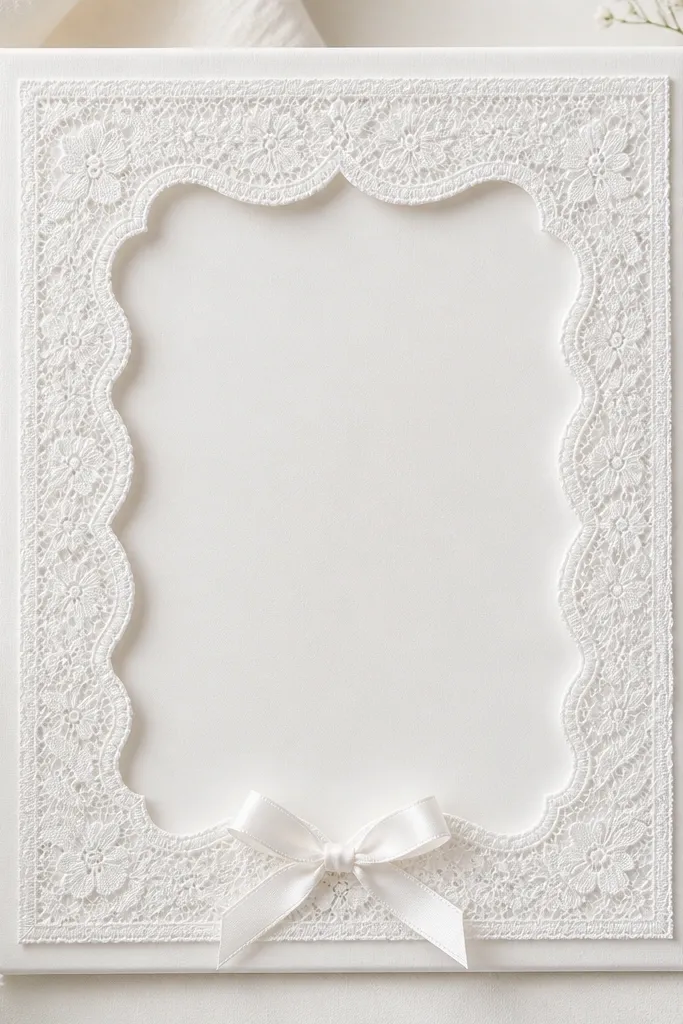
Lace looks expensive when it's structured, not floppy. A scalloped cotton lace border adds a classic wedding feel, and white-on-cream keeps it soft for all skin tones in photos. This works well for vintage themes, garden venues, and bridal showers. The scallops create a natural frame within the frame, so the card looks like part of the lacework. I prefer cotton lace over polyester lace because it lays flatter and doesn't shine.
Choose a white frame and remove the backing. Cut lace to fit the inner border area, leaving a 0.25-inch overlap at each corner. Attach lace to a thin foam board mat using spray adhesive, then trim with scissors so scallops are clean. Add a small bow at the bottom center using a 3/8-inch satin ribbon, and secure it with a dot of hot glue behind the mat. Insert the card, then place the lace mat over it so the card edges are visible through the opening.
Try thisUse fabric glue for lace edges if the mat bends; it stays flexible and won't crack.
Common mistakeSkip stretchy lace - it warps and the scallops look uneven.
12. Terracotta Clay Frame with Hand-Painted Dots
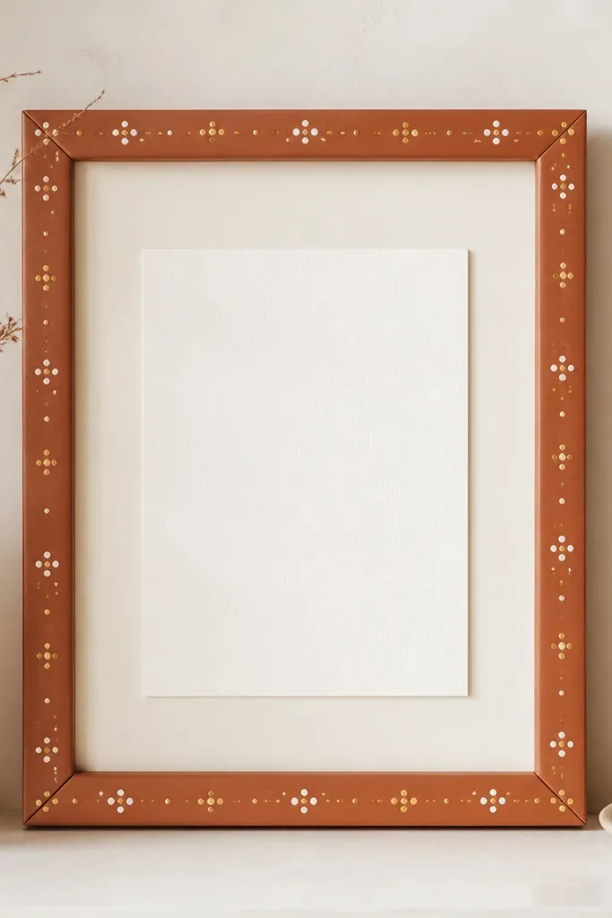
Hand-painted dots look artsy without looking messy when the spacing is consistent. Terracotta reads warm and flattering, especially with ivory, olive, and warm gray wedding palettes. The dots add a "made by someone" detail that looks thoughtful in close-ups, but it still stays clean enough for guests to read the card. This style also works when your venue has lots of natural textures like wood, stone, or terracotta tiles. It's a great option if you want something handmade but not floral.
Paint the frame terracotta using matte paint, two thin coats. Create a dot pattern with a dotting tool or the end of a clean pencil eraser - aim for 8-12 dots per side depending on frame size. Use cream paint for the first layer, then add a few muted gold dots between for variation. Let each color dry 20-30 minutes before adding the next. Cover the backing with off-white cardstock, center the card, and secure it with corner tabs.
Try thisMark dot positions lightly with a pencil first, then paint over - it keeps the pattern even.
Common mistakeDon't use metallic craft paint with thick texture; it dries lumpy and looks cheap.
13. Olive Green Frame with Faux Pearl Row and Charcoal Backing
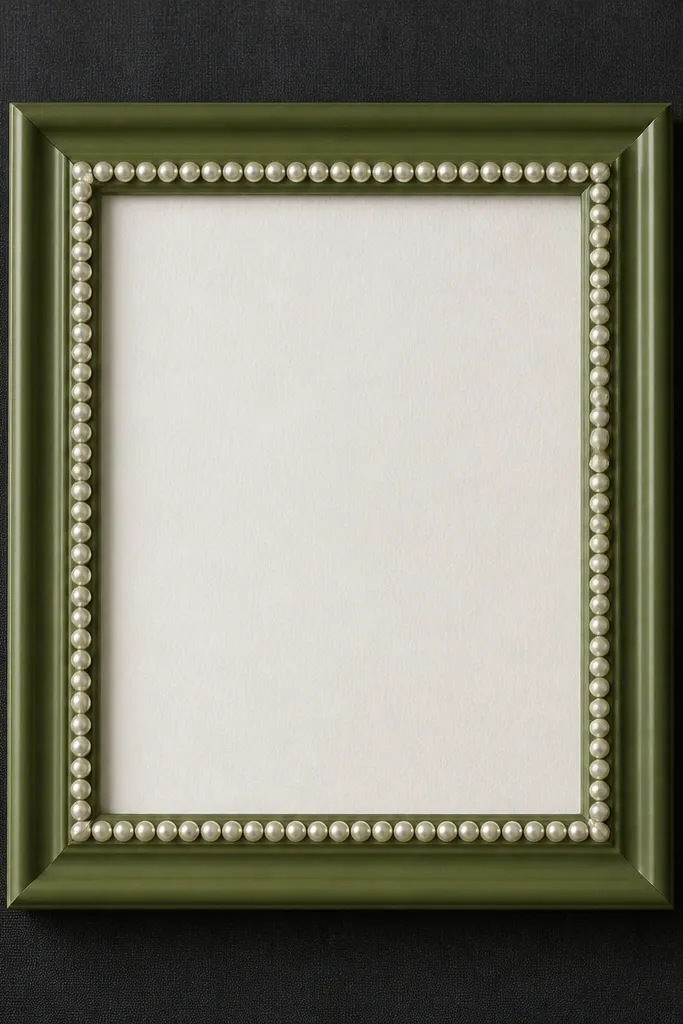
This is one of my favorite "garden formal" looks. Olive green feels grounded, and charcoal backing gives strong contrast so the card text stays readable. The faux pearl row along the inner edge adds a clean, jewelry-like detail without turning the frame into a craft project. It flatters warm skin tones and pairs beautifully with gold, ivory, and dusty rose. In photos, the pearls catch light in small flashes rather than big sparkles.
Spray paint the frame olive green with matte or satin finish, not gloss. Cut charcoal backing from heavy paper or thin felt and attach it to the frame back. Add the faux pearls: measure the inner perimeter and glue pearls along the inside edge using clear craft glue, leaving a small gap at the corners for neat alignment. When the pearls dry, insert the card and place it so there's a 1-inch border visible around it. Secure the card with small pieces of tape at the four corners only.
Try thisUse pearls with the same size - mixed sizes look like random beads instead of a planned border.
Common mistakeDon't glue pearls directly over thick paint ridges; it creates uneven spacing.
14. Map Print Frame with Antique Brass Corners
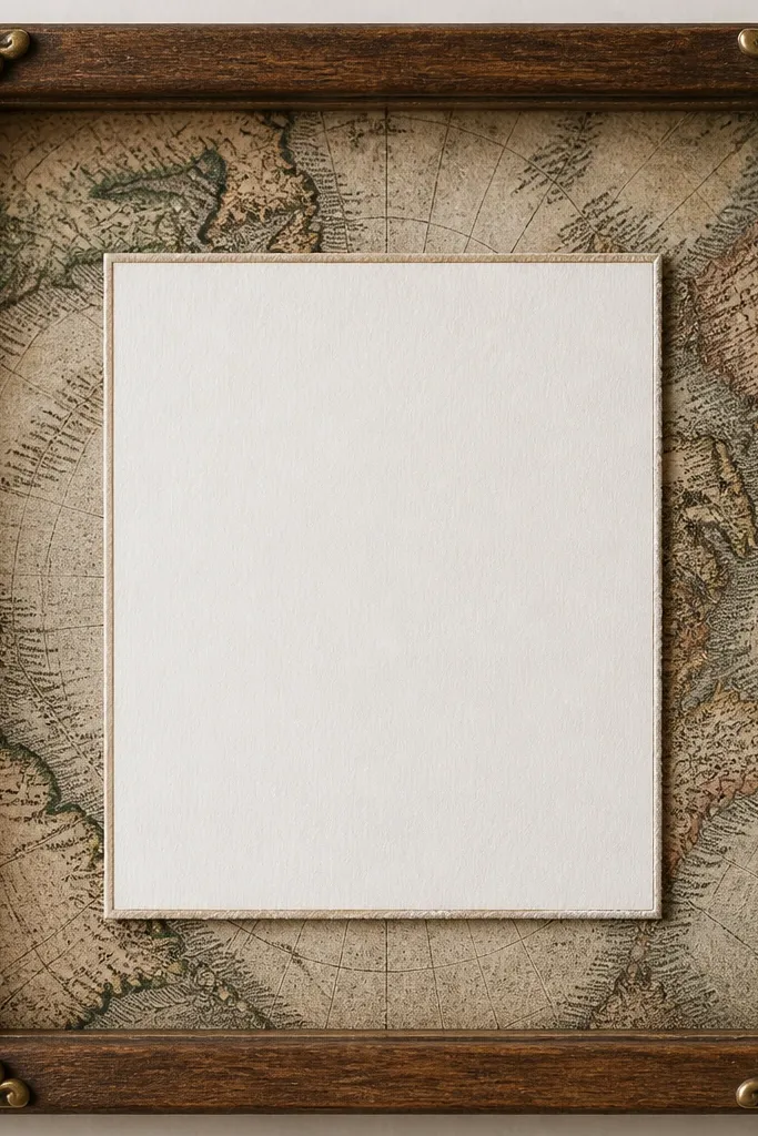
A map backing makes the display feel personal without adding bulk. Antique brass corners make it look like a keepsake display, not a random graphic print. This style works well for couples who want travel vibes, hometown references, or a subtle vintage feel. The map print adds texture and detail, but you keep it controlled by using only the corners in metal - the card stays the hero. In photos, map lines add interest behind the card without stealing attention from the text.
Start with a simple frame and remove the backing. Cut a map print backing to fit the inside area, then test how dark it looks behind your card. If it's too busy, add a thin layer of light cream cardstock on top of the map so the text stays readable. Attach antique brass corner brackets using the adhesive backing or small screws if your frame allows it. Place the card centered, then tape it down with small transparent tape corners. Add a light matte seal spray over the map if it's ink-heavy so it won't smear from handling.
Try thisChoose a map print with small text - large, bold map labels compete with wedding card text.
Common mistakeDon't use glossy photo paper for the map; glare makes the whole frame look cheap.
15. White Foam Board Frame with Faux Pearl Garland Loop
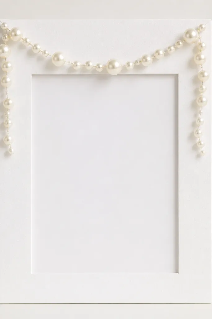
Foam board frames are the fastest way to get a neat, lightweight display, and the pearl garland loop makes it look styled. White keeps it bright and bridal, and the pearl loop adds movement without covering the card. This is great for budget weddings where you still want "pretty" photos. I've used it at backyard ceremonies because it's easy to transport and doesn't chip like wood. The garland loop also frames the card like a crown.
Cut foam board to build a frame: outer size first, then cut the inner window slightly larger than the card. Cover the foam board with smooth matte white paper so the surface looks uniform. Attach a faux pearl garland along the top edge in a gentle U-shape, letting the garland dip about 1.5 inches on each side. Secure the garland with hot glue at the back only, then trim any visible glue strings with a craft knife once cooled. Add a light beige backing, insert the card, and tape the corners.
Try thisUse a pearl garland that's already looped or evenly strung; uneven spacing shows instantly.
Common mistakeSkip thick foam board with rough edges; it makes the frame look handmade in a bad way.
16. Satin Ribbon Wrap Frame with Hidden Staple Backing
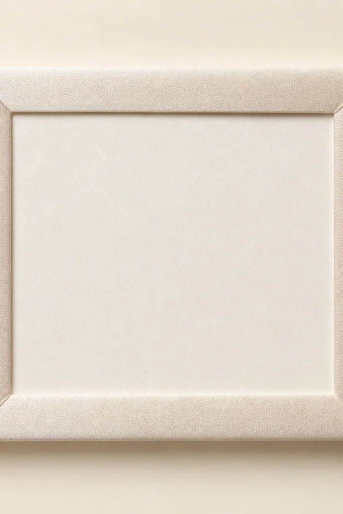
Wrapping a frame in satin looks expensive because it creates a continuous surface with soft shine. The key is hiding the fastening so you don't see staples or glue blobs. Pale satin in champagne or pale blush gives a gentle glow that flatters the card paper. This style works well for indoor venues where you want a romantic sheen, and it looks great with gold or rose gold accents. I've found it's also forgiving if the frame is slightly scratched underneath.
Cover a simple frame with satin ribbon by wrapping around the outer edges first. Start at the back so seams are hidden, and pull the ribbon tight without stretching it. Use a staple gun on the back edges if your frame allows it, then cover the staple line with a strip of backing paper. Wrap until the entire outer border is covered, then trim the inner edge so the card opening is clean. Add a cream backing, center the card, and secure with corner tape.
Try thisPick satin with a soft sheen, not mirror shine - mirror shine reads costume-y in wedding photos.
Common mistakeDon't glue ribbon directly on glossy plastic frames; it peels and the seam shows.
17. Clear Bubble Acrylic Frame with Mini Star Confetti
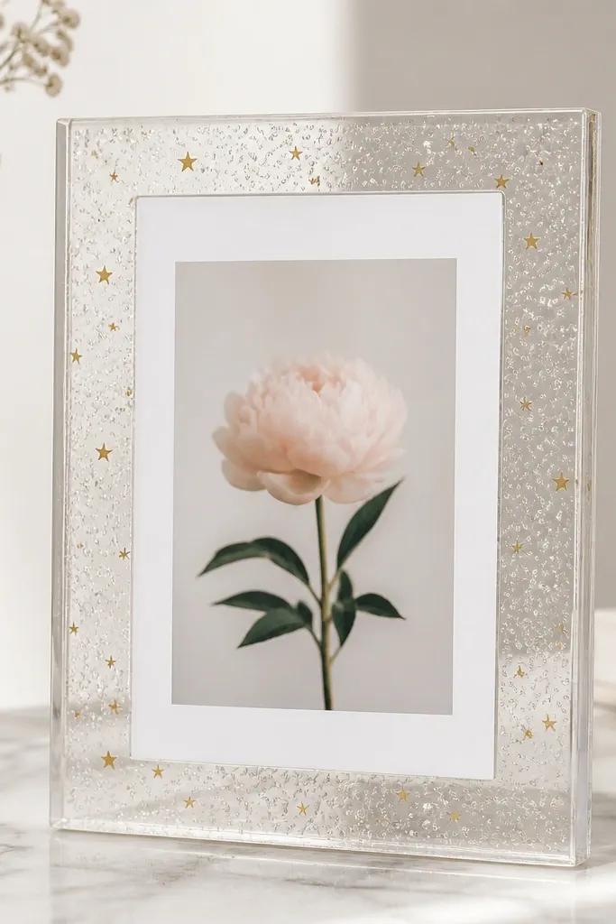
This one looks fun but still wedding-appropriate when you keep the confetti tiny and gold. Bubble acrylic adds texture and depth, and the confetti gives sparkle that's controlled - not glittery everywhere. I use this for couples who want a modern party vibe but still want the card to look elegant. The confetti sits behind the card, so text stays readable. In flash photos, bubble acrylic scatters light and makes the frame look "expensive" rather than cheap.
Buy or assemble a clear acrylic frame with a removable backing panel. Add a layer of thin gold star confetti behind the card area, but only around the edges so it doesn't cover the card's top lines. Tape the confetti layer lightly so it doesn't shift during assembly. Place the card centered, then close the frame with the backing panel. If the acrylic has protective film, remove it right before display - haze makes it look dull.
Try thisUse micro confetti stars (smaller than 3 mm) so it reads like shimmer, not mess.
Common mistakeSkip big sequins; they look like craft-store party decorations.
18. Monochrome Concrete-Style Frame with Soft Gray Backing
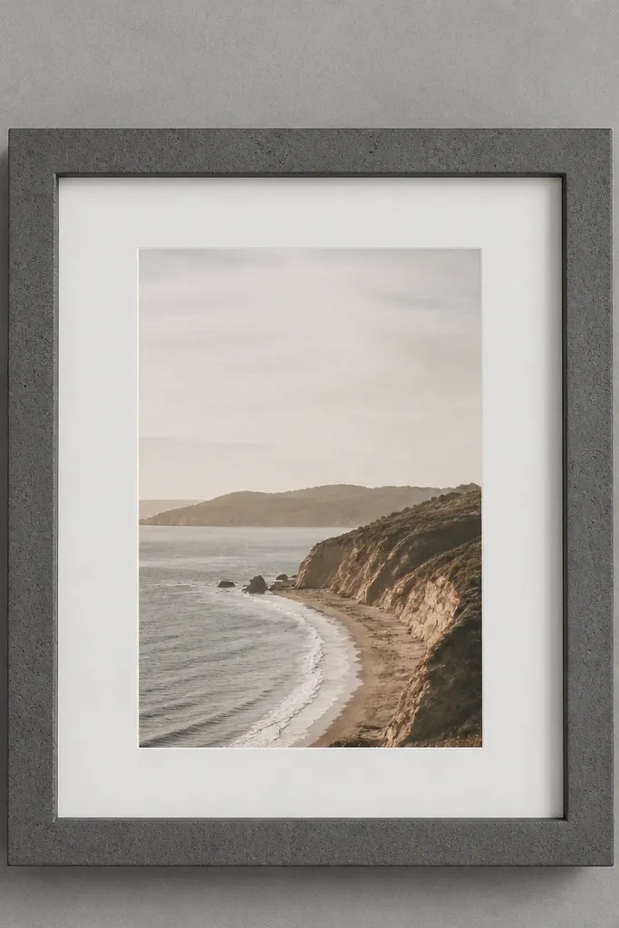
Concrete-style paint makes a frame look architectural, not store-bought. The dark gray speckle hides small scuffs and gives a modern, urban feel that works with industrial venues. I like it for couples using monochrome invitations or clean typography. The soft gray backing keeps everything calm so the card doesn't fight the texture. This style is also great for grooms' ceremonies where you want less lace and more structure.
Use a simple wood frame and prime it well. Paint with a concrete-style spray or spatter texture paint in dark gray, then add a light dry brush of charcoal on edges for depth. Let it cure fully. Cut a soft gray backing from thick cardstock and attach it flat. Insert the card centered, and use four corner tape points so the card sits perfectly flat. If your card is thin, add a second cardstock layer behind it to prevent waviness.
Try thisTest the texture paint on a scrap first - some dry too glossy and ruin the concrete look.
Common mistakeDon't add extra decor on top; the texture already does the talking.
19. Pearl and Lace Panel Frame for a Bridal Shower Table
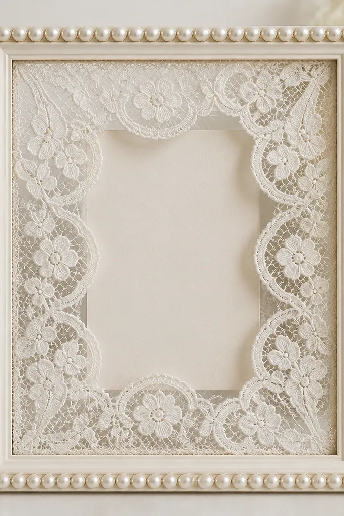
This is the "bridal shower table" look that still works for wedding card frames because it's layered. Lace in the middle creates a soft window effect, while pearls around the edge give a tidy finishing line. The result feels romantic without being messy, and it flatters both pastel and neutral palettes. It's also great when your card paper is plain - the lace adds interest without needing printed graphics. I've used this on buffet tables where you want something pretty but not tall.
Start with a frame that has a flat backing you can cover. Cut a lace panel slightly smaller than the inner window so it sits centered and doesn't overlap the card text area. Attach the lace to the backing with spray adhesive, then glue faux pearl trim around the inner perimeter like a picture frame border. Place the card behind the lace so the lace frames the edges of the card. Secure the card with corner tape so it stays aligned and doesn't shift when guests bump the table.
Try thisChoose lace with a consistent pattern scale; tiny repeating lace looks more expensive than big motifs.
Common mistakeAvoid thick lace that creates lumps behind the card; it makes the card look wrinkled.
20. Black-and-White Striped Frame with Skinny Gold Thread Border
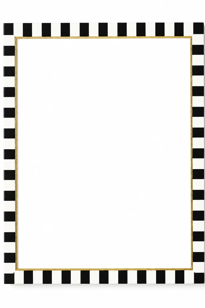
Striped frames look graphic and expensive when the stripes are crisp and the gold border is thin. The black-and-white palette makes the card text stand out, and the gold thread adds just a hint of luxury. This style works for modern weddings, courthouse ceremonies, and couples who want a clean look without florals. It also photographs well from above because stripes create strong lines. I like it when the invitation design is also graphic, like serif names with a simple layout.
Paint or wrap the outer border with black-and-white striped paper or vinyl, keeping stripe width around 1/4 inch for a tidy look. Create a thin inner border by gluing gold thread or metallic cord along the inside perimeter, about 1/8 inch thick. Use clear craft glue and keep tension even so the cord lies flat. Back the frame with white cardstock to keep contrast high. Center the card and secure with corner tape so it stays flat and readable.
Try thisIf you use adhesive vinyl for stripes, burnish the edges with a credit card so the lines stay sharp.
Common mistakeDon't use thick rope - it looks heavy and hides the card instead of framing it.