1. Cream ivory mat with warm gold inner trim
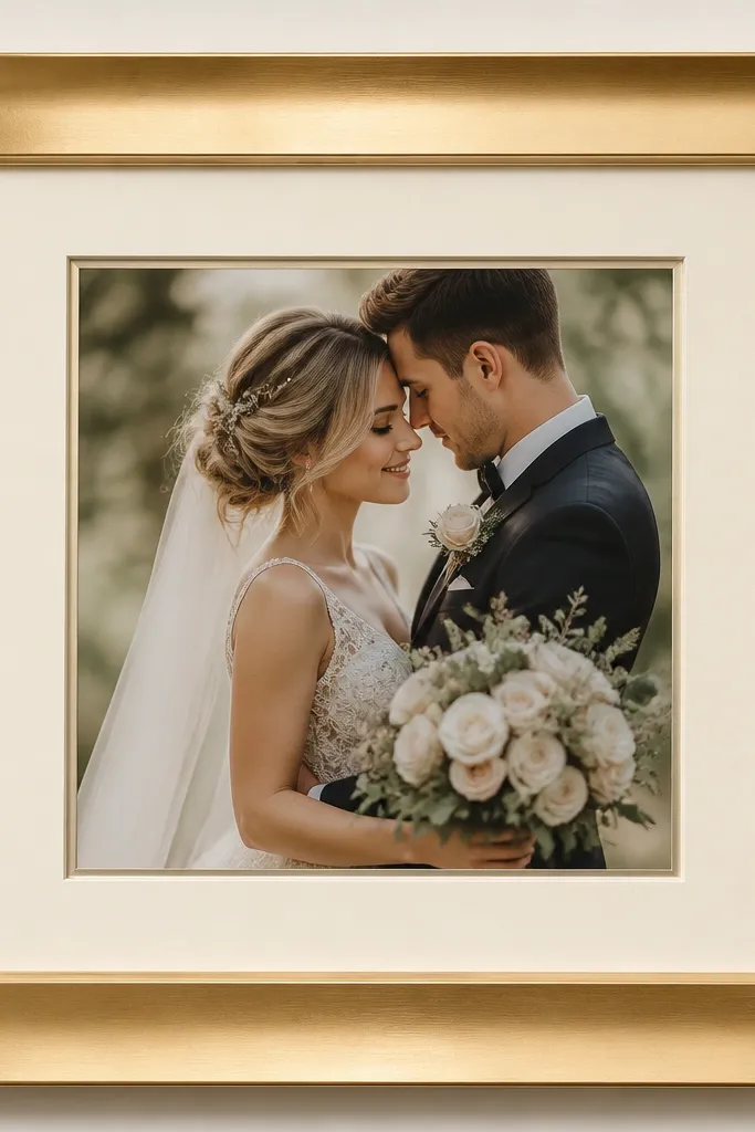
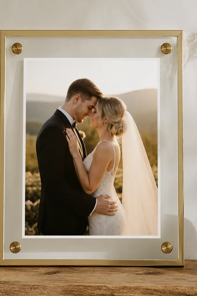
This setup looks luxe because warm gold and creamy ivory play nicely with wedding paper that has a soft off-white tint. I've used it for couples whose invitations had warm foil - the card reads crisp, not washed out. The satin gold finish is important; mirror-polished frames can throw bright hotspots across the card in photos. If your skin tone in the venue lighting reads warm (peachy undertones), this combination flatters the whole scene on camera.
Start with a frame that has a built-in depth or spacer so you get a shadow gap of roughly 8-12 mm. Cut or order a mat in cream ivory and keep the mat opening centered with a border of 1 inch around a 5x7 card. Add a thin warm gold inner trim (metallic mat tape works) just inside the mat window. Place the card on acid-free mounting tape, then slide it so it sits 1-2 mm above the mat surface for a clean mounted look.
Try thisDo a quick glare check with your phone camera before you lock the glass in place.
Common mistakeAvoid bright white mats - they can make warm paper look yellow and cheap.
2. Greige mat with brushed silver frame
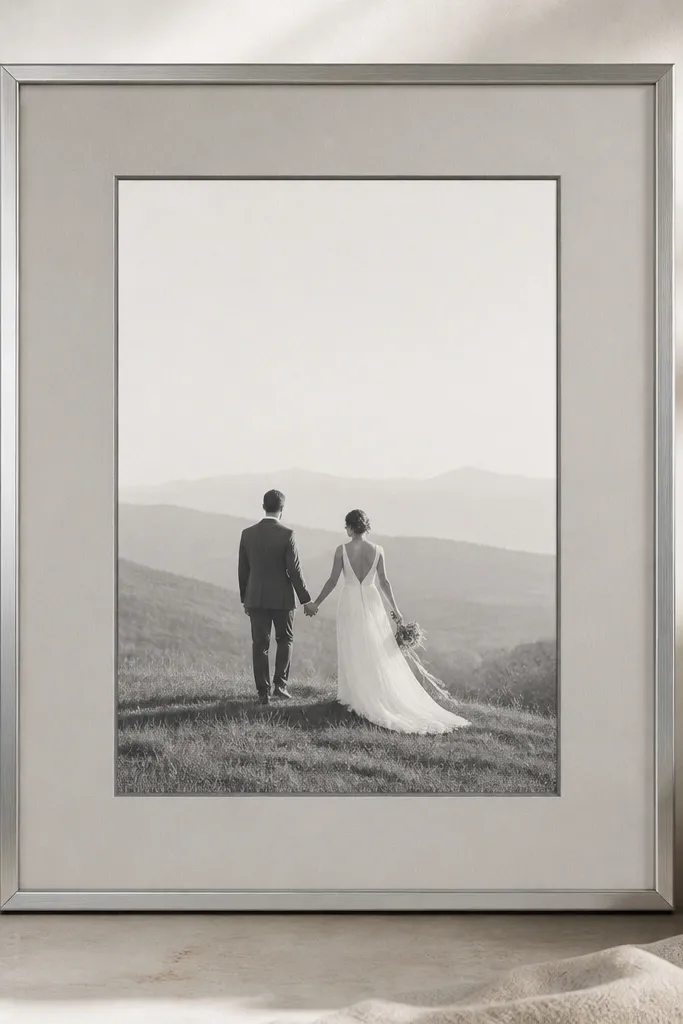
Greige mats are the quiet luxury option when your invitation palette has cool grays, navy, or steel accents. Brushed silver keeps the look modern and stops the frame from overpowering the card text. I like this for couples who chose minimal typography or deep ink - the contrast stays sharp without looking harsh. In venues with cool overhead lighting, greige prevents the card from looking dull or gray.
Choose a brushed silver frame with a matte finish and a depth that lets the card breathe. Use a greige mat with a window border of about 0.9 inches for a 5x7 card, and keep the mat thickness around 1/16 to 1/8 inch so it doesn't look flimsy. Mount the card using four small points of acid-free tape at the corners only. Finally, align the card so the text baseline sits slightly above center to look balanced in photos.
Try thisIf your card has navy ink, add a thin strip of silver mat tape behind the bottom edge for a subtle "gallery" feel.
Common mistakeAvoid chrome mirror finishes - they can create a harsh reflection band across the mat.
3. Matte black frame with warm parchment backing
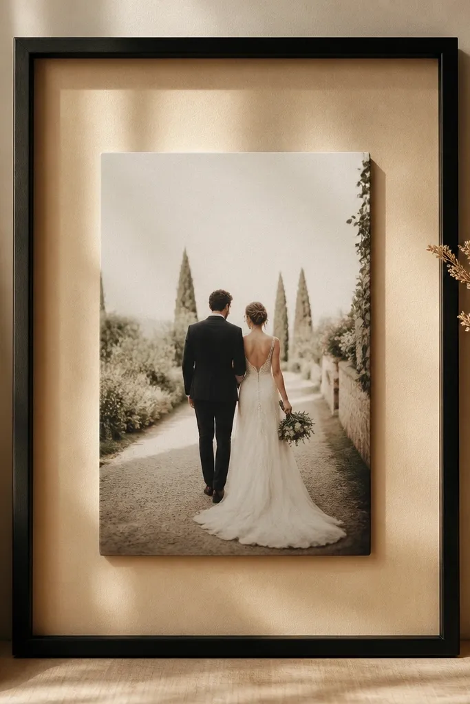
Matte black is dramatic, but it looks high end when you pair it with a warm backing instead of plain white. The parchment tone softens black and keeps the card from looking like a document in a copier. I've used this for couples who had black, espresso, or deep brown elements in their suite. It also flatters darker paper edges and keeps light from bouncing too aggressively around the card.
Start with a matte black frame with a deep lip so the card floats. Use a thin black mat or go matless with a spacer system; either way, keep the card 8-10 mm away from the backing. Cut a backing sheet in warm parchment (off-white with a slight tan) and place it inside the frame. Mount the card with acid-free tape at the corners, then wipe any fingerprints off the backing before you insert the glass or acrylic.
Try thisUse anti-reflective glass or museum acrylic so the black doesn't turn glossy under venue lights.
Common mistakeSkip bright white backing - it makes matte black look like a cheap photo frame.
4. Walnut shadow box with linen insert
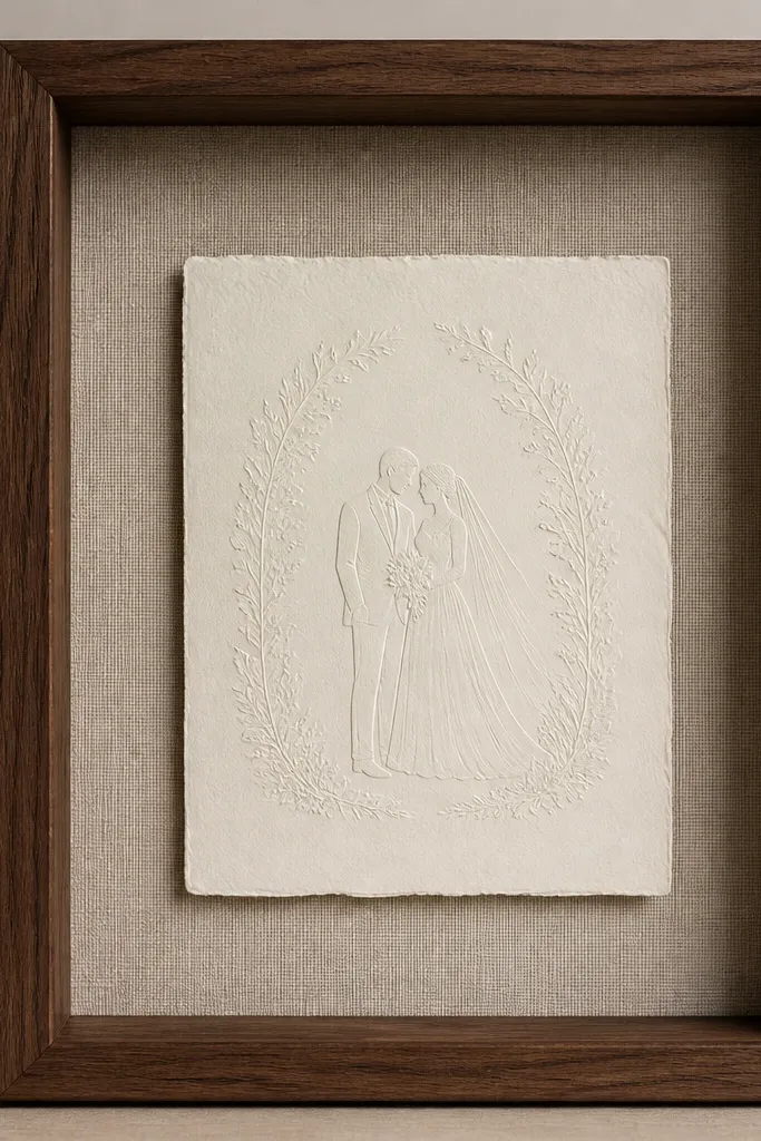
Walnut shadow boxes feel expensive because you get real wood grain and the depth reads like a gallery piece. The linen insert adds texture without being loud, which matters because wedding cards already have printing detail. This look works especially well for rustic-meets-elevated weddings with neutral florals and wood escort cards. If your invitation paper is cream and your ink is dark, the linen makes the card look warmer and more tactile.
Pick a walnut shadow box with a 1.5 to 2 inch depth so you can mount without crushing the paper. Cut a linen insert in oatmeal or light sand and lay it flat inside the frame. Center the card and mount it on 1/4 inch foam squares or clear acrylic spacers to create a visible shadow gap. Keep your border even - I aim for 1.1 inches around a 5x7 card - then trim any excess linen so the edges are clean and straight.
Try thisPress the linen insert under a book for 30 minutes before mounting so it lays flat.
Common mistakeAvoid thick, wrinkled fabric - wrinkles read messy in close-up photos.
5. White oak frame with pressed eucalyptus corner accents
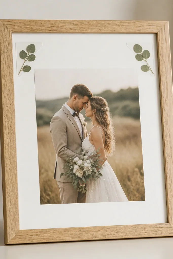
This is the kind of card frame that looks styled even when the wedding suite is simple. White oak keeps it warm and modern, while pressed eucalyptus adds a soft botanical cue that matches lots of wedding palettes. I like it for couples who had minimal text design and wanted a gentle nature reference without covering the card. The pressed leaves also photograph well because they're flat and don't cast bulky shadows.
Use a white oak frame with a light mat, either warm white or soft ivory. Mount the card using acid-free tape at the corners only so the paper stays flat. Place two pressed eucalyptus sprigs in the top left and top right corners, each tucked under a clear mounting tab so they don't shift. Keep the leaves small - about the size of a quarter in each corner - so they frame the card instead of competing with it.
Try thisSeal the pressed leaves with a light coat of clear matte spray before you mount them if they're a little brittle.
Common mistakeDon't glue leaves directly onto the card - you can stain the paper over time.
6. Pearl-cream double mat with subtle gold line
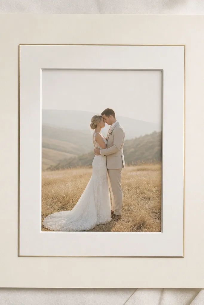
Double mats are the fastest way to make a card look like it belongs in a boutique gallery. The trick is keeping the colors close together so the look reads intentional, not layered for layering's sake. Pearl-cream gives you softness, and the thin gold line adds a hint of warmth that matches invitation foil. This works for almost any skin tone and venue lighting because the palette is neutral and forgiving.
Choose a frame with enough depth for a double mat (at least 1 inch internal clearance). Cut an outer mat in pearl cream and an inner mat in slightly brighter pearl, then add a thin gold line mat tape strip between them. Center a 5x7 card so it sits 0.9 to 1 inch from the inner mat edge. Mount the card using four small tape dots at the corners, then close it up with anti-reflective glass to keep the gold line from flaring.
Try thisMeasure the mat window openings with a ruler - double mats magnify any misalignment.
Common mistakeAvoid thick gold tape - it looks like craft store jewelry, not wedding fine finish.
7. Satin champagne frame with translucent acrylic cover
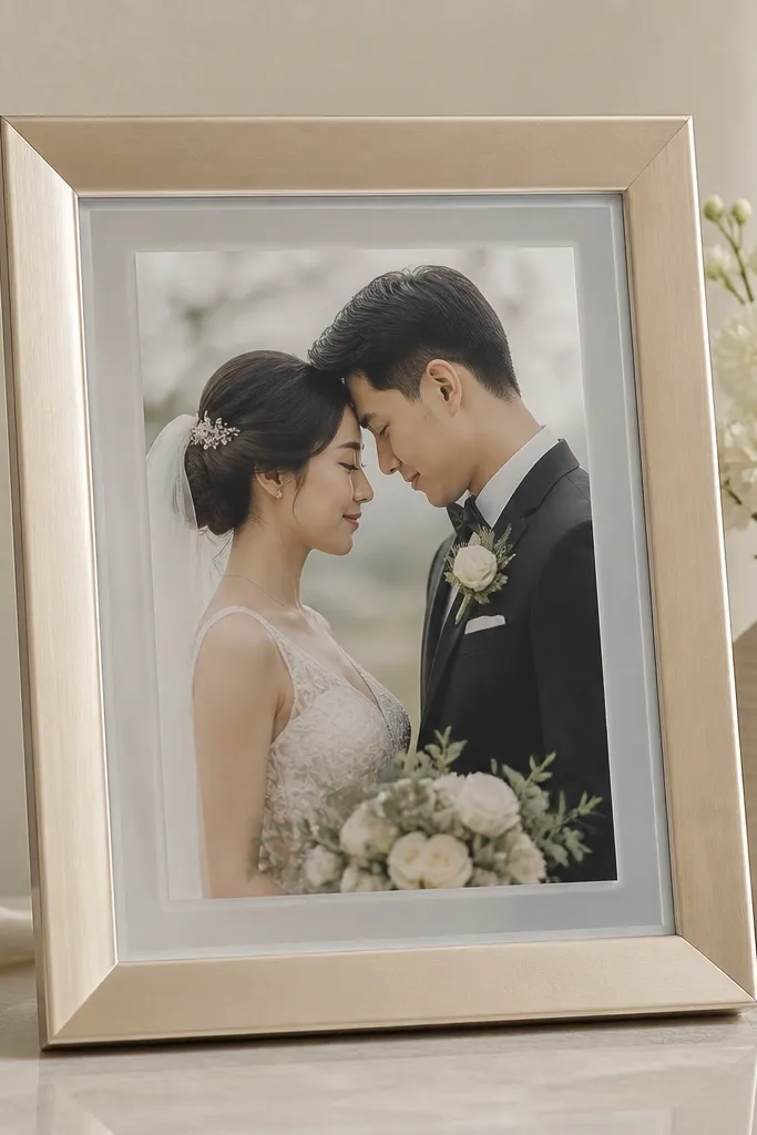
If you've ever seen a framed card with a bright glare stripe, you know why acrylic matters. Satin champagne tones feel celebratory but still calm, especially when your card has gold foil accents. The acrylic cover keeps the surface cleaner under venue lighting, and the matte edge prevents that cheap "clear block" look. This is a strong choice for outdoor receptions where sunlight hits at angles.
Pick a satin champagne frame with a clean profile and a gasket for acrylic. Use spacers so the card sits 8-12 mm off the backing. Cut a mat in soft ivory and keep the window border at 1 inch for a 5x7 card. Place the card using archival tape, then fit the acrylic cover without over-tightening so it doesn't warp. Wipe the acrylic with a microfiber cloth and anti-static spray so dust doesn't catch.
Try thisOrder acrylic with anti-reflective coating if you can - it makes a visible difference in photos.
Common mistakeAvoid glossy acrylic - it can still throw reflections even if it's not glass.
8. Deep espresso frame with black card mat border
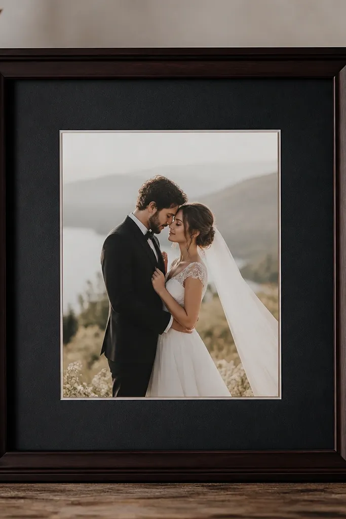
This look is for couples who chose dark ink, black wax seals, or a moody invitation palette. Espresso wood adds warmth, while a charcoal mat border makes the card feel framed like a print. I like it because it hides minor paper edge differences - the dark mat makes the card look intentional even if the card stock isn't perfectly uniform. It also reads premium under warm candle-style lighting.
Choose an espresso frame with a matte finish and a depth that supports a shadow gap. Use a charcoal mat border around the card window - keep it about 0.75 inches on each side for a 5x7. Mount the card on small foam tabs so the card lifts evenly. Keep the backing neutral, like warm gray, so the charcoal border doesn't look flat. Close with anti-reflective glass so the espresso doesn't create shiny streaks.
Try thisIf your card has gold foil, keep the mat border dark and skip extra gold embellishments around it.
Common mistakeAvoid shiny black mats - they look plasticky and show fingerprints.
9. Antique brass frame with ivory vellum backing
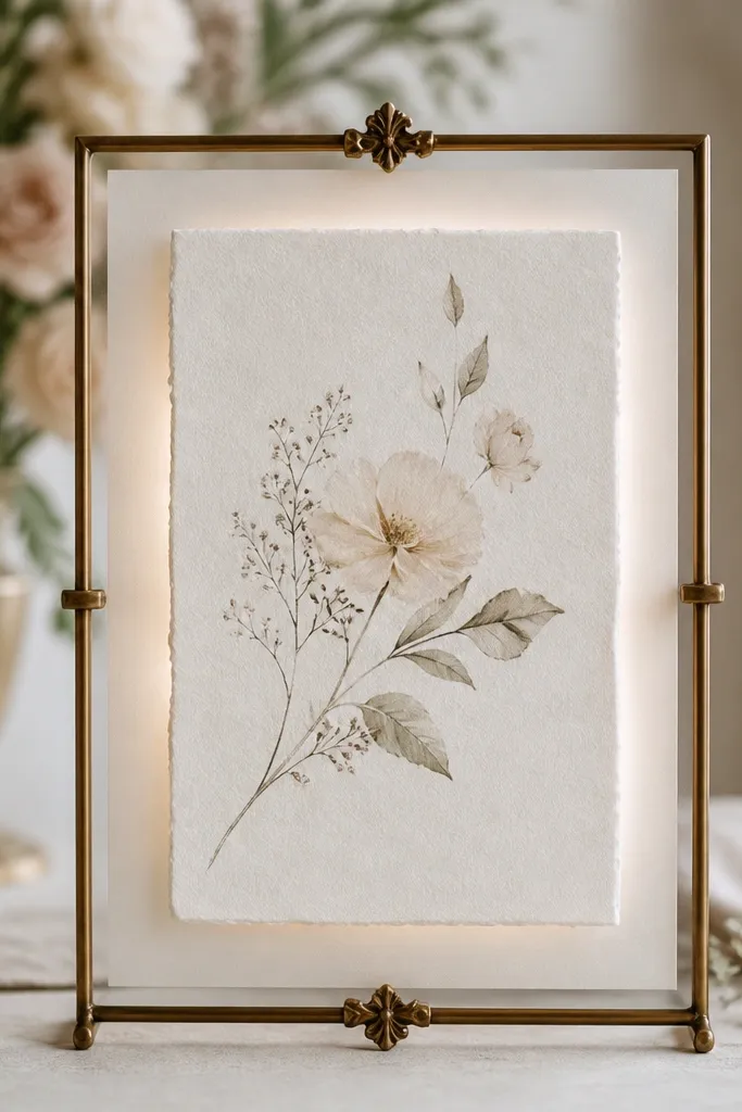
Antique brass reads luxe when it's paired with a soft, translucent backing. The vellum backing adds a gentle glow behind the card, which makes text look richer and helps foil accents pop without looking glittery. I used this for a couple with vintage-style type and warm ivory invitations. It flatters warm undertones and looks especially good in rooms with beige walls or cream drapery.
Use an antique brass frame with a patina finish and enough depth for the vellum layer. Cut the vellum to fit the backing area and secure it with archival tape at the edges only. Mount the wedding card on 1/4 inch spacers or foam tabs so it sits off the vellum. Center the card and keep even margins - around 1 inch for a 5x7. Add an ivory mat if you need extra separation, then seal with museum acrylic or anti-reflective glass.
Try thisTrim vellum with a sharp craft knife and metal ruler so edges don't look ragged through the frame.
Common mistakeDon't use heavy glitter vellum - it turns the card into a background instead of the main event.
10. Terracotta frame with off-white mat and stitched ribbon tie-back
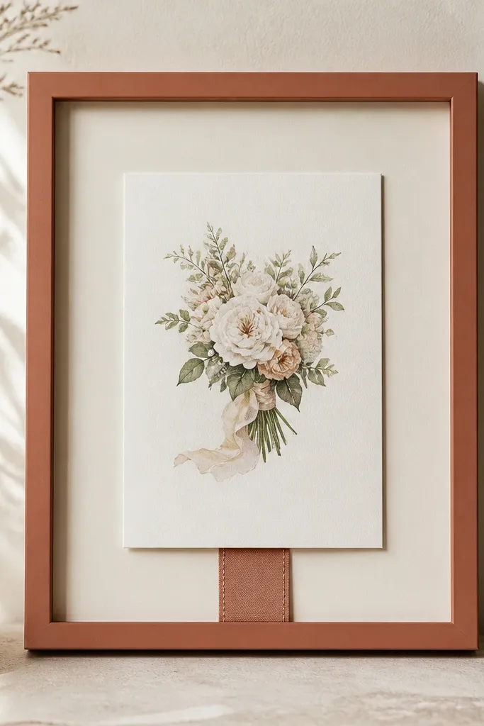
Terracotta is a grown-up color that still feels wedding-friendly when you keep everything else quiet. The off-white mat gives the card contrast, and the small ribbon tie-back adds a handmade detail that looks expensive when it's neat and centered. This works best when your invitation suite has terracotta, burnt orange, or warm clay accents. It also photographs well against green foliage because the frame color echoes the environment.
Choose a terracotta frame with a matte or satin finish so it doesn't look like painted plastic. Use an off-white mat with a 1 inch border around a 5x7 card. Add a stitched ribbon tie-back behind the card: tuck a 1/4 inch wide ribbon into the bottom center and secure it with clear thread or archival tape so it doesn't sag. Mount the card with tape points so it covers the ribbon ends. Finish by closing with anti-reflective glass and keeping the ribbon centered under the card text area.
Try thisUse ribbon that matches your invitation envelope seal color, not your bouquet stems.
Common mistakeAvoid loose ribbon bows - they look like craft store packaging.
11. Charcoal frame with vellum label strip
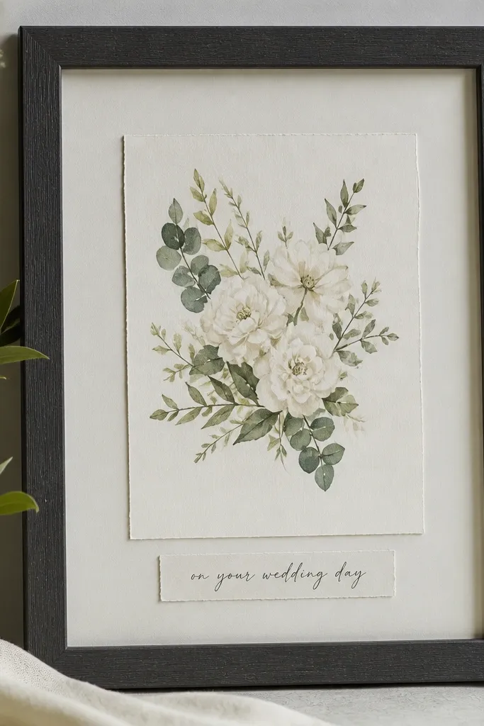
This is the "simple but styled" option when you want the frame to feel like a keepsake page, not just a card holder. The charcoal frame gives structure, and a vellum label strip adds a soft layer that looks like it belongs in a stationery suite. I like this for couples who want their names and wedding date visible without putting it over the main card design. It also keeps the card text readable because the label strip sits below, not on top.
Pick a charcoal frame with a matte finish and internal depth for a label strip. Use a light mat (warm ivory or soft gray) with a window border of about 0.9 inches for a 5x7. Mount the wedding card first on small spacers so it floats. Create a vellum label strip that's about 4 inches wide and 1 inch tall, centered under the card within the frame, then secure it with tiny archival tape tabs at the corners. Close with anti-reflective glass so the vellum doesn't glare.
Try thisWrite the label strip in a fine tip black pen that matches your card ink tone.
Common mistakeDon't place the label strip too high - it will visually compete with the card's main typography.
12. Aged mirror frame with black mat center window
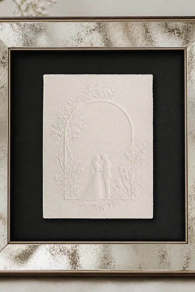
Aged mirror finishes look expensive because they reflect the room softly instead of blasting light back at the camera. When you pair that with a black mat center window, the card becomes the focus and the reflection stays controlled. I use this when the wedding venue has neutral decor and you want the card frame to look like a decorative object on a mantel. It's also good for couples who chose black and white stationery with small gold accents.
Choose an aged mirror frame with a thin profile and a protective backing. Use a black mat with a window border of 0.8 to 1 inch around your 5x7 card. Mount the card on 8-10 mm spacers so it floats and doesn't touch the mat. Keep the backing neutral gray so the mirror effect doesn't bounce too much color. Seal with anti-reflective glass, then position the frame so reflections land on the edges, not across the card text.
Try thisTest where glare hits by standing where guests will stand and taking one photo - adjust the frame angle if needed.
Common mistakeAvoid fully silver mirror frames - they create harsh hotspots and look costume-like.
13. Bamboo frame with natural jute backing
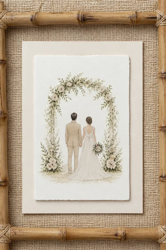
Bamboo frames can look cheap fast, so you need the right pairing: natural jute backing plus a light mat that separates the card from the texture. This combo reads warm, coastal, and intentional when your wedding palette has beige, sand, cream, or soft green. The jute texture adds depth without shine, which helps the card look grounded in photos. It also flatters light paper because the mat keeps the card crisp against the rougher background.
Pick a bamboo frame with a matte finish and a secure backing so the jute doesn't snag. Use a light mat in creamy ivory with a window border of about 1 inch for a 5x7 card. Cut jute to fit the inner backing area and smooth it flat against the backboard. Mount the card with four tape dots on the corners only, then add 1/4 inch spacers if you want the shadow gap. Finish with anti-reflective glass so the jute doesn't catch light in random spots.
Try thisTrim jute edges cleanly and tape the back seam so fibers don't shed into the frame.
Common mistakeAvoid glossy jute or satin backings - they make the whole frame look like a craft project.
14. Blush pink frame with pearl white mat and micro-floral corner stamps
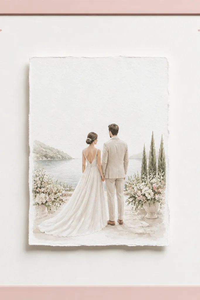
Blush pink frames work when the rest of the design stays restrained. Pearl white mat keeps the card bright and stops blush from overpowering the invitation typography. The micro-floral corner stamps add a delicate, stationery-style detail that feels designed, not decorated. I've used this for couples with blush napkins, pink florals, or rose-gold accents. It also flatters fair to medium skin tones in photos because it adds soft warmth without turning orange.
Choose a blush pink frame with a satin finish and clean edges. Use a pearl white mat and keep the window border at roughly 0.9 inches around a 5x7 card. Add micro floral corner stamps on the mat corners using a stamp pad that matches the frame tone, then let it dry fully. Mount the card with archival tape at four points, then use spacers so it floats 8-12 mm above the backing. Close with anti-reflective glass and wipe the mat so fingerprints don't show on the lighter surface.
Try thisTest stamp placement by dry-fitting the card first so the stamp sits outside the card's visual area.
Common mistakeAvoid hot pink - it makes the card look like a party invite instead of a keepsake.
15. French Blue Velvet Frame With Gold Leaf Edge
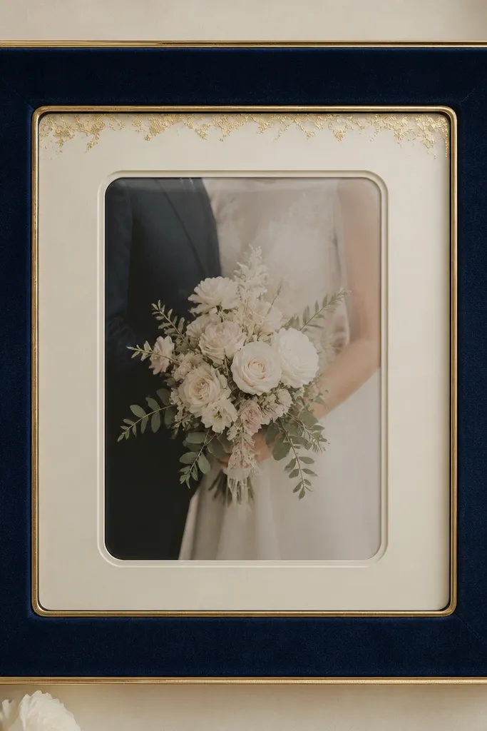
I'd do this one when the wedding vibe is moody, old-world, and a little dramatic. The French blue velvet reads expensive in a way plain wood never does - it absorbs light, so the gold edge looks sharper and brighter. I like pairing it with a warm cream mat so the blue doesn't feel cold next to skin tones. The card sits under a clear cover so the velvet stays clean and the edges don't get scuffed from handling. This frame also photographs really well because the velvet texture shows up as soft highlights instead of harsh reflections.
Pick a frame thickness around 1.5 to 2 inches so the velvet border has enough depth to look intentional. Use a warm cream inner mat with a 1/4 inch reveal so the gold edge stays visible without stealing attention from the card. Add a clear acrylic or glass front with rounded corners and a snug gasket - that keeps the velvet from getting dusty while still letting the gold flecks sparkle. Finish by mounting the card with two small linen corners or a thin archival tape strip on the back edge so it lies perfectly flat. Check the spacing so the card sits about 1/8 inch below the clear cover edge - it prevents glare lines across the card.
Try thisUse a lint roller right before you pack it - velvet holds stray fibers like crazy. If you want less glare in photos, choose a matte-clear acrylic instead of glossy glass.
Common mistakeSkip glossy gold paint on top of velvet - it looks plasticky and shows every fingerprint.