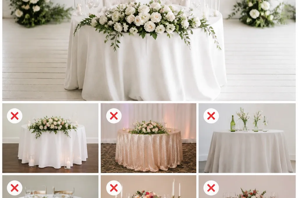
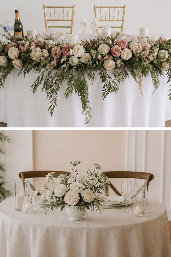
1. The "too-tall center" floral that blocked our faces
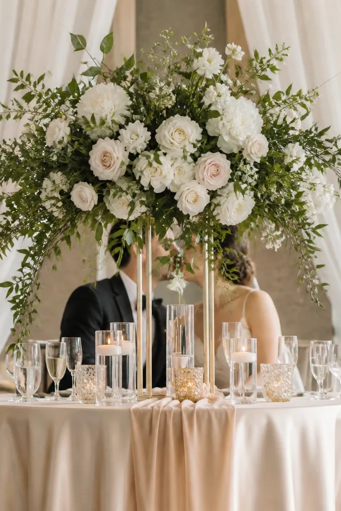
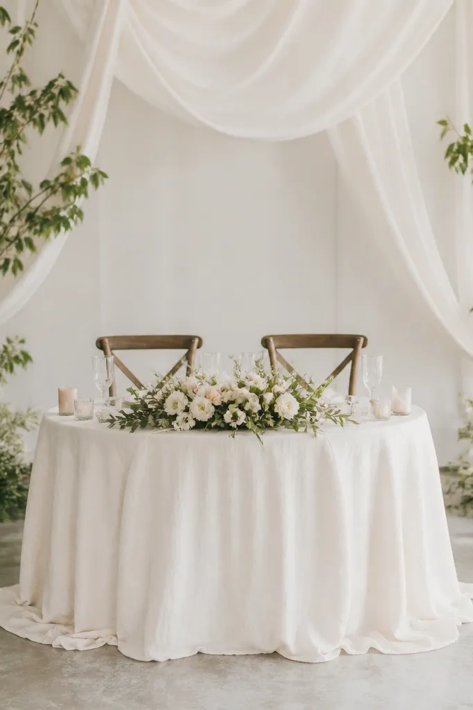
I put a tall cylinder vase in the exact middle because it looked dramatic up close. In photos, it turned into a visual wall, and every shot from the aisle made the arrangement swallow the couple. If you want florals to look romantic, keep the tallest point around chest height when seated, then let the stems taper down toward the table edge. This works especially well with blush, cream, and soft green palettes because the colors don't fight your skin tone and the greenery doesn't read as a dark lump.
Start by seating where you'll take photos and measure from the table top to your natural eye line, then set a hard limit for your centerpiece height. Build your centerpiece with a base that stays low - foam-free mechanics help here - and use shorter stems on the outside so the arrangement stays airy. Place any tall element slightly off-center if you're using a single statement piece, so one lens angle doesn't hit it dead-on. Finally, add small low clusters at the table corners to frame you without raising the overall height.
Try thisDo a 10-second phone test from the back of the room - if you can't clearly see both faces over the centerpiece, it's too tall.
Common mistakeMy mistake was thinking "taller = more romantic" and not checking how it looked from the aisle.
2. The wrong tablecloth drape that made my front edge look stiff
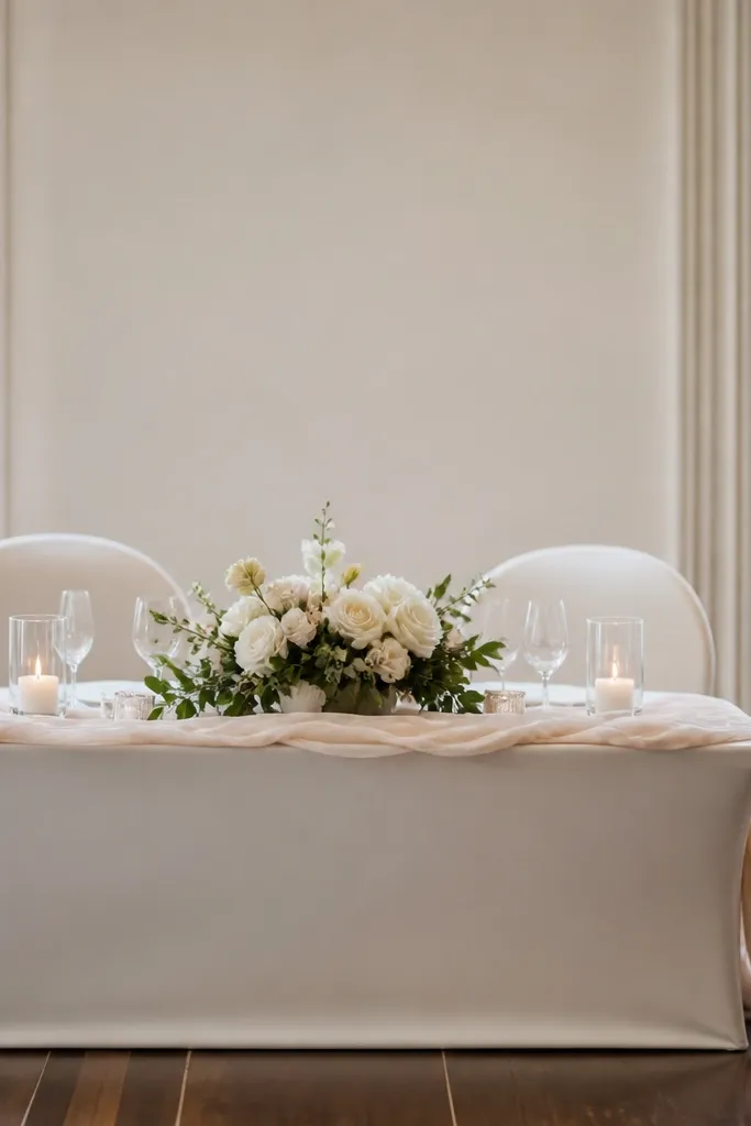
I chose a shiny cloth because I thought it would look "luxury" under warm lighting. It reflected spotlights hard and made the front edge look like a straight bar instead of a soft fall. For sweetheart tables, you want fabric that drapes and moves, not one that holds a rigid shape. Matte fabrics in ivory, champagne, or warm white look more expensive because they absorb light and hide minor wrinkles, which matters when the venue's chairs are slightly different heights.
Start with fabric weight: if it feels thin and clingy in the store, it will cling and crease on the table. Then choose a cloth with enough width for a natural hang - for most 6-foot tables, aim for a cloth that gives you 10-14 inches of drop on each side. Lay the cloth, pull the corners straight, and smooth the front edge by hand so the fold sits flat. Put the runner on top only after the cloth is set, and keep the runner centered with a small gap from the front edge so the drape still reads.
Try thisSteam the tablecloth in place, not on a flat surface - the steam releases the wrinkles exactly where they show in photos.
Common mistakeI skipped checking how the fabric creased under venue lighting and ended up with a stiff, shiny front edge.
3. Chairs that didn't match the table height (the photo gap)
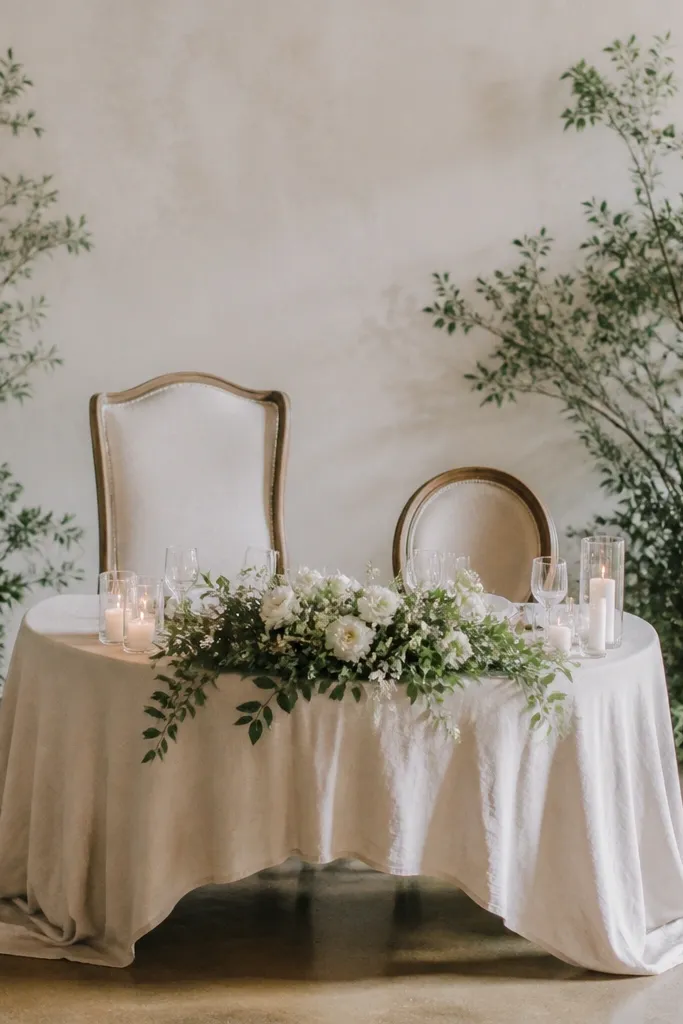
My chairs were "pretty" but not the same visual height once I sat down. That created a noticeable gap behind our shoulders in photos, and it made the backdrop look off-center too. A sweetheart table reads best when both chairs line up in the same height band and your shoulders feel level to the camera. If you're using upholstered chairs, match the back height and seat firmness so you sit at the same elevation. This is especially important for women with longer torsos or taller frames because chair height mismatch shows up immediately around the neckline.
Start by measuring the chair seat height from the floor and compare it to the table height you'll use on the day. Then do a dry run: sit in both chairs and have someone take a photo from the aisle level. Adjust by adding chair cushions or using different seat pads if the gap is visible. Finally, align the chair skirts or chair sashes so the fabric ends land at the same point on both chairs.
Try thisBring a small stack of seat pads or folded underlay - you can fix height differences in 5 minutes without redoing the styling.
Common mistakeI picked chairs based on looks alone and ignored the seat height, which created a constant photo gap.
4. A runner that was too narrow and looked like "extra fabric," not design
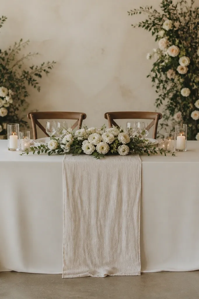
I went too narrow with the runner because I thought it would look airy. It ended up looking like I had simply placed extra fabric on top instead of building the design line. A runner should guide the eye and create a clear center path from the back row to close-ups. If you want a soft, romantic vibe, use a runner that's wide enough to anchor the table - especially if you're also using a floral centerpiece. Warm neutrals and subtle textures like satin organza or matte linen blends photograph better than shiny, thin synthetics.
Start by picking the runner width based on your table width: for a 6-foot table, a runner around 14-18 inches wide looks intentional. Center it so the edges sit evenly and don't bunch at the front corners. If you're using a floral arrangement, let the runner stop short of the centerpiece so it doesn't look tangled in stems. Then add small corner details - like two low candleholders or mini bud vases - so the table corners don't read as empty space.
Try thisPin the runner in place before the décor team touches it - runners shift when chairs get moved and the center line drifts in photos.
Common mistakeMy mistake was using a runner that was too narrow and a different sheen than the tablecloth, which reads as "last-minute."
5. Candles placed without checking wind and smoke in the room
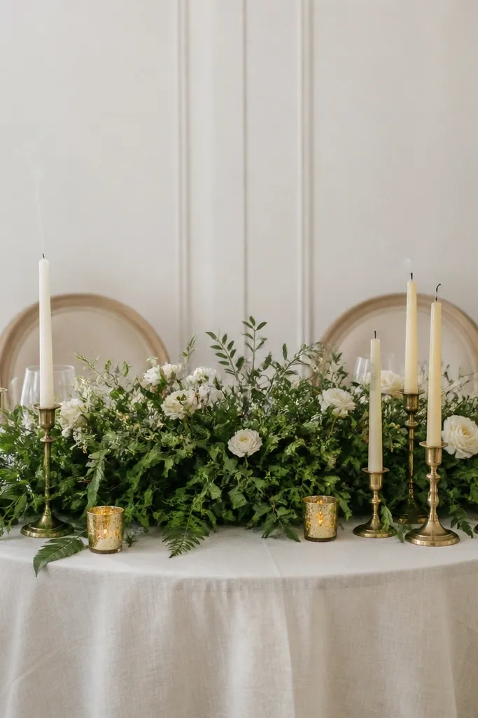
I thought taper candles would be the perfect romantic finishing touch. Then the room got a little drafty near the doors, and the flames leaned - the photos looked messy, and the smoke dulled the whites in the center. Real candlelight is gorgeous, but placement matters more than people admit. Use candles that match your centerpiece scale and keep them away from dense greenery and fabric. If you're doing winter or evening ceremony in a venue with airflow, LED warm-light candles in the same holders look clean and still photograph like real flame.
Start by checking where air moves: stand near the sweetheart table area and feel for drafts when doors open. Then place candles on a stable base with at least a few inches of clearance from greenery and any fabric backdrop elements. Use a holder with a weighted bottom so it doesn't wobble when someone brushes past. Finally, test a photo with your phone camera on portrait mode - if it blows out highlights or makes the flame look harsh, switch to LED candles with a diffuser.
Try thisIf you use real candles, trim wicks to about 1/4 inch so the flame stays steady and less sooty.
Common mistakeI placed candles too close to the greenery and didn't account for drafts, so the center looked chaotic.
6. Backdrops that were too close to the couple's heads
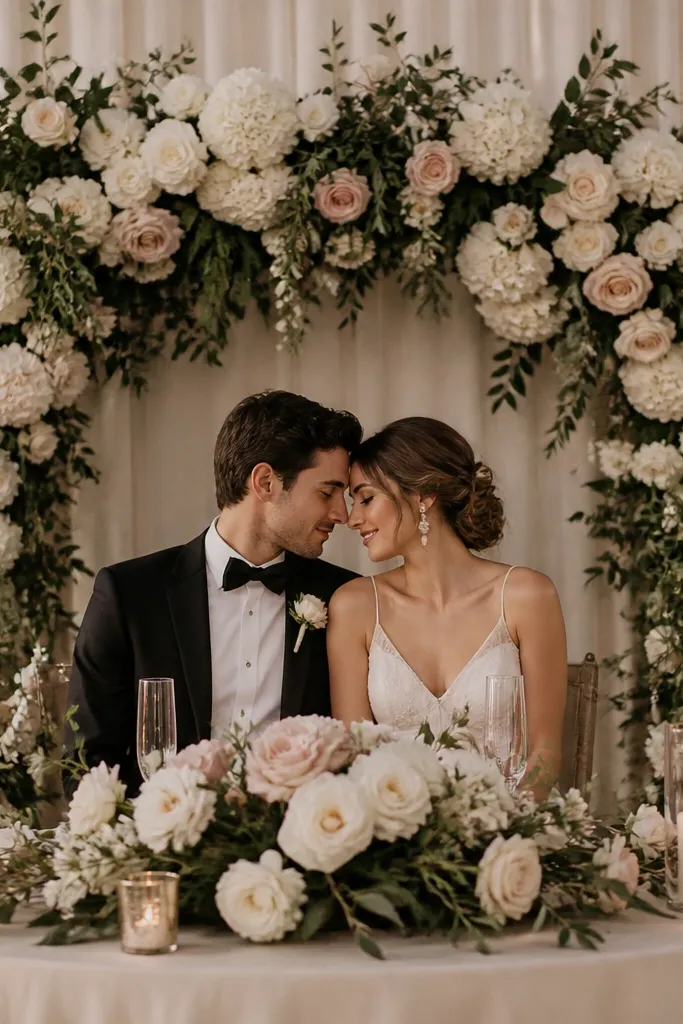
I leaned into a big backdrop because I wanted it to "frame" us. The problem was distance - when the structure sits too close, it crowds your hair and makes the background feel cramped in photos. A sweetheart table backdrop should create separation, not touch your personal space. This is where people lose the clean, airy look they think they're buying. Keep your backdrop back by enough space that your hair and veil sit clearly in front of it, and your lighting hits the backdrop without casting harsh shadows on your faces.
Start by placing the backdrop in a mock setup and measure from the chair back to the nearest part of the structure. Then do a photo test: sit where you'll sit and have someone take a picture from the front and one from the side. If the backdrop touches your head space in either angle, move it back or reduce the width of the structure. Finish by checking that the backdrop is centered to the table seam, not to your chair - chairs can be slightly off-center in real venues.
Try thisUse a simple marker on the floor to lock backdrop position before final décor - moving it 6 inches can change the whole photo look.
Common mistakeI packed the backdrop too close and ended up with a cramped background and shadowing behind our heads.
7. Floral colors that fought our skin tone (and turned us dull)
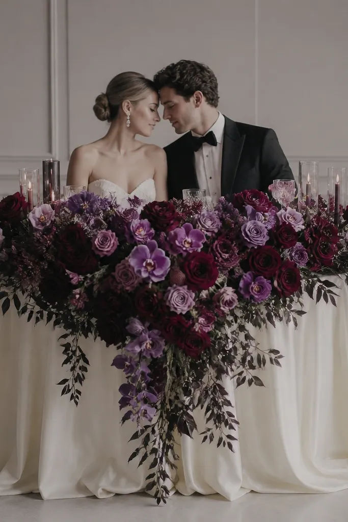
I picked a palette that looked stunning in the florist's photos but didn't flatter my skin under warm venue lighting. Deep purples and cool-toned greens can pull color out of your face, especially in banquet rooms with yellow overhead lights. If you want your complexion to look healthy on camera, build around warm creams, blush, and soft greenery with a little texture. I also learned that too much dark greenery reads like a bruise behind you in wide shots. Aim for a palette where your skin looks brighter next to the flowers, not "muted."
Start by testing your color pairing with a fabric swatch next to your face in the venue lighting if you can. Choose florals with warm undertones: blush roses, cream peonies, garden-style white blooms, and light-to-medium green eucalyptus. Keep dark accents to a small amount - think one narrow ribbon of deep color at the bottom, not a full blanket behind you. When styling, place the lightest flowers at the center line and let darker elements sit lower or farther back so they don't dominate your face area in photos.
Try thisIf your venue is yellow-lit, avoid anything that looks blue-purple next to your cheeks - swap in cream or peach tones.
Common mistakeI used cool, dark purples and heavy greenery that made my skin look flatter in pictures.
8. Table numbers and place cards placed too low for guest visibility
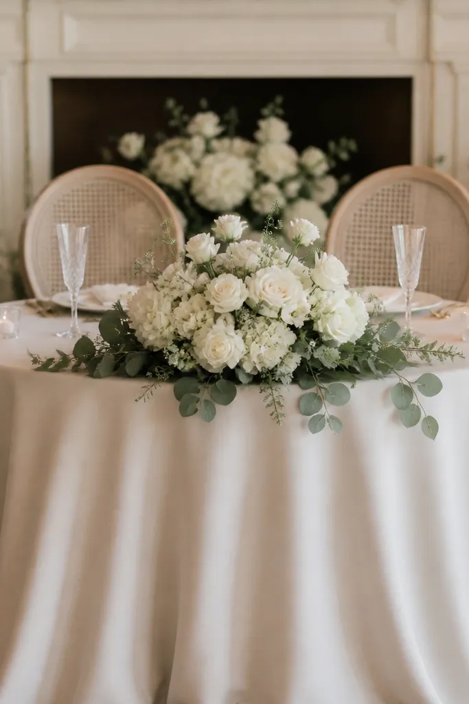
I put our place cards and the sweetheart table number on the front edge because it looked tidy. From the back of the room, guests couldn't read it, and the signage blended into the drape and florals. That's a styling miss because the sweetheart table gets looked at from multiple distances all night. If you want the look to feel intentional, keep signage readable without forcing guests to stand up. I like placing numbers on the back of the table area or on a medium-height stand that sits above the center floral line.
Start by deciding what people need to read: sweetheart table number, names, or a sign. Then position it so the text sits at around chest height when seated - not on the front edge. Use a stand or acrylic base that doesn't sink into the tablecloth fold. Finally, keep the sign set back from the centerpiece by a few inches so flowers don't overlap the text in close-ups.
Try thisTake one photo from the back row with your phone - if the text isn't crisp, raise the sign or switch to larger lettering.
Common mistakeI placed signage where it disappeared behind the centerpiece and the tablecloth fold.
9. Too many textures on the table at once (it looked messy, not romantic)
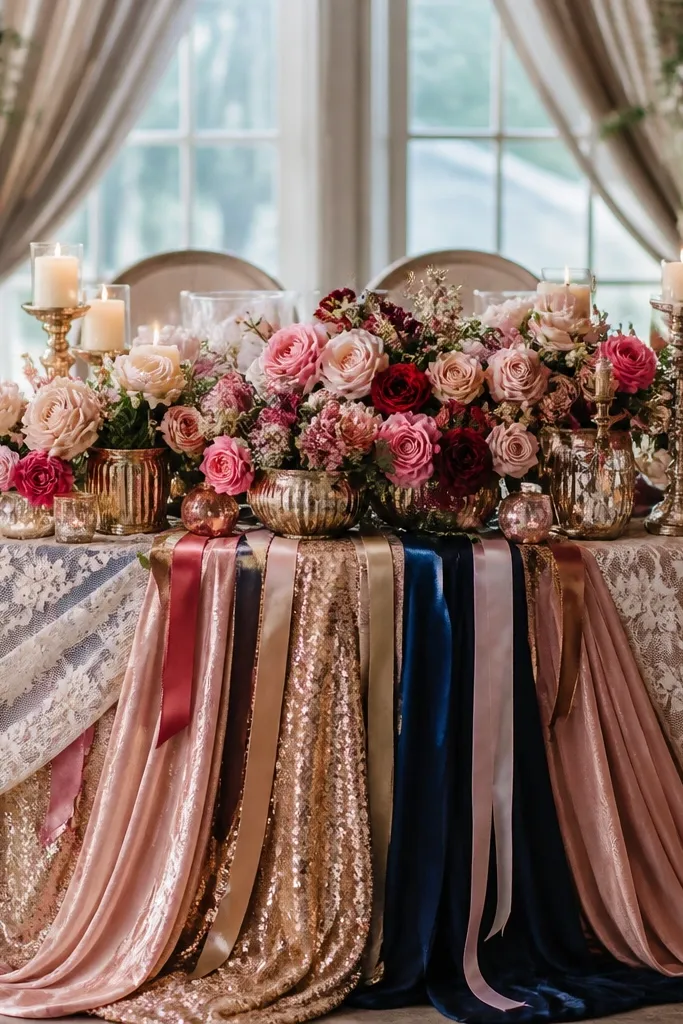
I tried to make my table interesting by mixing everything: lace, satin, glittery accents, and a busy floral arrangement. It looked amazing for a minute in person, then photos made it look cluttered. A sweetheart table reads best when you limit texture chaos and let one or two finishes lead. For me, matte linen or soft satin in one color family made everything look cleaner, while metallic accents in small doses kept it modern. This also helps if you have guests with busy outfits in the frame - your table should not compete.
Start by picking a base finish: matte linen or matte satin tablecloth, then stop there. Add only one secondary texture like a sheer organza overlay or a subtle lace runner, not both. Keep ribbons to a single color and one width so they don't fight your florals. When arranging the centerpiece, use fewer plant types - pick one main bloom and one filler greenery so the visual rhythm stays consistent. Finish by removing any décor that catches light too hard - if a piece looks sparkly under overhead lights, it will show up as noise in photos.
Try thisLay everything on the table dry first, step back 10 feet, then remove 20% of the items before you commit.
Common mistakeI mixed too many textures and accents, and the table looked busy in every wide shot.
10. Centerpiece scale that was right for a close-up, wrong for the whole room
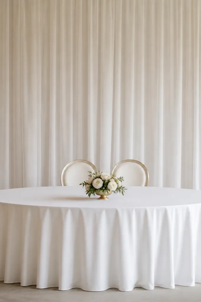
I sized my centerpiece based on how it looked on the table top, not how it would read against the room. In close-ups it was cute, in wide shots it looked like we forgot the main décor. Scale matters because the sweetheart table is a focal point, and your centerpiece needs to fill the visual space between your chairs and the backdrop. If you're using a tall backdrop, your centerpiece needs either height or width to balance it. A low, narrow arrangement can look tiny even if it's expensive.
Start by measuring the distance between the two chair backs and the width of the backdrop. Then choose a centerpiece width that covers roughly the middle third of that distance so it doesn't feel disconnected. If your backdrop is tall, add some vertical interest - a mix of medium-height blooms and low accents - rather than only low bud vases. Finally, add two side elements at table corners (candles, bud vases, or low floral clusters) so the table still looks full from the sides.
Try thisUse masking tape on the table to outline the centerpiece footprint before ordering flowers - it keeps you honest about scale.
Common mistakeI bought a centerpiece that fit the tabletop but looked lost against the backdrop in wide angles.
11. The "matching sets" look that ignored chair skirt length
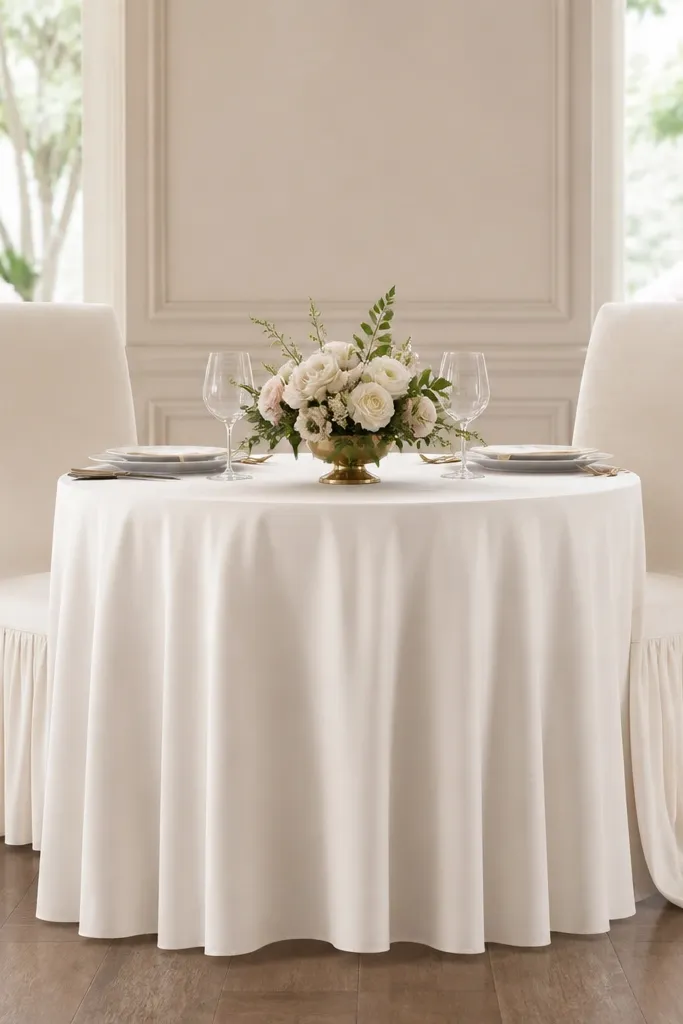
I ordered chair skirts that sounded like they would match my tablecloth, then I didn't check the length on the day. One skirt ended at mid-ankle while the other nearly touched the floor, and the difference shows up in every picture. The sweetheart table isn't just about the couple - it's about the frame around you. When skirts land at different heights, the whole setup looks like it came from two different days. Choose skirt lengths that skim and fall evenly for both chairs, and make sure the fabric weight looks similar so the drape lines up.
Start by checking chair skirt length before the event team pins anything. Sit in both chairs and have someone hold the skirt hem at the spot you like - I aim for a slight break above the floor, not pooled fabric. Then pin or clip so both skirts match that hem line. Use consistent fabric weight - if one skirt is airy tulle and the other is heavy satin, they will fall differently even if they're the same color. Finish by smoothing skirt folds so the front seam line stays straight in photos.
Try thisIf you have mismatched chairs, hide the difference with a slightly longer skirt on the shorter chair - it evens the silhouette fast.
Common mistakeI trusted "same color, same style" and missed skirt length differences that created a visible step.
12. Wrong lighting placement that made the table look gray
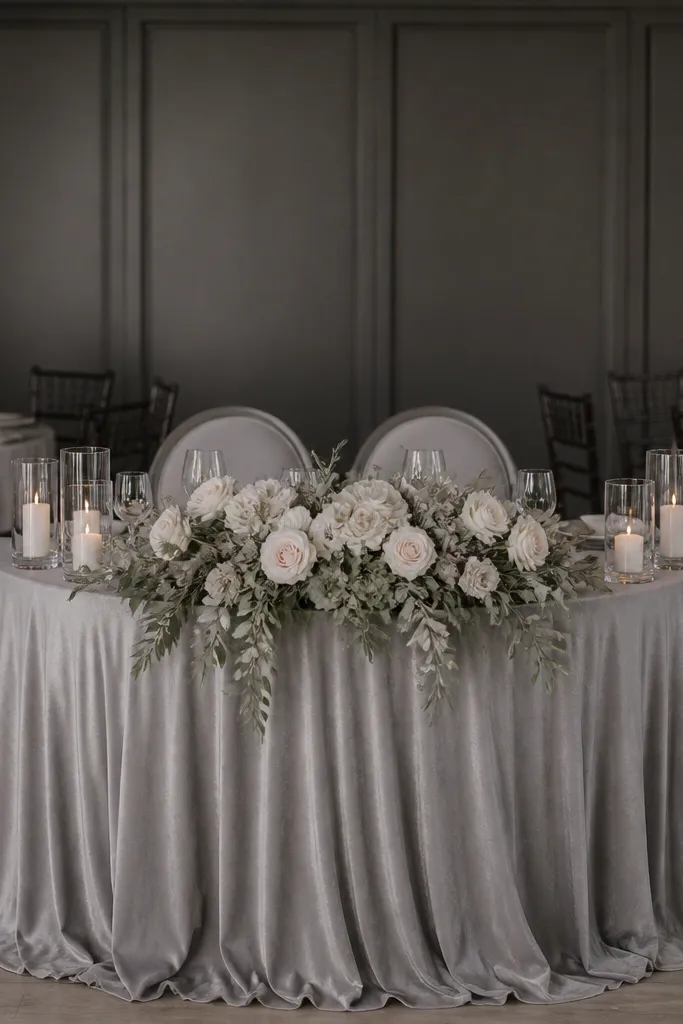
I didn't think lighting mattered because my décor was already neutral. Then the venue's overhead lights hit the table at a flat angle and turned my cream flowers into something closer to gray. This is why I now plan lighting direction, not just color. Warm uplighting aimed slightly upward behind the centerpiece makes creams look creamy and blush look alive. If you're using metallic candle holders or satin fabrics, lighting direction also prevents shiny glare.
Start by walking to your sweetheart table spot and looking up at the ceiling lights. If you see bright lights directly overhead, you need uplighting or diffusion to soften the shadows. Ask the venue for uplights or place small LED uplight units behind the table line so the light hits the backdrop and flowers, not your faces. Then adjust fabric choice: matte tablecloths and non-gloss runners handle light better than shiny satin when the venue lighting is unpredictable. Finally, take a quick test photo under the venue lights before guests arrive.
Try thisBring one small mirror and check how shadows fall behind your shoulders - if shadows look harsh, ask for uplights or reposition the décor.
Common mistakeI assumed neutral décor would photograph well under overhead lighting and ended up with gray, flat-looking photos.
13. A backdrop ribbon that kept tangling with the floral foam
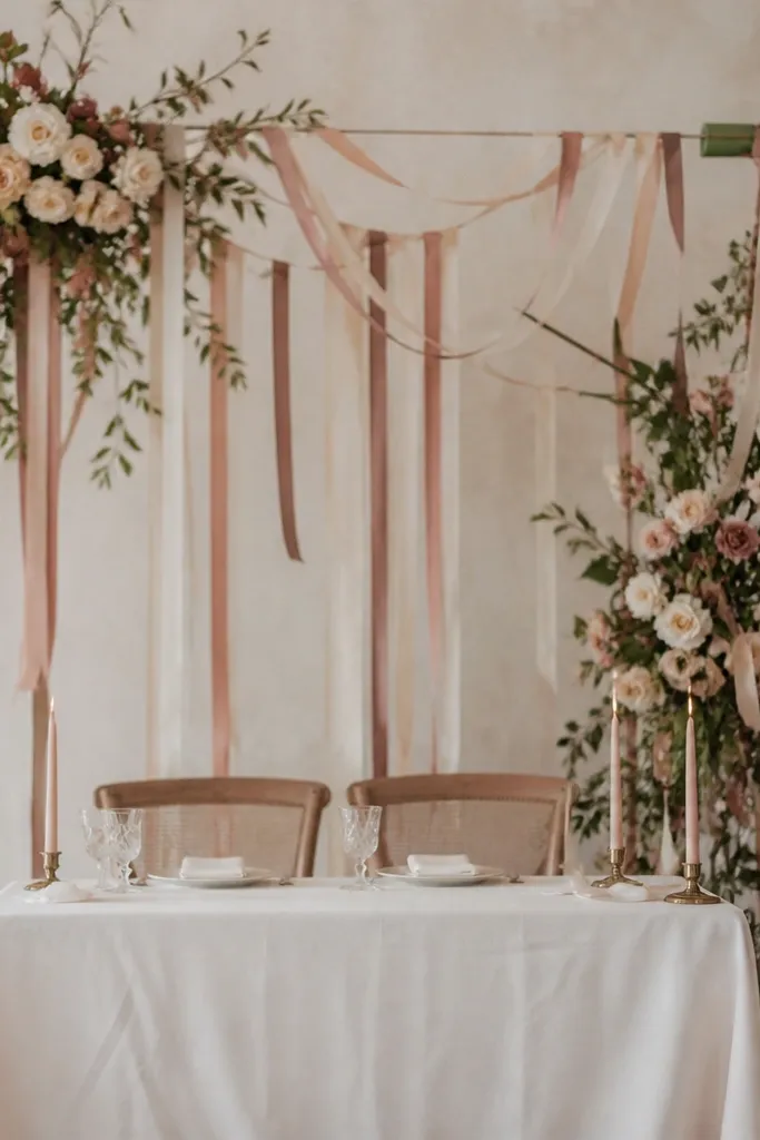
I loved the idea of hanging ribbons behind us. The execution was a mess because the ribbons kept catching on the floral structure and any exposed foam edges. On wedding day, you don't get time to untangle - it shows in photos and it annoys everyone. If you want ribbon movement, keep ribbons attached to the backdrop frame, not to the floral mechanics. Choose ribbon fabric that hangs smoothly like satin with a tight weave, and keep the ends weighted so they fall cleanly.
Start by attaching ribbon to the backdrop frame using zip ties or strong thread, then make sure it hangs freely without touching floral stems. If your florist uses foam, cover any exposed foam with floral mesh so fabric can't snag. Then cut ribbon lengths so the ends land around shoulder height or lower when you're seated, not at head height. Finish by checking the ribbon in motion - gently pull one end and watch where it drifts. If it drifts toward the centerpiece, shorten it or adjust attachment points.
Try thisUse weighted ribbon ends (small beads or a straight stitch hem with a little extra fabric) so they don't twist and knot.
Common mistakeI let ribbons hang from the floral structure and they tangled, which made the whole backdrop look sloppy.