1. Champagne-gold candelabra with sage taper cluster
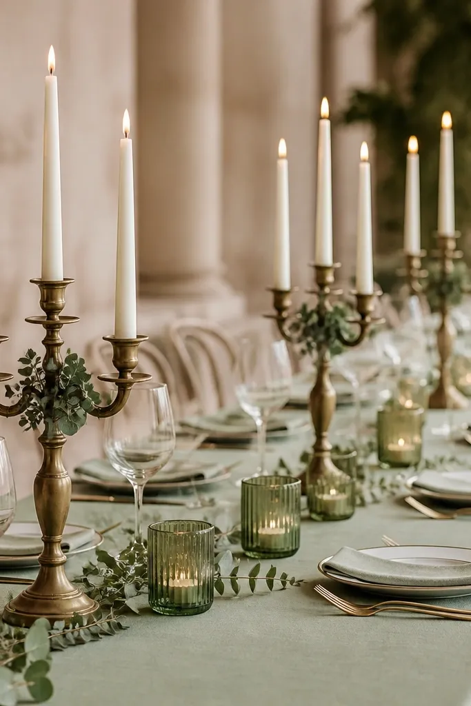
This look works because the gold reads warm and soft next to sage, instead of looking yellow against a cool green. I've used champagne-gold metal in places like candelabra and candle holders because it flatters both fair and medium skin tones in photos - it doesn't cast harsh yellow light the way bright yellow gold can. The sage element here is not just color - it's texture, via eucalyptus and sage-tinted glass. The styling principle is repetition: same gold finish across the centerpieces and a consistent taper height so the table looks styled, not crowded.
Start with your table runner or cloth in gray-sage (not mint). Then add antique champagne-gold candelabra at even intervals - I aim for one per every 4 to 5 feet of table, depending on width. Place three ivory tapers per candelabra and tuck tiny eucalyptus sprigs at the metal base so they look like part of the arrangement. Finally, add one sage-tinted glass votive near each cluster, not in every gap, so gold stays the highlight. Set your chair backs or menus with matching gold ink or gold foil so the finish ties back into the centerpieces.
Try thisIf your venue has warm bulbs, test one setup at the same time of day you'll take photos to confirm the gold doesn't go brassy.
Common mistakeAvoid mixing bright yellow gold chargers with antique gold candle holders - that mismatch reads "rental pile."
2. Gray-sage table linen with white floral in antique gold frames
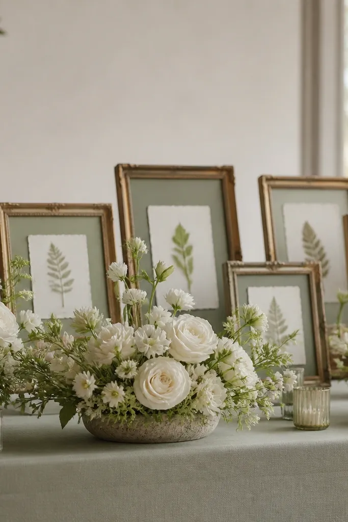
The combo of gray-sage linen and white florals gives a clean base that flatters everyone in the room. White blooms reflect light so your guests look bright in photos, while gray-sage keeps the palette from turning sugary. Antique gold frames add warmth without overpowering the flowers, and the frames add vertical lines that make the table feel taller in wide shots. This works especially well for couples who want a calmer look - it feels airy, not heavy.
Lay the gray-sage cloth first and keep the fabric finish matte (cotton-linen blend or matte polyester). Build low white arrangements - I like roses plus small filler like freesia or baby's breath - so you can still see across the table. Place antique gold frames behind the florals on a stand or easel, and slip in sage-and-white cards or pressed-leaf prints. Keep the frame count at an odd number, like 3 or 5, so it doesn't look symmetrical and rigid. Finish by matching your place card clip or menu card holder to the same frame color.
Try thisUse a single flower type for the pressed-leaf cards (like eucalyptus) so the paper details look intentional.
Common mistakeDon't choose a sage linen that's too light; it turns gray in photos and makes the gold look harsher.
3. Sage + gold arch with olive branches and cream drape
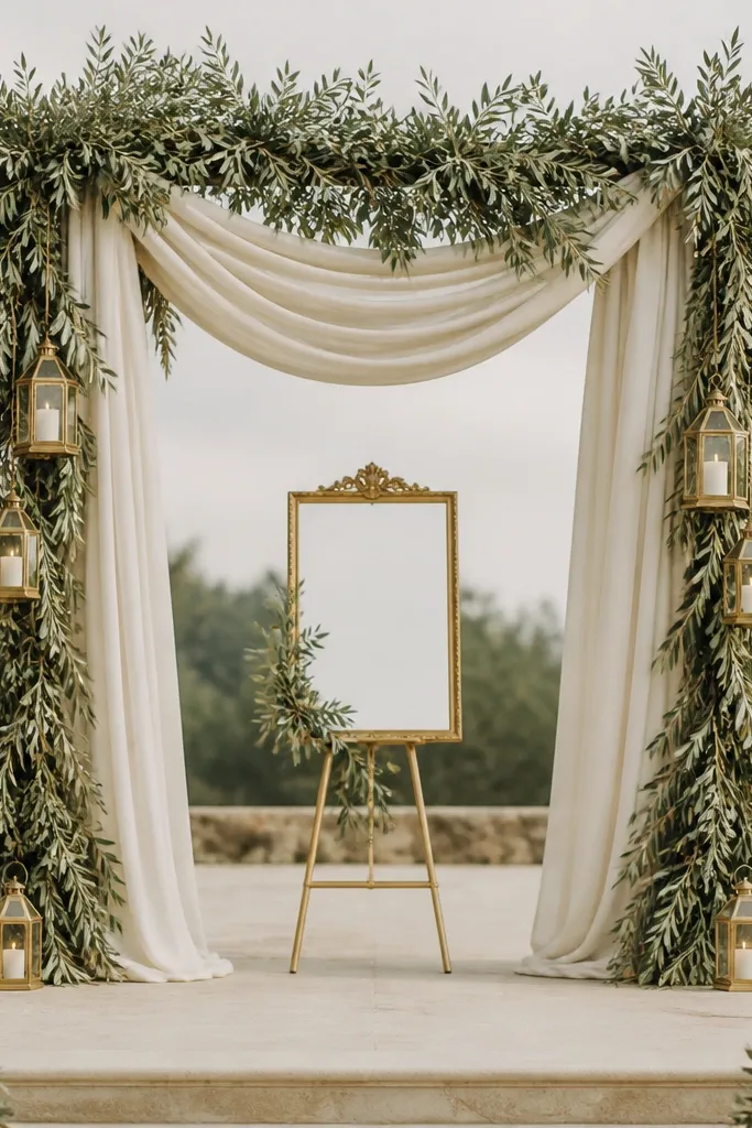
This arch style looks expensive because it uses movement. The cream drape creates soft highlights, while olive and sage greenery bring depth without needing pricey blooms. Antique gold lanterns and a gold-framed sign add that warm sparkle that shows up clearly in photos. It flatters couples because the arch frames the center of the body and keeps your faces bright against the greenery. I've used this for both indoor and outdoor ceremonies and it photographs well because the background has layers, not just one flat color.
Start with an arch base you can reuse (metal or foam ring). Wrap the base with olive branches first, then tuck sage-toned greenery in the gaps, so the greens look layered rather than pasted on. Hang cream drape panels on either side and let them fall to about waist height for most couples, then adjust on site. Add a gold-framed sign at center and place two antique gold lanterns on the lower sides. Keep the gold limited to those lanterns and the frame so it reads refined rather than cluttered.
Try thisPin the drape to the arch with hidden clips at three points so it doesn't twist in wind.
Common mistakeAvoid all-same-size greenery - it looks like a craft kit. Mix leaf sizes for a natural silhouette.
4. Sage bridesmaid dresses + gold sequin clutch for the bridal party
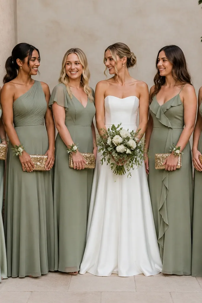
When you pair sage dresses with gold accessories, the palette looks cohesive without extra decor costs. Sage fabric sits close to skin and makes undertones look smoother, and gold sequins catch flash in a flattering way. I've seen this work across skin tones because the gold is not painted - it's reflective, so it lights up faces rather than dulling them. The styling principle is contrast control: keep the dresses in one shade family and let the gold be the only high-shine element.
Choose one sage shade family and stick to it across the party - gray-sage or yellow-sage. For variety, mix fabrics like satin (soft sheen) and chiffon (airy drape) while keeping color consistent. Give each bridesmaid a gold clutch or small gold wristlet, ideally sequins or metallic leather. Add a sage boutonniere or wrist corsage in eucalyptus and small white blooms so they match the ceremony greenery. For shoes, pick nude or metallic champagne - I avoid bright gold heels because they steal attention from the dresses.
Try thisIf you're doing photos outdoors, ask the photographer if flash is used; gold sequins look best with flash and won't look dull in shade.
Common mistakeAvoid mixing sage dress colors like mint + gray-sage in the same photo set - it fragments the palette.
5. Gold rim chargers with sage napkins and ivory plates
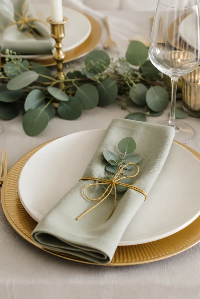
This is the simplest way to make an affordable sage green and gold wedding look high-end. Gold-rim chargers are an instant "designed" signal because they create a frame around the plate, and gold napkin ties add that second gold touch. Sage napkins bring color without forcing you to buy expensive centerpieces. I like this setup for both casual and formal venues because it reads polished in close-up photos and still looks tidy from across the room. The styling principle is framing: gold outlines the objects, sage provides the color block, and ivory keeps everything bright.
Lay an ivory plate and charger combination on each place setting, keeping the gold rim consistent across every table. Fold sage napkins into a simple rectangle with a slight roll, then tie with thin gold ribbon or a small gold napkin ring. Tuck a single eucalyptus sprig under the tie so it looks natural, not like a sticker. Add cutlery with a brushed finish that matches your gold (champagne or antique), not mirror-bright silver. Leave one inch of space between plate and charger so the gold rim is clearly visible.
Try thisUse fabric napkins if you can - they drape better and look more expensive than paper in daylight.
Common mistakeSkip mixed charger colors. If some are bright gold and some are antique, the table looks off in every photo.
6. Sage and gold escort cards on gold stands with pressed-leaf labels
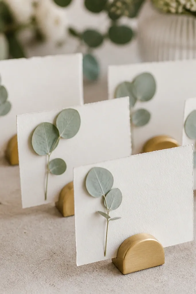
Escort cards are where your guests look up, and this setup makes them feel like part of the design. Pressed leaves tie the wedding palette to actual greenery, while gold stands keep it warm and photo-ready. Sage ink on the card text looks calm and intentional, especially in outdoor light. I've used this approach when budgets are tight because it replaces expensive signage with a clean, repeatable system. The styling principle is consistency: same font, same leaf type, same stand finish, different names.
Print your guest names in muted sage ink on thick cream cardstock (the kind that doesn't bend easily). Attach a small pressed eucalyptus leaf in the top corner using a clear adhesive dot. Place the cards on brushed gold stands and arrange them in alphabetical order with a slight stagger, not perfectly straight lines. Keep the stand height consistent so guests can read without leaning. If you have a welcome table too, match the same gold stand finish there so the whole entry area looks planned.
Try thisAsk the printer for a matte finish; glossy cards create glare and wash out the sage ink.
Common mistakeDon't use random leaf types. One leaf species looks cohesive; mixed leaves look like a craft table.
7. Antique gold cutlery with sage-toned acrylic candle holders
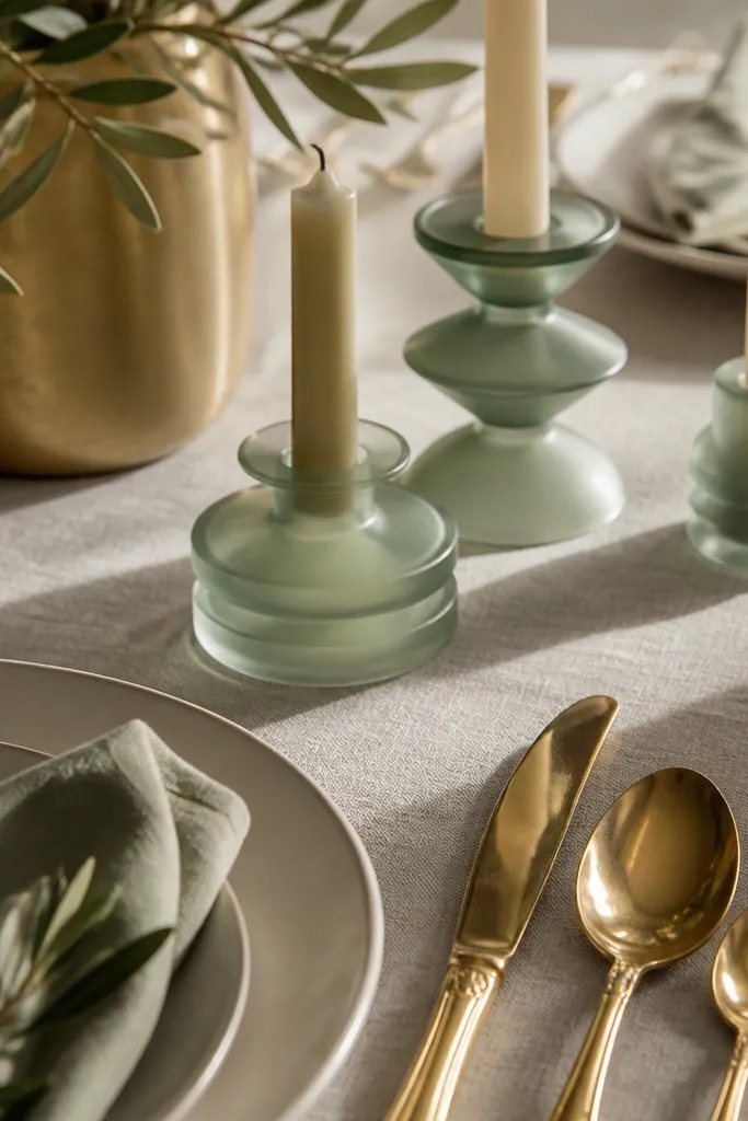
This is one of my favorite "affordable but luxe" combos because it adds sparkle at dinner without expensive florals. Antique gold cutlery catches highlights along the edges, and sage acrylic candle holders create a soft green glow that makes skin look healthier in evening photos. Frosted acrylic also hides candle wax mess better than glass, which matters when you're hosting. The styling principle is controlled shine: one reflective metal and one softly colored light source.
Set your table with ivory plates and antique gold cutlery, keeping the metal finish consistent. Place sage-toned frosted acrylic holders at the center of each place setting or in a small group per table, then insert ivory tapers. Keep the candle height around 10 to 12 inches so it stays visible but not blocking faces. Add a thin strip of sage fabric or a narrow runner down the center to connect the candles to the palette. Finish with simple place cards in cream cardstock and gold ink.
Try thisUse LED tapers for the rehearsal dinner or daytime events so you keep the look without worrying about wind.
Common mistakeAvoid clear plastic holders. They look cheap next to antique gold.
8. Sage and gold floating candle garland for the aisle
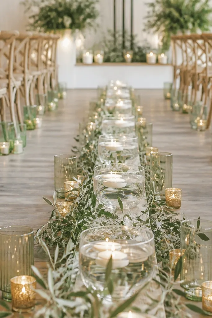
This gives you a ceremony moment that feels cinematic without building a huge installation. The shallow runner of candles produces a "floating light" effect, and sage glass makes the glow match your palette. Gold accents show up in small places so the aisle doesn't look bare. It flatters photos because the light lines guide the eye toward the couple and keep the background from swallowing your silhouettes. I've done this in both chapels and outdoor spaces; it works when you keep the candle height low and consistent.
Start by measuring the aisle width and picking a shallow runner or long tray that won't wobble. Place sage-green glass candle holders along the runner at intervals of 8 to 10 inches. Add a thin olive leaf garland down the center and lightly tuck it into the candle bases so it looks organic. Place small gold accents - like tiny gold votive cups or gold ribbon tied around a few holders - at every third interval. Keep flames (or LEDs) at the same height and use one taper style throughout.
Try thisIf it's outdoors, use LED tapers and keep the garland secured with zip ties hidden under the leaves.
Common mistakeDon't mix candle sizes. One tall candle in the middle ruins the line.
9. Sage green and gold wedding cake with textured buttercream ridges
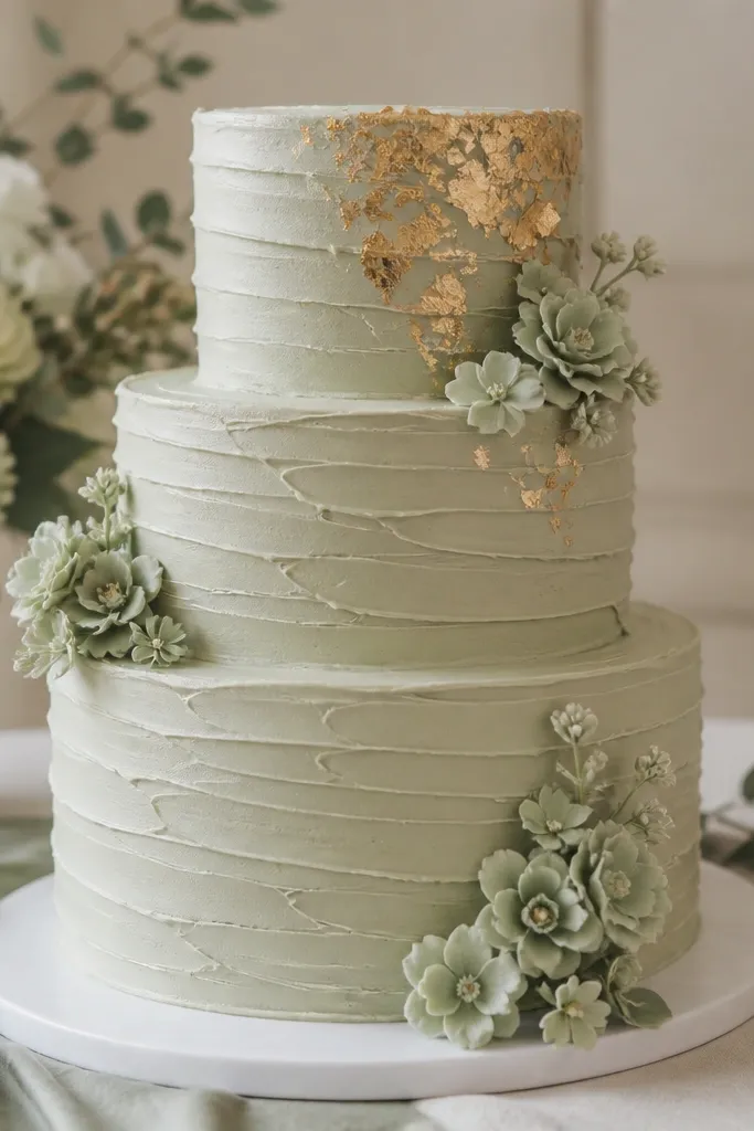
A textured cake looks expensive because it catches light and adds depth even if you keep the design simple. Soft sage buttercream gives a modern color block, and gold leaf makes the palette feel bridal without needing heavy fondant. This works for both fair and deeper skin tones in photos because gold leaf reflects warm light and doesn't cast a harsh yellow shadow. The styling principle is texture over complicated shapes: ridges plus a few gold leaf placements read "designed" from across the room.
Choose a soft sage base - not neon and not mint. Ask your baker for textured buttercream ridges using a comb tool or spatula technique, with ridges running vertically on the first tier and slightly diagonal on the second. Add small sage sugar flowers or piped buttercream blossoms near the bottom edge for grounding. Place gold leaf only on the top tier and two small sections on the side so it doesn't look like confetti. Finish with a simple gold cake topper in brushed champagne gold.
Try thisBring a swatch of your sage linen to the tasting so the cake matches your undertone in daylight.
Common mistakeAvoid edible glitter. It looks flat and sparkly under flash in a way gold leaf doesn't.
10. Gold mirror table number cards with sage acrylic base
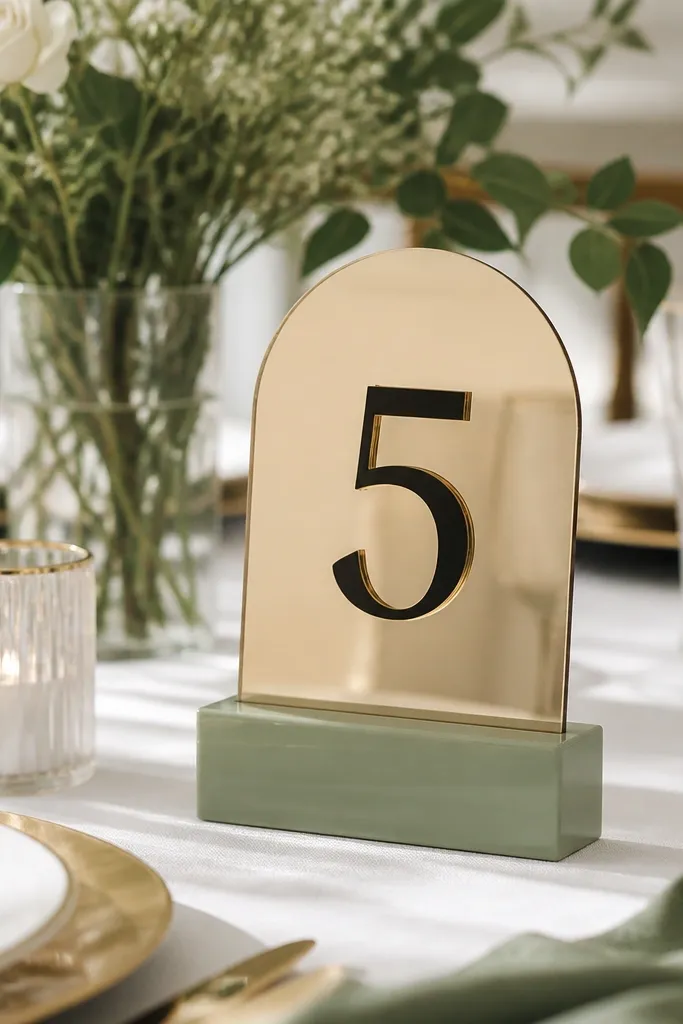
Table numbers are small, but they show up in every reception photo. Gold mirror cards reflect light and make the numbers feel crisp, while sage acrylic blocks tie them back to your palette without adding clutter. I like this for couples who want the design to look clean and modern instead of floral-heavy. It flatters the scene because it adds a glossy surface that contrasts with matte linens. The styling principle is light reflection: place the mirrors where they catch ambient light, usually near candles or windows.
Buy or rent sage acrylic blocks in a consistent size, then place your gold mirror table number cards on top. Print table numbers in a legible font and add a thin gold border that matches your cutlery finish. Keep the card height around 6 to 8 inches so they're readable in wide shots. For each table, position the number at the head of the table or near the center so it shows up in coordinator photos. If you have menus, print them on cream paper with gold ink to match the mirror cards.
Try thisWipe the acrylic with microfiber right before the event so it stays streak-free on camera.
Common mistakeSkip holographic or multi-color acrylic. It pulls attention away from the sage and gold theme.
11. Sage velvet guest book with gold pen and pressed leaf bookmark
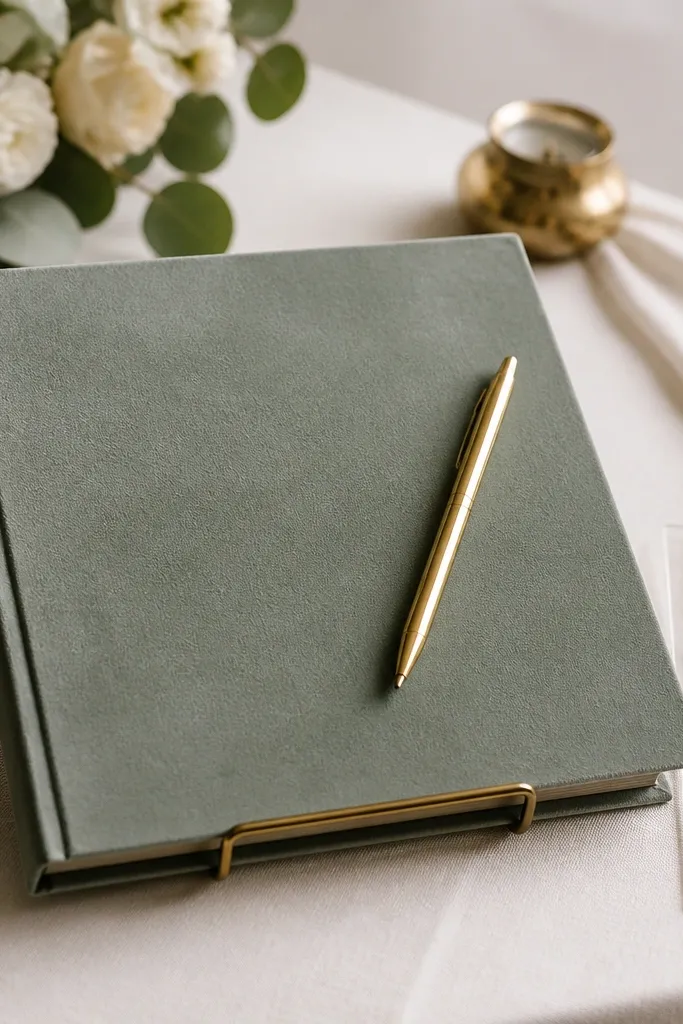
The guest book is one of the few items people touch during the event, so it needs to feel good and photograph well. Sage velvet looks rich without needing expensive embellishment, and gold accessories make it feel intentional. A pressed leaf bookmark ties the look to your greenery without adding extra color clutter. This setup flatters the space because velvet absorbs glare, so photos look softer and more premium. The styling principle is tactile texture: velvet + gold metal + matte paper.
Choose a sage velvet guest book cover in gray-sage for a mature look. Place it on a small gold stand or a gold tray so the velvet doesn't sit directly on the table. Add a brushed champagne gold pen with a simple cap and keep it centered on the book. Insert a pressed eucalyptus bookmark so guests can see the theme detail without reading signage. Put the guest book on the welcome table next to a small gold-framed sign printed in cream and sage ink.
Try thisUse a thicker bookmark card so the leaf stays flat and doesn't curl during the day.
Common mistakeAvoid shiny satin guest books. They create glare and the sage tone washes out.
12. Sage napkin ring made from gold wire and faux eucalyptus
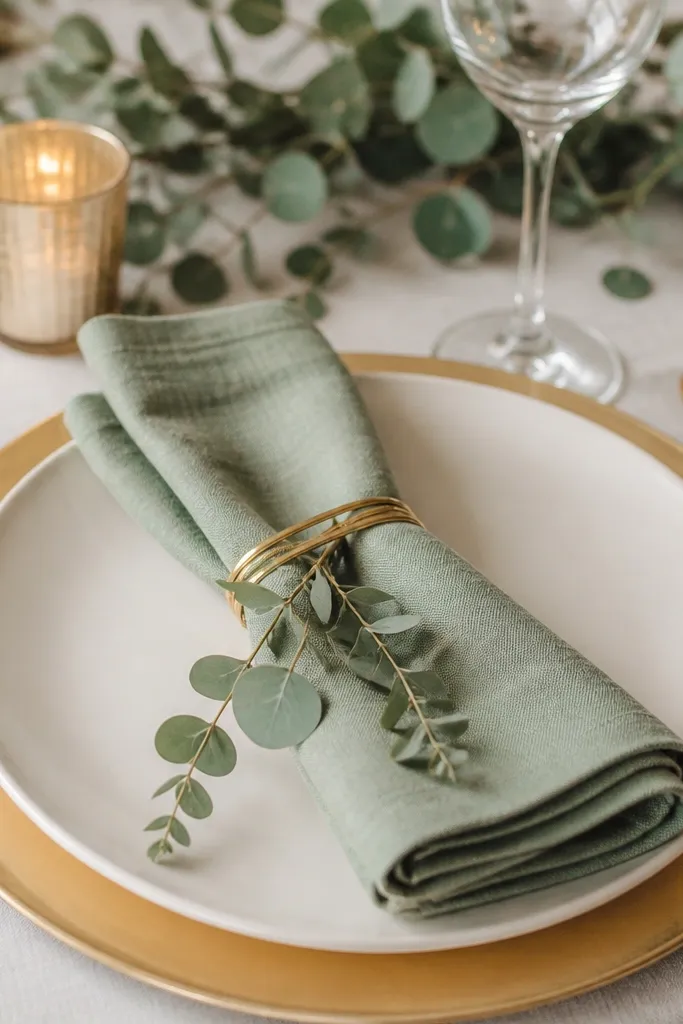
Napkin rings are where you can add personality without buying a bunch of expensive decor. Gold wire rings look airy and modern, and faux eucalyptus sprigs keep the palette consistent even if your real greenery runs out or wilts. This works especially well for outdoor weddings because faux greenery doesn't droop in heat. It flatters the table because the rings add a vertical element around the napkin, which looks neat in close-up photos. The styling principle is lightness: gold wire stays delicate, so the table doesn't feel heavy.
Fold sage napkins into a neat rectangle or simple roll. Wrap gold wire into an open ring shape, then twist the wire ends so they don't snag fabric. Attach a small faux eucalyptus sprig to the ring with floral wire, keeping it short so it doesn't stick up too high. Place one ring per napkin, then tie any extra ribbon flat. Keep the gold wire finish consistent with your cutlery or candle holders so it reads like one set.
Try thisMake a handful extra rings and keep them in a labeled box; one broken ring can ruin a table quickly.
Common mistakeDon't use chunky craft wire. It looks thick and cheap next to gold chargers.
13. Sage and gold welcome signage on gold easel with cream paper
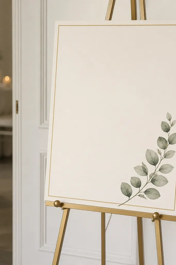
A welcome sign is the first thing guests see, and it sets expectations for the whole palette. Cream paper keeps it bright, sage lettering stays calm, and a thin gold border ties it to your metal accents. I like this because it's readable in daylight and still classy at night under warm lighting. It flatters the scene because the text is clean and doesn't compete with floral backgrounds. The styling principle is contrast: use sage ink on cream, not white-on-white, so it stays visible in photos.
Pick a brushed champagne gold easel so it matches your other gold finishes. Print the welcome text on thick cream cardstock and choose sage ink, not neon green. Use a thin gold line border and keep the design minimal - one corner accent with a eucalyptus illustration is enough. Add a small real eucalyptus sprig tucked into the easel base so it looks styled without covering the text. Place the sign near the entrance where it won't be blocked by guests lining up for photos.
Try thisBring two sizes of the same signage style: one main sign and one smaller direction sign so the entry looks coherent.
Common mistakeAvoid dark green ink on cream. It reads muddy next to gold.
14. Sage floral runner with gold confetti glass votives
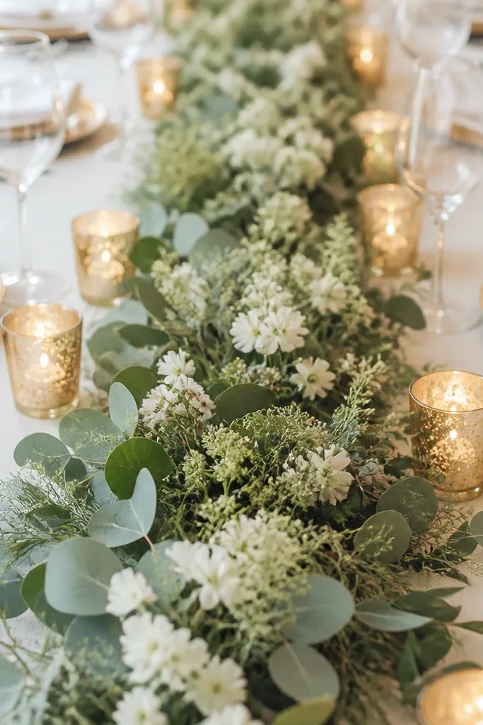
This runner look feels lush because it creates movement down the center. Sage greenery gives the base mass, while small white blooms keep it bright and prevent the table from looking too dark. Gold confetti votives add sparkle that shows up in both natural light and flash, and they don't require huge centerpieces. This flatters photos because the runner creates a clean line leading to the cake and the head table. The styling principle is a central axis: build one strong line, then let everything else stay simpler.
Start with a floral runner that's mostly greenery with a few white blooms spaced every 8 to 12 inches. Keep the runner width around 12 to 16 inches on a standard table so it doesn't overwhelm. Place gold confetti votives on both sides of the runner, staggered, so the lights don't look like a straight wall. Add sage napkins and gold-rim chargers so the table repeats the palette. Finish with small gold accents on place cards, like gold foil guest initials or a gold corner stamp.
Try thisChoose confetti votives with fine specks, not big glitter chunks, so the sparkle looks classy in photos.
Common mistakeAvoid heavy, dense floral mounds. They hide the table shape and make the whole look feel shorter.
15. Brushed gold balloon clusters with sage ribbon tails
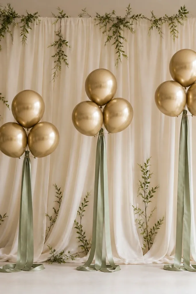
Balloons are a budget-friendly way to create a photo backdrop that still looks polished. Brushed gold balloons match champagne metals, and sage ribbon tails bring the theme into the lower half of the frame, where most people stand. I've used this for engagement-style reception photos because it creates a clean background without relying on expensive florals. It flatters everyone because the gold reflects light and the sage ribbon gives a soft color wash around torsos. The styling principle is height control: balloons handle the upper frame, ribbons fill the lower frame.
Choose brushed champagne gold balloons and cluster them in groups of three or five - not one giant single balloon. Add sage satin ribbon tails, cut to about knee height for most venues, and tie them at two points so they fall naturally. Place the clusters behind your photo spot on a cream drape or neutral wall so the gold stands out. Add a small strip of greenery at the bottom edge of the drape so it looks connected to the wedding palette. Keep the ribbon satin sheen similar across all pieces so the photos don't show uneven highlights.
Try thisUse balloon weights and check the wind. Ribbon tails act like sails.
Common mistakeAvoid metallic gold balloons that are too bright. They look like party balloons next to sage florals.
16. Sage and gold bar cart with herb sprigs and gold drink tags
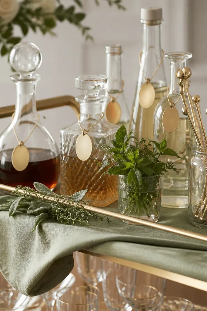
Your bar cart is a photo magnet, and it's one of the easiest places to repeat your palette. Sage fabric on the cart base makes the green feel intentional, while gold drink tags and stirrers add that warm sparkle without spending on big decor. Herb sprigs like rosemary or eucalyptus connect the drink station to your ceremony greenery. This setup flatters because it creates a clean, styled background behind guests holding drinks. The styling principle is functional decor: every piece has a job, so it doesn't look like clutter.
Drape a sage-green fabric runner over the cart shelves and keep it smooth so it looks tailored. Add glass bottles in different shapes, then tuck herb sprigs into bottle necks so they look fresh and controlled. Use gold drink tags - either printed cardstock with gold foil or actual gold metal tags - and hang them consistently at the same height. Fill a jar with champagne-gold stirrers and place it near the ice bucket. Finish with a small tray of sage-colored fruit or herb-infused garnish so the color repeats in the food area.
Try thisWrite drink names in sage ink on cream labels so the station looks cohesive in close-up photos.
Common mistakeDon't use random label colors like hot pink or black marker. It breaks the sage-and-gold rhythm.
17. Ivory satin bridesmaid robes with sage embroidery and gold piping
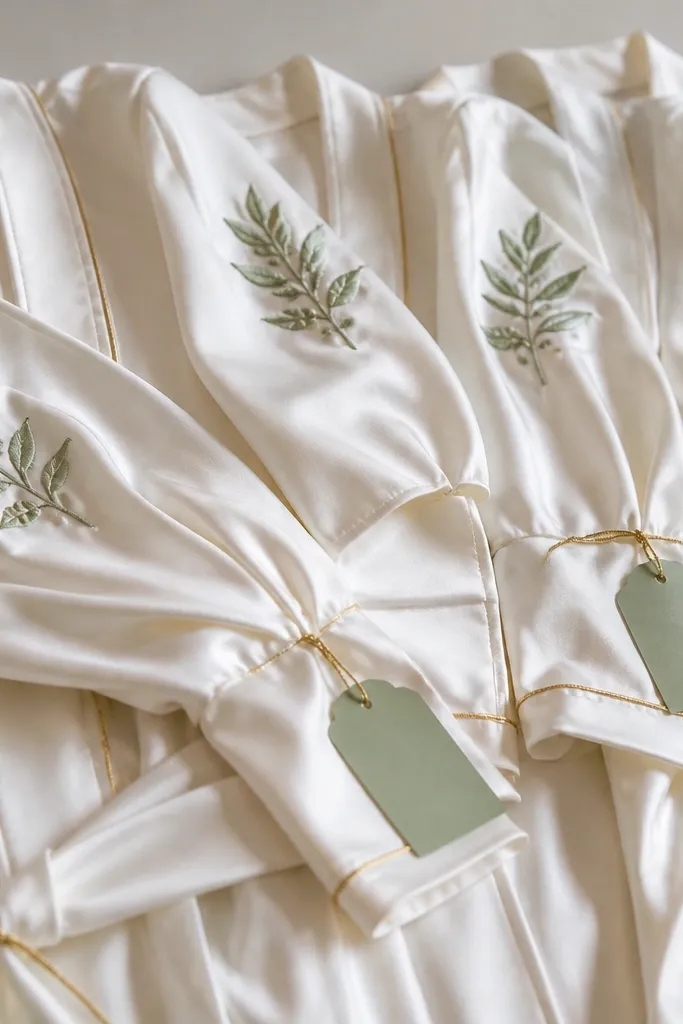
This is the kind of detail that shows up in getting-ready photos and makes the whole wedding feel pulled together. Ivory satin keeps faces bright, sage embroidery adds your color without covering the robe in green, and gold piping ties it to your metal accents. I've seen this work particularly well for warmer skin tones because the ivory base stays creamy, while sage and gold add contrast. The styling principle is trim control: keep the main fabric neutral and put your palette only on embroidery and piping.
Pick ivory satin robes with a medium weight so they drape and don't cling. Choose sage embroidery in a gray-sage tone for sophistication, and request thin gold piping along the lapel and cuffs. Keep the font simple and avoid heavy script so it looks modern in photos. Add matching sage-green hanger tags with gold string, then hang robes in a row so the undertone looks consistent. For accessories, give each bridesmaid a small gold clutch or hair clip that matches your ceremony gold finish.
Try thisSchedule a 10-minute robe photo window at the start of hair and makeup so the fabric catches soft morning light.
Common mistakeAvoid robes with thick glitter embroidery. It looks flat and itchy in close-ups.
18. Sage and gold hair accessories with antique gold combs and green pins
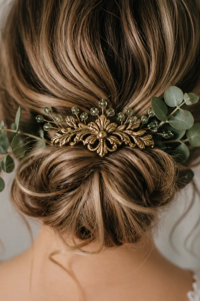
This is a small detail, but it matters because hair accessories show up in every ceremony photo and every video clip. Antique gold combs look more wedding-appropriate than bright gold because they match champagne metals and don't scream "costume." Sage-green crystal pins or green-tinted clips echo your palette without needing more flowers. I've used sage-tinted pins for brides with warm undertones because the green sits close to the skin tone and looks natural, not alien. The styling principle is cohesion: match the gold finish to your jewelry and keep green accents limited to a few placements.
Choose an antique gold hair comb or barrette and place it across a low bun or half-up style. Add 2 to 4 sage-green pins around the comb, keeping them spaced so they don't look like a cluster. If you're using real eucalyptus sprigs, place them where hair pins can hold them - near the bun base - and keep the sprig small enough to stay fresh. Match your earrings or necklace metal to the comb finish, ideally champagne or antique gold. Finish with a light mist of hair spray before placing pins so they don't slip.
Try thisBring a small sewing kit and bobby pins to the venue. One loose pin can happen fast during photos.
Common mistakeAvoid silver-toned hair pieces if your wedding gold is champagne or antique.
19. Sage green and gold wedding favors in mini gold boxes with dried eucalyptus
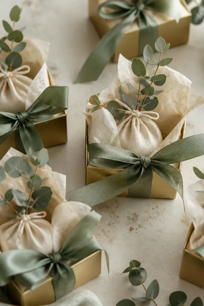
Favors are where you can make the theme feel personal without spending a fortune per guest. Mini gold boxes create that consistent gold finish, and dried eucalyptus adds sage color plus a recognizable wedding-green scent. I like this for couples who want something guests will actually use, not just toss. It flatters the reception photos because the favors look neat in detail shots and on the favor table. The styling principle is restraint: one gold box, one sage ribbon, one eucalyptus sprig per favor.
Buy mini gold boxes with a matte or brushed finish so they look wedding-ready. Place a small sachet or tea bag inside on top of cream tissue paper. Tie sage ribbon around the box using a simple bow and tuck a dried eucalyptus sprig into the ribbon knot. Arrange favors on a tray lined with sage fabric or a sage runner so the table matches your linens. Put one extra "display favor" that's prettier for photos, then fill the rest quickly with the same setup.
Try thisDried eucalyptus looks best when the sprig is short enough to stay upright in the box lid.
Common mistakeAvoid overly long sprigs. They snap and look messy by the end of the night.
20. Sage and gold cocktail napkins with gold foil edge
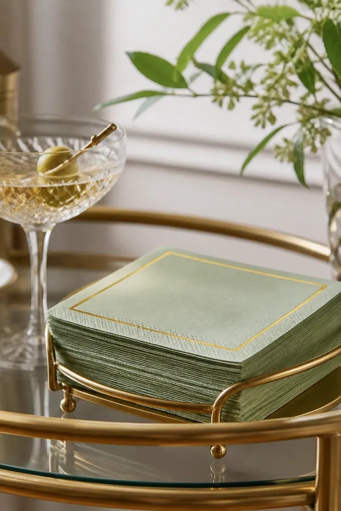
Napkins look small, but guests grab them constantly, and they show up in candid bar shots. Sage cocktail napkins keep the palette consistent, and a thin gold foil edge looks clean instead of flashy. I like foil edges because they reflect light in a controlled line, which photographs well even when the bar is dim. This works for both casual and formal weddings because it reads as "planned" rather than decorative. The styling principle is border detail: let gold be a line, not a block.
Choose sage cocktail napkins in a fabric-like paper or actual cotton blend, and look for a thin gold foil edge. Stack them neatly in a gold holder so the edges align. Place the napkins where guests grab them - near the ice and drink station - not hidden in a drawer. Add a matching gold drink tag or stirrer so the napkins feel part of one set. If you're doing table settings too, match the napkin tone to the main table napkins so the color stays consistent across the venue.
Try thisKeep napkin stacks at the same height on both sides of the cart so photos don't show lopsided piles.
Common mistakeAvoid thick glitter borders. They look like craft store supplies under flash.