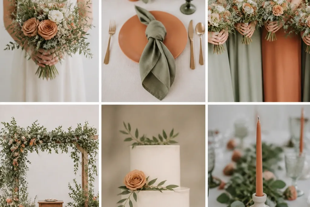
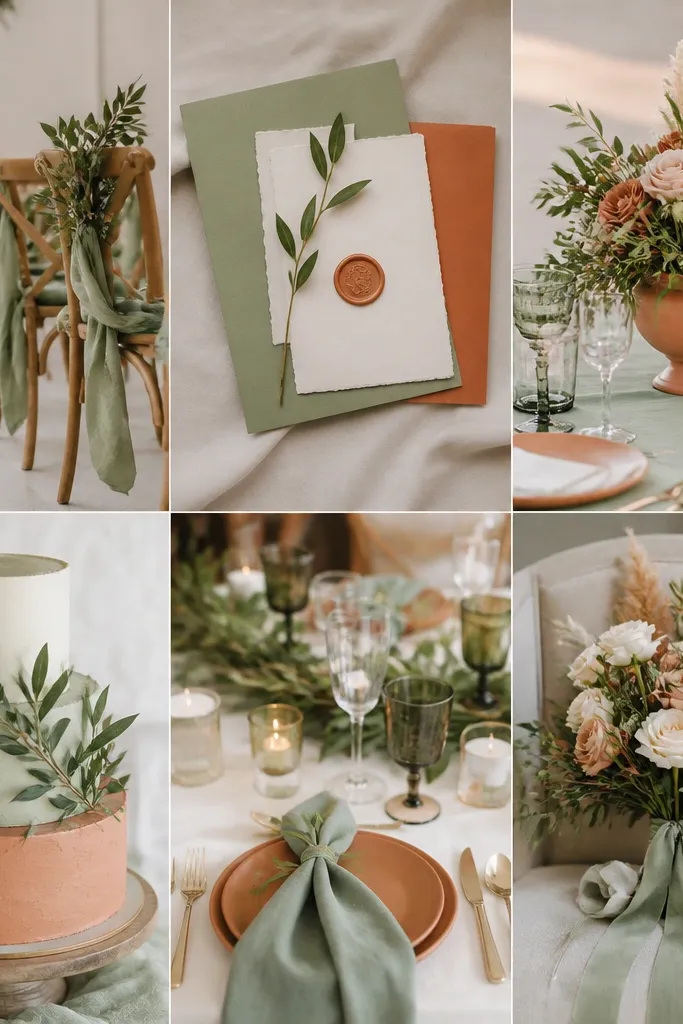
1. Olive-sage bridesmaid dresses with terracotta ribbon ties
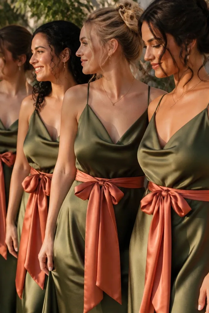
Choose olive-sage dresses with a slightly drapey fabric so they catch light softly instead of shining. Terracotta ribbon ties add warmth at the waist where cameras focus, and the contrast flatters most skin tones because the terracotta sits between peach and brick. I've used this on fair skin that burns easily (the warm clay tones keep the photo from looking washed out) and on deeper complexions (it adds warmth without turning the green dull). The styling principle is placement - use terracotta as a "spot color" on one body area so the whole look stays clean.
Start by buying or renting bridesmaid dresses in the same sage family, even if necklines differ. Then add terracotta ribbon ties in a consistent width, about 1.25 inches, and tie them at the natural waist rather than high under the ribs. Finally, keep shoes warm-toned: tan strappy sandals or bronze flats, and add small gold studs or tiny hoop earrings. For photos, photograph against a cream wall or outdoor greenery so the green and clay read true.
Try thisBring one terracotta ribbon to the fitting and compare it against the dress in natural light before you commit.
Common mistakeDon't use bright orange terracotta - it makes sage look grey and the whole wedding feel like a craft store theme.
2. Cream lace wedding dress with sage tulle veil
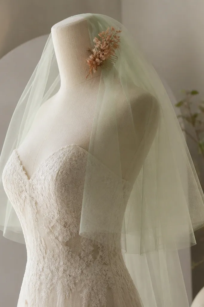
If you want the palette without dyeing your whole gown, keep the dress cream and add sage where the light can play. A sage tulle veil looks romantic in motion and frames your face, which is where undertones matter most. Terracotta can show up as a hair comb or small pin so the warmth appears in close-up photos. This flatters nearly everyone because the base is neutral and the colors are concentrated at the face and hairline. The principle here is contrast control - let cream do the heavy lifting, then add sage and terracotta in small, moveable pieces.
Start with a cream lace gown and choose a veil in grey-sage if your venue lighting is warm, or olive-sage if you're getting cool daylight. Then add a terracotta comb with dried-flower texture, like matte clay petals or terracotta resin beads. Keep jewelry gold rather than silver so the terracotta doesn't look ashy. Finally, style your hair in low waves so the veil drapes, not stands off your head.
Try thisCheck the veil against your skin tone in the bathroom mirror - sage can go too green under yellow bulbs.
Common mistakeDon't pair a sage veil with a silver-heavy jewelry set - it makes terracotta look muddy.
3. Sage and terracotta dried-flower bouquet with olive stems
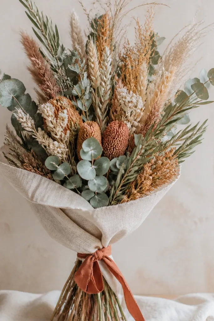
Dried flowers are the cheat code for this palette because they keep their undertone on camera and don't fight the venue's lighting. Use sage-green dried eucalyptus or seeded greens for the cool base, then add terracotta elements like dried roses, dried strawflowers, or clay-toned globe blooms. Olive stems tie it together and make the bouquet look intentional rather than "two colors thrown together." This works for brides with cool or neutral undertones because sage doesn't overpower, and terracotta adds warmth right where it looks flattering. The principle is texture layering - grasses for movement, eucalyptus for softness, and clay blooms for focus.
Start by soaking nothing - just sort your stems by thickness and build a base of eucalyptus around the outside. Then anchor the center with terracotta blooms, placing them slightly off-center so the bouquet doesn't look symmetrical in photos. Finally, add seeded grasses pointing upward and outward for shape, then wrap the stems with cream linen tape and tie a small terracotta ribbon at the end. Trim stems so the bouquet sits around mid-chest when held naturally.
Try thisTake a test photo in your venue's daylight window before the wedding day so you can see if your terracotta reads peachy or brick.
Common mistakeDon't use only one kind of dried flower - flat, uniform bouquets look like they came from the same bag of filler.
4. Terracotta bridesmaid dresses with sage embroidered shawls
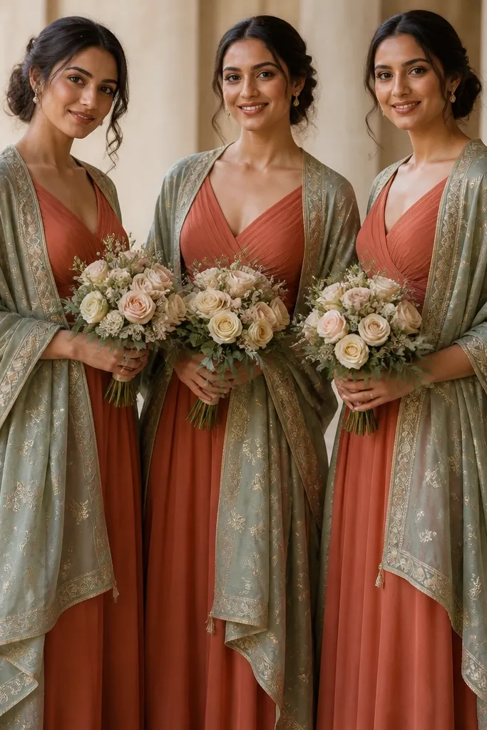
Flip the ratio for variety: terracotta dresses as the main color and sage as the soft overlay. Sage embroidered shawls look expensive because the stitching adds depth even if the dress is plain. This is flattering on a wide range of skin tones because terracotta warms the complexion and sage keeps it from looking too orange. I've used this formula for desert-outdoor venues where the sun makes terracotta pop - the sage overlay keeps photos balanced. The principle is controlled contrast - terracotta owns the body, sage frames it with texture.
Start with terracotta dresses in a matte fabric like chiffon or crepe so the color reads grounded. Then choose sage shawls with visible embroidery or a jacquard weave, and drape them so the embroidery sits at the upper chest and shoulder line. Add simple earrings in antique gold and keep hairstyles soft so the shawls move. Finish with sage-toned nail polish or a nude base with a hint of green undertone.
Try thisIf you're ordering shawls online, ask for a close-up stitch photo; embroidery that looks flat online can look great in person.
Common mistakeDon't pair terracotta dresses with a sheer sage fabric that's too light - it washes out and looks like a random cover-up.
5. Sage suit with terracotta pocket square for groomsmen
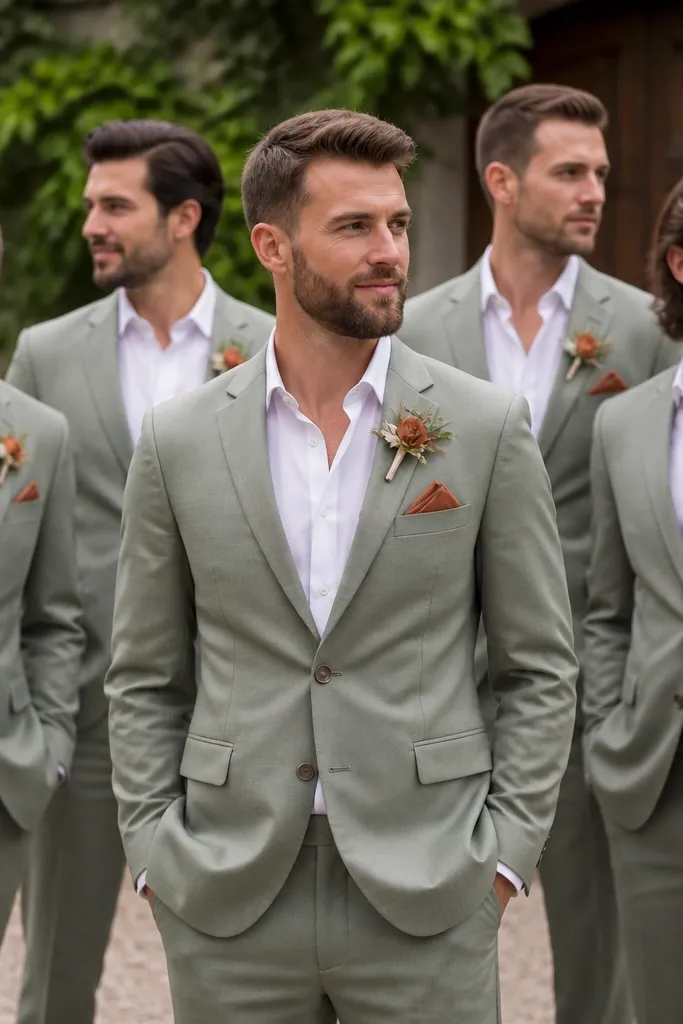
A sage suit is the easiest way to make a wedding look styled without changing every item. Terracotta in the pocket square adds warmth at the torso where cameras zoom in, and it keeps the suit from looking too muted. This flatters men with cooler skin tones because sage can look crisp, and terracotta prevents the overall palette from going monochrome. I've seen this work across body types too: a medium-weight sage suit holds structure for lean builds and still drapes well for broader shoulders. The principle is one accent - terracotta goes in small places so the look stays sharp.
Start by choosing sage suits with a matte finish, not shiny "wedding rental" satin. Then add a terracotta pocket square in cotton or linen - fold it into a simple TV fold so it stays flat in photos. Finally, match boutonnieres using dried terracotta-toned blooms or a terracotta ribbon wrap around the stem. Keep shoes in cognac or dark brown and use a belt that matches.
Try thisFold the pocket square the night before and steam it lightly so it looks crisp in close-ups.
Common mistakeDon't add terracotta to ties, socks, and pocket square all at once - it looks busy and cheaper than you think.
6. Terracotta tie with sage boutonniere for the officiant

This is the detail people notice in ceremony photos but rarely plan for. A terracotta tie looks warm and intentional against cream or white shirts, and a sage boutonniere keeps it aligned with the overall wedding palette. I like this for officiants because it adds color without forcing a full outfit change. It also photographs well because the tie is centered in the frame and the boutonniere gives a second color cue near the face. The principle is photo placement - use terracotta on the vertical line of the tie and sage on the lapel for balance.
Start by choosing a terracotta tie in a matte silk or textured knit so it doesn't glare under stage lights. Then pick a boutonniere with sage eucalyptus leaves and one terracotta-toned dried bloom or ribbon wrap. Pin it slightly above the lapel seam so it doesn't sink and flatten. Finish with simple cufflinks or no-show socks that match the shoe color.
Try thisIf the venue lighting is warm, choose a terracotta tie with a slightly deeper brick tone so it doesn't go peachy and washed out.
Common mistakeDon't use a glossy tie - it throws highlights that make the color look uneven in video.
7. Sage linen tablecloth with terracotta napkins and cream plates
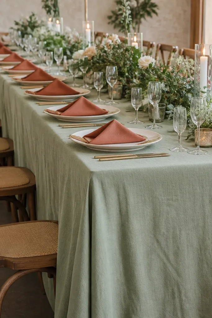
For décor, sage linen is the anchor because linen texture reads expensive even when it's budget-friendly. Terracotta napkins add warmth without forcing you to dye everything, and cream plates prevent the palette from getting too heavy. This combo flatters both indoor and outdoor settings because linen texture handles shade, sun, and mixed lighting. I've done this with simple glassware and it still looked polished because the colors were in the fabric layers, not printed on cheap items. The principle is base fabric + accent fabric - let linen do the work.
Start with sage tablecloths in a medium shade that isn't too grey; aim for a cloth that looks slubby, not smooth. Then add terracotta napkins folded into a triangle and place them centered on the plate or at the left side for a clean look. Use warm ivory or cream table runners if you need extra definition between centerpieces. Finally, match chargers or plates to cream, not stark white, so terracotta stays flattering.
Try thisSpray starch lightly on napkins so they hold folds without looking stiff.
Common mistakeDon't use printed terracotta fabric on the tablecloth - it looks like a disposable table cover in close-up photos.
8. Terracotta candle jars with sage labels and olive branches
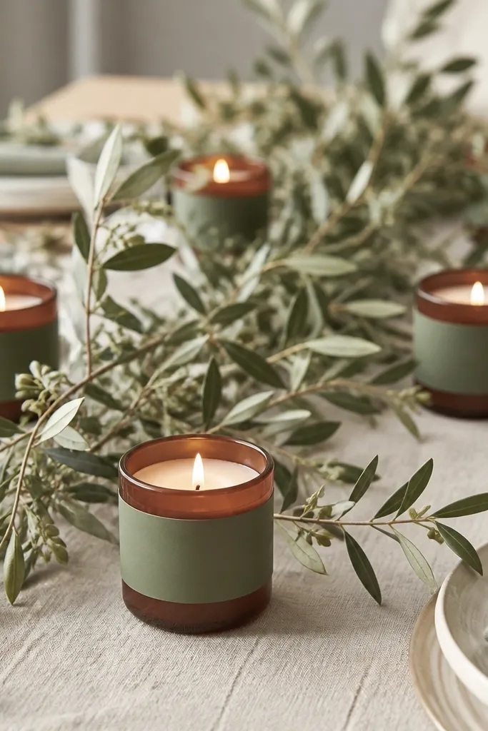
Candle jars give you height without building a tall floral structure, and the terracotta glass ties directly into the palette. Sage labels are a small branding move that makes everything look planned, even if you're using affordable candles. Olive branches add a natural green that sits between sage and olive, which keeps the palette from feeling too strict. This works especially well in evening receptions because warm candlelight makes terracotta look richer and sage look soft instead of flat. The principle is glow + texture - candles warm the colors, and branches add organic shapes.
Start by choosing terracotta-toned jar candles or plain jars wrapped in terracotta paper sleeves. Then add sage labels with printed text in a simple serif or a clean sans font, and keep the label size consistent across the table. Place a few olive branches behind each jar so the greens look layered, not random. Finally, scatter small sage-toned stones or dried eucalyptus leaves around the base for a natural finish.
Try thisUse LED candles for venues with strict fire rules, and test brightness - too bright LEDs can make terracotta look neon.
Common mistakeDon't put candles directly on a glossy table runner - reflections can make the jars look cheap and uneven.
9. Sage runner with terracotta place cards in cotton paper
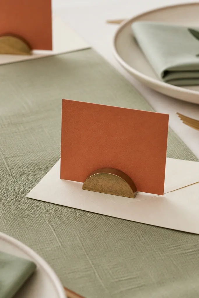
Place cards are one of the most photographed small items, so your paper choice matters more than the design. Sage runner fabric sets a neutral base, then terracotta cards add warmth without needing expensive signage. I've used cotton paper in a burnt terracotta tone and it looks soft under overhead light, not plastic. This flatters the palette because it keeps the green textured and the terracotta matte. The principle is tactile contrast - woven runner + matte paper + simple typography.
Start by laying a sage runner down the center or lengthwise across the head table. Then print place cards on cotton rag paper in a terracotta hue, not bright orange, and trim them with a straight guillotine so edges look clean. Use small terracotta ink or matching terracotta foil only for initials, keeping the rest in dark brown or charcoal. Finally, place cards in matching cardholders or tie them with a thin cream twine loop.
Try thisIf you're printing at home, do a test print on plain paper first to confirm the terracotta tone doesn't look too orange on your printer.
Common mistakeDon't use thick glossy cardstock - it catches light and makes the cards look like party favors.
10. Terracotta and sage macaron-style dessert stand
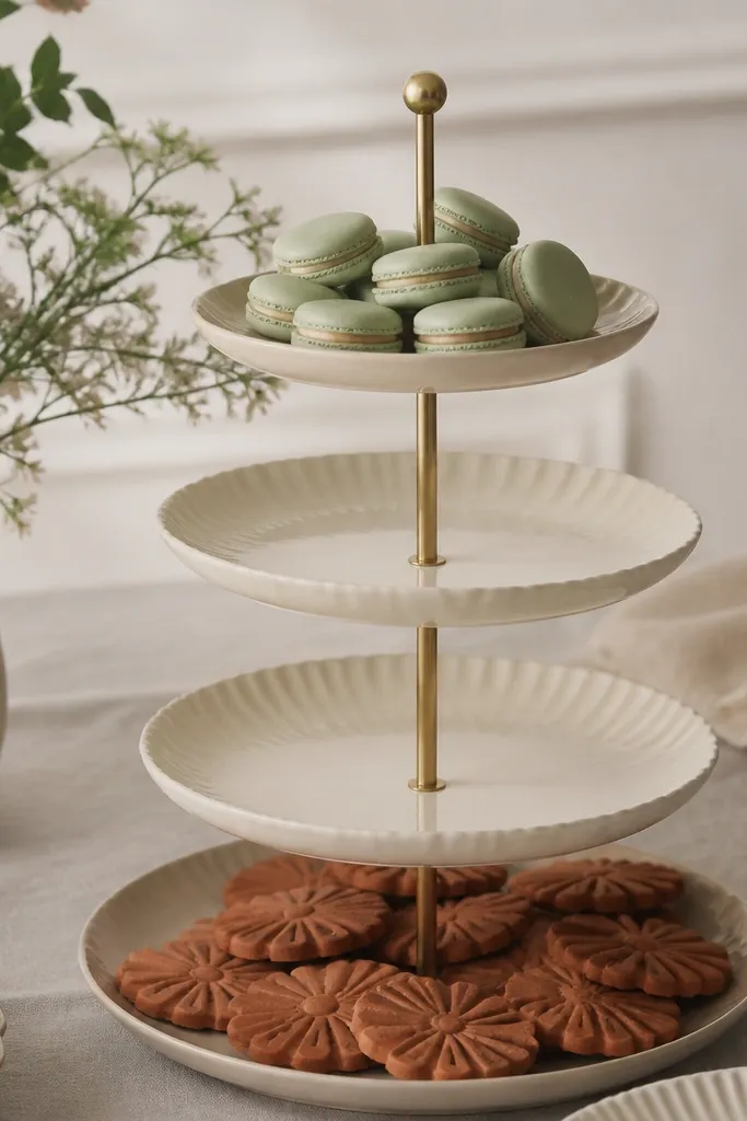
Dessert tables get photographed more than people plan for, and the palette helps you control the visual story. Sage-green sweets read fresh and clean, while terracotta cookies or cupcakes add warm color that looks good next to neutral plates. I like "macaron-style" sweets because their smooth tops contrast with matte décor, so the whole table looks styled. This works for both small and large weddings because you can buy a few dozen and still make it look intentional. The principle is color distribution - put sage where eyes start (top tier or center) and terracotta where eyes linger (bottom tier).
Start with a multi-tier dessert stand covered in cream or white parchment liners. Then add sage-colored macarons or buttercream cookies at eye level and terracotta treats on the lower tiers to balance the frame. Place a few small dried eucalyptus sprigs in terracotta planters near the stand so the floral palette repeats. Keep plate colors consistent: cream or warm ivory, not cool white.
Try thisUse a neutral background cloth behind the stand so the sage doesn't look grey.
Common mistakeDon't overfill the stand with mixed colors - two dominant shades plus neutrals looks intentional, five colors looks chaotic.
11. Sage and terracotta ceremony arch with fabric drape
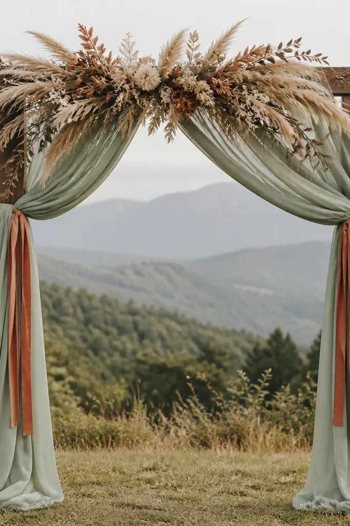
A fabric arch is the budget-friendly way to get that "big moment" look without building a full floral wall. Sage fabric gives you volume and soft movement, and terracotta ribbons add warm highlights. I've done this with plain polyester drape that looks great from the audience, but I always choose fabric that has a matte finish. Terracotta ribbons should be tied in small lengths so they sway and catch light. The principle is controlled repetition - sage panels repeat across the arch, terracotta only appears in the ties and one swag line.
Start by wrapping the arch with sage drape panels, spacing them about 6-10 inches apart so you see depth. Then tie terracotta ribbon lengths at the same height on both sides, around mid-arch, using a simple knot and trim ends evenly. Add a top swag made of dried greens and a few terracotta dried blooms for a focal point. Finally, keep the arch base simple with cream rugs or neutral ground cloth so the colors don't compete with the ceremony space.
Try thisBring a steamer and hang the fabric the day before - wrinkles can look messy in wide shots.
Common mistakeDon't use shiny organza for all drapes - it reflects harsh light and makes sage look washed out.
12. Terracotta macrame chair ties with sage aisle runner
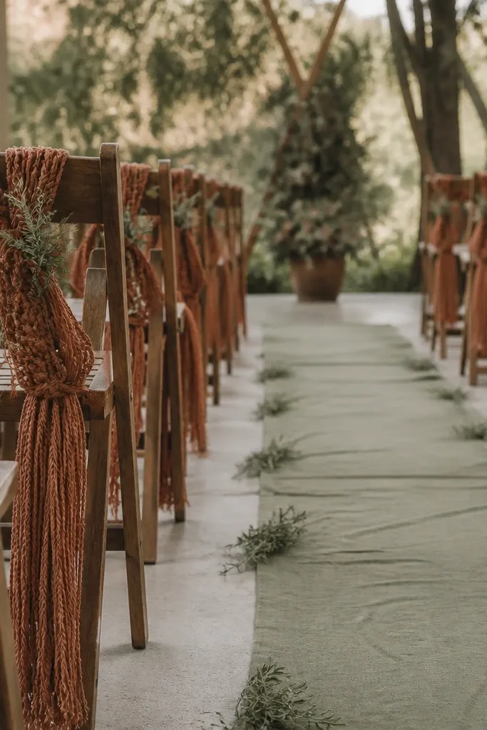
Chair ties are small but they frame the aisle in photos, especially if you have a wide ceremony shot. Terracotta macrame-style ties add a handmade texture that makes the palette feel warm and lived-in. A sage aisle runner keeps the walkway calm so the terracotta doesn't overwhelm the frame. This combo flatters everyone because it doesn't depend on skin tone; it's about clean color blocking and texture. The principle is texture-first styling - macrame texture reads richer than glossy satin.
Start by laying a sage aisle runner long enough to cover the full walking path, not just the center. Then tie terracotta chair ties using a consistent placement point about one-third down the chair back. Add tiny sprigs of dried eucalyptus or seeded grasses at intervals along the runner so the greens repeat. Finally, keep chair backs uncluttered - one tie per chair and nothing else.
Try thisUse a double-knot and trim ends at an angle so the ties look neat from the side, not frayed.
Common mistakeDon't hang chair ties too low - they drag on feet and look sloppy in candid photos.
13. Sage and terracotta wedding invitations with terracotta ink
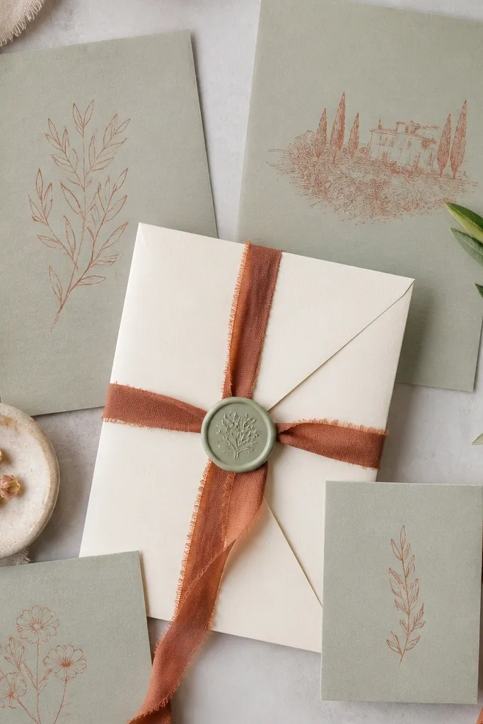
Paper goods are where you can control the palette without spending a fortune on décor. Sage paper feels soft and modern, and terracotta ink gives you warmth that reads handmade. I like pairing terracotta ink with dark brown or charcoal text so it stays legible and not orange-heavy. This works for both minimalist and cottage styles because the color pairing is the star, not the fonts. The principle is legibility + color harmony - keep the ink contrast strong and the paper tone muted.
Start with invitations printed or written on sage cardstock, then add terracotta ink for names, dates, or key lines. Use a cream envelope and tie it with a thin terracotta ribbon strip, about 1/4 inch wide. Add a sage wax seal on the flap if you want one tactile moment, but keep it small - around the size of a quarter. Finally, coordinate RSVP cards with the same terracotta ink so the suite looks consistent.
Try thisAsk your printer for a sample of terracotta ink on your exact paper stock; some brands shift orange under certain coatings.
Common mistakeDon't use bright coral ink - it looks off next to sage and turns the suite into a summer party.
14. Sage bridesmaid florals with terracotta ribbon wrap stems
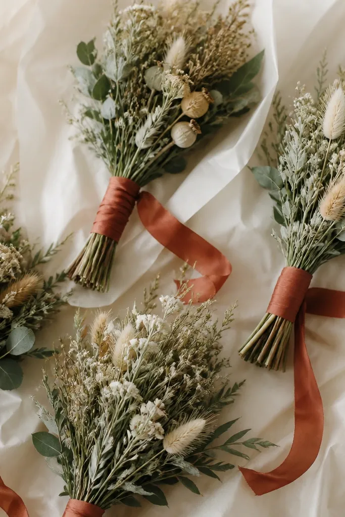
Small bouquets look best when the color plan is simple and repeatable. Use sage-toned dried florals as the bulk, then wrap the stems with terracotta ribbon so the warmth shows in every photo. I like this for weddings where bridesmaids wear different dress colors because the bouquet becomes the shared element. It also flatters different body types because the bouquet sits in the same position across the group photos. The principle is uniform focal detail - terracotta appears the same way in every bouquet.
Start by choosing one sage-green dried floral base, like eucalyptus or seeded greens, and keep stem lengths consistent. Then wrap each stem bundle with terracotta ribbon at the same height, about 2-3 inches below the flowers. Finish with cream wrapping paper and a tight ribbon knot. Finally, add one small terracotta bloom per bouquet so the color shows without turning everything orange.
Try thisTake a quick group photo at the florist table before leaving so you can spot if any bouquet reads too peach or too brick.
Common mistakeDon't skip the terracotta ribbon - without it, the bouquets can look like random dried greens.
15. Sage and terracotta welcome sign on reclaimed wood
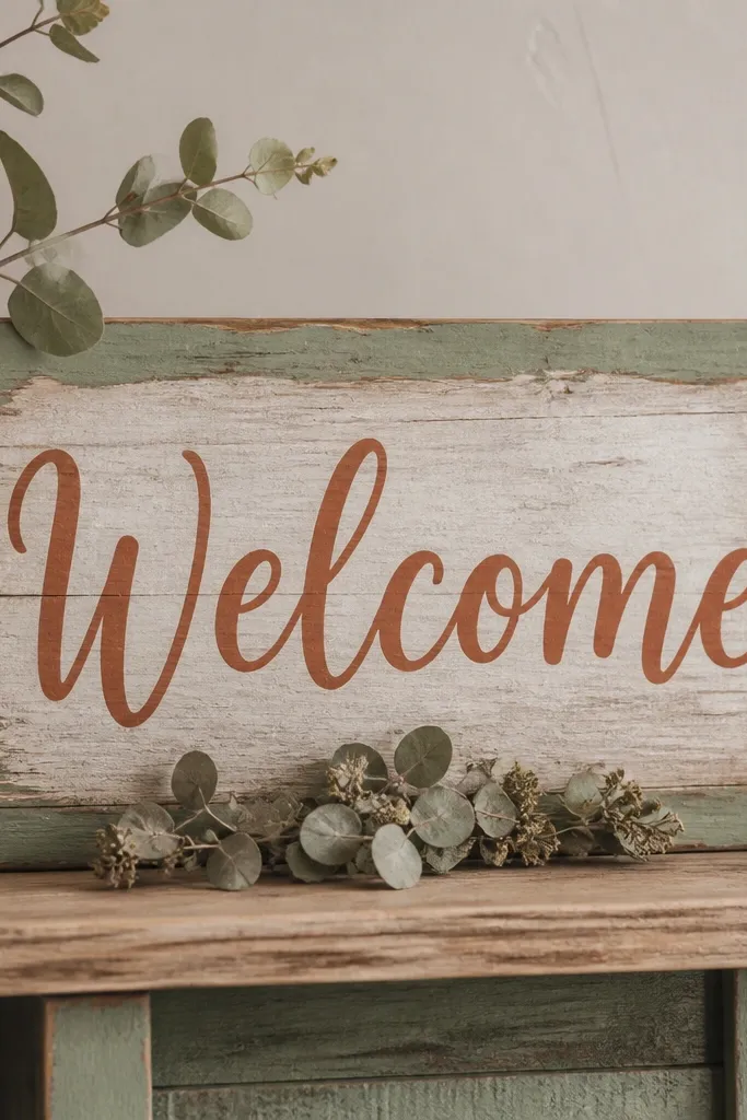
A reclaimed wood welcome sign gives you warmth that matches terracotta, and it looks grounded in both rustic and modern venues. Sage framing keeps it from looking too heavy, and terracotta lettering ties it back to the wedding palette. I've used this at barns and at modern event spaces; the wood makes the colors feel intentional instead of like printed decor. This works well for couples who want the palette to show up immediately at the entrance. The principle is framing - keep the sign's shape simple and use color to guide the eye to the text.
Start by sanding the wood lightly if it's rough and apply a thin sage paint border, staying within 1 inch of the lettering area. Then paint terracotta lettering in a simple script or block font, keeping stroke thickness consistent. Add one small dried eucalyptus cluster at the bottom edge and secure it with a clear floral pin or hot glue from the back. Place the sign on a stable easel and keep the background clean so it reads in photos.
Try thisPhotograph the sign in the exact spot at night if you have string lights - terracotta can shift under warm bulbs.
Common mistakeDon't use a busy border pattern - it competes with the text and makes the sign look handmade in a messy way.
16. Sage table numbers in terracotta frames
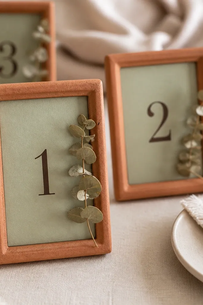
Table numbers are one of the easiest places to look "designed" without spending on big centerpieces. Sage cards keep the palette cool and calm, while terracotta frames add warmth and structure. I've used small picture frames because they look neat from every angle and don't require custom stands. This flatters guests because the numbers are readable, and the palette stays consistent across the room. The principle is repeatable units - same card style, same frame style, just changing the number.
Start with sage cardstock cut to the same size as your frames, then print numbers in a dark brown or charcoal ink. Insert the cards into terracotta frames and add a tiny dried eucalyptus sprig on the side corner if your frames have room. Place frames in a consistent location on each table, usually near the center centerpiece or on the charger. Finally, keep the table number height consistent so it lines up in group photos.
Try thisUse matte frames or cover glossy ones with a thin anti-glare spray so reflections don't ruin close-ups.
Common mistakeDon't pick frames that are too bright orange - terracotta should look like clay, not candy.
17. Terracotta and sage bridal shower cloche centerpieces
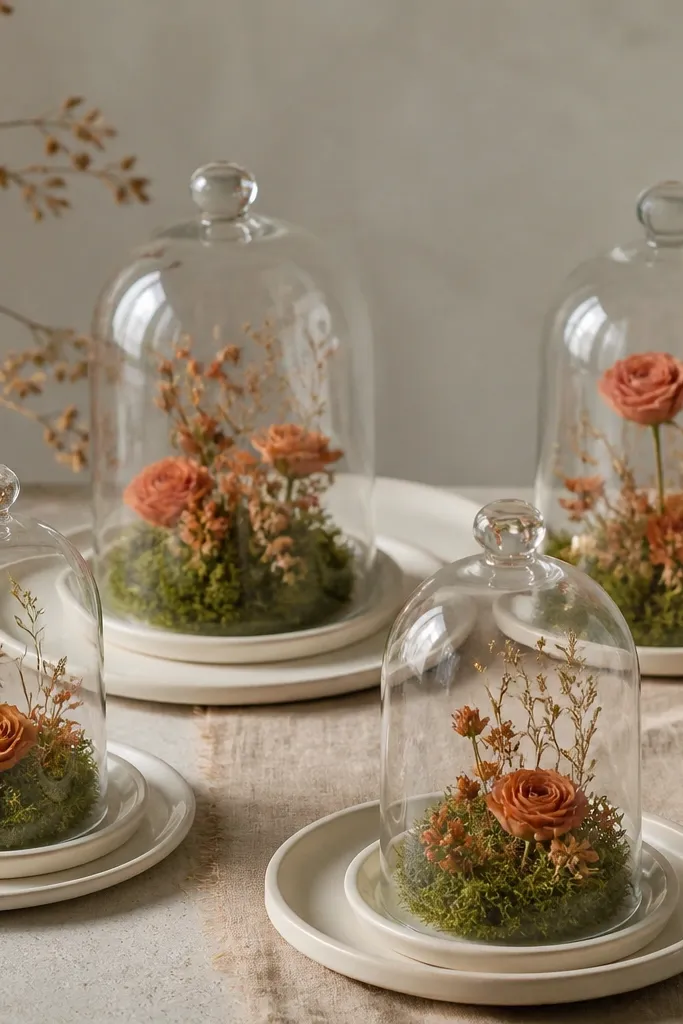
Cloches make small centerpieces look like a planned installation. Sage moss or preserved sage greens create a soft base, and terracotta mini blooms add warm color that pops under candlelight. I used this for a smaller wedding welcome event and it looked expensive even with fewer flowers because the cloche creates a "still life" effect. This is great for couples who want a cozy feel rather than big floral volume. The principle is miniature focus - the cloche narrows the viewer's attention to the palette.
Start by placing a cream plate or charger under each cloche so the centerpiece reads clean from afar. Then fill the cloche base with sage moss or sage-toned preserved greenery, keeping it slightly domed. Add terracotta mini blooms in a ring, then tuck one taller stem in the center for height. Finally, set a small LED candle under or near the cloche base if your venue allows it, and keep spacing between cloches even.
Try thisKeep cloches dust-free the day of - fingerprints show up fast under overhead lights.
Common mistakeDon't overcrowd the cloche - too many stems make it look like a craft project instead of a curated mini scene.
18. Sage and terracotta balloon cluster with matte latex
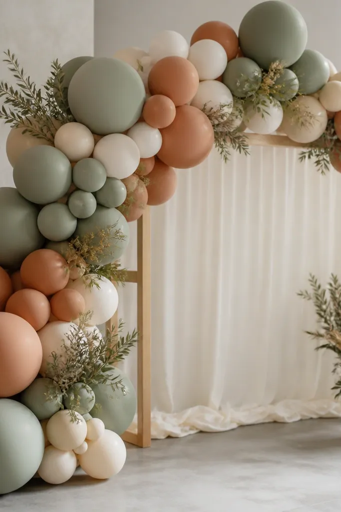
Balloon clusters are the fastest way to get color on a budget, and matte latex makes the palette look more grown-up. Sage balloons set the tone without looking loud, and terracotta balloons add warmth that reads like clay rather than "party orange." I've done this for smaller receptions where you can't afford a full floral wall; balloons still give that framed photo spot. This flatters guests of all skin tones because it creates a warm background that makes faces look healthier in pictures. The principle is finish - matte and cream base keeps it from looking like a birthday.
Start by building the cluster on the floor with a balloon frame or pre-made arch kit. Mix matte sage balloons and matte terracotta balloons in a 2:1 ratio, and add a few cream balloons for breathing room. Tie dried eucalyptus sprigs into the ribbon tails so the greenery matches your florals. Finally, place the cluster against a neutral wall so the colors stay true and don't blend into a busy background.
Try thisUse balloon weights hidden behind the cluster so it doesn't sag - sagging balloons look cheap in photos.
Common mistakeDon't use shiny balloons - they reflect venue lights and turn sage into a weird grey-green.
19. Sage and terracotta wedding cake with buttercream color blocking
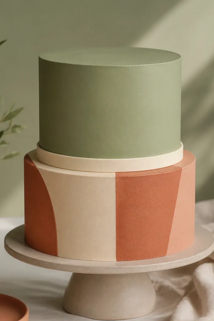
A cake is where you can get the palette without worrying about matching dozens of items. Matte buttercream looks like fabric and photographs clean, and color blocking keeps the design grown-up. Sage on the top tier reads airy, and terracotta on the bottom tier grounds the look. This flatters the bridal look because it ties to your outfit tones and doesn't compete with florals. The principle is matte finish and simple geometry - crisp edges read expensive.
Start with a two-tier cake and choose a matte sage buttercream for the top. Then pipe or spread terracotta buttercream in rectangular panels on the bottom tier, keeping spacing consistent. Add a cream ribbon border between tiers so the colors don't smear together. Finally, decorate with a small cluster of dried flowers in sage and terracotta tones, placing them at the seam between tiers rather than on every side.
Try thisAsk your baker to mix a terracotta that looks like clay in daylight, not orange-red - bring a ribbon swatch to match.
Common mistakeDon't add metallic gold all over - it can make terracotta look dirty and distract from the clean color plan.
20. Terracotta and sage bar cart with custom drink labels
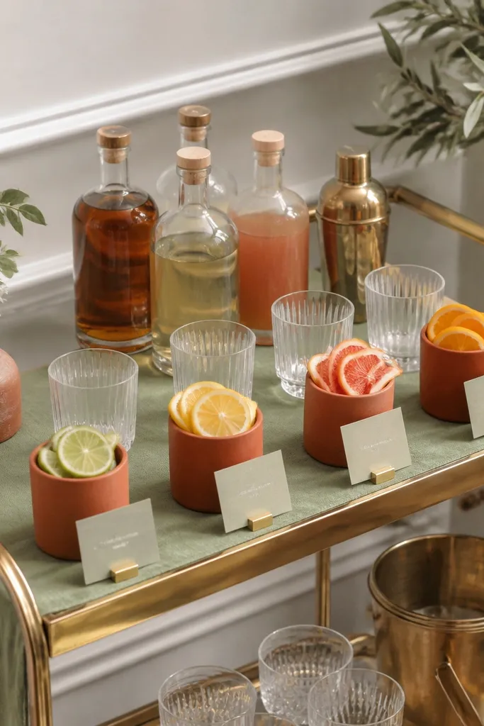
A bar cart can look styled in minutes if you repeat the palette on the signage and the base. Sage table runner makes the whole setup feel soft, and terracotta drink buckets add that warm clay color where guests look. Custom labels in sage paper with terracotta ink look purposeful even if the drinks are simple. This works for both cocktail-heavy receptions and mocktail-focused celebrations. The principle is signage repetition - keep label style consistent across every drink.
Start by covering the cart shelves with a sage runner or sage fabric panels so the base color stays consistent. Then place terracotta buckets or vases at the center with citrus, herbs, or ice - keep the fruit colors natural. Print labels on sage cardstock, and use terracotta ink only for drink names, keeping descriptions in dark brown. Finally, add one small dried eucalyptus bunch near the top shelf for a matching natural element.
Try thisUse clear acrylic label holders so the labels don't curl from condensation.
Common mistakeDon't mix too many label fonts - mismatch makes it look like a last-minute party.
21. Sage bridesmaid robes for getting ready with terracotta piping
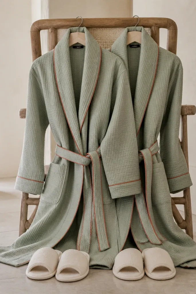
Getting ready photos are where this palette really shines, because skin tones and warm light make sage look flattering instead of washed out. Sage robes with terracotta piping look cohesive without forcing you to buy full outfits in the same shade. Terracotta piping gives you a crisp line near the face, which helps the photos look intentional even if everyone is moving. I've used this setup for both morning weddings and evening weddings; sage robes still look calm under different lighting. The principle is photo-ready uniform - one shared garment detail pulls the whole group together.
Start by choosing sage robes in a breathable fabric like cotton or lightweight waffle weave. Then look for terracotta piping on the collar and cuffs or add a thin terracotta ribbon trim if you're sewing. Tie each robe at the same height so the belt line looks consistent in photos. Finish with cream slippers and simple gold jewelry so the palette stays warm and clean.
Try thisSteam robes right before photos and keep a light cream throw nearby to reduce wrinkles in wide shots.
Common mistakeDon't choose a robe that's too sheer - you'll get distracting highlights and the color will look patchy.
22. Sage and terracotta guest favors in mini clay-toned jars
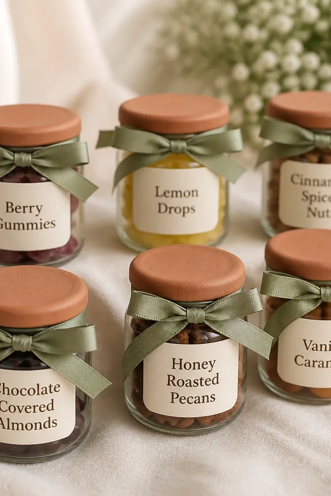
Favors are where people get tempted to buy cheap clutter. This idea keeps it useful and photo-friendly by using small jar shapes and a consistent color method. Terracotta lids read like clay and match the wedding palette exactly, while sage ribbon ties the favor to the décor. I've done this with edible favors like cocoa mixes and with non-edible like bath salts, and the jars still looked cohesive. This flatters the overall wedding look because it repeats your colors in a clean, repeatable format. The principle is consistency - same jar size, same ribbon width, same label style.
Start by picking mini jars with a terracotta lid or paint terracotta lids with matte craft paint. Then create labels on sage cardstock and print the favor name in dark brown or charcoal ink. Tie each jar with a sage ribbon, about 1/4 to 3/8 inch wide, and finish with a short knot so it doesn't look bulky. Finally, place jars on a cream cloth table or basket with a few eucalyptus sprigs so the background matches your palette.
Try thisIf you're mailing invites or favors, test the jar weight and lid seal so nothing leaks during transport.
Common mistakeDon't use a mix of lid colors - that turns the favor table into random clutter.
23. Sage and Terracotta Mixed-Metal Place Settings
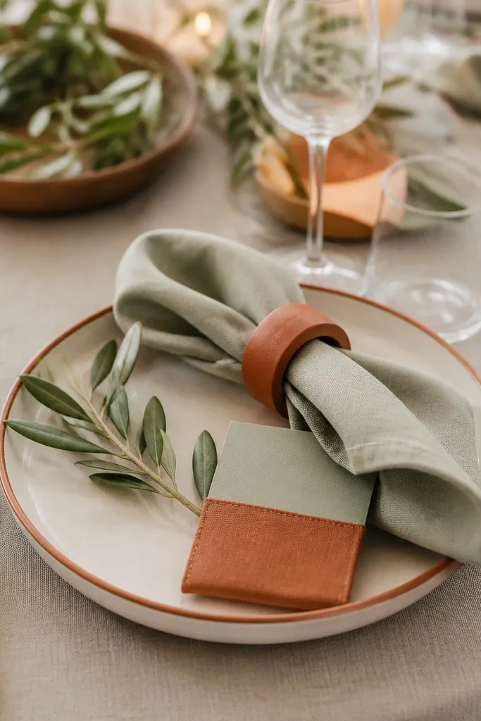
This color combo looks expensive without costing much because mixed metals hide the fact that you are mixing items from different places. Sage linen keeps the table calm, and terracotta gives you that warm, slightly dusty punch that reads well on camera. I've done this with thrifted cutlery and it still looks intentional because you repeat the same two metal tones across every seat. The napkin ring is the easiest place to anchor terracotta so you do not have to dye anything large.
Step 1: Buy or DIY napkin rings in terracotta tones (rust-orange clay color). Fold sage napkins into a simple rectangle fold and slide each ring over the fold so the terracotta shows from the top view. Step 2: Pair cutlery in two finishes only - brushed gold and copper - and keep the pattern the same at every place setting. Step 3: Add a small olive sprig or a single olive leaf tucked under the napkin so the greens feel connected from plate to centerpiece. Step 4: Use place cards in cream card stock and tuck them into a terracotta-stained cotton sleeve or ribbon loop so each seat has a color "hit" even when the table is busy.
Try thisIf your copper looks too pink, wipe it with a vinegar-water mix (1:1) and dry - it tones down the shine and looks more like aged copper under warm lighting.
Common mistakeSkip silver-on-silver cutlery with random copper accents - it reads accidental instead of styled.
24. Terracotta and Sage Ceremony Seating with Fabric Sashes
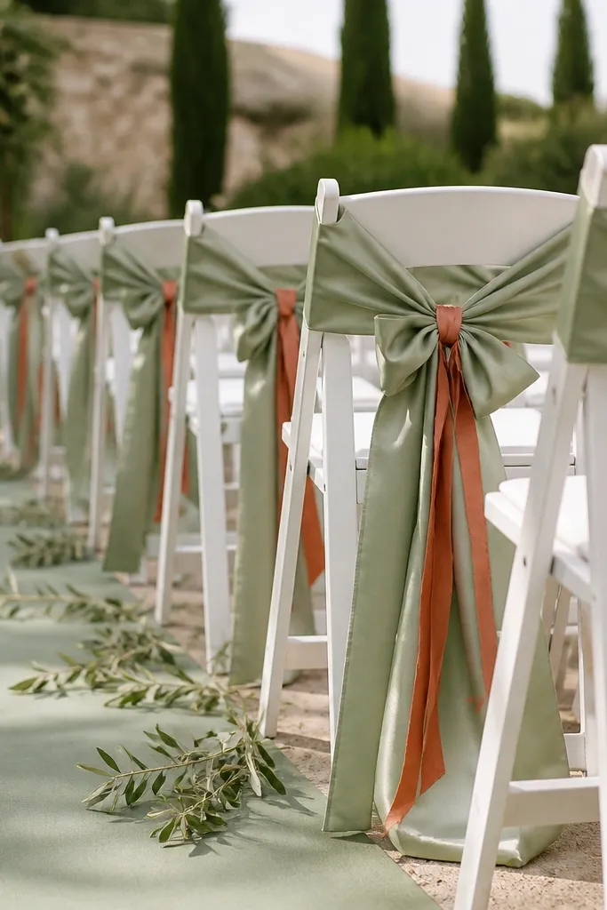
Chair styling is where you get the "someone thought about this" feeling from the aisles. Fabric sashes look airy and romantic, and they photograph better than printed signs because they move in the breeze. Sage satin adds a smooth, light-reflecting layer, while terracotta cotton brings texture so the palette does not look flat. I've watched guests notice the aisle details as they sit down, because the colors frame their outfits without stealing the spotlight.
Step 1: Choose one fabric for the main sash - sage satin or sage faille - and keep it consistent across every chair. Cut strips about 18-22 inches long and 2.5-3 inches wide so the bow sits at eye level on the chair back. Step 2: Add terracotta cotton ribbon through the bow knot or tie a small second loop that hangs 2-3 inches down. Step 3: Tie each sash with the same knot style (I use a simple bow with a tight second loop) so the line of chairs looks uniform from the back of the ceremony. Step 4: If you have any chairs with metal backs, wrap the ribbon around once more so it does not slide when people brush past.
Try thisPre-tie 10 sashes the night before and store them flat - it saves time and keeps the bow shape consistent across the row.
Common mistakeSkip stiff ribbon that stands straight up - it looks like party decor instead of wedding fabric styling.
25. Sage-Green and Terracotta DIY Welcome Bar with Chalk Labels
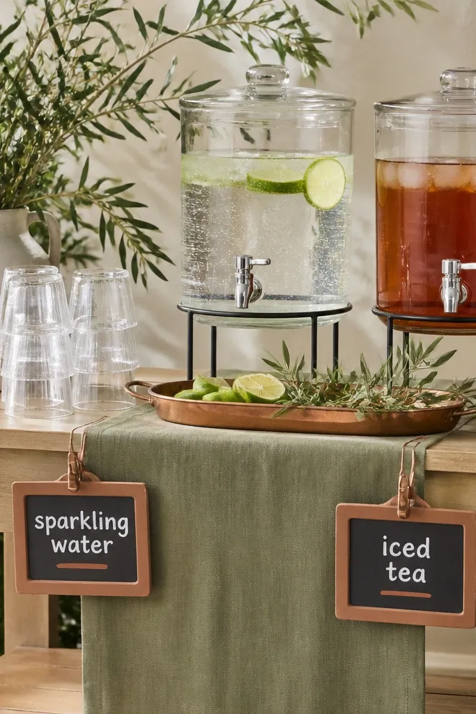
A welcome bar is one of the few decor spots guests actually use right away, so it has to look good and work fast. Sage-green linens keep the setup soft and clean, and terracotta labels make it readable without turning into a theme park. I've done this with a basic folding bar and it still looks styled because the label system is consistent and repeatable. The chalk lettering matters - thick strokes read better from across a yard than thin, fancy script.
Step 1: Set up a simple base - a wood table or folding buffet - and cover it with a sage runner plus a cream tablecloth underneath if you need coverage. Step 2: Make chalk labels on small chalkboard tags (about 3x5 inches) and write drink names in thick letters with a terracotta marker underline for contrast. Step 3: Use a copper tray to corral garnishes (lime wedges, orange slices, olive sprigs) so the terracotta theme shows through the "extras" area. Step 4: Place one sign at the front that says the menu order (example: sparkling water, iced tea, lemonade) so guests can scan quickly. Step 5: Add one small terracotta element near the labels, like a terracotta ceramic bowl for citrus peels, so the color repeats even if the chalk gets smudged.
Try thisUse a piece of cardboard behind the chalkboard tags while you write - it stops chalk from transferring to the table and keeps your lines crisp.
Common mistakeSkip tiny labels with thin handwriting - guests read them slower and the whole bar looks cluttered.