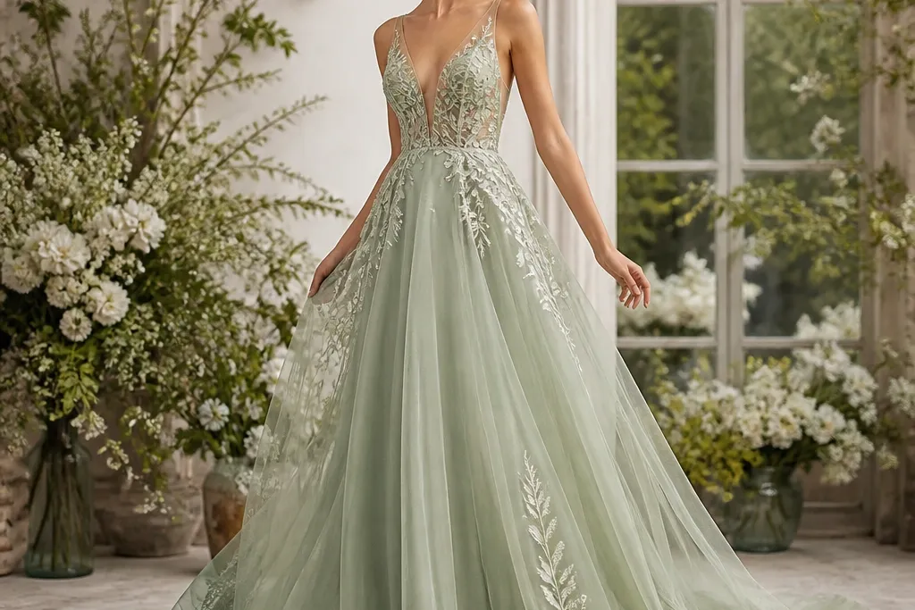

1. Do a daylight swatch with a white paper strip
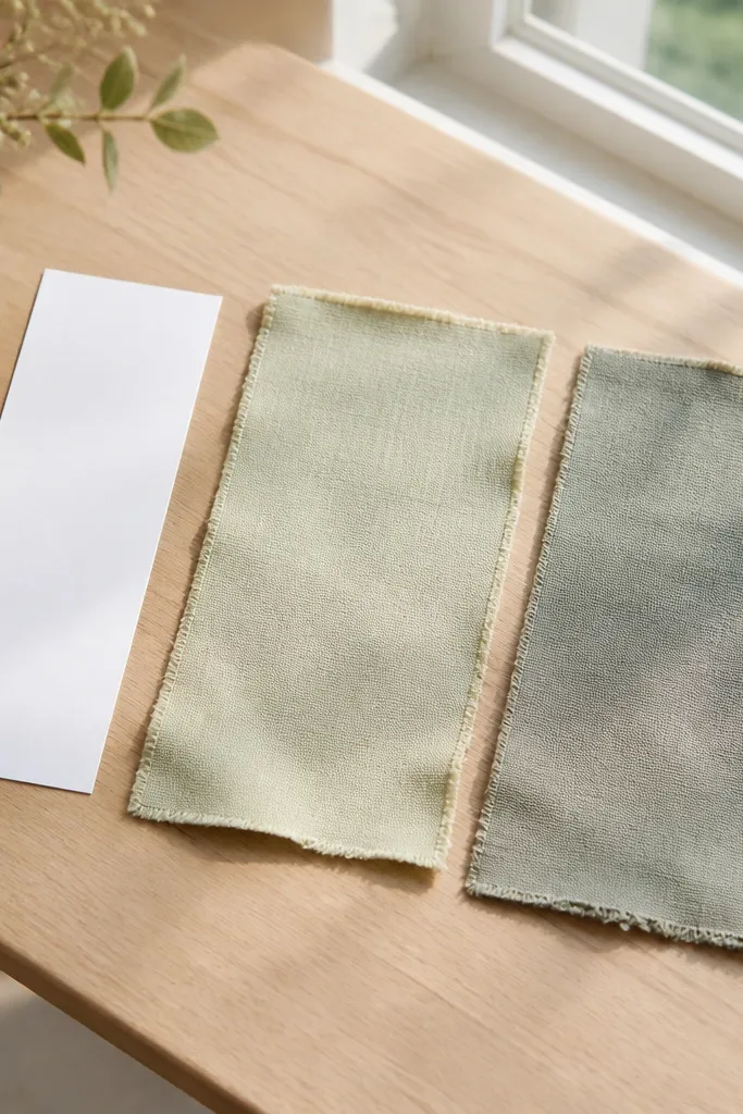
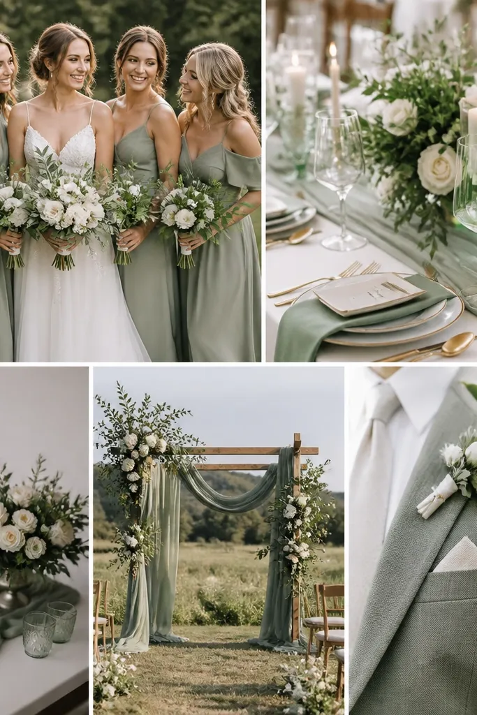
I always swatch sage against white because camera sensors exaggerate gray tones. Put your fabric by a north-facing window or shaded daylight and hold it next to a bright white paper strip. If the sage turns muddy or looks like it's missing color, that shade will likely look tired in wedding photos and under warm indoor lighting. If the sage stays creamy and slightly luminous against white, it reads luxe even when the dress is simple.
First, buy two tiny swatches or ask a boutique for scrap pieces in the exact shade you're considering. Then photograph them with your phone in the same spot and lighting so you can compare later. Finally, check the swatch under warm lamp light for 10 minutes and decide which one stays green instead of turning olive-brown. Pick the shade that looks closest to "soft mint meets gray" while still keeping a clear green tone.
Try thisBring your favorite white bra or slip to the swatch and place the sage over it - you'll see if the fabric is too sheer for your comfort.
Common mistakeDon't trust swatches photographed under salon bulbs or mixed LED - sage shifts fast.
2. Pick silk satin or silk-blend charmeuse for the bodice
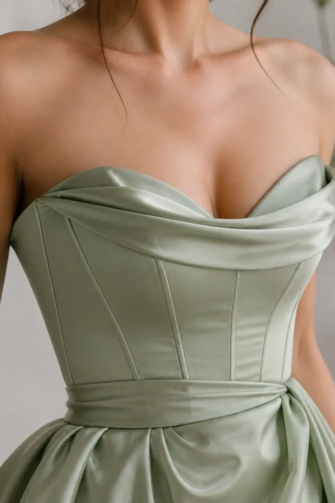
Sage looks expensive when the fabric has a soft sheen that catches light without turning shiny. Silk satin or silk-blend charmeuse makes sage read like "fresh greenery" instead of "powdery fabric." It's especially flattering if you have a straighter frame because the subtle gloss defines curves as the fabric moves. If you have fuller hips, the satin's drape can smooth without clinging when you use a lined bodice and a slightly flared skirt.
Start by choosing a dress with a lined bodice and satin on top, not a thin satin overlay over a flimsy lining. Then ask for or look for a structured neckline - sweetheart or straight with light boning so the satin holds shape. Finally, choose a skirt fabric that matches the sheen level; for example, satin bodice with crepe or matte chiffon skirt prevents the dress from looking "uniformly shiny." Keep the satin finish consistent so the green reads intentional from every angle.
Try thisIf you're worried about shine, choose satin with a soft luster (charmeuse) rather than high-gloss satin.
Common mistakeDon't pick a shiny fabric with no structure - it flashes under flash photography and looks cheap.
3. Use crepe for a luxe, matte sage (and it hides lumps)
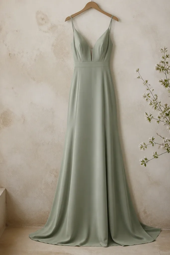
Crepe makes sage feel grown-up and expensive because it has a matte texture with controlled drape. When you want a clean silhouette, crepe hides minor texture issues and doesn't cling like jersey. It's great for brides with curves who want shape without looking "wrapped." For fair skin, crepe keeps the green from looking ashy, especially if the shade leans more green than gray.
First, choose crepe with enough weight that it doesn't cling when you walk; check by lifting the fabric and seeing if it falls back smoothly. Then make sure the bodice has a proper lining so the crepe doesn't stretch out and bag at the waist. Finally, pick a skirt that has movement but not billowing - a slim A-line or slight mermaid with a soft flare works well. Hem it after your shoes are final so the matte fabric doesn't bunch.
Try thisIf you're ordering online, ask for the fabric composition and weight in GSM or "dressweight crepe," not "light crepe."
Common mistakeDon't choose thin "crepe-like" polyester - it wrinkles and turns the sage flat by mid-day.
4. Choose structured lace with a satin underlayer
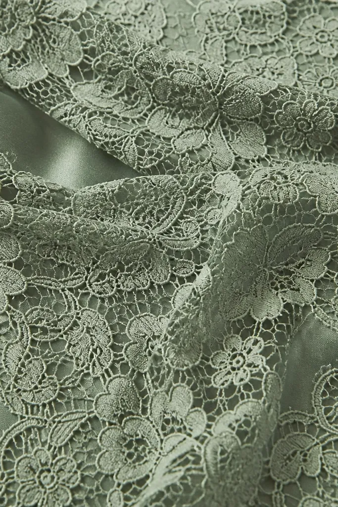
Lace can go either luxe or messy depending on the underlayer. Structured lace over a satin underlayer creates depth - the lace looks intentional and the sage stays even across the bodice. It's flattering for most body types because lace defines edges at the neckline and sleeves, which draws attention upward. If you have a smaller bust, the lace pattern can add visual texture without adding bulk when you keep the cups lined.
Start by confirming the dress has a full lining under the lace, not just a partial nude mesh. Then check the lace placement: a lace pattern that concentrates at the bust and waist looks richer than all-over random motifs. Finally, choose a satin underlayer color that matches the sage, not a stark white - stark white can make the lace look like it's pasted on. During fittings, move your arms and check for "see-through hotspots" at the sides and underarms.
Try thisAsk your tailor to baste a test underlayer in the shop so you can see the lace depth before final sewing.
Common mistakeDon't accept lace over nude mesh if you want luxe - it reads budget in flash photos.
5. Keep the neckline clean for expensive-looking sage
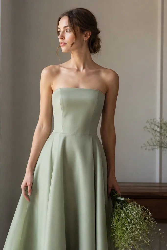
A clean neckline makes sage look intentional because it reduces visual noise. I like straight, bateau, or soft square necklines with a stitched edge because they frame the collarbone and keep the color looking smooth. This works especially well if your shoulders are narrow - the neckline widens you visually without adding ruffles. If you have a fuller bust, a neckline with built-in structure prevents sagging that can make sage look sloppy.
First, choose a neckline that sits without gaping; if you have to pin it constantly, it will look off in photos. Then ask for a lightly interfaced facing so the edge stays crisp. Finally, style with minimal jewelry at the neckline - small studs or a short pendant that matches your metal. Keep the dress fabric to one hero element; if the neckline is clean, the whole look reads more expensive.
Try thisBring a strapless bra or strap you plan to wear and do a 2-minute walk test in the mirror.
Common mistakeDon't pick a neckline that floats away from the body - sage highlights every gap.
6. Go for a corset-style bodice with boning for color control
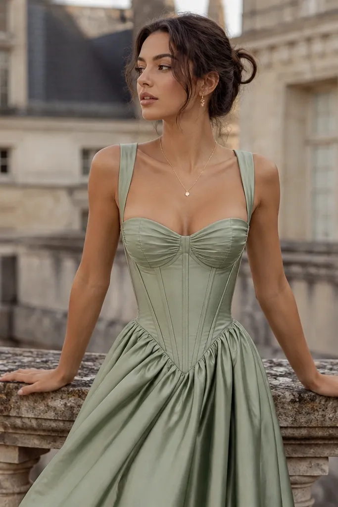
A corset-style bodice makes sage look luxe because it keeps the fabric tension even. When the bodice is stable, the green doesn't wrinkle and crease in random places - it stays smooth and photo-ready. It's flattering for nearly everyone because you can adjust the fit at the waist and bust without relying on stretchy fabric. For brides who want a defined waist but hate heavy shapewear, this is the sweet spot.
Start by choosing a bodice with real boning channels and a lace-up back or adjustable closure. Then fit the midsection first - your waist should sit where you naturally cinch, not where the dress decides. Finally, check the bust line: the cups should tack gently without pulling the neckline down. Once it's right, you'll notice sage looks brighter because fewer creases trap shadows.
Try thisIf you're between sizes, size for the bust and let the tailor adjust the waist - the green will look smoother.
Common mistakeDon't skip boning if the dress fabric is matte and heavy - it will fold and look uneven.
7. Match the shade to your hair with undertone checks
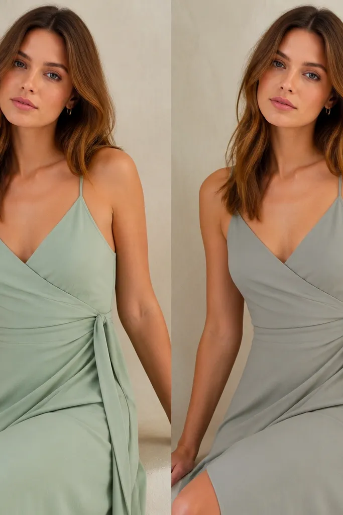
Sage reads different beside hair. If your hair is warm brown or honey blonde, a sage that leans mint keeps the whole face lively. If your hair is ash blonde or cool brown, a sage with slightly more gray can look refined, but only if it stays creamy next to white. I've paired sage with both types of hair in fittings, and the undertone match changes whether the dress looks flattering or just "a color."
First, bring a small swatch of your chosen sage to your hair trial or do a quick test with your hair color sample. Then place your hair out of the way and hold the fabric at your jawline in daylight. Finally, pick the shade that makes your skin look clearer, not the one that looks best by itself. If you're unsure, choose the mint-lean version and adjust jewelry metal to cool or warm the overall look.
Try thisFor most brides, mint-lean sage is safer because it fights the gray cast cameras love.
Common mistakeDon't choose sage by dress photos alone - hair and skin shift the color fast.
8. Add a satin bow or waist tie in the same fabric family
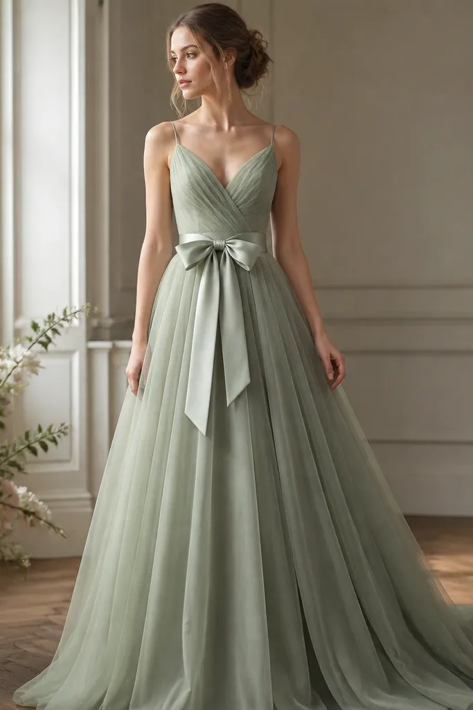
A satin waist tie adds luxe cues because it introduces a second texture that looks intentional, not decorative clutter. When the bow uses the same fabric family as the bodice (satin with similar sheen), sage looks cohesive and richer. This is flattering if you want definition and you're wearing a softer drape skirt - the tie gives you a focal point at the waist. It also balances a fuller skirt by pulling the eye inward before it drops.
First, choose a bow placement at your natural waist, not the skirt seam. Then secure the tie so it doesn't slide when you sit - a few hidden stitches at the back help a lot. Finally, keep the bow size proportional: for a slim frame, a smaller knot looks elegant; for a fuller frame, a wider tie keeps the look grounded. Pair it with simple earrings so the bow stays the hero.
Try thisIf you plan to dance, ask for a small interior loop that holds the tail ends in place.
Common mistakeDon't attach a bow to a fabric with a totally different sheen - the mismatch reads accidental.
9. Hem length that hits the floor without pooling in photos
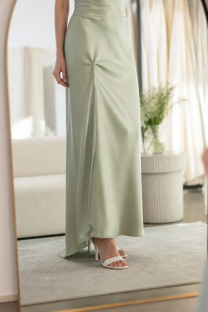
The hem controls how expensive sage looks because pooling creates dark shadows at the bottom. In my fittings, the best look is a floor-skimming hem that barely touches the ground, with a tiny break when you walk. This matters more in sage because the color can look flat when shadows gather. It's also practical: you'll step less on the hem and keep the dress looking crisp during photos.
First, wear the exact shoes you'll use and stand with relaxed posture. Then have your tailor pin the hem while you move your feet slowly - you want the fabric to clear your steps without dragging. Finally, plan for the venue: for outdoor grass, you may need an extra half-inch, but for indoor floors, aim for a clean skim. Do a 10-minute walk test in the fitting room so you're not guessing on the day.
Try thisAsk for a temporary bustle plan even if you don't need it - the hem can be lifted for portraits.
Common mistakeDon't hem too long "for safety" - extra pooling makes sage look heavier and older.
10. Sage + pearl: choose warm pearls, not icy ones
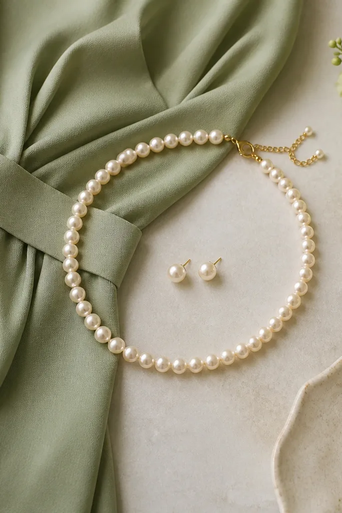
Pearls make sage feel wedding-appropriate fast, but the pearl tone matters. Warm ivory pearls sit nicely with sage and keep the color from turning gray. I've seen icy white pearls next to certain sage shades - they create a harsh contrast that makes the dress look less soft. Warm pearls flatter most skin tones because they add a gentle glow near the face. If you're doing a romantic hairstyle, pearls also look natural with soft waves or a low bun.
First, pick pearl color: warm ivory or champagne is the safest match for sage. Then keep the scale modest at first - 5-7mm studs or a short 16-18 inch necklace reads refined without overpowering. Finally, coordinate metal with your earrings: choose gold or rose gold if your jewelry is warm, and avoid cool silver if your sage leans gray. Try the jewelry in daylight and look at your reflection for 30 seconds.
Try thisIf you only own one pearl piece, start with studs - they sit closer to the face and look luxe even with a simple neckline.
Common mistakeDon't pair sage with icy, high-luster pearls - they can make the dress look dull.
11. Gold accessories with sage for a creamy, expensive look
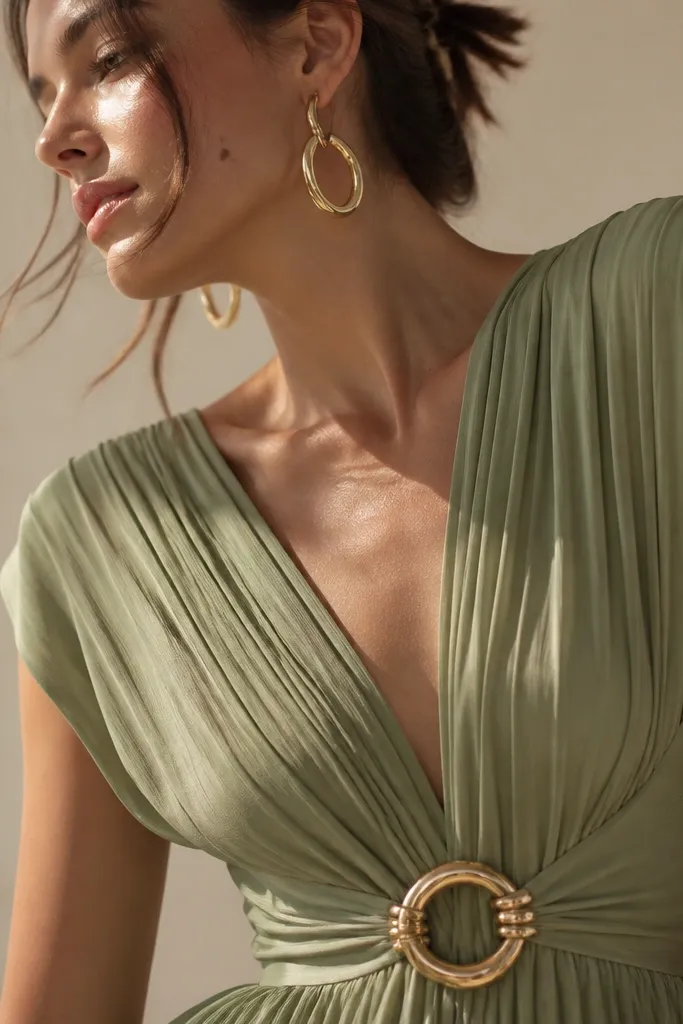
Gold makes sage look like it belongs in a wedding, not a bridesmaid catalog. When you match gold tones to sage, the dress reads creamy and romantic, especially if your skin has warm undertones. For cooler undertones, gold still works if your sage is mint-lean and your gold is more brushed than bright. This pairing also flatters a wide range of hair colors because gold adds warmth near the face.
First, choose one gold focal element: earrings, a thin bracelet, or a belt - not everything at once. Then coordinate shoe tone: I like nude-gold or soft champagne heels with a minimal strap. Finally, set your makeup metal choice: warm champagne eyeshadow or a gold-highlight cheek keeps the whole look consistent. If you're wearing a veil, choose a veil fabric that isn't too stark white next to the gold.
Try thisIf you see the green turning gray in mirror checks, switch to champagne-toned gold rather than bright yellow.
Common mistakeDon't use only cool silver with warm sage - it can make the dress feel mismatched.
12. Pick a veil that matches the dress weight and translucency
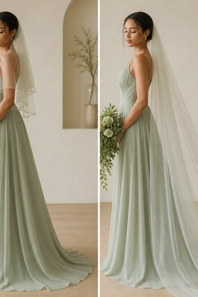
Veils can wreck sage if the veil is a different "white" than the dress's tone. I've seen off-white tulle make sage look dirty, especially if the dress is a lighter sage. Choose a veil that has the same warmth level as your lining or underlayer, and match the weight of the veil to the dress fabric. A heavier veil works with crepe and satin, while a lighter veil suits airy skirts. The right veil makes the green look intentional and gives your face a soft frame.
First, decide length based on your hem and train: fingertip for minimal pooling, cathedral if you have a structured train. Then pick tulle weight: soft, not stiff, so it drapes and doesn't create hard shadows on the bodice. Finally, hold the veil up near your jaw and check in daylight - if it looks too blue-white, it will fight the sage. If you can, order the veil in the same dye family as the dress or ask for a swatch in "ivory" versus "white."
Try thisUse bobby pins and a comb that actually grips your hair - a veil that slides looks cheaper than the fabric choice.
Common mistakeDon't choose a bright white veil with sage - it creates a visible color mismatch.
13. Choose shoes that echo the undertone: champagne, nude, or deep olive
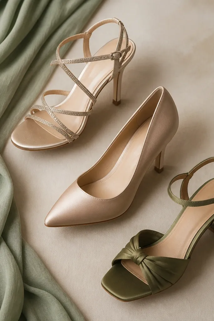
Shoes influence how sage reads in photos because they sit right under the dress hem. Champagne and nude keep the attention on the dress and make the green look softer. A deep olive shoe works for a more modern look and keeps the color palette cohesive, especially for outdoor venues. I've worn sage with both nude and olive, and the olive option looks the most intentional when the jewelry is also warm and minimal. If your sage is gray-lean, choose champagne rather than stark nude.
First, pick your shoe finish: satin reads bridal and looks smooth next to sage crepe or satin. Then match the undertone: warm sage gets champagne or nude with a warm base, cool sage can handle nude with a slightly pink tint. Finally, test the strap thickness and height - thin straps can look delicate but can also cut the foot visually. Bring the shoes to hem fitting so the hem lands correctly over the heel height.
Try thisIf you're between colors, choose the shoe that disappears into your skin tone more than the one that matches the dress exactly.
Common mistakeDon't pick black shoes - sage + black makes the whole look feel harsh and less bridal.
14. Add a sleeve or strap option only if it's lined and smooth
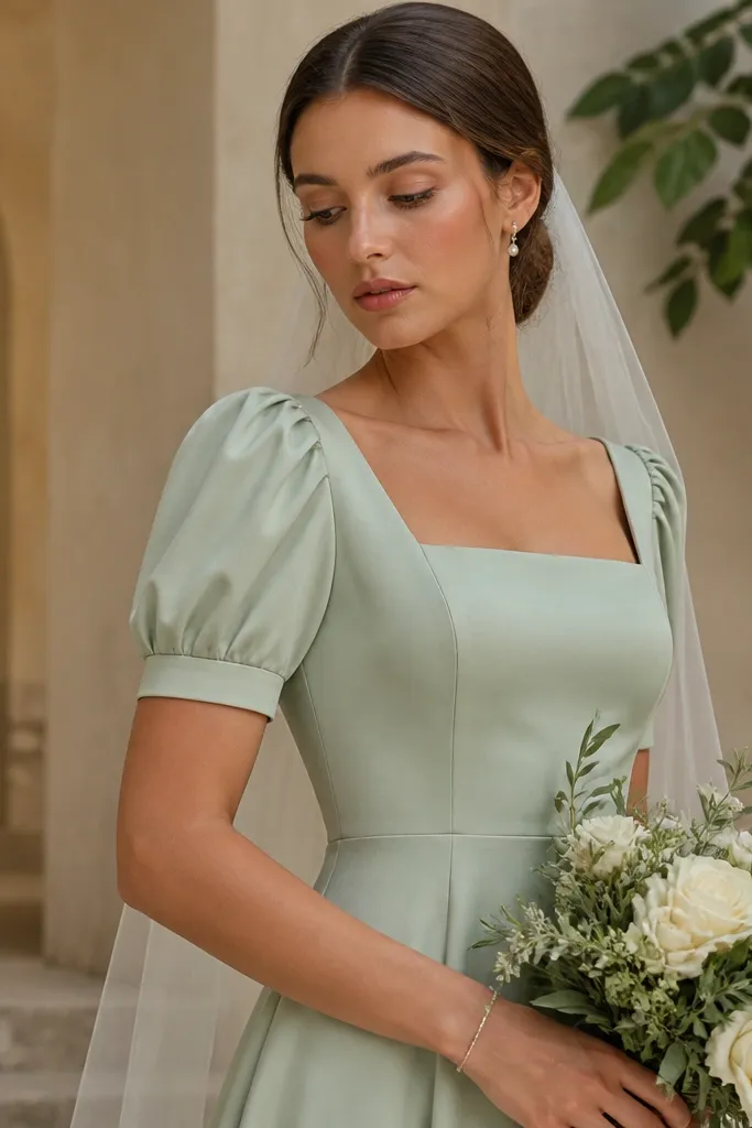
Sleeves can make sage look couture when they're lined and cut to lie flat, but they look budget when they pucker at the armhole. A short sleeve with a clean edge gives you coverage while keeping the dress airy. This is flattering for brides who want to balance proportions or feel self-conscious about upper arms. If you have a smaller bust, sleeves can add structure and frame the neckline so your face becomes the focus.
First, look for sleeves with full lining or a facing that keeps the fabric from sticking to your skin. Then check the armhole seam: it should sit close without digging, and it should not gap when you raise your arms. Finally, choose sleeve fabric that matches the bodice - satin or crepe works better than flimsy tulle if you want luxe. Style with a hairstyle that exposes the sleeve line, like a low bun or sleek updo.
Try thisDuring fittings, ask for one quick "arm raise" check so you can see puckering before alterations lock in.
Common mistakeDon't choose unlined sleeves if the fabric is stiff - they can scratch and create wrinkles under photos.
15. Add a subtle back detail like covered buttons or a satin-trim zipper
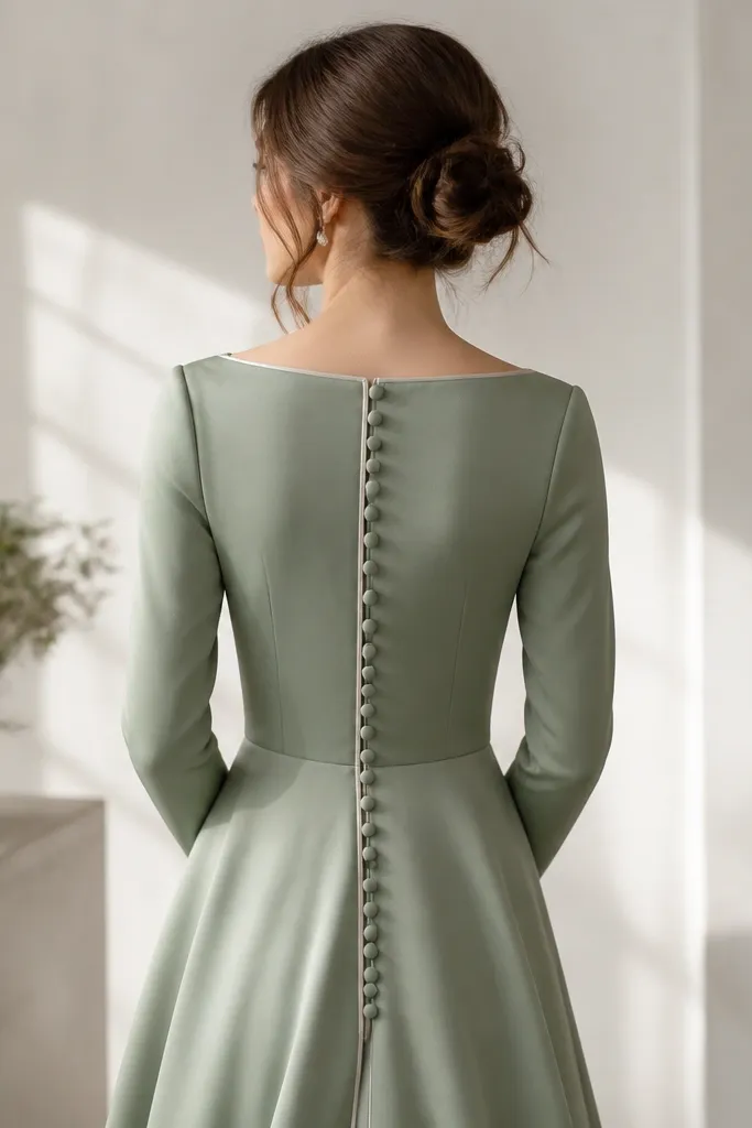
The back detail is where sage often wins or loses in real life. Covered buttons in matching sage fabric look romantic and expensive because they create a continuous line that doesn't interrupt the color. A satin-trim zipper also looks clean if the trim matches the bodice sheen and the zipper pull is hidden. This is flattering for photos from behind and for any bride who wants a "dress is special" moment without adding sequins. It also helps the fit because the back closure keeps the bodice tension even.
First, decide how much skin you want to show: low back with a modest depth for an elegant look, higher back for a more classic feel. Then choose closure details that match your fabric: covered buttons for lace or satin, satin-trim zipper for crepe or clean silhouettes. Finally, check spacing at the spine - uneven button placement makes the whole dress look off. Ask for a quick photo of the back in daylight so you can confirm the line reads smooth.
Try thisIf you're doing a veil, pin it so it doesn't cover the closure detail in your back photos.
Common mistakeDon't use contrast buttons or visible hardware - sage needs clean continuity.