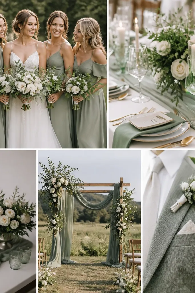
1. Sage napkins with a crisp hem vs wrinkled "any linen"
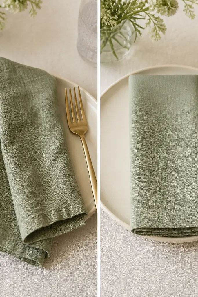
Sage linen reads sophisticated when it's pressed and structured. In my experience, the "before" napkins look like they came from a closet - the folds collapse and the fabric absorbs light, so the whole setting looks dull. The "after" version uses a napkin with a crisp hem and a tighter fold so the sage color shows up as a calm, even field. This works especially well for couples wearing ivory or champagne fabrics, because the sage doesn't fight the warm undertone. If you have lighter skin tones or warm undertones in your bridal party, sage pressed linen looks flattering because it keeps the color from turning too yellow.
Start by buying napkins with a visible hem or select a fabric that comes pre-finished, not thin craft linen. Press them with steam and a medium heat setting, then fold them into a simple rectangle or a flat square so the corners line up. Place the napkin centered on the plate, not tucked too close to the rim, and keep the fold line vertical for a cleaner photo. Finish by adding one small contrast element like a champagne-gold ring on the napkin or a thin satin ribbon tied around the cutlery. If you're using chargers, keep the charger cream or oatmeal so sage has a warm frame.
Try thisDo a test shot at the same time of day as your reception - window light changes sage more than you'd think.
Common mistakeDon't use wrinkled napkins or random fabric weights - saggy folds make sage look messy instead of styled.
2. Before/after: place cards in sage ink on oat paper
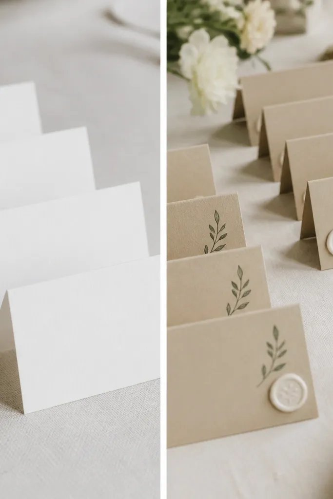
Sage ink on oat paper is one of my favorite "after" fixes because it makes the color feel intentional instead of decorative. The "before" version uses bright white cards, and the sage turns cooler and a little harsh next to it. Oat paper has a warm undertone that softens sage and makes it look like part of the stationery suite, not an overlay. This is great for formal dinners and garden venues because the cards look crisp up close but still gentle from a distance. I've used this combo with both gold and champagne metal flatware and it stays flattering across skin tones because the palette reads warm, not green-gray.
Choose oat or cream cardstock around 110-130 lb so it holds ink well and doesn't look flimsy. Pick a sage ink that reads deeper than your napkins - if your napkins are light sage, go one shade darker for legibility. Print name and table details with a clean serif or simple sans, keeping font size around 20-24 pt for names. Place the cards at a slight angle on the table setting using a small stand or a fold-over tent so the sage text catches light. Pair with a cream envelope-style insert if you're doing menu cards too, so everything matches in color and warmth.
Try thisIf you're ordering online, ask for a printed proof and compare it next to your actual napkin fabric in warm indoor light.
Common mistakeAvoid white paper with gray-green text - it makes sage look accidental and hard to read in photos.
3. Sage ribbon width test on wedding programs
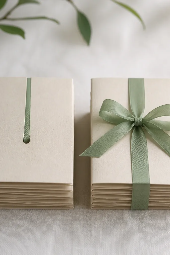
Ribbon width changes how sage reads from across the room. In my own event builds, narrow ribbons on programs can make the sage look like a faint wash, especially if your paper is also light. The "after" look uses a wider ribbon (about 3/8 to 1/2 inch) in a true sage tone, so it becomes a visual anchor. This works for both minimal and romantic weddings because the ribbon gives structure around the paper. If your bridal party dresses are soft neutrals, the sage ribbon adds a calm accent that doesn't clash with skin tones or makeup undertones.
Start with programs printed on oat or ivory paper stock with a matte finish. Wrap the program stack so the ribbon sits flat and doesn't twist, then tie a bow with two loops of equal size. Use a ribbon that looks smooth and slightly lustrous, not fuzzy or sheer. Position the bow centered at the top third of the program, and keep the tails long enough to reach just past the bottom edge of the paper. For the "after," compare photos at arm's length - if the ribbon disappears, widen it or darken the sage by one shade.
Try thisMake one "before/after" photo with your exact ribbon on the exact paper before you tie everything.
Common mistakeDon't use a pale ribbon that matches the paper tone too closely - it disappears in real photos.
4. Ceremony aisle markers: sage greenery clusters vs single sprigs
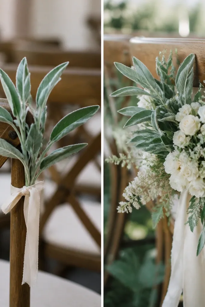
Sage aisle markers look expensive when you cluster them. The "before" setup uses single sprigs, and they read like a craft project because there's not enough volume to catch light and frame the aisle. The "after" version uses small clusters - even if the flowers are simple - so the sage becomes a shape, not a hint. This works for outdoor ceremonies because wind can flatten singles quickly, while clusters hold their silhouette. It also flatters most skin tones because the sage sits next to the aisle and doesn't pull focus from faces; it adds calm color around people instead of competing with them.
Start by attaching greenery to chair backs with two ties instead of one, so the cluster can't rotate. Build each marker with 3-5 stems total, mixing sage-toned leaves with cream blooms or cream filler so the sage doesn't look too green by itself. Keep clusters consistent - measure the height from the chair top to the cluster end and match it across the aisle. If you're using ribbon, use a satin band in cream or champagne to frame the green without adding another green shade. Finally, walk the aisle and check from the back row - if you can't clearly see the cluster shape, add volume or move the tie point higher.
Try thisAttach the cluster on the back of the chair, not the seat, so it stays visible in standing photos.
Common mistakeSkip single sprigs - they look thin and vanish in camera framing.
5. Table runner: sage linen vs sage organza (the honesty test)
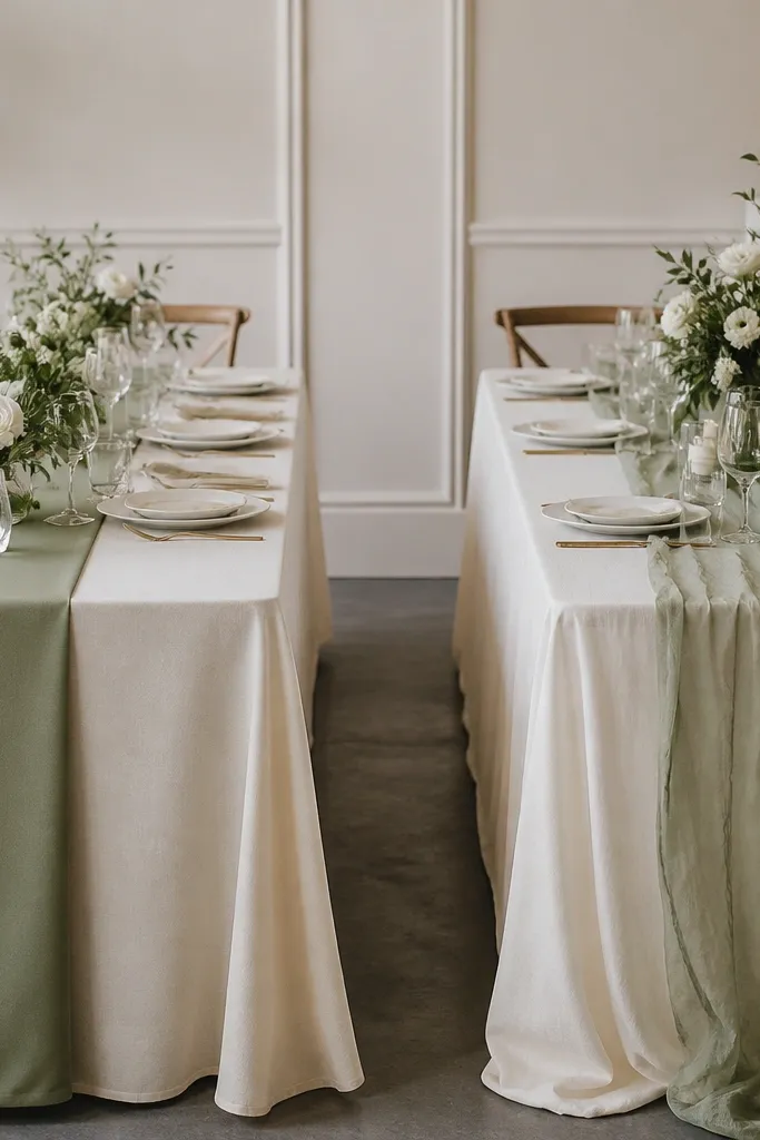
I'm picky about sage runners because they can either make a table look styled or make it look like fabric you draped last minute. Sage linen is matte and holds shape, which makes it look clean and intentional under overhead lighting and candles. Sage organza is pretty, but it catches light unevenly and can show wrinkles or the wrong base color underneath. If your base tablecloth is white, organza can make sage look gray; if your base is cream, it can look minty. For most weddings, linen wins because it reads calm and consistent in photos and it feels right with both gold and silver accents.
Start with a base tablecloth in cream or oatmeal, then place a sage linen runner centered and measured to hang evenly on both sides. Use a runner width of about 12-18 inches for standard round tables so it looks proportional, not like a narrow strip. If you want layered texture, add a second element like a sheer overlay only on the top third of the table, not across the whole runner. Press the linen so there are no wave creases, and pin the ends so it doesn't shift during setup. Take a quick test photo under your reception lighting - if sage looks too gray, warm up the base color before you buy more decor.
Try thisIf you're unsure, choose linen. Organza is beautiful but it demands a perfect base and a smooth install.
Common mistakeDon't put sage organza over bright white - it turns the whole table cooler and flatter in photos.
6. Sweetheart table chairs: sage slipcovers with cream seat cushions
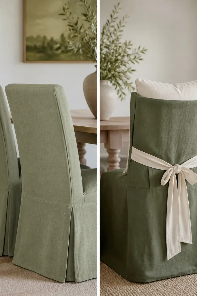
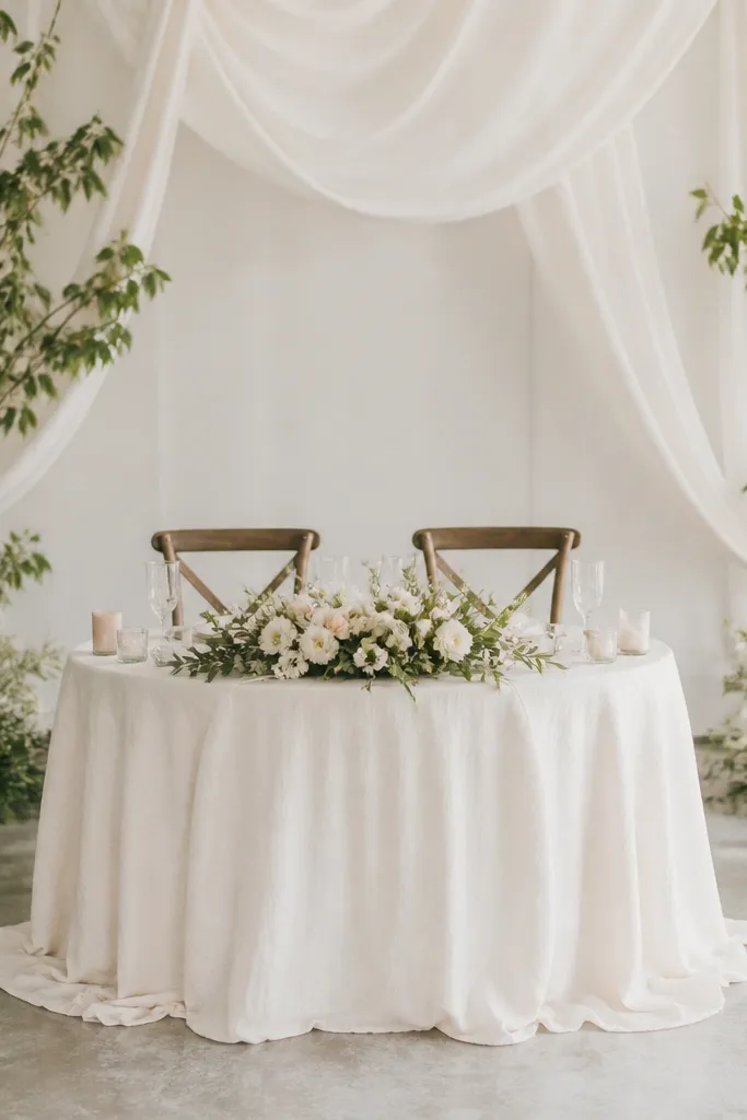
Chair styling is where sage either looks chic or looks costume-y. Sage slipcovers alone can look flat and too uniform, especially if your fabric is the same tone as your signage and napkins. The "after" version adds cream seat cushions and a small cream ribbon tie, which gives the sage structure while keeping the palette warm. This pairing flatters a wide range of skin tones because cream cushions brighten the photo area around the couple. It also looks great with both minimalist dresses and lace-heavy looks because cream acts like a neutral buffer. In my setups, this combo reads intentional even when the rest of the decor is simple.
Start by fitting sage slipcovers so the back panel sits smoothly and doesn't sag. Add cream seat cushions with a slightly thicker profile so the couple's chairs look padded in photos. Tie a cream satin ribbon around the chair back at about mid-height, not at the very top, so it frames the couple without blocking signage. If you're using table skirts, keep them cream or champagne so the chairs don't blend into the table base. Do a quick test from the front row - if the chairs look like one flat block of green, add a cream element like cushions or a throw blanket.
Try thisKeep the slipcover fabric matte. If it's shiny, sage can look too "fashion" for a wedding dinner.
Common mistakeAvoid identical sage everywhere - chairs and linens in the exact same tone can make the whole setup feel heavy.
7. Sage candle bases with cream tapers (before: mismatched holders)
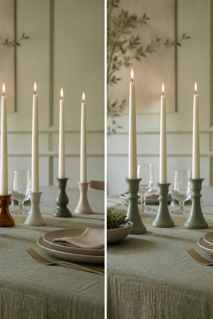
Candles make sage look romantic when your holders match and your taper color is warm. The "before" version uses random glass and metal tones, and the flame reflection bounces around, turning sage into a green-glow mess. The "after" version uses consistent sage-toned bases (or sage-tinted glass) and cream tapers, so the light warms the green instead of cooling it. This works in both indoor ballrooms and outdoor evenings because the flame gives movement, and sage stays calm. I've seen this pairing flatter brides with cool undertones too, because cream tapers add warmth directly in the frame.
Start by choosing taper candles that are cream, not bright white, and cut them to a consistent height if needed. Place them in holders that match in color - sage glass, clear glass with sage sleeves, or matching metal. Arrange candles in a straight line along the center of the table, keeping even spacing between holders. If you're adding greenery around candles, keep it behind the holders so it doesn't block the flame. Finally, light them and take a photo at table height - if the sage looks too gray, swap to slightly warmer holders or add a cream runner underneath.
Try thisUse matte candle holders when possible. Glossy holders show every fingerprint and make the palette look messy.
Common mistakeDon't mix holder metals and glass colors - it makes sage look like it's fighting the lighting.
8. Sage floral foam cover vs no foam cover (the base you never see)
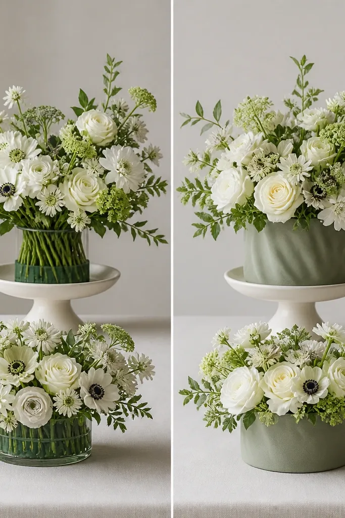
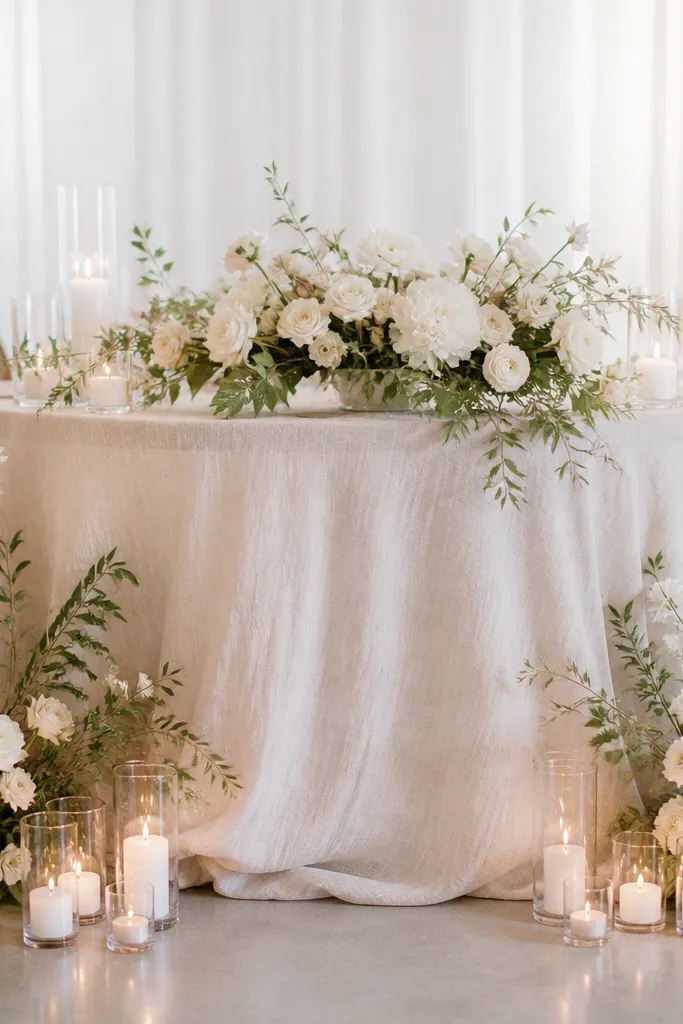
Even if your flowers are stunning, the base can ruin the look. The "before" version leaves foam or the mechanics visible, and sage turns into a backdrop for messy stem ends. The "after" version uses a sage-toned wrap or fabric cover under the arrangement so the green reads as part of the design, not as construction. This matters most for sweetheart tables and reception centerpieces that guests photograph from close range. It also works across different skin tones because clean, finished edges keep the frame focused on faces and hands, not on the arrangement's guts. If you're using mixed bouquets with cream and blush, this base makes sage look cohesive.
Start by covering the floral mechanics with a sage fabric wrap or hidden foliage so the foam isn't visible from the front. Cut the cover to match the container shape, then tuck and secure with floral tape so it doesn't shift. Place your taller stems first, then fill with medium blooms and finally add small filler so the arrangement has depth. Keep the sage base consistent across tables - if one centerpiece shows more mechanics, it will look like you had a different vendor. Check from two angles: standing eye level and seated eye level, because that's where guests actually see the base.
Try thisBring a phone and shoot one centerpiece from the side. If you can see mechanics, you'll see it in every memory photo too.
Common mistakeDon't leave foam exposed - it makes sage look like a background color instead of a designed element.
9. Menu cards: sage border vs full sage background
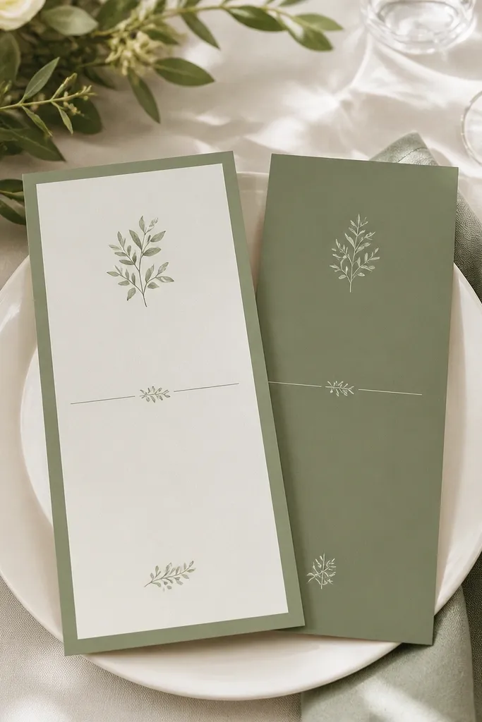
I like sage menus with a border more than full sage panels. The "before" look with a fully sage background can make the page look too dark under warm venue lights, and the text can lose contrast when the paper has a matte finish. The "after" border approach keeps the sage as a framing color while letting your typography stay crisp. It also reads cleaner for both formal and casual weddings because the menu stays easy to scan. This works best if you're pairing sage with cream chargers and warm metals, because the border color sits nicely between neutrals. If your couple's palette includes blush or dusty rose, a sage border makes those tones pop without turning the page into a green block.
Choose a cream or oat menu card and print with black or deep charcoal text for readability. Add a thin sage border that's about 1/4 to 1/3 inch wide - thick borders can feel heavy. If you want extra detail, add a small sage corner accent or a simple line icon in sage, not a full background wash. Place menus on top of the charger or in a small acrylic stand so the card catches light. For the "after," keep the border consistent across all paper pieces - menus, programs, and place cards - so sage feels like one suite.
Try thisDo a quick contrast test: read the menu text from 6 feet away in the room lighting.
Common mistakeAvoid full sage backgrounds with white text - they look moody and can get hard to read indoors.
10. Sage balloon accents: matte sage + cream instead of one big sage cluster
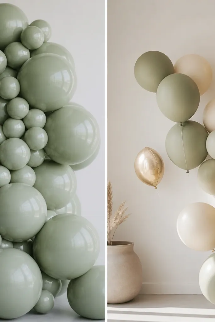
Balloons are where sage can either look modern or look like a theme party. The "before" glossy sage cluster reflects overhead lights and can make the green look too bright or too yellow. The "after" version uses matte sage balloons paired with cream balloons and small gold foil accents, which makes the sage feel muted and expensive. I've used this at bridal showers and wedding entrances and it photographs well because the matte finish reduces glare. It also flatters the couple because the cream balloons create a bright frame around skin tones. Leave some negative space - that's the part people miss when they copy a dense cluster.
Start with matte sage balloons in two sizes: one around 12 inches and one around 18 inches. Add cream balloons in a similar size mix so the arrangement has contrast without extra colors. Use a few gold foil balloons at about 5-10 percent of the total, not more, so they act like punctuation. Anchor the cluster with a weight and attach balloons at the right height so the bottom edge doesn't sag. For the "after," step back and check from the doorway - if it looks like a solid wall, remove a few balloons and increase spacing.
Try thisIf your venue has strong overhead lighting, matte balloons look dramatically better than glossy ones.
Common mistakeDon't use only one shade of glossy sage - it flares in photos and turns the palette loud.
11. Arch drape: sage fabric width and fall vs thin strips
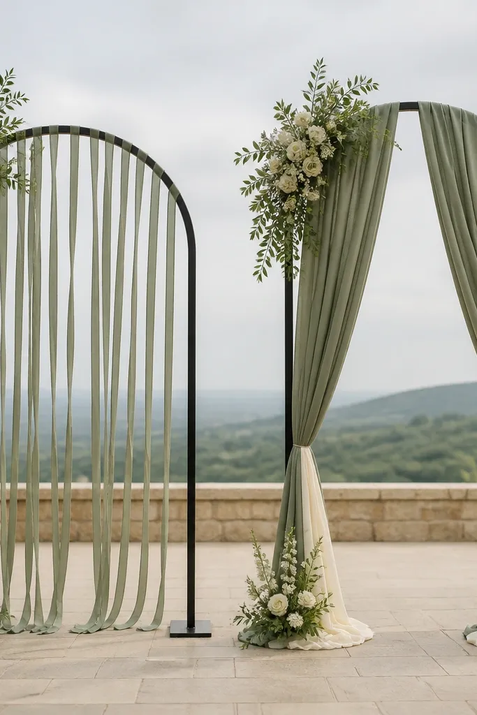
An arch is supposed to frame the couple, and fabric width decides if it frames or flutters. The "before" look uses thin strips of sage that hang with gaps, so the arch reads as decoration rather than a backdrop. The "after" version uses wider drapes that fall in smooth vertical lines, which makes sage look intentional and architectural. I've done this for both outdoor ceremonies and indoor stages, and the wider fabric holds up in wind better because it has more weight and coverage. This style also flatters skin tones because the drape gives a consistent background behind faces and outfits. Pair it with cream florals so the arch doesn't look monochrome green.
Start by choosing a fabric with good fall, like heavy chiffon or a light satin blend, in sage with a matte or low sheen finish. Cut lengths that reach from the top rail down to just above your couple's shoulder height, then plan overlap so you don't see the frame behind. Attach fabric in sections, smoothing each panel as you tie, then adjust for even vertical lines. Add cream accents at the base - small bunches or a cream ribbon wrap - so the arch has a warm anchor. Finally, stand where guests will stand during photos and check for gaps - if you see the frame through the drape, add overlap in that specific area.
Try thisUse wider panels even if you think you need less fabric. The "less" version usually looks like a temporary install.
Common mistakeAvoid thin strips and uneven spacing - it makes sage look like it's hanging by accident.
12. Sage table scatter: mixed leaf shapes vs one-size green confetti
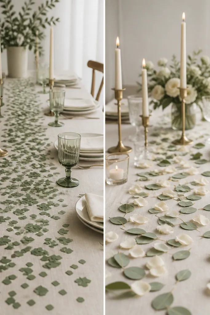
Table scatter is small, but it changes the texture of your photos. The "before" version uses one-size sage pieces that look like confetti, so the table floor becomes patterned in a way that feels cheap. The "after" version uses mixed leaf shapes or layered greenery pieces in sage, plus a few cream petals so the scatter looks like it came from a real floral design. This works because your eye reads variety as natural, and sage becomes a soft texture instead of a repeated motif. It also flatters the couple because scatter stays low and doesn't block centerpieces or place settings. I've used this for both candlelit dinners and daylight receptions and it looks good in both.
Start by choosing scatter that has shape variation - leaf confetti, dried sage leaves, or small paper leaf pieces in sage tones. Mix two sage shades: one lighter and one slightly deeper, then add cream petals or pale gold flakes for warmth. Scatter in a loose oval around the centerpieces and charger area, not across the whole table. Keep the density higher near the centerpiece and lighter near the edges so it looks intentional. For the "after," do one photo from the side - if you see a repeating pattern, remove some pieces and redistribute.
Try thisIf you're using real dried leaves, mist them lightly with a mix of water and a tiny bit of clear fabric spray so they lie flatter.
Common mistakeDon't use one-size confetti scatter - repetition reads "party supply," not wedding design.
13. Sage bar signage: charcoal text on sage-backed board vs white vinyl
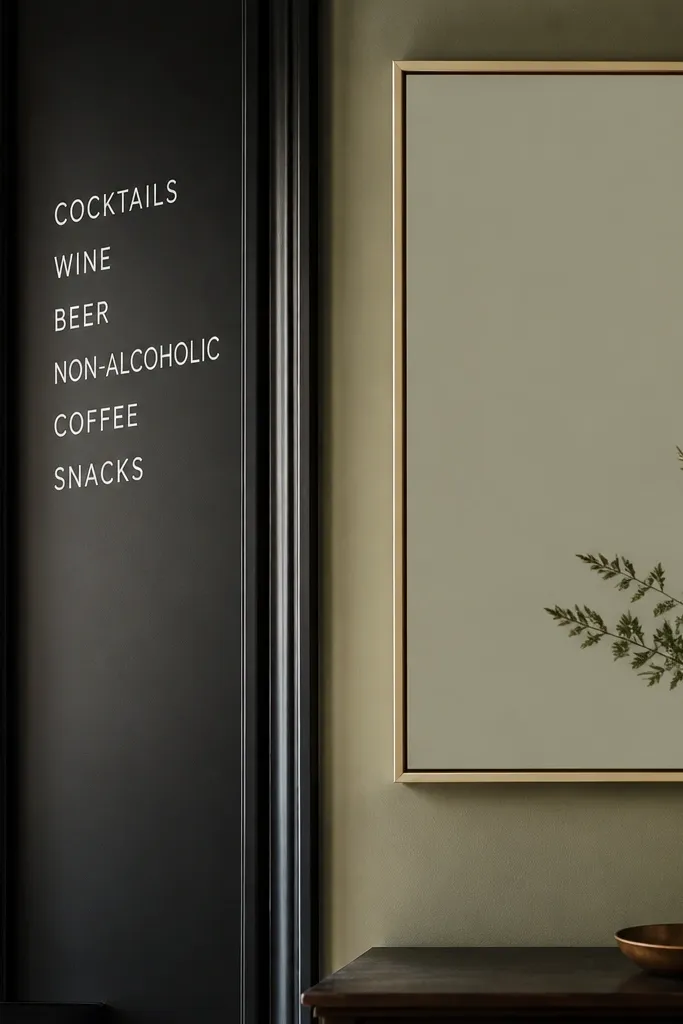
Bar signage is a close-up photo magnet, and white vinyl is the most common "before" fail I've seen. It looks like a sticker, and the bright white can make sage accents look washed out. The "after" look uses charcoal text on a sage-backed board or matte card stock, so the sign looks like part of the stationery suite. This also helps with readability because charcoal stays legible against sage without looking harsh. It flatters the whole palette because the signage sits between the bar items and the couple's outfits in the frame. If your wedding has neutral table settings, this keeps your bar area from looking like a separate event.
Pick a matte sage board or thick cardstock in a medium sage shade, not the lightest one you own. Use a charcoal or deep espresso font, and keep lettering sizes around 64-90 pt for the main drinks and 28-40 pt for details. Add a thin gold or cream line frame if you want a little polish, but keep it minimal. Mount signs on small easels that match the metal tone of your bar tools, then place them at the bar height where people actually read them. For the "after," take a photo with someone standing beside the sign - if it looks like a sticker, swap to board or printed cardstock.
Try thisMeasure the text height: if your sign is more than 6 feet from the seating area, bump font size instead of adding more lines.
Common mistakeSkip white vinyl lettering on its own - it looks temporary and makes sage look less cohesive.
14. Sage + champagne escort cards in acrylic boxes
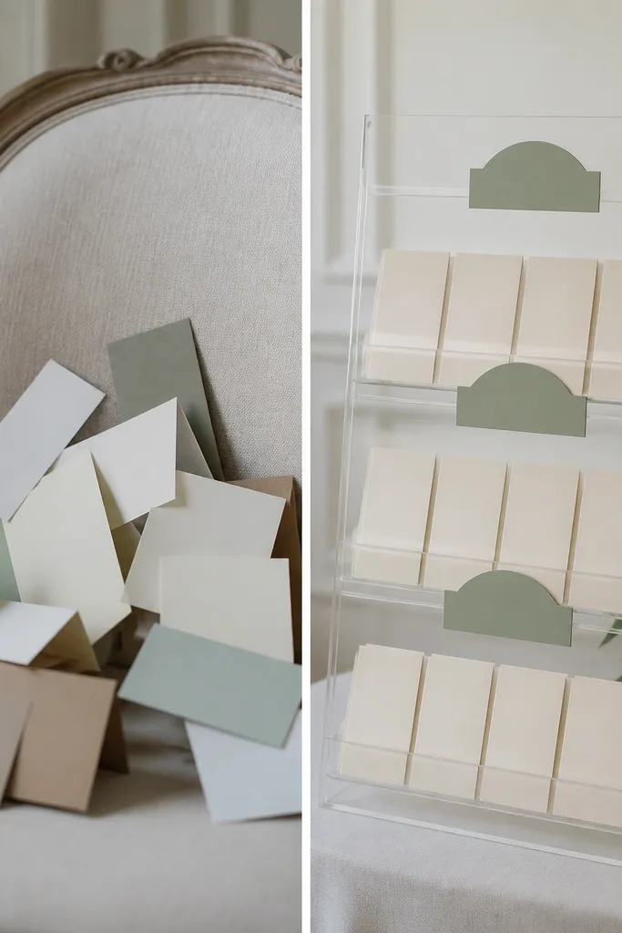
Escort cards look polished when they have structure and a consistent label system. The "before" version puts cards on a chair or table with mixed paper colors, so sage becomes one more color instead of the organizing theme. The "after" uses acrylic or clear boxes with sage labels, plus champagne-toned cards so everything reads warm and cohesive. This is especially good for weddings with lots of guests because people move fast and need clarity. It also flatters the photo area because acrylic reflects light cleanly without adding extra color noise. I've used this setup in both indoor and outdoor receptions and it holds up because the labels guide people right away.
Start with champagne or oat card stock for the names and tables, then print sage labels on matching paper. Use acrylic boxes or a clear tiered stand so cards sit upright and don't get knocked over. Label each section with a sage header - keep the label font consistent and large enough to read from 5-8 feet. Sort cards by table number and keep spacing even between columns. For the "after," place the display near the entrance path but not directly in line with harsh sunlight so glare doesn't wash out the sage label.
Try thisAdd a small cream ribbon bookmark tied to the acrylic box so the display looks finished from every angle.
Common mistakeDon't scatter escort cards loose - they look chaotic and sage turns into "random green paper."