
1. The 3-Zone Bride-to-Be Frame Layout
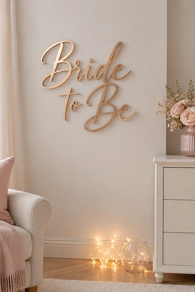
I build bride-to-be setups in three zones because it stops the "everywhere at once" look that wrecks photos. Zone one is the wall backdrop - I use a sign or a fabric panel centered at about 60 inches from the floor. Zone two is the table or dresser - I keep it at one main height so the bride's hands and face stay visible. Zone three is lighting - warm string lights or a small lamp placed off-center so it adds glow instead of harsh shadows. This setup works for small apartments because it uses vertical space and keeps clutter off the floor.
Start by picking one wall and taping a rectangle on it with painter's tape (for example, 36 by 60 inches) to plan your backdrop. Then place the sign centered within that rectangle and set the dresser items so the tallest object is no higher than the bride-to-be's chin when she stands beside it. Finally, add a lighting source in Zone three - I angle string lights from the side, not straight at the camera, so you get a soft edge glow. Keep anything reflective (gold foil signs, mirrored trays) out of direct line with the camera flash.
Try thisUse 2700K warm bulbs if you can - the whole palette suddenly looks like "wedding photos," not "craft store."
Common mistakeAvoid scattering decor across the whole room without a taped-off photo frame.
2. Fabric Backdrop Instead of a Balloon Wall
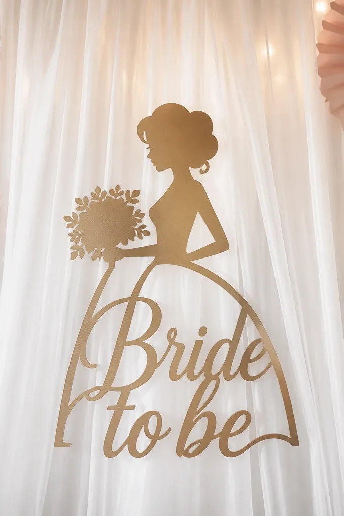
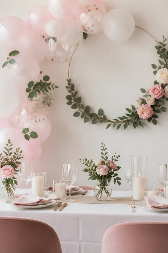
After I ruined a setup with a balloon wall that looked lumpy in indoor light, I switched to fabric. A single white sheer or tulle backdrop gives you smooth texture without gaps, and it photographs like a soft studio background. For blush themes, I add a blush satin ribbon tied in a bow at the top corners, which gives the fabric shape. This works especially well for people with warm undertones because blush doesn't clash with skin - it looks like it belongs. If your room has patterned wallpaper, fabric also hides the busy background.
Start by hanging the fabric from a tension rod or command hooks so it's taut but not stretched tight. Use two side ties or clips so the folds fall naturally and don't pool behind the sign. Then place paper fans or small faux stems at the lower corners, keeping them under 12 inches tall so they don't crowd the center. Center the bride-to-be sign so the fabric frames it evenly, and keep the fabric's bottom edge at least 4 inches above the table surface.
Try thisSteam the fabric for 3 minutes before hanging so the folds look intentional, not wrinkled.
Common mistakeAvoid using thin tablecloth fabric that wrinkles in blocks - it shows in every photo.
3. Paper Fans That Actually Read on Camera
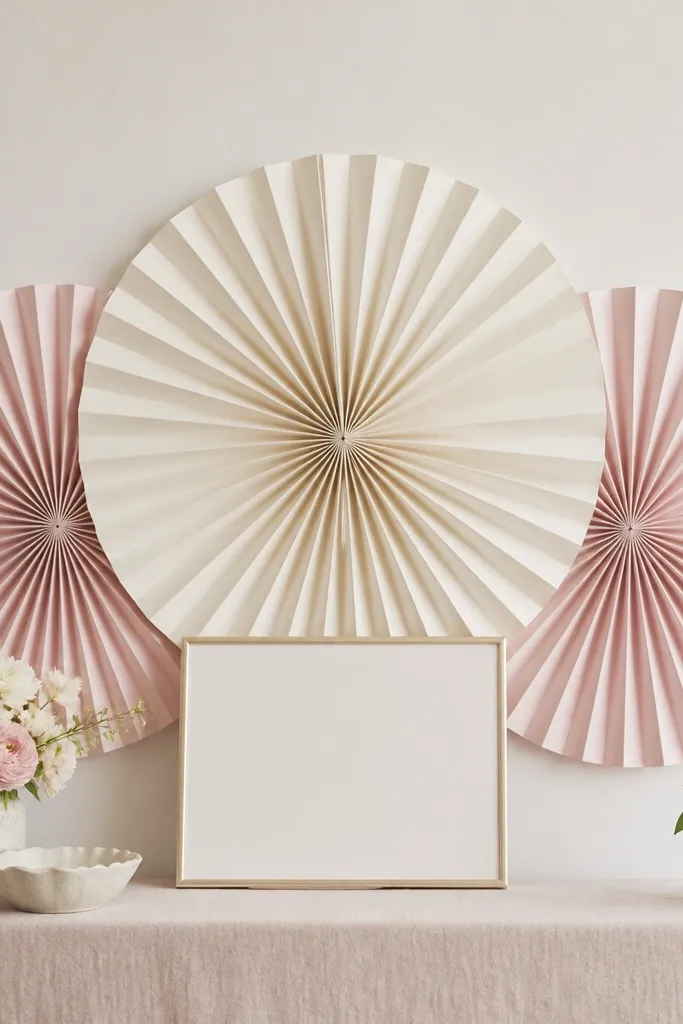
Paper fans look great, but they fail when they're too small or placed off-level. I learned to size fans to your sign: if the sign is around 10 inches wide, fans should be at least 16 inches across. I use blush and cream fans because they show contrast against a light wall without looking harsh. The fans create depth behind the bride-to-be moment, so the photo has layers - sign in front, fans in mid, and fabric or wall in back. It's flattering for photos with overhead lighting because the accordion folds catch highlights.
Start by folding and mounting fans in a staggered triangle behind the sign: one large centered, two medium on the sides. Keep the fan bottoms aligned at the same height so the layout looks tidy. Then place the sign in front of the center fan, leaving 2 to 3 inches of fan visible on each side. Finally, add one small gold accent (like a thin foil banner strip) low on the table so the palette repeats below.
Try thisUse foam mounting squares for the sign so it doesn't sit flat against the fans.
Common mistakeAvoid placing fans too low or too high - misalignment makes the whole corner look unplanned.
4. Satin Ribbon Bow on the Sign Rod
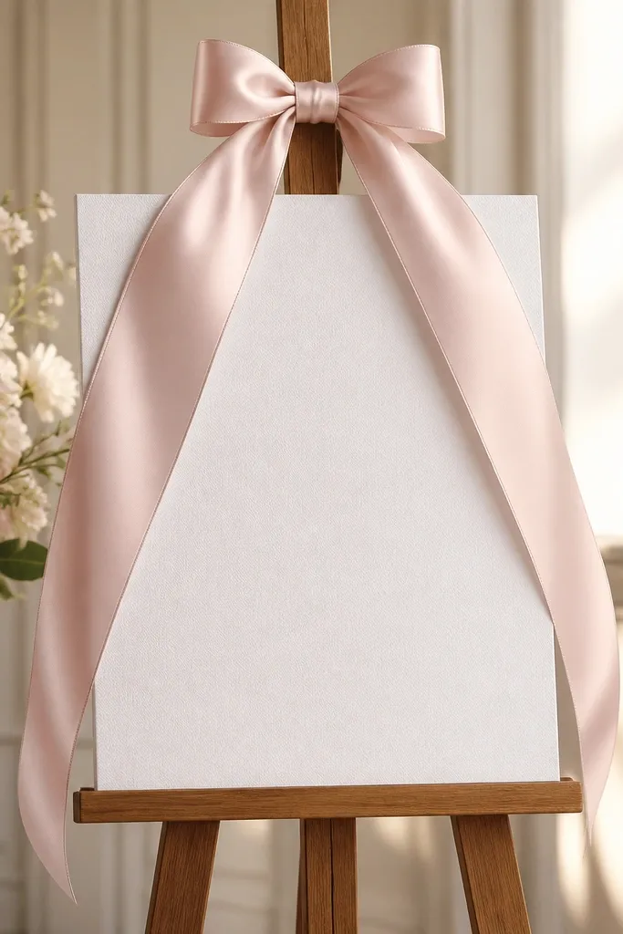
One satin bow fixed my "cheap sign" problem instantly. When a sign is plain, the bow adds polish and gives your eye a finishing point. I use 2-inch wide blush satin ribbon because it reads soft instead of shiny plastic. The bow also helps the sign feel like part of the decor, not a random printout. This works for both men and women bride-to-be setups because it doesn't lean too feminine - it just adds a clean focal detail.
Start by tying the ribbon around the top of the sign stand, not the paper itself, so it doesn't warp the card. Make a loop about 7 inches wide on each side and pull the ends so they fall to about the middle of the sign. Then trim the ends into V-shape with fabric scissors so they don't fray. Finally, use two small clear command hooks behind the sign to keep it steady and centered so the ribbon doesn't twist.
Try thisHeat-seal the ribbon ends with a lighter for 1 second each so it stays smooth and doesn't fray.
Common mistakeAvoid tying the bow directly to the sign paper - it will crease and look messy fast.
5. Champagne-Gold Mirror Tray for Centerpiece Height
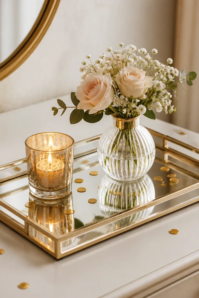
A mirrored tray makes a bride-to-be corner look styled because it creates a second light source. I put a candle and a mini vase on the tray so the reflections add sparkle without needing glitter bombs. Gold confetti or gold leaf flakes look expensive when they're controlled - a little scatter beats a full messy layer. This works in rooms with neutral walls because the mirror catches light and adds dimension. If your bride-to-be theme is blush and white, champagne gold keeps it warm and flattering instead of icy.
Start by choosing a tray size that's wider than your main vase - for a 6-inch vase, use at least a 10-inch tray. Then place the candle on one side and the mini vase slightly off-center so the arrangement looks natural, not symmetrical. Scatter a thin line of gold confetti around the candle base, keeping it away from the wick. Finally, wipe the mirror clean right before guests arrive so fingerprints don't show in flash photos.
Try thisIf you use a real candle, test it in the space for 10 minutes - smoke can ruin the photo vibe.
Common mistakeAvoid overloading the tray - too many items make reflections chaotic.
6. One Tall Vase, Two Low Bud Vases
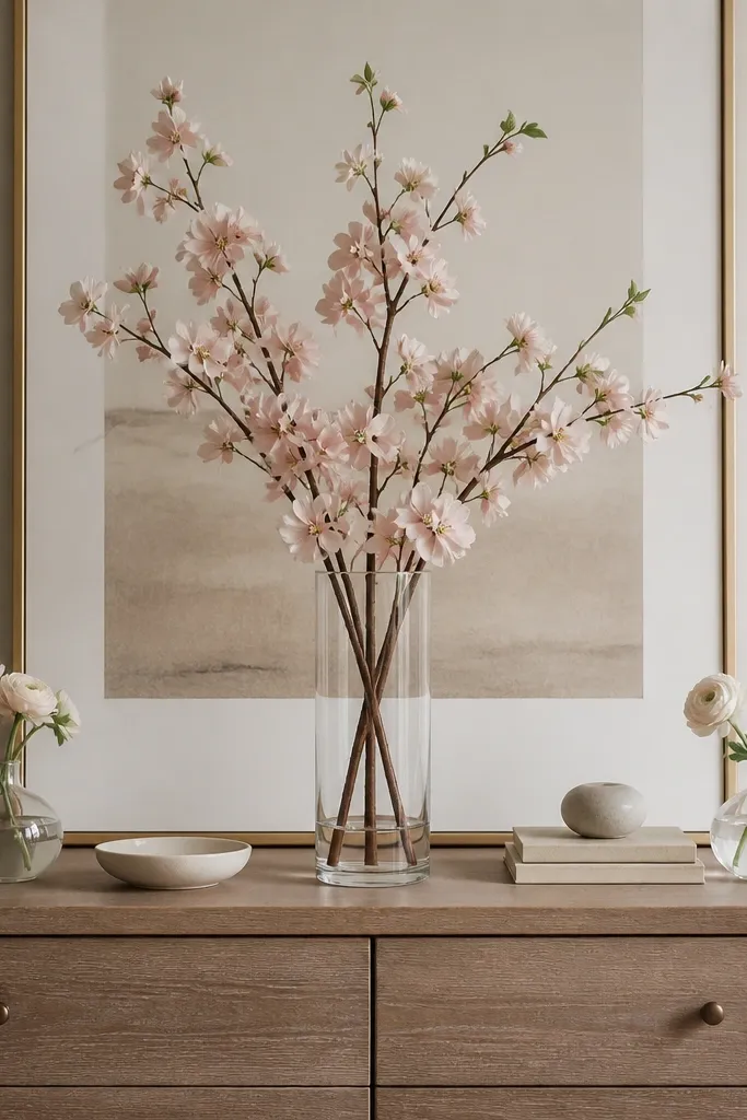
This arrangement solved my "everything looks the same height" problem. A tall centerpiece gives you a clear focal point, and low bud vases keep the bride-to-be's face unobstructed in photos. I use blush or cream stems with a bit of greenery so it looks airy, not heavy. Clear vases also photograph well because they don't fight the background colors. This layout flatters most body types in pictures because it keeps the visual line above the table, not across the bride's torso.
Start by placing the tall vase in the center of the dresser, aiming for a total height of about 14 to 16 inches. Then add two bud vases on either side, each about 6 to 8 inches tall, spaced so there's 6 to 8 inches of empty space between vases and the dresser edge. Fill the bud vases with smaller clusters so the arrangement feels balanced. Finish by tucking a few stems behind the tall vase so the back looks full.
Try thisUse a foam insert or a small grid inside the tall vase if you're using faux stems - it prevents gaps.
Common mistakeAvoid using all short candles and no height - the photo looks flat.
7. Warm String Lights as Side Lighting, Not Ceiling Lighting
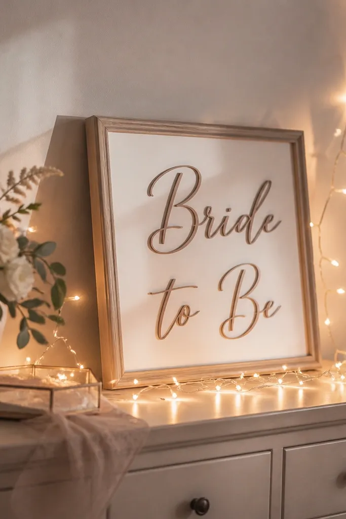
Lighting is where most bride-to-be decoration ideas mistakes happen, because people buy decor and forget how it looks under bulbs. Side lighting creates a soft shadow line that makes the sign and flowers look dimensional. I use warm white string lights because they match the champagne and blush palette. Cool blue lights turn white decor gray and make gold look dull. This is the easiest upgrade for anyone decorating a home living room without professional lighting.
Start by plugging in the lights and testing the glow from the camera position you'll use. Then drape the lights along the side of the backdrop or wrap them around a small wall hook - keep the strand 4 to 8 inches away from the sign so it doesn't cause glare. Add one battery LED candle on the table so the center has a second warm point. Finally, turn off overhead lights for photos - your decor will look intentional instead of flat.
Try thisIf you see hotspots, spread the strand wider - tight loops look like bright dots in pictures.
Common mistakeAvoid aiming lights straight at the lens - you'll get glare and blown-out highlights.
8. Confetti Scatter on a Dark Tray for Contrast
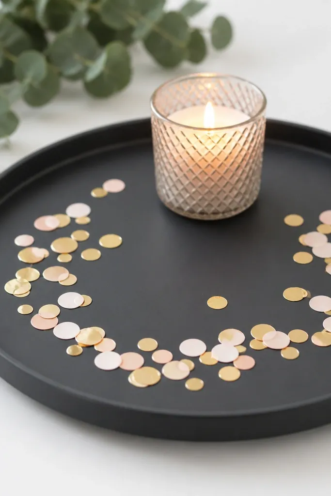
Confetti is only classy when it's controlled. I put it on a dark tray because it makes gold flecks show up clearly in photos, even with indoor lighting. If you scatter confetti directly on a light tablecloth, it blends in and looks like dust. The dark base also makes blush pieces look richer. This works well when your room has lots of white furniture because the contrast gives the photo a focal landing spot.
Start by choosing a tray color that's darker than your theme - charcoal or deep brown works. Then scatter confetti in a small oval where the candle or centerpiece sits, keeping the densest area within a 6-inch radius. Use a small spoon to distribute so you don't dump a pile. Finish by wiping the surrounding table surface so confetti doesn't travel and look messy later.
Try thisUse thicker paper confetti or metallic flakes - thin tissue confetti disappears in flash.
Common mistakeAvoid using glitter that sheds - it ends up on faces, clothes, and the floor.
9. Balloon Weight Strategy That Stops Sagging
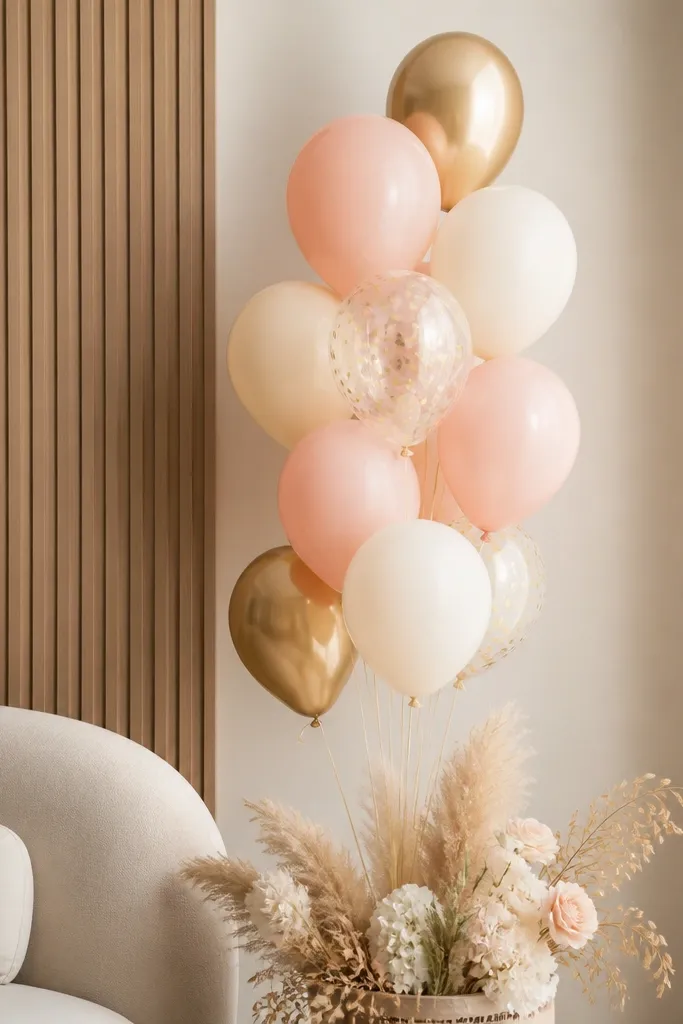
Balloons look amazing until they droop and tilt, and then they ruin the whole photo frame. I use a weighted base and keep balloon clusters smaller than people expect. Pastel balloons look best when they're not packed tightly - you should see breathing room between them. Gold accents help the palette connect to candles and trays. This works in homes because a floor-weighted cluster doesn't need wall anchors or damage.
Start by using a balloon weight (or a filled sandbag in a fabric pouch) and placing it where it won't block the dresser. Tie balloon strings to a central knot and keep the cluster height around 40 to 48 inches from the floor for most rooms. Then adjust the angle so balloons lean slightly toward the photo camera, not sideways. Finally, hide the base with a small faux plant or a folded fabric panel that matches your backdrop.
Try thisSpray the balloons with a tiny amount of anti-static balloon spray if you get dust on them - it keeps them clean for photos.
Common mistakeAvoid taping balloons directly to walls - it leaves marks and causes lopsided droop.
10. Acrylic Name Sign with Subtle Gold Vinyl
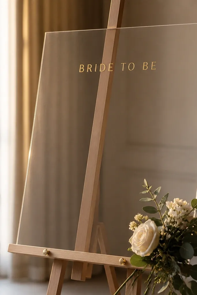
Clear acrylic signs look crisp and modern, but only if the lettering is restrained. I like small gold vinyl because it reflects light without looking like a sticker bomb. Keep the font size readable from 6 to 8 feet - that's the typical distance in home photo setups. Acrylic also pairs well with both men and women themes because it looks clean and neutral. In a blush-and-white room, gold vinyl ties everything together with the same metal tone as candles and trays.
Start by choosing an acrylic sign size around 10 by 14 inches and an easel that keeps it slightly angled toward the camera. Apply gold vinyl letters so the headline sits 1.5 inches from the top edge, not centered too low. Then add a small charm or ribbon at the base of the easel so it doesn't look like a standalone print. Place the sign behind the centerpiece, so the centerpiece sits in front and the acrylic stays readable.
Try thisWipe acrylic with microfiber and lens cloth - streaks show instantly under flash.
Common mistakeAvoid using thick gold foil stickers across the whole sign - it looks uneven and cheap.
11. Photo Booth Corner with a Curtain + Clip Garlands
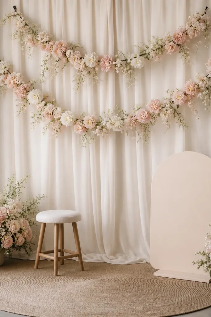
When I wanted more than a table display, I built a tiny photo booth corner. Curtain backdrops look softer than paper boards, and clip garlands let you change the look without buying a new set. I use blush paper garlands with a cream base because it keeps the palette consistent. The key is to keep the booth area tight so guests naturally stand in the right spot. This suits apartments because the setup packs down quickly and doesn't require wall drilling.
Start by hanging a curtain behind the photo spot and securing it so it falls in straight vertical panels. Then clip a garland line across at about 55 inches from the floor, leaving room for a sign in the center. Place a stool or small chair in front of the curtain so people have a natural pose point. Finally, keep the table in front minimal: one vase, one candle, and one small tray so the background stays the star.
Try thisUse two curtain panels instead of one long sheet - it reduces wrinkles and looks cleaner in pictures.
Common mistakeAvoid crowding the background with too many long items - it creates visual noise.
12. Table Runner Color that Matches Skin Tones
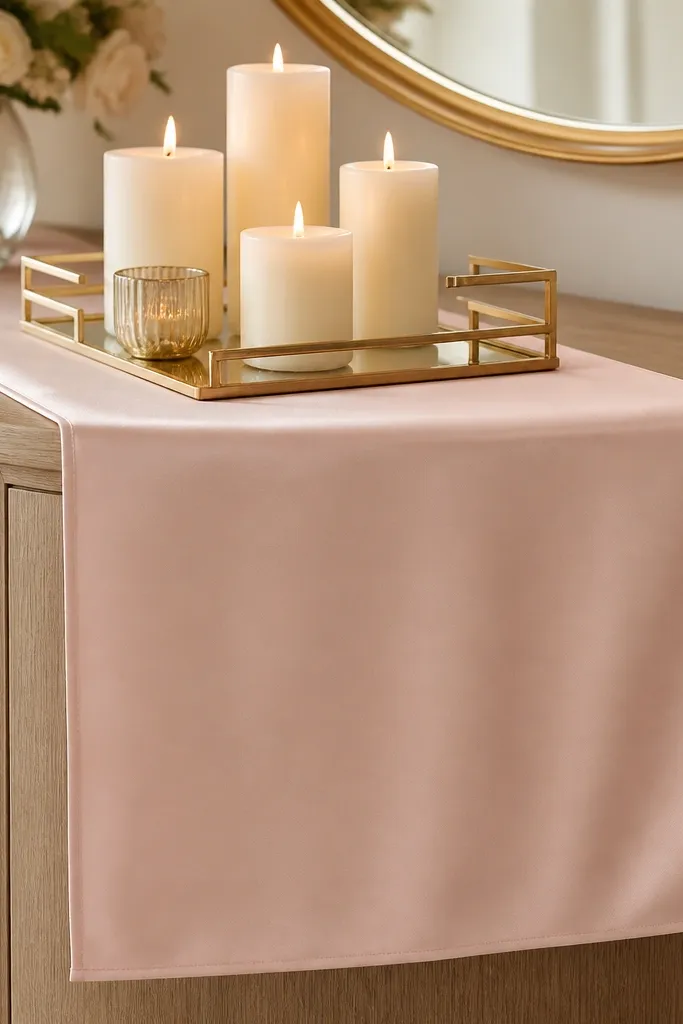
Your table runner color changes how skin looks in photos more than people expect. I use blush satin or a soft cream linen because it flatters both cool and warm skin tones under warm lighting. Satin catches light and makes the whole setup look intentional, but it needs to be smooth - wrinkles show. Linen looks more casual and forgiving. If your bride-to-be is wearing a warm-toned dress, blush reads harmonious; if the dress is cool-toned, cream keeps things balanced.
Start by measuring your dresser top and choosing a runner that overhangs 2 to 3 inches on each side. Then center the runner and smooth it flat with your hands, pulling out wrinkles from the corners. Place the centerpiece tray in the middle so it sits on the runner, not directly on the wood. Add one small element at each end (a mini candle or a small floral stem) so the runner doesn't feel empty.
Try thisIron linen on low heat or use a steamer - a smooth runner makes everything look more expensive.
Common mistakeAvoid using patterned runners with tiny busy prints - they fight the sign and flowers.
13. Single-Color Faux Flower Wall Squares
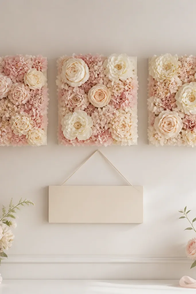
These flower wall squares are a cheat code when you want impact without building a full arch. The reason they work is that they create a consistent texture behind the sign, so photos don't show blank wall patches. I keep them to one color family - blush and cream - so the background doesn't look multicolored and chaotic. Faux flowers also last longer than fresh stems for a home event. This looks great for both men and women bride-to-be themes because the texture is the focus, not the gendered details.
Start by choosing squares that are about 12 by 12 inches each and lay them on the wall to test spacing. Then mount them in a simple row or a 2x2 grid, leaving the center area for your sign. Place the sign below the center squares so it reads cleanly without overlap. Finish by adding a matching small stem bouquet on the table so your colors repeat in both background and foreground.
Try thisUse removable hooks behind the squares so you can take them down without tearing paint.
Common mistakeAvoid mixing flower colors that don't match your sign - it makes the background look like random purchases.
14. Statement Sign with Two-Color Vinyl, Not Glitter
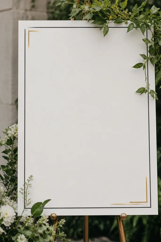
When I used glitter paper on a sign, the sparkle looked great in person but turned messy in photos under flash. Two-color vinyl is sharper and stays readable. I like matte white sign board with dark charcoal text and a small gold accent line because it looks clean and modern. This is especially good when your bride-to-be theme includes a specific color like blush, because the vinyl doesn't compete with the flowers. The sign becomes your anchor, and everything else can stay soft.
Start by choosing a sign board size around 12 by 18 inches so it reads from 6 feet away. Apply dark charcoal vinyl for the main headline and add a thin gold line under it, keeping gold to about 10 to 15 percent of the design. Mount the sign on a stand so the bottom edge sits 6 to 10 inches above the dresser. Then add a small greenery frame at the sides so the sign blends into the decor instead of floating.
Try thisUse matte board, not glossy - glossy reflects overhead light and washes out the letters.
Common mistakeAvoid glitter letters on the sign - it creates speckled glare that looks messy.
15. Greenery Swag on the Dresser Edge
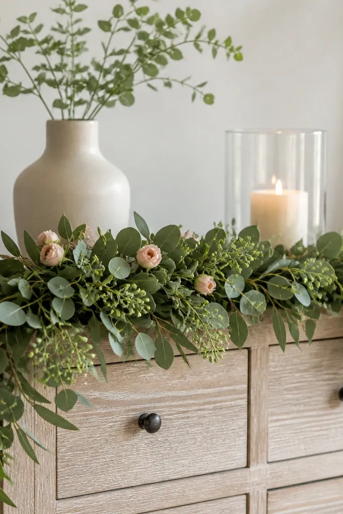
Greenery swags make a dresser look finished without adding bulk. I learned this when I had a gorgeous vase but the space around it looked empty. A swag along the front edge creates a visual base, like a garland, and it also hides uneven table clutter. I choose faux eucalyptus-style greenery because it has natural movement and doesn't look cartoonish. When you add a few blush buds, it ties the greenery to the bride-to-be color story.
Start by laying greenery along the front edge of the dresser and marking where it should start and end based on your centerpiece width. Then tuck it under the edges or secure with thin floral wire so it lies flat. Add 3 to 5 blush buds spaced evenly, keeping them at about the same height so it looks intentional. Place the candle and vase above the swag, leaving at least 2 inches between them and the greenery to avoid crushing.
Try thisUse floral wire you can hide - it keeps the swag from sliding when guests bump the table.
Common mistakeAvoid thick, overly uniform greenery that looks like a straight hedge - it reads artificial.
16. Candles That Match Your Lighting Temperature
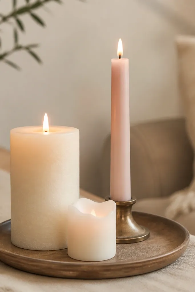
Candles are the easiest way to make decor look romantic, but only if you match them to your lighting. I choose cream and blush candles because they reflect warmth instead of turning gray in indoor light. If you're using LED candles, pick warm flicker settings rather than cool white LEDs. The candle cluster also balances the height of flowers, so nothing looks top-heavy. This is flattering in photos because the glow gives skin a gentle highlight instead of harsh shadows.
Start by picking one main pillar candle about 3 inches wide and 4 to 5 inches tall for the center. Then add two smaller taper candles on either side or one blush LED candle if you want safer lighting. Place candles on a tray so wax mess doesn't land on the table. Finally, light or turn on the candles 10 minutes before photos so the room has time to warm up visually.
Try thisIf the room is dim, use one larger candle instead of three tiny ones - tiny flames get lost in flash.
Common mistakeAvoid using unscented candles that look sweaty or uneven - the wax texture shows on camera.
17. Balloonless Corner with a Layered Paper Backdrop
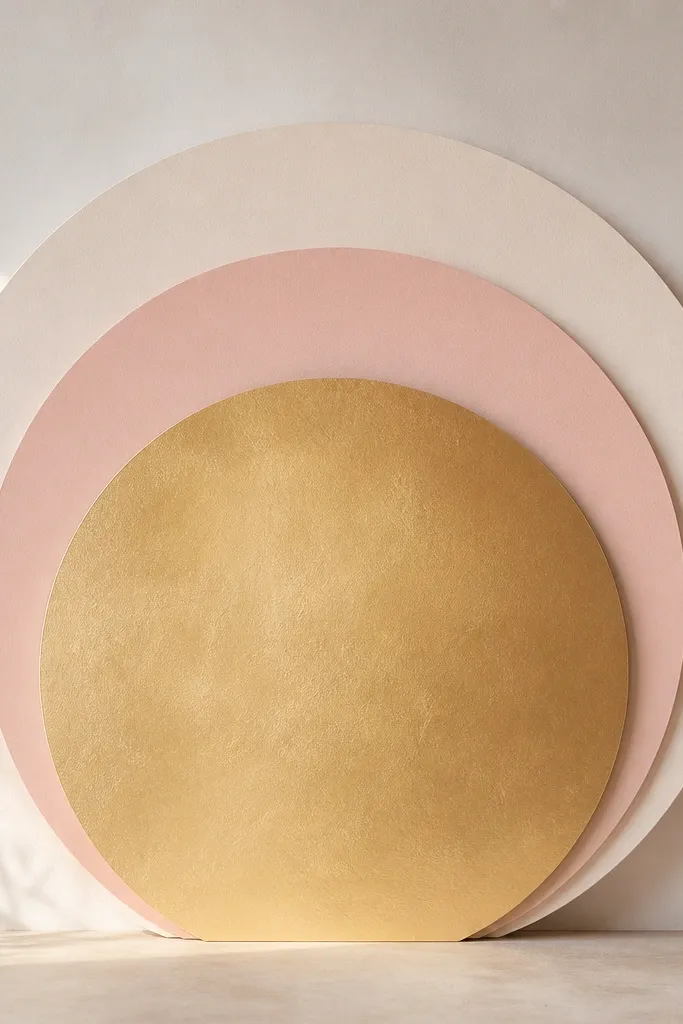
You don't need balloons to get a "wow" backdrop. Layered paper circles create a similar depth effect, and they look tidy even in small rooms. I use cream as the base, blush as the middle layer, and a gold-toned paper on top for sparkle. This works when you have low ceilings or when balloons would block the camera angle. The texture also stays consistent - no sagging, no popping, no frantic last-minute fixing.
Start by cutting or buying paper circle sets in three sizes (for example, 16, 12, and 8 inches). Mount the largest circle flat to the wall, then stack the next size with foam squares so it pops forward. Place the smallest circle behind the sign so it peeks around the edges. Then add one thin gold ribbon at the bottom of the sign area so the gold theme repeats on the table.
Try thisUse cardstock, not thin craft paper - thin paper curls and looks uneven in photos.
Common mistakeAvoid paper layers that are the same color family without contrast - they blend and disappear.
18. Gold Foil Quote Banner with a Clean Baseline
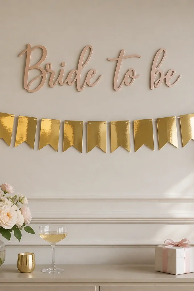
A banner adds movement, but only if it hangs straight and has a clean baseline. I use gold foil for the quote because it catches warm light and looks intentional next to champagne accents. Keep tassels minimal - too many fringe pieces make the photo background busy. This works well for bride-to-be corners because it gives you a second focal line above the centerpiece. It also reads well in overhead phone photos because the banner is horizontal.
Start by measuring the width between two wall hooks and hanging the banner so there's equal spacing left and right. Use a level app or a simple bubble level - one degree off looks crooked in photos. Then add the tassels so they hang at a consistent length, around 6 to 8 inches. Place the banner under the main sign, leaving 4 to 6 inches of vertical gap so the text doesn't compete.
Try thisIf your banner is wrinkled, gently steam it and then clip it flat with clothespins until it cools.
Common mistakeAvoid banners that swing in the air - movement turns letters into blur.
19. Dresser Props: One Tray, One Book Stack, One Frame
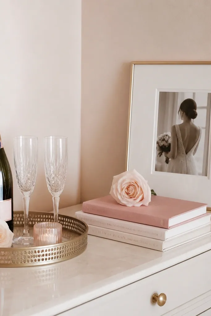
When I let myself go wild with props, the whole corner looked like a craft fair. This rule keeps it styled: one tray for small items, one book stack for height, and one frame for personal warmth. I pick books with cream or blush covers and use a small neutral frame so it doesn't steal attention from the bride-to-be sign. This setup looks good for both women and men because it feels like decor, not themed clutter. It also helps if the bride-to-be wants to add her own photos later.
Start by placing the framed piece on the dresser or leaning it on a wall behind the centerpiece, centered with the sign. Then add a book stack under the frame if you need height - keep the top of the books around the same height as the sign's lower edge. Place the tray in front and keep it to three items max: one candle, one small floral bud, one small gold accent. Finally, leave at least 4 inches of empty space around the tray so it doesn't look crowded.
Try thisUse neutral books and one themed book - it keeps the color story from shifting.
Common mistakeAvoid stacking random small items across the whole dresser - it looks disorganized.
20. Hanging Photo Clips for a Personal Touch
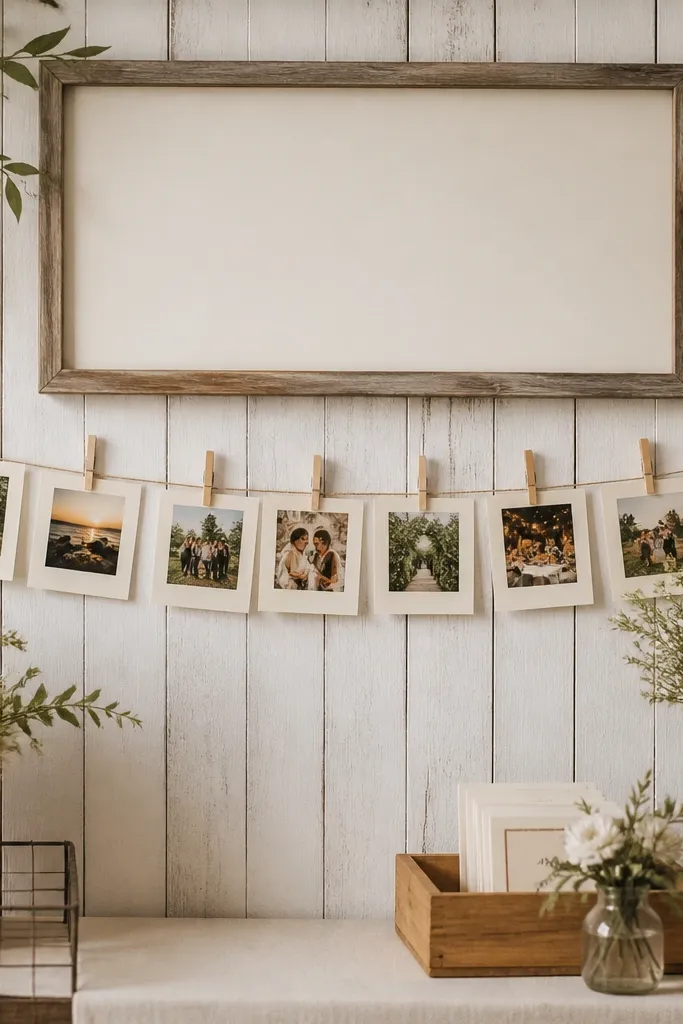
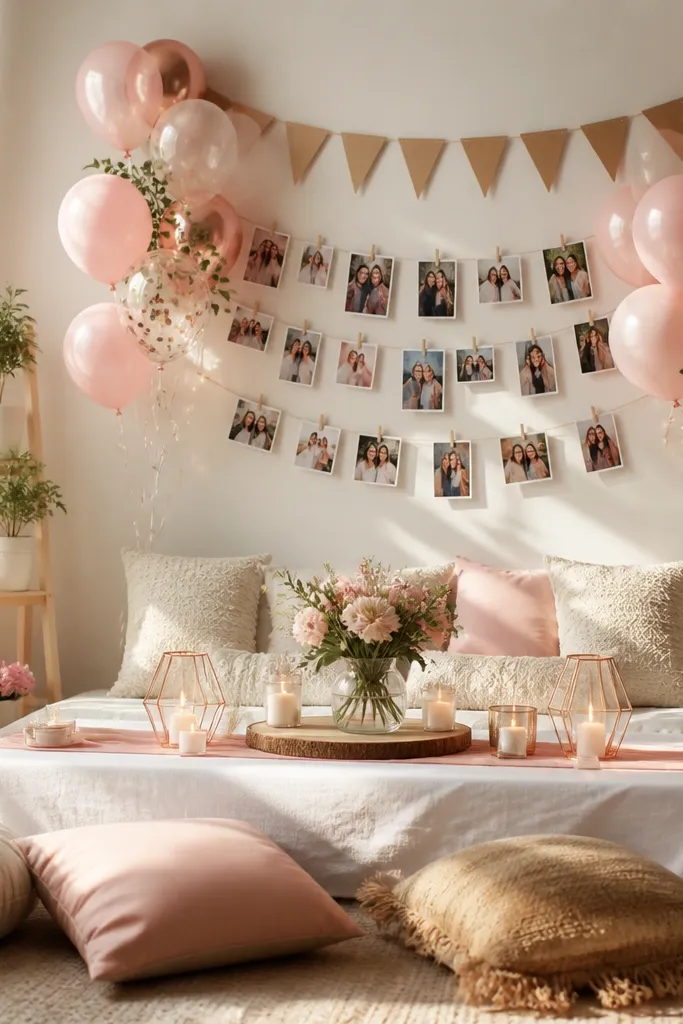
Personal photos make bride-to-be corners feel real, not just decorative, and they also give guests something to look at besides the centerpiece. I hang small photos in a single line so the background stays clean and doesn't turn into a wall of frames. Use clothespins in natural wood or matte cream so they match the warm palette. This works for events where the bride-to-be wants to bring her own memories - you can swap the prints before guests arrive. It's also flattering in photos because faces in the background look cohesive when the frame sizes match.
Start by measuring the width of your backdrop and stretching a thin string line using two hooks at the ends. Then clip 6 to 10 photos along the line, spacing them evenly so there's no big gap in the center. Use photo sizes around 4x6 inches so they're readable but not overpowering. Finally, keep the clips line at least 8 inches above the table so it doesn't interfere with hands reaching for gifts or cake.
Try thisPrint on matte photo paper - glossy prints catch glare and look washed out in indoor lighting.
Common mistakeAvoid mixing frame sizes wildly - inconsistent sizes look chaotic behind the sign.