1. Blush balloon cluster with a single gold "Bride" topper
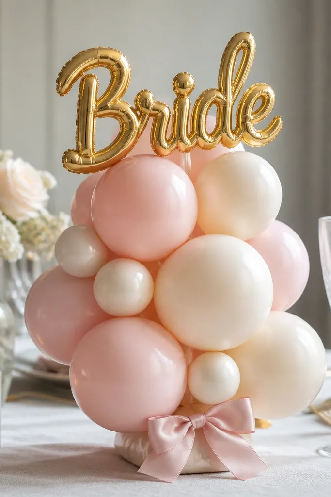
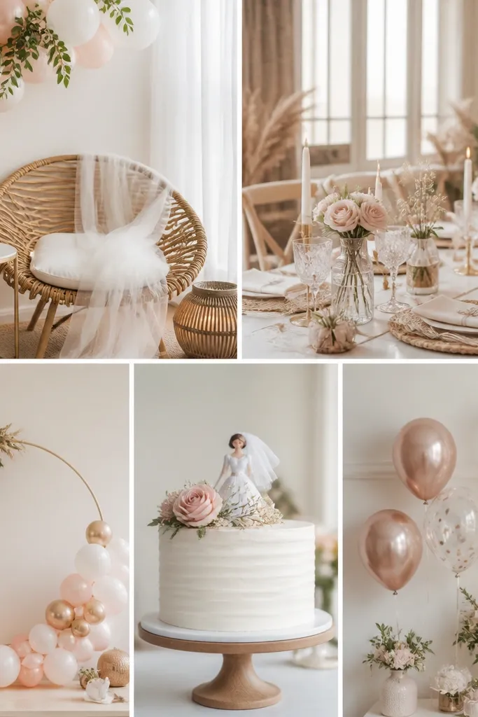
This is the easiest way to make a dessert table look styled even when you only have one corner to decorate. I use blush balloons plus a few cream ones so the cluster reads soft on camera. The gold "Bride" topper adds a reflective focal point that catches light without needing extra props. It works especially well for fair to medium skin tones because blush sits close to your natural undertone, and it also looks good against dark table linens. The styling principle is one clear message element plus a tight color set so nothing competes.
Start by inflating 12-20 balloons: 70% blush, 20% cream, and 10% metallic gold accents. Tie them in pairs, then group them into three mini-clusters before combining with fishing line or balloon tape. Place the cluster on a small tray or cake board so it doesn't slide, and set the gold "Bride" topper on top using a foam dot or zip tie. Finish by wrapping a 2-inch satin ribbon around the base in a simple loop, not a big bow.
Try thisUse a mix of matte and glossy balloons so the cluster has depth in photos.
Common mistakeAvoid using more than two colors in the same cluster - it turns into party confetti instead of decor.
2. Crepe paper tassel garland in blush-to-cream gradient
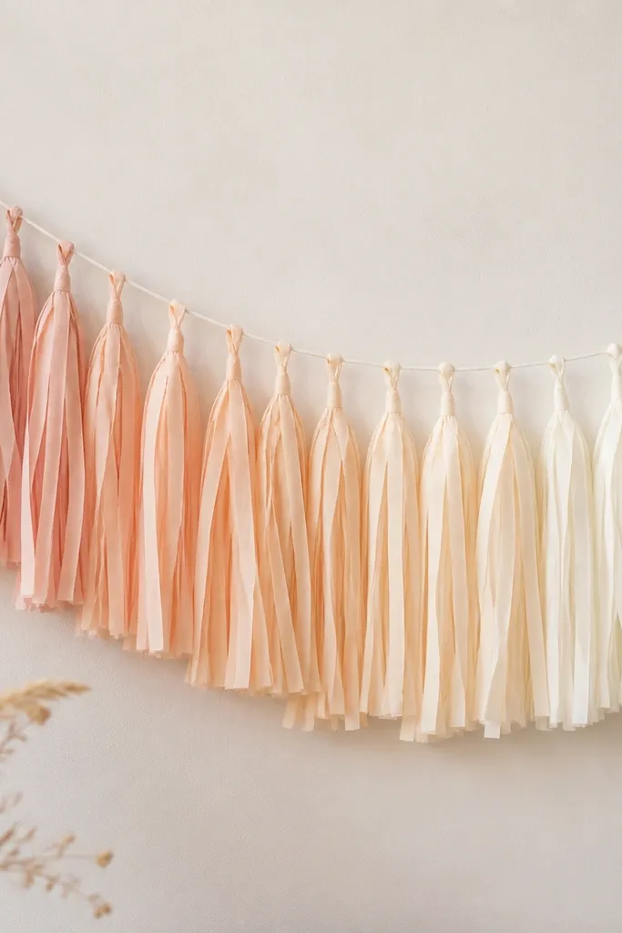
A gradient tassel garland makes a whole wall look styled without looking like you spent a lot. I've used blush fading into cream because it flatters most color palettes - especially white tablecloths and champagne tableware. Crepe paper gives movement, and movement shows in photos as soft blur instead of flat paper. It's great for outdoor showers too because light fabric and paper sway nicely in breeze. The principle here is vertical rhythm: repeating tassels create structure even when the shapes are simple.
Cut crepe paper strips about 2.5 inches wide and 30 inches long, then fringe one side with a 1-inch uncut top. Make two batches: one blush batch and one cream batch, then alternate them as you tie onto a thin line. Hang the garland with clear fishing line so it looks like it's floating. Keep the garland height around 6-7 feet if it's a backdrop; for a small wall, aim for 4-5 feet.
Try thisStagger tassel lengths by 2-3 inches so the garland looks fuller instead of flat.
Common mistakeDon't use a single solid shade end-to-end - it looks like a straight ribbon, not a styled backdrop.
3. Personalized name banner on thick foam board with satin trim
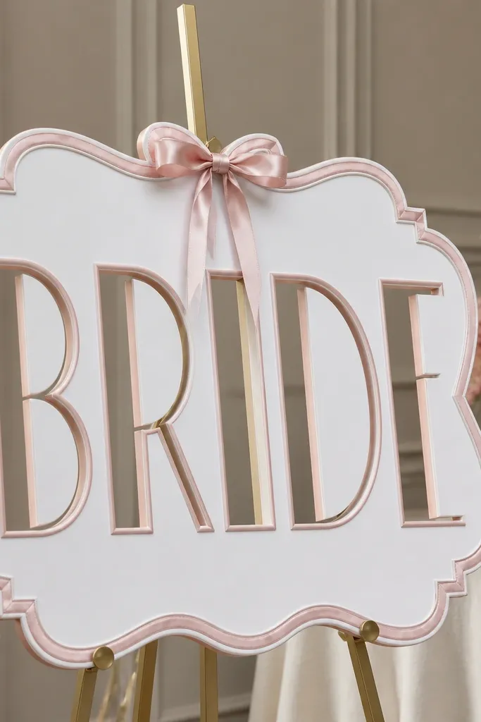
This is the kind of decor you can reuse later as a photo prop and it always looks intentional. Foam board letters stay crisp, and satin trim makes the edges look finished instead of paper-craft. I like blush satin on white foam board because it reads soft and clean in daylight. This works for all hair and skin tones because it pulls focus to the face without adding harsh contrast. The principle is a strong, readable focal message plus clean edges.
Buy foam board at least 1/2-inch thick so the letters don't bend, then cut your name in 3-4 inch tall letters. Paint the foam letters with matte white first, then layer blush satin ribbon along the letter edges using hot glue. Mount the sign on a small poster stand or two wood blocks wrapped in ribbon. Add a thin line of pearl garland or faux pearl string at the top edge so it frames the name.
Try thisUse a black or dark brown marker to outline the ribbon edges before gluing - it hides any glue gaps.
Common mistakeDon't mount thin cardboard letters without stiff backing - they look wavy in photos.
4. Table runner of tulle rosettes with a champagne-gold center strip
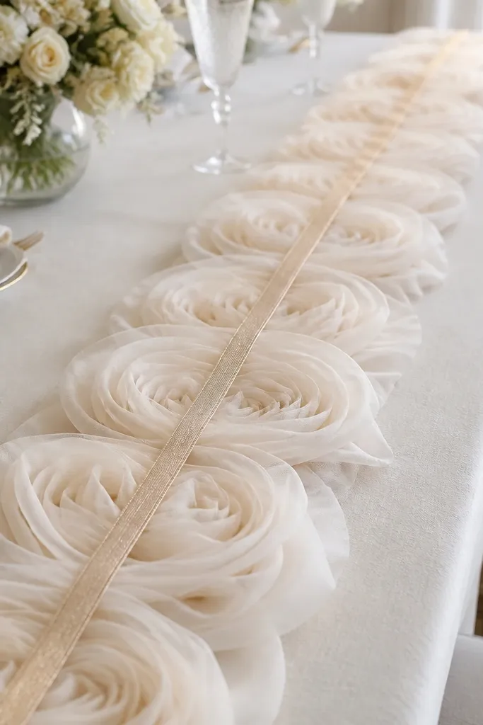
If you want the dessert table to look dressed up fast, this runner does it. I've used blush tulle rosettes because they look soft under warm lights and still show detail in overhead shots. The champagne-gold center strip adds a straight line for structure, so the table doesn't look random. This also flatters different skin tones in photos because it creates a warm, neutral base around the plates. The principle is texture repetition (rosettes) plus one clean geometric line (gold strip).
Cut tulle into 6-inch squares, then pinch each square at the center and tie with a thin thread to form a rosette. Arrange rosettes in a single row down the length of your table, with 3 inches between centers. Add a narrow 1-inch champagne-gold satin ribbon strip down the middle by taping it to the table underlay first. Finish by placing small faux pearl picks between a few rosettes every 10-12 inches.
Try thisSpray the tulle lightly with fabric stiffener so rosettes hold shape for the whole event.
Common mistakeAvoid using too many rosettes across the entire width - it crowds the plates and makes the table look smaller.
5. Acrylic photo frame with peel-and-stick vinyl "Here comes the Bride"
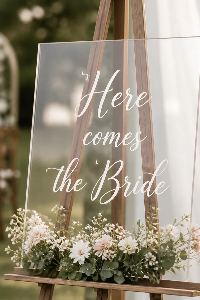
A frame is one of the cleanest decor pieces because it gives your photo spot a boundary. I use clear acrylic because it looks modern and doesn't fight with tableware colors. Peel-and-stick vinyl text keeps the lettering crisp and readable from across the room. This is especially good if you're serving a lot of people and you need a photo moment that doesn't require pinning paper to walls. The principle: define a photo area with transparency so everything else stays simple.
Put the vinyl text on the acrylic before you set it on the easel so you don't have to re-align later. Use 2-3 lines of text with the biggest line in the center, like "Here comes the Bride." Add a small faux floral arrangement at the bottom edge using 2-3 stems and a wrapped ribbon tie. Place the frame on a white cake board so it stands out from dark floors.
Try thisWipe acrylic with rubbing alcohol first so vinyl sticks without bubbles.
Common mistakeDon't use glitter pens for text on acrylic - it looks messy and sheds on fingers.
6. Mini floral "seat markers" using ribbon loops and a single blossom
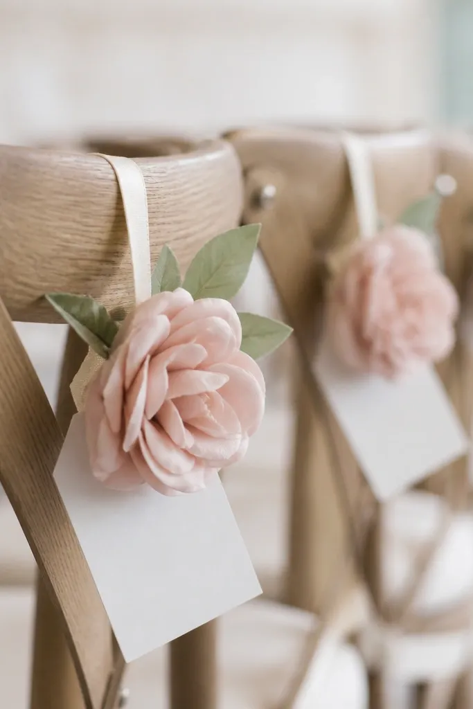
Seat markers are small, but they make the whole event feel organized when people take photos near their chairs. I use a single blossom per chair because it looks intentional and avoids a crowded, tangled look. Blush faux flowers match most wedding palettes, and white tags keep the text readable. This works best for chairs with straight backs and for venues where you can't hang big backdrops. The principle is one clear item per chair: ribbon loop, tag, and one flower.
Cut 12-inch ribbon pieces in blush or satin white, then fold each into a loop. Clip the loop to the chair back using a small metal binder clip covered with ribbon. Attach a white cardstock name tag using a hole and ribbon knot. Add one faux blossom at the bottom of the loop with a tiny zip tie hidden behind the ribbon fold.
Try thisMake 10 extra tags even if you think you won't need them - last-minute guests happen.
Common mistakeAvoid stacking multiple flowers per chair - it looks like leftover craft supplies.
7. Champagne-gold and blush balloon arch with a taped base strip
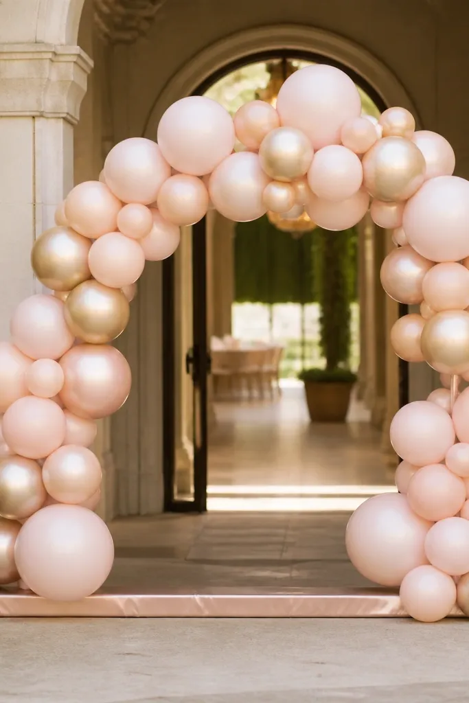
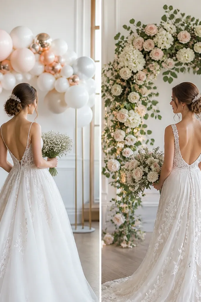
A small arch makes the entrance feel like an event, and it frames the bride-to-be in photos. I like a compact arch because it looks full without needing a huge frame. Champagne-gold and blush balloons give a warm, flattering tone that works in both daylight and indoor warm lighting. It also hides awkward door corners because the arch acts like a visual boundary. The principle is a stable base and a tight color mix so the arch reads clean.
Use a lightweight arch frame or create a base strip with two parallel balloon tape lines. Inflate balloons to consistent sizes: mostly 11-inch with a few 9-inch for spacing. Attach balloons in a pattern: blush, champagne, blush, then fill gaps with smaller gold accents. Wrap the base strip in satin ribbon so the bottom edge doesn't look like raw tape.
Try thisMist the balloons lightly with anti-static spray so they don't stick to each other and lose shape.
Common mistakeDon't overfill the arch - if balloons press too hard, they pop and the arch sags.
8. Paper rosette wall behind the dessert table with a "date" banner
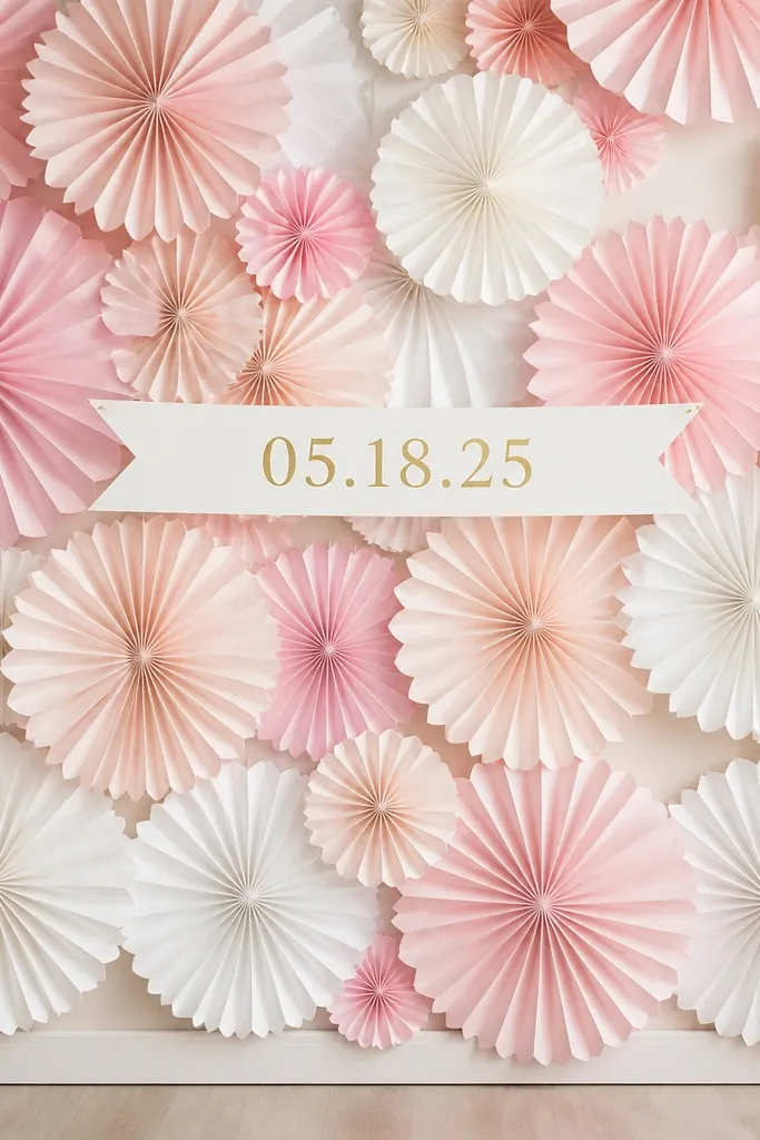
A rosette wall makes your dessert table look like a backdrop photo set. I use paper rosettes in three sizes so it looks dimensional, not flat. Blush and white rosettes keep the palette soft, while gold date lettering adds a "designed" feel. This works if you have a plain wall and a long table, because the rosettes fill the negative space behind food. The principle is depth through size variation plus one line of readable text.
Hang a thin white backdrop sheet or curtain first so the wall color doesn't bleed through. Place large rosettes every 18-20 inches, medium in between, and small rosettes in the gaps. Make your date banner with thick cardstock and gold vinyl, then mount it across the top third of the rosette wall. Leave a 12-inch empty space in the center so the bride-to-be can stand comfortably for photos.
Try thisUse foam dots behind rosettes so they cast a shadow - it makes them look more expensive.
Common mistakeDon't place rosettes too evenly - the wall starts looking like a grid instead of decor.
9. Tulle and ribbon hanging swags over the doorway or photo corner
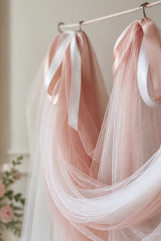
Hanging swags are the easiest way to turn an ugly corner into a photo spot. I layer two kinds of fabric: airy tulle plus satin ribbon so there's both softness and shine. Blush swags look good with white walls, and the ribbon loops create a clear top anchor where people's eyes land. This works for venues where you can't tape a full backdrop but you can hang from a hook or rod. The principle is vertical drape with layered textures so the corner reads finished.
Use a tension rod across the corner or a line of hooks, then tie 3-4 tulle strips per side. Cut tulle strips 6 feet long for a dramatic fall, or 4 feet for a smaller setup. Add satin ribbon loops every 12-16 inches using double knots so they don't slip. Finish by tying a small bow at the center point where the swags meet.
Try thisSteam or hang tulle overnight so it drops in smooth folds instead of wrinkled bands.
Common mistakeAvoid using only ribbon without tulle - the look turns rigid and flat.
10. Milk glass vase cluster with blush baby's breath and pearls
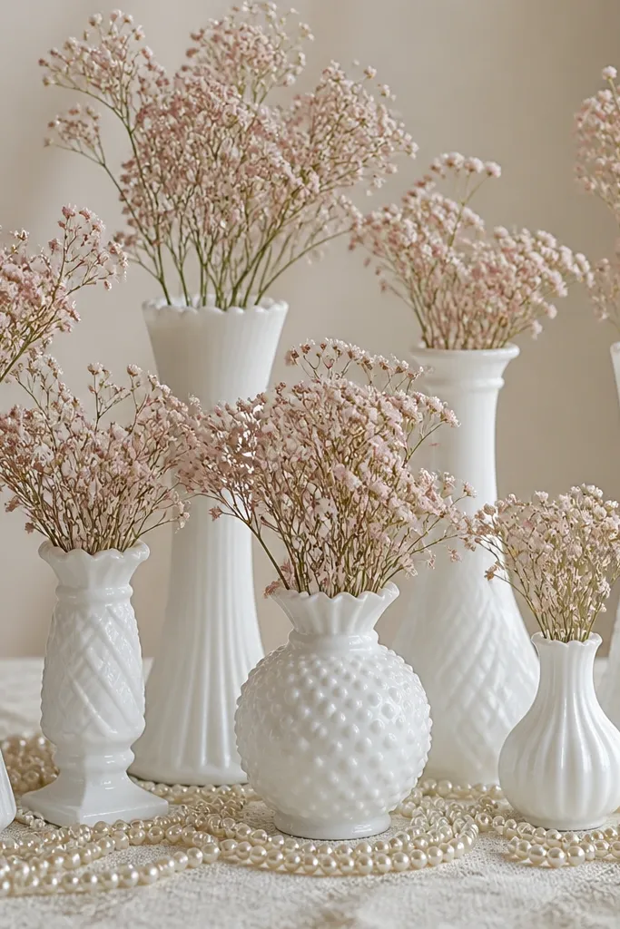
If your party theme is soft and classic, milk glass vases look right away like real event styling. I use blush baby's breath (faux or fresh) because it fills without big petals that overpower the scene. Pearl strands add a delicate detail that shows up in close-up photos. This works for both indoor and outdoor settings because the vases bring structure even when the rest is simple. The principle is using glass texture and small flowers to keep the palette gentle.
Pick 3-5 milk glass vases in different heights, roughly 6, 9, and 12 inches. Fill each with faux baby's breath and secure stems with floral foam or clear tape inside the vase. Wrap a thin pearl string around the base of two vases, leaving the center vase plain for a focal point. Add a satin ribbon ring around one vase neck, about 2 inches wide, in blush.
Try thisUse clear fishing line to anchor pearls so they don't roll around on the table.
Common mistakeDon't use large rose blooms in milk glass - it looks like a supermarket bouquet next to delicate decor.
11. Dessert table "confetti" balloons using clear balloons with paper inside
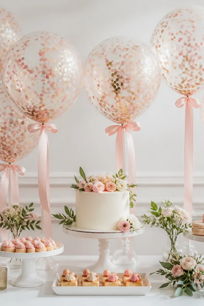
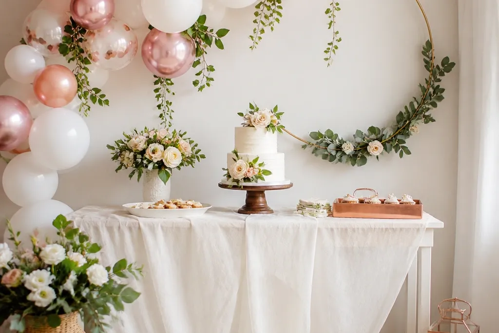
Clear balloons with confetti make even a simple dessert table look playful and celebratory. I keep the confetti to blush pink and gold so it matches the rest of the palette. The clear balloon shape also reflects the room light, which makes photos look brighter. This works well when your desserts are already colorful because the balloons don't add new big shapes. The principle is controlled confetti colors and placement around the centerpiece.
Inflate clear balloons and add confetti carefully using a funnel. Use 2-3 balloons at each side of the dessert table, then one larger balloon near the center if space allows. Tie the balloons with 1-inch satin ribbon and anchor them by placing them on weighted balloon bases or heavy trays. Add a small strip of gold ribbon around the tray edge so the base looks styled.
Try thisChoose confetti pieces under 1 cm so they don't clump when you move the balloon.
Common mistakeSkip huge paper streamers inside clear balloons - they look messy and block the view.
12. Gold foil "Bride to Be" mini banner on a chair back
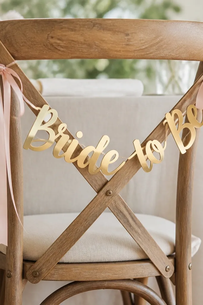
This is a quick personalization trick that looks polished in group photos. Gold foil catches light and makes the chair area feel like a designated spot without building a full backdrop. I like keeping the banner small and centered so it doesn't compete with the guest's outfits. It flatters everyone because gold sits well next to both warm and cool skin undertones. The principle is small message placement with clean alignment.
Cut a string of mini triangles or use pre-made banner pieces in gold foil. Position it on the chair back so the text sits at eye level - about 52-56 inches from the floor. Tie the ends with 1-inch blush ribbon and adjust until the banner sits straight. Add a small faux pearl cluster at the bottom center point to finish the look.
Try thisUse a level app on your phone to check the banner line - it matters in photos.
Common mistakeDon't hang it too low - it turns into a cluttered "paper mess" near knees.
13. Satin ribbon-wrapped cake stands with a pearl line border
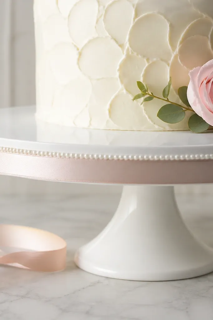
Wrapped stands make the desserts look styled even when you don't have time for a full table set. Satin ribbon adds shine at the exact place people look first, and a straight pearl line keeps it from looking too simple. I've used blush satin on white stands because it looks soft and not loud. This is flattering for nearly any theme because it doesn't introduce new colors, it adds finish. The principle is finishing the "boring" base so the table looks designed.
Wrap the base of a cake stand with blush satin ribbon and secure the back seam with hot glue. Add a thin line of faux pearls along the top edge of the ribbon using glue in small dots. Set a second smaller stand nearby and repeat with a cream ribbon so the table has variation. Place the stands on a tray or runner so the ribbon doesn't snag during service.
Try thisUse fabric glue for pearls if you want less mess than hot glue.
Common mistakeAvoid wrinkled ribbon - steam and press ribbon flat before wrapping.
14. Bridal-themed "welcome" sign on a standing easel with faux floral base
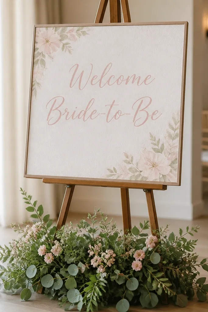
A welcome sign is the fastest way to make the entrance feel intentional, and it gives guests something to photograph right away. I like blush lettering on a white background because it reads clean and not too busy. Adding faux greenery at the base gives the sign weight, so it doesn't look like a loose printout. This works for both indoor and outdoor tables and it's easy to adjust for any venue. The principle is readable typography plus a small floral foundation.
Use a foam board or sturdy poster board for the sign, sized around 18x24 inches. Add text with gold vinyl or printed vinyl-style lettering, centered with generous margins. Place the sign on an easel and tie a small blush-and-white ribbon around the easel legs. Build a base with 3-4 stems of faux greenery and one blush flower cluster, securing with floral tape.
Try thisIf the venue is windy, add a small weight to the easel base so the sign doesn't wobble in photos.
Common mistakeDon't use bright neon colors for the text - it clashes with most wedding palettes.
15. Edible-looking "button" backdrop using cardstock circles and a pearl pushpin grid
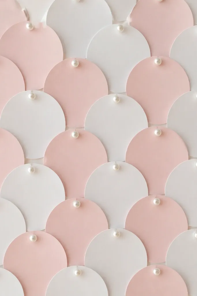
This looks clever in photos because it creates a soft, bubbly pattern behind the bride-to-be without using flowers. I call it the button-wall look because it resembles fabric buttons, and the pearl pushpins add shine. It flatters the face because the background is light and evenly spaced. It also works for people who don't want balloons (some venues restrict them). The principle is pattern repetition with consistent spacing so the backdrop reads clean.
Cut cardstock circles in three sizes: 3 inches, 4 inches, and 5 inches. Arrange them on a sheet backing (foam board or poster board) with even gaps, then pin them using pearl pushpins. Keep the color mix simple: 70% white, 25% blush, 5% champagne-gold. Add a small "Bride to Be" title at the top center using vinyl letters so it stays readable.
Try thisUse a ruler to mark the grid - crooked rows show up immediately in photos.
Common mistakeAvoid random spacing - it looks like a collage instead of a designed backdrop.
16. Tulle pom-poms hanging from the ceiling with a single ribbon string
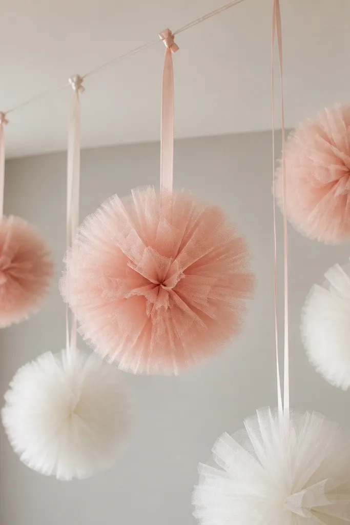
Ceiling-hanging pom-poms add a wow effect without taking up floor space. I like tulle pom-poms because they move gently and catch light, which makes photos look lively even if you only have a small room. Blush and white keep the look soft, and you don't need extra props. This works best when you already have a table setup and want the room to feel decorated in every direction. The principle is adding dimension above eye level so the event feels bigger.
Make pom-poms with tulle sheets cut into 18-20 inch squares, then fold and tie at the center with thread. Separate layers as you fluff so the pom looks round, not flat. Hang them from a single ribbon line using clear fishing line so the line disappears. Space pom-poms about 18 inches apart and keep the lowest point around 6-7 feet high for comfortable photos.
Try thisUse the same knot style on every pom so the line looks uniform.
Common mistakeDon't hang them too low - people's heads block the pom in group photos.
17. Mini "thank you" favor tags attached to a ribbon ring on the gift table
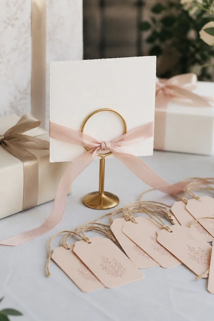
If you want decor that also helps with the event flow, favor tags are a smart move. I attach tags to a ribbon ring so they look like part of the display, not random pieces people pick up. Blush tags with white twine look clean against neutral gift bags and wrapping paper. This works for both baby shower-style layouts and more formal bride-to-be events. The principle is functional decor: it communicates and looks styled at the same time.
Tie a 1-inch satin ribbon into a ring around a small wooden circle or even a wreath form. Attach 10-20 tags by punching holes and using short lengths of white twine, varying tag lengths by 1-2 inches. Place the ribbon ring next to the gift area or on the side table where people naturally stand. Add one small faux flower clip to the ring so the display has a focal point.
Try thisPrint tags on thick cardstock so they don't curl when you handle them during the event.
Common mistakeAvoid thin string tags - they twist and look sloppy by mid-party.
18. Vintage-style frame with faux pearl garland and a "bride" monogram
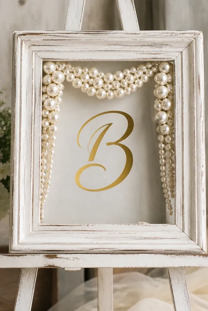
This one looks like you borrowed it from a wedding shop, even though it's simple. The distressed frame gives you texture, and pearls add a soft shine that reads well in close-ups. A gold monogram is easy to tailor and looks great whether the bride has a traditional or modern vibe. I've used this in rooms with busy wall colors because the frame creates a clean rectangle that pulls focus. The principle is framing: a border makes everything inside feel intentional.
Use a ready-made frame or thrift one and repaint it matte white if needed. Add gold vinyl monogram letters at the center, sized about 6-8 inches tall. Drape faux pearl garland in an arch shape behind the monogram and secure the ends with clear tape. Prop the frame on an easel and place a small bouquet at the bottom to balance the weight.
Try thisUse matte clear spray on the gold vinyl if lights are harsh - it reduces glare.
Common mistakeDon't use glossy gold paint on the frame - it clashes with pearl shine.
19. Matchbook-style place cards on a mini ribbon line at the dessert table
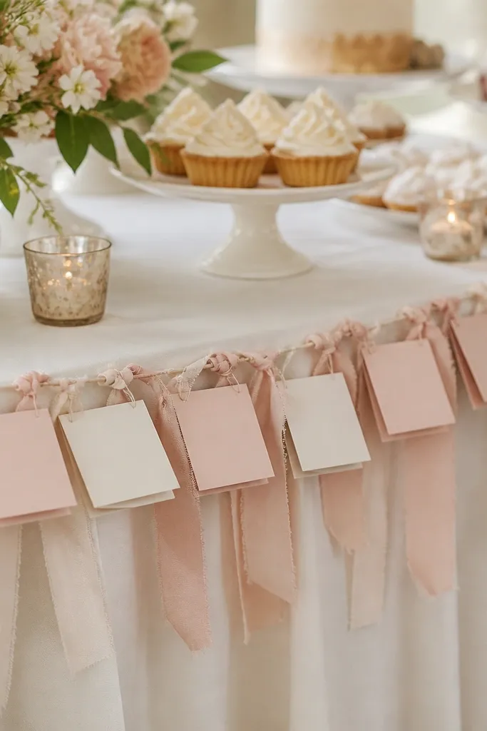
Place cards made like matchbooks look cute and keep the table from feeling bare. I like blush cardstock with white ribbon ties because it matches most bride themes without being loud. The mini ribbon line creates a visual boundary where people know to look for their spot or their treat. This is also a photo magnet because it adds small readable details. The principle is micro-organization: small labeled elements make the whole area feel planned.
Cut cardstock into matchbook shapes, about 3x4 inches folded, then write names or table numbers in gold or blush ink. Punch two holes and thread with 1/8-inch white ribbon so each card hangs from the ribbon line. Stretch a thin line of ribbon across two small stands or around the edge of the dessert table. Space cards 3-4 inches apart so they're readable and don't tangle.
Try thisUse a gel pen for names so the ink doesn't smear when hands touch the cards.
Common mistakeAvoid using too many fonts or colors on cards - it reads chaotic.
20. Hanging ribbon rods with "Bride" letters cut from glitter-free vinyl
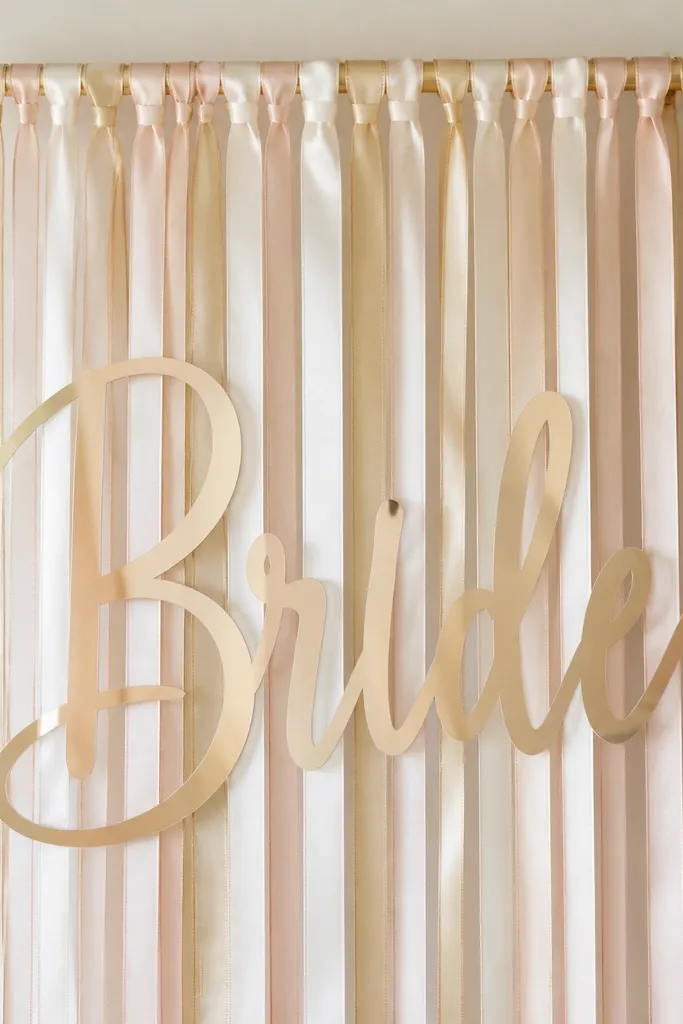
Ribbon rods create a backdrop effect without needing a wall covered in paper. I hang them in a cluster behind the photo spot and place the "Bride" letters across the center so the message is clear. Glitter-free vinyl looks more grown-up than craft glitter and stays readable under flash. This works for both indoor and outdoor photos because the ribbons move and add life. The principle is controlled movement: hanging ribbons plus one clear letter set.
Tie 10-14 ribbon strips (satin or organza) to a rod or sturdy dowel using knots, keeping lengths around 5 feet for a full fall. Mix blush satin with white organza so you get both shine and softness. Cut "Bride" letters from vinyl in a clean serif or simple script and attach them to the ribbon bundle using small clear tape pieces. Place the rod on a stand and angle it slightly so the letters face the camera.
Try thisUse organza ribbon for at least 30% of the strips so the background looks airy, not heavy.
Common mistakeDon't use thick ribbon for every strip - heavy bundles sag and look uneven.
21. Blush and cream rose bud garland for the dessert table edge
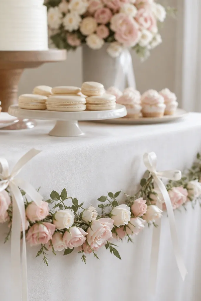
This edge garland makes the dessert table look like it has a "frame," which is what most people forget. I use small rose buds because they don't block serving items and they sit neatly along the table line. Blush plus cream keeps it soft, and the white ribbon ties make the garland look secured rather than loose. This flatters the bride-to-be photos because the flowers sit around the products instead of behind faces. The principle is framing the table edge so the whole setup looks finished.
Use faux rose bud garland with stems long enough to drape about 6-8 inches down the table front. Drape it along the table edge starting at the center so the roses balance left and right. Tie the garland to the table using thin white ribbon loops at 12-18 inch intervals. Add one small cluster of faux greenery at each end so the garland doesn't look like it starts and stops abruptly.
Try thisSecure the garland with zip ties hidden under a table skirt if your venue allows it.
Common mistakeAvoid big bulky rose heads - they create uneven lumps that look messy from across the room.
22. Clear acrylic "cocktail" welcome sign with blush menu cards
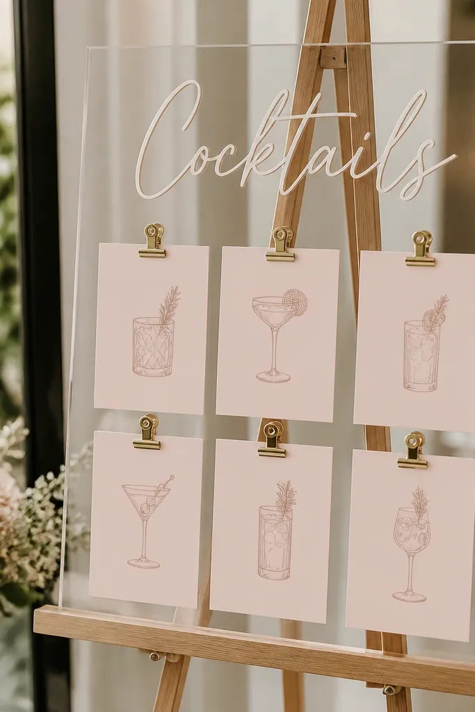
If your event includes drinks, a cocktail sign makes the bar area look styled and helps people decide quickly. Clear acrylic keeps it modern, and blush menu cards keep the theme soft. I've used this at showers where the bar was on a side table and needed structure. It reads clean in photos because the text is flat and the cards are aligned. The principle is functional signage tied to the color palette.
Get a clear acrylic sign board or sign holder and print text on white cardstock in a clean font. Place "Cocktails" at the top and leave space for a short list. Cut menu cards from blush cardstock and clip them with small acrylic binder clips so they don't slide. Add a small faux flower clip to the bottom corner of one menu card for a finishing touch.
Try thisUse a neutral ink color like charcoal so the text stays readable on camera.
Common mistakeDon't pick bright primary colors for the menu cards - it fights the bride palette.
23. Floating candles in glass jars with rose-gold ribbon bands
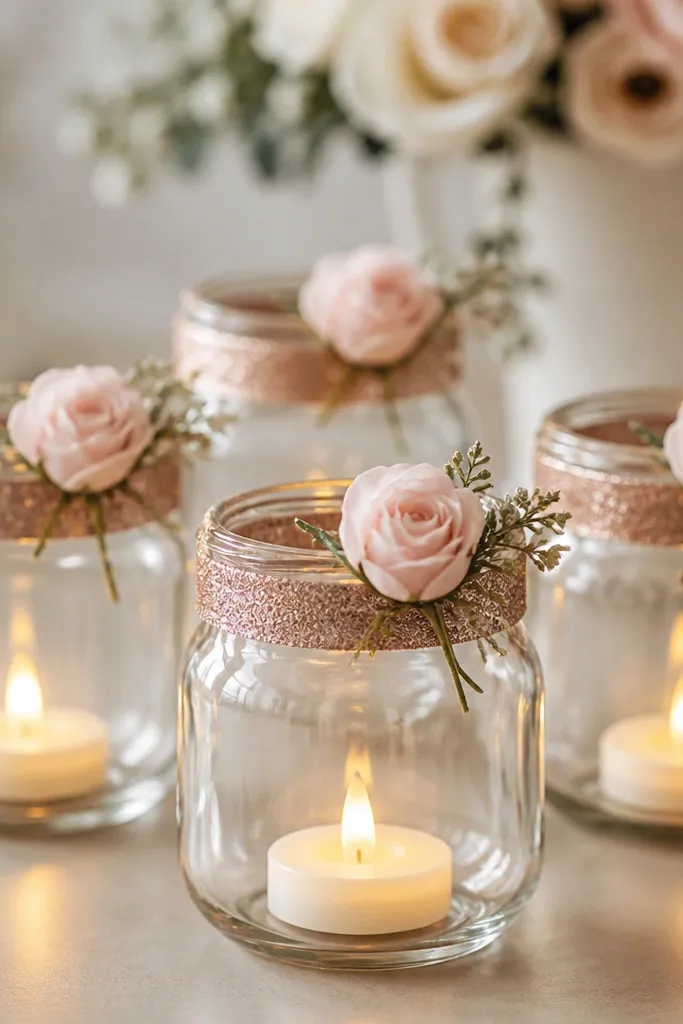
Candles make any event feel warm, and glass jars keep the look cohesive. I use LED tea lights if the venue is crowded or there's wind, and the glow still looks real in photos. Rose-gold ribbon bands add a soft metallic touch that matches champagne-gold balloons. This works for evening showers and for indoor spaces with warm lighting because it adds atmosphere without clutter. The principle is lighting plus consistent ribbon finish across multiple jars.
Choose 6-10 glass jars in similar shapes, then wrap a rose-gold ribbon band around each jar's midsection. Tie the ribbon in a neat bow but keep it small so it doesn't cover the light. Place a tiny faux blush flower at the ribbon knot using hot glue or a pin. Group the jars on a tray or directly on the table, spacing about 8-10 inches apart.
Try thisSet jars on a reflective tray if you want extra shimmer in photos.
Common mistakeAvoid using open flames in windy outdoor spots - it ruins the look fast.
24. Bride-to-be balloon spelling strip using one long word and mini clusters
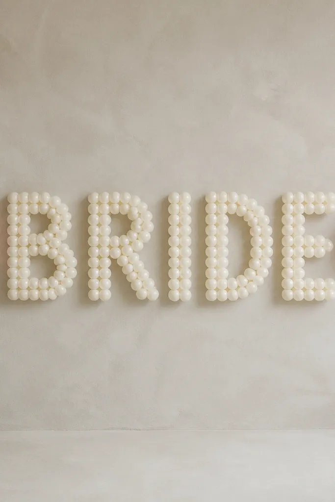
Spelling setups feel playful and intentional when you keep the layout simple. I build one long word using balloon letters or printed balloon-style letter stickers on balloons, then add mini clusters at the ends so it looks balanced. Blush and white make the letters feel soft instead of harsh, and a small gold accent keeps it festive. This works for both kids-friendly showers and more grown-up bridal events when you keep the palette restrained. The principle is one readable message plus symmetry.
Lay out the word on the ground first so you get spacing right, then attach balloons to a thin line or balloon tape strip. Use mostly blush balloons for the letters and add 2-3 tiny gold balloons between clusters. Anchor the strip with weights or attach to a stand so it doesn't sag. Place the mini clusters at both ends with 2-3 balloons each and wrap the base with satin ribbon.
Try thisTake a quick test photo from the guest perspective before you fully inflate - it shows spacing issues immediately.
Common mistakeAvoid mixing too many balloon sizes in the same letter - the word looks wobbly.
25. Paper lanterns in blush and white with a gold "date" label
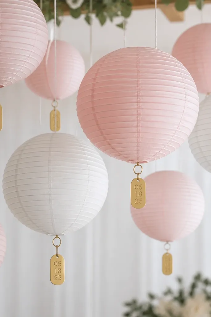
Paper lanterns add height and softness, and they photograph beautifully under warm lights. I hang blush and white lanterns with a gold date label so the decor tells you what day it is. This is great for venues with high ceilings because the lanterns fill vertical space without balloons. It also works if the bride wants a more classic look than glitter and sequins. The principle is using labels to add information while keeping the shapes consistent.
Hang 3-5 lanterns at different heights: one at 6 feet, one at 7 feet, and one higher if there's clearance. Use blush lanterns as the majority and add white ones for contrast. Print the date in gold on cardstock, then cut into small rectangles and tape them to the lantern frames with clear tape. Keep the labels centered so they don't look crooked in photos.
Try thisUse LED lantern bulbs if you plan to light them - the glow stays even and safe.
Common mistakeAvoid hanging lanterns too close together - they overlap and look like one big blob.