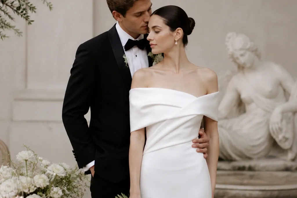
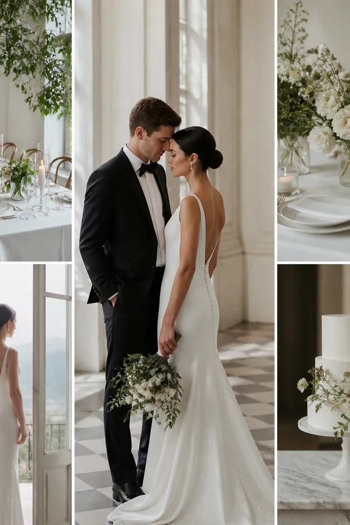
1. Swap "any white" for ivory silk or satin with real drape
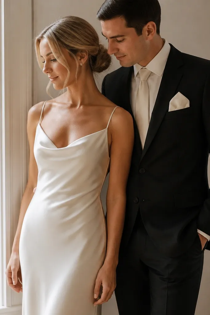
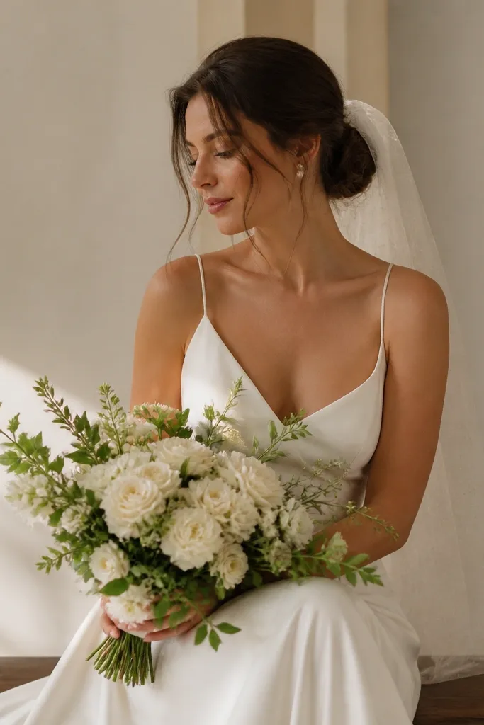
For luxe small wedding ideas, the fastest upgrade is fabric with weight. I've watched "bright white" satin look chalky in photos, while ivory silk or heavier satin catches light like a gentle glow. If you have warm skin tones, ivory reads creamy and flattering; if you're cooler, ivory still works because it's not blue-based white. The drape matters too - a slip dress that falls in long lines makes your body look longer and more intentional, even with minimal accessories.
Start with a swatch test under both daylight and indoor lighting. If you're buying, choose ivory silk charmeuse, silk crepe, or a medium-weight satin that doesn't ripple like cheap polyester. Then style it with a clean understructure - a strapless bra that matches the skin tone and a slip or shapewear that doesn't create lumps. For men, match the ivory via a satin tie and pocket square, not a white cotton pocket square that will look too matte next to the sheen.
Try thisBring your venue lighting info - even a quick phone photo of the room - and check how ivory reads there before you finalize.
Common mistakeAvoid bright optical-white fabrics that look harsh in flash and make skin look washed out.
2. Do a two-color palette and repeat it in 6 places
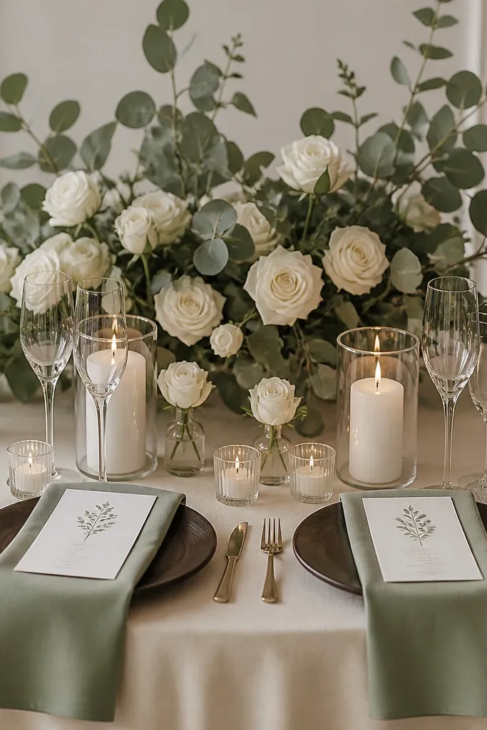
Luxe doesn't come from adding more colors. It comes from repeating the same two hues until your brain reads "designed." I pick one base (cream/ivory) and one accent (sage, dusty blue, or espresso-brown) and I repeat them in six places: attire detail, paper goods, florals, table linens, signage, and one lighting element. Sage is my favorite accent for small weddings because it looks soft in daylight and not too trendy in photos.
First, choose your accent shade from real materials, not a Pinterest screenshot. Then map six touchpoints: (1) napkin color, (2) invitation ink or wax seal, (3) floral greens, (4) chair tie ribbon, (5) candle label sticker, and (6) one bar item garnish like lime wedges or herb sprigs. Keep everything else neutral: cream, taupe, and warm wood. Finally, check the palette next to skin tones - if the accent makes your hands look grey, switch it.
Try thisIf you want more contrast without adding a new color, use texture: matte napkin + glossy candle glass.
Common mistakeAvoid five different "almost-matching" pinks or greens; they look like you shopped in a hurry.
3. Replace the aisle runner with a wider 24-30 inch fabric ribbon path
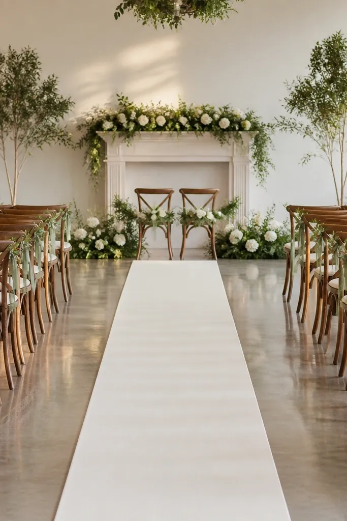
In a small wedding, the aisle is the main "set." A narrow runner looks like an accessory; a wider fabric path looks like a plan. I've used 28-inch wide ivory runner fabric and watched the whole scene look more editorial because the eye has enough space to rest. This works for every body type and venue style because it frames the couple's line of sight and keeps the photo geometry clean.
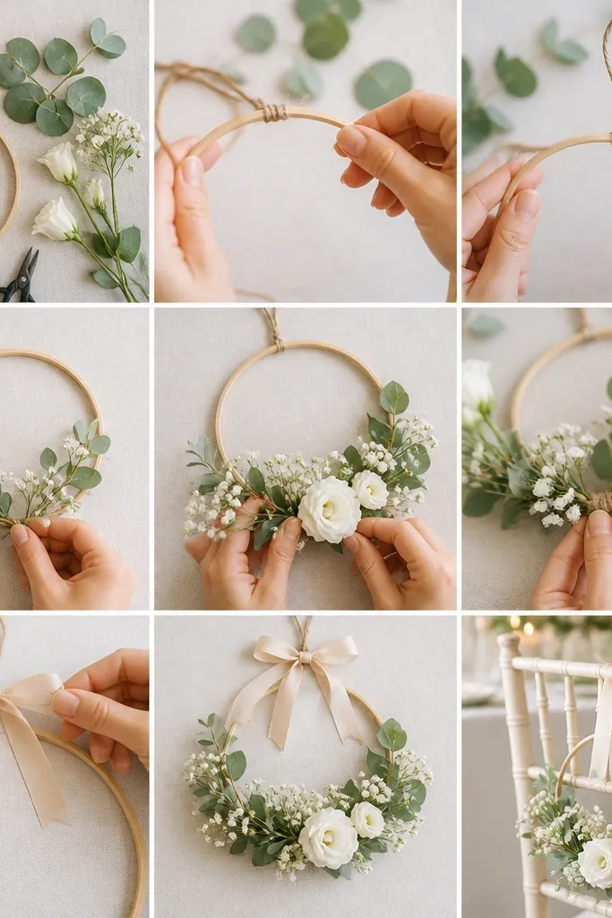
Start by measuring from the centerline of the front seating to the back door - then add 8-10 inches beyond each end so it doesn't look chopped off. Choose a fabric that lays flat, like cotton-linen blend or medium-weight polyester satin that doesn't cling. Lay it on the floor with double-sided carpet tape at the edges only, then steam it right before guests arrive. Tie chair backs with 1.5-inch ribbon in your accent color so the aisle reads consistent from every angle.
Try thisTake one test photo from the back of the room before the ceremony starts. If the runner edges distract, widen or center it again.
Common mistakeAvoid a thin, wrinkled runner or one with visible tape in the photo line.
4. Use bud-vase density instead of big statement arrangements
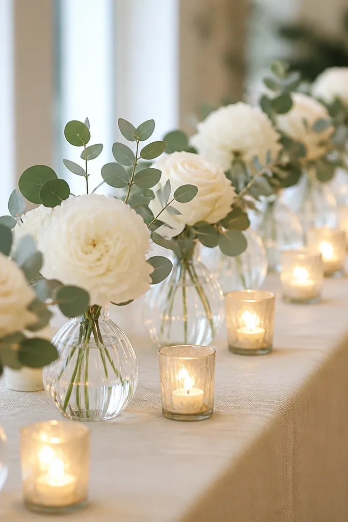
Big florals look expensive only when they're placed perfectly. For small weddings, I prefer bud-vase density because it reads intentional even if your venue isn't huge. The repetition gives you that luxe "catalog" feel, and the single-stem look keeps the color palette controlled. This also flatters the couple because your faces stay visible - you don't get tall floral blocks between guests and the camera.
Pick 12-20 stems for a ceremony or cocktail display, then break them into single-stem placements. Use clear bud vases or frosted glass so the stems look light and airy. Space vases 10-12 inches apart on a table edge so the row reads continuous but not crowded. Anchor the stems with one type of greenery only (sage eucalyptus or seeded eucalyptus) so it doesn't turn into a mix.
Try thisIf you're reusing vases from table to aisle, wash them the night before and polish the glass with a dry microfiber so they catch candlelight cleanly.
Common mistakeAvoid mixing five different flower types with different petal textures; it turns into a craft pile fast.
5. Hire one lighting tech moment: 2700K candles + uplights behind the couple
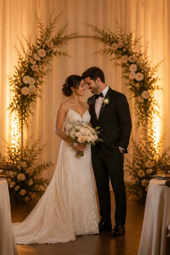
Photos look luxe when your lighting is warm and consistent. I've done this with 2700K candles and low uplights behind the couple, and the difference is immediate: skin looks smoother, and whites don't go icy. If you're in a small venue with beige walls, uplighting makes the space feel more dimensional without adding decor. It also helps anyone with cool undertones because it warms the whole scene.
Start with 2700K bulbs for any uplights and choose candle-style LED if real candles aren't safe. Place uplights 4-6 feet behind the couple's seating line, angled upward to avoid shadows on faces. Then build table light with real or LED taper candles in glass holders so reflections look intentional. Keep the rest of the room dim - turn off overhead fixtures if you can, or cover them with diffusion shades.
Try thisBring a small white paper card and hold it under your lights. If it looks yellow-gold and not grey-blue, you're in the right temperature range.
Common mistakeAvoid mixing cool blue lighting with warm candles; it makes skin and dress tones fight each other on camera.
6. Choose a linen tablecloth that puddles 1-2 inches, not a tight fitted look
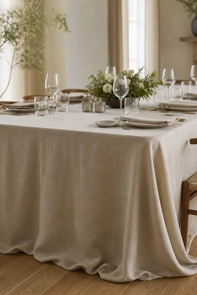
A crisp, tight tablecloth can look like a rental. A linen cloth with a small intentional puddle looks tailored and expensive because it creates weight and movement. I aim for 1-2 inches of overhang beyond the table edge, especially in small receptions where the table is the main visual anchor. This works for all body types because it keeps the focus on people, not on a "stretched" fabric look.
Start by measuring your table height and choose a linen size that gives you that 1-2 inch drape. Use heavier linen (not thin sheers) so it falls in folds instead of clinging. Steam it right before placing centerpieces. For napkins, match the linen tone but switch to a slightly lighter weight if you want a softer fold; then place cutlery and glassware after steaming so you don't re-wrinkle the cloth.
Try thisIf you can't get the puddle, use a linen overlay runner instead of a fitted cloth. The overlay hides mistakes and adds depth.
Common mistakeAvoid polyester tablecloths that shine - they read cheap under warm candles.
7. Tie chairs with silk ribbon and a simple double-knot spacing
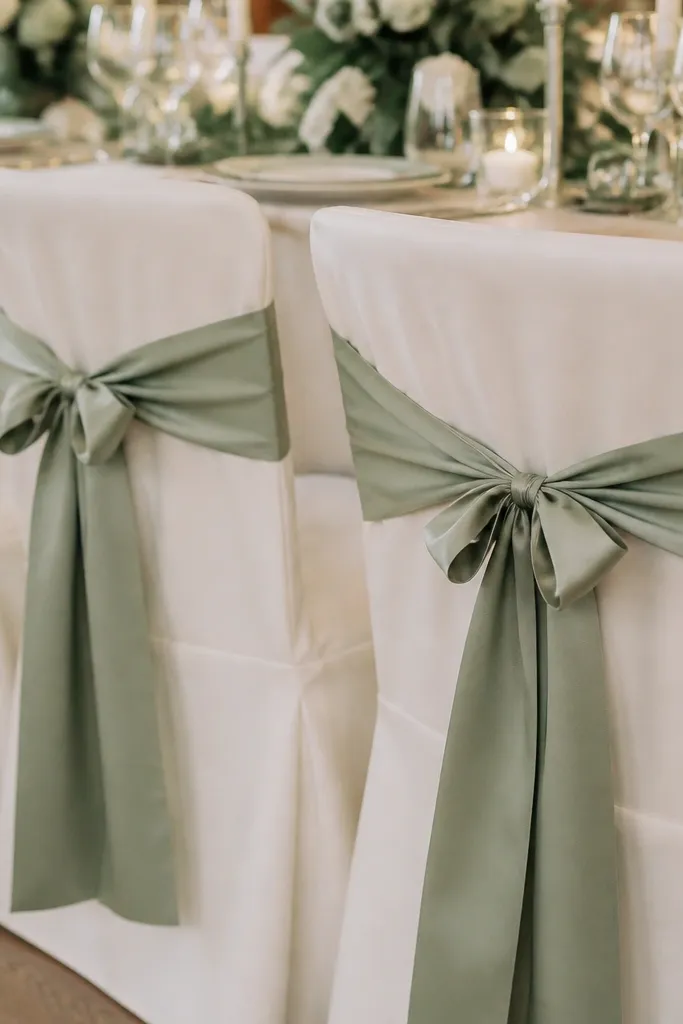
Chair details are what guests notice when they walk in close. Silk ribbon gives you a soft sheen and crisp edge, and the knot is what makes it feel tailored. I tie each chair with consistent spacing so the photo looks structured, not random. This flatters everyone because it frames the seating without blocking bodies or creating visual clutter in a small room.
Choose 1.5-inch silk ribbon for chair backs so it looks proportionate on both wood and upholstered chairs. Cut tails to 14-16 inches so they hang cleanly without dragging. Tie a double-knot and pull it tight enough that the ribbon doesn't sag. Then align the ribbon so the knot sits centered on the chair back, not slightly off to one side.
Try thisPin one ribbon knot template on a wall at home and match it for every chair so your spacing stays consistent.
Common mistakeAvoid curling ribbon tails or uneven lengths; it looks like last-minute decoration.
8. Use a single statement bar set in one tray size
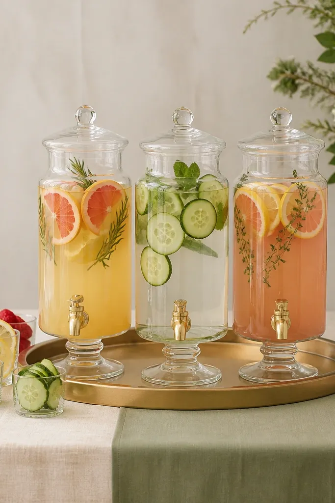
Small weddings look luxe when the bar area reads like a design moment, not a storage corner. I keep everything on one tray size so the photos don't show random shapes fighting each other. A gold-rim tray plus matching pitchers makes the bar look styled even when you're serving simple drinks. It works especially well for smaller guest lists because fewer stations means one clean focal point.
Pick one tray - I like 20x30 inch for most small bars - and build everything around it. Use glass pitchers and uniform garnish cups, then add one repeat element like herb sprigs in a single cup. Label drinks with small menu cards in the same ink color as invitations. Keep the rest of the bar table minimal: one stack of napkins, one ice bucket, one trash bin hidden under a cloth cover.
Try thisChill your garnishes and pitchers before guests arrive. Cold glass looks sharper and reduces condensation mess on camera.
Common mistakeAvoid mixing tray metals (silver + gold + brass) in the same frame.
9. Upgrade the invitation look with thick cotton paper and wax seal only on one layer
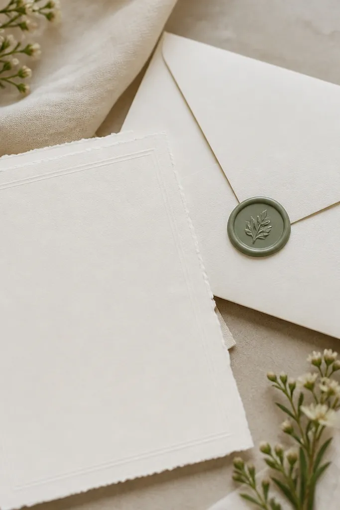
Paper quality is one of the fastest luxe small wedding ideas you can feel in your hands. Thick cotton paper holds the color better and looks expensive under natural light. A wax seal on only one layer keeps it classy and avoids the "craft project" vibe. If your accent color is sage, choose a wax tint that matches the undertone instead of going bright neon.
Choose a cotton paper weight around 120-160 lb equivalent so it doesn't flop. Print in matte black ink or deep espresso instead of metallics. Apply wax to the outer envelope flap only, then keep the inner card simple. Assemble with a straight edge - use a bone folder to crease folds so it looks crisp in close-up photos.
Try thisDo one test assembly with your exact paper and wax before ordering the full set. Wax can stain thin paper if it's too absorbent.
Common mistakeAvoid shiny metallic paper; it reflects glare and looks messy in close photos.
10. Build a low-centerpiece dinner table with candle clusters in clear glass
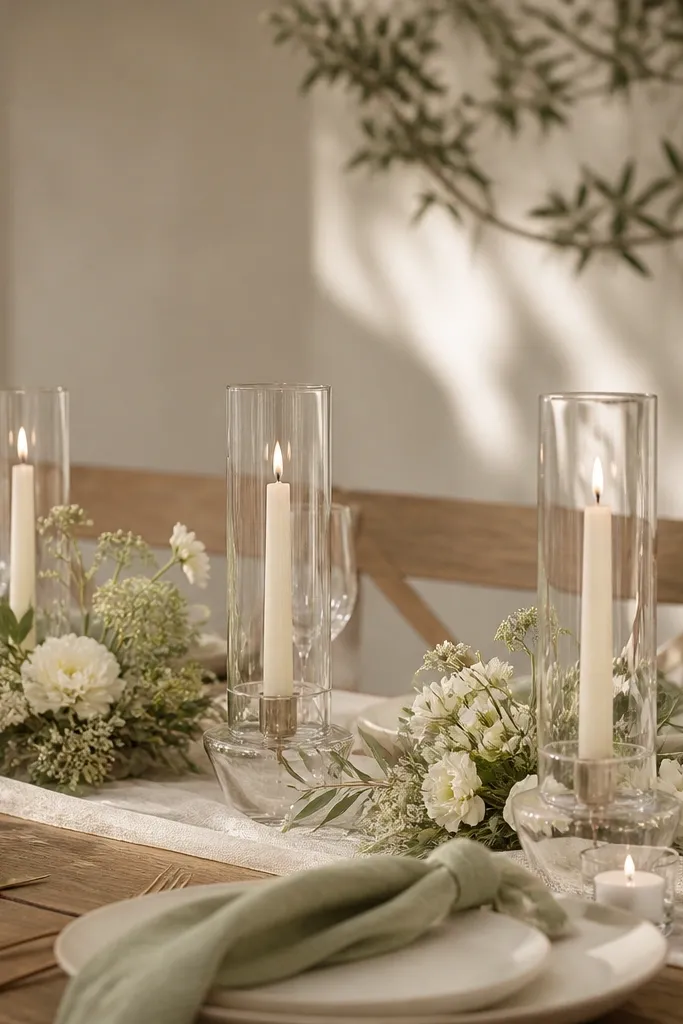
Low centerpieces make a small wedding feel higher-end because guests actually see each other. Clear glass candle holders add sparkle without adding extra colors, and the cluster effect looks styled. I keep florals low - under 8 inches at the center - so faces stay visible. This also flatters rounder table setups because sightlines stay open and photos don't look cramped.
Pick a centerpiece height target of 7-8 inches maximum at the center. Use 3-5 candle holders in clear glass with matching taper candles, then add one small strip of greenery along the table runner only. Keep flowers minimal: one type of bloom in cream, spaced so it doesn't look like a bouquet dumped in the middle. Place candles first, then florals, then napkins last so you don't knock petals when adjusting.
Try thisUse different candle heights by 1-2 inches within the cluster. It looks intentional and reads more expensive than perfectly equal stacks.
Common mistakeAvoid tall centerpieces that force guests to crane their necks and block the camera.
11. Make the groom's look match the bride with one shared material detail
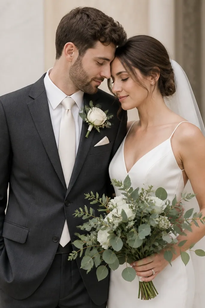
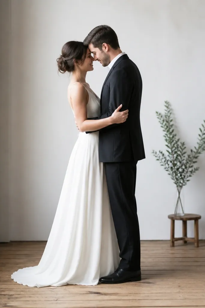
A luxe small wedding idea is making the couple look like a set without matching every piece. I pick one shared material detail - usually ivory satin or cream silk - and repeat it in the groom's tie and pocket square, and in the bride's dress or accessories. Charcoal suits love this because the contrast is clean in photos. It also flatters most skin tones since ivory reads softer than stark white next to a darker jacket.
Start with the groom's suit base: charcoal, deep navy, or warm brown. Then choose one ivory satin element - tie and pocket square - and keep the rest matte. Add a boutonniere with the same greenery used in bridal florals, like sage eucalyptus, plus one cream bloom. For shoes, pick dark brown leather or black oxford, and keep socks close to suit color to avoid distracting contrast.
Try thisPress the tie with a steamer before the ceremony. A slightly wrinkled satin tie makes the whole set look less polished.
Common mistakeAvoid a white cotton pocket square next to satin tie - the texture mismatch reads cheap.
12. Plan wedding party outfits by fabric weight, not just color
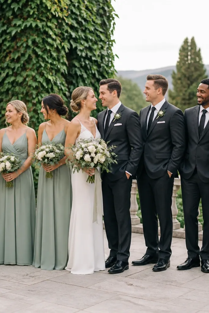
Matching by color alone is where small weddings look messy. Different fabrics reflect light differently, so "the same sage" can look like three different shades on camera. I plan wedding party looks by fabric weight and sheen so they land in the same visual family. Light chiffon or crepe for women and matte suiting for men keeps the palette consistent. It also flatters different body types because drape hides lumps and matte suits define shoulders without glare.
Pick one women's fabric category: chiffon, satin-back crepe, or silk blend with a similar sheen level. Then choose men's suit fabric: matte wool or wool blend, not shiny polyester. Make sure everyone has the same accent element - sage boutonniere for men and sage ribbon or earrings for women. Coordinate lengths too: if one person's hem hits mid-calf and another hits ankle, the photos look uneven, so set a single target length.
Try thisAsk your photographer where they shoot most often (front light or side light). If it's side light, avoid high-shine fabrics that flare.
Common mistakeAvoid mixing heavy satin with airy chiffon in the same color group; the sheen difference reads like different colors.
13. Use a veil or hair piece that matches the room's light direction
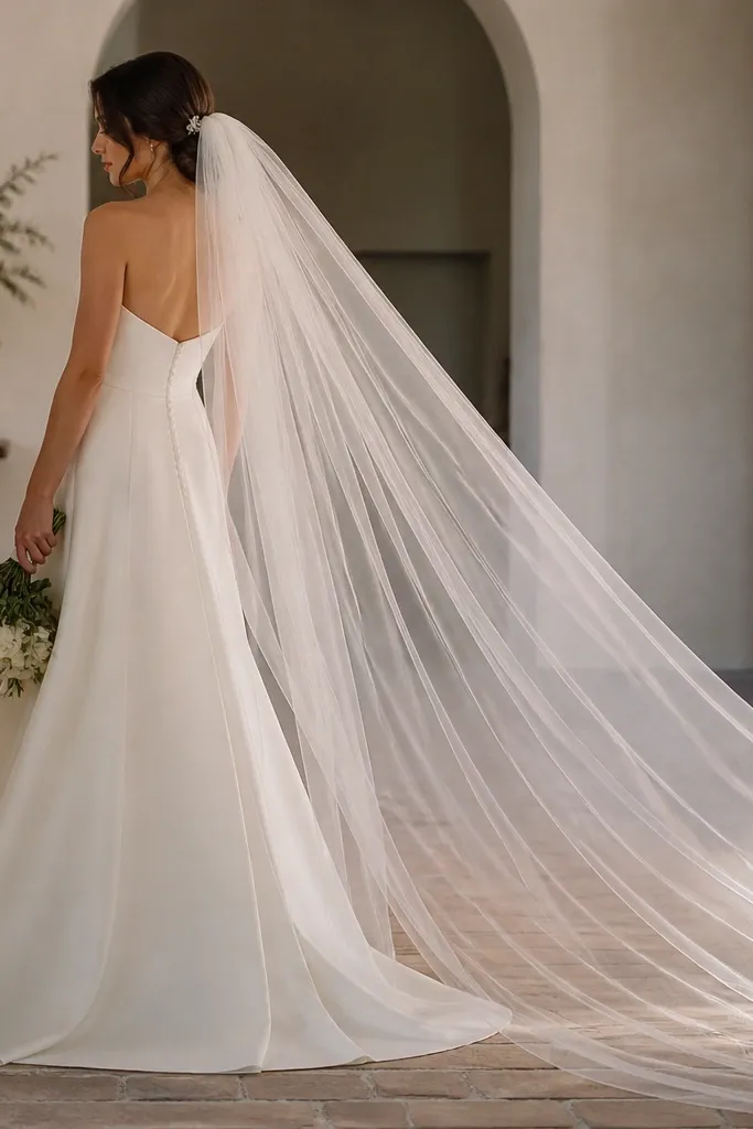
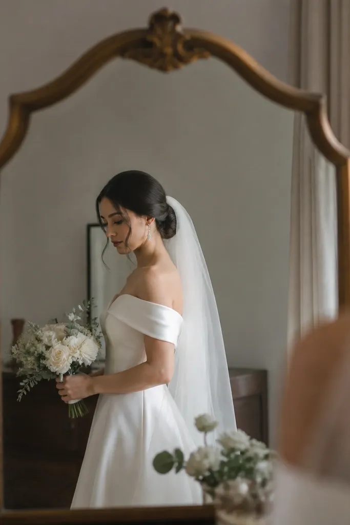
In a small wedding, your hair detail is in every close-up. The luxe look comes from how your veil or hair piece catches light - not from how elaborate it is. If your venue has window light from one side, a veil pinned slightly off-center creates a gentle arc instead of flat hanging. Pearl hair combs look expensive when they're small and spaced evenly, not when they're oversized and crowded. This works well on most hair textures because the comb anchors the look without needing heavy styling.
Choose a veil length that matches your dress. For a tea-length or slip dress, go for a shoulder-to-elbow or fingertip veil so it doesn't overwhelm. Pin your veil low and test the angle in a mirror with your hair in ceremony style. For a hair comb, place it 1-2 inches above the nape so it frames the back of your neck in photos. Finish with a light mist of anti-frizz spray and secure with bobby pins that match your hair color.
Try thisDo a 30-second "walk test" in your venue. If the veil sways into your face in motion, repin it before guests arrive.
Common mistakeAvoid a veil that's too sheer and stringy; it looks cheap when it flutters.
14. Set the ceremony soundtrack by room math, not vibes
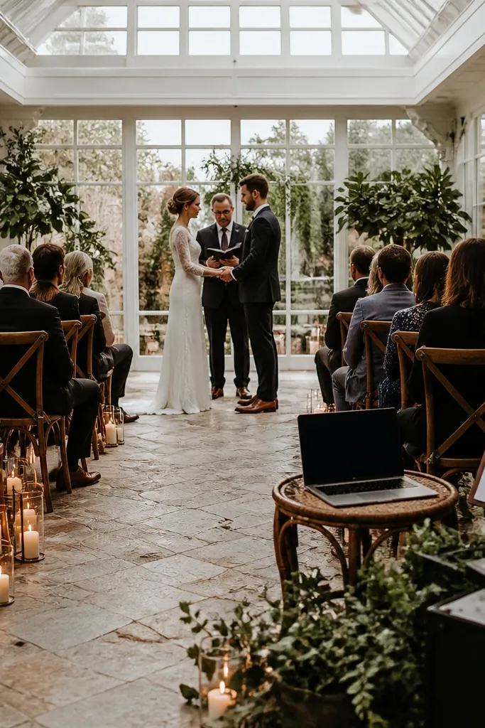
I always plan the ceremony music around how sound actually behaves in the space, because small weddings can sound messy fast. If you have a hard floor, bare walls, or a tent ceiling, voices and strings bounce and smear - the couple's "soft moments" turn into mush. My fix is simple: pick one audio source, set volume for the first 20 seconds, then build the playlist around that level. This works because the guests hear lyrics clearly without you cranking speakers, and you still get luxe, intimate pacing instead of loud background noise.
Start by measuring the room distance from where the sound station sits to the farthest seated guest. If it's more than about 35 feet, plan for two speakers instead of one so you don't get a harsh "hot spot" near the aisle. Do a test track that has both vocals and a steady beat, then set volume so the vocals sit comfortably at the first row without distortion. Write down three cues on paper - entrance, vows, and exit - and keep one person responsible for pressing play so nothing drifts. Choose one transition style that matches the moment: a 2-count fade for entrances, a clean cut for vows, and a longer fade for exits.
Try thisBring a cheap decibel meter app and keep peaks under 85 dB during vows, especially if you have older guests.
Common mistakeAvoid guessing volume from the sound station - set it while standing where the farthest guest sits.
15. Make a real 'luxe small wedding ideas' menu card guests will actually read
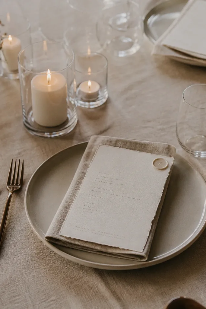
For small weddings, the food feels personal, so the menu card should feel personal too. I've seen guests ignore tiny print on glossy cardstock, and I've seen them actually read menus when the paper is thick and the layout is calm. This is one of the easiest luxe small wedding ideas that costs less than extra florals because it changes how the whole table looks in one second. It also helps you control expectations - people know what's coming and ask fewer questions mid-meal.
Pick thick cotton paper or cotton blend (about 220-300 gsm) so it doesn't look flimsy under candlelight. Use cream or ivory ink, not pure black, and keep font sizes big enough to read from 3-4 feet - I aim for roughly 14-16 pt for the item names and 10-12 pt for details. List only what's served at that table: starter, entrée, and one dessert line, plus one short allergen note like "contains nuts" or "contains dairy." Put the menu card in a simple place card holder or fold it into a small tent that stands without wobbling. If you're doing wax seals, seal only one layer - I seal the top card, not the whole stack - so it stays flat on the table.
Try thisPrint a second menu master with larger item names and swap it in for any table with guests who sit farther back or have older eyes.
Common mistakeAvoid cramming every course and wedding detail onto the menu - guests read the first two lines and stop.