1. The 6-Seat Candleline Dinner (Before vs After)
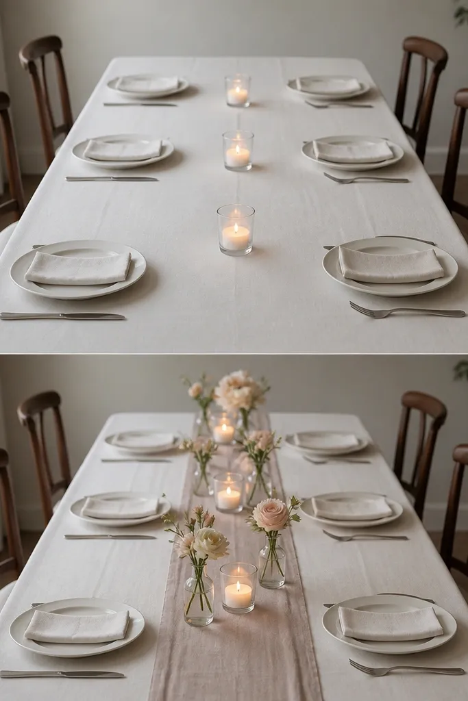
A small dinner setup looks best when the table story is tight and readable. For this one, I use a plain white linen tablecloth because it makes every candle glow look intentional, not random. The candle cluster works because it sits low - the light stays near chin level and doesn't block faces across the table. I like blush and cream flowers because they flatter most skin tones without turning the room pink. If you have deeper skin tones, the warm candlelight makes the undertones look rich instead of muddy. The styling principle here is low height + even spacing so the camera sees warmth, not clutter.
Start with a white or ivory linen cloth and measure the table width. Then center a low candle line: three glass holders with tea lights spaced about 18 inches apart, leaving roughly equal gaps to the place settings. Add two to four bud vases with short stems (keep them under 8 inches tall) and stagger them so one sits slightly closer to the front edge. Finish with a thin runner or a narrow strip of fabric down the center, about 10-12 inches wide, so the table looks dressed but not over-covered. For chairs, choose simple backs or keep seat cushions minimal so people don't disappear in the frame.
Try thisUse warm LED tea lights if the venue has restrictions - they flicker enough to look real in photos.
Common mistakeAvoid tall candles or anything higher than 10 inches - they cut faces in half in every picture.
2. Lavender-Gray Backdrop vs Plain Wall
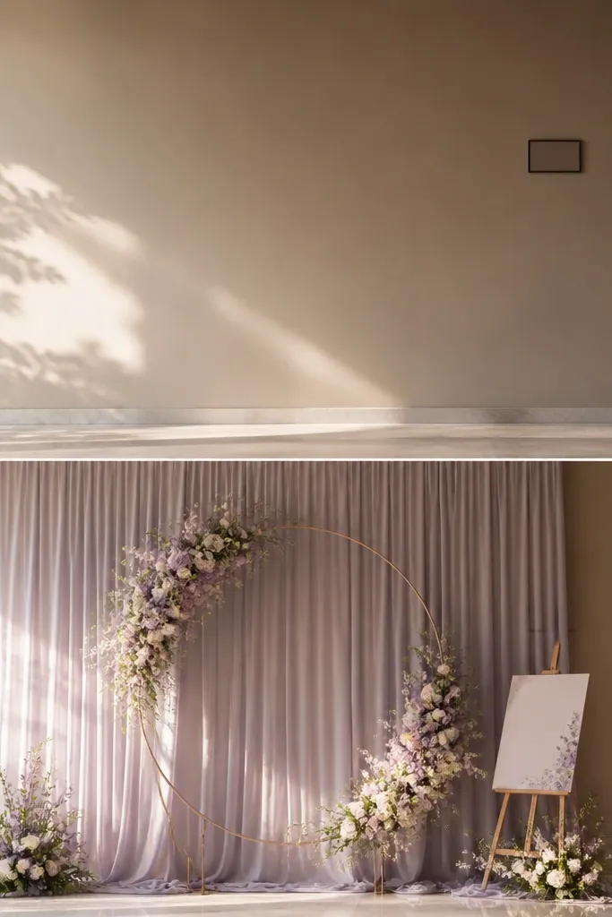
In a small venue, a plain wall can swallow you. A single draped backdrop fixes that by giving the camera a smooth, flattering background that doesn't compete with your outfits. I like lavender-gray fabric because it sits between cool and warm - it flatters both silver and gold jewelry. Then I add one circular focal element: a floral hoop or ring with white blooms and a few purple sprigs. The ring shape frames faces and keeps things elegant without taking up floor space. This works especially well for couples in light blue, black, or cream outfits because the background adds color without overwhelming them. The principle is one large surface behind you plus one contained focal accent.
Start by choosing a drape panel that's wide enough to cover at least 4 feet behind the couple and hang it flat, not bunched. Then anchor a circular hoop at about chest height for the standing couple, typically around 45-50 inches from the floor. Place the welcome card or table number off to one side, keeping it at least 12 inches away from the hoop so it doesn't look like a cluttered collage. Use warm string lights or a small lamp aimed toward the backdrop from the side, not overhead. Finally, test from the exact camera spot: if the drape wrinkles show, re-tension the fabric before the ceremony.
Try thisSteam the fabric and let it hang for an hour before you shoot - wrinkles show up fast in indoor light.
Common mistakeSkip busy prints - they make small rooms look dated and they steal attention from faces.
3. Two-Color Balloon Cluster Instead of a Full Balloon Arch
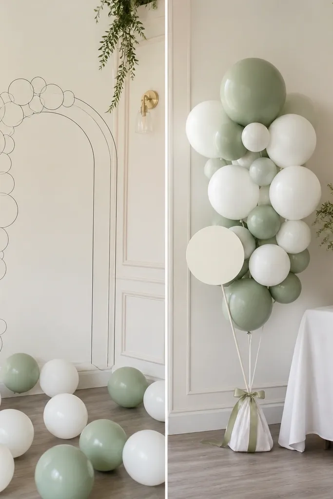
Balloon arches look great in big venues because the scale matches the room. In small weddings, a full arch can feel like it's blocking sightlines and overwhelming the space. I've had the best results with a compact cluster in two colors: matte white and sage green, sometimes with one thin metallic gold balloon for a highlight. The cluster gives you the "party" feel without eating the room. It also photographs cleaner because the background stays mostly uncluttered. This is flattering for everyone because the colors sit close to natural tones - they don't cast weird tint on skin like bright neon balloons can. The principle is controlled scale and a limited palette.
Start by picking a corner that already has good light, ideally near a window or warm wall lamp. Then use one weighted stand (or a small base) and tie three balloon strings together so the cluster stays tight, about 20-24 inches wide. Add balloons in a pattern: two whites, two sages, and one gold accent balloon. Attach a satin ribbon tail so it sways slightly in photos. Put it at least 3 feet away from the table so guests aren't bumping it and ruining the look.
Try thisSpray the balloons with a matte finish if you're using glossy ones - it reduces glare in flash photos.
Common mistakeDon't mix five colors - it makes the cluster look like a party store display.
4. The One-Table Welcome Moment (Before vs After)
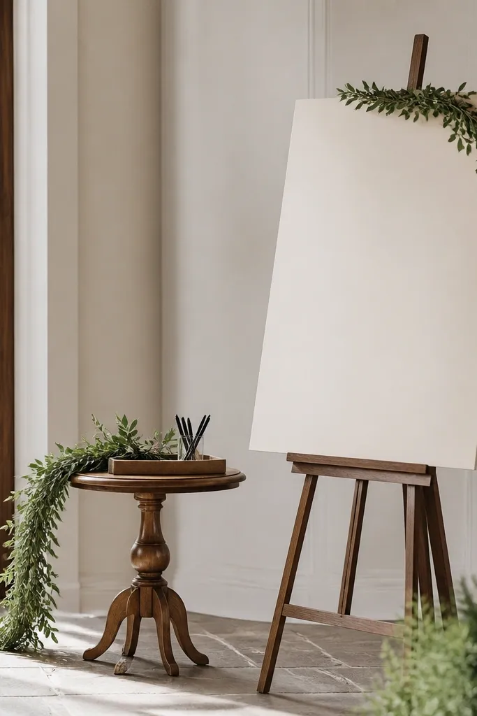
Small weddings don't need a wall of signs. What they need is one readable welcome moment that guides people without cluttering the entry. I use an easel board in cream or warm white, and I keep the text minimal: names, date, and one short line for the schedule. The pens tray is practical and it looks intentional on camera. I add a thin greenery garland only along the side table edge so the entry feels styled, not decorated. This works for both men and women outfits because the palette is neutral and doesn't fight clothing colors. The principle is one focal sign plus one practical item, placed where guests naturally pause.
Start by standing where guests enter and mark the spot they slow down in. Place your easel board there so it's readable at about 4 feet height. Then add a small tray with 2-3 pens and a tiny card that says what to write - I use a simple "Guestbook" card. Keep the garland under 3 feet long and drape it along one edge of the side table. Finally, wipe down the floor area and clear any cables from behind the sign so the camera doesn't catch mess.
Try thisUse matte board or textured paper so overhead lights don't create glare on letters.
Common mistakeSkip three different fonts and sizes - it reads chaotic in small entry spaces.
5. Micro-Succulent Place Cards in Sage Tint
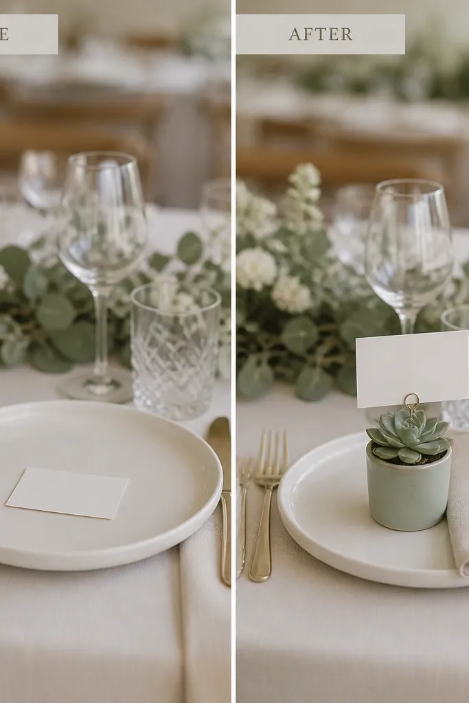
If you're doing small wedding ideas on a budget, micro-succulents give you a "designed" look without big floral costs. The key is consistency: I use a single pot color (sage or soft terracotta) and keep the succulents similar in size. Place cards attached to the pots look charming in close shots and they also help guests find seats without a big seating chart. Succulents photograph well because they have texture, and texture holds up under indoor lighting. This setup flatters both warm and cool skin tones because the greens sit close to natural hues. The principle is edible-looking texture without the fragility of fresh blooms.
Start with 10-25 mini pots in one color and choose succulents that are about 3-4 inches tall. Then write place cards on thick cardstock and clip each card to the pot rim with a small binder clip or mini clothespin. Lay napkins on the left side of each plate and place the succulent right at the top corner of the setting. Keep the succulents at the same height so the table looks uniform across photos. Finally, group similar pot colors together - don't mix random hues if you want it to look intentional.
Try thisMist the succulents lightly the morning of the wedding so they look fresh, not dusty.
Common mistakeAvoid loose cards on a busy table runner - they get lost in the frame.
6. Single-Flower Float Bud Vases for 12 Guests
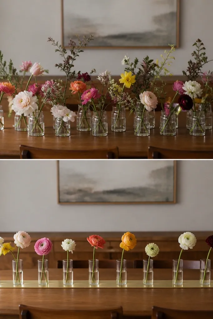
Multiple-stem arrangements look good on a big table because you have distance to blend shapes. For small wedding setups, one-stem bud vases look cleaner and more expensive. I use clear glass cups or small bud vases so the water and stem read in the light. Pick one flower type - like garden roses, ranunculus, or peonies if you can source them - then keep stem lengths consistent. The result is a repeating pattern that frames the table without blocking plates. This flatters guests with glasses because the center of the table stays uncluttered. The principle is repetition with restraint.
Start by laying out empty cups on the table and measuring the spacing. Then cut stems so each vase has a similar height, usually 6-8 inches above the rim. Place one vase at each place setting or every other setting if you want more open space. Add a thin metallic gold strip runner under the cups if your linen is plain - keep it only 2-3 inches wide. Finish by wiping each vase so there are no water spots visible under flash.
Try thisIf you're using roses, remove lower leaves so the stems look clean against the glass.
Common mistakeDon't mix flower types and colors in every cup - the table will look random instead of styled.
7. Taper Candles on a Mirror Strip (Before vs After)
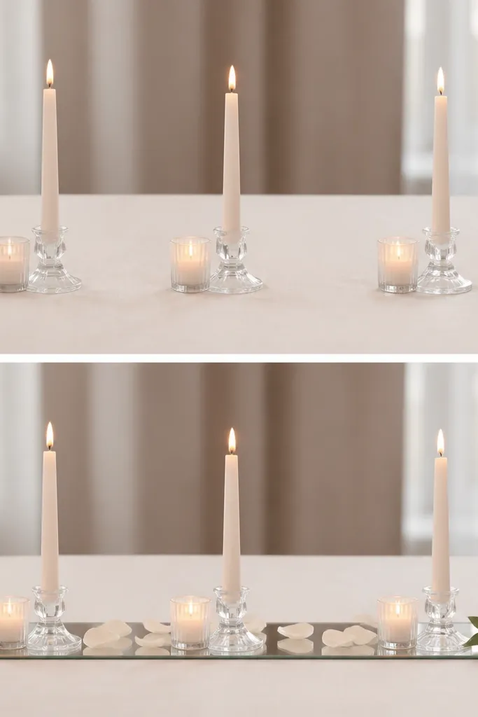
A mirror strip is one of my favorite small wedding set tricks because it multiplies light without adding height. In a small room, flat candlelight can look dim, especially if you're using matte linens. When you put taper candles on a narrow mirrored tray, the reflections make the centerpiece glow and it reads brighter in photos. I keep the candle color consistent - either clear glass holders or simple brass - so reflections don't look messy. This works well for both men and women because it doesn't pull attention from outfits; it just adds warmth. The principle is using reflective surfaces to boost light while keeping the centerpiece low.
Start with a narrow mirrored tray about 10-14 inches wide and long enough to fit three to five tapers. Then arrange candles in a straight line with equal spacing, usually 3-4 inches between holders. Add two tiny greenery sprigs at the ends only, not in the middle, so the reflection stays clean. Scatter a few petals lightly - one thin layer - so it doesn't look like a mess. Put the tray center-front on the table so it catches camera flash from the right angle.
Try thisWipe the mirror with a microfiber cloth right before guests arrive - fingerprints ruin the effect.
Common mistakeSkip a wide mirror under a tall arrangement - it turns into a cluttered disco look.
8. Macramé-Style Runner Instead of a Full Floral Arch
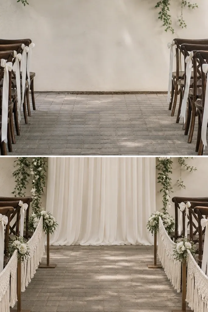
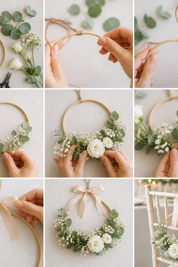
If you want ceremony photos to look intentional without building a full arch, use a hanging runner concept. In small wedding ideas vs big wedding, the big arch wins on space, but the small runner wins on flexibility. I use a neutral macramé-style runner or woven fabric panel in cream, then attach a few small flower clusters at chest height intervals. It frames the aisle without blocking the view of guests sitting close by. This is friendly for people with shorter heights because the decor doesn't tower above heads. The principle is vertical structure placed low enough for sightlines but high enough to read on camera.
Start by choosing two anchor points: chair backs on the aisle side or a low frame near the entrance. Then hang the runner so it sits about 30-36 inches from the floor at the lowest point. Attach small clusters every 2-3 feet using floral wire or zip ties - keep the clusters to 3-5 stems each. Add one drape panel behind the couple if the wall is plain, but keep it simple. Finally, do one test photo from where guests sit - adjust the height so the runner doesn't cut into heads.
Try thisUse floral wire with a rubber coating so you don't snag fabric while adjusting.
Common mistakeDon't overload the runner with flowers - it looks heavy and cheap under indoor lighting.
9. Beer-Glass Escort Cards for a Garden Patio
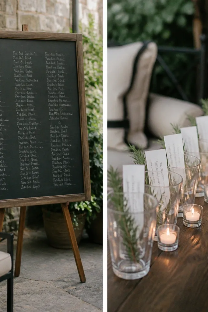
Chalkboards are common, but they can look messy in small patios where people walk by close. A row of clear glasses is cleaner and it gives you height without a big board. I use clear beer glasses or small water tumblers, then set a handwritten card inside with a simple font. Add one small sprig of herbs or rosemary at the base of each glass so it matches garden vibes. This looks great in daylight and still reads in evening because the glasses catch warm candle glow. It flatters everyone because it doesn't tint skin like colored signage can. The principle is readable cards with a light, transparent display.
Start by measuring the space where guests will look for seating, usually near the drink table. Then line up 12-20 glasses in a straight row, leaving about 4-6 inches between them. Place cards inside each glass so the text sits at about 3-4 inches above the rim. Add a tiny candle or tea light beside every third glass so the display doesn't become flat at night. Finally, keep the background clear - remove extra bags, boxes, or stacks so the row stays the focal point.
Try thisWrite cards with a paint marker on matte cardstock - it won't smear when someone brushes the glass.
Common mistakeSkip reflective glossy paper - flash makes it glare and the names disappear.
10. Curtain-Clip Photo Lights Instead of Overhead Bulbs
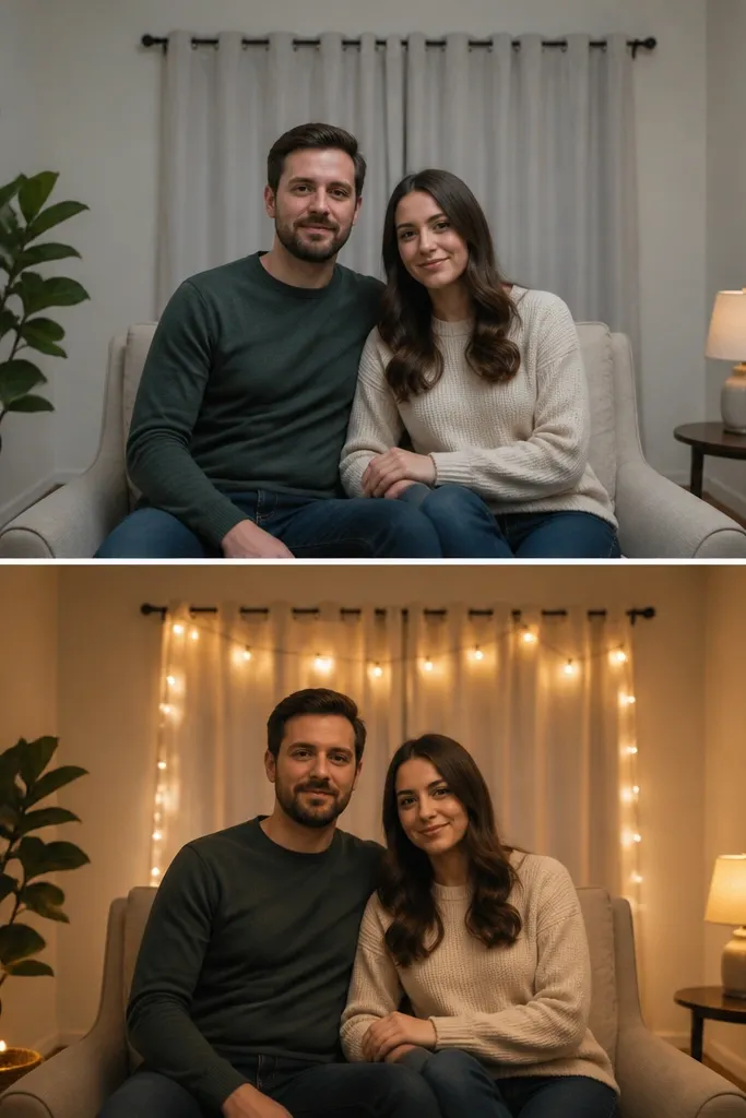
This is the "after" change that people feel immediately. Small venues often have ugly overhead lighting that makes everyone look tired, especially under flash. I use curtain-clip string lights with warm bulbs, placed behind the seating area, so the light wraps around the couple instead of blasting from above. I also add one small lamp near the chair - not bright enough to light the whole room, just enough to fill shadows. The effect is softer skin tones and fewer harsh shadows on jawlines. It works for people with both light and deep complexions because the warm color temperature reduces contrast. The principle is light placement, not more decorations.
Start by turning off or dimming overhead lights during the photo moments, then aim string lights behind the couple at about shoulder height. Use curtain clips so the lights stay in a straight line and don't sag. Keep the string light length short enough to avoid covering the whole wall - aim for a band about 6-8 feet long. Add a lamp on the side, 2-3 feet from the couple, with a warm bulb or a shade that diffuses. Take one phone photo in Auto mode - if faces look shiny, move the lights farther back or reduce brightness.
Try thisBring a small roll of gaffer tape - you'll fix light cords in minutes when the venue setup is messy.
Common mistakeAvoid blue-white bulbs - they make skin look grey in indoor photos.
11. Two-Tier Cake Stand That Fits a 60-Inch Table
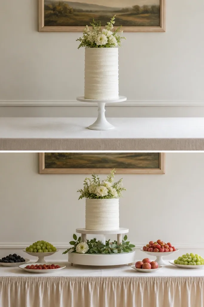
Big wedding cake tables can handle oversized stands. In a small wedding, the cake stand needs to respect the table width and the camera angle. I use a compact two-tier stand with a low base so the cake doesn't dominate the whole frame. A cream linen cake skirt makes the base look intentional and hides the scuff-prone table edges. Add two small fruit plates in a neutral color like white or light stone - it gives the table texture without adding visual noise. This setup looks good for both classic and modern couples because the linen and stone tones read clean. The principle is proportion: the cake should be the hero, not the only object.
Start with a 60-inch table and measure where guests will stand behind the cake. Place the cake stand center, but keep at least 18 inches of clearance from the nearest chair. Use a cake skirt that hangs 6-8 inches down and covers the entire base area. Add one small fruit plate to each side of the stand, spaced so they don't touch the flowers if you have them. If you add flowers, keep them in a single low arrangement under 10 inches tall - nothing that blocks the cake photo angle.
Try thisUse non-slip matting under the stand - small tables shake more than you think.
Common mistakeSkip tall, thin stands on narrow tables - they feel unstable and look top-heavy.
12. Bar Cart Mocktail Station in One Color Glass
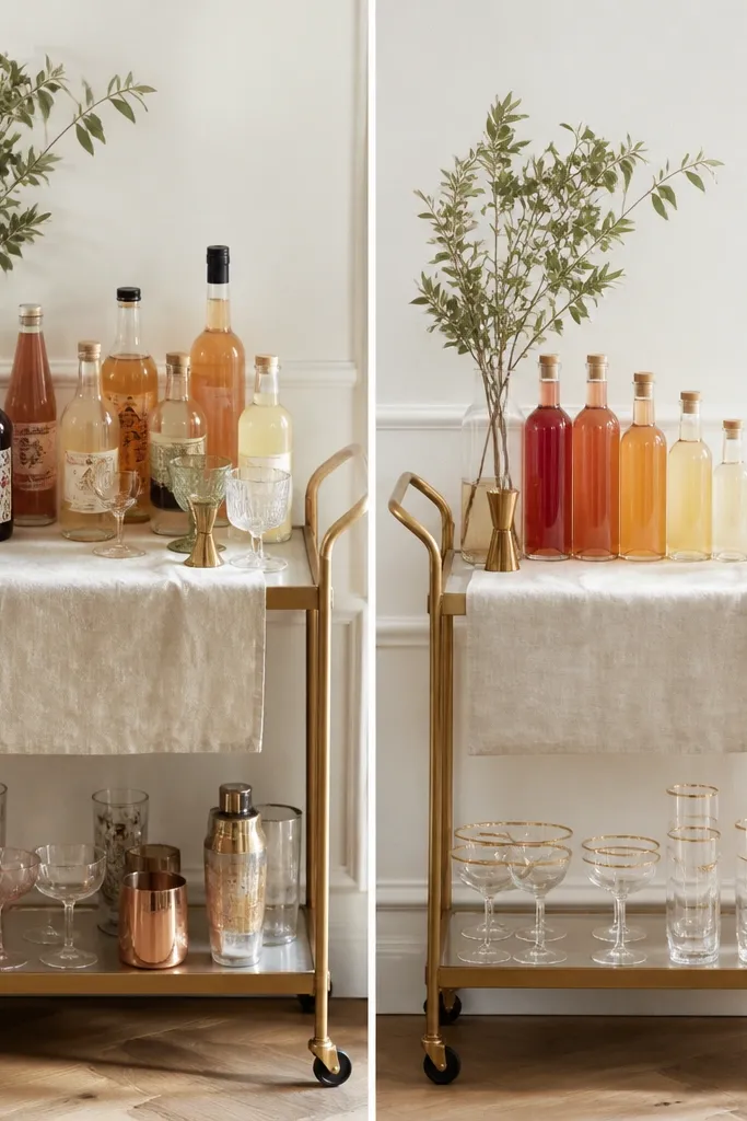
A bar station can turn chaotic fast in small wedding ideas. When you keep glassware uniform and repeat one accent color, it looks styled even if it's simple. I use clear glasses with gold rims and group bottles by height, not by label. Then I add one linen runner on the cart shelf in either ivory or warm beige. The warm neutrals photograph clean and don't compete with guest outfits. This setup works for both men and women because it doesn't look "girly" or overly themed. The principle is visual uniformity: same glass shape, same accent, tidy heights.
Start by choosing one cart size and wiping it down so it doesn't look dusty in flash. Then stage bottles in a line: tallest in back, medium in the middle, short in front, leaving 2-3 inches between each. Set out glasses in small clusters of four so guests can grab without knocking everything over. Add one small sign for each drink - I use simple card tags taped to the bottles at eye level. Finish with a linen runner and a small tray for garnishes with tongs so the station stays neat all night.
Try thisPut napkins under the garnish tray - spills look ten times worse on metal carts.
Common mistakeAvoid mixing frosted and clear glass - the bar looks messy in photos.
13. Chair Sashes in One Fabric and One Knot Style
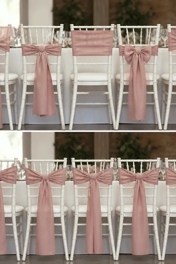
Chair decor is where small weddings either look coordinated or randomly decorated. I stick to one fabric - satin or soft taffeta - and one knot style so the line of chairs reads clean. Dusty rose works well because it's muted enough not to cast pink shadows, yet it still shows up in photos. I tie sashes so the ends fall to about the same point on each chair back, usually around 10-12 inches from the top. This flatters both men and women outfits because it doesn't compete with dresses or suits. The principle is consistency: same material, same length, same knot.
Start by measuring chair backs and cutting sashes so every one matches, usually 2.5-3 inches wide and long enough to wrap and tie. Then tie the knot the same way on every chair - I use a simple loop knot, not a bow, because bows look uneven when chairs get bumped. Make sure the sash sits centered and the ends hang evenly. If your venue is windy or crowded, add a small safety pin on the underside so it doesn't slide. Finally, step back and check the chair line from where the couple will stand - adjust the lengths before guests arrive.
Try thisSteam sashes before you tie them so they drape smooth, not wrinkled.
Common mistakeDon't mix ribbon textures like satin and burlap - the chair line looks patchy.
14. Seating Chart on a Single Picture Frame with Clips
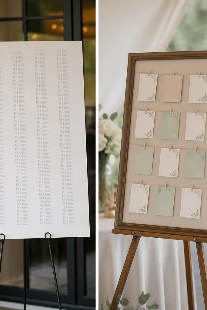
In small weddings, seating charts should be quick to scan. Tiny printed blocks on a big poster board look hard to read and they crowd the wall. I use a single picture frame on an easel and clip individual name cards to lines inside the frame. The frame makes it look finished, and the cards give you flexibility if you change names. I keep the cards in two neutral tones with black marker so it reads clean. This works for both men and women because the display doesn't add color cast to the room. The principle is readability: big text, limited entries, and a display height that matches where people naturally stand.
Start by buying a simple picture frame with a flat backing and remove the glass. Add string or thin wire across the frame interior, spaced so you can clip name cards in rows. Then write names on cardstock and clip them with mini clothespins. Place the easel at the same height as a sign - about 60-65 inches from the floor to the center of the frame. Add a small arrow card for "Find your table" so people don't stand there guessing. If you have under 20 guests, keep it to one table grouping to avoid overcrowding.
Try thisUse bold marker and keep each card to 2 lines max so reading takes seconds.
Common mistakeAvoid printing seating charts on thin paper - it curls and looks sloppy fast.
15. The "No Empty Corners" Lounge Setup
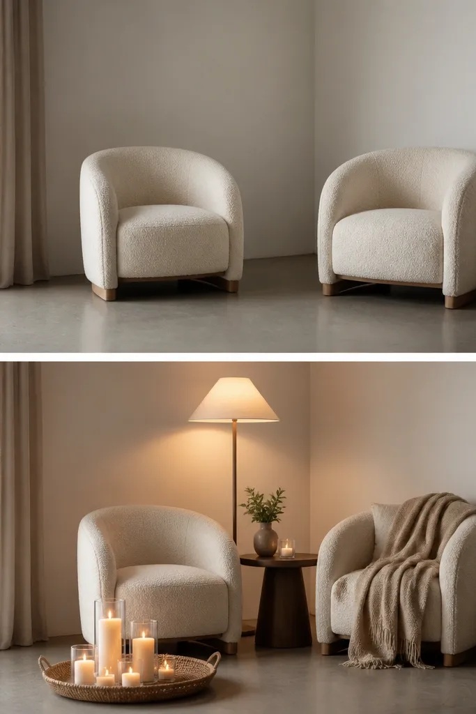
Empty corners look worse in small venues because every photo includes them. I fix it with a simple lounge vignette that uses one lamp, one small table, and one texture item. I use a woven throw in oatmeal or cream and a tray with two taper candles or one lantern so the corner reads warm even after sunset. The goal is to give guests a place to stand that still looks good in pictures. This flatters everyone because the warm lamp creates soft light on faces without blasting overhead glare. The principle is a complete mini-scene: light + surface + texture.
Start by placing two chairs with a small gap between them so guests aren't cramped. Then add a small side table next to one chair, not in the middle of the corner, so it stays usable. Put a warm-shade lamp on the side table and angle it slightly toward the chairs. Add a woven throw folded over one chair arm and a tray on the table with two candles. Finally, check from the ceremony photo angle - you want the corner to look styled but not block the aisle.
Try thisBring a lint roller - woven throws pick up dust and it shows under warm indoor light.
Common mistakeSkip random loose decor items - in a small corner, clutter reads like mess.