1. Cream frame with warm fairy lights and blush dried stems
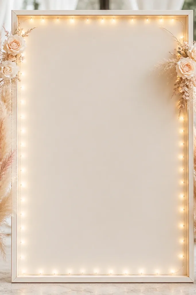
This is the sign I keep coming back to because it looks soft without going dim. The cream frame reflects light, so your lettering stays readable even when the fairy lights are on. I used blush dried stems because they keep their shape and don't wilt in outdoor shade. The warm light color (around 2700K) makes the whole thing look cozy against ivory and warm wood tones, especially if your wedding palette is cream, blush, and champagne. It also flatters photos because the glow sits behind the frame, not directly over the text.
Start with a framed sign base that has depth - mine was about 1.25 inches so I could tuck wire behind. Lay your lettering first, then map where the stems will sit: two clusters at the top corners and two smaller ones mid-height. Wrap the outer edge of the frame with warm battery fairy lights, then secure the wire with clear tape on the back so nothing shifts. Add stems by anchoring the stems to a thin backer board using floral tape and zip ties, then trim so the tallest pieces reach just above the top line of text. Finish by adding one or two small white flowers near the center to break up the blush-only look.
Try thisUse warm white lights even if your wedding decor is cool-toned; cool lights make cream paper look gray in evening photos.
Common mistakeDon't place lights directly across the middle of the sign where your lettering sits - it creates glare and makes the message unreadable.
2. White foam board with pastel paper flowers and micro LED halo
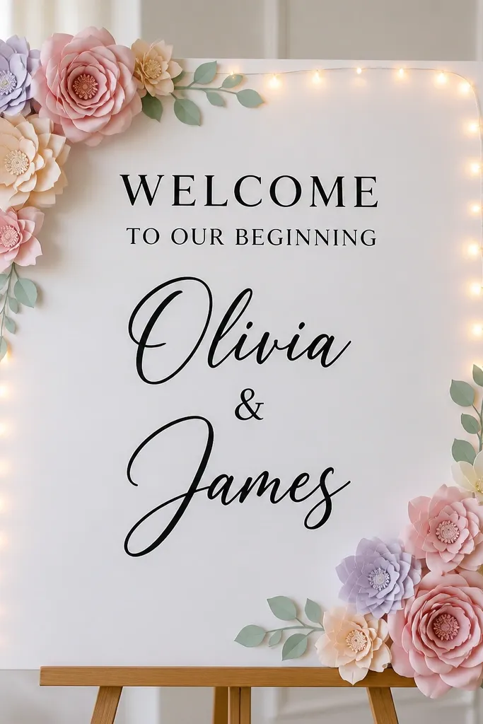
If you're trying to keep the build lightweight and beginner-friendly, this is the one. White foam board is easy to cut and stays flat, and paper flowers hold their positions without fighting gravity. The micro LED halo gives a "floating wreath" vibe that looks clean in photos because the lights are thin and controlled. I like this when the venue has bright lights overhead since it doesn't compete with strong ceiling bulbs. It's also flattering for weddings with pastel palettes - mint, lilac, and soft peach - because the colors stay crisp against the white base.
Start by cutting your foam board to the size you can carry easily - 18x24 inches is a sweet spot for visibility. Print your lettering with high contrast: black text for the main message and a slightly darker gray for names if you want a softer look. Place paper flowers first in a corner frame, keeping the center clear so the text has a clean "reading window." Then attach micro LEDs around the top and sides using hot glue only on the back edge points. Finally, add a small battery pack holder behind the foam board and route the wire down one side so it disappears behind the stand.
Try thisIf you're using paper flowers, mist them with a light anti-wilt spray that also slightly stiffens the petals so they don't sag when you handle the sign.
Common mistakeDon't overload the corners with thick flower clusters; too much height makes the sign look top-heavy on a simple easel.
3. Greenery garland with fairy lights behind translucent acrylic
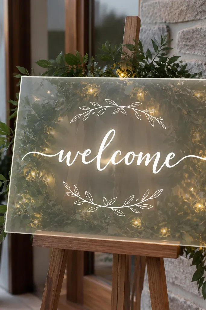
This look is for people who want "glow" without harsh glare. Translucent acrylic lets the warm lights diffuse, so the sign feels magical at night while staying readable. I've done this with eucalyptus-style greenery because it reads as lush even when the garland is not huge. The acrylic also hides the wiring because you mount lights behind the panel. This works especially well if your wedding has modern decor - white, black, and silver - because the glow looks sleek rather than rustic.
Start with an acrylic panel and a stand that holds it straight; I used clips on a slim frame so the panel didn't wobble. Attach a thin greenery garland behind the acrylic using floral tape at three anchor points: left edge, center top, right edge. Wrap warm battery fairy lights behind the acrylic, keeping the brightest section above the text so it doesn't wash out letters. Mount your lettering using vinyl or paint pen style lettering on the acrylic so it stays crisp. Finally, hide the battery pack behind the stand and secure it with zip ties so it can't swing when guests bump the base.
Try thisTest glow brightness by turning it on under the same lighting as your reception space; if the letters look washed out, space the lights farther from the text.
Common mistakeDon't use cool blue LEDs; they make acrylic look icy and the greenery looks dull.
4. Rustic chalkboard with twinkle lights and sunflower accents
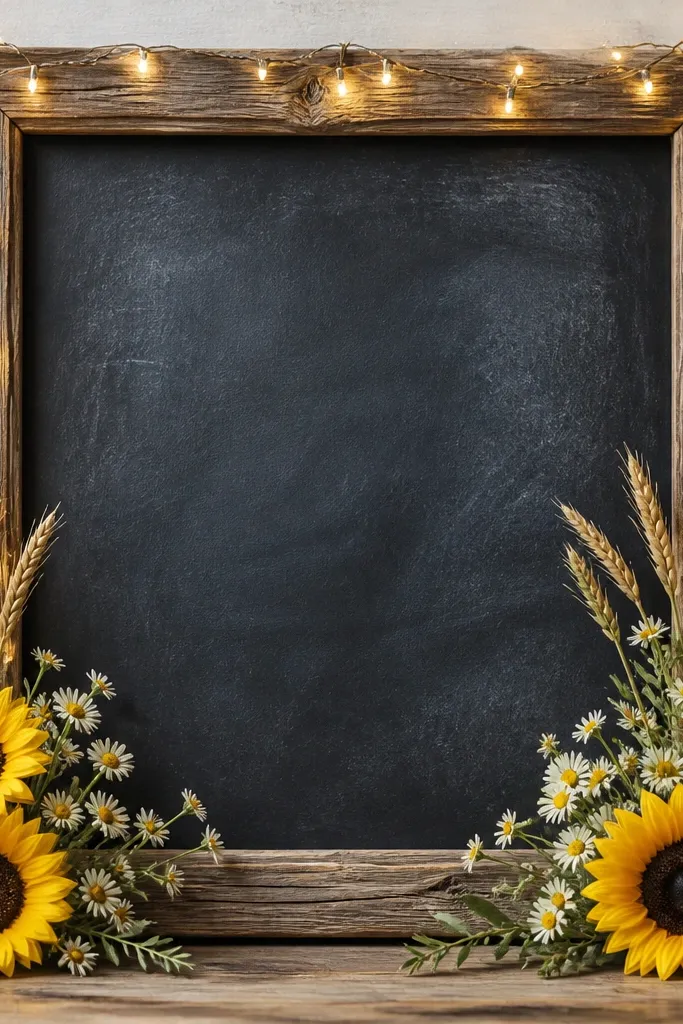
This one is perfect when your venue has lots of natural textures - wood beams, barn doors, or outdoor string lights. The dark chalkboard gives contrast, and the twinkle lights add sparkle without turning the sign into a bright billboard. Sunflowers bring warmth and a clear focal point, and keeping the stems mostly at the corners stops the flowers from blocking the message. I've used this for late summer weddings and it looks great with denim blues and warm neutrals. Under evening lighting, the twinkles make the chalk look dimensional rather than flat.
Start by choosing a chalkboard that has a thick frame so you can anchor lights. Write your welcome message first with chalk: big "Welcome" at the top, names centered, and a smaller date line near the bottom. Attach a string of warm twinkle lights along the inside edge of the frame, then cover the wire route with a thin strip of burlap or ribbon so it doesn't show. Place sunflower stems in the bottom corners and secure them with floral tape to the frame - trim so no petals touch the chalk text. Finish by adding one small cluster of daisies near the lower center to balance the weight.
Try thisSeal chalk with a matte clear spray from a distance, then let it cure fully before you attach flowers.
Common mistakeDon't use slick satin ribbon around the frame; it reflects light and makes the chalkboard glare.
5. All-white floral wreath with battery LED strip glow behind
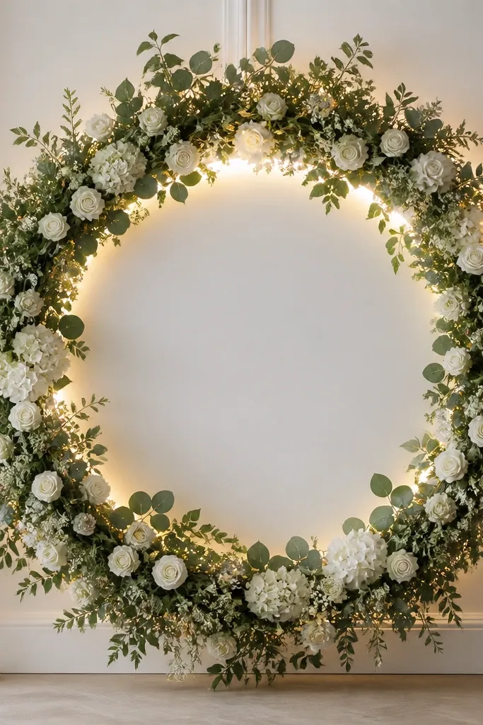
This is the clean, bridal version of a welcome sign. The all-white wreath looks timeless, and the backlit LED strip gives a halo effect that makes the wreath feel full without adding extra volume. I like using a circular layout because it pulls attention to the center message naturally, especially from an angle when people walk up. It also photographs well when your wedding has white florals or a monochrome theme. The key is that the text sits on a separate backing so the glow enhances it instead of washing it out.
Start with a circular backing board and attach a wreath frame to it, then plan your message placement in the middle. Mount a warm battery LED strip around the inner perimeter behind the wreath so the light goes through the greenery and flower gaps. Attach white blooms in a repeating pattern - larger blooms at top and bottom, smaller clusters at the sides - so the wreath looks balanced. Use floral tape and small zip ties to secure stems to the frame, not to the backing board itself, so the wreath doesn't sag. Finally, mount the sign on a freestanding stand and route the battery pack to the back of the stand where it stays hidden.
Try thisIf your wreath looks flat, add two or three taller stems behind the top half so the halo glow shows depth.
Common mistakeDon't put a bright LED strip directly in front of the letters; it turns the center into a glare spot.
6. Champagne ribbon bow with soft roses and warm string lights
This look reads "bridal" because the satin bow gives you a clear top focal point. I used champagne and blush roses because they add dimension without turning the sign into a neon candy palette. Warm string lights look flattering against satin - they create tiny highlights on the ribbon folds. This works well if your wedding dress is warm-toned ivory or champagne, or if you have gold accents in the venue. It also helps in photos because the bow catches light and pulls the eye upward to the names.
Start with a sign base that matches your ribbon - I used cream with a subtle matte finish. Tie a champagne satin bow separately, then mount it at the top center using hot glue on the back and a couple of stitches through the bow tails for extra hold. Place roses around the bow in a shallow "U" shape so the center stays open for text. Add warm string lights along the left and right edges, securing the wire to the back with clear tape so it doesn't show. Put the battery pack in the lower back corner and hide it behind the stand so it stays out of sight.
Try thisCut the ribbon tails at an angle and seal the cut edge with a tiny amount of fray-check so they don't shed fibers by the end of the night.
Common mistakeDon't use a glossy ribbon - it throws hard reflections that make the sign look cheap in night photos.
7. Terracotta and cream dried bouquet frame with orange LED tips
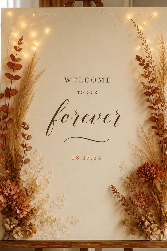
This is for fall weddings or any event that wants warmth without going fully rustic. Terracotta dried flowers look great beside cream paper because they warm up the whole palette, and the orange-tinted LED tips mimic candlelight. I like that the LEDs are used sparingly - tiny points near the top corners - because it keeps the text readable. The sign feels intentional even if your venue is modern, because the dried materials add texture. It also flatters skin tones in photos because the warm color cast is gentle rather than harsh.
Start with a cream sign board and dark brown lettering so it doesn't compete with the warm accents. Add dried grasses and terracotta blooms in a side-by-side frame, keeping the middle third open for text. Use only two to three LED clusters at the top corners, not across the whole border, and keep the wires behind the board. Secure dried stems with floral tape to a thin backing strip so nothing shifts when you carry it. Mount the sign on a stand and angle it slightly upward so guests see the message as they approach.
Try thisTrim all dried stems to the same height range before you attach them - it keeps the frame looking designed instead of random.
Common mistakeDon't choose super bright LEDs for this look; they fight the warm dried palette and look artificial.
8. Monochrome black base with white roses and cool-white fairy lights
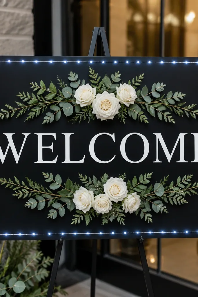
This one is dramatic in the best way. The matte black base keeps the lighting controlled, and the white roses pop with a high-contrast look that reads clearly in low light. I only use cool-white fairy lights for this style because the black background makes warm lights look slightly yellow and less crisp. It flatters modern venues with black chairs, minimalist tables, or a lot of white linens. In photos, the text stays sharp because there's no glare directly across it. The symmetry also makes it feel "planned" even if the florals are simple.
Start with a matte black sign base and choose white vinyl lettering or painted lettering. Arrange roses behind and slightly around the text - not on top of it - so the glow frames the message. Outline the edge with cool-white fairy lights, keeping the wire spacing even so it doesn't look patchy. Secure florals with floral tape to a backing strip, then attach the backing to the sign so the weight isn't pulling on the text area. Hide the battery pack behind the stand leg and keep the wire path tight along the back edge.
Try thisIf your venue lighting is warm (like amber bulbs), use warm-white lights even on black - cool white can look too harsh under amber tones.
Common mistakeDon't use glossy black or shiny lettering; reflections turn the sign into a glare blob.
9. Green eucalyptus fan with white lights tucked behind vellum panels
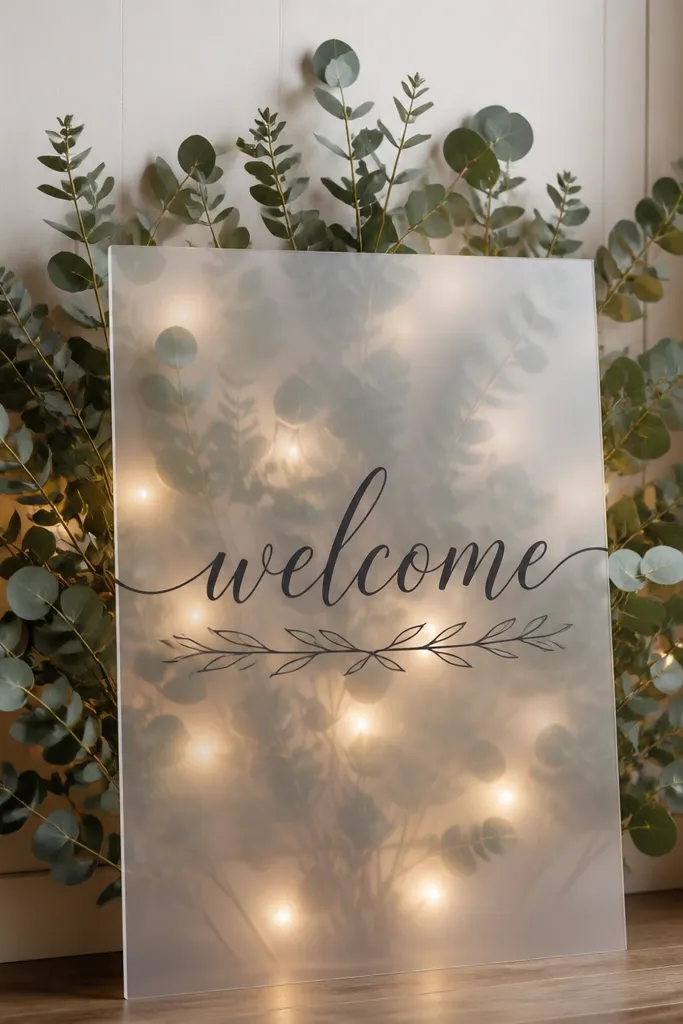
Vellum changes everything because it diffuses light like a soft lamp shade. When you tuck white lights behind vellum with eucalyptus, the greenery looks airy instead of heavy, and the sign reads clearly because the light spreads evenly. I used eucalyptus because it gives structure without needing a huge bouquet. This look is great for indoor ceremonies where you want a gentle glow that doesn't overpower guests' faces. It also works well for people who want real-looking texture without the smell or mess of fresh florals.
Start by cutting vellum panels to cover the area behind your text, leaving a clean margin for readability. Arrange eucalyptus branches in a fan shape behind the vellum and secure them with floral tape to a backing strip. Place white LED fairy lights behind the vellum, not in front, and tape the wire so it sits evenly across the fan. Add your lettering on the front vellum with darker ink or vinyl, then check from the guest angle to make sure the letters aren't washed out. Mount the sign on a stand with a slight tilt so the glow catches the entrance path.
Try thisUse a matte vellum or frosted look; shiny vellum makes light streaks and looks uneven.
Common mistakeDon't tape lights directly onto the sign surface without a diffuser - you'll see bright dots instead of a smooth glow.