1. 6mm Crystal Clear Acrylic with Centered Script Names
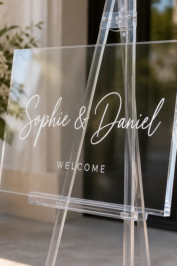
This look reads expensive because the acrylic is thick enough that it has weight in photos, not the "thin sheet" vibe. I use crystal clear acrylic for the base and white ink or vinyl that sits cleanly without texture. The best pairing is script for the names and a simple thin sans for "Welcome," because the script gives personality while the sans keeps it readable from across the entry. It flatters most skin tones and venues because white lettering stays crisp against bright floors and darker walls. If your entry has marble or glossy tile, this setup controls reflections better than dark typography.
Start by ordering 6mm acrylic with polished edges, not laser-cut raw edges. Then center your text block and measure a 1-inch buffer around the perimeter before you approve the design. Place the sign on a clear acrylic stand tilted back 10-20 degrees so the overhead lights reflect near the bevel, not into the camera. Finally, remove the protective film from the front last, right before you set it down, and wipe with a microfiber cloth so you don't trap dust under the lettering.
Try thisAsk for "polished edges" in the order notes and do a quick flashlight test at home - you want smooth highlights, not jagged streaks.
Common mistakeAvoid thin 3mm acrylic with raw edges because the cheap-looking edge sheen shows up in flash photos.
2. White Frosted Acrylic with Gold Foil-Style Typography
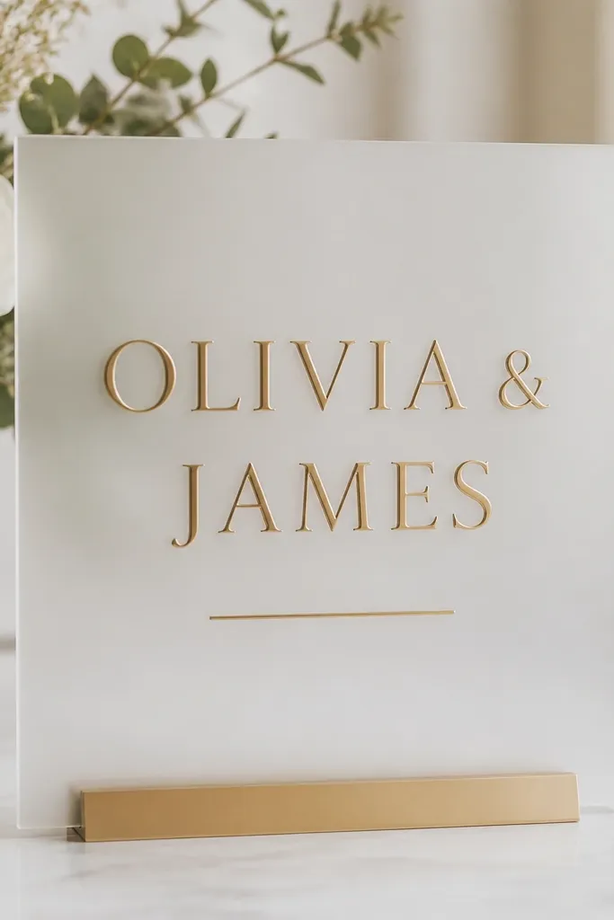
Frosted acrylic is the move when your venue has harsh overhead lighting or busy backgrounds. The matte surface diffuses glare, so gold lettering looks like it's printed rather than floating on a glossy sheet. I like a gold foil-style finish (a warm antique gold, not neon yellow) paired with clean uppercase for the welcome line. This combination looks flattering in both daylight and evening because it doesn't rely on perfect lighting angles. If your couple likes a classic feel, frosted plus gold reads like stationery, but it still feels modern because it's acrylic.
Order white frosted acrylic around 5-6mm thick so it doesn't look flimsy next to floral arrangements. Keep the names larger than the welcome text by about 30-40% in height, and center the block with equal spacing above and below. Use gold lettering that has a subtle gradient or foil effect, and avoid pure bright yellow gold - it looks costume-like against white. Mount it on a stand that doesn't cover the bottom corners, then set it slightly back so the frosted surface stays matte and doesn't pick up glare.
Try thisDo a test print of your font on plain paper first - if the gold effect looks too thin there, it will look fragile on acrylic.
Common mistakeDon't use tiny gold fonts on frosted acrylic; the matte surface hides fine strokes and makes the text look blurry.
3. Clear Acrylic with Black Ink + Tiny Gold Corner Accents
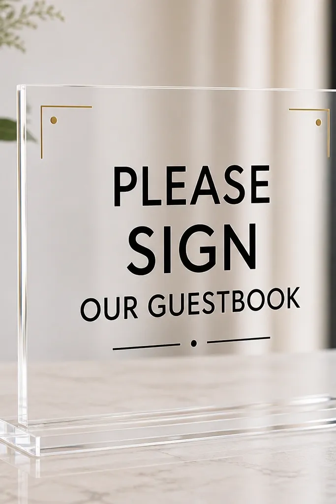
This is the cleanest "luxury but not fussy" option I've used. High-contrast black lettering on clear acrylic looks sharp and intentional, especially when your venue has light walls or neutral decor. I add small gold corner accents because they create a finished border without turning the whole sign into a theme park. The effect is flattering because black holds legibility for guests walking past quickly, and the gold adds warmth without overpowering. It also works for couples who don't want lots of script flourishes.
Start with clear acrylic, ideally 6mm, and choose a bold font for names or last name. Add "Welcome" in black uppercase or a narrow sans, then place gold corner accents that are small - think thin lines or dots, not big ornamental corners. Keep the text about 1 inch from the edges and align the accent details with the same baseline grid so it looks designed. Set the sign on a clear stand and angle it slightly back so overhead light hits the polished bevel rather than the center where black text sits.
Try thisIf you're using vinyl or printed lettering, choose a matte black finish so it doesn't reflect like sticker gloss.
Common mistakeAvoid chunky black fonts with glossy finish; they reflect and look like decals when the camera flash hits.
4. Acrylic Sign with a Thin Beveled Border Frame
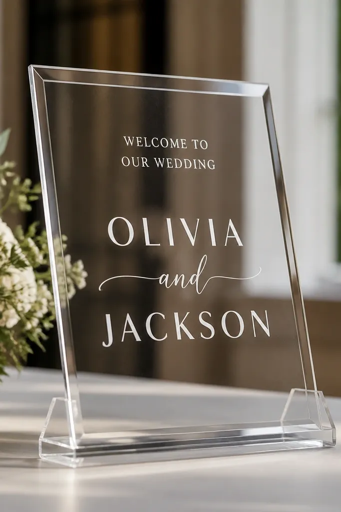
A beveled border is the easiest way to make acrylic look "architectural." Instead of relying on heavy graphics, the border uses light itself - it creates a rim glow that reads premium. I keep the interior typography minimal: names in white or soft silver, and a short welcome line in thin uppercase. This looks good for both modern and traditional couples because the border is neutral and doesn't force a theme. If you have a floral arch or garland wall behind the sign, the border gives structure so the background doesn't swallow the text.
Order a design that includes a thin beveled frame, not a thick carved border. Measure your overall size and keep the interior text area consistent, with about 1 inch margin from the outer edge. Use white lettering for the main names and a smaller thin font for the welcome line, centered inside the frame. Mount it on a stand with rubber feet, then tilt back 10-15 degrees so the bevel catches light while the text stays readable.
Try thisTake one photo against a bright window before the wedding day - if the bevel flares too much, reduce the tilt angle slightly.
Common mistakeAvoid thick border designs because they crowd the typography and make the sign look like a storefront placard.
5. Two-Layer Acrylic Stack with Names on Top

Layering is where acrylic starts looking like custom signage instead of a flat print. I like a clear base for depth and a frosted top layer for contrast, so the names pop without harsh reflections. The key is spacing: you want a visible gap between layers, around 1/4 inch, so you get real shadow depth. This design flatters a wide range of venue styles because it reads clean in both minimalist and floral-heavy settings. Guests also get a quick read because the top layer carries the main message.
Choose two acrylic pieces: a clear base (around 6mm) and a frosted top layer (around 4-5mm). Cut them to matching outer dimensions, then plan your names on the top layer and the smaller welcome line on the base. Add spacers or standoffs so the top layer sits about 1/4 inch above the base, creating a crisp shadow line. Place the stacked sign on a sturdy stand that supports both layers without wobble, then angle it back slightly so the shadow depth stays visible in photos.
Try thisPick fonts that look good at different depths - script on the frosted layer photographs better than script on clear if there's glare.
Common mistakeAvoid stacking with no gap; if layers touch, it looks like one flat piece and you lose the premium depth.
6. Clear Acrylic with Etched-Look Monogram and Date
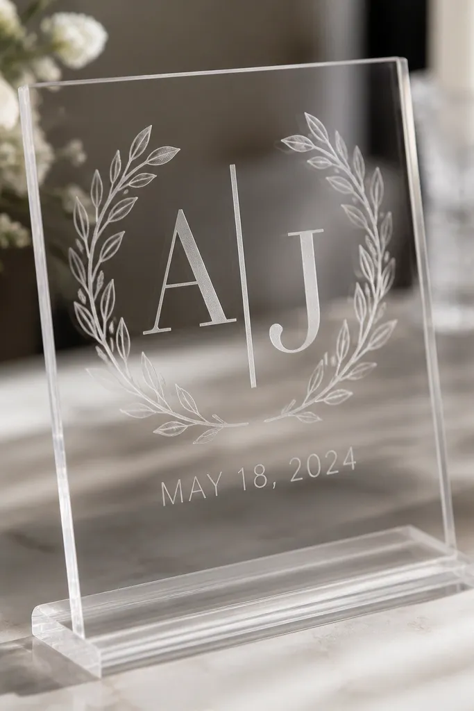
Etched-look typography looks expensive because it mimics glass etching - it's subtle, not loud. I use an etched-style monogram in the center because it creates a focal point that doesn't rely on heavy color. Then I add the date in thin uppercase so the whole sign still reads quickly when someone walks in. This style flatters couples who want a modern, understated look and venues with patterned walls, because the etched effect doesn't scream for attention. It also photographs well in both bright and dim light because the engraving catches soft highlights.
Start with clear acrylic, 6mm if you want that sturdy luxury feel. Choose an etched-look finish for the monogram, and keep the monogram large enough to occupy the center third of the sign. Add the date below in a thin font, spaced slightly wider than normal so it stays legible through reflections. Use a stand that keeps the sign stable and tilt it back 10-20 degrees, then test photos from two angles: straight-on and slightly off to the side.
Try thisIf you can, request the etched effect to be "matte etched" rather than "faux metallic" - matte stays readable.
Common mistakeAvoid deep-contrast colored fills for etched designs; it can look like cheap screen printing on acrylic.
7. Acrylic Sign with Watercolor Wash Background Behind Text
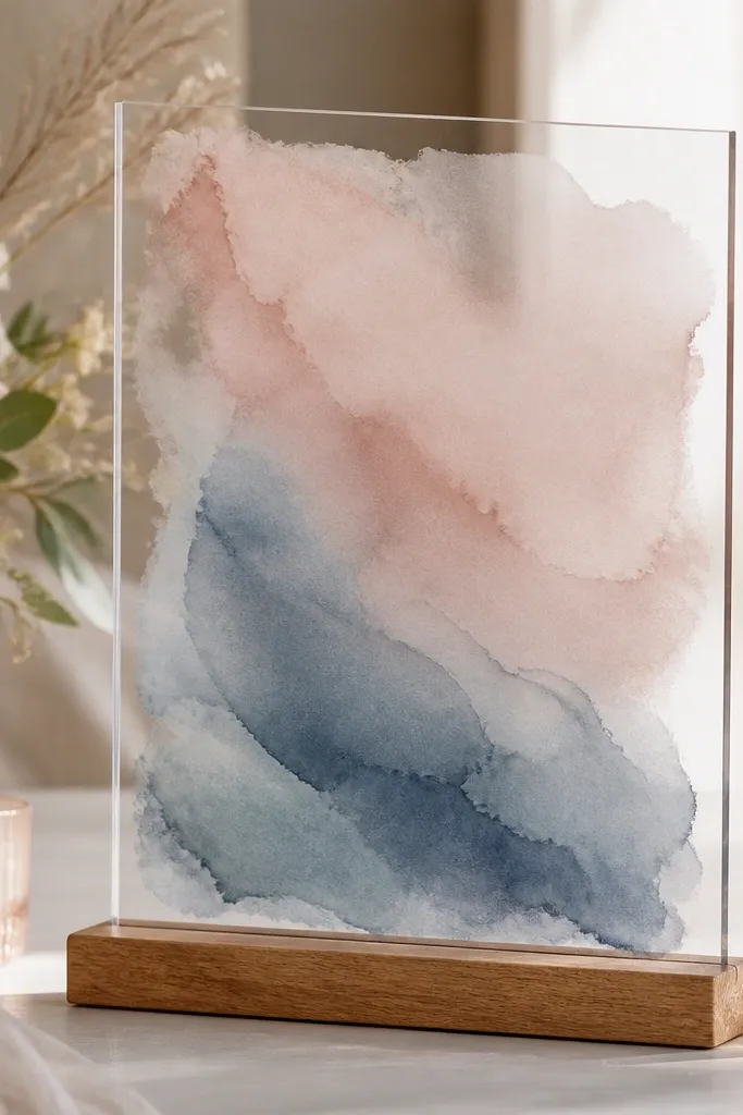
This is for couples who want softness without losing legibility. Instead of printing the watercolor on the acrylic surface, you place a color backing behind the acrylic (or use a digitally printed layer) so the watercolor looks like it's under glass. I keep the watercolor wash muted - blush, dusty blue, and a hint of sage - because loud pigments turn into visual noise once acrylic reflections hit. The white lettering stays clean, and the color makes the sign feel romantic even if your fonts are simple. This setup looks great when your welcome area has neutral flowers or simple linens.
Pick a watercolor palette first, then design your sign text in white with enough thickness to survive reflections. Use a backing layer behind the acrylic so the watercolor stays crisp and doesn't smear. Keep the watercolor coverage lighter around the center where the names sit; you want a calmer field for readability. Mount the acrylic on a stand at 10-15 degrees back, then wipe the front film-free surface and do a quick glare test under the venue's lights.
Try thisChoose a backing that matches your wedding palette by eye, not by a color swatch - acrylic changes how colors read.
Common mistakeAvoid bright neon watercolor backgrounds; acrylic turns them into hotspots in photos.
8. Black Acrylic with Clear Text Window and White Letters
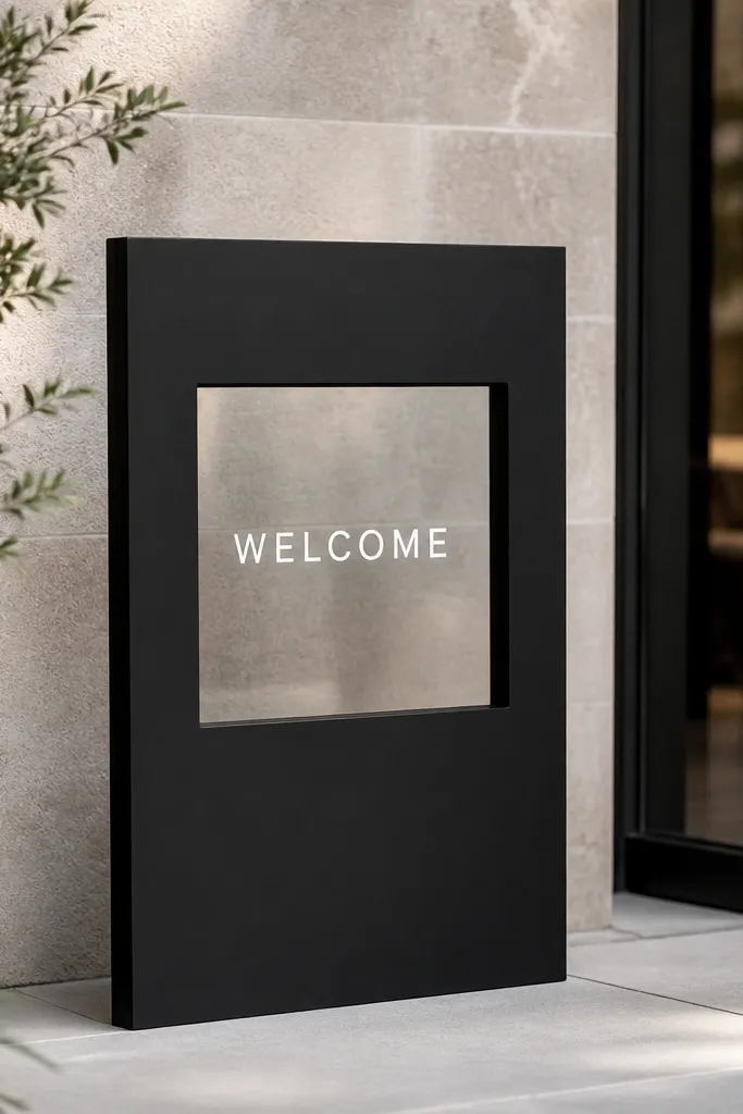
Black acrylic makes the whole sign feel like a designer piece, especially for evening weddings. The trick is to avoid full glossy black with bright white vinyl - it can reflect like a mirror. I like a matte black base with a clear window or inset so the white lettering looks clean and protected. This design flatters venues with warm lighting, like candlelit receptions, because the black absorbs stray highlights. It also helps if the entry background is busy - the black base gives a controlled frame.
Order matte black acrylic around 5-6mm thick, then design a center inset area in clear acrylic for the text zone. Put your names in white lettering inside the clear window so the letters look sharper and less reflective. Keep the typography centered and give it room - don't cram it into the corners. Use a stand that doesn't scratch the black surface, and set the sign slightly back so the clear window catches light without flaring directly into the camera.
Try thisDo a night-time mock setup with a phone flash - if the clear window glares too much, angle it less steeply.
Common mistakeAvoid glossy black full-surface designs because they show fingerprints and glare under flash.
9. Clear Acrylic with Minimal Line Icons and Name Initials
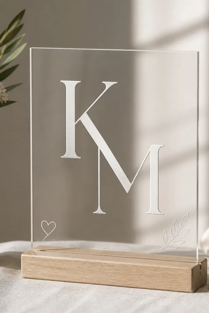
Minimal line icons look premium when they're tiny and consistent in stroke width. I pair clear acrylic with a centered initials layout because it feels personal without needing a full illustration. The white or soft silver typography stays crisp, while the line icons add personality without turning the sign into clip art. This is especially flattering for couples who want a modern, not-too-cute look, and it works with both formal black-tie and casual garden weddings. If your florals are bold, minimal icons keep the sign from competing.
Start with clear acrylic, ideally 6mm, and design a centered initials monogram as the main element. Add a short welcome line below the initials in thin uppercase, then place two small line icons at the lower corners aligned with the baseline. Keep icon stroke width consistent so they don't look different across the file. Mount on a clear stand and set at 10-15 degrees back, then wipe the acrylic carefully so the minimal design stays sharp in photos.
Try thisUse one icon style only - if you mix heart and leaf styles with different thickness, it reads cheap fast.
Common mistakeAvoid thick icons or heavy shading; they fight the clean acrylic reflection.
10. Acrylic Welcome Sign with Gold Script Names and Small Date Medal
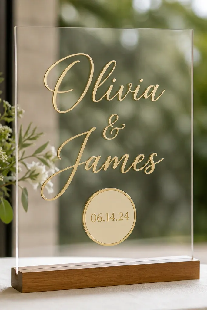
The "date medal" is a small detail that makes guests actually remember the date because it looks like a label on fine stationery. I keep the main names in gold script so the top reads romantic, then I use the medal for the date so it stays legible at a distance. The rest of the sign stays simple, which is what keeps it from looking busy. This design flatters couples who have lots of decor around the welcome area, because the medal gives a controlled focal point. It also works well in both warm and cool venues since gold plays nicely with candlelight and daylight.
Use clear acrylic and choose gold lettering that looks like antique gold, not bright metallic yellow. Place the names in a script font across the center, then create a medal shape below that contains the date in a thin uppercase. Keep the medal about the same width as the date text block, and give it a small margin from the bottom edge. Put the sign on a stand angled back 10-20 degrees, and do one photo check with the camera slightly above eye level to see if glare hits the gold medal.
Try thisIf you're ordering vinyl, ask for a "matte gold" option - it looks more like foil than shiny sticker.
Common mistakeAvoid oversized medal shapes; a big badge turns the sign into a trophy.
11. Acrylic Sign with Navy Ink and Blush Accent Line
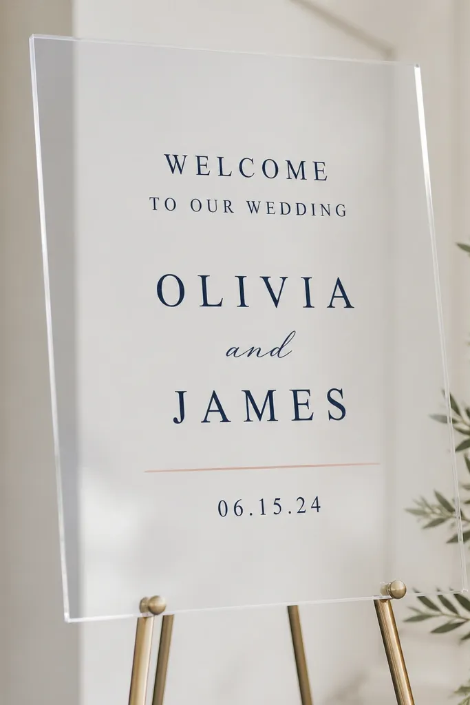
Navy ink on clear acrylic is one of my favorite combos because it looks crisp without the harsh contrast of pure black. Add a thin blush accent line and you get a soft wedding feel that still reads "clean." I keep the welcome line in navy and the date in a smaller navy font, then use blush only as a separator so it doesn't compete with the main message. This style flatters couples with neutral florals, wood tones, or modern reception tables. It also stays readable in photos because navy has enough depth to avoid looking faded next to acrylic reflections.
Choose clear acrylic and pick a navy tone that looks like deep ink, not blue-gray. Design the names centered in a serif or elegant sans, then add "Welcome" in smaller navy uppercase. Insert a thin blush line separator between the welcome line and the date, keeping it straight and centered. Use a stand that keeps the bottom edge visible, and angle the sign 10-15 degrees back so the navy lettering stays sharp in both direct and side lighting.
Try thisPrint your navy and blush on paper first; acrylic can shift perceived color warmth under LEDs.
Common mistakeAvoid using blush for main text; pale blush on acrylic can wash out when reflections hit.
12. Frosted Acrylic with Clear Top Layer for a 3D Name Effect
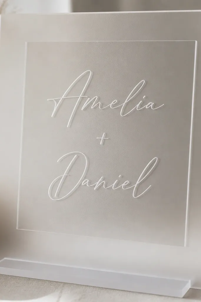
This is the "3D without glitter" look. The frosted base hides glare, and the clear top layer creates a floating illusion that feels custom-made. I like putting the names in a clear cut-out or a raised layer effect, then adding a subtle white or silver backing so letters stay visible. It looks great on both bright days and evening receptions because frosted absorbs glare while the clear layer catches soft highlights. This is also a flattering choice for people who want something more tactile in person without adding heavy decor.
Start with frosted acrylic for the base, then plan a clear top layer that sits above it with standoffs. Add your name lettering either as a cut-out or a raised layer, but keep the visible letter edges clean so they don't look like rough acrylic scraps. Add a white or silver backing behind the clear lettering so it reads at a distance. Mount on a sturdy stand and tilt back 10-20 degrees, then check from the entry perspective - you want the floating effect to show without the letters disappearing into reflections.
Try thisChoose standoffs that are small and consistent so the shadow line looks intentional, not random.
Common mistakeAvoid thick, chunky 3D letters; they look like craft projects and cast heavy shadows.
13. Acrylic Welcome Sign with Photo-Style Backing (Monochrome Couples Silhouette)
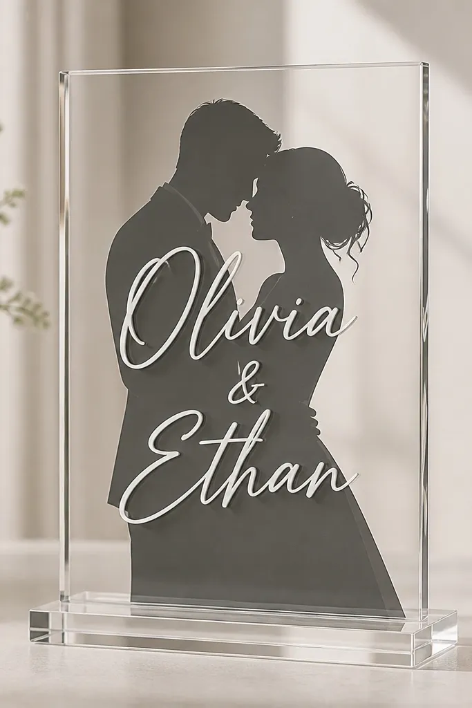
If you want the welcome sign to feel personal without using full color artwork, go monochrome. A dark grey silhouette backing behind clear acrylic gives you that "photo moment" look, but it stays classy because it's one color family. I put names in white on top so they're readable over the silhouette, and I keep the welcome line short so the background doesn't fight the text. This works especially well for couples who have a signature style - clean, modern, cinematic. It's also flattering on camera because the silhouette creates depth behind the acrylic.
Order clear acrylic and design a monochrome backing layer that fits inside the sign dimensions. Place the couple silhouette centered behind where the names will sit, and keep the silhouette slightly lighter around the edges so the white text doesn't disappear. Use white lettering for names and a thin uppercase for the welcome line. Mount on a clear stand and angle back 10-15 degrees, then test with your phone camera in portrait mode - you want the silhouette depth visible even with reflections.
Try thisUse a dark grey silhouette instead of pure black; pure black can look like a sticker blob behind clear acrylic.
Common mistakeAvoid detailed full-color photo backing; reflections turn it into visual clutter fast.
14. Gold and White Acrylic Split Layout with Vertical Divider
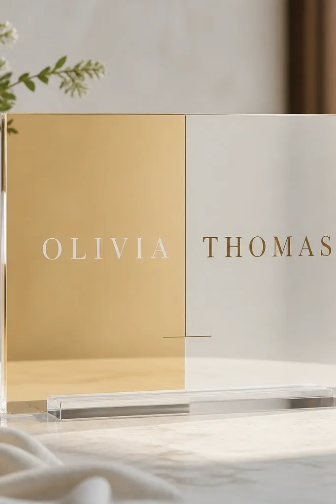
A split layout looks luxurious because it looks designed, not decorated. The gold/white contrast gives you depth while the vertical divider keeps everything structured. I like this when you want the sign to feel modern and symmetrical, especially if your wedding palette includes gold, champagne, or cream. It also flatters photos because the divider creates a clean line that frames the names. Keep the typography simple: short lines, consistent font weights, and no extra flourishes that would crowd the split.
Choose clear acrylic and plan a two-tone treatment: gold-toned backing on one side and white-toned backing on the other. Add a thin vertical divider in a matching gold line, centered to keep the layout balanced. Place the names across the center area so they bridge the divider, and keep the welcome line under the names with equal spacing. Mount on a stand and tilt back 10-20 degrees so reflections don't wash out the gold side.
Try thisIf you're using digital printing, ask for a matte gold finish so the gold side looks like stationery foil, not shiny plastic.
Common mistakeAvoid busy split colors like teal and hot pink; the split becomes loud and the sign looks like party decor.
15. Acrylic Welcome Sign with Floating Floral Sprigs in the Corners
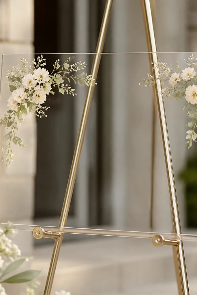
Corner floral sprigs are my favorite "soft detail" because they frame the main message without taking over the whole sign. On acrylic, the illusion of floating works best when the floral art is small and the text is clean and centered. I use muted floral colors like dusty rose, sage, and soft taupe, and I keep the main text in white so it stays readable. This look flatters almost every wedding style, because it reads like a border on a wedding invitation. It also helps if your welcome area is bare - the corners add interest without turning the sign into a full illustration.
Start with clear acrylic, 5-6mm, and design the main names in white script, then add a smaller uppercase welcome line below. Place floral sprigs in the top corners only, leaving the bottom clean so the stand doesn't block anything. Keep the floral elements thin-lined and small enough that they don't compete with the names. Set the sign on a clear stand with a slight backward tilt, then wipe the front thoroughly so the delicate corner art doesn't pick up dust and look smudged.
Try thisUse fewer floral colors than you think - two to three muted tones look more expensive than five bright ones.
Common mistakeAvoid full-bleed florals behind the text; reflections make them look muddy.