1. Ivory Cardstock With Single-Side Eucalyptus Line
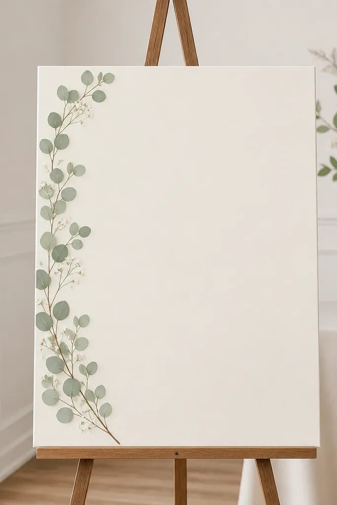
This setup works because the sign stays the hero and the greenery frames it like a border, not a pile. I use ivory cardstock (not bright white) so the black text looks warm instead of harsh, especially in daylight. The eucalyptus line gives you movement and texture without adding lots of different colors. It looks great on light skin tones in photos because the overall palette stays soft, and it photographs cleaner against white walls than colorful bouquets do. Keep the cluster narrow - about 2.5 to 3 inches wide - so the empty space stays intentional.
Start by printing or lettering your welcome text on ivory cardstock sized 8x12 inches or 11x14 for a stronger presence. Mount the card on a clear stand or foam board backing so it doesn't curl in humidity. Build the floral line with eucalyptus stems - trim them so the tallest leaves reach roughly the same height as the lower third of the text, not the top. Tape or wire the stems along the left edge only, then add 3-5 tiny white accents (like baby's breath or small spray blossoms) tucked between leaves. Finish by placing the easel so the sign is about 54-58 inches to the top edge and check readability from 8-10 feet away.
Try thisUse matte adhesive dots instead of hot glue if you're reusing the greenery - it peels off cleanly.
Common mistakeDon't let loose stems cross over the text, because it reads like clutter in close-up photos.
2. Matte Black Acrylic With Blush Rose Micro-Cluster
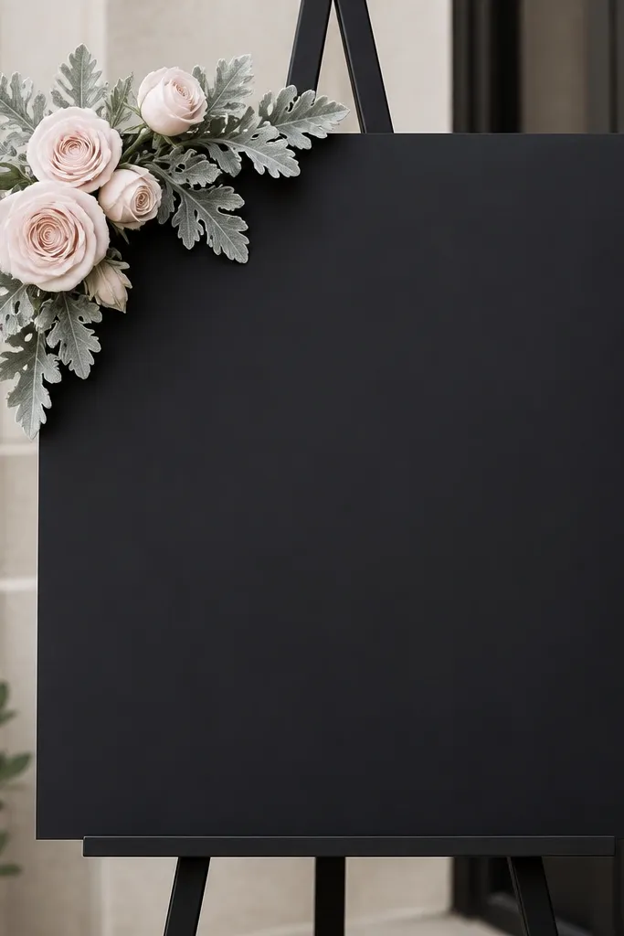
Matte black acrylic is the fastest way to get minimalist drama because it handles low light without glare. The blush rose micro-cluster adds softness without overwhelming the text, and the dusty miller gives you a gray-green texture that looks expensive in photos. This color combo flatters warm undertones in guests' skin because it's not icy; it reads romantic under evening lighting. I also like it for venues with dark backdrops like wood, brick, or greenery walls - the sign stays readable and the cluster looks intentional. Keep the roses small and grouped tight so it looks designed, not scattered.
Order or DIY matte black acrylic sized 8x12 or 12x18 inches, then use white vinyl lettering or paint-marker lettering for sharp edges. Place the floral cluster in the upper left corner, keeping the bottom half of the sign clear. Trim rose stems so the cluster height is about 4-5 inches and the width is about 3-4 inches. Add dusty miller for a soft base layer, then tuck one small rosebud behind the front rose for depth. Mount the acrylic on a sturdy stand and position it where people stand in front of it, not angled toward a bright window.
Try thisIf you're using real flowers, mist them lightly and replace any drooping petals the same day as the ceremony.
Common mistakeSkip glossy acrylic or shiny vinyl, because reflections make minimalist text look messy on camera.
3. Clear Glass Frame Look With White Floral Sprigs
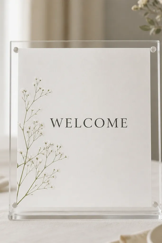
This look works when you want "modern" without heavy florals. The clear frame gives clean edges, and the white sprigs feel light and airy, which matches minimalist styling. I like it for beach weddings and modern lofts because the palette stays neutral and doesn't fight the venue. White-on-white can be risky, so the paper needs to be bright enough or the lettering needs a dark tone - I use either black ink or charcoal vinyl. The diagonal sprig placement guides the eye to the text without covering it.
Print your welcome wording on thick paper (at least 200gsm) and choose a font with clean strokes, like a modern serif or simple sans. Put the paper inside a clear acrylic or glass-style frame so the edges look finished. Add 2-3 thin white sprigs (delicate baby's breath sprays or miniature white wildflowers) and keep them narrow, about 1 inch total thickness. Tape the sprigs lightly to the back of the frame so they sit diagonally and don't sag. Place the frame on an acrylic base or easel and set it at 56-60 inches so guests see it without looking down.
Try thisUse a dark pen for signatures or add a small date line in charcoal so the sign reads in bright sun.
Common mistakeDon't add multiple thick flower bunches - the frame style looks best with thin, airy plant material.
4. Terracotta Stand With Cream Dahlias and Soft Green Leaves
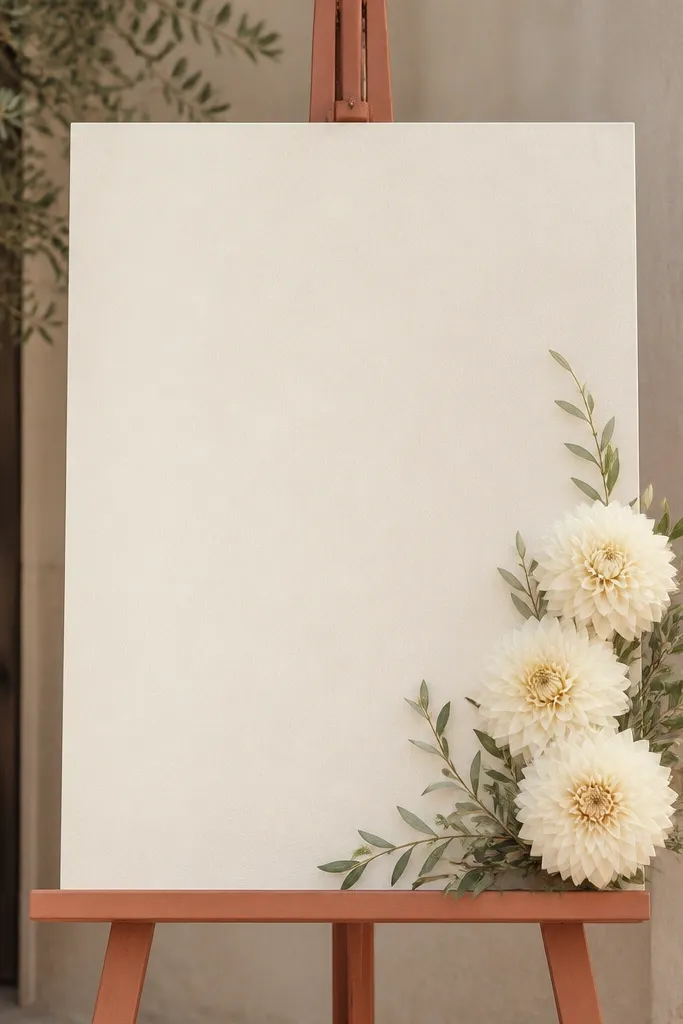
Terracotta makes minimalist signs feel warmer and more "real-life wedding" than all-white setups. Cream dahlias look plush without being loud, and the soft green leaves keep the palette grounded. I've used this in outdoor venues where the soil and natural tones already dominate the background, and the sign blends in while still standing out. This combo also looks great on warm undertones because terracotta warms the whole photo. Keep the dahlia cluster on one side so the sign stays clean and guests can read the names quickly.
Pick a terracotta easel or paint a wooden one matte terracotta, then mount an 8x12 or 11x14 cream sign on top. Use dark brown lettering for contrast, not pure black, so it feels softer. Create a cluster with 2 cream dahlias and 3-4 smaller leaf sprigs, placing it on the right edge about level with the center of the word WELCOME. Trim stems so the cluster reaches only from the upper third to just below the middle of the sign. Add one small filler leaf for texture and leave the rest empty. Set the stand so the sign faces the walkway straight-on, not angled.
Try thisIf you're using fresh dahlias, remove any leaves under the waterline so the greens don't discolor the sign area.
Common mistakeSkip bright coral accents - they clash with terracotta and make the sign look like a random bouquet.
5. Wood Slat Backdrop With Dusty Millers and White Text
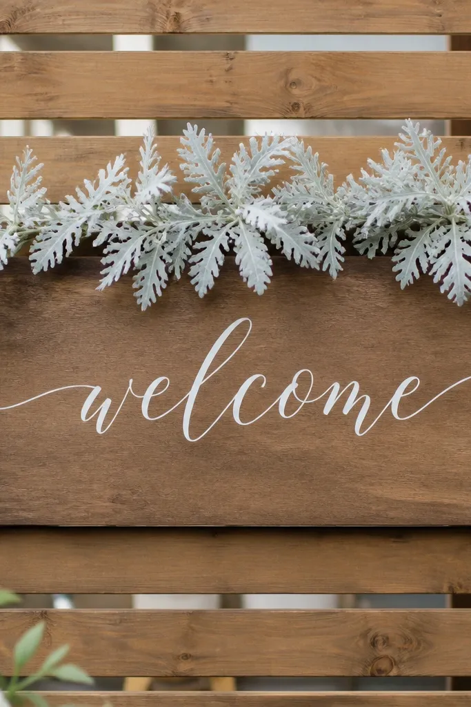
This is minimalist in the best way because the backdrop texture does half the work. Dusty miller gives you that soft, silvery look that reads elegant without needing multiple flower types. The wood slats anchor the sign so it doesn't float, and white lettering keeps it crisp against natural materials. I like this for garden weddings and outdoor receptions where the background already has plants or wood. It flatters all skin tones because the palette is neutral and doesn't pull attention away from people.
Build a wood slat panel (or buy one) that measures about 12 inches wide and 18-24 inches tall. Attach a sign card centered on the panel using small spacers so it doesn't touch the wood directly. Use white vinyl or paint-marker text for the word WELCOME and keep the couple names smaller. Add dusty miller along the top edge only, spreading it in a gentle arc so it frames the text but doesn't cover it. Leave a clear gap of at least 2 inches around the main lettering so the typography stays readable. Place the whole setup where it isn't backlit by strong sun; wood + white can wash out if the sun hits directly.
Try thisMist dusty miller lightly before styling if it's crisp - it looks more pliable and natural.
Common mistakeDon't pile miller down the sides in thick clumps, because it starts to look like a costume wreath.
6. Single Pampas Stem With Tiny Baby's Breath Tips
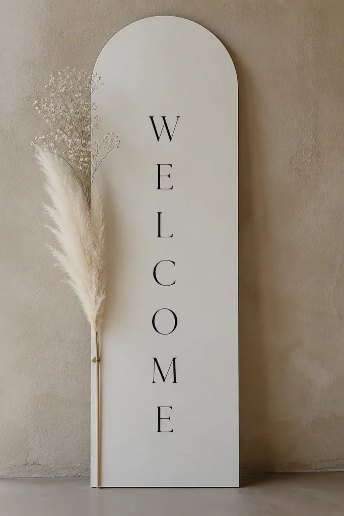
Pampas grass is naturally minimalist because it gives height without needing a bouquet. A single stem keeps the composition clean, and baby's breath tips add a subtle sparkle in photos. This look works especially well for ceremonies with neutral decor - beige, tan, cream, and light wood. It also photographs well because the plume creates a soft vertical line that makes people look taller and more centered in frame. The key is restraint: one stem, one cluster point, and no extra filler.
Choose a slim sign size like 8x16 inches so the vertical line has room. Use black lettering and keep the welcome text at the top third so the pampas plume doesn't cover it. Insert the pampas stem into a small floral foam block or a weighted holder attached behind the sign. Add baby's breath at the top of the plume - just 1-2 tiny bundles - and trim any loose strands so they don't wrap around the text. Position the sign so the plume leans slightly outward, about 10-15 degrees, for a natural curve. Stand it at 56 inches to the top edge and check that the plume doesn't block the names from guest height.
Try thisIf you're using dried pampas, give it a quick shake outside before styling so dust doesn't land on your sign.
Common mistakeSkip multiple pampas stems - two or three plumes make the look feel like a whole installation instead of a minimalist sign.
7. Greenery-Only Border With Boxwood and Micro Leaves
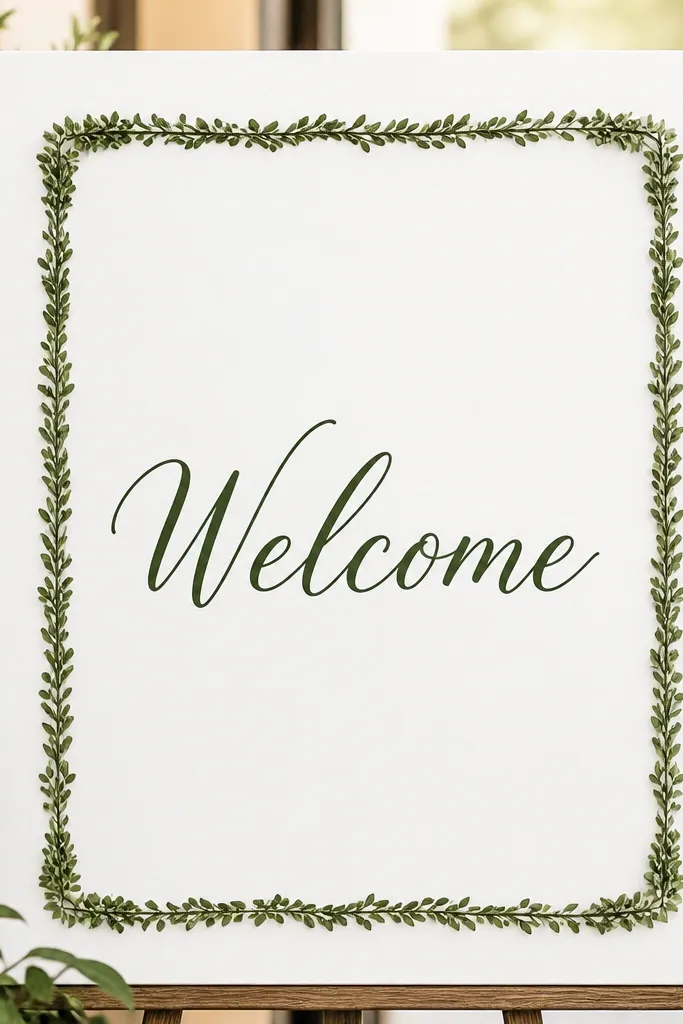
If you want minimalist that survives heat and humidity, greenery-only is the move. Boxwood-style leaves hold their shape and look tidy, which matters when guests take photos in direct sun. The thin border frames the sign without adding color clutter, and it reads clean even from a distance. I like dark green lettering because it looks cohesive with the greenery and doesn't feel like a separate sticker. This setup flatters people in photos because it keeps the palette consistent with most wedding outfits - no bright flower colors competing with dresses and suits.
Start with a white sign card (8x12 or 11x14) and use dark green lettering so it matches the greenery. Create a border using micro boxwood stems trimmed to fit the perimeter, leaving 1-2 inches of margin from the text. Attach stems with floral tape or small clear adhesive dots along the back. Keep the border thickness to about 0.75-1 inch so it looks like a frame, not a wreath. Add no flowers at all - just leaves - and place the sign on a stand that keeps it flat and straight. Set it in a spot with some airflow so fresh leaves don't wilt quickly.
Try thisUse floral tape wrapped around the back edges for a clean finish that doesn't show through the front.
Common mistakeDon't use long vine tendrils that droop - they make the border look uneven and cheap.
8. Cream Linen Runner Base With Small Wildflower Corners
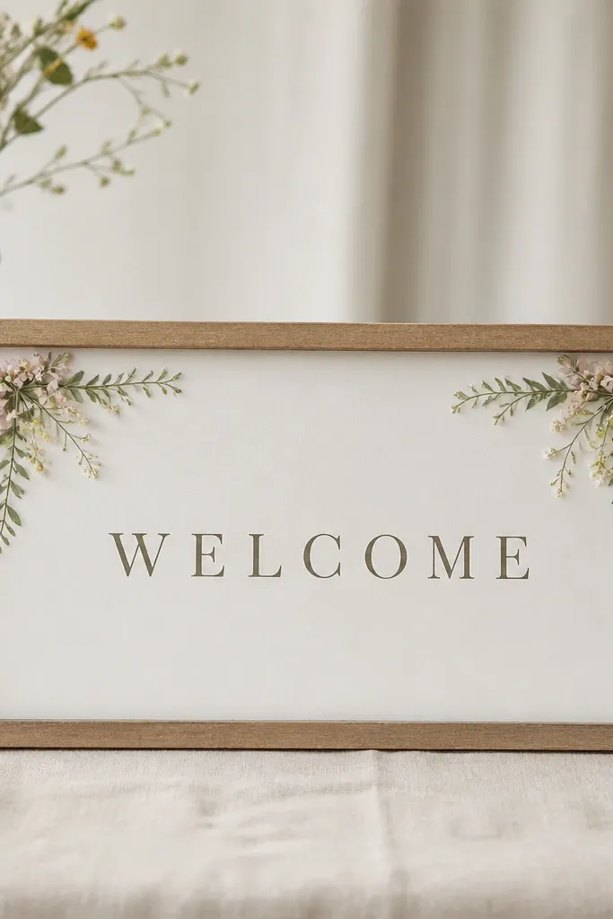
This one is minimalist but still feels handmade because the linen adds texture. The sign sits on a soft base instead of standing alone, which makes the whole entrance feel styled rather than assembled. Wildflower corners work because you're using small amounts of color in two places, so the center stays clean for text. I've used this setup for ceremonies where the entrance is a cocktail table area, and it photographed well because the linen catches light softly. It also looks good next to neutral outfits since the colors are muted and not saturated.
Pick a linen runner in cream or oatmeal and spread it flat on your welcome table. Place a sign on foam board or a small stand, sized so it sits about 10-12 inches above the runner surface. Add wildflower sprigs only in the top left and top right corners, keeping each cluster under 2 inches wide. Use muted blooms like pale yellow daisies, soft pink mini roses, and a bit of light green filler. Pin or tape the stems under the sign's backing so they don't shift. Adjust the sign position until the text sits centered above the runner folds.
Try thisPress the linen with a steamer first; wrinkled linen can make the whole scene look messy even with minimalist flowers.
Common mistakeSkip colorful, high-saturation blooms - they fight the linen and turn the corners into a rainbow.
9. Arch-Top Sign With Single Rose Under a Thin Frame
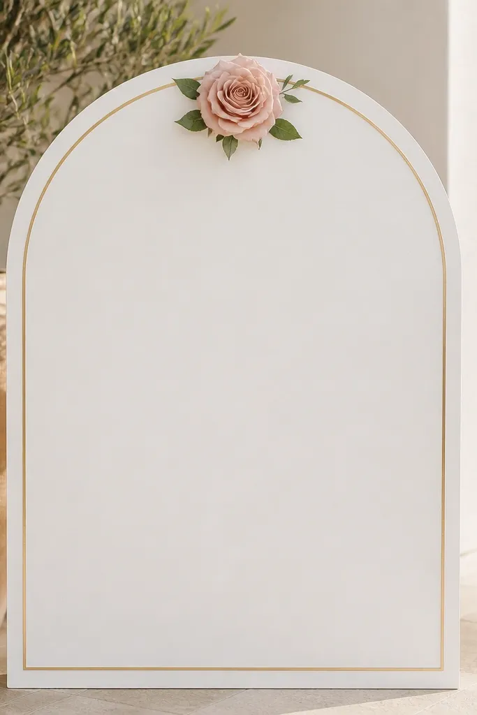
An arch-top sign already has a built-in focal shape, so you only need one flower to make it feel intentional. The single rose under the arch looks like a small crown, and it keeps the minimalist rule - empty space stays clean. Gold outline adds a modern touch without turning into a heavy frame, and it pairs well with warm venues and indoor lighting. This works especially well for couples who want romantic but not "full bouquet." In photos, the rose becomes the sharpest point, which helps the text stay readable and not compete for attention.
Choose an arch-top sign shape about 10-12 inches wide and 16-18 inches tall. Use black lettering with the word WELCOME in a bold size at the center line, then put names and date lower. Add a thin gold border or use a gold vinyl outline if you're making it yourself. Place one blush rose at the center just below the arch curve, with the stem hidden behind the sign. Add 2-3 small eucalyptus leaves behind the rose for a subtle green halo, keeping them under 2 inches around the rose. Secure the rose with a small floral pin holder or foam dot so it doesn't wobble.
Try thisUse a rose with a firm head, not a fully open one - it holds its shape better on a stand.
Common mistakeDon't add extra buds around the rose - the arch frame already does the styling.
10. White Sign With Greenery Ribbon Bow and No Flowers
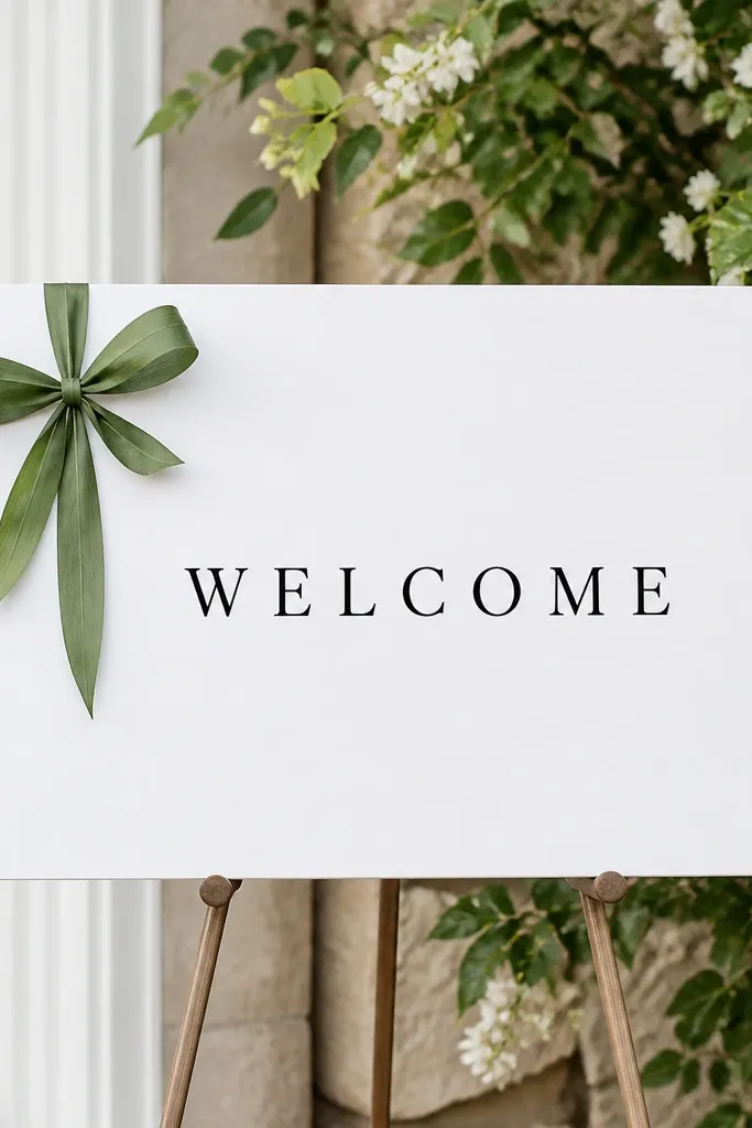
This is minimalist with a twist because the "flower" element is actually texture. A greenery ribbon bow gives a structured shape that looks neat even in wind, and it doesn't wilt like loose petals. I've used this at garden weddings where people want green but not a full bouquet look. The white sign keeps everything crisp, and the bow placement on the left creates a balanced frame without covering the center. It also photographs well because you get a clear silhouette - bows read instantly at distance.
Start with a white sign card and black lettering in a clean font. Create the greenery bow using flat leafy ribbon or wired greenery strips you can bend into loops. Place the bow on the left side about halfway down the sign, with tails that reach roughly to the middle line of the text. Secure it with floral wire behind the sign so the bow sits flat. Add one small leaf accent near the bow knot but keep it minimal. Stand the sign on an easel and check that the bow doesn't cast a heavy shadow across the text in your photo spot.
Try thisUse wired greenery so the loops hold their shape for the whole ceremony day.
Common mistakeSkip fuzzy, unstructured ribbons - they look messy and lose the bow silhouette.
11. Mocha Paper With Cream Peonies and One Leafy Accent
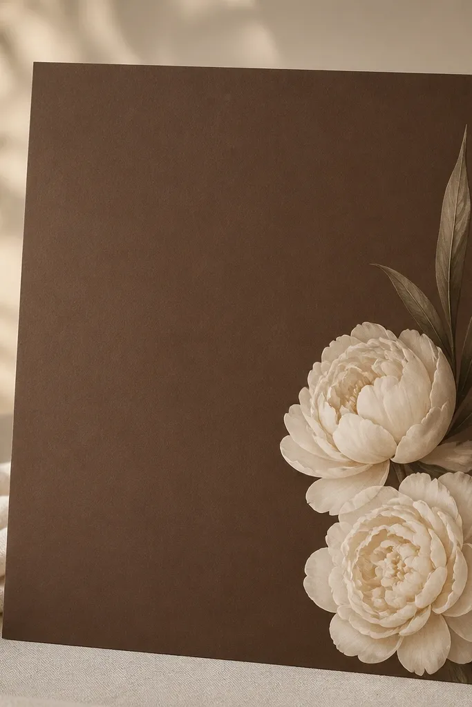
Mocha paper makes minimalist signs feel upscale because it adds depth without needing lots of decoration. Cream peonies look soft and full, but you only use them as a pair so the sign stays airy. One long leaf gives you direction and keeps the cluster from looking like two separate flowers. This palette flatters people with medium to deep skin tones because the warm paper tones show well and don't wash out faces. It also works for fall weddings and venues with warm wood or neutral walls.
Use thick mocha cardstock and print or letter your welcome text in cream or lighter brown so it contrasts. Place the peony pair on the right side, with the blooms sitting around the upper third and middle line. Add one long leafy accent behind or beside the peonies and trim it so it doesn't cross the text. Keep the cluster width to about 3-4 inches total. Mount the sign on a stand for clean sightlines and keep the center empty. Position at 56-58 inches to the top edge and take a quick photo from where guests will stand.
Try thisIf you're using real peonies, remove outer petals that look bruised - minimalist signs show everything.
Common mistakeDon't choose a paper that's too dark - black text on deep brown disappears in daylight.
12. Monochrome White Floral Foam-Free Spray Cluster
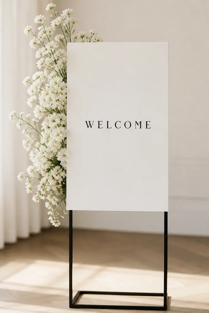
This look is minimalist because it uses sprays, not bouquets. Foam-free clusters look cleaner because there's no bulky base showing under the sign. Monochrome white keeps the entrance calm and lets your typography stay the focal point. I like this for venues with patterned tile or colorful walls because the flowers don't add extra competing colors. It also works for both men and women fashion photos because the palette doesn't clash with outfits - it stays neutral and soft.
Choose a slim sign size like 8x14 inches so the floral cluster doesn't overwhelm the frame. Attach the sign to a backing board with a small hidden holder behind it so you can insert stems without foam. Use 2-3 white spray stems (mini calla, sweet pea sprays, or small white garden sprays) and trim them so the cluster sits just left of center or slightly to the right. Secure stems with floral wire behind the sign and cover any visible wire with a thin layer of green leaves. Keep the cluster height around 5-6 inches and maintain a clear 2-inch gap around the text. Place the sign at guest eye level and check for shadows across the letters.
Try thisWrap wire ends with tape before inserting stems so nothing scratches the sign surface.
Common mistakeSkip thick, round bouquet heads - they show foam and read crowded fast.
13. Rosemary Sprigs With Tiny White Wax Seals Look
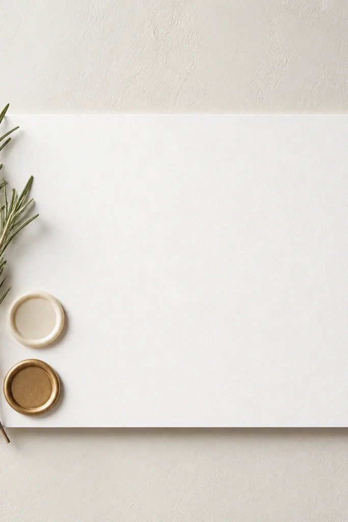
This idea feels modern because rosemary is structured, not fluffy. The tiny wax-seal look gives a graphic element that reads crisp in photos, and it balances the organic herb texture. I like it when the wedding vibe is simple, maybe a courthouse ceremony or a backyard setup where you don't want big floral budgets. The rosemary's green also adds life without turning the sign into a bouquet. The graphic accents keep it from looking like a kitchen herb moment - it looks intentional.
Start with a white sign card and black lettering, keeping the WELCOME text large and centered. Tie or wire 3 rosemary sprigs along the left edge so they form a gentle vertical line, not a thick bundle. Add two small circular white accents near the sprigs - you can use matte white sticker seals or small faux wax seal stickers - and place them about 2-3 inches apart. Make sure the circles don't touch the letters. Mount the sign on a thin stand and keep the rosemary cluster about 2 inches wide so the center stays clear. Position the sign so the rosemary doesn't cast a dark shadow across the main text.
Try thisUse rosemary that's freshly trimmed - older sprigs look dull and limp next to crisp typography.
Common mistakeDon't add extra herbs or more than two seal accents, because the graphic look turns into clutter.
14. Two-Tone Sign With Sage Green Text and Pink Peony Buds
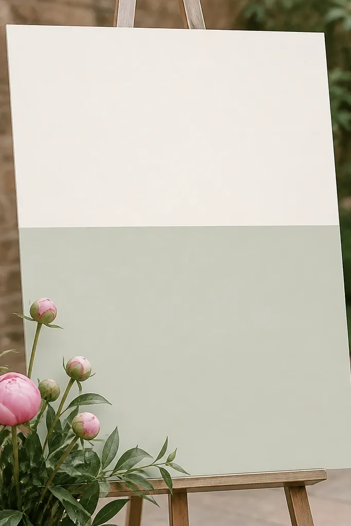
Two-tone signs look modern because the color blocks guide the eye. Sage green text feels soft and contemporary, and it matches the minimalist floral palette without needing lots of extra greenery. The small pink peony buds add a hint of romance at the bottom corner, which keeps the top clear for the welcome line. This is a great pick for couples who want a clean look but still want flowers to feel present. It also helps readability because the text color is chosen to match the background block, not forced to contrast with the whole sign.
Create a sign with a top off-white section and a bottom pale sage section, sized 11x14 for legibility. Print the word WELCOME in sage green on the off-white top, and keep names/date in a neutral darker tone on the sage bottom. Place 3-4 small pink peony buds along the lower left edge only, with the buds' height staying below the main names line. Add one thin green leaf accent behind the buds so the cluster looks layered. Secure buds with floral wire or a hidden adhesive dot at the back. Set the sign on an easel and keep the entire right side empty so the color block stays clean in photos.
Try thisIf you're printing, test a small sample first - sage can look too gray if your printer settings are off.
Common mistakeSkip multi-color typography; it breaks the modern two-tone effect.
15. Black Ink Calligraphy With Blush Baby's Breath Halo
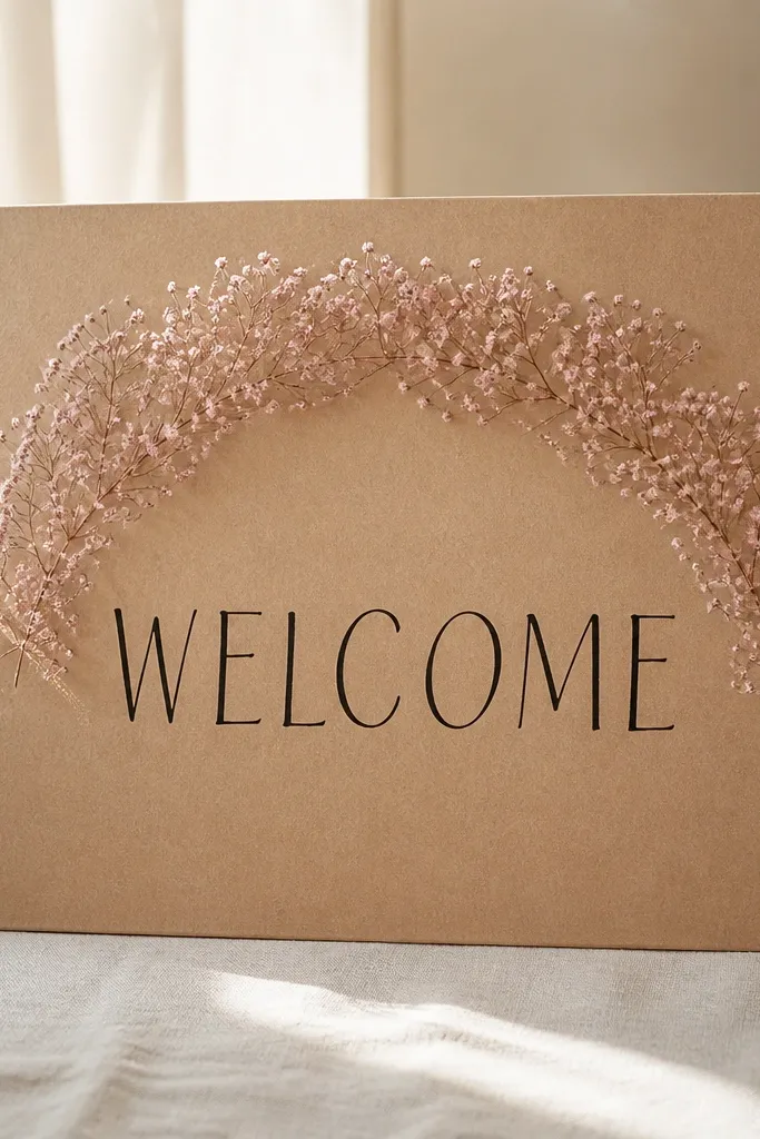
Kraft paper plus black ink is the easiest way I've found to make minimalist florals look intentional. The blush baby's breath halo frames the welcome text like a gentle spotlight, and it doesn't add color chaos because the blooms are all in the same family. This setup looks especially good for weddings with rustic-modern decor, because kraft paper matches wood, linen, and neutral seating. In photos, the halo helps the eye find the text quickly, even at a distance. It also flatters warm undertones because kraft paper is earthy and not icy.
Use kraft cardstock sized 8x12 or 11x14 and write WELCOME in black ink calligraphy or a calligraphy-style vinyl. Build a blush baby's breath halo by wiring 1-2 thin baby's breath sprays into a semicircle behind the text area. Keep the halo radius about 2.5-3 inches wide and don't cover more than the top third of the sign. Secure the wired halo at the back with tape so it holds shape. Add no extra greenery - let the baby's breath fill the space. Place the sign on an easel and check readability from 8 feet, because kraft + blush can soften contrast.
Try thisChoose baby's breath with small blossoms - big clumps look like filler, not a halo.
Common mistakeDon't go heavy on the halo thickness; a thick loop hides the calligraphy and looks cheap.