1. Frosted Acrylic on White Foam Board
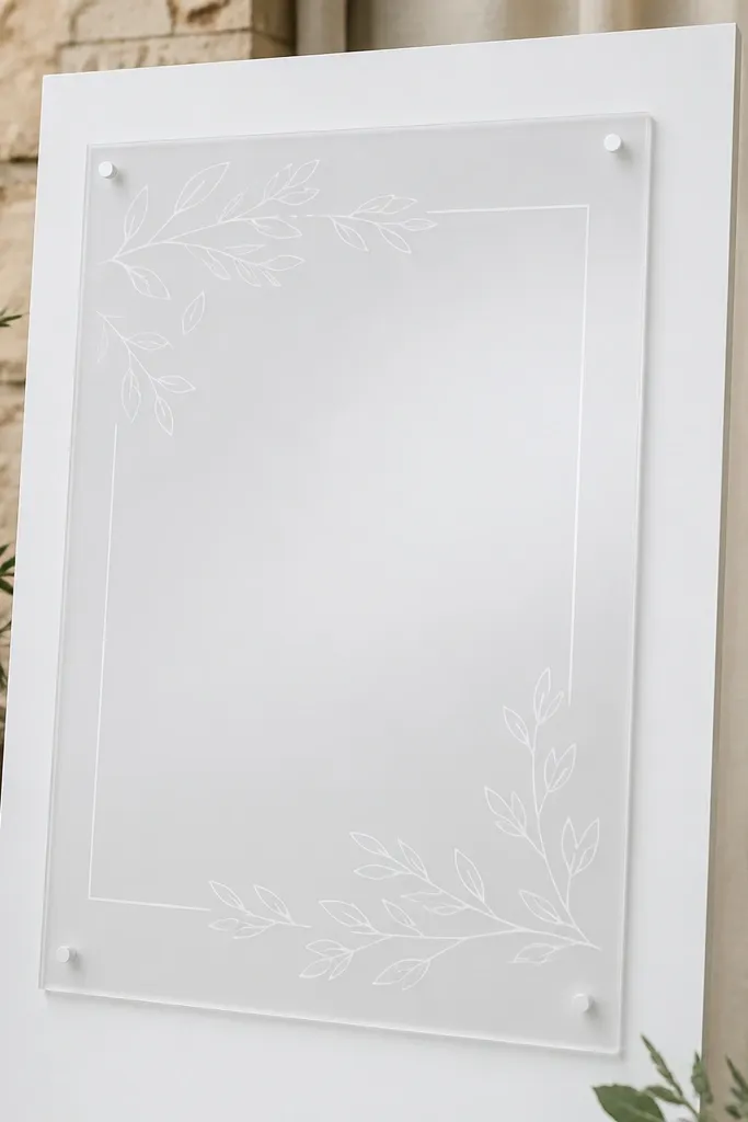
This is the first setup I recommend when people say they want "clean but not shiny." The frosted acrylic diffuses light so your letters stay readable even when the entry area is bright. I've used this with white foam board because it gives the vinyl a crisp edge without making the whole sign look like a sticker. It flatters warm skin tones in photos because the sign doesn't blast highlights onto faces. It also fits almost every dress code, from casual backyard to hotel ballroom, because the finish is gentle.
Start by centering your foam board so it's wider than the acrylic by at least 2 inches on each side. Place the frosted acrylic on top using a clear acrylic stand or two small standoffs so the sign doesn't touch the board. Next, check height: the top edge should land about head level for guests, around 5 feet from the floor at the tallest point. Finally, keep the background plain - no busy patterned tablecloth - so the frosted finish doesn't compete with reflections.
Try thisIf your venue has overhead lights, take one test photo from 6 feet away before you set flowers. If the letters look hazy, your vinyl might be too light or your backing might be too gray.
Common mistakeAvoid putting frosted acrylic on a dark, glossy backing - it makes the sign look dim and cheap.
2. Clear Gloss Acrylic with Light Wood Backing
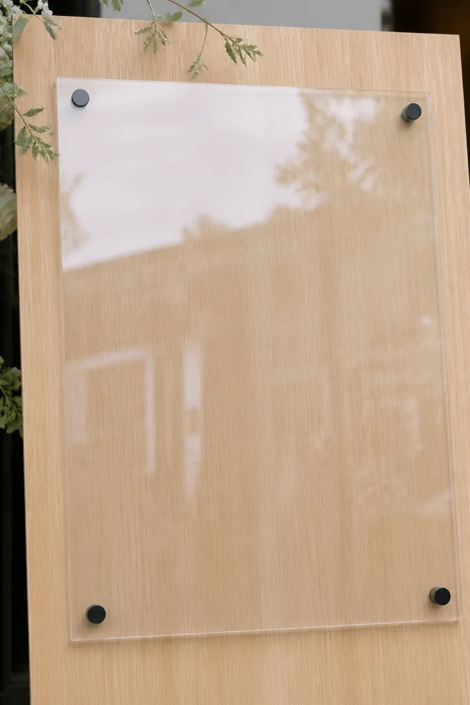
Clear gloss acrylic looks like "storefront polished" when you pair it with light wood. The wood gives warmth and the clear acrylic adds depth, so the letters seem to float above the background. I've seen this combo work best for modern farms and beachy ceremonies because it blends clean lines with natural texture. It also photographs well because the highlights stay controlled when the backing is not reflective. If you're wearing champagne bridesmaid dresses or guests have warm-toned outfits, the wood makes everyone look better next to the sign.
Start with a backing board that's at least 1 inch thicker than you think you need, so it doesn't warp. Use a pale oak or unfinished birch tone - the goal is light, not honey-orange. Lay the acrylic on top with standoffs, not tape, so you keep a consistent air gap. Set the sign on a console or easel and angle it slightly toward the camera - about 10 to 15 degrees - so glare doesn't land straight on the lens.
Try thisUse a dark letter color like charcoal or deep espresso vinyl on clear gloss. It keeps the text readable when the acrylic catches light.
Common mistakeSkip glossy black backings under clear acrylic - you'll get mirror-like glare where the camera wants detail.
3. Pearl White Acrylic for Winter Entries
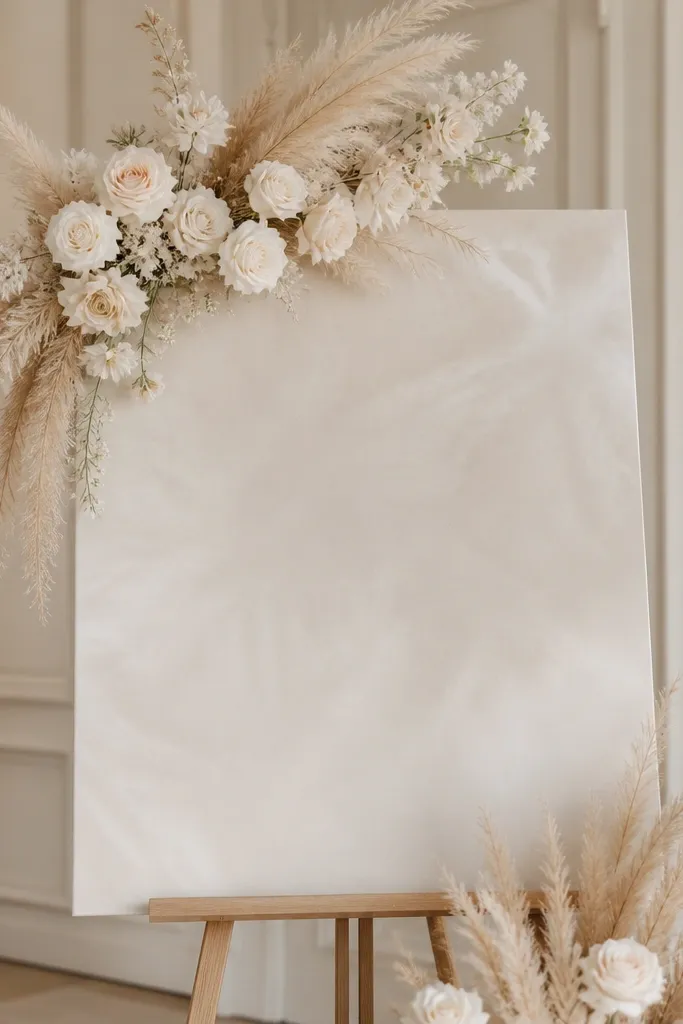
Pearl white acrylic is the "winter version" of frosted. It's not as diffused as frosted clear, and it doesn't go icy like some white plastics. The milky finish makes your typography look softly embossed, which is why it flatters both cool and warm palettes. I've used it with navy, silver, and dusty rose accents and it never looks out of place. If your venue is dim, this finish helps the sign stay visible without needing harsh lighting.
Pick a pearl white acrylic panel and keep the lettering either white-on-pearl or a slightly darker cream for readability. For backing, use blush or light gray cardstock if you want it to look romantic, or leave it on a white board for a clean "snow resort" feel. Mount it on a stand that keeps the bottom edge at least 2 inches above the table so it doesn't look like a placemat. Then add one height cue: place a short greenery bundle or a single candle holder on the side, not behind the sign.
Try thisIf you're using faux snow or glitter decor nearby, keep the sign finish pearl-white. It won't fight sparkle the way clear gloss does.
Common mistakeDon't pair pearl white acrylic with bright neon vinyl - it looks like a craft project.
4. Blush Gradient Acrylic with Warm Backdrop
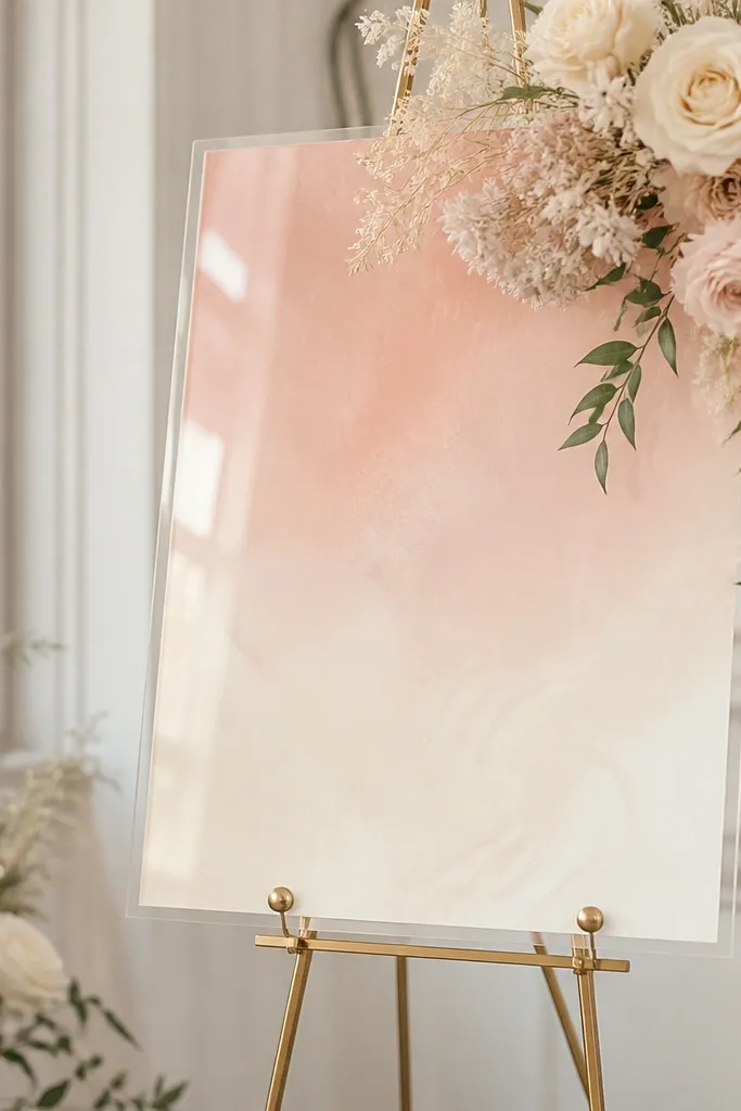
Blush gradient acrylic makes your welcome sign look like it belongs in a photo set, not just on a table. The gradient gives depth without needing extra graphics, and it makes the lettering pop even when guests walk past quickly. I like it for rose, blush, and champagne weddings because it echoes those tones in a way that feels intentional. It also flatters people with medium to deep skin tones because the pink stays warm, not dusty. When you want a "before and after" upgrade without changing the whole theme, this is the material that does it.
Choose a gradient acrylic panel where the lightest area sits behind the first line of text. Set it on a warm backing like champagne satin board or a light tan fabric stretched flat. Keep the sign centered and use a stand so the gradient isn't blocked by table shadows. For styling, keep florals minimal - one line of small roses or baby's breath on each side at the same height as the sign's midline.
Try thisUse deep rose or espresso vinyl letters on blush gradients so the text stays readable in daylight.
Common mistakeAvoid busy patterned backdrops behind gradient acrylic - the gradient gets muddy in photos.
5. Mirror Silver with Black Linen Backing
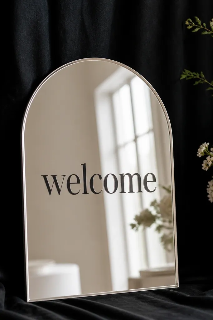
Mirror silver looks expensive when you give it a disciplined background. Black linen is the trick I learned the hard way after seeing mirror signs turn into a reflective mess at a venue with shiny floors. With black fabric behind it, the mirror still shines but the reflections don't wash out the text. It reads fast because the contrast is high. I've used this for modern black-and-green weddings and it also works for classic weddings when you want a "wow" without adding too much decor. The sign makes guests look sharper in photos because the contrast cleans up the background.
Start by cutting black linen so it's larger than the sign by about 3 inches on each side. Stretch it flat over a stiff backing board so it doesn't wrinkle - wrinkles show up as dark waves in the mirror. Mount the mirror sign directly on top using adhesive dots or a frame so the mirror sits flat. Then place the setup slightly angled to the camera - 5 to 10 degrees - so glare hits the letters instead of the lens.
Try thisDo a quick phone test at noon if possible. If your letters disappear in direct light, angle the sign or add a small matte frame around it.
Common mistakeSkip glossy black acrylic backing under mirror - it multiplies reflections and the sign looks messy.
6. Mirror Champagne for Candlelit Rooms
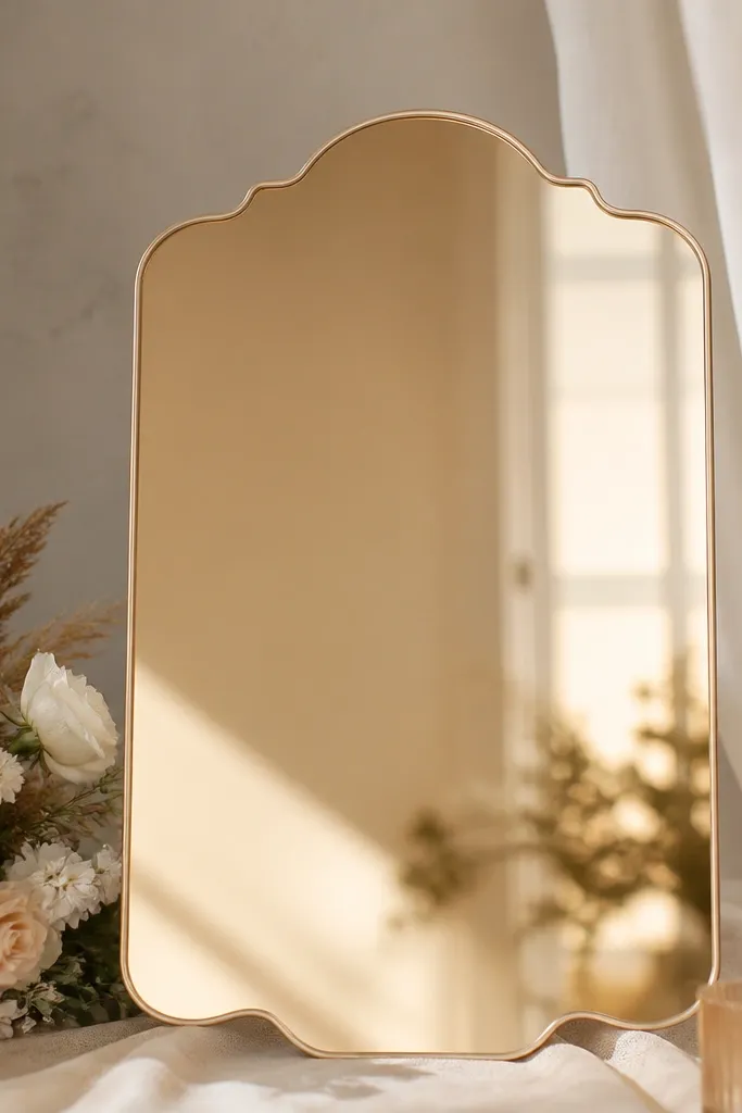
Champagne mirror is softer than silver. It gives you that reflective "metallic" look without the harsh winter-white glare that silver can throw. I used this in a ballroom where the lighting was warm and the entrance had lots of gold accents, and the sign matched the room perfectly. The reflective surface also flatters guests because it bounces warm tones back into the scene. If your palette is champagne, ivory, or gold-green, this is the mirror finish that won't look out of place. It's especially good for evening receptions and photos near candles.
Choose a champagne mirror sign and place it on a neutral backing like ivory felt or warm gray board. Keep the backing matte so the mirror doesn't fight another shine source. Mount with a thin frame or stand so the mirror edge stays visible - the frame is what makes it look intentional. Position it about 4 to 5 feet from the main photo spot so guests face the sign without leaning.
Try thisUse black or deep brown vinyl letters, not white. Champagne mirror makes white letters look washed in some lighting.
Common mistakeDon't pair champagne mirror with cool-toned silver decor nearby - it looks like two weddings collided.
7. Mirror Black Frame for Moody Green Gardens
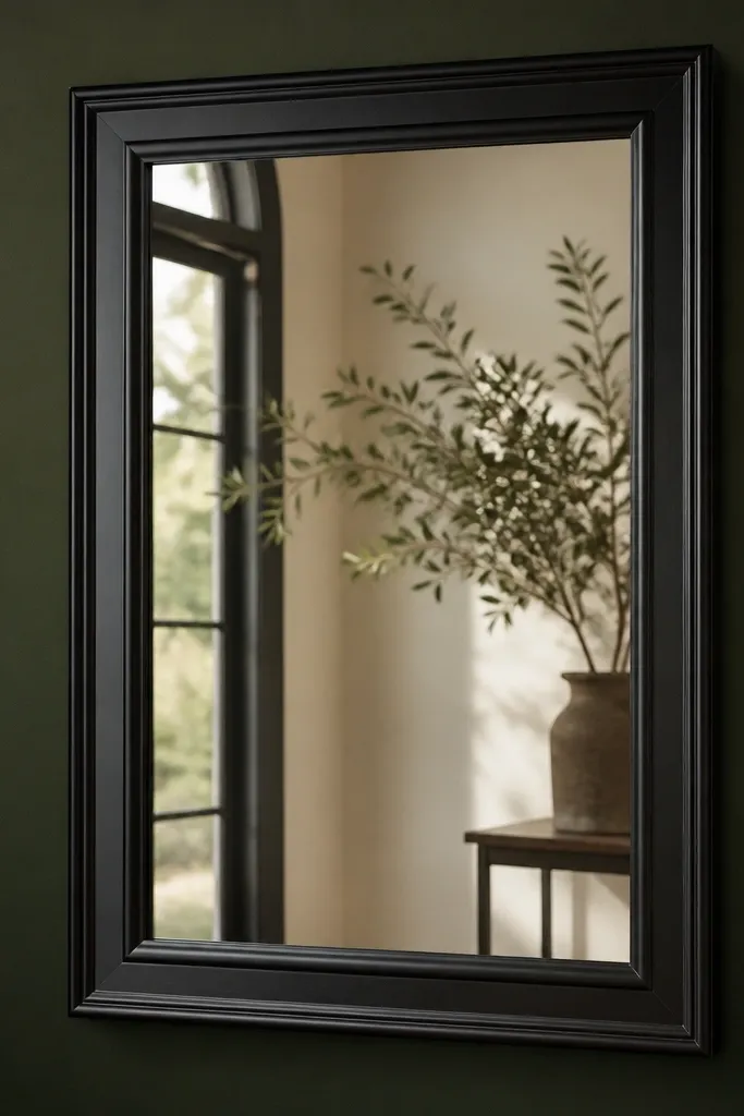
A mirror sign with a black frame gives you structure. The frame acts like a border for the reflection, so the sign reads as one clean object instead of a reflective panel stuck to a board. I've used this for deep green, forest theme weddings because the black frame makes leaves and candlelight look dramatic. It also keeps the text readable in a way that plain mirror panels sometimes don't. If you want a before and after wedding welcome sign transformation that looks "designed," this is the move. It's bold, but it still feels classy because the frame shapes the whole piece.
Pick a mirror panel with a black border or add a matte black picture frame around the sign. Back it with deep green felt or charcoal fabric so the reflection has a dark base. Mount it on a sturdy stand that doesn't wobble - a wobbly stand makes mirror glare shift in photos. Place the sign near greenery but keep the immediate background uncluttered behind the letters.
Try thisMatch the frame finish to your tableware or signage color. If your welcome table uses matte black, keep the frame matte too.
Common mistakeAvoid chrome frames with mirror - the chrome turns the whole sign into a distraction.
8. Acrylic with Wood Backing for Rustic-Modern Entries
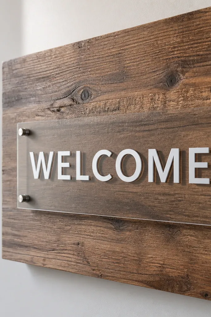
This is the "easy upgrade" option because wood backing already looks styled. When you put acrylic on wood, the sign looks grounded, not floating on a random tablecloth. I've seen this combo work at venues with wooden doors, barn beams, and even modern farmhouses because the wood grain ties the scene together. It also helps guests' eyes because wood texture gives a natural frame behind the lettering. Acrylic keeps the typography clean, so it doesn't turn into a rustic craft sign. It's the best choice when you want warm visuals without adding extra props.
Choose light or medium wood depending on your palette. For blush and champagne, use light wood; for terracotta and caramel, use medium wood. Mount the acrylic so there's a small gap between acrylic and wood, even if it's just a thin spacer - that keeps shadows from looking messy. Keep the lettering a dark color like espresso or charcoal, and place the sign on a stand or easel so it faces guests at eye level. Add one matching element - a dried eucalyptus sprig or a small wood tray - on the side of the sign.
Try thisIf your wood is very busy, switch to frosted acrylic so the background texture doesn't compete with highlights.
Common mistakeDon't cover the wood with patterned paper under the acrylic. You lose the reason the wood looked good.
9. Clear Acrylic with White Vinyl for Beach Weddings
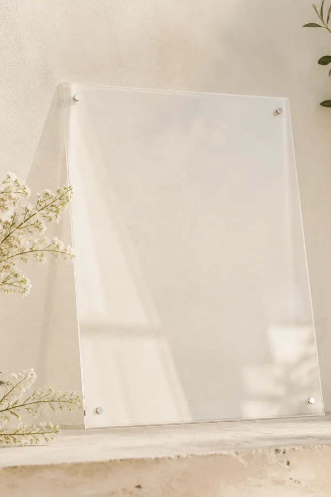
White vinyl on clear acrylic is a beach classic for a reason: it looks bright without needing extra color. The clear panel lets the background influence the tone, so it looks airy in coastal weddings. I used this setup with a pale taupe board and it photographed clean even when the wind blew table decor around it. The sign stays readable because white letters are high contrast, even in bright daylight. It also flatters guests because it doesn't cast a colored glow like some colored acrylics can. If you want a quick before and after wedding welcome sign transformation and keep your palette simple, this is the cleanest route.
Use a clear acrylic panel and apply crisp white vinyl lettering - not off-white, so the text stays legible in glare. Back it with a pale neutral board like sand, light beige, or warm white. Mount on a stand that keeps the sign stable and slightly forward of the welcome table so guests see it without leaning. For styling, keep the immediate area around the sign uncluttered and add shells or greenery only on the sides, not behind the text.
Try thisChoose a background that's matte. If the backing is glossy, the clear acrylic picks up glare and the white vinyl looks washed.
Common mistakeSkip dark backing under white vinyl - it makes the sign look like a sticker over a board.
10. Matte Acrylic for Tents and Overhead Lights
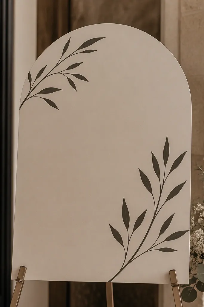
Matte acrylic is the fix for the "tent problem" - overhead lights bounce and turn glossy signs into a glare mirror. I've set up welcome areas under white tent canopies where every shiny surface became a headache for photos. Matte acrylic avoids that because it reduces reflections and keeps your letters steady. It also reads well from different angles, which matters when guests approach from the side. If your wedding has mixed lighting - string lights plus ceiling fixtures - matte is the most forgiving choice. It looks modern, not craft, because the surface finish stays even.
Pick a matte acrylic panel and use high-contrast lettering like black or deep navy vinyl. Back it with a solid matte surface - white foam board or light gray board - so the sign doesn't pick up background shine. Place the sign at the end of the welcome table, not dead center, so guests don't block it with their bodies. Keep the sign height consistent: the text baseline should be around chest level for most adults. If you use a stand, tighten any screws and check wobble by gently pushing the sign.
Try thisIf you're stuck with glossy decor near the sign, move the welcome sign 2 to 3 feet away. Matte acrylic still reads, but it's less affected by reflections.
Common mistakeAvoid clear gloss acrylic in tents unless you plan to test in the exact lighting.
11. Mirror Silver with Frosted Acrylic Insert Look
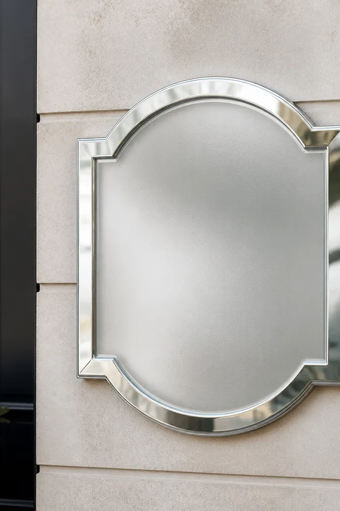
This mixed look gives you the best of both worlds. The mirror border gives that sharp metallic edge, while the diffused lettering area keeps it readable when the room is bright. I like this for venues with lots of windows because the mirror catches light, but the frosted center keeps the text from getting lost. It also makes the sign feel layered without adding extra graphics. If you're trying to match a bridal party's metallic accessories and keep a softer overall vibe, this works. It's a "designed" look that still feels clean and modern.
Choose a mirror sign that has a frosted or diffused lettering area, not a full mirror panel. Back it with a solid color - I've had good results with charcoal felt and deep navy board. Mount it on a stand with a straight-on viewing angle, then rotate it slightly until the glare sits on the border, not across the letters. Keep the rest of your welcome setup simple: one floral cluster per side and no shiny ribbons right behind the sign.
Try thisUse a matte table runner behind the sign. Even a small glossy runner can create glare across the diffused center.
Common mistakeDon't place this sign directly under a spotlight. It turns the border into a bright ring.
12. Acrylic with Navy Backing for Classic Contrast
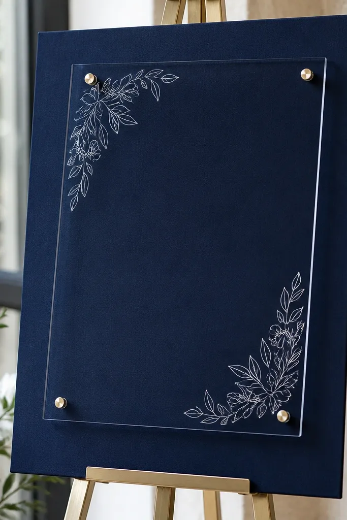
Navy backing makes acrylic look like it belongs in a formal invitation suite. The dark base gives your lettering a clean, editorial feel, and it also helps the sign look intentional even without a frame. I've used this with gold accents and it reads like classic Americana - the sign feels dressed up, not decorative. It also works for guests because navy tones don't wash out people's skin the way bright white backdrops can in strong lighting. If your palette is navy, ivory, blush, or sage, acrylic on navy is a dependable win.
Start with a navy backing board covered in matte fabric - avoid shiny satin. Place your acrylic sign on top with standoffs so you keep a small shadow line. Use gold or cream vinyl lettering for a formal look, or white vinyl if your gold is too warm. Put the sign on an easel or console so it's not sitting flush with a tablecloth that might ripple. Finally, check readability under venue lighting: if the letters look too light, switch to a slightly darker vinyl color.
Try thisIf you're using gold lettering, choose a slightly darker navy than you think. Bright navy makes gold look flat in photos.
Common mistakeAvoid textured backing with heavy weave - it can show through and make letters look uneven.
13. Clear Acrylic with Black Vinyl for Modern Minimal
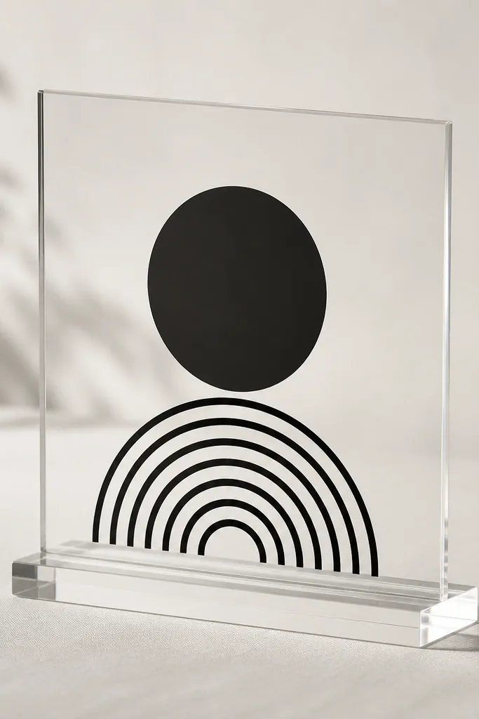
Clear acrylic with black vinyl is the most "clean designer" look I've achieved with the simplest materials. It's sharp, legible, and it doesn't depend on lots of color. I've used it for city weddings where the welcome area is already styled with neutral florals and architectural details. The clear panel adds depth, and the black letters anchor the scene. In photos, this setup stays readable because black doesn't fade when the background is bright. It's also forgiving if your wedding palette includes multiple colors because the sign stays neutral.
Use a clear acrylic panel and apply matte black vinyl so reflections don't turn the letters glossy. Back it with white or light gray board for maximum contrast. Keep the sign centered and make sure the stand is sturdy - a wobbly clear acrylic sign looks cheap fast. Place it at the same distance from the photo spot every time - about 4 to 5 feet - so guests don't block it. Style with one side element only, like a single tall candle or a slim vase.
Try thisUse matte black vinyl, not glossy. Glossy vinyl catches light and can look like office labels.
Common mistakeDon't use thin, flimsy acrylic stands. The sign should feel solid, not like it's floating.
14. Mirror Silver with Textured White Backing
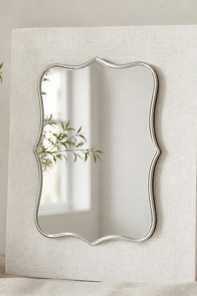
If you love mirror but worry about glare, textured white backing is the compromise. It gives the mirror surface something to reflect that isn't a busy pattern or glossy surface. I've used this in bright indoor venues where the floor is light and reflective, and it keeps the sign from washing out. The mirror still looks luxe, but the text stays readable because the background texture breaks up reflections. This setup is great for ivory, pearl, and soft neutral palettes. It also flatters guests because the sign reflects a gentle, light tone rather than harsh white glare.
Pick a textured backing like white linen, boucle, or plaster-look board. Make sure it's matte and flat - wrinkles and bubbles show up in mirror reflections. Mount the mirror sign with a frame or stand that keeps it straight, not tilted. Place it so the main light source hits at an angle, not directly into the camera. Then do a test photo from the spot where people naturally line up for pictures.
Try thisUse a slightly darker vinyl color than you think, like charcoal, so letters stay crisp against bright reflections.
Common mistakeAvoid smooth glossy white backing. It creates glare bands across the mirror.
15. Acrylic with Sage Backing for Garden Weddings
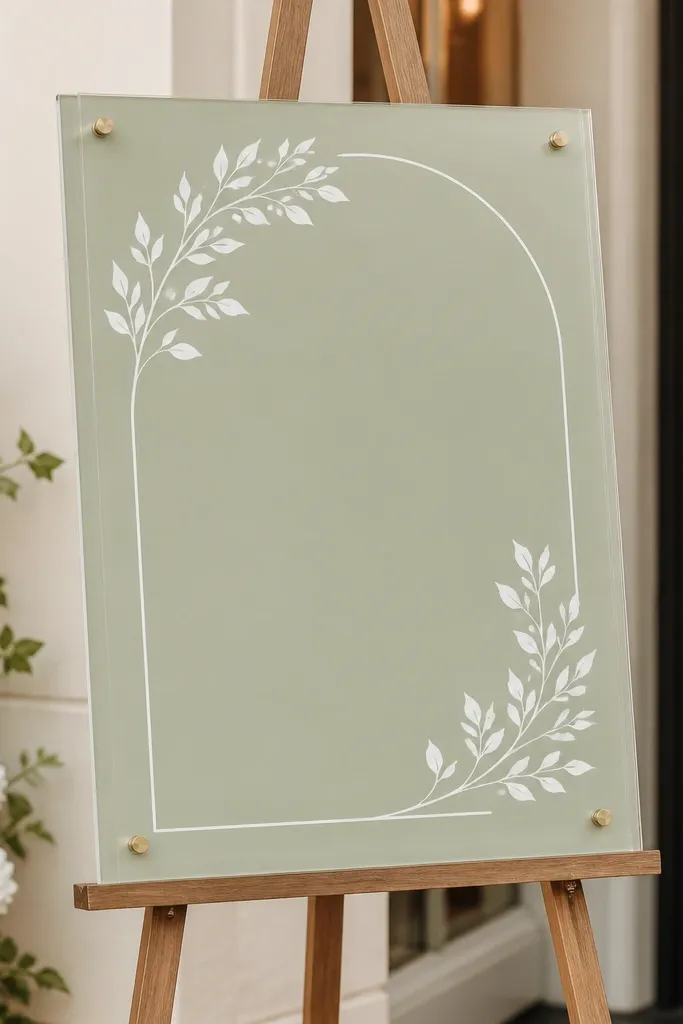
Sage backing makes acrylic feel like part of the garden, not something pasted onto it. It's a calm color that doesn't steal attention from florals, and it keeps the sign looking cohesive with greenery. I've used this for outdoor ceremonies where the welcome area sat near hedges and the background was already green - sage made the sign blend without disappearing. Acrylic stays crisp, so the typography doesn't get lost. This is also a skin-flattering choice because sage is muted and doesn't create harsh contrast on faces in photos. It's a great before and after upgrade when your current sign looks too white or too bright next to greenery.
Use a matte sage backing board or fabric, and keep it solid - no leaf patterns. Mount the acrylic sign on standoffs to keep a clean shadow line. Choose lettering in cream, white, or dark espresso depending on how light your sage is. Set the sign height so the text is readable when guests stand close to the welcome table, around 4.5 to 5 feet. Add a small greenery accent on only one side to keep the frame balanced.
Try thisIf your sage is very light, use darker lettering like espresso. If it's darker, use cream for a softer look.
Common mistakeSkip patterned sage backings - the pattern competes with the lettering and looks messy.
16. Mirror Champagne with Soft Blush Fabric Backing
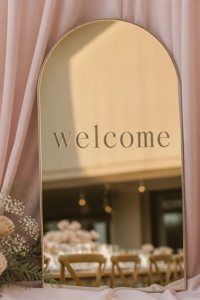
This pairing is romantic without turning pink. Champagne mirror reflects warm tones, and blush fabric gives it a soft surface to bounce light from. I used this in a venue with lots of floral arrangements and it helped the welcome sign feel cohesive instead of loud. The mirror finish adds sparkle, but the blush backing keeps it gentle so the sign doesn't look like a disco ball in photos. It also looks great next to satin bridesmaid dresses because the color temperature matches. If you want a "before and after wedding welcome sign transformation" that feels like a budget upgrade to designer styling, this is it.
Stretch blush fabric over a stiff matte board so it stays smooth. Mount the mirror sign directly on the board with a thin stand or frame so the mirror edges are visible. Use dark or deep brown vinyl letters so they cut through the mirror reflections. Place the sign where the light hits from the side, not straight overhead. Keep the immediate area behind the sign simple so the blush reflection doesn't get diluted by other colors.
Try thisDo a quick test shot in the evening if possible. Champagne mirror looks best once warm lighting kicks in.
Common mistakeAvoid bright hot pink fabric. It makes the champagne mirror look orange in photos.