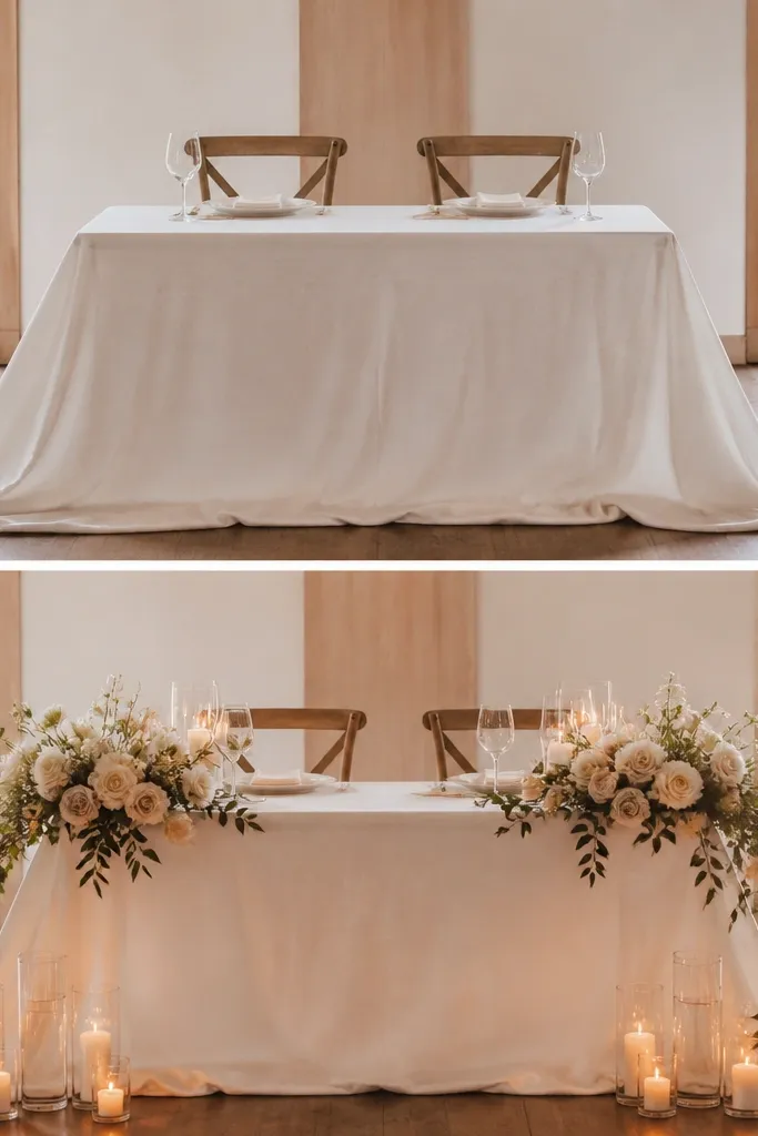
1. Blush satin base with a soft white runner (the photo looks "clean")
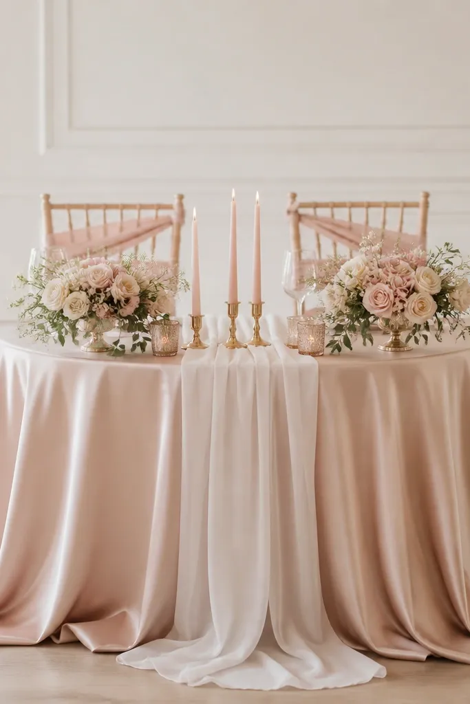
This setup is the one I reach for when the venue has busy lighting or patterned walls. The blush satin base catches light like silk but still reads soft, and the sheer white runner adds movement without adding clutter. I like it for fair to medium skin tones because blush looks flattering next to the bride's makeup and doesn't overpower warm hair tones. If you're worried your table will look "too pink," keep the satin closer to champagne-blush and let the runner stay truly white. The styling principle is contrast with restraint: smooth base, airy top layer, low centerpiece so everything stays readable in photos.
Start by ironing and pulling a satin tablecloth so it hangs straight at the corners. Lay a sheer white runner down the center with a 12 to 18 inch tail on each side, then pin it under the table edge so it doesn't slide. Build a low centerpiece using two matching foam-free arrangements about 10 to 12 inches tall, placed left and right of the center seam. Add taper candles in blush holders and keep the candle group narrow - about 14 inches across - so it doesn't fight the chair backs. Tie chair backs with 2 to 3 inches wide blush ribbon, letting the tails land around mid-height.
Try thisFor the "after" look, steam the runner right before the ceremony - sheer fabric wrinkles show up hard in flash photos.
Common mistakeAvoid mixing cool white and warm champagne in the same cloth set - it makes the table look mismatched in every lighting condition.
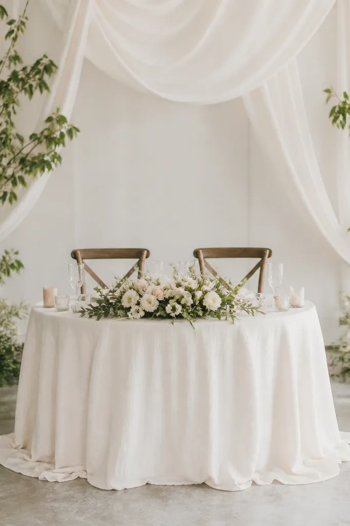
2. Ivory linen tablecloth + dusty rose rose garland (romantic but not fussy)
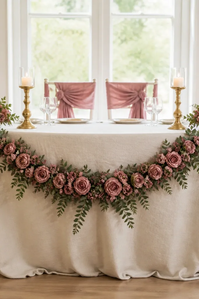
If you want "romantic" without the table looking like a craft project, linen plus a garland is the combo. Ivory linen has texture that hides minor table imperfections, and it looks expensive even when the centerpiece is simple. Dusty rose flowers read softer than bright pink, so they flatter a wide range of skin tones and don't clash with neutral venues. I've used this for both daytime garden weddings and evening receptions because it doesn't go too warm or too cool under lighting. The principle here is a continuous line: the garland creates one long focal curve instead of several competing blobs.
Start with an ivory linen tablecloth that's at least 60 inches wide over the table top so it drapes cleanly at the edges. Drape the dusty rose garland along the center, then adjust it so the lowest point sits about even with the top of the centerpiece. Place two small end clusters at each end of the garland - keep them smaller than you think, around 8 to 10 inches wide. Add brass LED candles in holders that match the garland metal vibe, then keep the candle height under 10 inches. Finish by tying chair backs with dusty rose fabric bows using double-sided ribbon so the tails look full.
Try thisUse a fabric steamer on the linen before dressing - a flat linen surface makes the garland look intentional instead of dropped.
Common mistakeSkip oversized bouquets on this look - big, round arrangements make the garland feel like it's competing for attention.
3. All-white cascading chiffon with micro fairy lights (soft glow, no clutter)
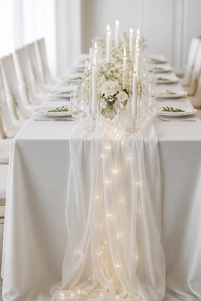
This is a "before after" rescue when your table looks flat in low light. Chiffon catches light in a way that makes photos look dreamy without adding heavy florals. I like it for venues with dim uplighting because the chiffon glow reads like atmosphere, not decoration. It also flatters people who want their table to look bright and clean rather than romantic-pink. The key is to keep the rest of the styling minimal - the lights and fabric are the stars. The principle is one high-drama material: airy chiffon plus tiny light points.
Lay a white satin tablecloth first so the chiffon has something smooth to sit on. Pin chiffon strips at the center seam and let them cascade in uneven lengths - aim for one strip about 14 inches longer than the others. Tuck micro fairy lights under the chiffon so only the bulbs show, not the wire. Add clear acrylic candle holders with white LED tapers and keep the cluster tight, about 12 inches wide. If you're adding chair decor, use simple white fabric wraps or ribbon - skip tall floral back pieces that block the glow.
Try thisTest the lights in the same room at night - some fairy lights look blue under venue LEDs, so you want warm white.
Common mistakeDon't drape chiffon all the way to the floor if your chairs are close to the table - it tangles and looks messy on photos.
4. Champagne tablecloth + gold geometric candle frame (modern, sharp lines)
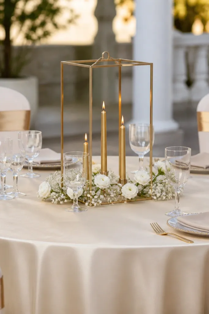
This look is for couples who want their sweetheart table to look designed, not decorated. The champagne cloth adds warmth, and the gold geometric frame gives a clean focal point that reads clearly on wide-angle photos. I've seen this work especially well when the venue has modern furniture or lots of clean lines, because the geometry matches the room. It's also great if you're doing hair and makeup that's more crisp and editorial - the table won't fight the look. The principle is structure: one strong center shape, small supporting accents, and no sprawling florals.
Start with a champagne tablecloth that hangs straight and has a slight sheen, not a matte polyester. Place the gold geometric candle frame exactly in the center and anchor it with non-slip pad or removable tape under the base. Add three tapers in the frame, keeping the candle heights consistent - around 10 to 12 inches. Add a few minimal white floral stems (think spray roses or small ranunculus) around the frame base, but keep them under 8 inches tall. Tie chair backs with gold ribbon bands and keep them at the same height on both chairs so the symmetry reads on camera.
Try thisUse a level or phone grid lines to center the frame - a few inches off looks obvious in wedding photos.
Common mistakeAvoid mixing gold frame with silver candle holders - it makes the center look accidental.
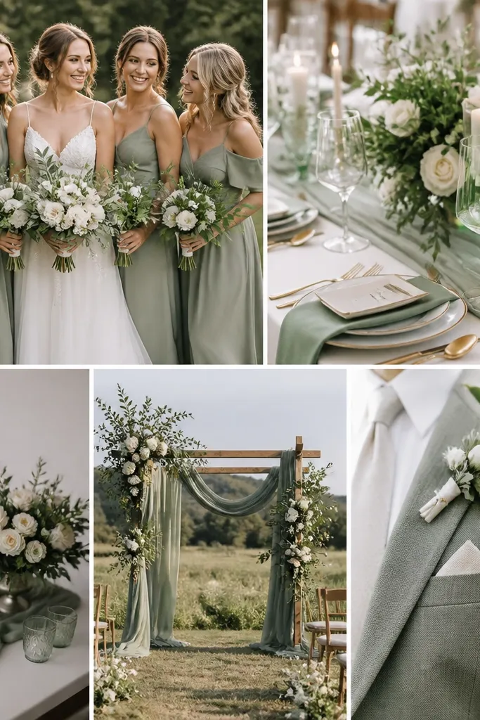
5. Greenery-forward with sage runner and cream blooms (garden vibe, budget-friendly)
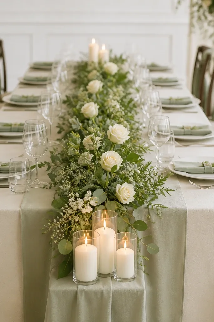
If you want it to look full without spending on giant floral pieces, greenery-forward setups win. The sage runner gives you a color base that feels lush even if your flowers are limited. Cream blooms look clean and flattering in daylight, and the greenery brings depth so the table doesn't look like it's "waiting" for more. I've used this for backyard weddings where the background is messy (trees, string lights, random chairs) - the sage and cream keep the table the focus. The principle is value stacking: a long garland does the heavy lifting, then cream blooms add brightness.
Start with a cream tablecloth and iron out any wrinkles so the sage runner lays flat. Place the sage runner down the center, then add a greenery garland on top, tucking it into the runner folds so it doesn't slip. Use cream blooms as spacing markers - add a cluster every 10 to 12 inches rather than piling them in one spot. Keep candles low and grouped, with one cluster near each end, and use LED tapers in matte holders to avoid glare. Tie sage ribbon on chair backs and mirror the ribbon width on both sides for a tidy look.
Try thisBuy greenery in bulk bundles and trim to length yourself - it's cheaper and you can control how dense the center feels.
Common mistakeDon't use bright neon green greenery - it clashes with cream and makes skin tones look off in photos.
6. Black accents with ivory flowers and matte candle cups (dramatic, not goth)
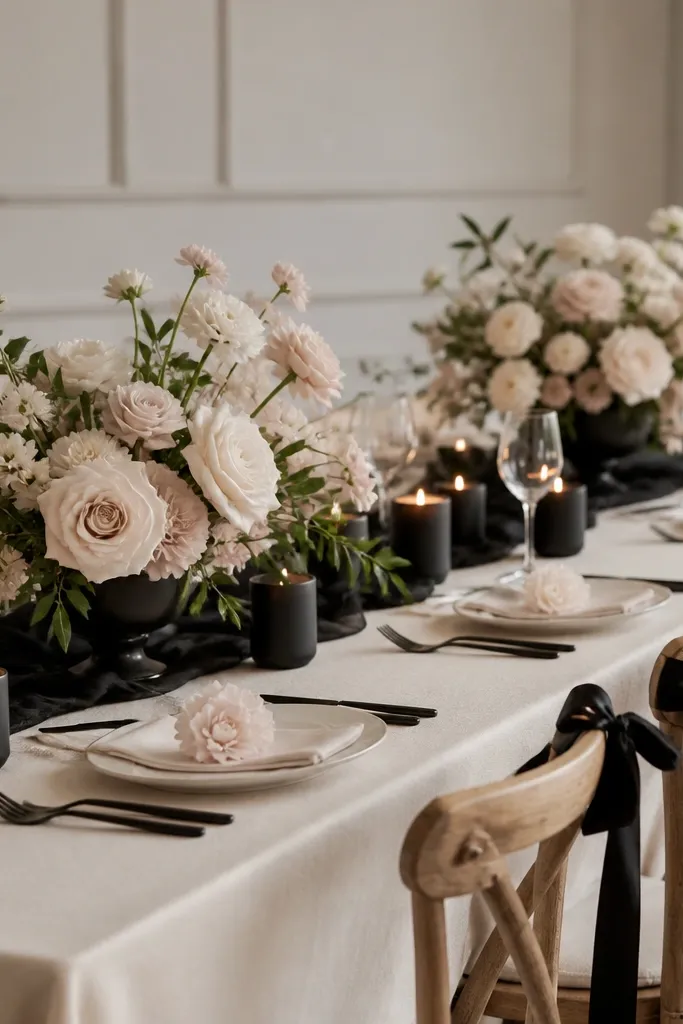
This setup is the answer when your venue is all white walls and you want the sweetheart table to actually stand out. Black matte candle cups add depth without making the flowers look washed out, and ivory blooms keep it romantic. I've done this with couples who have darker hair or bold makeup because the contrast looks intentional. It also works well when your wedding palette includes muted neutrals, not bright jewel tones. The principle is controlled contrast: one dark element repeated (candles and ribbon) so the look feels cohesive, not random.
Lay an ivory tablecloth first, then place a black satin ribbon down the center line at the top third of the table - about 6 to 8 inches wide. Build two low ivory arrangements, keeping them under 12 inches tall so the black accents remain the focus. Add matte black candle cups with LED candles and keep them grouped between the arrangements, not outside the center line. Chair backs get black ribbon bows tied at the same height as the center ribbon, with tails about 8 inches long. Finish with a few scattered ivory petals or small greenery sprigs around the base so the table looks finished from all angles.
Try thisChoose matte black holders, not shiny - glossy black reflects camera flash and shows glare spots.
Common mistakeSkip heavy black tablecloths for an outdoor daytime wedding - it absorbs light and makes everything look darker than you planned.
7. Two-tier floral runner with low bud vases (keeps it airy, still full)
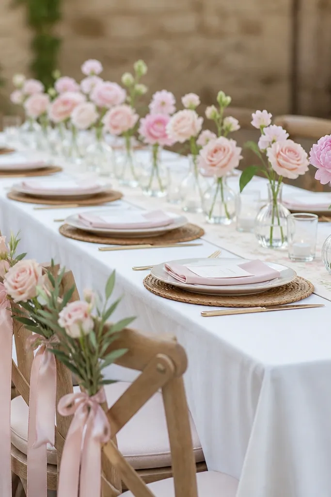
This is my go-to for couples who want "full" but hate the look of giant bouquets on the table. A two-tier runner - one band of greenery and one band of blooms - gives you depth, while the low bud vases keep the height down. It flatters people in both warm and cool skin tones because blush and soft pink sit in the middle of the color temperature range. It also reads great for close-up photos because you can see the individual stems. The principle is height control plus repetition: repeating small vases creates rhythm without overcrowding.
Start with a white or cream tablecloth and place a narrow greenery runner in the center about 12 inches wide. Add a second layer of blooms on top, but keep the runner's total height under 10 inches. Line up 6 to 8 low bud vases along the center line, spacing them about 8 inches apart so they don't touch in photos. Use one flower type per vase for a cleaner look - for example, blush spray roses or small peonies if you can source them. Add chair decor by tucking a tiny sprig into the ribbon tie on each chair back, keeping it smaller than the table centerpiece.
Try thisMake your vases all the same height by trimming stems to length before you set them down.
Common mistakeAvoid mixing tall bud vases with short ones - the uneven top lines look sloppy in camera angles.
8. Coordinated velvet chair backs with neutral runner (luxury feel, easy styling)
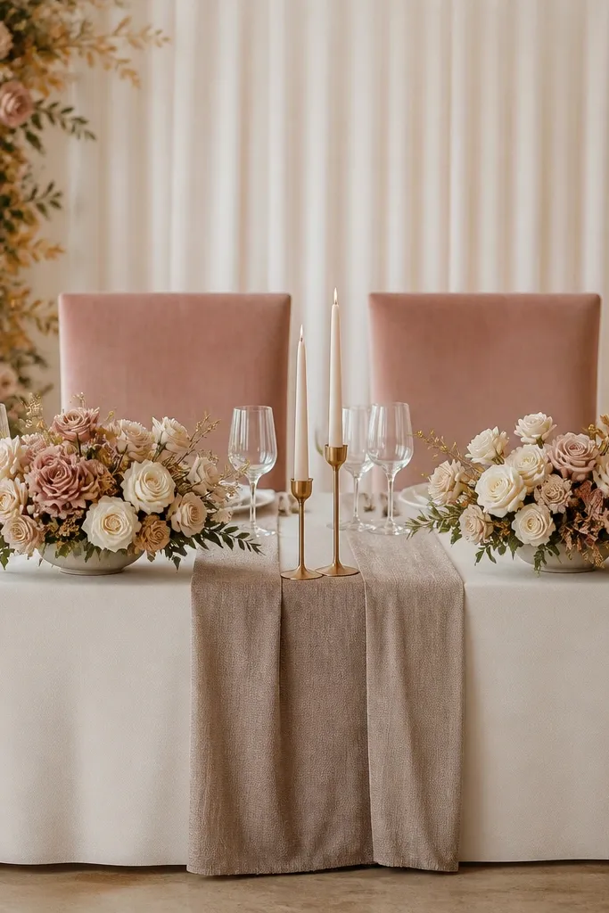
Velvet chair backs change the whole picture because guests notice the chairs first in photos. This setup works when you're using simple table decor but want it to look "done." Dusty rose velvet reads expensive and flatters most skin tones because it isn't neon and it has a soft warmth. I've used this in venues with white chair backs where the contrast looks harsh - velvet fixes that instantly. The principle is framing: give the chair backs a rich texture and keep the table styling calmer so it doesn't turn into a circus.
Start with a cream tablecloth and add a neutral textured runner in taupe or warm beige, centered and pinned so it stays put. Place two low floral arrangements on either side of the center seam, using cream and blush flowers with minimal greenery. Add gold candle holders with LED candles and keep the candle height around 9 to 10 inches. For chair backs, use velvet panels or rental chair covers in dusty rose, then tie them with a thin ribbon in matching gold or warm champagne. Keep any ribbon tails short so they don't block faces when guests sit down.
Try thisSteam velvet panels before attaching - a wrinkled velvet surface looks cheap immediately under flash.
Common mistakeDon't add heavy tall florals on the chair backs with velvet panels - it makes the chairs look bulky.
9. Monochrome monochrome (sage to olive) with olive ribbon line (for earthy couples)
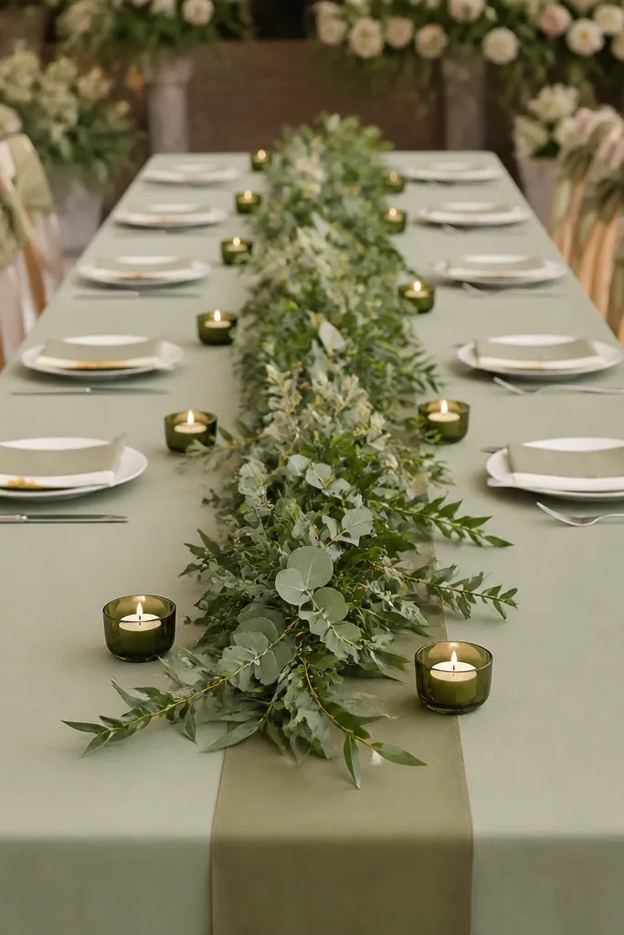
Monochrome green setups are underrated because they look cohesive even when the flowers are simple. Sage to olive gives you depth without introducing new colors that might clash with your bouquet or bridesmaids dresses. I like this for couples who want a natural look but still want the table to photograph clean. It's also great for outdoor weddings where the background is green - the table blends in, then the candle line and ribbon make it readable. The principle is tonal layering: different shades of green plus one repeated ribbon line.
Start with a sage green tablecloth or a sage-toned overlay, then place an olive ribbon down the center seam. Lay a long greenery garland in a slightly wavy pattern so it doesn't look like a straight line. Add small cream candles in olive holders spaced evenly - about 10 to 12 inches apart - so the candle line looks intentional. If you're adding flowers, use one type and keep it in cream or very pale yellow-green, then place them in gaps in the garland. Tie chair backs with olive ribbon bows and keep the knot centered so photos look symmetrical.
Try thisCut your garland into sections and rebuild - it looks fuller than one long piece that twists unevenly.
Common mistakeAvoid adding bright white flowers on top of olive - it can look stark next to leaf tones.
10. Pastel rainbow restraint with a single color pop (blue or lilac flower center)
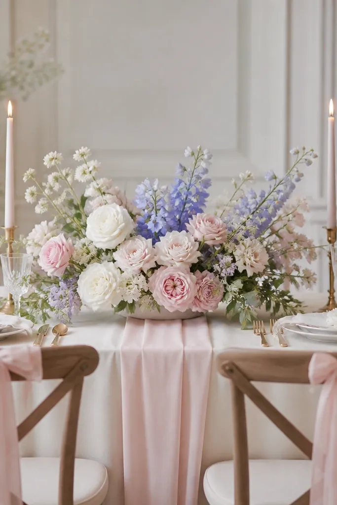
This is for couples who love color but want the table to look classy in every photo. The trick is to keep the base palette neutral (cream and blush) and then add exactly one color pop in the center. That pop can be lilac, periwinkle, or soft sky blue - I've used all three and they read beautifully against warm skin tones. It also helps if the bridesmaids' dresses are already colorful, because you're not adding a new chaos palette. The principle is one focal color: everything supports the center, not the other way around.
Start with a cream tablecloth and a blush runner, centered and pinned so it doesn't drift. Build a low arrangement using mostly cream and blush flowers, then place the color pop flowers in the center third only. Add two taper candles at either side of the centerpiece, keeping them the same height and using holders that match your metal finish. Chair backs get blush ribbon ties, and you add a tiny single stem or two color-pop petals tucked into the ribbon knot. Keep the rest of the table empty - no extra mini bouquets - so the color pop stays the focal point.
Try thisUse the same color pop in place cards or a napkin fold - even one small repeat makes the whole setup look planned.
Common mistakeAvoid scattering the color pop everywhere - it turns the table into confetti instead of a focal point.