1. Table runner that was too wide (and killed the sightlines)
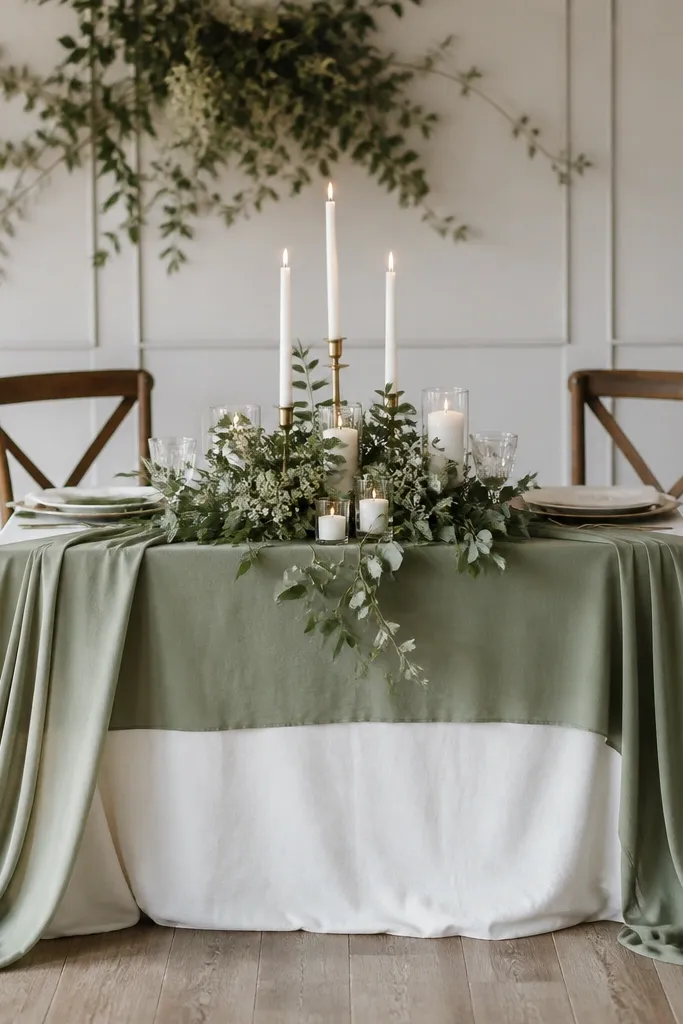
I bought a sage runner that was the same width as the table plus extra - it looked gorgeous in my apartment. At the venue, it swallowed the table edges and made the whole place look cramped, especially in side-angle photos. Sage green is already a slightly muted color, so when it takes over too much surface area, your layout loses contrast. For small spaces, you want the runner to frame the table, not cover it. I also noticed my skin tone looked a bit dull next to the runner because there wasn't enough warm light contrast from cream linens.
Start by measuring your table width and decide how much runner should hang past each side. I use 6 to 8 inches of overhang per side for small tables, and I keep the runner centered so it forms a clean rectangle. Then place your centerpiece on the runner's centerline, but keep at least 2 inches clear around candle bases so nothing looks crowded. Finally, add one warm element like cream napkins or ivory place cards to bring contrast back into the scene. If you're using eucalyptus or olive, keep the greenery low so it doesn't block faces when people sit.
Try thisIf your runner looks "fine" but photos look busy, reduce the width first - it fixes the problem faster than changing flowers.
Common mistakeAvoid using a runner that overhangs too much and packs candles right next to it.
2. Backdrop fabric that was hanging at the wrong height
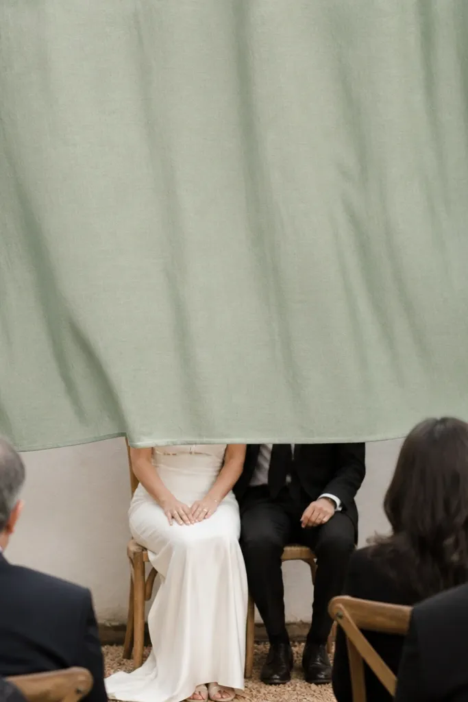
My first sage backdrop was draped like I was styling a ballroom. In a small room, the fabric sat too low and visually pushed the wall closer. The photos looked like we were in a tent, even though the room wasn't small on paper. Sage fabric also absorbs warm light, so when it's too close to faces, skin looks flatter and the eyes get pulled to the background instead of the couple. Women's dresses in champagne or soft blush still looked pretty, but the overall image lost depth.
Start by marking the center of your backdrop area with tape on the floor. Hang the top edge at least 12 to 16 inches above eye level for standing photos, then check from the side where guests will actually stand. If your venue is low-ceiling, keep the backdrop narrower and let it sit higher rather than wider and low. Next, attach the fabric so it creates vertical folds - I use clips or curtain rings so the fabric doesn't bunch horizontally. Finally, add one small line of greenery at the seam or edge, not across the middle, so it frames the couple instead of fighting the fabric.
Try thisDo one 10-second test photo before you commit - move the fabric up if your heads blend into the background.
3. Greens that looked gray under warm bulbs
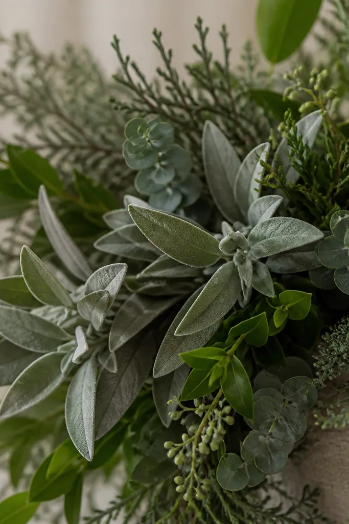
I mixed fresh-looking eucalyptus with older olive stems and the whole cluster turned gray-green under the venue's warm lighting. Sage green wedding decor should read as calm and airy, not dusty. The problem wasn't the greenery itself - it was the age and finish mismatch. Dried greens with a powdery surface reflect differently than fresh stems, so the cluster becomes patchy. If you're wearing a white or ivory dress, that gray shift makes the dress look less bright. Men's suits in cream or light tan can also look a little washed out.
Start by sorting greenery by look: keep anything that looks slightly powdery out of the main cluster and use it only as a border or filler. Then choose a consistent tone family: either fresh blue-green eucalyptus with olive, or dried olive with a more yellow cast - not both. Place your sage anchor behind the greenery, like a matte sage cloth or a cream linen so the greens have a stable background. Finally, mist fresh greenery lightly with water right before setup so it regains a consistent sheen. If you're using dried, wipe it gently with a soft dry cloth to remove surface dust.
Try thisBring a small zip bag of your greens to the venue and compare them under the actual lights before you build the cluster.
4. Too many candle heights in one corner
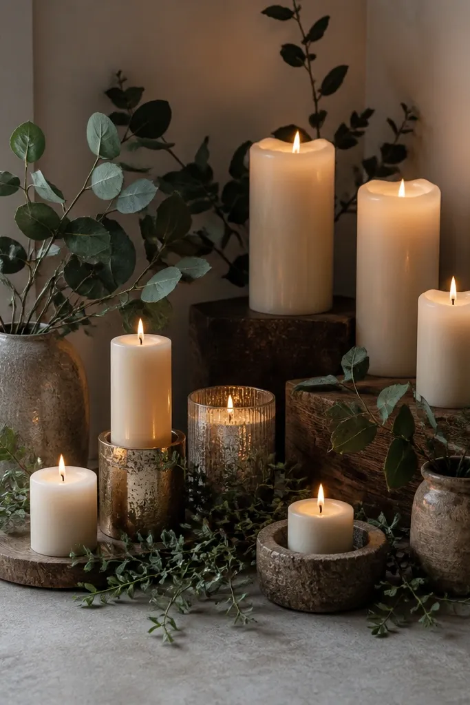
I packed candles of three different heights because I thought it would look layered. In a tight room, that created a messy skyline and made the corner feel busy instead of romantic. The sage tones already sit low on the color spectrum, so when candle flames and holders vary wildly, the eye gets pulled away from the couple. Also, uneven candle spacing under indoor lights throws shadows that look like clutter. Women's dresses in satin or crepe can pick up those shadows and look less clean in photos.
Start by picking one height range for the cluster. I recommend either 3 to 4 inches for tea lights and short votives, or stick to 7 to 10 inches for taper candles in holders - keep it consistent. Then set them on a flat tray or cake stand so all shadows fall from the same plane. Place greenery behind the tallest candles, not around the sides, and keep at least 3 inches between candle bases. Finally, add one sage element like a linen napkin folded upright or a small sage ribbon loop so the cluster still ties into the color story.
Try thisIf you want height variety, do it across separate zones - not in the same candle cluster.
5. Using glossy chargers that reflected everything
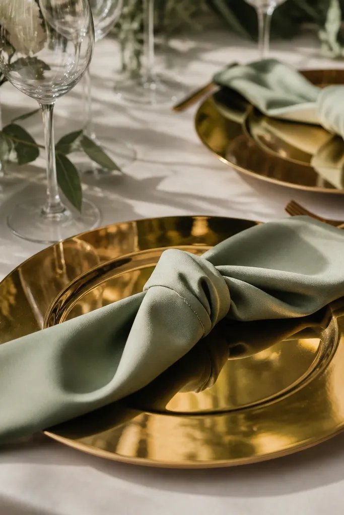
This one surprised me. Glossy gold chargers look amazing in daylight, but in warm indoor venues they throw bright reflections that make sage napkins and linens look dirty at certain angles. I kept seeing bright highlights on the table surface, and it made the whole setting look less expensive in photos. Sage green wedding decor needs calm surfaces because it's a soft color. When you add glossy plates and shiny candle holders, the highlights fight each other. It also changes how cream and ivory look - they can pick up yellow glare instead of staying warm and clean.
Start by choosing chargers with a matte finish, or skip chargers entirely and build with linen and flatware. If you already bought shiny chargers, cover the worst reflective areas with a runner or a large matte placemat. Then keep candle holders matte too - I switched to frosted glass for votives and the difference was immediate. Fold napkins with a simple edge fold and place them centered so reflections don't travel across folds. Finally, keep your centerpiece low and wide so reflections don't bounce off tall items.
Try thisDo a quick phone-photo from guest seating distance - if plates glare, swap chargers or cover them.
6. Signage that was too big for the room
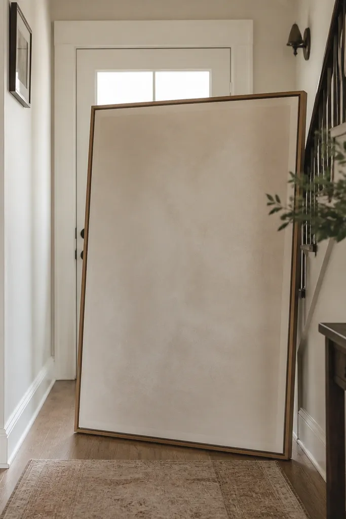
I printed a huge welcome sign because I wanted it to be readable. In the small venue, it blocked the natural flow of people and made the entry area feel narrower. Big signage also creates a visual wall, so the rest of your sage green wedding decor looks smaller by comparison. The couple photos suffered because guests clustered near the sign instead of moving toward the ceremony spot. If you want sage to feel airy, you need negative space.
Start with a sign size that fits the wall space you actually have. I use 18x24 inches for narrow entryways and 24x30 inches only if the wall has at least 6 feet of uninterrupted space. Mount it so the bottom edge is about 52 to 56 inches from the floor for easy viewing. Then keep it off the main walking line - place it to the side or behind a small table so people don't stop in the middle. Use a matte board or frosted acrylic so reflections don't create glare behind the letters.
Try thisIf your sign has to be large, make the font bigger and reduce the number of lines - fewer lines look cleaner at distance.
7. Green on green ribbon that matched too perfectly
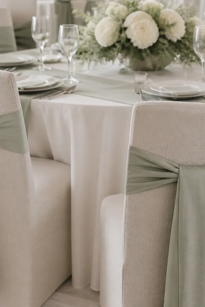
I used the exact same sage ribbon shade everywhere. It looked coordinated in my living room, but in the venue it flattened the look because nothing created contrast. The eye needs a difference in tone, texture, or sheen to read the design. When every green thing is the same, it turns into one blob - especially on chair backs where people move. The chairs can also look dusty if the ribbon is too similar to the greenery. For women's dresses, this can pull attention away from the outfit because the chair backs become the dominant green block.
Start by choosing two greens with a visible difference. I keep one sage that is slightly cooler (more gray-blue) and one that is more yellow-olive in greenery. Then use ribbon on chairs in a matte fabric, and keep greenery as a separate element so it stays dimensional. Wrap ribbon with a simple V on the back of the chair, leaving 2 to 3 inches of chair fabric visible so the ribbon doesn't swallow the chair shape. Finally, add one warm contrast like cream tulle or ivory tags so the chair decor looks intentional next to skin tones.
Try thisIf your chair bows look flat, change just one variable: either the shade or the texture, not both.
8. Chair covers that billowed and wrinkled under spotlights
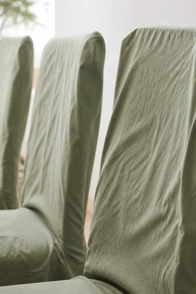
I rented chair covers thinking sage green wedding decor needed a full uniform look. The venue's spotlights hit the fabric and every wrinkle showed, plus the drape billowed where I tied it. In photos, that made the chairs look like they were wearing costumes instead of part of the design. Sage also shows creases because it's not dark enough to hide them. Women's dresses looked great, but the seating looked messy, which pulls attention away from the couple. Men's suits next to wrinkled chairs can look oddly sharper in comparison.
Start by testing fabric under venue lighting if you can, or at least check the rental fabric in daylight at home. If chair covers are wrinkling, switch to a tighter fit and use fewer tie points. I prefer snug covers with a simple tuck at the back so the fabric hangs in clean vertical lines. Then steam everything on a hanger before bringing it in - I do 5-minute steam passes focused on creases at the top and sides. Finally, place chair decor only where it frames the couple's seating area, not across every chair in a small room.
Try thisKeep chair cover drape vertical - horizontal gathers show wrinkles faster under spotlights.
9. Table scatter that was too random
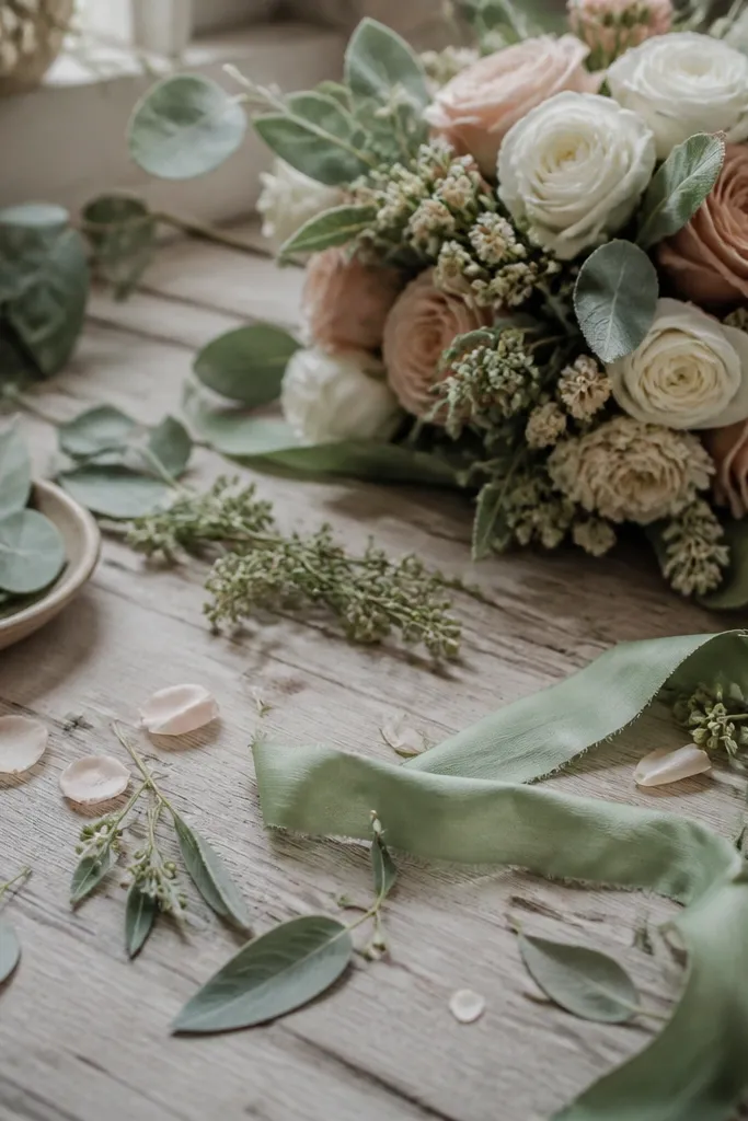
I tried to make my tables feel handmade by scattering little bits everywhere. It looked cute while I was placing it, and then it looked chaotic once the room filled with people. Sage green wedding decor needs intentional placement, because small items create visual noise in tight spaces. Loose ribbon ends and petals catch light and create tiny bright points, which makes photos look messy. When I replaced scatter with a single centerpiece and a few controlled accents, the whole table looked cleaner. The couple's hands and centerpieces also photographed better because there wasn't clutter competing.
Start by choosing one centerpiece container - tray, low vase, or a foam-free arrangement in a shallow bowl. Then place only 3 to 5 accent pieces around it, spaced evenly so the table still reads as structured. Tuck ribbon ends under napkins or under the centerpiece so they don't hang loose. Finally, keep the rest of the table clear - I leave at least one full napkin-length of empty space between the centerpiece and the edge. If you want extra texture, add it through the table runner and napkin folds, not loose bits.
Try thisIf you can't explain where each small item goes, remove half of them.