1. Ivory Linen Napkins with Sage Ribbon Tie
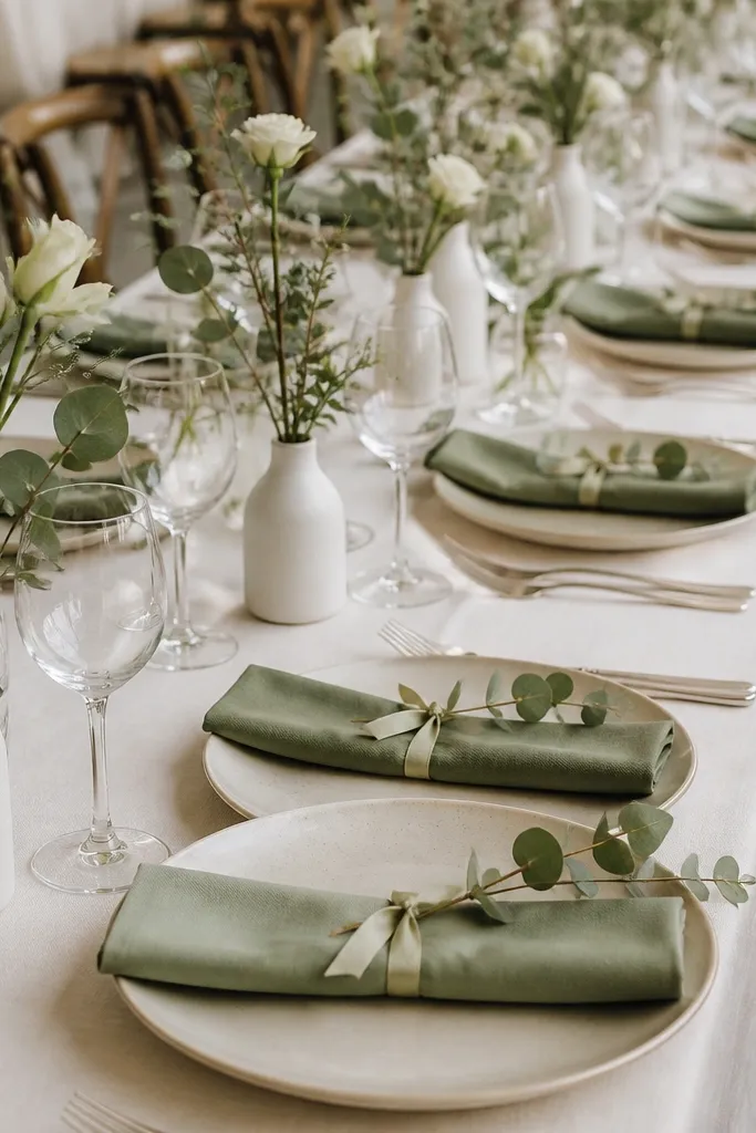
This setting looks polished because the napkin has real fabric weight and the ribbon gives a clean, photo-ready shape. Use ivory napkins with a slight slub texture - they catch light without looking shiny. Sage green reads soft against warm skin tones and works well for garden venues, spring weddings, and outdoor receptions. The eucalyptus sprig adds a natural curve that frames the plate instead of sitting flat. I like this look for men and women because it doesn't fight any outfit colors; it stays neutral while still feeling styled.
Start by placing your ivory plates and aligning them so every place setting matches the table edge. Fold the napkin into a simple rectangle and tie it with a 12-14 inch piece of 1/4-inch sage satin ribbon, knotting it just above the fold so the tails hang evenly. Add a small sprig of eucalyptus or seeded greenery on the napkin fold or tucked at the plate's upper-left corner. Finish with one bud vase per two seats or a low cluster at the center, keeping everything under candle height. Set flatware in a single metal finish and keep place cards the same font style across the table.
Try thisUse a quick fabric steamer on napkins before folding - wrinkles show up fast in overhead photos.
Common mistakeDon't use thin polyester napkins with a glossy ribbon - the shine looks off against linen plates.
2. Matte Black Charger Plates with White Porcelain Layers
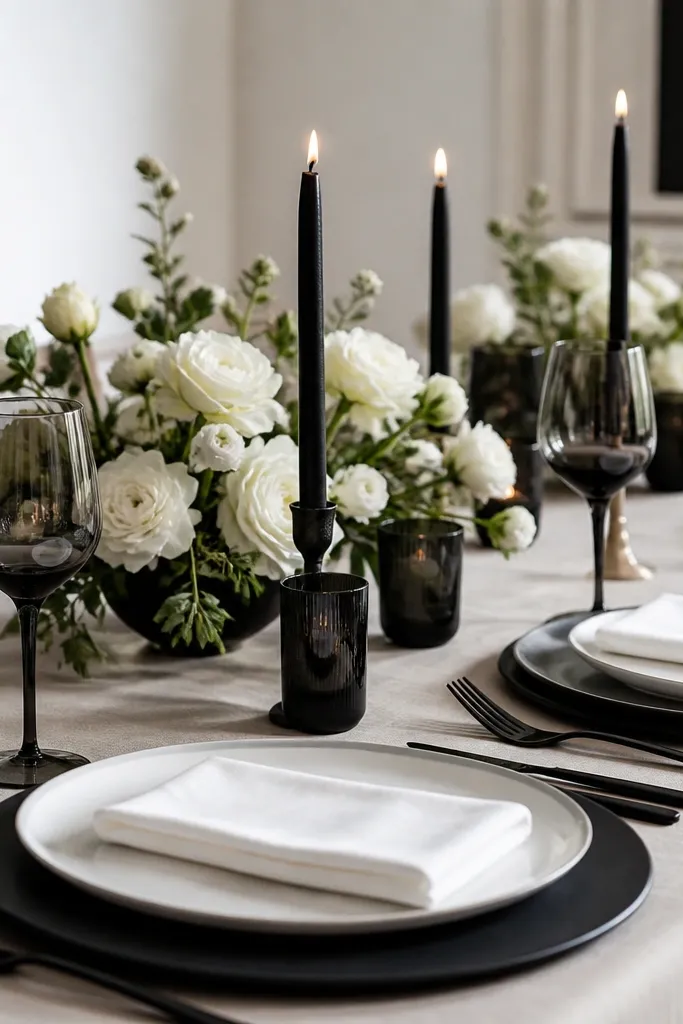
Matte black chargers make a table look designed even when the centerpiece is simple. The black base grounds the setting and makes white plates and napkins pop, which looks great for evening weddings and indoor venues with warm lighting. Choose matte chargers, not glossy - glossy black reflects messy highlights and can look cheap on camera. This setup flatters a wide range of guest attire because it doesn't rely on one specific color palette. I've used it with both neutral and jewel-tone florals; the table still reads cohesive.
Lay matte black chargers first, centered so the plate rim shows evenly all around. Place white dinner plates on top and keep salad plates either out or in a matching white if you're doing a full course. Fold napkins into a straight rectangle and wrap them loosely with a thin black satin strip or place a black ring around them. Add a single candle holder per two seats or a low black-and-white arrangement at the center. Use black votives with frosted glass for a softer glow that doesn't glare.
Try thisIf your venue has lots of mirrors, test one candle holder at the table height - frosted glass hides reflections.
Common mistakeAvoid mixing matte black chargers with shiny black flatware; the mismatch reads like bargain rentals.
3. Blush Pink Napkins with Gold Foil Place Cards
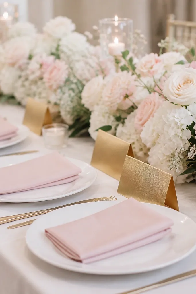
Blush napkins paired with gold-foil place cards look "soft glam" without going full theme. Blush works especially well if your guests wear warm tones like beige, cream, olive, or rose - the table echoes those shades. Gold foil adds a subtle sparkle that reads elegant in natural light and still shows in dim reception lighting. Keep the rest calm: white plates and minimal greenery so the gold doesn't look scattered. This is one of my go-to ideas for couples who want pretty but not overly themed.
Start with white plates and a light neutral runner (cream or oat) running down the center. Fold blush napkins into a triangle fold and tuck a gold-foil place card into a small napkin holder or stand it upright with a tiny clip. Place the card at the top-left of each plate so it aligns visually across the table. For the centerpiece, use a low arrangement in white and pale pink with a few gold accents like metallic berries or a gold-toned tray. Keep your candle count even - one per every two seats looks intentional.
Try thisWrite place cards in a dark ink (charcoal or deep brown) so the gold doesn't wash out.
Common mistakeDon't choose blush napkins that are too close to your florals; they should contrast slightly, not disappear.
4. Dried Lavender Buds in Clear Glass Bottles
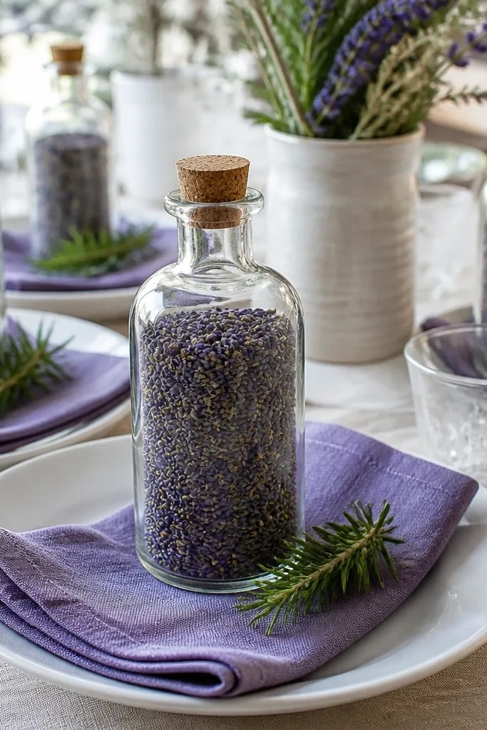
Dried lavender in clear bottles makes the table smell like a wedding memory, and it looks styled without needing fresh flower budgets. Lavender adds a calm color cue that still photographs well, especially against white or light wood tables. Clear glass keeps the look airy and lets the table feel lighter in a small venue. I like this for daytime ceremonies that turn into brunch receptions because the palette feels intentional without heavy candles. It also works for people who want a little scent but don't want to deal with water-heavy vases.
Place white or off-white plates first and add lavender napkins with a simple fold. Set one clear bottle per two seats, spacing them so each bottle aligns with the center of a pair of place settings. Fill bottles with dried lavender buds only - don't overstuff; leave a little negative space so the stems look airy. Add a tiny rosemary sprig at the base of each bottle or tuck it near the napkin. Keep place cards simple in white card stock with lavender ink.
Try thisUse a thin layer of floral foam-free filler (like dry straw) at the bottom of bottles so buds don't shift during setup.
Common mistakeDon't put wet flowers in clear bottles with dried buds - the color mismatch looks messy fast.
5. White Lace Runner with Pearly Votive Candles
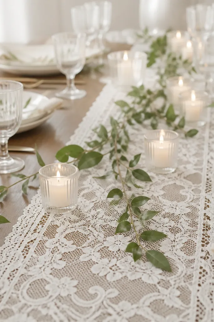
A lace runner creates an instant "dress-up" effect because it adds dimension across the whole table, not just at the centerpiece. Pair it with pearl-toned votives for a gentle glow that looks romantic without being overly dark. White lace reads clean on camera when you place it straight and keep the runner centered. This is a strong choice for indoor weddings where the room lighting isn't flattering; the lace brightens the scene. It also works well for both men and women's outfits because it stays in neutrals and doesn't compete with dress colors.
Center the lace runner so it hangs evenly on both sides of the table. Use white plates and keep napkins either white or light cream to avoid color clashing with the lace. Add votive candles in clear or frosted glass, clustering them in groups of three along the runner. Scatter a few small sprigs of greenery between candle clusters so the lace doesn't look empty. Place cards should be simple and matte - I use cream paper with black text.
Try thisSteam the runner and smooth it with your hands before you set the candles - lace wrinkles show up in overhead shots.
Common mistakeAvoid lace that's too sheer with a dark table - the contrast makes it look like a craft project.
6. Terracotta Placeholders with Cream Napkin Rolls
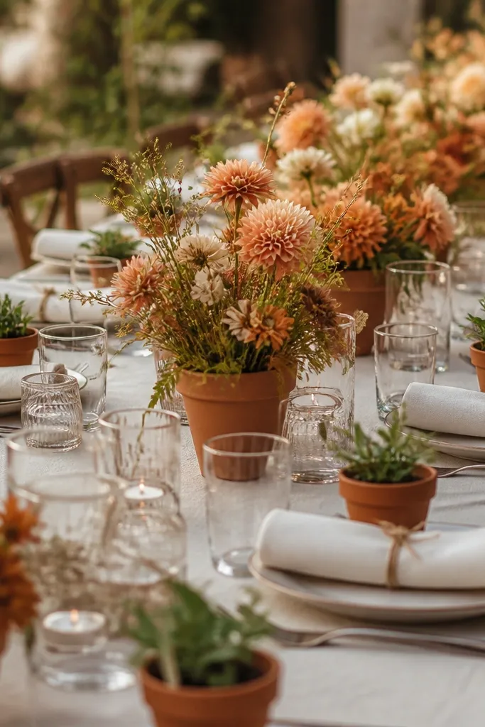
Terracotta brings warmth that reads "cozy wedding" instead of formal restaurant style. Cream napkin rolls tied with twine look handmade in the best way, especially when the twine is matte and not shiny. This color combo flatters olive and warm undertones in guest skin, and it looks stunning with outdoor golden-hour lighting. If your venue is rustic, terracotta also matches wood tables and exposed beams without effort. I've used this look for late summer weddings when fresh flowers are plentiful and you want the table to feel grounded.
Set cream plates or white plates on terracotta-toned chargers. Roll napkins tightly (about a 2-inch roll), then tie each roll with 10-12 inches of natural twine, knotting at the front so it faces the guest. Add a terracotta mini planter or small clay cup at each place setting with a tiny bud or a single leaf stem. For the center, use larger terracotta pots with cream and peach flowers. Keep place cards in kraft paper with a clean black font.
Try thisSpray a tiny mist of water on twine ends before tying - it helps them lie flat and look neat.
Common mistakeDon't use bright orange terracotta if your florals are peachy; they'll clash and look neon.
7. Satin Emerald Napkin Rings with White Floral Micro-Bouquets
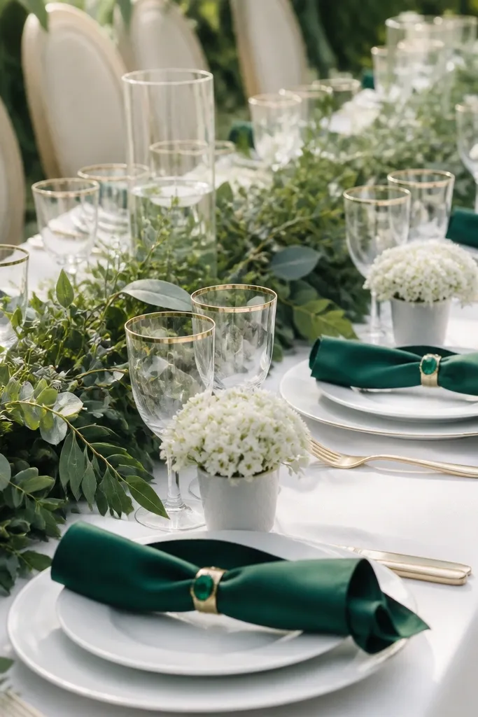
Emerald napkin rings add a jewel-tone hit without forcing you to color the entire table. White micro-bouquets keep the look airy and clean, and emerald makes them pop in photos. This is a great pick for winter weddings where the room lighting is warm and people wear darker outfits. Emerald also flatters a lot of skin tones because it has enough green depth to look rich, not loud. I like that the centerpiece work stays small - each guest gets the same "moment" at their seat.
Place white plates on neutral chargers or directly on the table if the table is already decorative. Slide emerald satin napkin rings onto folded napkins, keeping the ring centered and the fold edges crisp. Arrange tiny cups or bud vases at each setting with white flowers like ranunculus or small roses. Add a thin greenery garland down the center, but keep it low enough that guests can see place cards. Use white or cream place cards and avoid extra color accents on paper.
Try thisCut napkin rings' satin tails so they don't hang unevenly - uneven tails show up in every photo.
Common mistakeSkip multi-color napkin rings; they make the table look like party rentals.
8. Sea Glass Blue Plates with Clear Acrylic Place Card Holders
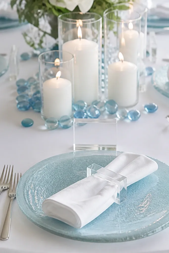
Sea glass blue looks like summer water, and it instantly makes the table feel personal. Clear acrylic place card holders keep everything sharp and modern, especially if you want a beachy look without using too much nautical theme. White napkins keep the palette from getting heavy. This setting flatters cool undertones and works beautifully with silver flatware. I've used it for coastal weddings where the venue has lots of natural light and the table needs a color anchor.
Use sea glass blue dinner plates and keep salad plates white or skip them if you want a cleaner look. Fold white napkins into a simple rectangle and place a clear acrylic card holder at the top-right of each plate. For the center, scatter a small handful of blue glass beads on a runner or tray, then set white candles in clear holders. Add one low arrangement of white flowers with a few blue accents like delphinium or blue thistles if you can source them. Keep the table runner neutral so the plates stay the star.
Try thisWipe acrylic holders with a microfiber cloth right before the ceremony - fingerprints show in photos.
Common mistakeDon't use colored acrylic holders; they look cloudy and cheap in warm venue lighting.
9. Monochrome Cream Table with Taper Candles
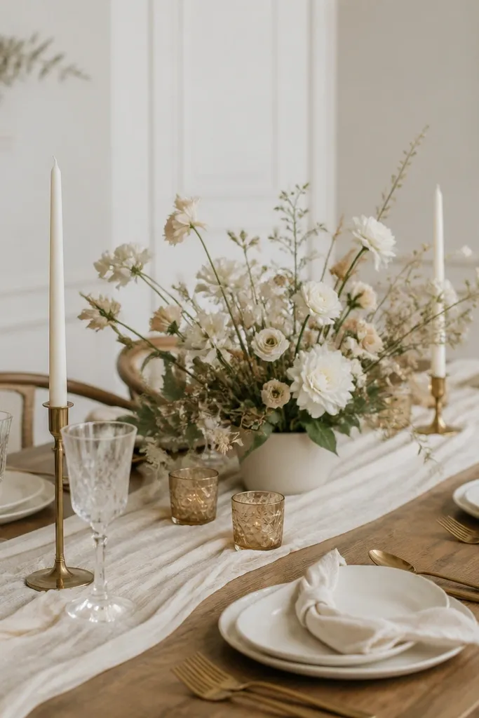
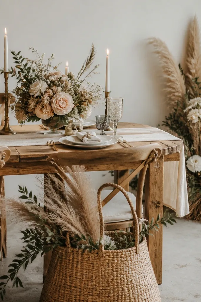
A monochrome cream table is the quiet luxury look that always photographs well. Taper candles in brass holders add vertical lines, which makes the table feel taller and more formal without adding clutter. Cream on cream works best when you use different textures: matte ceramic plates, linen napkins, and wax candles. This setting suits formal dinners and winter weddings where you want warmth but not color chaos. It also flatters guests because neutral tables don't fight the shade of their outfits.
Lay a cream runner and place cream plates so the rims show evenly. Fold napkins in a classic rectangle and stack them neatly, then set each napkin with a brass ring or skip rings and just keep them centered. Place taper candles in brass holders along the centerline, using two holders per centerpiece group. Add a low neutral floral arrangement in white, cream, and beige, keeping it under the candle height. Finish with cream place cards and dark ink so the text is readable.
Try thisUse candle drip protectors or trays under tapers - wax drips ruin the look fast.
Common mistakeAvoid mixing stark white with creamy ivory in every piece; the table can look patchy.
10. Blown Glass Bud Vases with One Matching Flower
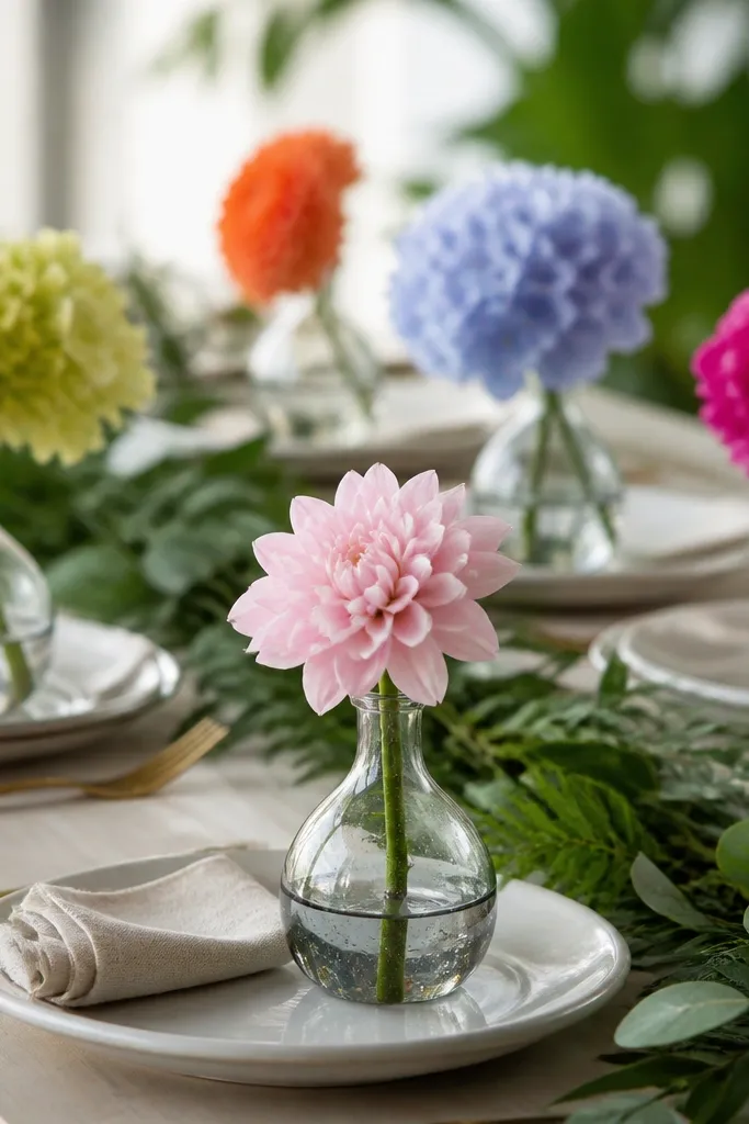
One matching flower in a bud vase looks intentional because it creates repetition without bulk. Blown glass adds texture and sparkle even with minimal flowers, and it's easy to keep consistent across many seats. Choose one flower species like white stock, baby's breath in clusters, or pale pink sweet peas - the uniformity reads "designed." This setting works for both casual and formal weddings because the glass does the heavy lifting. I've seen it look great on round tables too since the vases catch light from different angles.
Set your plates and align them first, then place a bud vase at each seat or every other seat depending on your budget. Fill each vase with the same amount of stems, trimming stems so they sit at the same height above the rim. Add a strip of greenery or a thin runner along the table center so the vases don't look like they're floating. Keep napkins in a neutral like white or light gray, folded and placed right at the plate. Use place cards in simple white stock or a color that matches the flower shade.
Try thisMeasure stem height using one "test vase" so every vase looks identical from the aisle.
Common mistakeDon't mix three different flowers in each vase; it turns into a craft table instead of a cohesive design.
11. Charcoal Napkins with White Plate Stacking
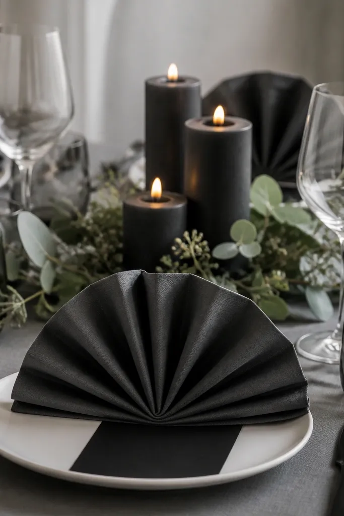
Charcoal napkins make a table feel modern and clean, especially when the plates stay white. The contrast is strong without being flashy, and it looks great in evening venues where warm overhead lights can flatten lighter palettes. This setting also handles bold wedding colors better - your table doesn't compete with deep reds or jewel greens from bouquets. I like it for couples who want a sleek look but still want comfort in the textures. Charcoal linen also hides small wrinkles better than bright white.
Start with white plates and add charcoal napkins folded into a gentle fan or simple rectangle with a slight curve. Place a slim menu or place card at the top-right of the plate and keep font simple. Add a center cluster of charcoal candles in matte holders, keeping the wax color consistent. Lay a dark runner or use a dark tablecloth if the venue allows; if not, add a charcoal runner down the center only. Finish with a few sprigs of greenery so the dark palette doesn't feel heavy.
Try thisPress napkins lightly with a warm iron setting so the fold lines look crisp, not stiff.
Common mistakeAvoid shiny charcoal napkins; they reflect light and look plasticky.
12. White Plates with Greenery-Only Table Runner
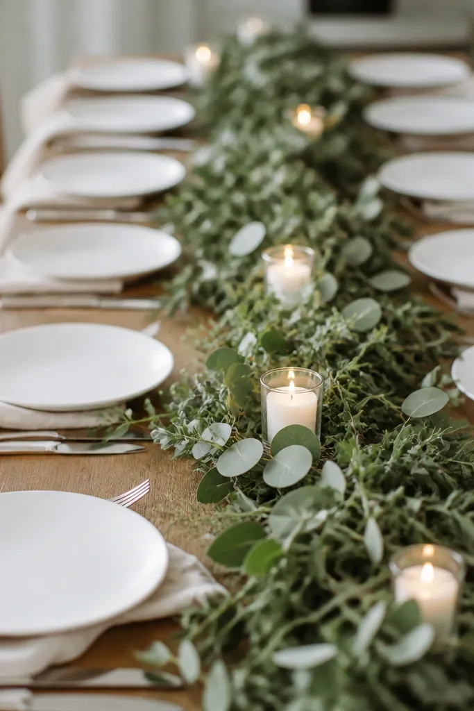
A greenery-only runner is the easiest way to make a table look expensive without buying tons of flowers. Greenery adds texture, movement, and depth, and it keeps the palette flexible if you have a wedding color theme. White plates keep the look bright, and cream napkins soften the overall contrast. This works especially well when your venue already has character - wood walls, garden views, or simple white linens. I use this when I'm trying to keep setup light but still want that "someone styled this" feeling.
Use white plates and place cream napkins with a straight fold at each seat. Lay a runner made of mixed greenery along the table center, about 12-14 inches wide, and secure it with floral tape or wire ties under the greenery. Add small votive candles in glass holders spaced evenly along the runner, leaving gaps so it doesn't look crowded. Place a single low candle or one small floral cluster at the ends for balance. Keep place cards consistent and simple so the greenery stays the main texture.
Try thisUse rosemary or eucalyptus in the runner - their leaves hold shape longer than delicate greenery.
Common mistakeDon't add too many different greenery types; it can look like a random pile instead of a designed strip.
13. Teal Napkins with Gold Speckled Candle Holders
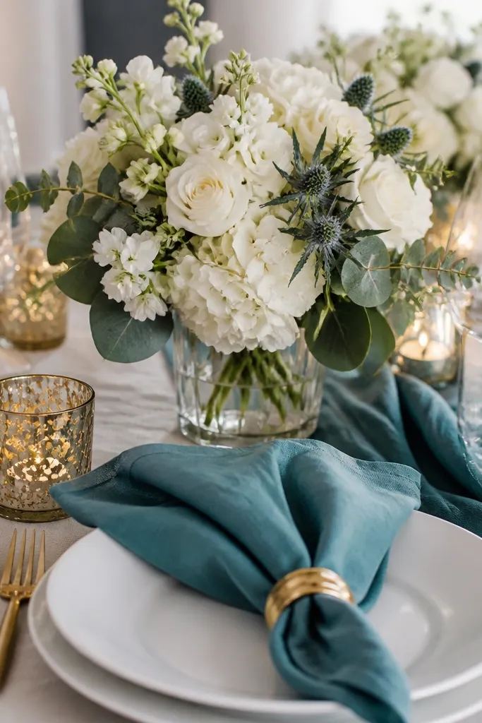
Teal napkins give you a color that looks rich in photos but still feels fresh for daytime. Gold speckled candle holders add warmth and movement, because the speckles catch light as candles flicker. This combo works beautifully with white flowers because teal is the only strong color in the table setting. I've used it for indoor receptions where the lighting is warm and you need something that won't look flat. It also flatters a range of outfits: navy suits, burgundy dresses, and neutral gowns all look good against teal.
Place white plates and fold teal napkins into a consistent shape for every seat. Add gold speckled candle holders in the center, using a mix of heights that still stays under the centerpiece height limit for conversation. For the centerpiece, use white flowers and add teal accents only in small amounts like a few ribbon loops or a couple of teal blooms. Place cards should be gold foil on white card stock or plain white with teal ink. Keep table runner neutral, so teal stays focused on napkins.
Try thisGroup candles in odd numbers (3 or 5) - even numbers can look too symmetrical and sterile.
Common mistakeAvoid teal napkins that lean blue-green neon; they look harsh under venue lights.
14. Sage and Cream Place Cards in a Matching Runner Tray
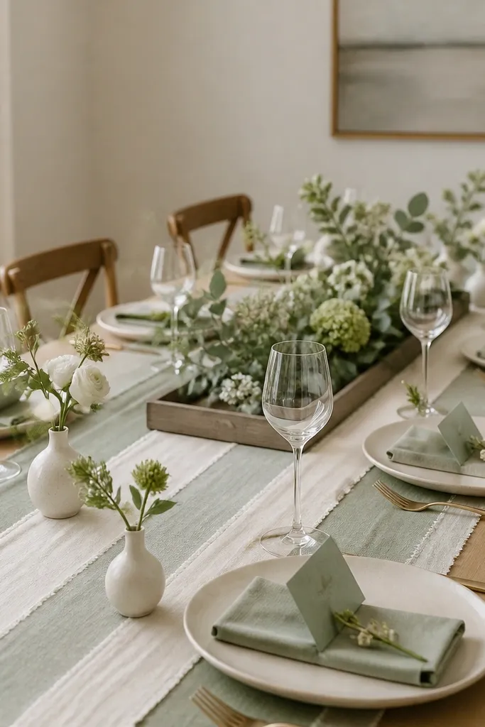
This look is clean because you treat the table like a styled set: one runner, one tray, and matching card details. Sage and cream make a soft, modern palette that works for spring and early fall weddings. The tray centerpiece keeps everything in one plane, which makes it easier to set up and easier to keep neat. Place cards look more intentional when they match the runner tone and sit in the same spot at every setting. I like this for couples who want a minimal table that still feels thoughtful.
Choose a sage runner and place it centered with even overhang on both sides. Set white plates on top and fold cream napkins into a simple rectangle. Place each sage-accented place card at the top-left of the plate, aligned with the napkin fold edge. Build the centerpiece on a tray: use cream bud vases and a few sprigs of greenery, keeping stems short so the tray doesn't block view. Add one or two candles on the tray only if the tray is stable and the venue allows open flame.
Try thisUse a tray liner (thin burlap or felt) so bud vases don't slide on smooth tabletops.
Common mistakeDon't scatter loose place cards across the table - aligned cards look expensive, scattered cards look rushed.
15. White Napkins with Natural Twine and Mini Citrus Tags
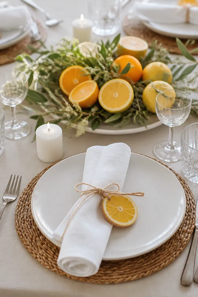
Citrus tags on napkins make the table feel playful but still refined, especially for brunch receptions and summer weddings. Natural twine keeps it grounded and matte, while the citrus detail adds a bright color pop without taking over the whole palette. White napkins keep everything crisp and allow the tag to be the focal point. This setup also helps guests find their seats quickly because the tags are visible from a distance. I've used this when couples wanted "fresh" and "not too formal," and it reads right in both daytime and golden-hour photos.
Place white plates and fold napkins into a tidy rectangle. Tie each napkin with 12 inches of natural twine and attach a mini citrus tag (lemon or orange shape) with a tiny knot or paper clip. Position the tag so it faces outward toward the guest, not against the plate. For the centerpiece, use a runner tray with sliced citrus (use real slices only if the table is short; otherwise use faux), plus greenery and a couple of low candles. Keep place cards simple and place them under the tag area so the seat looks styled, not cluttered.
Try thisIf using real citrus slices, swap them for faux within a couple hours of setup if the venue is warm.
Common mistakeDon't use glitter tags; they look cheap under overhead lights.
16. Monogrammed Cloth Napkins with Neutral Centerpieces
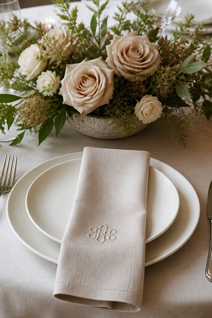
Monogrammed napkins add a personal touch that looks expensive because it's subtle and consistent. The key is keeping everything else neutral so the embroidery can be the detail guests notice. This works for couples who want something custom without doing full table themes. Neutral centerpieces keep the table calm and allow the monograms to stand out. I've seen this look especially good on formal plated dinners because it feels "family owned" and intentional rather than party-decor.
Use white or beige plates and keep chargers optional. Fold monogrammed napkins into a simple rectangle and place them so the embroidery sits near the top edge of the plate. Add a low centerpiece of beige roses or garden flowers in a neutral vase, and keep the height low enough for conversation. Use place cards in matching paper tones and keep fonts consistent across the table. If you want extra polish, add a thin ribbon around the vase or on the menu card - one color only.
Try thisOrder monogram napkins a shade warmer than your plates; stark white embroidery can look harsh.
Common mistakeAvoid oversized embroidery that takes up the whole napkin - it looks like a towel print.
17. Cream Runner with Black Menu Cards and Mini Rose Buds
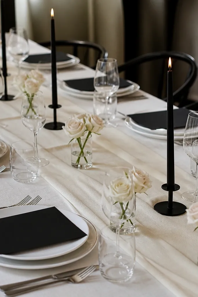
Black menu cards on a cream runner give you instant editorial style. Mini rose buds keep the centerpiece budget friendly while still looking romantic. This look is strong for couples who want a classic wedding table but with clean, modern details. Cream makes the black feel elegant instead of gloomy, and the mini roses add softness at guest level. I use this when the wedding color palette is busy - the table stays neutral so guests can focus on outfits and florals.
Start by laying a cream runner down the center, centered and pressed flat. Place white plates and fold napkins in a simple rectangle, either cream or soft white. Put a black menu card at each setting, aligned to the top edge of the plate and angled slightly if your card holder supports it. Add a mini rose bud in a small glass cup near the card, keeping the stem height consistent across seats. Place black taper candles in holders along the center, spacing them so each candle is visible between menu cards.
Try thisUse matte black paper for menus; glossy ink reflects light and can glare in photos.
Common mistakeSkip bulky card stock holders - bulky hardware makes the table look like a rental package.
18. Dusty Rose Napkins with Blush Pink Smoke Votives
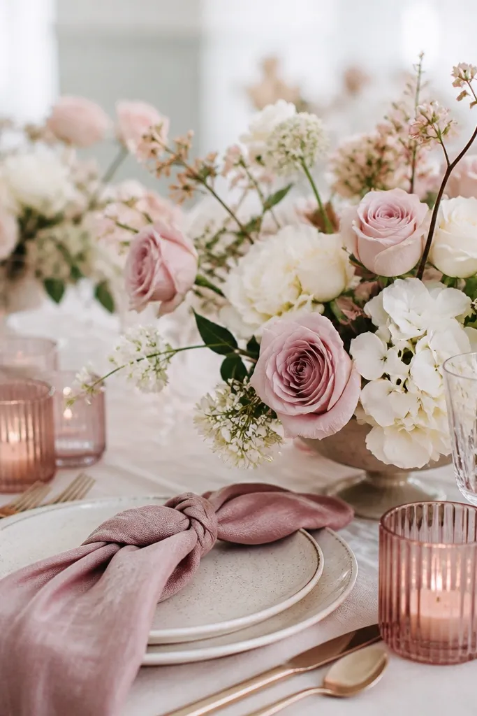
Dusty rose napkins are one of my favorite "wedding neutral" colors - they read romantic without turning into bright pink candy. Smoke votives in a blush tone add a softer candle glow, which looks good in dim venues. This setting works for both indoor and outdoor evening weddings because the candle color adds warmth. It also pairs well with silver or rose-gold flatware, depending on your venue. The key is keeping flowers pale and letting the napkins do the color work.
Set white plates and fold dusty rose napkins into a soft cuff fold, where the top edge rolls over about 1 inch. Place the napkin so the rolled edge faces the guest. Add blush smoke votives in the center, grouping them in clusters of two or three with space between. Build a low centerpiece with pale pink and white flowers, using greenery sparingly so the pale petals don't get overwhelmed. Place cards should be white with rose-gold or gray ink for readability.
Try thisTest the votive glow by lighting one candle at home near a white wall - you'll see if the color reads too orange or too gray.
Common mistakeDon't use hot pink napkins; they look harsh under candlelight.
19. Navy Blue Napkins with White Porcelain Textured Chargers
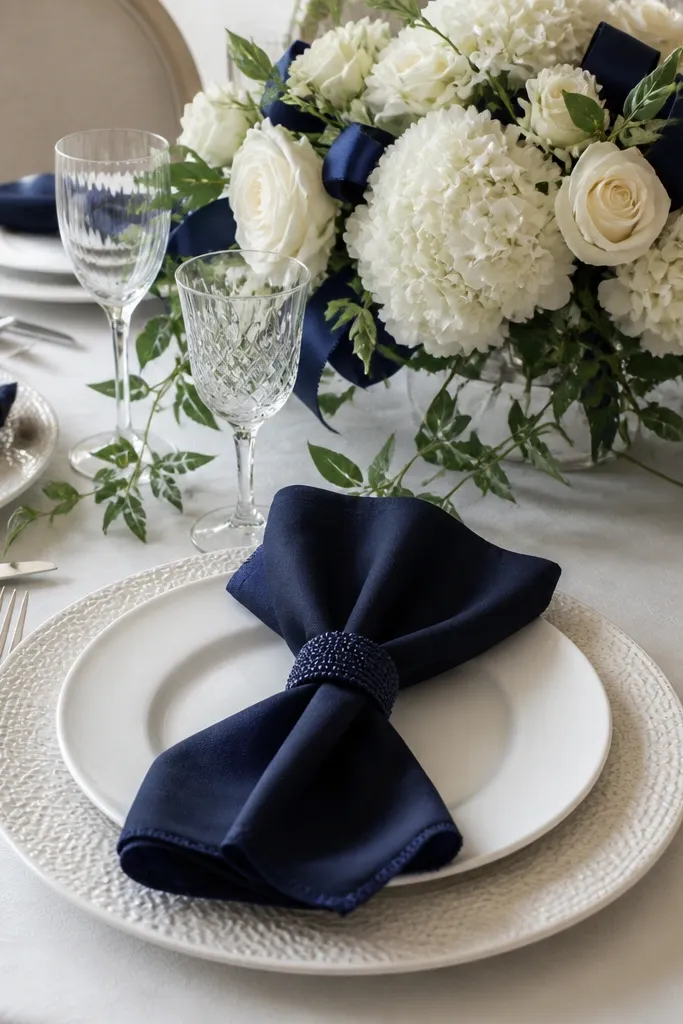
Navy napkins look crisp and formal, especially when chargers have texture. Textured porcelain chargers catch light in small highlights, so the table looks layered even if you don't add extra florals. This setting flatters cool undertones and makes warm gold jewelry look great in photos. It also works well for fall and winter because navy feels grounded. I've styled it for both men's suit-heavy guest lists and dress-forward tables - the napkin color ties everything together.
Place textured white chargers under white plates, centering them so the texture ring shows evenly. Fold navy napkins into a clean rectangle and secure with navy napkin rings or a narrow navy ribbon. Add a small ribbon accent near the center bouquet in the same navy tone so the table feels cohesive. For the centerpiece, use white flowers and a bit of greenery, and keep the arrangement low. Place cards can be white with navy ink, placed at the top-right of each setting.
Try thisKeep navy tone consistent across napkins and ribbon; even small shade differences look noticeable.
Common mistakeAvoid smooth matte chargers with navy napkins - the table can look flat and unfinished.
20. White Plates with Green Glass Bead Runner Center
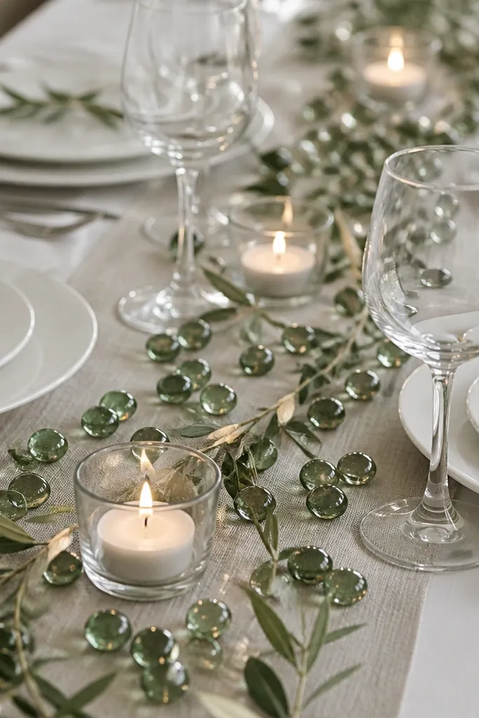
Green glass beads create a ready-made "sparkle" effect without needing fresh flowers. It looks intentional because the beads sit in a controlled line along the runner, not as random scatter. White plates keep everything clean, and clear votives let the candlelight bounce off the beads. This setting is perfect for couples who want a modern look but still want a romantic candle glow. I like it for weddings where the color palette already has greens in the bouquets, so the table echoes it.
Use a neutral runner (cream or light gray) down the center. Place white plates and fold white napkins into a simple square fold. Scatter green glass beads along the runner in a band about 6-8 inches wide, keeping the edges neat. Add clear votive candles in a straight line through the bead band, spacing them evenly so the beads don't look crowded. Add a small amount of greenery at the ends of the runner, not throughout the beads. Place cards in white with green ink keep the look cohesive.
Try thisUse a small spoon to place beads, then gently tap the runner to settle them before you light candles.
Common mistakeDon't use too many beads - if the runner turns fully glittery, it reads like party decor.
21. Single Rose in Small Bud Vase at Every Seat
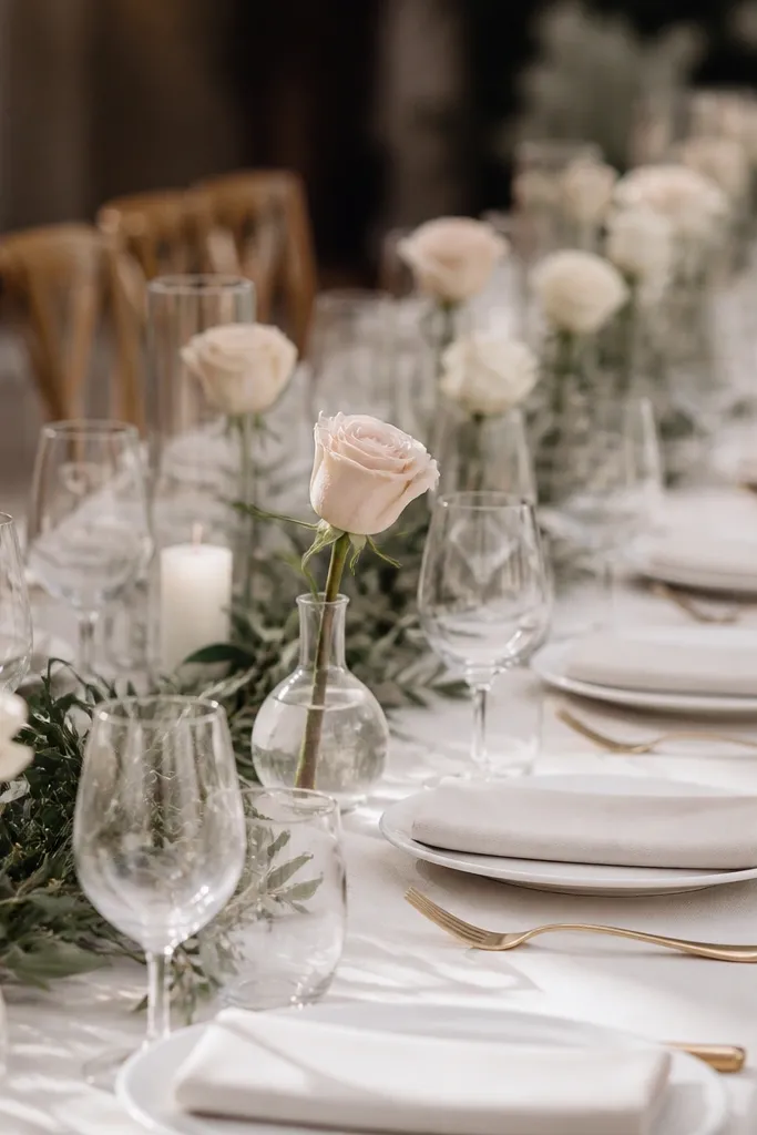
One rose per seat looks personal because it's visible at every plate, even when guests aren't standing near the centerpiece. I like it for weddings with mixed guest tables because the design doesn't rely on a single focal point. Choose one rose color and repeat it: deep red, blush, or soft white. The bud vases make it look styled without needing heavy arrangements. It also flatters all outfit colors because the flower shade becomes the controlled accent across the table.
Place white or ivory plates and keep napkins neutral (cream or light gray). Set a small bud vase at each seat, centered near the napkin or to the plate's upper-left. Place exactly one rose in each vase, trimming stems so the bloom sits at a consistent height. Add a thin greenery strip down the center for a base, and keep the center arrangement minimal - no tall bouquets. Put place cards in a matching neutral paper and keep the card holder simple so it doesn't compete with the rose.
Try thisCut stems at a slight angle and change the water before setup - single blooms look best when petals stay tight.
Common mistakeDon't mix flower types in the bud vases; it turns the table into a random assortment.
22. Gold Flatware with White Napkin Pocket Menus
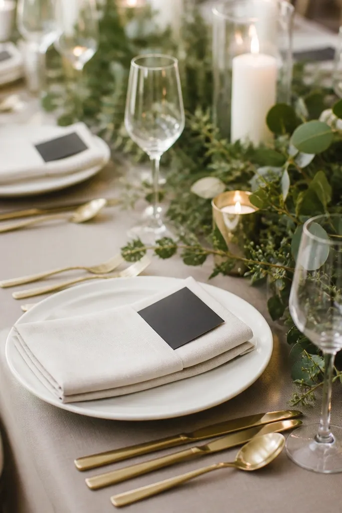
Napkin pockets are one of those details that makes everything look custom because the menu sits exactly where it should. Gold flatware adds warmth, and white napkins keep it crisp and readable. This setting works for plated dinners because menus and place cards feel like part of the table design, not extra paper. It's also great for weddings with dietary cards because you can place those inserts inside the pocket. I've done this with both black and deep green menu text - the pocket keeps the look clean.
Use white plates and gold flatware, then fold napkins into a pocket shape by creating a top fold and tucking the sides slightly. Slide the menu card into the pocket so it sits upright and aligned across the table. Place the napkin with the pocket facing the guest, not turned sideways. For the centerpiece, use white candles in glass holders with a simple greenery base around them. Add place cards in white with small gold accents, and keep everything centered on the plate so the table reads symmetrical.
Try thisIron napkins flat before folding - pockets look sharp when there's no puckering at the fold corners.
Common mistakeDon't overfill the pocket - bulky menus make the napkin look messy.
23. Olive Green Napkins with Wooden Place Card Stands
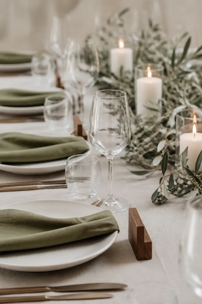
Olive green is a wedding color that looks good in daylight and still feels grounded at night. Wooden place card stands add warmth without looking rustic in a messy way, especially when you keep the rest of the table clean. White plates and olive napkins create a calm base that doesn't fight the floral palette. This setting is especially flattering if your guests wear earthy shades like tan, cream, and deep green. I've used it at outdoor venues where the table needs to blend with greenery in the background.
Place white plates and fold olive napkins into a simple rectangle. Set a wooden place card stand at the top-right of each plate, with the card centered and level. For the centerpiece, use small white candles in glass holders and add olive branches tucked around the candle group. Keep the runner neutral like oatmeal or natural linen so the wood doesn't compete with the olive. Finish with a few small greenery sprigs between candle clusters, not a full garland.
Try thisWipe wooden stands with a dry cloth right before setup - fingerprints show as shiny spots.
Common mistakeAvoid overly distressed wood stands; they look like farmhouse decor from a craft store.
24. Black-and-White Check Napkin Fold with Red Rose Accent
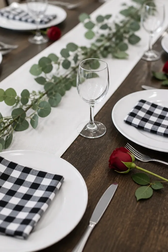
A black-and-white check napkin gives the table a graphic look that feels modern and photo-friendly. The red rose accent adds a single bold color that looks striking against the pattern without turning the table into a circus. This is a strong choice for couples who want high contrast and don't mind a little drama. The setting flatters guests because black-and-white is neutral and the red reads as a deliberate focal point. I've used it for rehearsal dinners and smaller wedding receptions where you want the table to look styled even if the centerpiece is minimal.
Use white plates and a white or neutral runner. Fold check napkins into a crisp shape - I like a simple rectangle with the check pattern aligned so it looks straight across the table. Place a small red rose bud in a mini vase or bud cup at each setting, keeping the bloom height consistent. Add greenery only around the center arrangement so the red accents stay visible at each seat. Put place cards in white with black text to keep the pattern from getting busy.
Try thisAlign the check pattern by folding once, then adjusting the corners so the lines match across the table.
Common mistakeDon't add more than one red element; one rose per seat is enough.
25. Champagne Satin Napkin with Pearl-Tone Button Detail
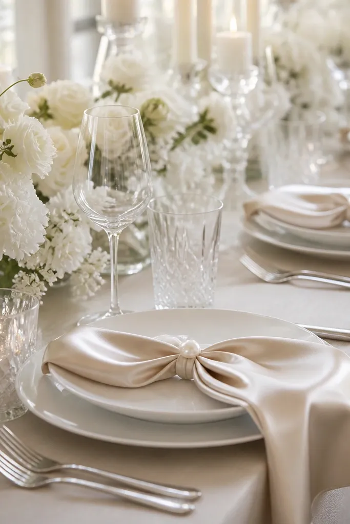
Champagne satin napkins look formal because the fabric has a gentle sheen, and the pearl-tone detail makes it feel bridal without going full theme. This setting works best when the rest is restrained: white plates, soft white flowers, and crystal or clear candle holders. The champagne tone flatters most skin tones because it's warm and neutral, not too yellow or too pink. I like it for winter weddings and ballroom receptions where you want the table to match the room's shine. It also photographs beautifully because the satin catches light in small highlights.
Place white plates and position napkins so the sheen faces the guest. Tie each napkin with a pearl-tone button detail or a small pearl brooch at the center of the fold, keeping it consistent across seats. Add crystal or clear candle holders in the center, with soft white flowers in a low arrangement. Place cards should be white with champagne-gold text or deep brown ink so the paper reads clearly. Keep flatware in one finish - gold or silver - and don't mix tones.
Try thisIf the satin shows wrinkles, hang napkins in the bathroom during a hot shower for 10 minutes before setup.
Common mistakeAvoid overly bright champagne satin; it can look yellow under warm venue lighting.