1. The 3mm floating margin inside the mat
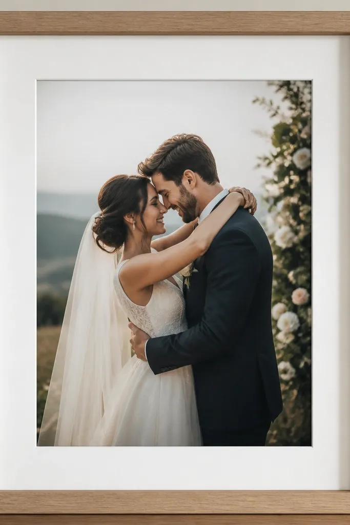
When you leave a 3mm margin, the card reads as intentional and crisp instead of "stuck in." I've done this with thick 300 gsm cardstock and thin letterpress sets, and the gap makes both look more premium because the eye sees clean borders. Use a mat in matte white or warm off-white if your card has gold foil or glossy ink. For darker cards, a soft cream mat keeps the card from looking swallowed by the frame. This is especially flattering for smaller frames because the border becomes the visual anchor.
Start by measuring the frame opening width and height. Subtract your card dimensions and divide by two - that number is your target margin, aiming for about 3mm on every side. Place the card on top of the mat dry, then mark four tiny pencil dots at the corners through the mat opening. Add small corner tabs or tape on the card's back only after you confirm the card is level across the top.
Try thisUse a metal ruler and a pencil that's easy to wipe off - you want razor-straight border lines before tape goes anywhere.
Common mistakeAvoid letting the card touch the glass - that contact creates smudges and a shiny hotspot that looks cheap on camera.
2. Matte frame for glossy invitation ink
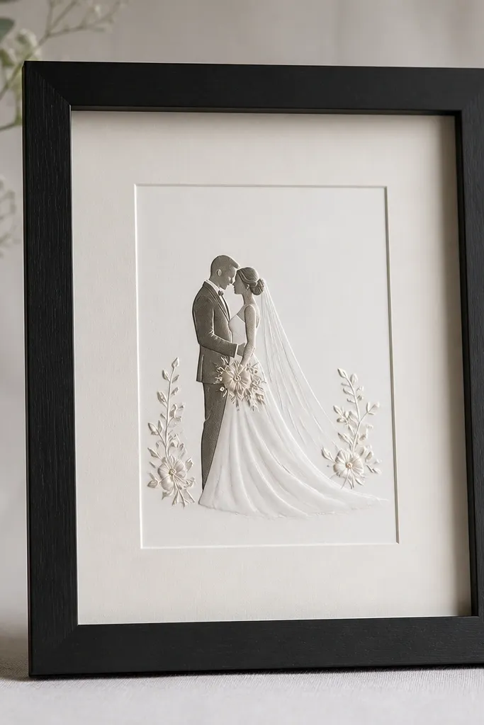
Glossy ink and foil reflect light, so a matte frame finish keeps the reflection from competing with the card. I've framed cards with rose-gold foil on cream paper using a matte black frame, and the foil stays readable instead of turning into a bright glare blob. Matte finishes also hide fingerprints better, which matters because you'll touch the frame while hanging it. If your card has a high-shine background, choose a matte frame and a plain mat - no glossy accents around the border. This combo looks clean on both light and medium skin tones in photos because the card stays the focal point.
Pick a matte frame in black, charcoal, or warm white - avoid satin or lacquer if the card is glossy. Add a mat that matches the card's paper tone, then position the card so the foil sits centered and not too close to the glass. Test glare by moving a phone light across the glass - if you see streaks, swap to a matte frame or increase the gap with spacers. Tape the card at the back corners so the front surface stays flat and glare-free.
Try thisWipe the frame interior with a microfiber cloth before assembly; matte finishes show smudges less, but they still show.
Common mistakeAvoid using a shiny gold or glossy lacquer frame with glossy card ink - the reflections fight each other.
3. Satin brass frame with raised lettering
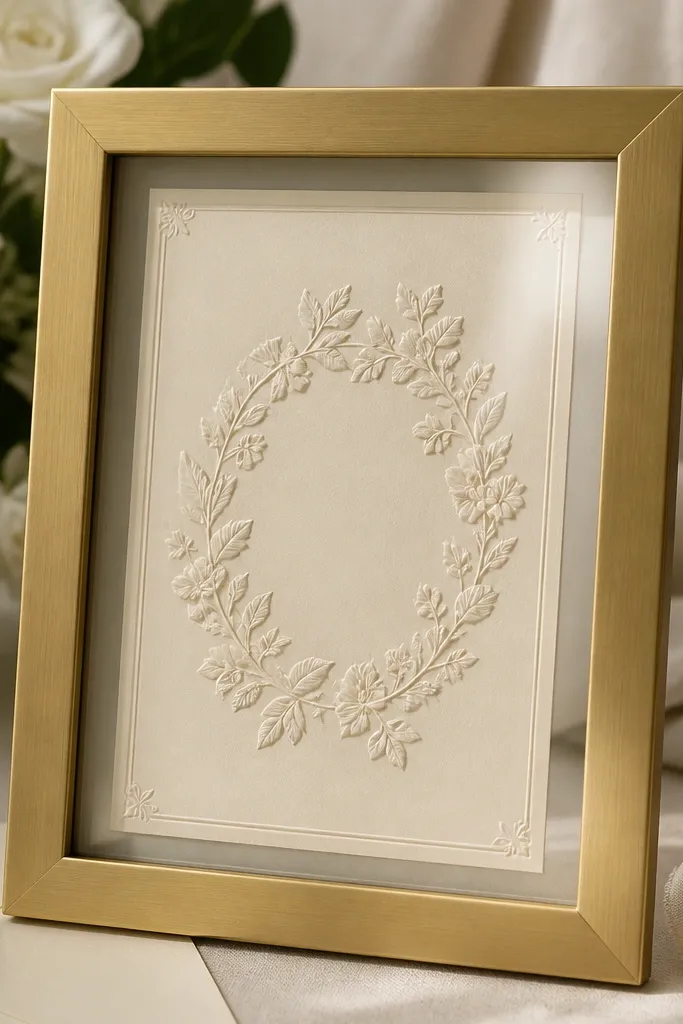
Raised lettering needs a frame that adds warmth without turning into a mirror. Brushed or satin brass gives a gentle glow that complements embossing and keeps it looking dimensional. I used this pairing on a card with thick, raised script and it photographed beautifully - you could see the texture without harsh glare. This works best when the card is cream, ivory, or champagne, and the ink is dark (black, deep green, or burgundy). The satin finish flatters the card's texture and makes the lettering look more sculpted.
Choose a satin or brushed brass frame, not polished mirror-brass. Use a neutral mat, either ivory or light greige, and keep a 2-3mm floating margin. Center the card by measuring from the mat edges, then lightly tape only the back corners so the raised areas stay unobstructed. If your frame has thick glass, consider adding a thin non-glare sheet behind the glass or using UV glass if available, then test glare with side lighting.
Try thisIf the brass still throws bright reflections, turn the frame slightly when you hang it - a few degrees changes the hotspot.
Common mistakeAvoid mirror-polished brass with raised foil - it creates hard reflections that flatten the lettering.
4. Off-white mat to calm dark cards
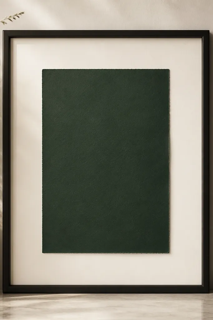
Dark cards look expensive when the mat adds light around the edges. I've framed deep navy and forest-green cards using an off-white mat, and the contrast makes the ink look sharper without overpowering the design. A bright pure white mat can look too stark, especially if the card paper is warm or creamy underneath. Off-white also hides tiny alignment errors because the border is forgiving. This pairing is flattering for darker card palettes and works well for both minimal and ornate card designs.
Start by comparing the mat to your card paper in daylight - if the card looks warm, choose off-white instead of stark white. Place the card on the mat and check that the border feels balanced, then mark the placement. Use thin archival tape at the corners or a strip along one side on the back only. Close the frame and view it against the wall - if the card looks swallowed, increase the mat border or add a thin spacer behind the card.
Try thisHold the finished frame at arm's length and step back two feet; you'll instantly see if the mat is too bright or too tight.
Common mistakeAvoid pure white mats with warm-toned dark cards - the contrast can look harsh and "cut out."
5. Clear acrylic spacers for frames without a mat
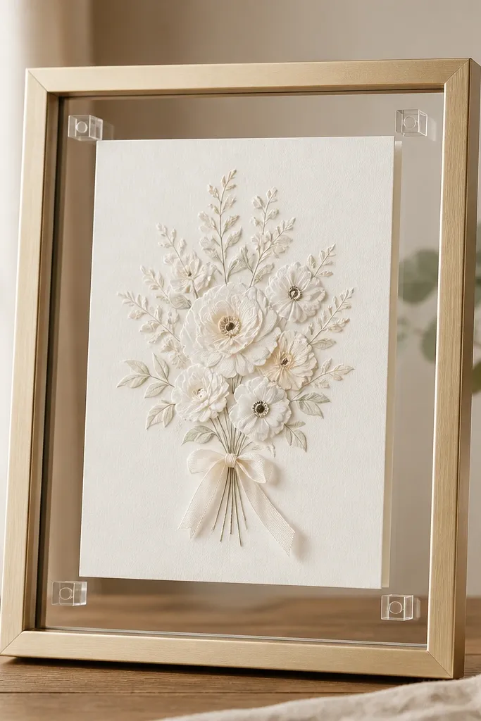
If your frame has no mat, clear acrylic spacers solve the biggest wedding card frame mistakes: the card touching glass and catching fingerprints. I've used small acrylic blocks behind the card's corners to create a consistent gap, and it instantly looks more like a display than a craft. Acrylic is also strong enough to keep the card from bowing when you close the frame. This works well for postcards, folded cards, and thicker cardstock that needs space to stay flat. The gap gives the card depth, and the transparent spacers disappear against the glass.
Measure your frame opening depth and choose acrylic spacers thin enough that the frame still closes without pressure. Place the card dry inside the frame, then position the spacer blocks at the back corners - keep them away from any text or raised elements. Tape the card to the spacers using archival double-sided tape or small dots of removable adhesive. Close the frame slowly while watching the card edges; if the card lifts, remove and reduce spacer thickness.
Try thisUse a flashlight from the side once assembled; if you see contact points, reduce spacer thickness or shift the blocks.
Common mistakeAvoid gluing the card directly to glass - it sticks permanently and makes glare worse.
6. Corner tabs instead of full-sheet tape
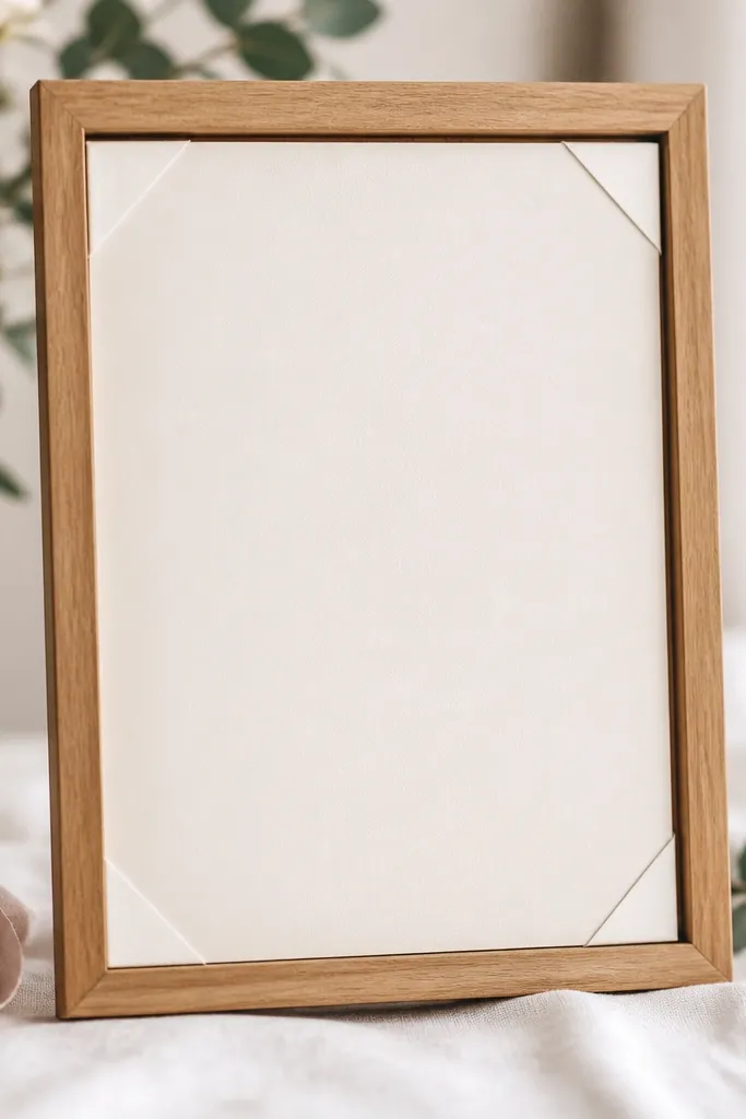
Full-sheet tape makes the card look slightly wrinkled or warped because it presses the paper unevenly. I prefer corner tabs because they hold the card flat while leaving the center free to sit naturally. This matters most with handmade cards that have deckle edges or slight texture - full tape fights that texture. Corner tabs also make it easier to remove the card later without tearing it. The front stays clean and smooth, so the design reads clearly.
Lay the card face-up and check it's perfectly dry and flat. Flip it over and apply two small strips at the top corners and two at the bottom corners, or use archival corner tabs if you have them. Place the card into the frame opening, then press each corner tab down one at a time while you check alignment. After it's positioned, gently press the center with your fingertips through a clean cloth to confirm it lies flat.
Try thisIf your card is thick, use thinner tabs - thick tape can create a visible ridge behind the mat.
Common mistakeAvoid taping the entire back - it can create bubbles and makes the card look uneven.
7. Archival tape and acid-free backing
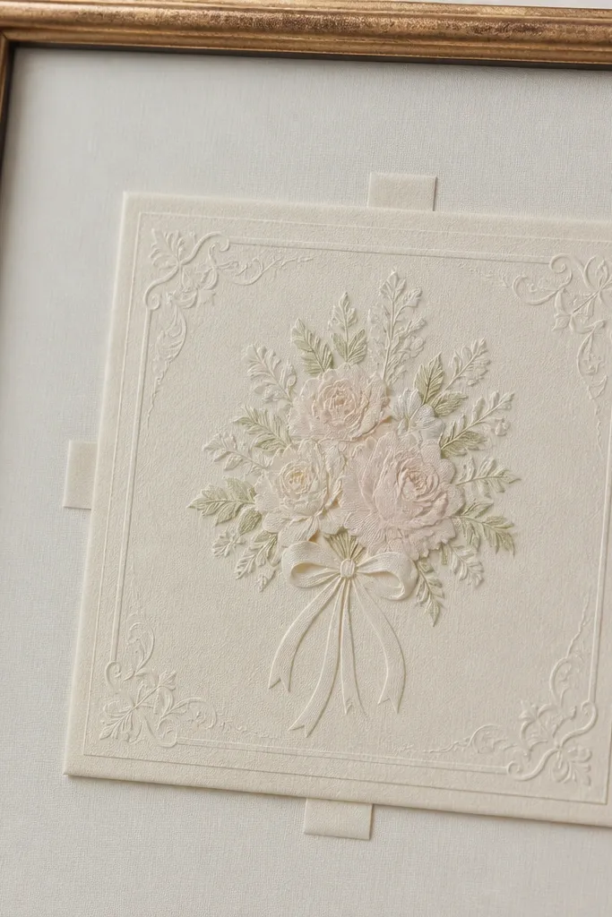
You want the card to look the same ten years from now, and the materials matter more than people think. Acid-free backing prevents yellowing, and archival tape is less likely to leave residue or damage paper fibers. I've had one framed card stored in a bright room where cheap tape dried out and left a faint stain; it was subtle but noticeable in daylight. Acid-free materials keep the paper tone steady, especially for cream or ivory cards. This is also safer for cards with delicate foil - you don't want adhesives reacting over time.
Buy acid-free foam board or acid-free mounting board that matches your frame depth. Cut it to fit the frame backing, then pre-measure your card placement so you don't have to re-cut. Apply archival tape only where you need it - corners or a short strip along the back edge. Close the frame and store it away from direct sun for the first week so any adhesive settles before you hang it.
Try thisIf you can smell sharp adhesive when you open the tape, switch brands; that smell usually means harsher solvents.
Common mistakeAvoid regular office tape or glue sticks - they can stain paper and yellow over time.
8. Level the top edge with a phone inclinometer
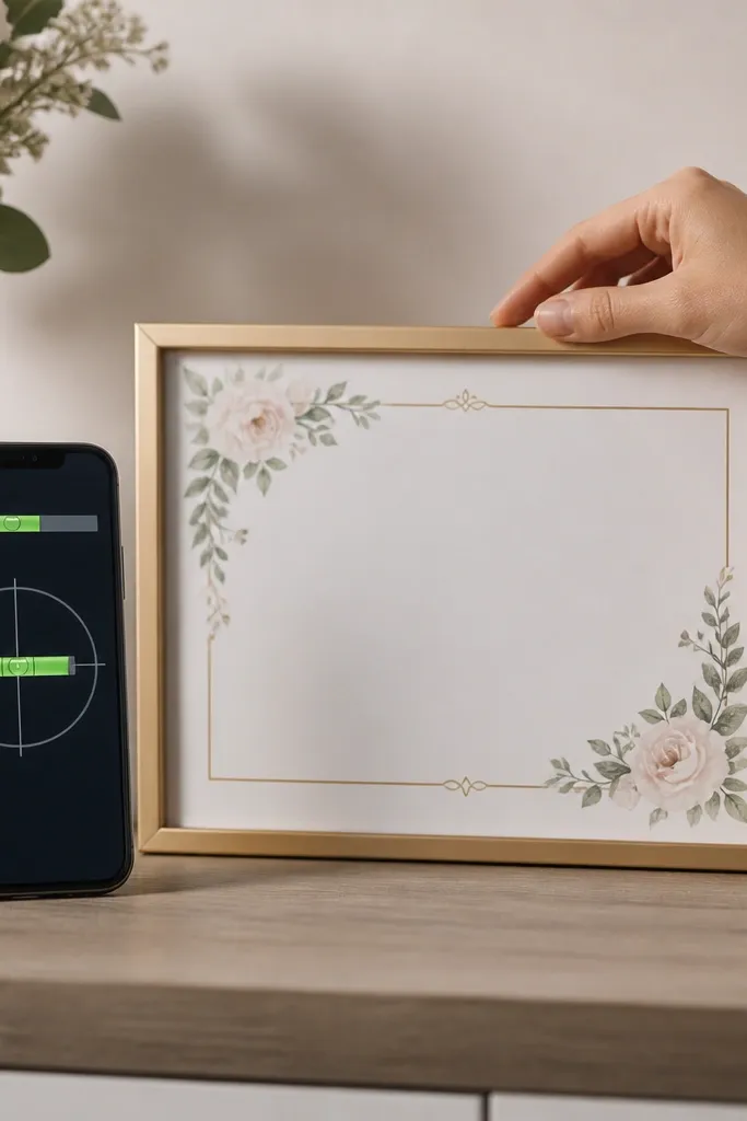
A crooked frame is the fastest way to make a wedding card look like a rushed DIY. I've framed a lot of these, and the "looks straight" trick fails under hanging height and wall angles. Leveling the top edge first makes the whole piece feel calm and intentional. This matters for tall frames where a small tilt becomes obvious in photos. It also flatters the card design because the border lines look straight, which people read as "clean" instantly.
Hang the frame without the glass snap-in if possible, or set it on a table at the final viewing height. Use a phone inclinometer app and place the phone along the top edge of the frame. Adjust the frame until the reading is at zero, then mark the hanging points lightly with pencil. After you hang it, check again from two angles - standing and slightly to the side - because wall perspective exaggerates tilt.
Try thisIf you hang above eye level, check level again from the couch - that's where most guests will view it.
Common mistakeAvoid eyeballing level using the frame corners alone - those corners can be slightly off even when the frame looks square.
9. Non-glare film when your room has bright windows
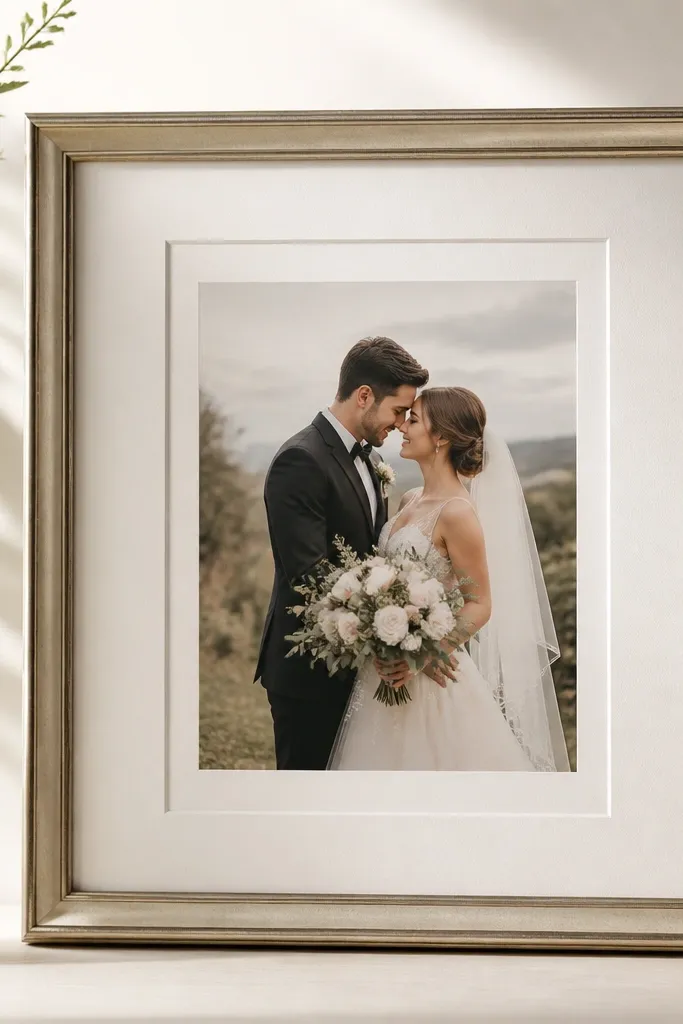
If you have bright windows or a chandelier, glass glare turns into a white streak that covers the card's best part. I've fixed this by adding non-glare film on the inside of the frame glass when the lighting is unavoidable. The card stays readable, and the colors look more like the original cardstock. Non-glare film also makes raised foil less painful to photograph. This is especially worth it for frames displayed in entryways or living rooms with hard light.
Clean the inside of the glass with a lint-free microfiber cloth so the film sticks cleanly. Measure the glass area and cut the film slightly larger, then trim after you test fit. Apply the film slowly from one side using a squeegee or a clean credit card wrapped in cloth to avoid bubbles. Once it's in place, assemble the frame and test with your phone camera - move the light source and confirm the card stays readable.
Try thisIf the film shows rainbow edges, press them out with the squeegee and let it sit for an hour before final assembly.
Common mistakeAvoid removing glare with thick curtains and hoping - glare still shows in camera lighting.
10. Black-brown frame for warm ink tones
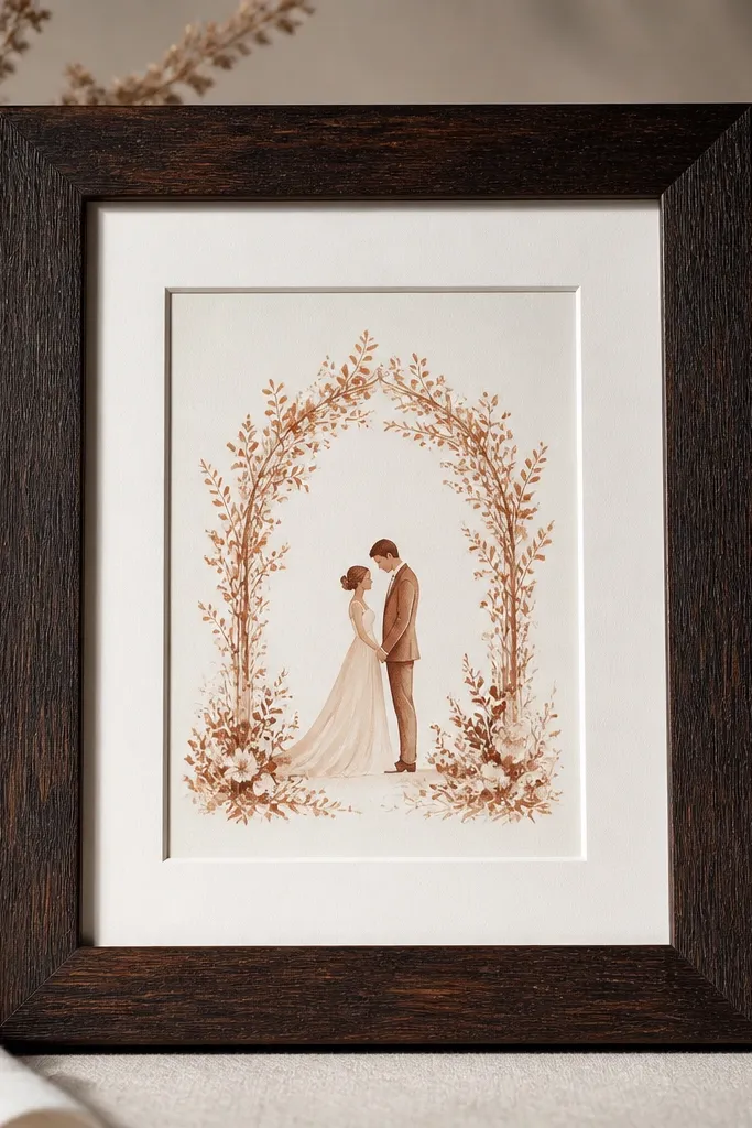
Black-brown wood frames look warmer than flat black and they match copper, terracotta, and warm brown ink without making the card look cold. I used this on a card with copper foil accents and it looked like the foil belonged in the frame, not pasted on. Warm undertones also flatter people's skin tones in photos because the frame doesn't throw harsh gray shadows. If your card has ivory paper with warm script, choose black-brown and a cream mat. It's a small change that makes the whole setup feel cohesive.
Pick a frame with a satin black-brown finish and avoid pure jet black if your card is warm. Use a cream mat and keep a consistent border around the card. Center the card and tape with corner tabs so the foil edges stay smooth. Hang it in a spot with indirect light; warm frames look best without overhead glare.
Try thisIf the frame looks too dark in person, switch to a lighter cream mat before you blame the card colors.
Common mistakeAvoid pure black frames with copper-leaning cards - it can turn the whole piece gray.
11. Mat border that matches the invitation border thickness
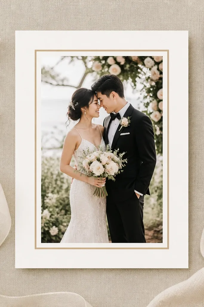
When the mat border width echoes the card's own border weight, the eye reads it as one design system. I've noticed this most with cards that already have a printed frame line or a thin border on the paper - the wrong mat width can make the card feel cramped or floating too far. Matching border rhythm makes the card look placed, not inserted. This works whether your card is minimal (thin line art) or ornate (lace-like edges). It also makes the card feel balanced in wider frames.
Look at your card and measure the printed border thickness or the width from edge to design line. Choose a mat border that feels similar - for thin line borders, use a slimmer mat border; for bold borders, use a slightly wider one. Dry fit the card and step back; if the mat border feels too small, add a second mat layer or choose a larger frame opening. Once it looks right, mark placement and mount with corner tabs.
Try thisIf you're unsure, aim for a mat border that's 1.5 to 2 times the printed border thickness.
Common mistakeAvoid a mat border that's either too thin or too wide - both make the card look like it got squeezed.
12. Folded card display using a shadow-box depth
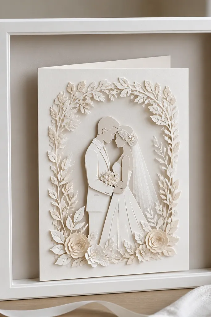
A folded card deserves depth, not a flat press. Shadow-box frames let the fold sit with a little angle so the shape is visible, and that makes the card feel like a keepsake instead of flat paper. I've framed folded RSVP cards and wedding bands notes in shadow-box style, and the fold shadow makes the design look intentional. Choose this method for cards with ribbons, layered paper, or any physical dimension. It looks great in offices and entryways because it has texture from normal viewing distance.
Use a shadow-box frame with at least 3/4 inch (about 18-20mm) depth so the folded card doesn't crush. Mount the card on acid-free foam board, then position it so the fold faces outward and casts a shadow. Secure with corner tabs or small foam adhesive dots so the fold stays sharp. Close the shadow-box and check through glass for reflections; if the fold creates glare, slightly tilt the card toward the light source during mounting.
Try thisIf your fold has a ribbon, keep it flat against the backing and avoid letting it touch glass - ribbons snag and blur in photos.
Common mistakeAvoid forcing a folded card into a flat frame - it flattens creases and can damage paper fibers.
13. Thin-line black mat for modern minimal cards
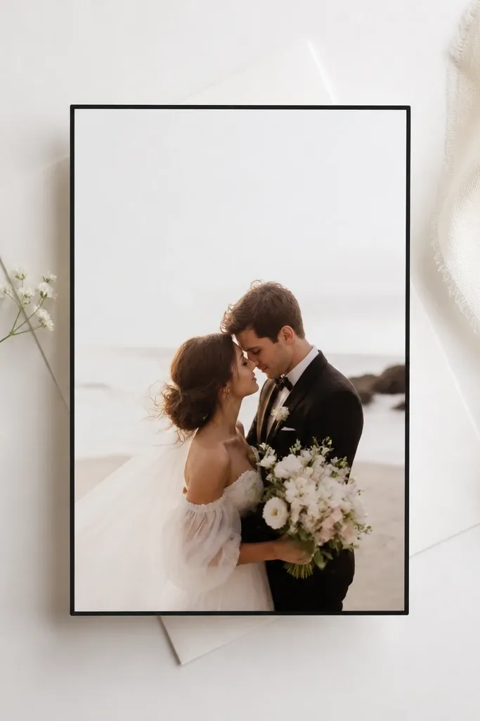
Minimal cards look best with a narrow, crisp border that doesn't steal attention. A thin-line black mat makes the card edges look clean and frames the typography without adding bulk. I used this approach on a card with simple sans-serif text and it photographed like a gallery print. It also works well for monochrome palettes: black, white, and soft gray. This is flattering for people who like clean, modern aesthetics because it doesn't feel heavy.
Choose a frame with a simple profile and a matte finish. Cut or buy a black mat with a narrow border and place the card centered with a consistent gap. Mount using corner tabs so the card doesn't shift when you close the frame. Check that the card's ink isn't too close to the mat edge; keep at least 3mm clearance so text doesn't feel squeezed.
Try thisIf the card has very light typography, switch to dark gray mat instead of deep black to soften contrast.
Common mistakeAvoid thick decorative mats with minimal cards - the extra border makes the design look busy.
14. Warm oak frame for watercolor paper tones
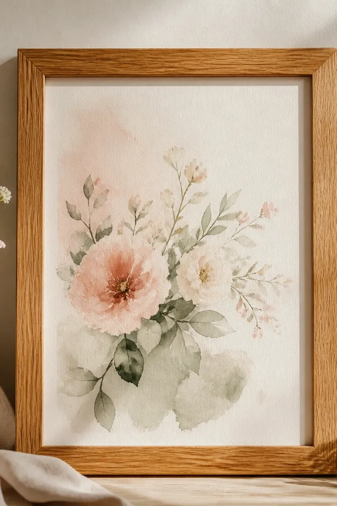
Watercolor cards already have gentle gradients, and warm oak frames keep that softness without adding harsh contrast. I've framed blush-and-sage watercolor cards in honey oak with an ivory mat, and the colors look truer than when paired with black frames. Oak also hides minor scuffs better than glossy black, which matters because you'll handle it during display setup. This pairing looks great for outdoor wedding palettes and for cards that have botanical illustrations. It's flattering in photos because the warm wood tones balance cool ink shades.
Pick a warm oak frame with a matte or satin finish so the wood doesn't glare. Use an ivory mat and keep a 3-5mm floating margin depending on card thickness. Align the card so the watercolor focal point sits slightly above center if the illustration is top-heavy. Mount with small corner tabs and press gently through a cloth to avoid fingerprints on the watercolor texture.
Try thisWipe watercolor cards with a dry microfiber cloth only - avoid moisture that can disturb pigment edges.
Common mistakeAvoid pairing watercolor cards with glossy black frames - the contrast can look severe and flatten the washes.
15. Spacing for cards with thick embellishments
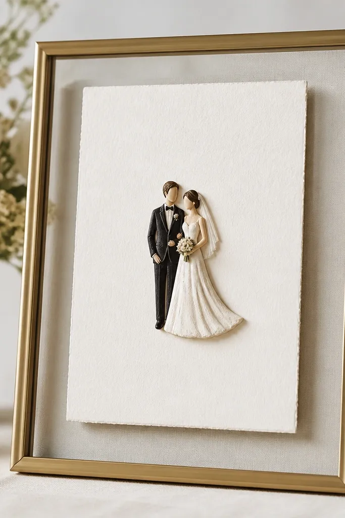
If your card has layered paper, a ribbon knot, or a 3D sticker, you need clearance or the glass will press it and you'll see dents. I learned this the hard way when a small foam sticker got flattened after the frame closed - the front looked fine until it caught light. The solution is to build depth behind the card so the embellishment sits in free space. This method keeps texture visible and protects the card's edges. It also makes the final piece feel more like a display and less like a document in a sleeve.
Measure the thickest point of the card embellishment with a ruler or caliper. Choose spacers or a shadow-box depth that gives at least 2-3mm clearance beyond that thickest point. Mount the card on acid-free backing, then tape only the parts that are flat - avoid taping over thick raised areas. Close the frame and run your fingertip around the glass edge; if you feel pressure, add more depth or reduce backing layers.
Try thisIf you're between depths, go bigger - you can always trim foam board, but you can't undo a crushed sticker.
Common mistakeAvoid closing the frame while it feels tight - tight means the embellishment is getting compressed.
16. Micro-tilt for wide frames to reduce visual imbalance
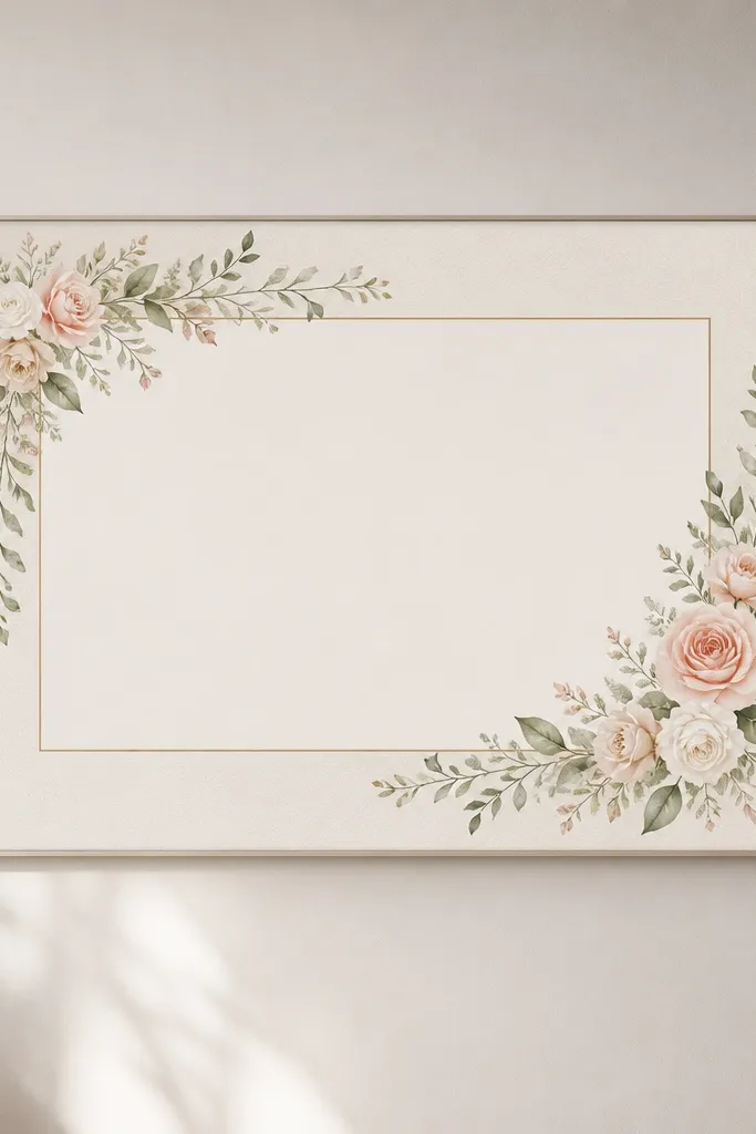
Wide frames can look "crooked" even when they're technically level because the wall perspective exaggerates small angles. I've found that a micro-adjustment - a tiny correction you only see when standing at the main viewing spot - makes the card look centered and calm. This is not about slanting for style; it's about matching the camera angle most people use. The card should look straight when viewed from the couch or entry threshold. This approach is best when the frame is wide and the card art is centered with lots of whitespace.
Hang the frame using level for the top edge first. Step back to the exact viewing distance where guests will stand, and use your phone camera grid to check if the card top border looks off. If it does, adjust the hanging hooks by a millimeter or two and re-check with the phone. Once it looks straight from that spot, leave it - small "fixes" after that usually make it worse.
Try thisUse two check points: one at eye level and one at chest height; walls trick your eyes at only one height.
Common mistakeAvoid re-leveling after every tiny adjustment - repeated changes make the frame drift out of true alignment.
17. Glass cleaning before assembly, not after
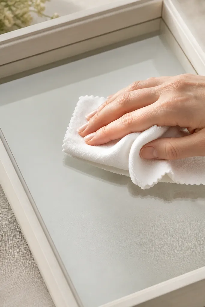
Cleaning glass after assembly is how you create new fingerprints in the exact spot you need to be perfect. I clean the glass before I mount the card because you're less likely to touch the inside surface once the frame is closed. This matters for wedding card frames because the glass is large and glare shows every smudge. A clean interior keeps foil, embossing, and printed lines crisp. If you skip this, the card can look dull and the colors look washed out even with good lighting.
Take the glass out and wipe both sides with a clean microfiber cloth. If you use cleaner, spray onto the cloth, not directly onto the glass, and buff until no streaks remain. Assemble the card first, then place the glass carefully without dragging the cloth across it. After final closure, check the glass under a diagonal light; if you see a smear, open the frame and clean again - don't wipe through the frame once it's mounted.
Try thisDo a final check using a flashlight held at a low angle - smudges show up fast.
Common mistakeAvoid cleaning with paper towels - they leave micro-scratches and smear residue.
18. Frame size choice that matches card aspect ratio
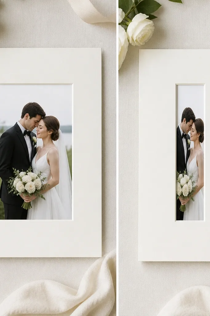
A frame that's the wrong aspect ratio makes the card look like it's shrinking, even if the mat is the right color. I've seen this with square frames holding portrait cards - the border becomes too wide on one side and too tight on the other, and your eye notices immediately. Matching aspect ratio keeps the card's proportions correct and makes the design sit naturally. This looks best when the frame opening is close to the card's intended orientation - portrait stays portrait, landscape stays landscape. It also makes hanging easier because the composition looks balanced without extra tricks.
Measure the card front area you actually want visible, not the whole folded edge. Choose a frame opening that keeps the card centered with a consistent margin on all sides. If you're stuck between sizes, pick the one that allows a mat and margin - margins are your friend. Dry fit the card in the empty frame and step back; if the card feels cramped, switch sizes before mounting.
Try thisWhen in doubt, prioritize mat space over frame size - mat space hides small alignment errors.
Common mistakeAvoid stuffing a portrait card into a landscape opening - the card looks off even when it's level.
19. Use a 2mm "reveal" so the card edge never kisses the glass
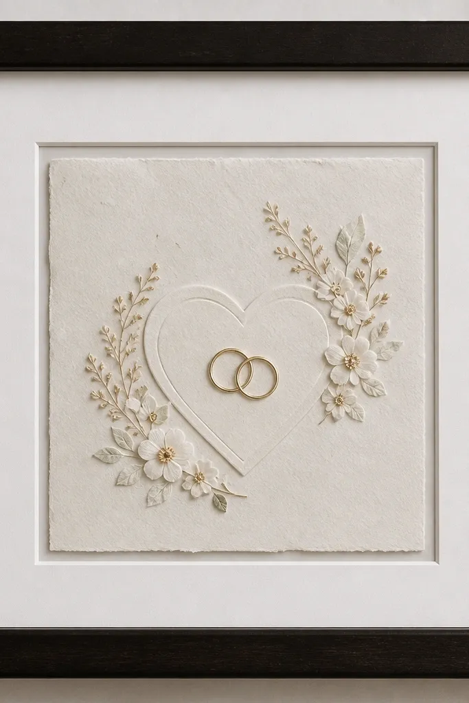
This is the part people miss when they frame at home - the card edge needs a small, even buffer so it never touches the glass during shipping or temperature swings. I aim for a 2mm reveal around the card, not a wider gap that makes the card look like it is floating randomly. When there is that tiny air space, you also avoid the "wet ink" look that happens when glossy ink reflects right off the glass too closely. I've rebuilt frames that were only off by 1mm and the difference was obvious in photos - the card looked cramped and the ink glare got worse.
First, measure the card thickness and then decide whether it will sit directly on the mat or on a backing board. Next, cut your mat opening so the card sits with a 2mm gap on all sides - I mark the card outline on the back of the mat with a pencil and then subtract 4mm total from each dimension (2mm each side). If the mat opening is already cut, you can still fix it by adding a thin liner strip behind the card to center it and create the reveal. Dry-fit the card with the glass in place before you tape anything, then check the gap at the four corners under a bright lamp.
Try thisUse a cheap metal ruler and measure the reveal at all four corners - eyeballing looks fine until the frame is on a wall.
Common mistakeSkip frames where the card edge touches the glass even in one corner - that's when fingerprints and ink transfer show up later.
20. Seal the back like a photo album: tape only the corners, then cover with a paper dust cover
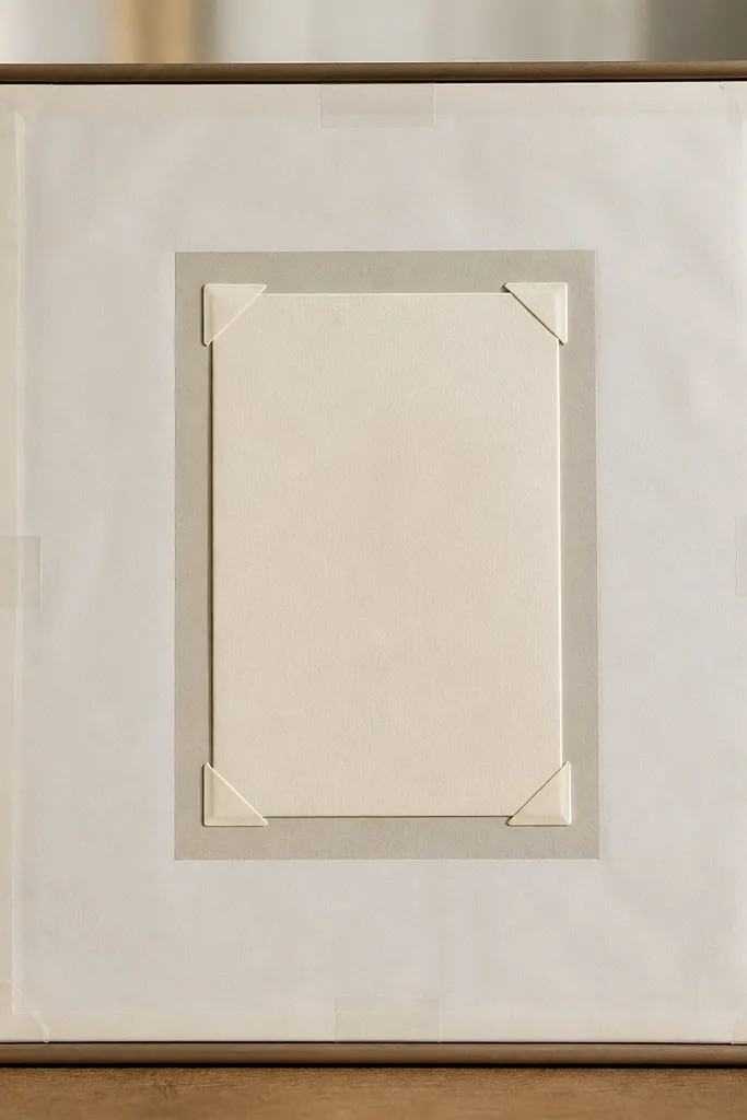
A framed wedding card doesn't just need a good front - it needs a back that stays flat, clean, and dry for years. I tape at the corners only, because corner points hold the card without wrinkling it or pulling it toward the center as adhesives age. Then I add a paper dust cover over the backing so dust and tiny paper fibers don't drift out from inside the frame. The first time I started doing this, I found less discoloration around the card edges after months of hanging in a room with sun exposure.
First, put the card on the acid-free backing board and secure it with two corner tabs on the top corners and two on the bottom corners, leaving the center completely free. Next, add a dust cover cut from off-white archival paper - it should sit just inside the inner edge of the frame so it doesn't bow the backing. Tape the dust cover to the frame edges only, using small strips that never cross over the card area. Close the frame and check from the front that no adhesive edges show through the mat window, then shake the frame gently once - the card should not move.
Try thisUse a brayer or your palm to press the dust cover tape down firmly at the frame edges, then trim any paper overhang so it cannot rub the glass.
Common mistakeSkip wrapping the card in plastic wrap or letting tape sit across the center - it creates trapped moisture spots and can leave a ghost line on the paper.