1. Tape-Frame Cream Card Sign with Navy Welcome
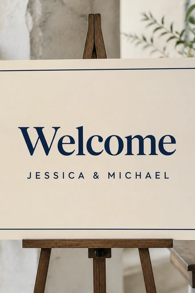
This is the one I reach for when I want clean, classic, and fast without hunting for frames. The cream cardstock makes skin tones in photos look warmer, and navy ink reads well under both daylight and warm indoor bulbs. The tape border tricks the eye into thinking the sign is professionally finished because it creates a crisp rectangle. It looks best with simple typography and works whether you're doing an elegant church vibe or a backyard dinner with neutral decor.
Cut cream cardstock to 12x18 inches. Print your "Welcome" and names on plain white paper, then trim the text to fit inside your tape border leaving about a 1 inch margin on all sides. Lay masking tape around the edges first, pressing it down firmly with your thumbnail so it seals cleanly. Mount the printed text with a thin layer of glue stick or double-sided tape, then press again so nothing bubbles. Finally, add two small dots of navy tape at the corners as "anchors" so the border feels intentional.
Try thisUse painter's tape, not glossy packing tape - the finish matters when the sign is photographed.
Common mistakeAvoid thick tape stacks; they make the border look lumpy and unfinished.
2. Thrifted Picture Frame Insert Welcome Print
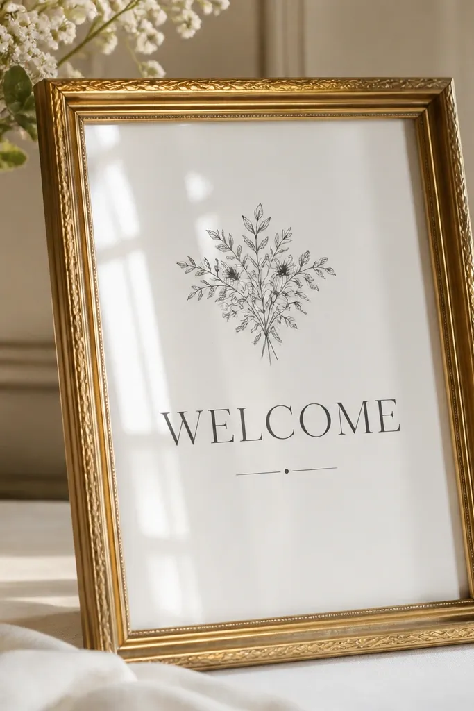
Picture frames instantly make a welcome sign feel like decor, not a craft. I like this option when the venue already has table frames, mirrors, or gold accents, because the metal ties the whole look together. Charcoal text on white keeps it readable and modern, while the frame adds weight and stability so it stands straight. This works especially well for people who don't want to mess with glue or borders because the frame does the finishing for you.
Find a frame that fits a 5x7 or 8x10 insert, then pull out the backing. Print your welcome design to match the insert size exactly, trimming so it sits flush. Lay the print over the glass side or behind the glass depending on the frame type, then tape the corners lightly to stop it from shifting. Reinsert the backing and close the frame. For display, set it on an easel or lean it against a stand, and add a small felt pad under the bottom edge so it doesn't slide.
Try thisIf you're using glass, pick matte text (not shiny metallic) so glare doesn't wash out letters in photos.
Common mistakeDon't pick a frame with heavy dust or scratches; cleaning takes longer than you think.
3. Chalk Marker on Reversible Burlap Ribbon Board
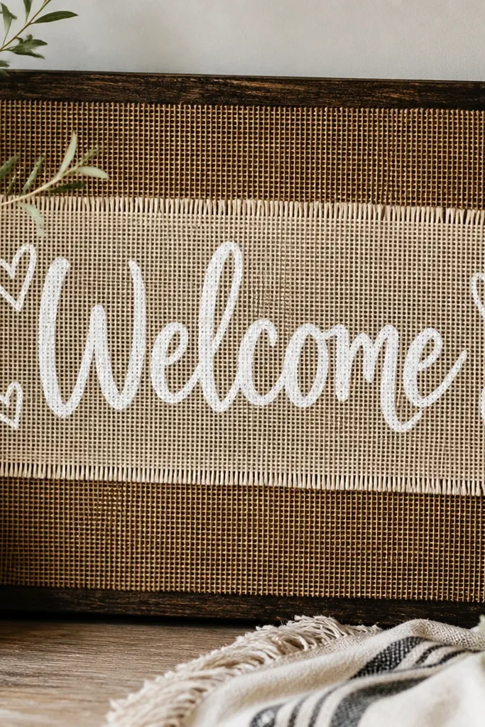
Burlap makes everything feel wedding-y fast because the texture reads warm in photos. I use a reversible burlap ribbon panel on top of a darker backing so the letters pop even from a distance. Chalk marker looks soft and handwritten without needing calligraphy practice, and it matches rustic, garden, or farmhouse decor. If you have olive or tan skin tones in your wedding party, burlap's warm neutrals make everyone look good in group shots.
Cut a foam board backing to 12x18 inches, then cover it with burlap or a burlap-look fabric using spray adhesive. Add a centered vertical strip of cream burlap ribbon or fabric panel, leaving about 3 inches of margin on both sides. Use chalk marker to write "Welcome" first, then add names and date in smaller lines under it. Let it dry flat for 5-10 minutes so the chalk doesn't smear. Display it on an easel and keep the board matte; avoid glossy clear spray unless you test it on scrap.
Try thisPractice the "W" on scrap burlap first - chalk sits differently on weave than on smooth paper.
Common mistakeAvoid writing too close to the fabric edges; fraying spots show in photos.
4. Monogram Vinyl Sticker Welcome on Matte Black Poster
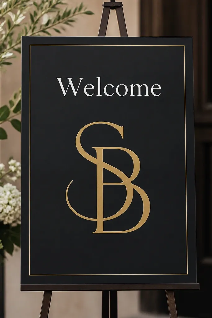
Black poster board with white vinyl-style text is the fastest way to get high contrast. It reads clearly from across a room and looks sharp in evening light, which is when most guests arrive. I like adding a gold line because it keeps the black from feeling too harsh. This is a strong choice for modern weddings, indoor receptions, and venues with black chairs or gold accents.
Cut matte black poster board to 12x18 inches. Print or draw your "Welcome" and names, then transfer them as vinyl stickers if you have access, or use pre-cut letter stickers. Add a thin line frame using gold metallic tape, keeping the border about 1 inch from the edges. Place the monogram in the center first, then align the "Welcome" above it so spacing looks even. Press every sticker down firmly and run a credit card along edges to prevent lifting.
Try thisIf you're using stickers, press them after the board warms up to room temperature to reduce curling.
Common mistakeAvoid glossy black; it reflects overhead lights and makes the text harder to read.
5. Pressed Flower Corner Welcome on Thick Watercolor Paper
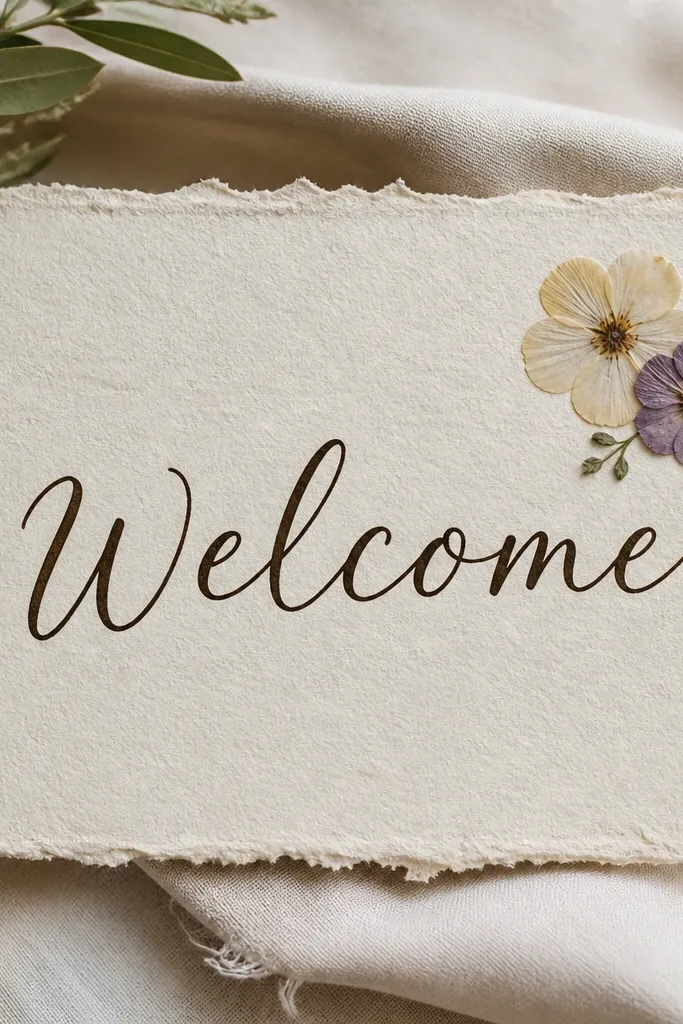
This idea looks delicate without being fragile. Thick watercolor paper holds ink well and gives a handmade feel that still looks clean. Pressed flowers in the corner keep the composition light so the text stays the main event. It works beautifully for neutral palettes, garden ceremonies, and people who like soft, airy stationery. In photos, the deckled texture adds dimension even if your guests don't notice the flowers in person.
Use 140 lb watercolor paper cut to 11x17 or 12x18 inches. Print or hand-letter "Welcome" in dark brown ink, leaving a lot of breathing room. Place pressed flowers in the top-right corner - I keep it to two blooms so it doesn't look crowded. Fix them with tiny dots of clear gel medium or craft glue near the stems, then let it set flat for 10-15 minutes. For display, mount the watercolor paper onto a thin backing board so it doesn't bend at the edges.
Try thisUse dark brown or charcoal ink, not black, because pressed blooms look calmer with softer contrast.
Common mistakeAvoid too many flowers; a cluttered corner makes the sign read as "craft" instead of decor.
6. Fabric Swatch Banner Welcome on Wood Clothespins
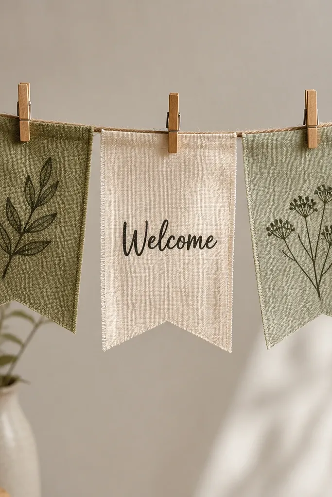
This is a great option when you need something that moves slightly and looks cute in outdoor light. Fabric swatches hide minor printing imperfections and add color without needing a lot of supplies. Clothespins make it interactive and easy to set up - you can swap the banner for welcome-to-the-reception later. It looks best with linen, cotton, or gauze-like fabrics in cream, blush, and dusty blue.
Cut three fabric rectangles, about 8x10 inches each, in coordinated colors. Print your "Welcome" for the middle panel, then iron-on transfer or fabric-safe marker it using a stencil. Stretch twine across two nails or a small stand, then clip the fabric swatches with wooden clothespins. Arrange the swatches so the center "Welcome" panel sits slightly higher than the side panels for visual balance. Tie a small bow at one end to hide the twine knot and make the setup look finished.
Try thisUse fabric-safe transfers and test one swatch first; cheap transfers can crack after ironing.
Common mistakeAvoid slippery satin fabric; it wrinkles and makes the letters look crooked.
7. Acrylic Nameplate Style Welcome on Clear Sheet
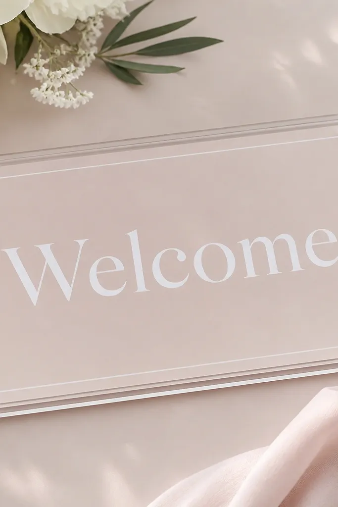
Clear-sheet signs look polished fast because they mimic acrylic nameplates you'd normally buy for events. The trick is backing color: pale blush or light peach makes the white text glow instead of looking harsh. This works well for modern, minimalist weddings and for couples who want a clean look that doesn't compete with florals. It also photographs well because the sign feels "layered" even though it's just sheet + backing.
Buy a clear plastic sheet or acrylic-style transparency sized about 12x18 inches. Cut a backing card in pale blush to match exactly. Apply white vinyl letters or white permanent marker with a stencil for "Welcome" and names. Place the backing card behind the clear sheet, then tape the edges with clear tape so nothing shifts. Display on a stand or prop against a frame so it stays vertical and doesn't catch glare from directly behind.
Try thisPlace the sign so lights hit from the side, not straight behind, to avoid glare washing out the letters.
Common mistakeAvoid using bright neon backings; they make white letters look washed.
8. Gold Foil Contact Paper Border with White Print
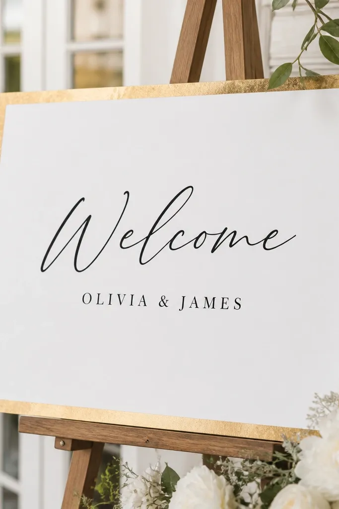
Gold contact paper is one of those supplies that makes a cheap print look expensive. The reflective border catches warm indoor light without needing glittery full surfaces. White paper keeps it crisp, and black script gives you that soft wedding feel without going full calligraphy project. This works especially well for receptions with gold cutlery, brass candle holders, or warm beige walls.
Cut a white cardstock panel to 12x18 inches. Apply gold contact paper to create a border: measure a 1 inch margin, then cut the border strips to size and press them down smoothly. Print "Welcome" in black script and names in small caps, then mount it inside the border with double-sided tape. Smooth the whole sign with a clean cloth to remove bubbles. If the sign is going outdoors, skip extra reflections and keep the contact border only.
Try thisTrim contact paper edges with a sharp craft knife so the border lines look factory-straight.
Common mistakeAvoid large gold areas; too much foil can look tacky in photos.
9. Pastel Ombre Paper Welcome with Simple Block Letters
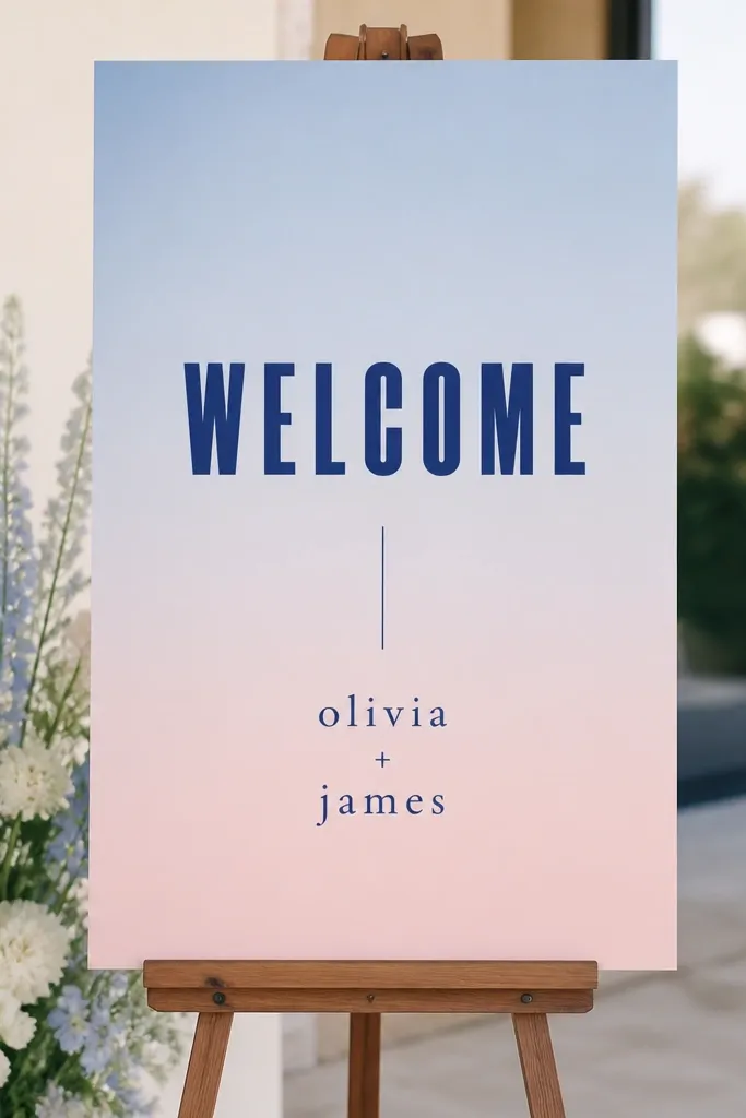
Ombre backgrounds look dreamy, but you don't need a digital printer to make them. Pastel transitions add softness while block letters keep the sign readable, which is the part I care about most for guest flow. This looks great for spring weddings and for couples who want color without loud patterns. It also flatters a lot of skin tones because the background sits in the cool-to-warm range.
Create an ombre using three ink pads or watercolor washes on thick paper. Start with powder blue at the top, blend down into lilac, then fade into blush at the bottom using a damp sponge. Let it dry fully, then lightly pencil a center guide. Paint or stencil deep navy "Welcome" in bold block letters, then add names and date in smaller navy text. Mount the finished ombre onto a white foam board backing so it doesn't curl.
Try thisUse a stencil for the first word so the letters stay consistent and look sharp from far away.
Common mistakeAvoid wet layers that bleed into the text; let the ombre dry before you write.
10. White Linen Look Backdrop with Navy Rope Border
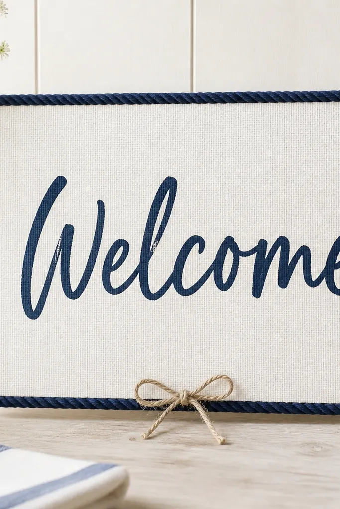
If your wedding has a coastal, beachy, or nautical vibe, rope border is a fast way to match it. Linen-texture backing looks expensive in photos because it hides minor surface imperfections and keeps the whole design soft. Navy rope around the edges frames the text without needing gold or glitter. This works well for outdoor ceremonies, especially near water or in airy venues with lots of natural light.
Cover a foam board with white linen-look fabric using spray adhesive. Cut a rectangle of navy rope border pieces that fit the perimeter, leaving about 1 inch inside the edge. Glue rope using hot glue, but apply it in short segments so it doesn't cool into lumps. Write "Welcome" in navy marker centered, then add names below in smaller handwriting. Finish by tying a tiny bow or knot at the bottom center where the rope ends meet.
Try thisHand-rub the rope border after gluing so it sits flatter and catches light evenly.
Common mistakeAvoid leaving glue strings along the rope; trim immediately with a craft knife.
11. Chalkboard Style Print with Framed Clipboard
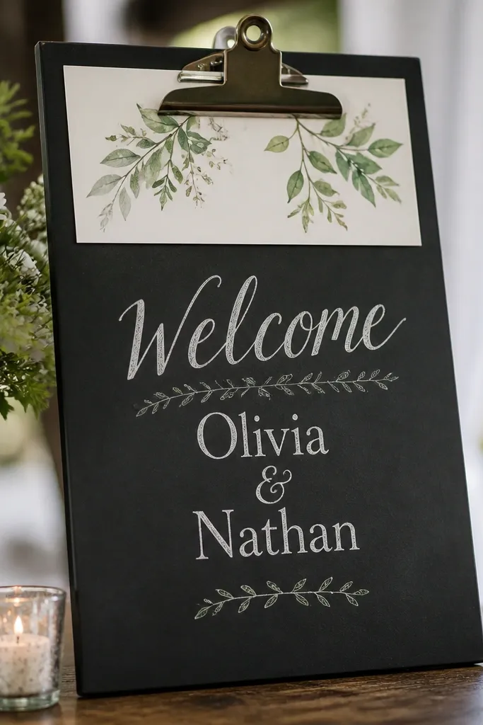
Clipboard signs look like they belong at an event, not a DIY corner. The black surface gives you strong contrast, and the white chalk-like lettering reads clearly in dim venues. I've used this style at receptions where lighting was warm and slightly dark, and the sign was still easy to spot. It's also a good choice if you want to update the sign later for "Dinner is Served" or "Please Take a Seat."
Buy a black clipboard or clip board board that's about 9x12 or 11x14. Print a chalkboard-style welcome design on white paper with thick letters. Slide the insert under the clip so it sits flat and doesn't shift. If the clipboard is glossy, matte it with a light dusting of chalk dust (optional) so reflections don't glare. Place it on a small easel or table stand near the entrance.
Try thisChoose fonts with thick strokes; thin chalk fonts disappear at distance.
Common mistakeAvoid using a glossy photo print; the shine fights with black surfaces.
12. Watercolor Wash Background with Cutout Name Letters
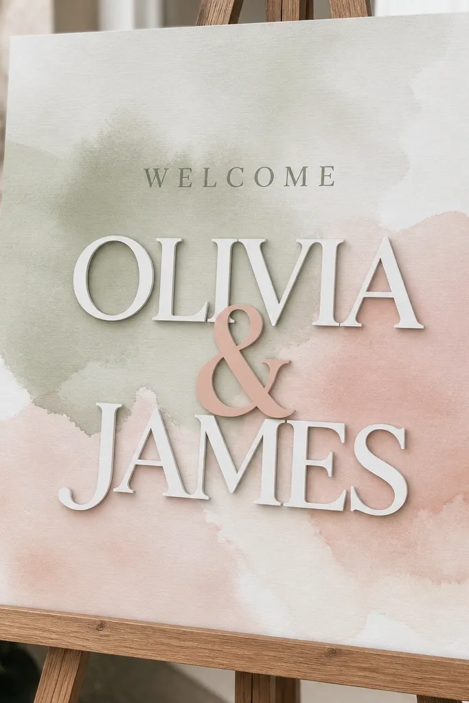
Cutout letters add dimension without expensive materials. The watercolor wash gives softness, while the layered letters create a shadow that keeps the names readable. I like sage plus blush because it flatters warm and cool skin tones and matches both greenery-heavy florals and neutral tables. This works for couples who want something artsy but still clean and organized.
Paint a watercolor wash background on 12x18 thick paper using sage at the top and blush at the bottom, leaving the center a little lighter for contrast. Print "Welcome" in a dark gray ink and glue it near the top center. Cut name letters from cardstock in white and a second layer in blush, then glue the blush layer slightly offset to create a shadow effect. Mount everything onto a foam board backing so the cutouts don't bend. Display on an easel and keep the sign away from direct airflow so paper edges don't lift.
Try thisOffset the second layer by 1/8 inch for a clean shadow - bigger offsets look sloppy.
Common mistakeAvoid tiny letter sizes; cutouts need width to look crisp.
13. Printed Tissue Paper Window Welcome on Foam Board
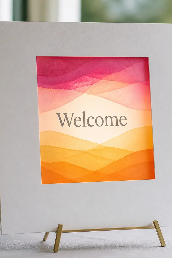
This is my go-to for evening weddings when you want the sign to look like it has light behind it. Tissue paper creates a soft glow, and it hides uneven printing because the texture diffuses contrast. I use it with a simple white "Welcome" and a darker backing so the letters still read. It looks great for indoor venues with string lights, because the sign blends into the warm lighting instead of fighting it.
Cut a foam board base to 12x18 inches. Cut a centered rectangle opening, about 6x10 inches, and leave a border of foam around it. Cover the opening with layered tissue paper in blush and pale gold, then tape the tissue to the back. Print "Welcome" on white paper and place it behind the tissue, taping it so it sits flat. Add a thin frame border around the window using washi tape or thin ribbon.
Try thisUse at least two tissue layers; one layer looks too see-through and the glow looks weak.
Common mistakeAvoid bright red tissue; it can make white lettering turn pink in photos.
14. Minimalist Black-and-White Typography on Mounted Card Stack
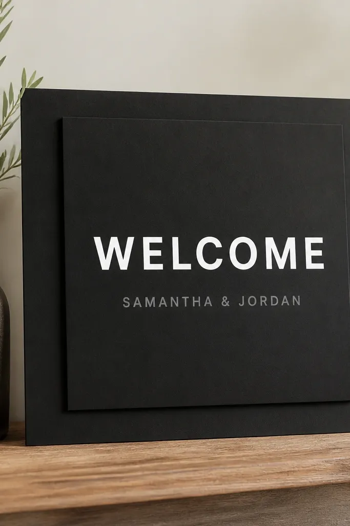
Stacked cardstock gives you that designer look without buying anything fancy. Black-and-white typography reads cleanly and keeps the focus on your names and date. This is a smart choice if your venue has lots of busy decor because the sign stays calm and doesn't compete. It's also friendly for photos because the contrast stays consistent in different lighting.
Cut a black cardstock base to 12x18 inches. Cut a second slightly smaller black panel (about 11.5x17 inches) and glue it centered to create a layered edge. Print "Welcome" in white bold sans serif and mount it near the top center, leaving 3 inches of space below. Add names in gray or light silver and keep the spacing equal on both sides. Mount the final piece on a foam board if you want it to stand rigid.
Try thisUse a single font family for both lines; mixing fonts too fast makes the design look like a flyer.
Common mistakeAvoid adding extra icons; minimal means fewer elements, not empty space.
15. Rope and Dried Eucalyptus Welcome on Natural Wood Slat Board
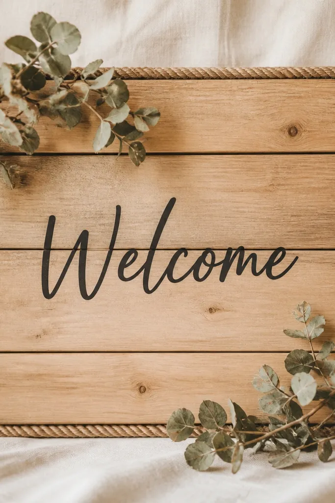
Wood slats give you texture that looks good even if your letters are simple. The dried eucalyptus corners add a soft green that works with both warm and cool palettes, and it doesn't overwhelm the text. I like this when the wedding tables already have greenery runners or pampas arrangements. It's also a practical choice because the wood hides small scuffs and looks fine if you're moving it between spots.
Buy or cut a wood slat board roughly 12x18 inches. Wipe it clean, then lightly sand any rough spots so marker ink sits well. Tie thin rope around the perimeter, then secure it with small hot glue dots at the corners only. Paint or stencil "Welcome" in dark brown or charcoal centered, then add names below. Place dried eucalyptus sprigs in the top-left and bottom-right corners and secure with floral wire behind the slats.
Try thisIf you're using marker, test on a scrap slat - some woods soak ink unevenly.
Common mistakeAvoid placing eucalyptus too close to the center; it makes the sign harder to read.
16. Gold Leaf Look Letters on Matte White with Painter's Tape Frame
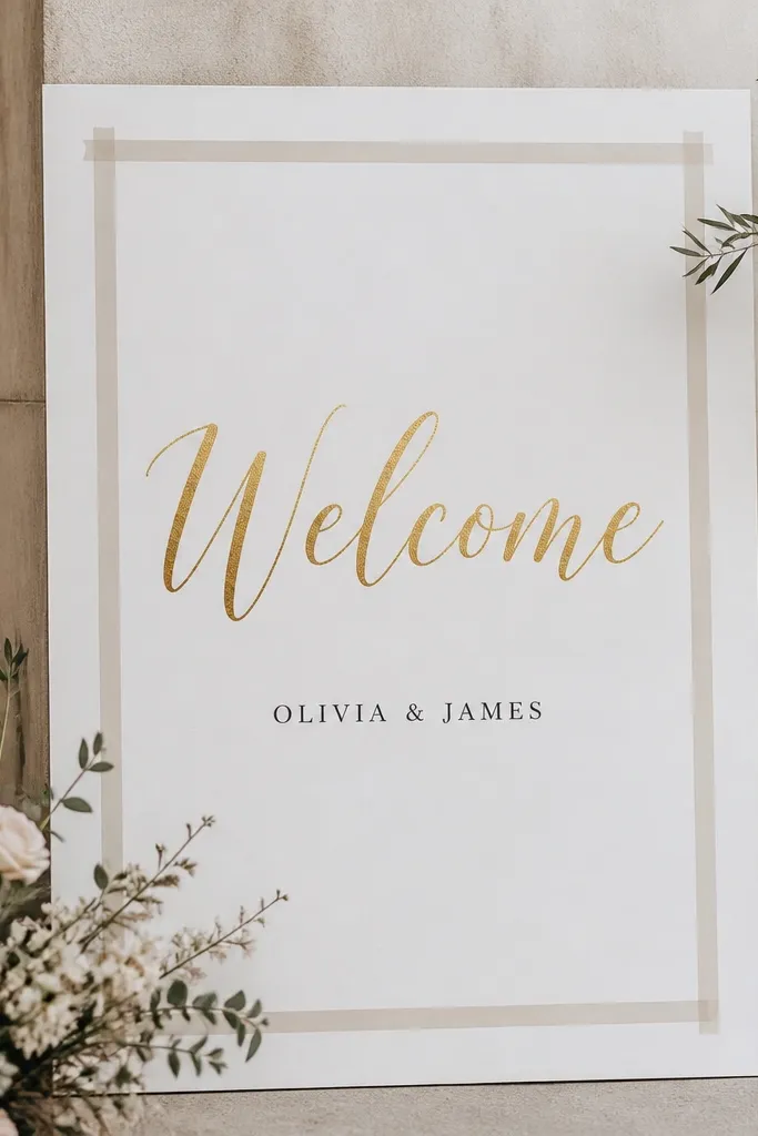
Gold leaf look lettering adds instant ceremony energy, but you need to keep it matte so it doesn't look like cheap stickers. Painter's tape frames it cleanly, and matte white keeps the text readable under overhead lighting. I use this when the wedding palette is white, cream, and soft gold - it matches candles and charger plates. This also flatters a wide range of skin tones because the background stays neutral and the gold sits warm.
Cut matte white cardstock or foam board to 12x18 inches. Tape a border with painter's tape, leaving a 1-inch inner margin. Write "Welcome" using a gold leaf effect pen or transfer letters, then add names in black or deep charcoal below. Press the tape firmly so edges are crisp, and remove tape carefully while the marker is dry. Mount the sign on foam board if you want it to stand without warping.
Try thisRemove painter's tape while the surface is still slightly tacky from adhesive so the edge stays sharp.
Common mistakeAvoid metallic ink on glossy paper; it reflects and turns letters into a glare blob.
17. Ribbon Bow Welcome on Large Letter Cutouts
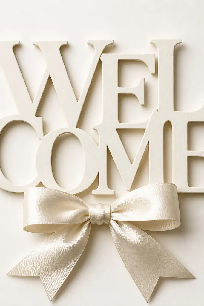
Large letter cutouts create impact without needing fancy printing. The ribbon bow adds a celebration cue and gives the sign a focal point guests can notice from the entrance. I like off-white cardstock because it keeps the ribbon color looking true - no weird color cast. This works best for casual-to-elegant weddings, especially if you have ribbon in your bouquets or chair ties.
Print "WELCOME" as big cut guide letters or trace onto cardstock. Cut each letter from thick cardstock, then layer with a second color behind for depth if you want it fuller. Glue the letters in a centered stack or slightly staggered line so the word reads quickly. Tie a satin ribbon bow (about 6-8 inches wide) and glue it under the letters so it sits like a centerpiece. Finally, mount the whole arrangement onto an off-white foam board base for rigidity.
Try thisUse a craft knife and cut on a cutting mat - clean edges make layered letters look expensive.
Common mistakeAvoid thin paper for big letters; they sag when guests bump the stand.
18. Photo Booth Strip Welcome with Print Strip Names
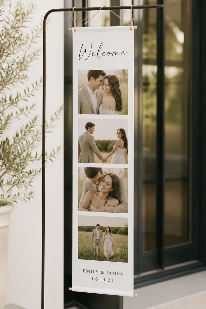
If you're doing a photo booth or you already have a photo backdrop, this sign matches the vibe and looks cohesive. A photo-strip layout reads fun and modern, and it's a clever way to add names without heavy calligraphy. I've used this at couples who want a playful tone but still need a formal "welcome" moment. It also works well for venues with lots of people moving, because the strip layout gives the eye multiple points to land.
Print a long strip layout on cardstock or thick printer paper sized 12x18 inches. Put "Welcome" at the top in a bold font, then create three to four photo-frame boxes where you'll place printed name cards or simple color blocks. If you're not using actual photos, print small white cards with names inside the frames. Mount the entire strip onto foam board, then add a simple border frame using washi tape or thin black tape. Display on an easel and keep it angled slightly toward the entrance so the frames face guests.
Try thisUse a consistent border thickness around each frame so it looks like a designed template, not random blocks.
Common mistakeAvoid mixing color fonts inside the frames; too many colors makes it look like a collage.
19. Color Block Welcome on Corrugated Cardboard with Satin Ribbon
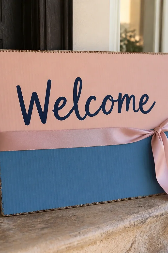
Corrugated cardboard sounds too casual, but it looks surprisingly good when you keep the design clean. The texture adds depth, and the color blocks keep it from looking like shipping material. A satin ribbon sash gives you that wedding finish, and the ribbon also hides any uneven edges from cutting. This is a strong choice for outdoor receptions or backyard venues where the decor leans cozy and relaxed.
Use corrugated cardboard and cut it to 12x18 inches, then cover the top surface with white craft paper or thin cardstock so marker ink doesn't soak in oddly. Create two or three clean color blocks with painter's tape and acrylic paint, letting them dry fully. Write "Welcome" in navy marker centered, then add the names below. Glue or pin a satin ribbon sash horizontally across the middle, making it sit just above the names. Finish by tying a small knot at the center and trimming ribbon ends at a diagonal.
Try thisSeal the marker lines with a matte clear spray tested on scrap - it prevents smudging during setup.
Common mistakeAvoid painting directly on raw corrugation; the ridges make letters wobble and look uneven.
20. Handwritten Felt Banner Welcome with Stitched Look
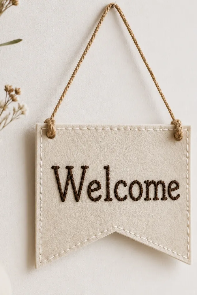
Felt banners look cozy and high-touch without taking hours. The softness of felt makes the sign feel warm, and it holds marker ink well when you use fabric markers. The stitched-look lettering gives texture that reads nicely even from a distance. This works for winter weddings, woodland venues, and any event that already has knit throws, candle lanterns, or warm neutrals.
Cut felt into a banner shape about 12 inches wide by 8 inches tall, or do two smaller felt panels for a layered look. Use fabric marker or white fabric paint to write "Welcome" in dark brown, then add a stitched-look outline by drawing small dots or short dashes around the letters. Add small holes at the top corners and thread twine through, tying tight knots. Tie the banner to a stand or hang it on a chair back near the entrance. Keep the rest of the sign minimal so the felt texture stays the feature.
Try thisUse fabric marker rather than permanent marker - it dries without cracking on felt.
Common mistakeAvoid thick marker strokes; they soak into felt and smear when touched.