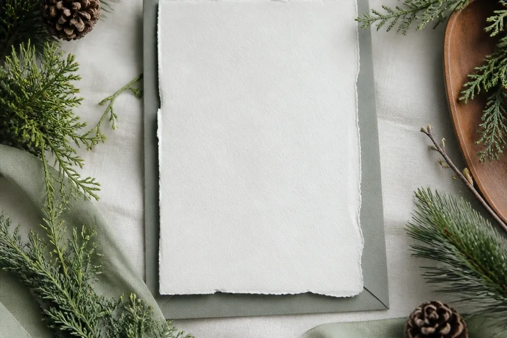
1. Cream Linen + Pine Branch Hand Pass
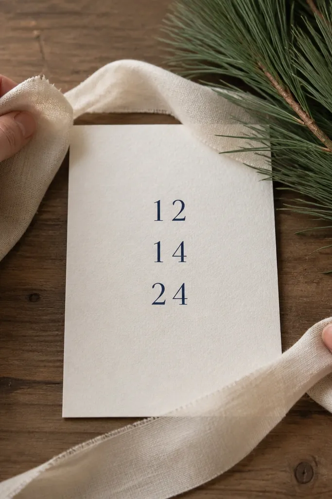
This look is soft but still clearly "winter." The cream linen ribbon reads warm on camera, and pine branches give you the seasonal signal without looking like a costume. I've used it with both dark and light skin tones - the linen sits cleanly against everything, and the navy text stays legible. It also flatters different body types because the focus is hands and texture, not your silhouette. The styling principle is texture-first: you're selling depth through fabric grain and the pine needles' fine detail.
Start by laying a piece of cream linen over a warm wood surface and placing your save the date card in the middle. Put pine branches to the side, then use a single ribbon pass - slide the ribbon from left to right across the card so it ends just past the date area. Keep your camera at table height so the card looks flat and readable. Finish by adding one small brass element (a pen or tiny tray) near the corner to catch light and make the shot feel finished. End with a still frame for 1.5 seconds on the card.
Try thisIf your pine looks too sharp, lightly mist the branches with water so the needles catch light instead of looking dry.
Common mistakeAvoid shiny holiday garlands - they create glare and cheap-looking hotspots.
2. Sage Napkin + Brushed Steel Ring Reveal
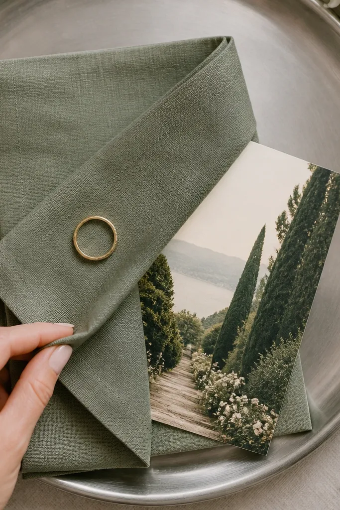
Sage is one of those colors that feels seasonal but still neutral enough for year-round use. The brushed steel background makes the invite feel crisp, like a fine restaurant setting, and it photographs well with phone cameras. I've seen this work on fair skin and deeper skin tones because the color contrast sits in the tabletop, not on your body. It's flattering if you're doing this with minimal prep since the shot is mostly hands and objects. The principle is a "reveal moment" - you create a satisfying motion that makes the end card feel intentional.
Lay a brushed steel tray on a table near a window and place a sage napkin folded into a triangle at the top edge. Set the save the date card under the napkin so only the corner shows, then place a single ring on the tray next to it. Record as you lift one napkin corner slowly, letting the card slide into view. Keep the camera steady and centered so the text stays in the same spot. Add the date end card by holding the tray still for the last second.
Try thisUse matte paper for the card; glossy stock turns the steel into a glare mirror.
Common mistakeSkip cluttered props - more than one metal item makes the shot look like a craft table.
3. Terracotta Clay Vase + "Date Drop" Close-Up
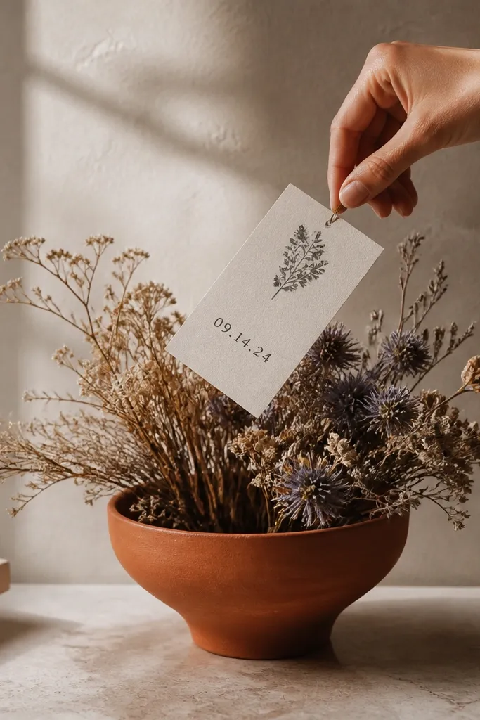
Terracotta gives you autumn energy without needing pumpkins or cartoon leaves. The clay texture reads handmade and expensive on camera, and it hides small imperfections in props. This is especially flattering for people who feel awkward on camera because the action is close-up and object-focused. If your skin tone runs warm or neutral, terracotta makes your hands look natural instead of washed out. The principle is a "date drop" action that gives your video a beat people can anticipate.
Place a terracotta vase on a light neutral surface (off-white or pale wood). Add dried stems - I like straw-colored pampas or small dried seed heads - and keep them slightly off-center. Hold the save the date card above the vase and drop it gently so it lands flat without covering the text area. Film from a 20-30 degree angle so the vase rim frames the card. End with the camera still and the card upright so the date and location are readable.
Try thisTest the drop once with a scrap paper first so the card lands exactly where you want.
Common mistakeDon't use bright orange satin ribbons with terracotta - the colors fight and look costume-y.
4. Icy Blue Window Condensation + Foil End Card
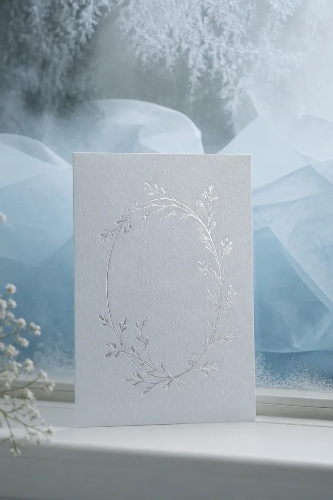
This one looks wintery without literal snow machines. The icy blue tissue paper gives a cool cast, and the foil end card catches light in a way that feels celebratory. I've used this with navy, black, and light hair on camera - the cool palette keeps everything clean and makes the card pop. It's also great for couples who want a calm, editorial feel instead of a holiday vibe. The principle is lighting control: you're using window light and a reflective finish to create drama.
Tape icy blue tissue paper to the window so it sits behind where your card will rest. Place the save the date card on a small strip of glass or a clear acrylic stand so the card stays crisp. Create condensation by breathing lightly near the window, then wipe one clean path so the foil text lands on the most flattering part. Film close enough that the text fills most of the frame, then let the last second be a steady hold. Keep your movement slow so the mist pattern doesn't smear across the card.
Try thisIf your foil is too bright, shoot with your phone slightly off-axis to soften glare.
Common mistakeAvoid direct flash - it turns foil into a harsh glare blob.
5. Spring Peony Sleeve + Invite Through a Flower Frame
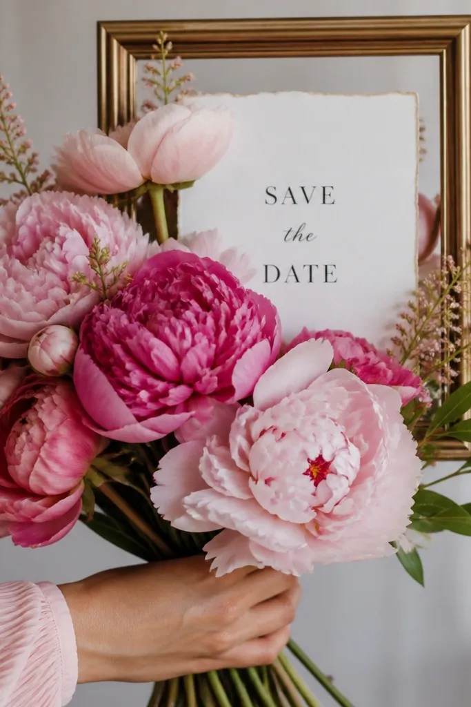
Peonies read spring instantly, but you don't need a full bouquet to get the look. The sleeve color matters because fabric against flower petals makes the shot feel coordinated, not random. I've done this with both short-sleeve cotton and long-sleeve satin; either works as long as the sleeve tone matches your card palette. It looks best when your hands are relaxed and the card is held still - the flowers provide motion blur while the text stays sharp. The principle is framing: you use flowers as a natural viewfinder.
Set up a simple background (plain wall or linen sheet) and place a few peony stems in a small vase or hold them loose. Choose a sleeve color close to your card accent (pale blush or dusty rose works well). Hold the save the date card behind the flowers so the text sits in the clear gap between petals. Film from chest height to avoid extreme overhead distortion. Finish by moving the card slightly closer to the lens for a gentle "push in," then hold still for the end card.
Try thisUse anti-glare matte card stock so the flower petals don't reflect as white streaks.
Common mistakeDon't let the flowers cover the date line - keep at least one full line unobstructed.
6. Midnight Navy Suit Cuff + Wax Seal Stamp
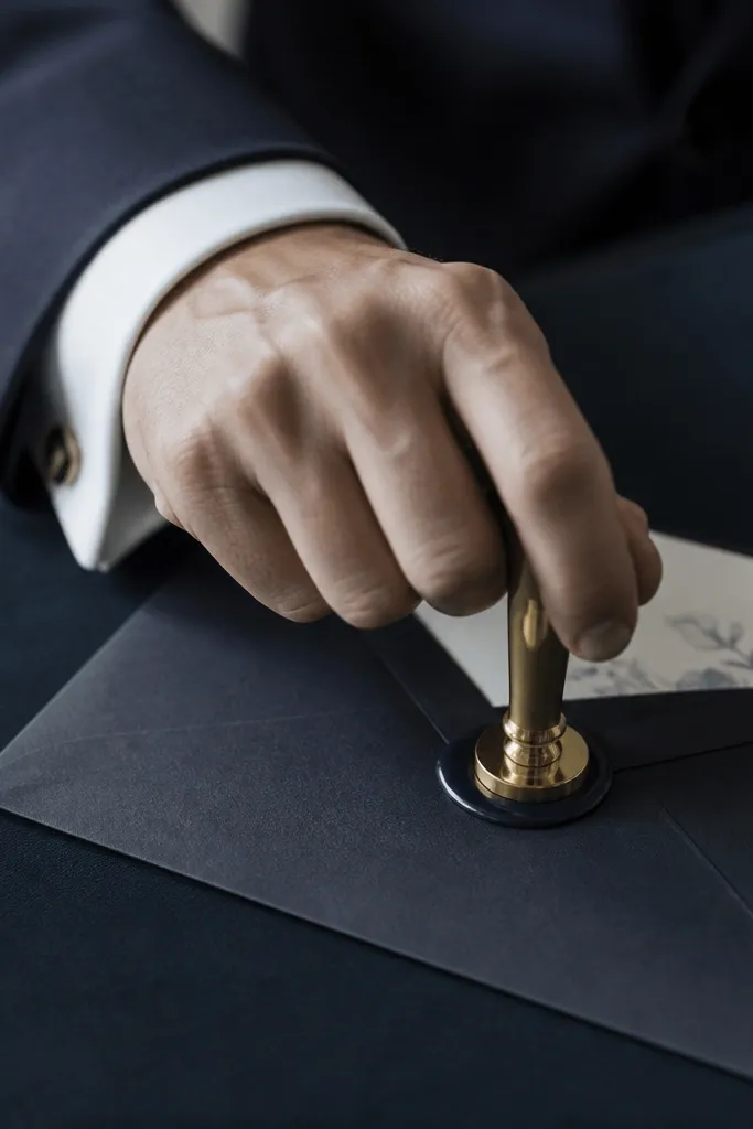
This is my go-to for "evergreen" because it looks formal without being seasonal. The midnight navy cuff gives a rich base, and the wax seal adds a tactile moment that reads luxury on video. It flatters most skin tones because the focus is on the contrast between deep fabric and warm wax. If one partner doesn't like being on camera, you can keep faces out and still look like a real production. The principle is a tactile action: pressing wax gives a satisfying, slow motion beat.
Place your envelope on a dark surface so the wax color stands out (charcoal or deep brown works). Position the suit cuff near frame edge, then press a wax seal stamp onto a small label area on the envelope. Slide the save the date card halfway out so the date line is visible right after the stamp lands. Film at a slight angle so the wax texture is readable, then slow your hand movement for the press. Hold the final frame on the card for 1.5 seconds.
Try thisWarm the wax slightly before stamping so it doesn't crack - cracked wax looks messy.
Common mistakeSkip cheap glue seals - they look flat and don't catch light the way real wax does.
7. Sunflower Yellow Tissue + "Handwritten" Date Reveal
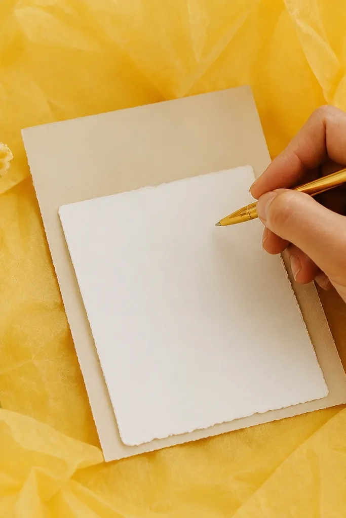
Sunflower yellow brings summer heat without needing a beach. The tissue creates soft diffusion, so even a phone camera looks smoother and more flattering. This works great for people who want a playful save the date but still want it to look grown-up. It's especially nice on camera for lighter skin tones because yellow doesn't wash people out when you keep the background bright and the card text dark. The principle is handwriting as motion: writing gives your video a human beat.
Tape sunflower yellow tissue paper behind a flat surface near a window. Place your save the date card face-up, then put a small scrap card on top aligned so the date area matches. Use a fine-tip black pen to write the date on the scrap, then slide it away to reveal the printed date underneath. Keep the pen tip in frame and record from directly above for clean alignment. End with a steady hold on the full save the date card.
Try thisUse a pen with a matte ink finish; glossy ink reflects and looks wet on camera.
Common mistakeAvoid neon highlighters - they make the whole shot look like a school project.
8. Monochrome City Walk + Corner-View End Card
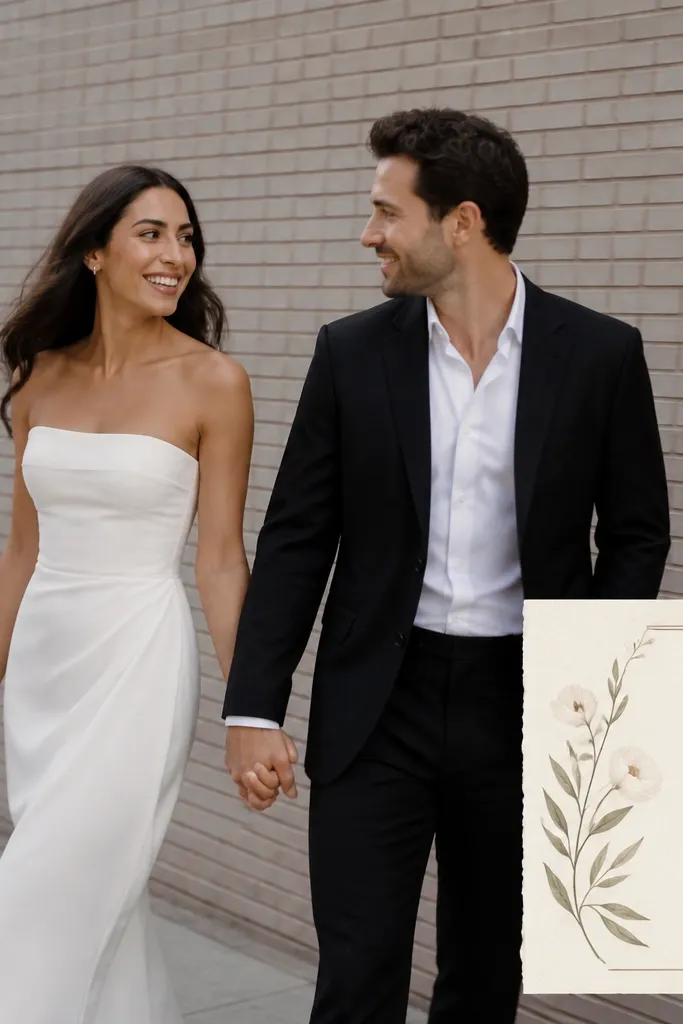
This one feels modern and works in any season because the outfits do the heavy lifting. Monochrome styling reads intentional, and brick or concrete backgrounds add texture without needing seasonal decor. I've used this for both men and women because you can match in color even if the cuts differ - think black trousers and a cream top, or charcoal jeans and a white button-down. It also flatters different heights because the end card sits at a consistent corner. The principle is "motion context": walking shots look lively, then the end card anchors the message.
Dress in monochrome tones (black, charcoal, cream) and pick one accent fabric like a wool coat or a crisp cotton shirt. Record a walking shot for 8-10 seconds, keeping the camera at chest height and panning smoothly. During editing, place your save the date card in a corner frame where the background stays simple (like a wall patch). Keep the end card visible for the last 2 seconds with date and location centered. If you shoot in bright sun, shade the camera to avoid text glare.
Try thisChoose a route with fewer cars - passing headlights ruin the clean look fast.
Common mistakeDon't use busy patterned outfits with brick backgrounds; it turns the frame noisy.
9. Autumn Maple Leaf Press + Pressed-Card Texture
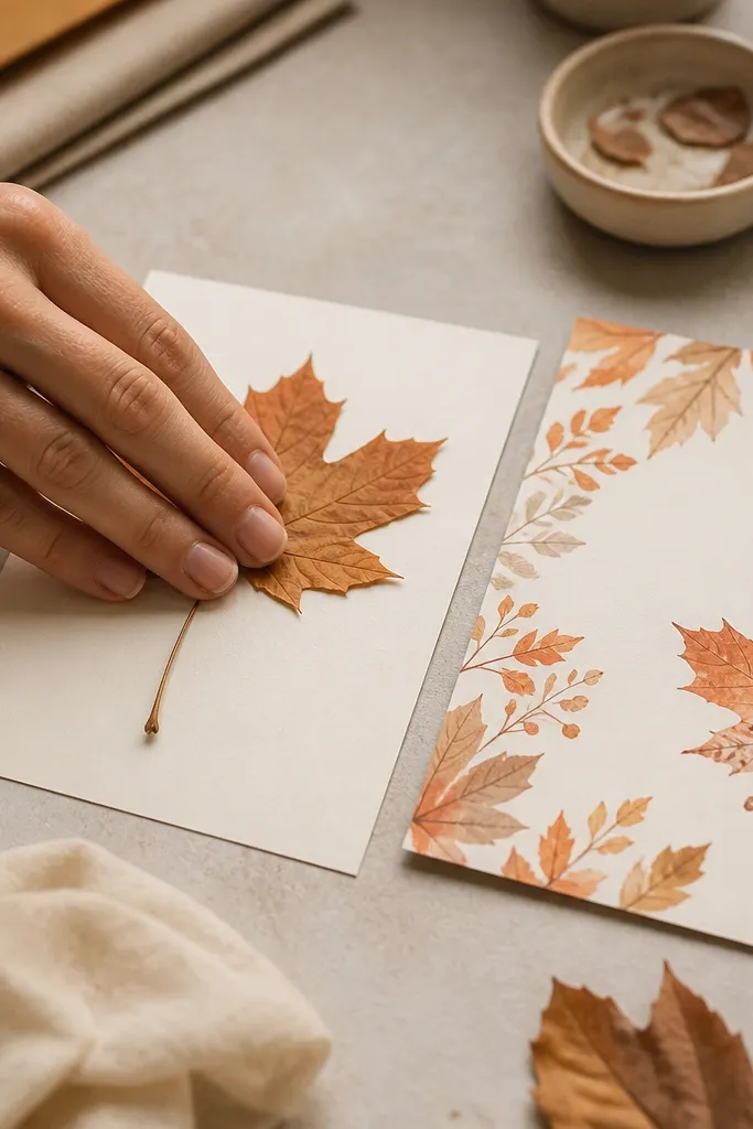
Pressed leaves give you a real seasonal texture that stays classy. The matte card and leaf veins look detailed on camera, and the warm palette ties into fall without needing extra props. This works well for couples who want a hands-on, craft-meets-polished vibe. It flatters everyone because the focus is on fingers and paper, not your body. The principle is micro-detail: close-up textures make a short video feel longer.
Lay your printed save the date card on a flat surface and keep it in frame. Place a single maple leaf near the card, then press it lightly onto a separate matte paper scrap so it flattens. Film the press from above with a steady camera, then cut to the finished card shot next to the pressed leaf. Match the leaf color to your card accent - terracotta or burnt orange looks best with warm browns. End with a still shot of the card and leaf side-by-side.
Try thisPress the leaf between two books for 24 hours so the veins stay crisp on camera.
Common mistakeAvoid wet leaves - they curl and look sloppy in under a minute.
10. Candlelit Hourglass Pour + "Date in the Glow"
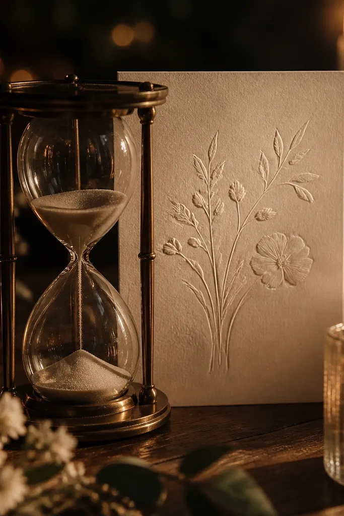
Candlelight gives you instant mood and makes your save the date feel like an intimate invitation. The hourglass adds motion without shaky camera work, and the falling sand reads like a countdown. I've done this with creamy paper and dark text so it stays readable even in low light. It flatters people who want a quiet, romantic tone without showing faces. The principle is controlled darkness: you let the glow do the work, then keep the card in a bright zone.
Set up two candles on either side of a small hourglass, then place the save the date card behind the hourglass so it sits in the center glow. Turn off overhead lights and use window light only if needed to prevent the card from going too dark. Film at a slightly higher angle so the sand stream is visible and the card text is steady. Add a slow camera move - just a small push in - while keeping focus on the card. End with a clear still frame where the date line is centered and readable.
Try thisIf your phone struggles in low light, tap to focus on the card before you start rolling.
Common mistakeAvoid colored LED candles; they tint the paper and make the text harder to read.
11. Bridal-Style Veil Fabric + Static "Floating" Cutaway
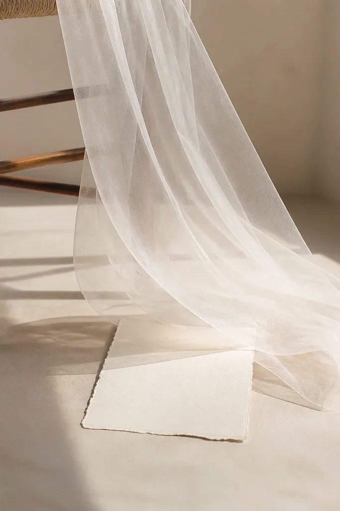
Sheer fabric looks expensive on camera, and it stays evergreen because it reads classic instead of seasonal. The trick is how you move it - a gentle lift looks cinematic, while frantic waving looks messy. This works for both men and women styling because the fabric can be attached to a stand or draped on a chair, not your body. It flatters different skin tones since the veil is the light source and the card text stays dark. The principle is negative space: the veil creates airy framing around your information.
Drape a white or off-white sheer fabric over the back of a chair so it forms a frame around where your card will sit. Place the save the date card on a table directly below the center of the veil. Record a short clip where you lightly lift one corner of the fabric so it billows for 2-3 seconds, then settles. Keep the camera still and focus on the card text area. End with the veil at rest and a crisp close-up on the card.
Try thisUse a fabric steamer for 10 seconds before filming; wrinkles show up fast in daylight.
Common mistakeSkip lace that's too busy - it competes with your text and makes the frame look chaotic.
12. Ocean Blue Linen + Shell Stack Typography Frame
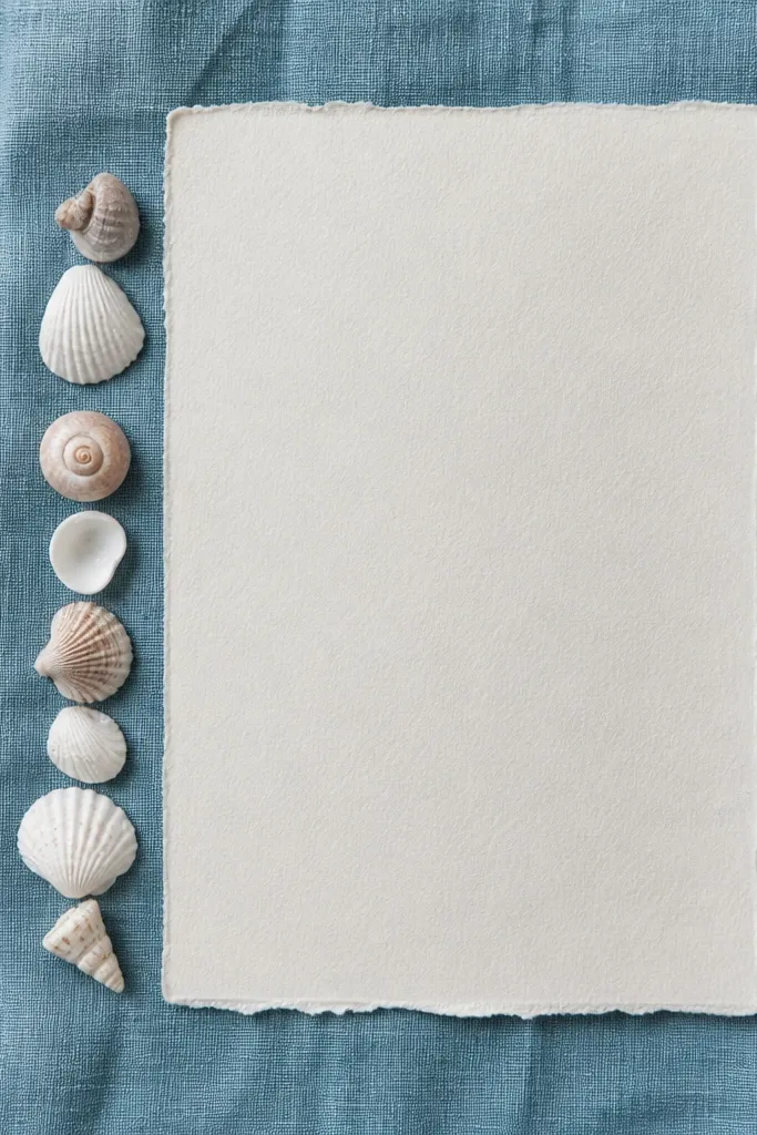
Ocean blue linen is summer without screaming beach party. Shells add a natural texture, and the key is using them like a border, not a pile. This is flattering for people who want a clean aesthetic because the card stays the star. It also works for different skin tones since the palette is cool and consistent. The principle is border composition: you frame the card with texture so the eye lands on the date immediately.
Lay ocean blue linen flat and place your save the date card centered on top. Line up 6-10 shells along one edge only, keeping their shapes similar in size so the border looks intentional. Film from directly above and slide the camera slightly to create a gentle parallax effect. Make sure at least one full line of text stays completely uncovered by shells. End with a still shot where the card is centered and the shell border sits quietly at the bottom.
Try thisWipe shells with a dry cloth so they don't look dusty under sunlight.
Common mistakeDon't use mixed-color shells with bright glittery finishes - they look cheap on video.
13. Gold Foil Brush Strokes + Black Card End Frame
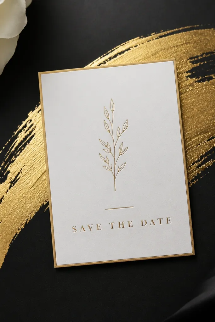
This one is pure design - no seasonal props needed. Gold foil brush strokes read festive, and the black matte background keeps everything crisp and readable. I like it for couples who want an editorial vibe and plan to send save the dates in a formal style. It flatters a wide range of skin tones because the shot is mostly paper and texture. The principle is contrast: dark base, bright metallic accent, then clean typography on top.
Tape black matte cardstock or a black fabric backdrop to a flat surface. Use gold foil transfer sheets or gold acrylic paint with a fine brush to create one swoosh behind where the card will sit. Place the save the date card in the center and film a slow rack focus from the foil to the printed text. Keep the card at least 2 inches from the edges of the frame. End with a steady close-up where the date line is sharp and centered.
Try thisDo a test stroke on scrap so you know how opaque the gold looks under your lighting.
Common mistakeAvoid using too many foil swirls; one clean stroke looks expensive, five looks messy.
14. Matcha Green Ribbon + Matching Card Corners
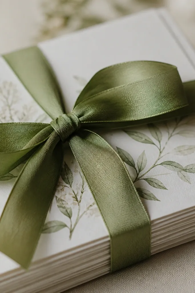
Matcha green is one of the easiest evergreen seasonal cues because it feels springlike but not specific to a single holiday. The ribbon adds movement, and tying it around the card bundle makes the video feel like a real "send" moment. This flatters everyone because the hands are the subject, and the color sits on the paper. I've used it for both understated weddings and louder celebrations - just change the card font color and the ribbon width. The principle is symmetry: the knot and corners align so the frame looks designed.
Bundle 3-5 of your save the date cards together with the edges perfectly aligned. Wrap matcha green ribbon around the bundle once, then tie a neat knot near the bottom third. Film close enough that the knot fills part of the frame, then gently tug the ribbon ends once so it moves. Keep your camera angle slightly above so the corners look crisp. End with the bundle resting still and the top card showing the date.
Try thisUse satin ribbon that's 1/4 inch to 1/2 inch wide; thin ribbon looks flimsy on camera.
Common mistakeAvoid frayed ribbon ends - trim with sharp scissors before filming.
15. Charcoal Suit Lapel + Pocket Photo Flip
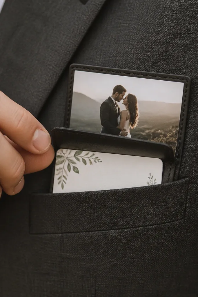
This is a slick, masculine-friendly save the date look that still works for women because the lapel framing is just structure. The charcoal fabric gives you a premium base, and the pocket flip is a satisfying mechanical motion. I've done this for couples where one partner hates being filmed - you can keep faces out and still make it feel personal. The contrast between dark suit and light paper makes the date readable even with shallow depth of field. The principle is an "interactive" moment: you create a flip so the viewer watches instead of scrolls past.
Drape a charcoal blazer or vest on a chair so the lapel is visible and stable. Place the save the date card behind the pocket opening so the text peeks through. Record a clip where you flip open the pocket photo holder (or a small card sleeve) and reveal the save the date card for 2-3 seconds. Keep your camera close to the lapel so the action is the focus, not the background. End with the pocket open and the date line centered.
Try thisUse a matte card sleeve; glossy sleeves create distracting reflections.
Common mistakeSkip busy patterned suit fabrics - the lapel pattern competes with the date text.
16. Lilac Cut Paper Confetti + Slow Hand Scatter
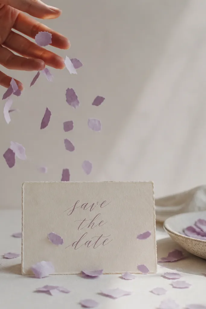
Paper confetti is one of the few seasonal-looking effects that still looks clean and graphic. Lilac feels like spring, but the shot can repeat in any season by swapping the paper color. The confetti movement adds energy without needing fancy editing. It works for couples who want a fun vibe but still want the card to look designed. The principle is controlled scatter: the confetti is small and slow so it doesn't cover the text.
Cut small paper shapes from lilac cardstock (circles or tiny squares work). Place the save the date card on a white or light cream surface and tape the edges lightly so it doesn't shift. Hold the confetti above the card and release a small handful so pieces fall slowly. Film from slightly above with a steady camera so the card stays centered. End with a still frame once the falling stops, keeping the date fully visible.
Try thisWarm up the paper with your hands for 10 seconds so it doesn't clump - clumps look like craft mess.
Common mistakeDon't use glitter paper - it sheds and makes your frame look dirty.
17. Red Apple + Knife Board Slice Reveal
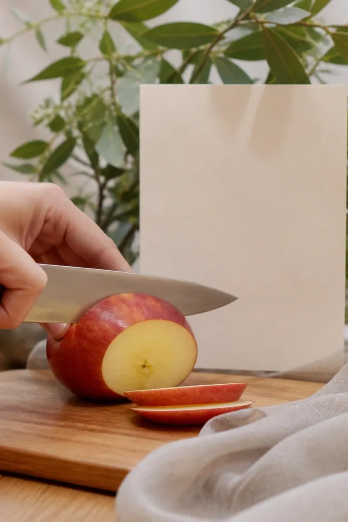
This is the most "fall kitchen" idea that still looks styled. A red apple gives you instant autumn color, and the cutting action creates a clear start-to-finish beat. I like it for afternoon shoots with window light because the apple skin shines without going greasy. It flatters people who want a cozy vibe without floral overload. The principle is using motion that tells a story - slice, reveal, then hold the card.
Place a wooden cutting board near a window and set your save the date card behind the board so it's visible through a gap. Use a red apple as the main prop and slice it once - just one clean cut - so the motion is quick. Film from a side angle where the card stays readable between movements. After the cut, pause and reposition the apple slightly aside so the card text is fully visible. End with a still shot on the card with the apple resting in a corner of the frame.
Try thisUse a sharp knife and wipe the blade quickly; smudges show up on camera.
Common mistakeAvoid messy food spills - they turn the video into a mess instead of a styled moment.
18. Spring Rain Umbrella Frame + Clear Date Window
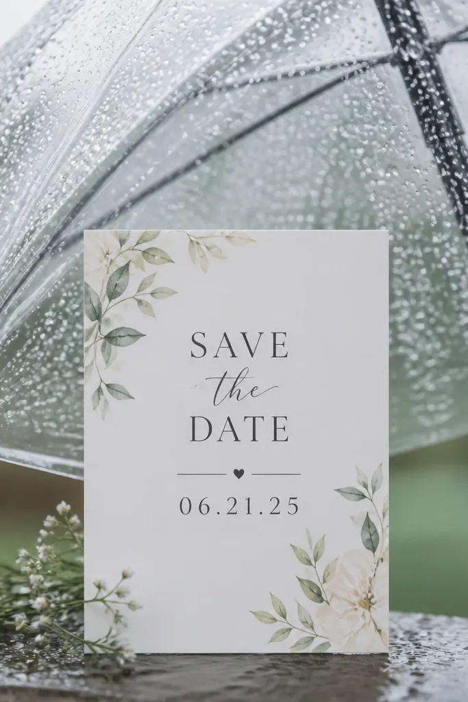
Rain shots feel fresh and seasonal, but they can still look evergreen if you keep the palette neutral. A clear umbrella makes the background interesting without stealing attention from the card. I've used this for both casual and formal save the dates by matching the card colors to your outfit - cream card with navy text looks best under gray light. It flatters everyone because you're not relying on face visibility; the umbrella and card are the stars. The principle is "clean center composition": keep the date area unobstructed and let the rain texture fill the edges.
Choose a neutral outfit (cream, navy, charcoal) and hold the clear umbrella so it frames where your card will sit. Place the save the date card on a small board or flat surface under the umbrella so it stays dry enough to read. Film with the card centered and keep your camera steady while raindrops hit the umbrella. Once you've got a clean view, do a slow tilt so the raindrops sparkle slightly, then stop. End with a steady close-up of the card for 1.5 seconds.
Try thisIf your umbrella fogs, wipe the lens area with a dry cloth before recording.
Common mistakeAvoid umbrellas with loud prints - they compete with the date text.
19. Winter Evergreen Candle Trio + Trio-Card Flip
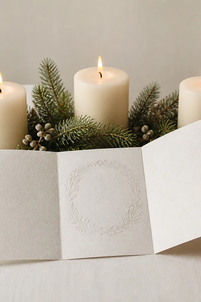
This is a structured winter idea that looks intentional even in short clips. The evergreen sprigs give the seasonal cue, and the candle trio creates a symmetrical composition that feels formal. The three-panel flip adds a "designed" motion without needing animation. It flatters different skin tones because the color contrast is candle warm against green - not your complexion. The principle is symmetry plus controlled motion: viewers feel the order even if they watch while multitasking.
Set up three candles on a tray with evergreen sprigs tucked between them, keeping the sprigs low so they don't cover the card. Use a three-panel save the date card or create panels with a fold line so you can flip from left to right. Place the card so the date is on the center panel when open. Film as you flip the panels in one smooth motion, then hold the open center panel for the final second. Keep the camera level with the tray so the composition stays balanced.
Try thisUse unscented candles if you're filming near paper; scented oils can leave smudges sometimes.
Common mistakeSkip tall sprigs that sway into the lens - they look like random greenery blobs.
20. Summer Linen Beach Bag Tag + "Swinging Tag" Date Reveal
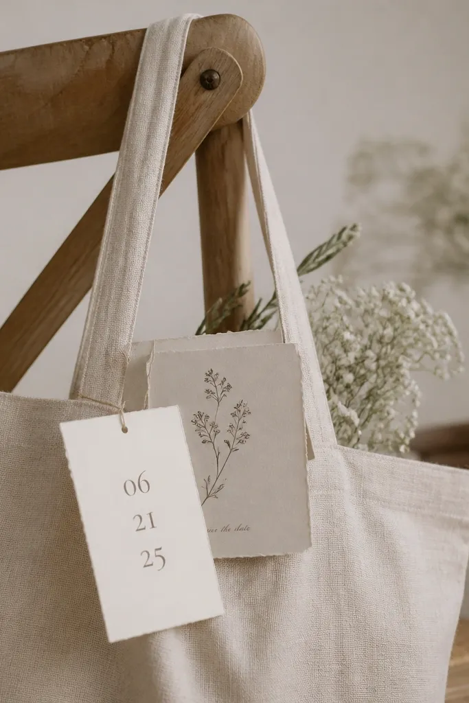
A bag tag is one of the simplest ways to make a save the date look like a real item you'd keep. Linen tote fabric reads summer clean, and the swinging tag creates motion that feels playful without needing confetti. This flatters people who want a casual, approachable vibe because it looks like your everyday life - just styled. I've used it with both minimalist and colorful card designs; the tag is where you put your text, so the rest stays quiet. The principle is motion from an object, not from the camera.
Attach your save the date card to a small paper tag or cardstock hang tag using a string or ribbon. Hang the linen tote bag from a chair so the tag swings freely in front of the bag. Record a clip where you gently nudge the tag so it swings past the camera, revealing the date for a clear moment. Keep your camera at bag height and focus on the tag text when it's closest. End with the tag hanging still so the full date and location are readable.
Try thisUse heavier cardstock for the tag so it swings smoothly instead of wobbling.
Common mistakeAvoid thin curling paper tags - they twist and make text unreadable.
21. Autumn Spice Jar Labels + Macro Sticker Placement
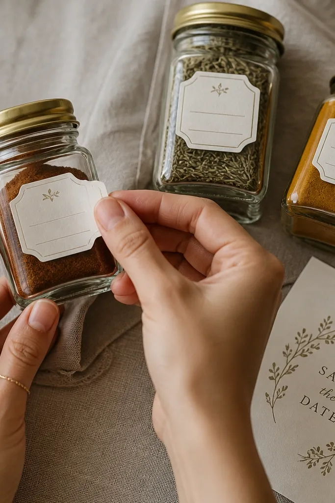
Spice jars give you fall color and a real-world reason for the date to look like part of the home. The macro shot keeps it design-focused: typography, label placement, and texture. This flatters everyone because the camera is on hands and labels, not your face or body. It also looks great with both men's and women's style because the props do the aesthetic work. The principle is "label continuity" - your save the date matches the typography style and feels like it belongs in the same set.
Pick 2-3 jars with matte glass or neutral lids and wipe them clean. Place your save the date card beside the jars so the labels are visually connected. Peel and place small matching stickers or label strips on the jars, then cut to a shot where you place one label directly above where the save the date text would be. Film in macro mode if your phone has it, and keep your hands steady to avoid label crookedness. End with a still frame of the jars and the save the date card side-by-side.
Try thisUse a ruler or tape guide for the first label so the rest looks aligned fast.
Common mistakeSkip messy handwriting labels - crooked text makes the whole set feel amateur.
22. Evergreen Plywood Frame + "Photo Strip" Date Panel
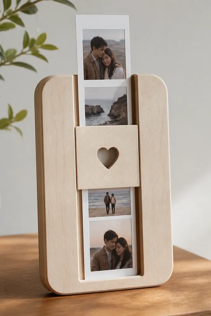
Plywood frames are evergreen because wood tone looks warm in any season and it doesn't scream holiday. The photo strip format feels nostalgic, and nostalgia reads well for save the dates because it looks personal. I've used it with both classic and modern card designs; you just match the photo strip spacing and the text font weight. It flatters different skin tones because the frame is the dominant color. The principle is a "slide-in" reveal: the motion tells people to watch instead of scroll.
Sand or wipe a small plywood frame so it looks clean, then place it flat on a table. Create a photo strip style save the date panel with 3-4 small photo windows or blank frames and a center date panel. Slide the strip into the frame from the side so the date lands at center. Film from straight-on so the text doesn't warp with perspective. End with the strip fully in place and the camera still for 1.5 seconds.
Try thisLightly sand the plywood edges so they catch light without looking rough.
Common mistakeAvoid dark, glossy wood finishes - they reflect and make the text harder to read.
23. Monarch Butterfly Paper Cutout + Shadow Date
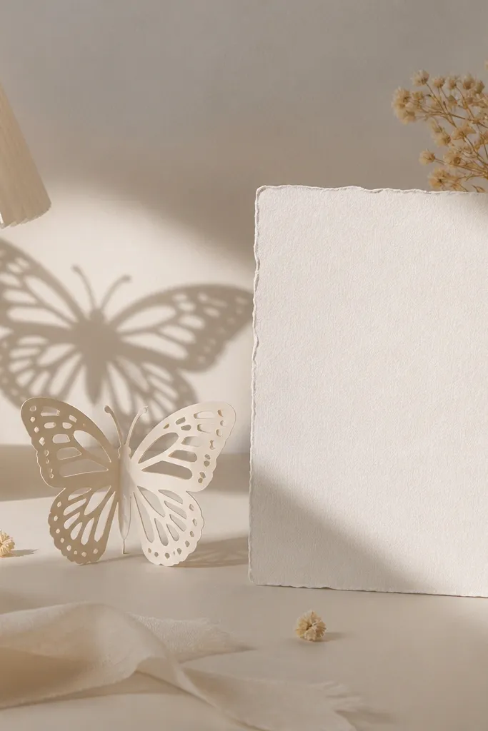
Butterfly shadows look artsy and still feel seasonal without being cheesy. The monarch pattern gives you a warm, late-summer cue, but the video can repeat by swapping the cutout color for any season. This works well if you want a more creative aesthetic and you're comfortable with a simple lighting setup. It flatters everyone because you're not relying on face framing; the shadow does the personality work. The principle is lighting direction: you create a shadow on the background, then keep the card in focus.
Cut a simple butterfly shape from cardstock and keep it small enough to cast a clear shadow (about 3-4 inches wide). Place a lamp behind the cutout and aim it toward a blank wall or paper backdrop. Put the save the date card in front of the lamp with the card text facing the camera. Record as you move the cutout slightly so the shadow shifts but the card stays readable. End with the cutout held still and the date line in sharp focus.
Try thisUse a matte backdrop sheet so the shadow edges look clean instead of fuzzy.
Common mistakeAvoid busy backgrounds - the shadow gets lost when the wall has patterns.
24. Rose Gold Spoon Stir + "Date on Spoon Handle"
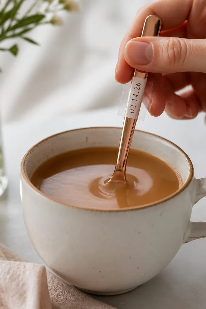
This is a clever way to build motion while keeping the date visible. Rose gold looks warm and celebratory, and the stirring motion adds rhythm that feels like a small ritual. It flatters different outfits because the palette is metallic and warm, so your clothing can be simple. I've used this for both indoor morning light and evening candle setups; the spoon always catches something. The principle is that the date is physically attached to the moving object, so the viewer's eye naturally follows the movement to the text.
Tape a narrow strip of printed save the date date text onto the spoon handle using clean tape on the underside. Fill a small cup with water or tea (clear liquid looks best) and place it near a window. Stir slowly so the spoon turns and the date strip rotates into view for a second or two. Film close enough that the text strip is readable when it faces the camera. End with a final still shot where the spoon handle points toward the lens and the date strip is flat.
Try thisIf the tape shows, place it under the spoon handle curve and trim the strip edges neatly.
Common mistakeSkip heavy condensation - wet glare on the spoon makes the text look smeared.
25. Winter Coat Pocket Pull + Card Slide-Out
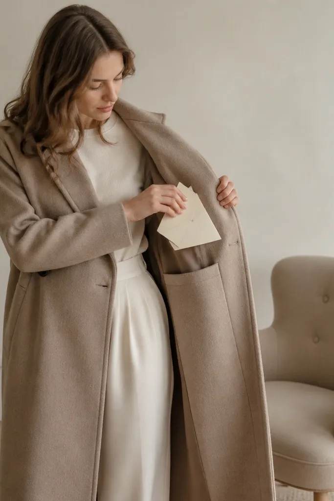
This looks like a real moment because it uses your actual coat pocket. Wool texture reads high-end, and the slide-out motion feels satisfying without needing props. It flatters just about everyone because the framing is mid-torso and hands, so you don't need to worry about full-body posing. The evergreen part is the coat and neutral background; the seasonal part is the color of your inner layer. I've used this across winter into early spring by swapping the inner scarf color, keeping the coat constant. The principle is "coat-as-prop": the garment becomes the design element.
Choose a wool coat in charcoal, cream, or deep navy. Place a folded save the date card in the inside pocket so only a small edge shows. Film from mid-torso up, then pull the card out slowly and lay it flat on a neutral surface in front of the chair. Keep your text facing the camera, and use window light so the paper looks matte. End with a close-up of the card with your scarf or inner layer peeking behind for color harmony.
Try thisUse a lint roller before filming; wool fibers show up as tiny specks in close-up.
Common mistakeAvoid thin card sleeves that crinkle - the noise and wrinkles read cheap on camera.