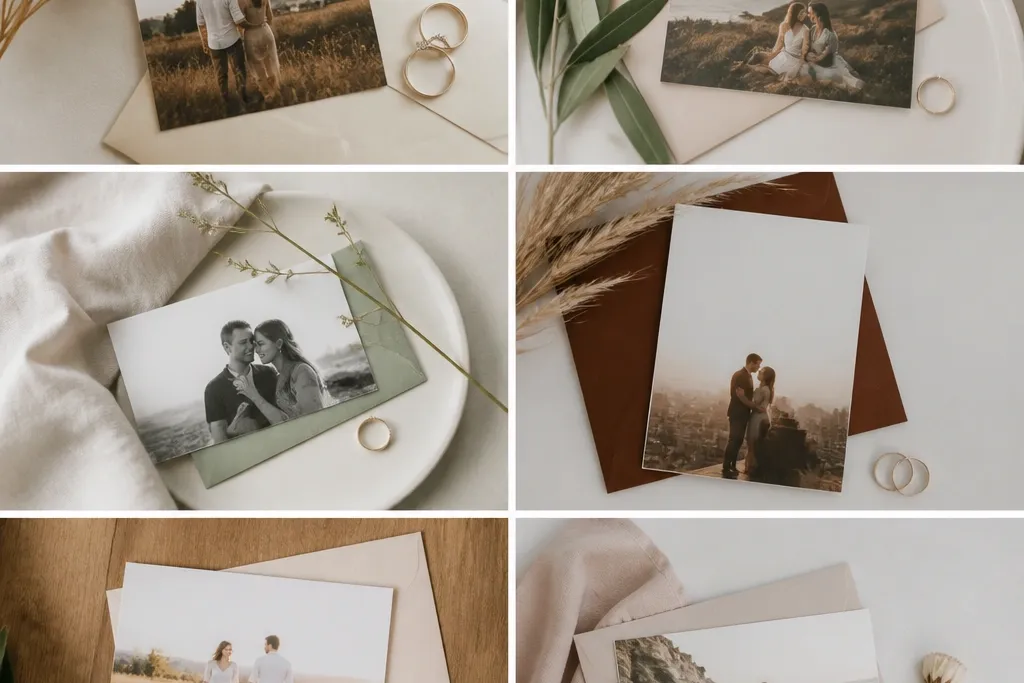
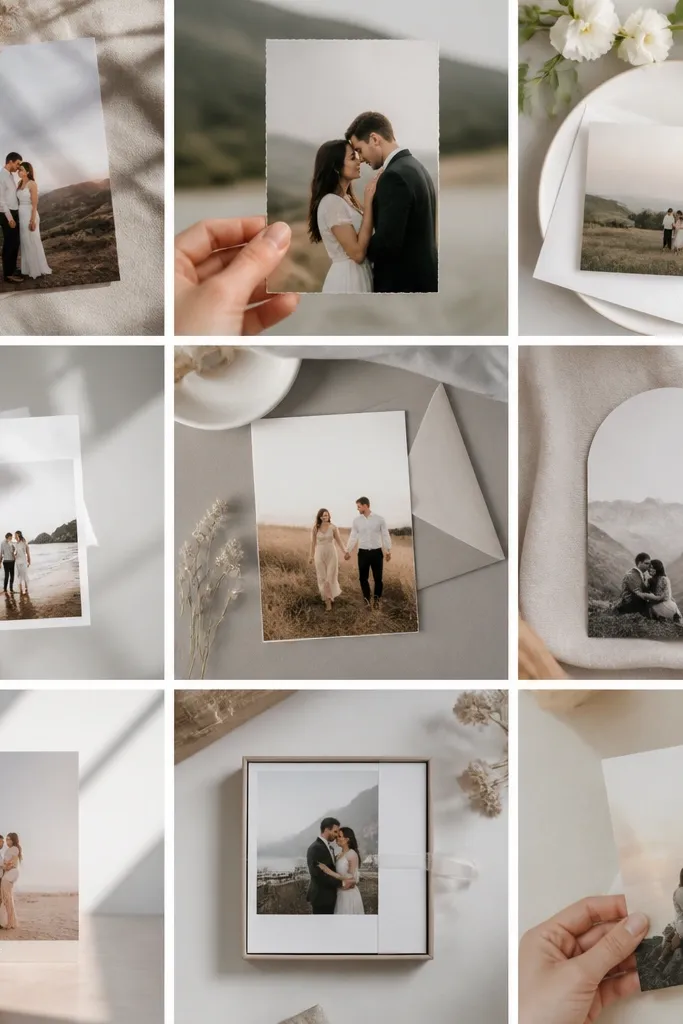
1. Cream Card + Espresso Names (Photo Frame Version)
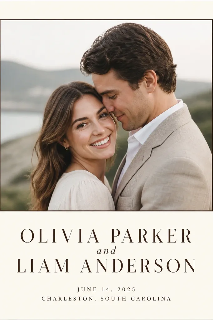
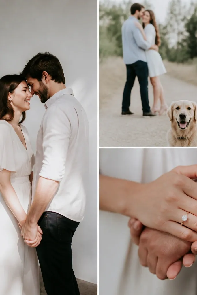
This is the style I reach for when your photos are already beautiful and you just need the card to stop looking like a template. The cream background keeps skin tones warm and flattering, and the espresso-brown type looks intentional instead of "gray-and-white generic." I like it for couples whose engagement pictures have soft lighting, neutral clothing, or a warm outdoor setting because the card doesn't fight the image. The simple frame gives structure - your eye lands on the photo first, then the names, then the date. It also works for both men and women because the typography is the same weight and scale for each name, so nobody looks "smaller."
Start with a 5x7 canvas on a cream base and set your safety margin so text stays at least 0.25 inches from the edge. Place the couple photo at the top at about 60% of the card width, then add a thin 1-2 pt espresso rectangle around it. Put both names centered below the photo in one font family, with the date line in a smaller size and a lighter weight of the same family. Finish with the city and optional wedding hashtag in one line, all in espresso, and keep everything left-to-right aligned so it looks calm. For shoes and styling tie-in, I'd wear warm neutrals (camel, cream, espresso) in your engagement shoot because the card color matches that palette.
Try thisIf your printer tends to smear, print one test card and check the espresso letter edges - if they look fuzzy, switch to a slightly darker ink color and increase font weight by one step.
Common mistakeAvoid light gray text on cream when your photo has dark areas - it makes the whole card feel washed out.
2. Full-Bleed Photo with One-Line Date (After Dark Upgrade)
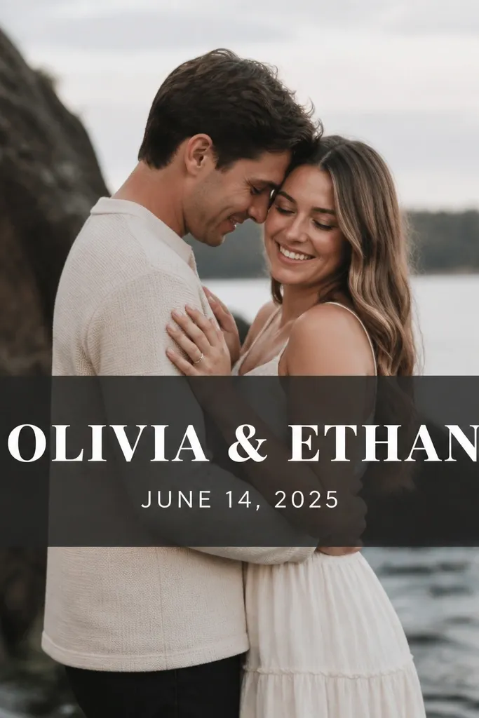
This direction looks high-end because the photo owns the page and the text is treated like a label, not a separate element. The trick is the charcoal translucent band - it keeps white text readable even when your photo has bright highlights. I like this for moody indoor sessions, blue-hour shots, or black-and-white photos because the card turns into a clean "poster" feel. It also flatters couples with dramatic contrast in their photos since the band smooths the visual noise behind the text. For men and women, the bold serif names read strong, and the smaller sans-serif date keeps it from looking like a wedding program.
Start by using a full-bleed photo so the background touches all edges of the card. Add a charcoal overlay band across the middle at about 18-22% of the card height, then set your text in white or near-white. Put the couple names centered within the band, with the date line directly underneath in a smaller size. Keep the font sizes consistent with a hierarchy: names about 2-2.5x bigger than the date. If you want an extra "after dark" touch, add a thin white rule line above the date line, about 1/4 inch long, and keep it centered.
Try thisUse a translucent overlay around 35-50% opacity - too light and text fades, too dark and it looks like a sticker.
Common mistakeAvoid putting text directly on the photo without a band or box - it reads messy because the background keeps changing.
3. Monogram Circle Seal (Gold Foil Look Without Foil)
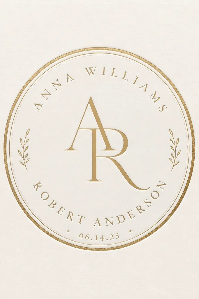
If you want "formal" without actual foil, this is the layout that gets the reaction. The circle seal creates a focal point that feels like stationery you'd see at a museum wedding or a black-tie event. I like off-white paper because it makes the gold-toned ink look warmer instead of brassy. The monogram works best when the letters are clean and bold; it reads well at a glance even if someone doesn't know your full names. This style flatters anyone because it reduces reliance on photo lighting - you can use a simple photo strip later or keep it text-only. It also looks great for both genders because the monogram is centered and symmetrical.
Start with a 5x7 card in off-white and place a circle seal graphic dead center. Use a gold ink color for the ring and a slightly darker gold or deep brown for the monogram so it doesn't look flat. Set the couple names in a small serif above or below the seal, centered, with the date line even smaller. Keep all typography in one color family - don't add a second ink color unless it's a deep forest for contrast. If you want a "before and after" improvement, remove any extra icons and add just one subtle texture layer behind the seal.
Try thisFor a convincing gold look on matte paper, use a warm metallic-like hex (think #B08D3A range) rather than bright yellow-gold.
Common mistakeAvoid using a complicated monogram script - it turns into a blob when printed small.
4. Minimal Typography Block (Modern Editorial Save-the-Date)
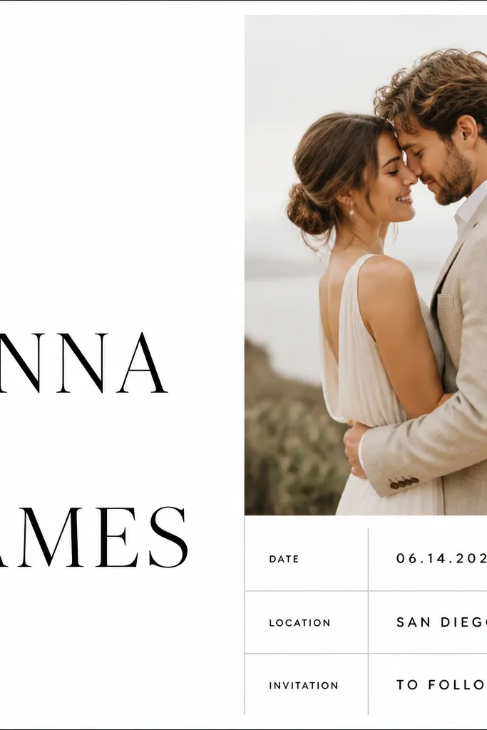
This is the "we read design blogs" look, but it's still easy to pull off if you respect the grid. The typography block style works because it treats the card like a layout page, not a scrapbook. I've used it for couples who don't want their engagement photos on the card - it still feels personal because the names and date carry the focus. It's especially flattering for couples with last names that look good in uppercase or small caps, because the spacing stays crisp. For skin tone and photo color issues, this style sidesteps them completely.
Set up a grid with two columns: left for the word and names, right for date/location. Use black or near-black for the names, then medium gray for supporting lines so the hierarchy stays clear. Put the couple names on the left column in a large size, then place the date and city in the right column aligned to the same baseline each time. Add thin lines (1 pt) only if they help separate information, not to decorate. Finish with one accent rule line at the very bottom in gray, centered, about 2 inches wide.
Try thisIf you're unsure about fonts, use one strong sans for names and a light sans for the details - it reads modern without looking trendy.
Common mistakeAvoid mixing three font weights and two fonts - it makes the card feel like it was assembled in a hurry.
5. Navy Script Names + White Photo Mat (Coastal Wedding Mode)
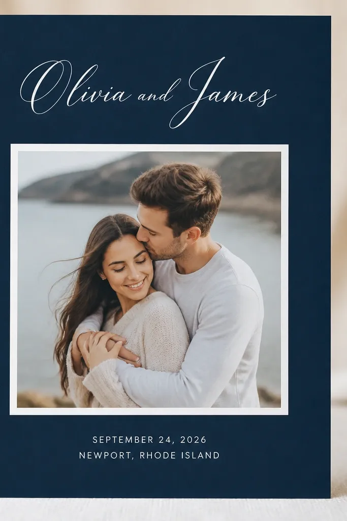
Navy plus a white photo mat is one of those combos that always looks intentional in real life. The script names give it romance, but the photo mat keeps everything from feeling too busy. I like this for coastal or garden weddings because navy echoes deep water and green foliage, and the white mat makes the photo pop. It flatters couples with bright outfits in their photos, like crisp white shirts or light dresses, because the contrast is clean. Even if your engagement photos have mixed backgrounds, the navy base tones everything down.
Start with a navy background sized for your card, then add a white photo mat centered with a 3-5 mm border around the photo. Place the couple names at the top in navy script, centered, leaving room so it doesn't collide with the photo mat. Add the date line and location in white sans-serif below the names, keeping the lines short and centered. If you want an "after" upgrade, add a thin white rule line between the names and the date line. For finishing, pair with simple accessories: a navy ribbon or twine on your envelope seals looks better than loud colors.
Try thisUse navy text only on the navy-free areas - script ink that bleeds into the photo mat edge looks sloppy fast.
Common mistakeAvoid using light pastel text on navy without a clear hierarchy - it turns into glittery noise.
6. Terracotta Sunset Gradient (Warm Venue Save-the-Date)
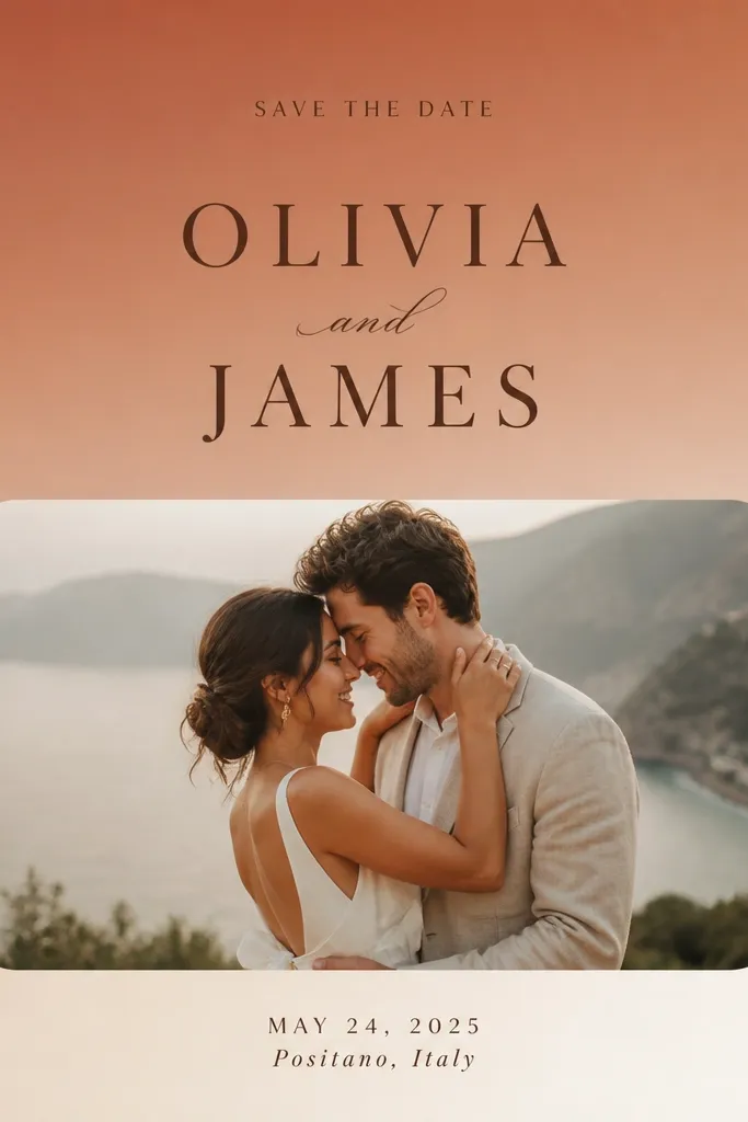
This design works when your engagement photos have warm tones and you want the card to feel like the same day, not like a separate project. The terracotta-to-cream gradient adds warmth without needing extra graphics, and dark brown type keeps it readable. I've used it for desert weddings, late-summer gardens, and even indoor venues with warm bulbs because the gradient matches the lighting in the photos. The rounded photo rectangle feels friendly, and the simpler typography keeps it from looking like a party invite. It also looks good for both men and women because the names are the same color and weight; nobody gets pushed into the background by decorative elements.
Create a gradient background that goes from terracotta on top to cream at the bottom, keeping the transition smooth. Place the names in dark brown centered, with the date line below in a smaller size. Put the photo in a rounded rectangle near the bottom, leaving generous space above it so the card breathes. Keep the city line short and centered, and avoid extra icons. For a strong before-and-after, remove any extra color accents and stick to terracotta, cream, and dark brown only.
Try thisBefore you print, check readability by squinting - if you can't read the city line from arm's length, darken the brown or increase font size by 1-2 points.
Common mistakeAvoid adding a second gradient color like teal - it makes the card look like a random template.
7. Botanical Line Art Border (Greenhouse or Garden Wedding)
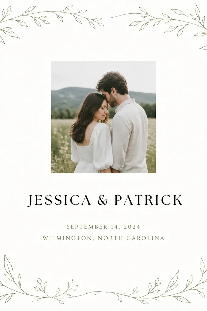
Line art borders look expensive because they frame the card instead of covering it. Muted green keeps it from feeling like a kids' craft - I like using a sage tone with thin strokes. This style fits garden venues, greenhouse ceremonies, and even rustic weddings where the photos already have leaf textures. It flatters couples because the border adds polish to the edges while the center stays clean for names and dates. If your photo has busy background clutter, the border gives your eye a path back to the important text.
Use a white background and draw or place botanical line art only as a border, not across the entire card. Keep the border thickness thin and consistent - about 1-2 mm of line weight. Place your couple photo small and centered near the top, then set the names in black serif mid-page. Put the date and location in muted sage, centered, and keep font sizes readable for quick scanning. For the envelope, use a matching sage stamp or sticker in the corner so the whole set feels coordinated.
Try thisPrint one card on the paper you'll use and check for light green visibility - if the sage disappears, darken it slightly.
Common mistakeAvoid heavy botanical illustrations - thick leaves look like a coloring book when printed small.
8. Black and White Photo Strip + Red Date Line
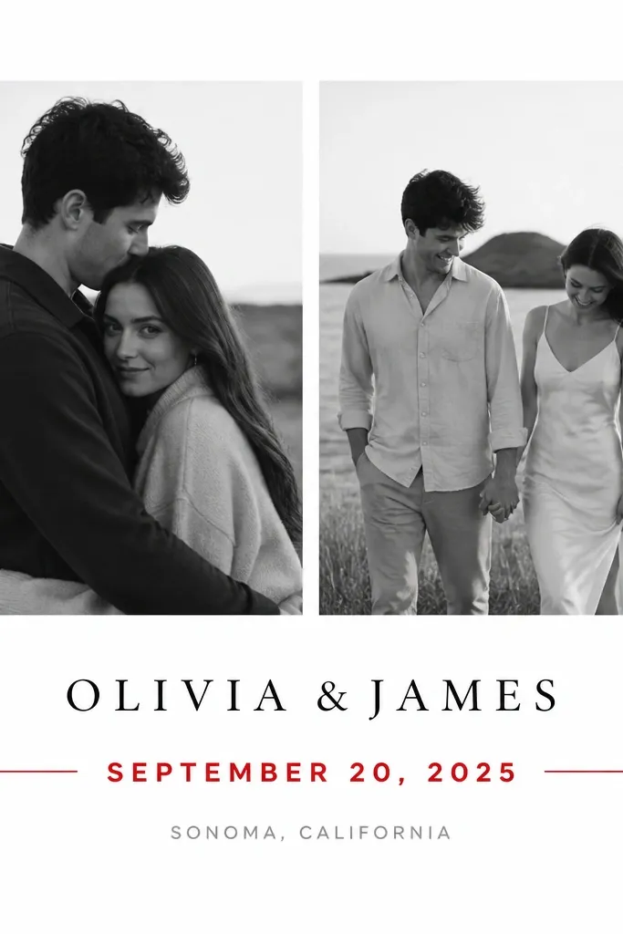
This is a style I trust when you have great photos but the color palette is all over the place. Black-and-white photos calm everything down, and the red date line creates a moment of urgency without adding extra clutter. The red also works for both men and women because it sits on the date information, not on one partner's name. I've used this look for downtown weddings, museums, and city halls where the environment is gray and textured. It reads clean in both natural light and indoor lighting because the contrast is strong.
Convert your selected engagement photos to black-and-white and crop them consistently with the same aspect ratio. Place them side by side at the top with a small gap between them. Add the couple names centered below in black serif, then create a red date line: either a thin horizontal red rectangle or a bold red text line. Keep the location in gray below the date so it doesn't compete. For an after upgrade, remove any extra decorative shapes and let the red line be the only accent.
Try thisChoose one red shade and stick to it - if your red is too orange, it looks like cheap ink on matte paper.
Common mistakeAvoid multiple accent colors like red plus gold plus teal - the card starts looking like a flyer.
9. Map Coordinates + Photo Corner (Travel-Themed but Clean)
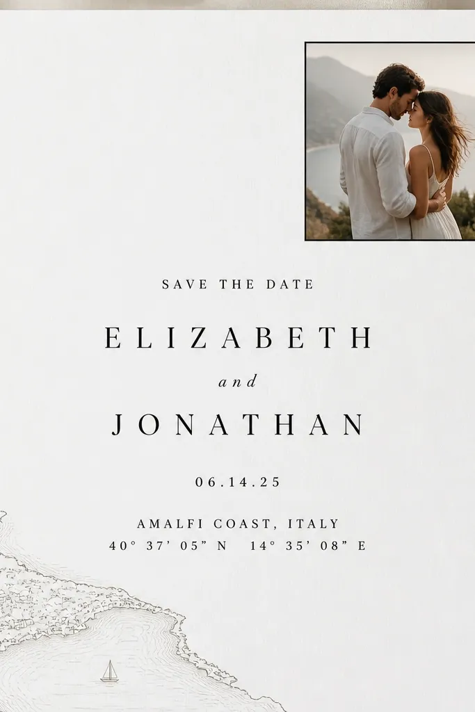
Map coordinates give the card a personal angle without turning it into a novelty. The key is keeping the map small and placing it away from the main text so it looks like a detail, not a background. I've done this for couples who met in a different city or are getting married somewhere meaningful - the coordinates act like a secret note. It also works when your engagement photos are busy because the map corner anchors the design. For both men and women, the names stay centered and clean, so nobody feels "buried" under graphics.
Start with a white background and set the couple names centered mid-page. Place a small photo in the top right corner with a thin border, about 20-25% of the card width. Add a small map graphic in the bottom left corner and include coordinates in a line of small caps near the location text. Keep all typography in black and gray, then add one small accent line in a dark gray to guide the eye. If you want the before-and-after improvement, remove icons like arrows or airplanes - the coordinates already tell the story.
Try thisUse coordinates in a simple format like 40.7128°N, 74.0060°W - it looks clean compared to long paragraphs of text.
Common mistakeAvoid full background maps - they reduce text contrast and make printing look muddy.
10. Soft Blush Background + Black Serif Names (Classic Wedding Stationery)
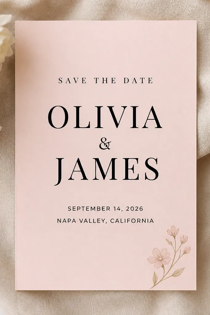
This is the "works for everyone" stationery look when you want classic and you're not sure about your photo palette. Blush backgrounds flatter a wide range of skin tones and make printed black type feel crisp. I like black serif names because they read formal without needing embellishments. If your engagement photos include warm skin tones, blush keeps them cohesive; if they're cool, it adds a gentle warmth. It's also easy to style with envelopes and seals because blush works with gold, blush ribbon, and even plain kraft paper. For men and women, serif names give a balanced, formal presence for both.
Pick a blush base and keep the rest of the design monochrome: black for names and charcoal gray for date/location. Center the couple names and set the date line below with consistent line spacing. Add a single small floral icon in one corner only - top left or bottom right - and keep it tiny so it doesn't steal attention. For the after version, remove any extra colored accents and let the paper color do the work. Print a test to confirm your blush isn't too light - if it's almost white, the card loses the color intention.
Try thisIf your printer makes blush look gray, adjust the background to a warmer pink tone rather than trying to add more colors.
Common mistakeAvoid using thin hairline fonts for the names - they break up on matte cardstock.
11. Art Deco Border + Gold Divider Lines (Evening Wedding Energy)
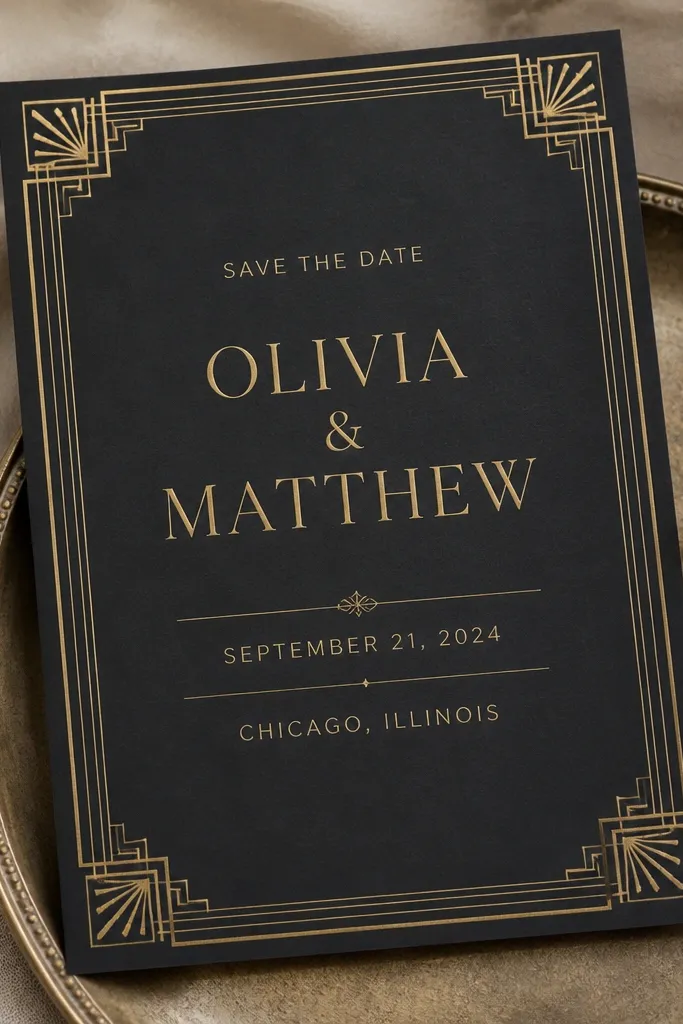
Art deco borders make a save-the-date feel like a real invitation, not a quick announcement. The trick is to keep the ornamentation at the edges and use gold divider lines to guide the eye. I like deep charcoal because it makes the gold look warm and not neon. This direction fits evening weddings, black-tie attire, and venues with dark wood or brass fixtures. It also flatters both men and women because the gold names are centered and readable, and the divider lines keep the date from getting lost. If your engagement photos are dark or moody, this card style matches them instead of fighting them.
Start with a deep charcoal background and place an art deco border only around the outer edge. Use gold for the couple names in a serif font, centered, then add a thin gold divider line below. Put the date and location between divider lines, keeping the text short and centered. Add small gold corner ornaments only if they're subtle - too many shapes make it busy. For an after upgrade, reduce the number of ornament elements by half and let the border do the work.
Try thisIf your gold ink prints too dull, increase font weight slightly and use a warmer gold tone rather than bright yellow.
Common mistakeAvoid placing large ornament blocks behind text - it kills readability.
12. Photo Collage with One Clean Caption Line (No Scrapbook Chaos)
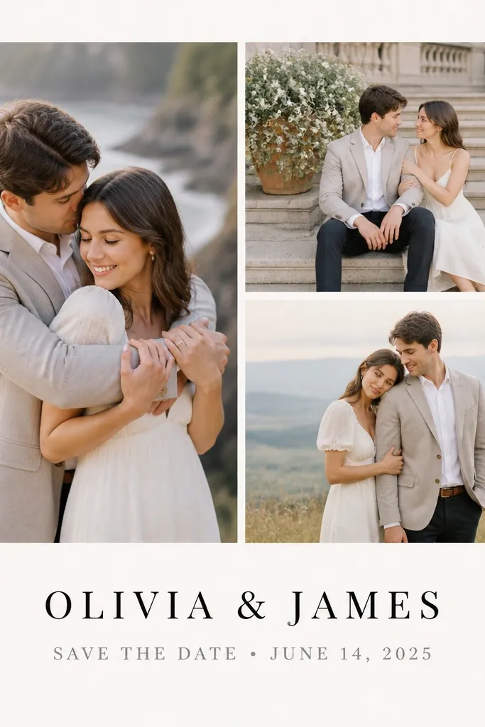
Collages look fun until they start looking like a scrapbook. This version works because it uses a strict grid and one caption line, so the card has rules. I've used it when couples have multiple great photos but want the card to feel personal without full-bleed drama. The grid keeps the photos consistent, and the single caption line keeps the information clean. It flatters different photo tones because the card background stays neutral and the photos are scaled the same size. For men and women, the main names stay centered and large, so the collage doesn't steal attention.
Choose three photos and crop them to the same aspect ratio so they don't look mismatched. Place them in a 2x2 grid where one photo is larger or where all three align evenly with consistent spacing. Use a white background and keep the grid area around 40-45% of the card height. Put the couple names centered below the grid, then add one line for the date and location. For the after fix, remove any extra text blocks and keep only the essential lines.
Try thisIf you want a more premium feel, add a 2-3 mm white gap between each photo instead of letting them touch.
Common mistakeAvoid mixing portrait and landscape crops - it makes the collage look accidental.
13. Two-Color Letterpress Style (Deep Green + Cream)
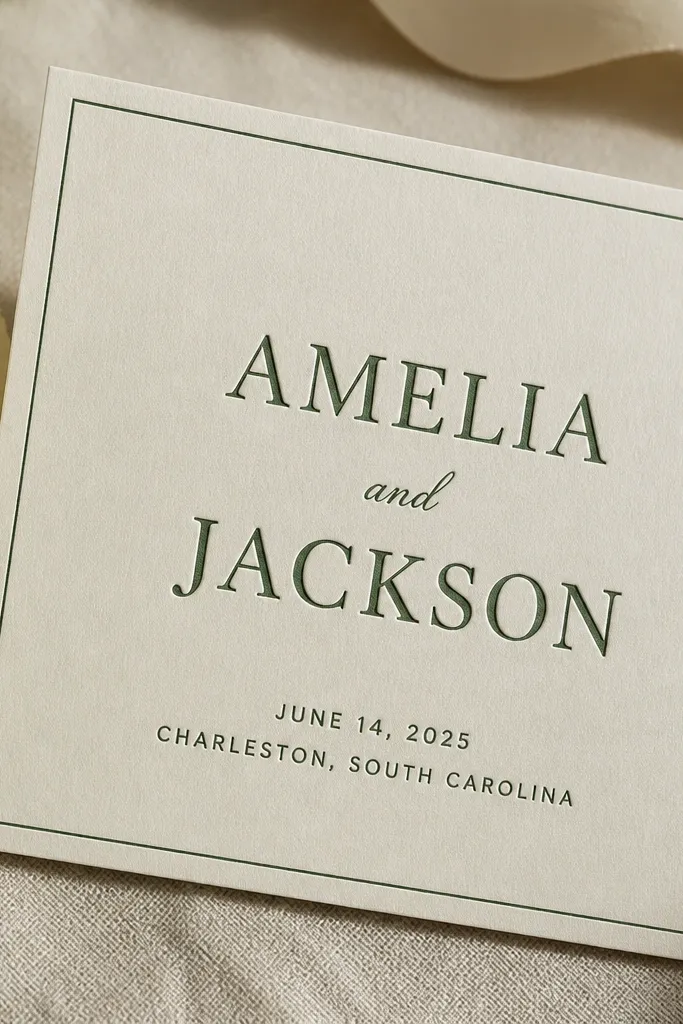
Letterpress style is one of the easiest ways to make something feel handmade without paying for actual presses. The deep green on cream looks grounded and works with garden, woodland, and rustic venues. I like the slightly textured look because it hides tiny printing imperfections that happen with at-home printing. This also flatters couples with green accents in their wardrobe - like olive, sage, or forest tones - because the card echoes that choice. For both men and women, the clean two-color palette keeps the typography readable and avoids "party invite" vibes.
Use cream cardstock and set everything in one deep green color for a two-color look. Add a thin border around the edges and keep the names centered. Use a serif for the names and a simple sans for the date/location, both in the same green ink color. For the letterpress feel, add a subtle offset shadow effect behind the text by a pixel or two (only if your design tool supports it) so it looks stamped. If you're ordering, request a test print to see how the texture reproduces on your paper.
Try thisChoose a slightly muted green, not bright emerald - bright greens look cheap on matte paper.
Common mistakeAvoid using gradients or multiple greens - letterpress style looks best with flat ink.
14. Modern Photo Corner + Big Date Typography (City Hall Friendly)
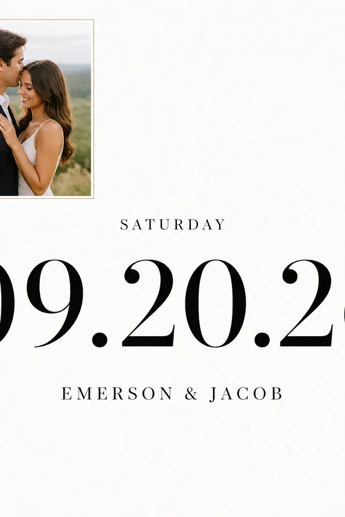
Huge date typography makes people remember the date because they see it from across the room. This style works especially well for couples having a ceremony at a venue where guests need quick clarity - city halls, theaters, and parks. The photo corner adds personality without turning the whole card into a photo collage. I like this for both men and women because the names stay in a steady serif, while the date gets the bold treatment. The white background makes it readable, and the photo corner keeps it from feeling sterile.
Start with a white background and place a small photo in the top left at about 20-25% of the card width. Center the couple names below the photo with a medium-large size. Put the date in oversized bold numbers across the midsection, leaving enough breathing space above and below it. Add the day of week smaller above the date and the location line underneath in a simple sans. For an after upgrade, ensure the date numbers align to a single baseline and don't use too many font styles - one bold number font and one supporting font.
Try thisIf your date is long (like with an extra line), shorten it on the card and move the full address to a separate insert or your wedding website.
Common mistakeAvoid making the date the same size as the names - it reads like a calendar instead of an announcement.
15. Vintage Ticket Stub Layout (But With Real Spacing)
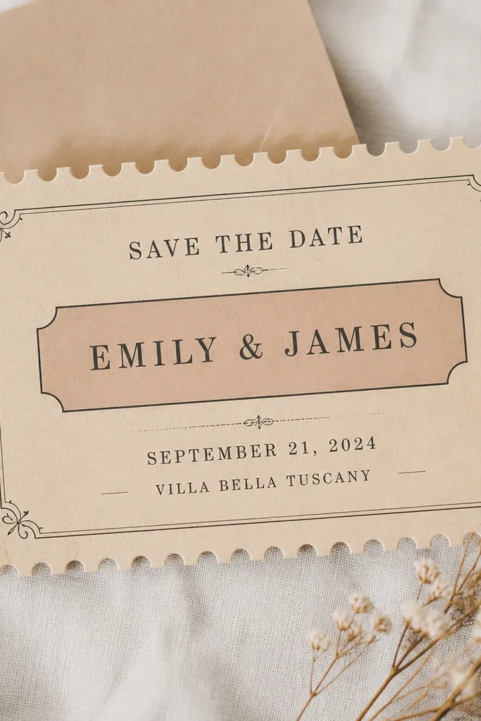
A ticket stub layout makes the card feel fun and themed, and it works surprisingly well for weddings that have a lighthearted tone. The reason it can look cheap is when the perforation effect is heavy and the text gets squeezed. This version stays premium by keeping the ticket area centered with clean margins and using restrained ornament lines. I like it for couples who want an event vibe but still need clarity for guests. It flatters both men and women because the names sit in the center and the date is set in a clear, readable block. Also, it photographs well because the ticket shape gives depth and a clear silhouette.
Create a centered ticket shape area on a cream or off-white background with a subtle perforation effect only at the edges of the ticket block. Keep the ticket block width around 70% of the card and center it vertically. Put the couple names in the middle using a readable serif or strong sans, then place the date on one line and the city/venue on the next. Add only two decorative rules - one above names and one below the date - and keep them thin. For the after improvement, increase font size slightly and widen the line spacing so it doesn't feel jammed.
Try thisIf you plan to mail these, avoid super thin decorative fonts - they can break up during printing and look like smudges.
Common mistakeAvoid tiny text packed into the ticket shape - it turns into unreadable noise.